|
| Group |
Round |
C/R |
Comment |
Date |
Image |
| 25 |
May 18 |
Comment |
Great shot. The composition is great and the subject is nice and sharp. It clearly was a cloudy day so a little color enhancement of the coyote would make him/her pop more. I agree with the adjustments Audrey suggests. |
May 22nd |
| 25 |
May 18 |
Comment |
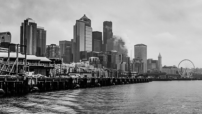
I like the line of the waterfront going from left to right. It leads the eye through the photo. The composition is a bit to wide. I changed the aspect ratio to 16x9 and eliminated some of the water in the foreground and some of the sky. I then added a left to right gradient and added contrast to 60 and sharpening to 60. This may have overdone it a bit but you get the idea. B&W is a good alternative for this type of shot. |
May 22nd |
 |
| 25 |
May 18 |
Comment |
What a fun shot. It clearly tells a story about kids having fun. Was the fire department called to get him down. I would add a darker vignette to help focus the eye. Thanks for the laugh. |
May 22nd |
| 25 |
May 18 |
Comment |
I like your composition and the colors are spot on. I agree the background is a bit harsh and like Audrey's adjustments. A vignette would help toning the background down. |
May 22nd |
| 25 |
May 18 |
Comment |
I like the lines which lead the eye to the little tree which I think is the subject. I thought the lines in the bottom third lead the eye out of the image so I changed the aspect ratio to 1x1 to focus the viewer more on where the lines take the eye. I think this strengthens the composition. The original seems to have been shot at midday since the light seems to be reather harsh. Shooting with the light at a greater angle would bring out the shadows and add some pop, but that may not have been possible. The different shades of brown add to the composition. In addition to changing the aspect ratio, I enhanced the browns and greens and added some sharpening. The thumb nail shows the result. Hope you like it. |
May 22nd |
 |
| 25 |
May 18 |
Reply |
I agree with liking the B&W better. I belong to a critique group at my camera club and showed them this image with the lines in front similar to your version. The consensus of the group was the leading lines are a distraction. Thus I removed them for the study group to get another set of comments. This is one where I think it is in the eye of the viewer, and there is no right or wrong. By the way, I submitted the one without the lines in this month B&W print competition at my club, and the judge gave it an honorable mention.
Thanks for your comment. |
May 18th |
5 comments - 1 reply for Group 25
|
5 comments - 1 reply Total
|