|
| Group |
Round |
C/R |
Comment |
Date |
Image |
| 25 |
Jan 17 |
Comment |
WOW, you were there when you had really great light. What time of day? Your post processing is also spot on. I would change nothing.
As for adding more of the root, when I am taking landscapes such as this one I will also turn the camera to shoot portrait and shot a 180 degree multi shot pano. This allows me to stitch the shots together in Photoshop and then select the section I find the best. |
Jan 23rd |
| 25 |
Jan 17 |
Comment |
Great shot. The owl is tack sharp right where it should be, in the eyes, and the feathers are also sharp. I find the tree trunk on the left a little bright. Toning it down would reduce the distraction. I think the black background is a little harsh. The green leaves Audrey suggests are an improvement. You might want to lightening the black by 25% to make it a dark gray and see how that looks. |
Jan 23rd |
| 25 |
Jan 17 |
Comment |
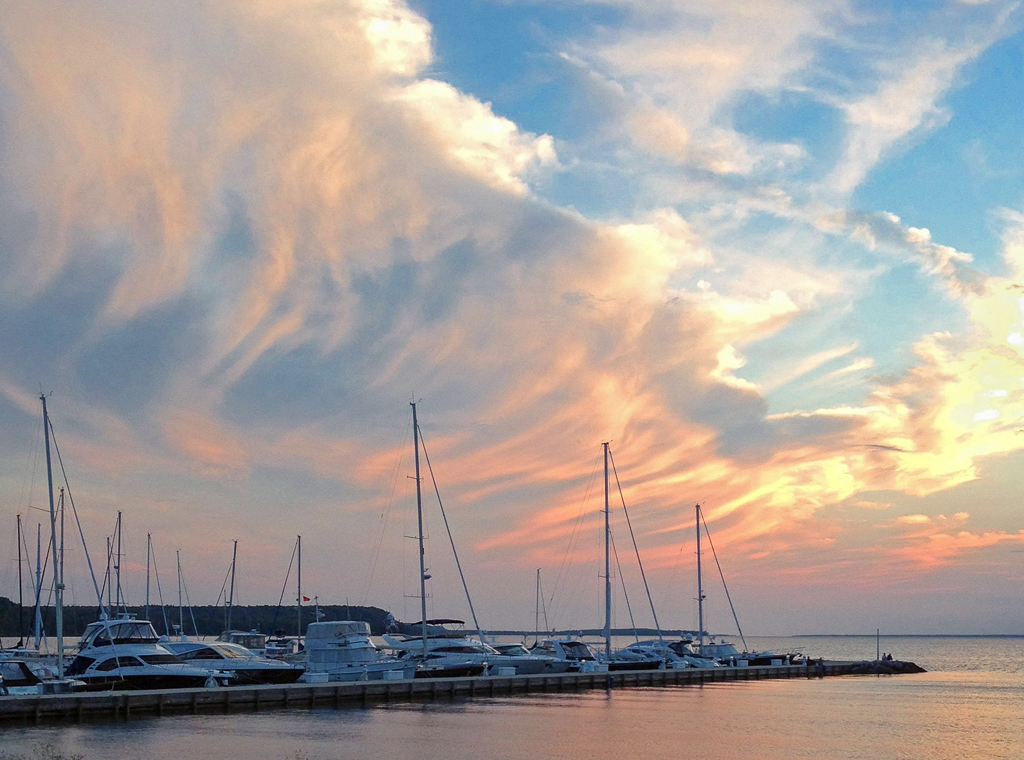
Great sunset and the rays of sunlight definitely make it "not just another sunset" shot. I agree with the adjustments Vince and Audrey suggest. |
Jan 23rd |
| 25 |
Jan 17 |
Reply |
I entered it in the Intermediate Group for Prints and won an Honorable Mention. |
Jan 23rd |
| 25 |
Jan 17 |
Comment |
Welcome Vince. I can see from your photo that you are going to give us some great shots to review. Let me warn you, the question I ask myself on every photo is what could be done to make it better. This is not to be critical, but to present a different point of view. I also do this because I find it a good learning tool for me. All of the photos submitted in this group are good shots, not snap shots, so I hope you find my comments useful.
When I first saw your photo I really liked it. As stated by others I find the small bare branches a distraction. I also like the fence coming out of the lower right corner, a very strong visual feature, but the tree on the left is more dead space than an asset. With these thoughts in mind, I imported into Lightroom and made the following adjustments. I cropped the top and left side a little, darkened the sky a little, and found the fence posts not quit vertical so I adjusted them. I also have been beaten up by judges about light objects around the borders of a photo, so I automatically look for them when reviewing a photo. The area to the right of the tree does attract the eye. I could not decide if this is a big impact, but cropped it out so you could see the difference. My adjustments are in the thumbnail below. |
Jan 23rd |
 |
| 25 |
Jan 17 |
Comment |
A great shot and the obvious correction is the horizon line. I felt it needed a little pop so I imported into Lightroom where I cropped the sides and top a bit, darkened the blues in the sky, and opened up the shadows a bit. I adjusted the horizon also. These are all subtle changes but I think it adds some pop. Result is in the attached thumbnail. |
Jan 23rd |
 |
5 comments - 1 reply for Group 25
|
5 comments - 1 reply Total
|