|
| Group |
Round |
C/R |
Comment |
Date |
Image |
| 1 |
Jul 18 |
Comment |
Hi Kathryn
I had to comment great composition I agree with Sol at first glance the viewing scopes looked like a line of robots very,very well seen and superbly handled. |
Jul 12th |
1 comment - 0 replies for Group 1
|
| 7 |
Jul 18 |
Comment |
Hi Rich
I love this type of image shape and and texture have you thought of trying it in monochrome a really contrasty mono can look fantastic with this type of image.
Ian |
Jul 13th |
1 comment - 0 replies for Group 7
|
| 27 |
Jul 18 |
Comment |
Hi Danny
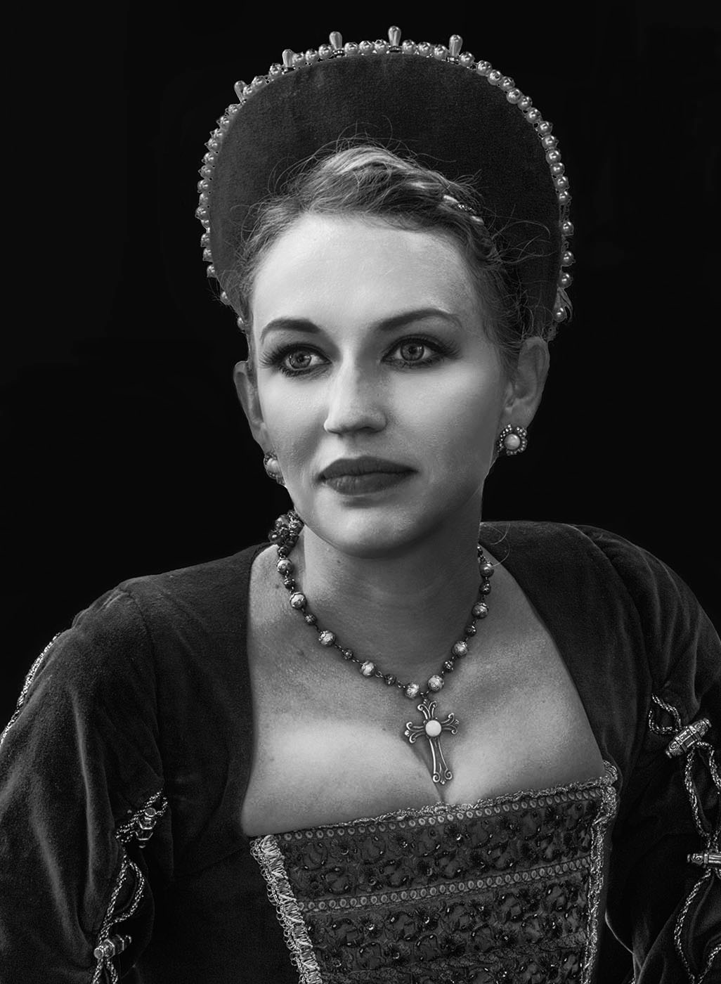
I take a lot of portraits and just wanted to commend you its a superb portrait so much character and expression I would agree with Jon the slightest lightening of the eyes would be the final touch for me I dodge eyes at about 3% exposure on a seperate layer very gently but your call whether you leave alone or lighten the eyes its a winning image in for me. |
Jul 17th |
1 comment - 0 replies for Group 27
|
| 31 |
Jul 18 |
Reply |
Hi Ella
its a beautiful capture well seen and taken and only an idea for an edit but hope it gives you a few ideas. |
Jul 17th |
| 31 |
Jul 18 |
Comment |
Hi Ella
Just did a quick edit used a black and white gradient map upped the contrast adjusted in highlights and shadows and dodged the eyes at 5% exposure doesn't look quite as flat. |
Jul 17th |
 |
| 31 |
Jul 18 |
Comment |
Hi Ella
So glad you are hooked on these events like I am you get to photograph some great characters.Your subject is a great choice and the crop is spot on I have to agree with the others it does look a bit flat I know in other images you have removed backgrounds very'very successfully but Ella I am sorry this one does look like its been removed maybe added contrast would solve that but I do agree it s a great subject just needs a bit of a tweak but keep going and enjoying these events. |
Jul 17th |
| 31 |
Jul 18 |
Reply |
No problems John, Peters version is a vast improvement. |
Jul 17th |
| 31 |
Jul 18 |
Comment |
Hi Paul
Firstly can I congratulate you highish ISO slowish shutter speed pin sharp image, fantastic contrast very very strong composition I have to agree with Peter a thin white stroke defining the image would just finish it to perfection for me. |
Jul 16th |
| 31 |
Jul 18 |
Reply |
Peter
You are always so precise with your work I thought it must be something in the far distant terrain thank you for clarifying. |
Jul 16th |
| 31 |
Jul 18 |
Reply |
Many thanks Peter it looks so much better for your treatment I will apply myself.
Ian
|
Jul 16th |
| 31 |
Jul 18 |
Comment |
Hi Rashid
I love the concept and although I have always loved our work this one does not really work for me,if I am going to say that I need to justify my comments two thirds of the left hand side are dark but I find the small white splashes distracting and drawing my eye to them I would take them out and make the black much stronger it is a little patchy I also find when I look at the brighter area my eye drawn to small amount of bottom step and handrail,I love the concept but on this ocassion it does not quite work for me so sorry Rashid. |
Jul 15th |
| 31 |
Jul 18 |
Comment |
Hi John
Great choice of portrait presentation the people fill in what would have been dead space and add dimension to the buildings but the thing i like the most is all the various non uniform shapes and angles created by the building great composition and an image the more you look the more you see,it works really well for me. |
Jul 14th |
| 31 |
Jul 18 |
Comment |
Hi Peter
Another master class in composition the lead in and shapes with in the image guide the eye all the way through the image.Tone and texture beautifully handled I love the way the building on the left hand hill side almost blends in but is just visible and the white building to the left of the church is superbly placed.My only negative observation and it could be me the image seems to lean slightly from right to left but as I say that could be me. |
Jul 13th |
6 comments - 4 replies for Group 31
|
| 32 |
Jul 18 |
Reply |
Happily do that Diana though it won't be Wednesday I beleive theres a football game on .. |
Jul 9th |
| 32 |
Jul 18 |
Comment |
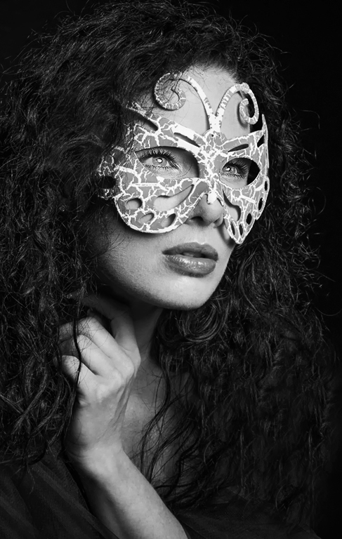
Hi Diana
I love the angle you have taken this at it so works and is very intimate also hands can be a problem in portraits but again I think the hand adds something to this it most certainly doesn't detract from the image.My only thought is it looks a little flat so I have done a re-edit I hope you dont mind firstly on an adjustment layer I used a black and white gradient map on about 70% opacity on another adjustment layer I upped the contrast slightly on a further layer I adjusted the highlights and shadows I then added a light vignette and finally at 4% exposure dodged the midtones in the hair.One thing I did note there are skin blemishes on the jaw line leading into the cheek the way to remedy this go back to the original sharpen the image then using a mask paint the skin back in leaving only the mouth and eyes sharpened.
Ian |
Jul 9th |
 |
1 comment - 1 reply for Group 32
|
| 64 |
Jul 18 |
Reply |
Hi Stuart
West Kirby sadly does not have a lighthouse it does have an old stone beacon very close to my house but you are spot on it is New Brighton Lighthouse I know Malpas it is beautiful,good luck in the competition it should do very very well. |
Jul 25th |
| 64 |
Jul 18 |
Comment |
Hi Stuart
A great capture of something I know very well as I live in West Kirby about 8 miles away from the lighthouse it is a much photographed structure both by locals and those further afield I see so many shots of the lighthouse and ocassionally one stands out from the others and and you have grabbed my attention with this ethereal image well done. |
Jul 24th |
1 comment - 1 reply for Group 64
|
11 comments - 6 replies Total
|