Activity for User 453 - Cyril Mazansky - cy.mazan@gmail.com
Close this Tab when done
160 Comments / 10 Replies Posted
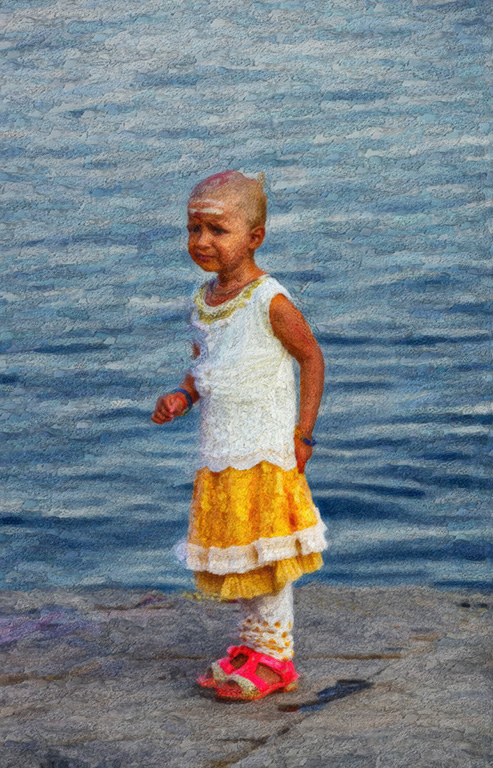
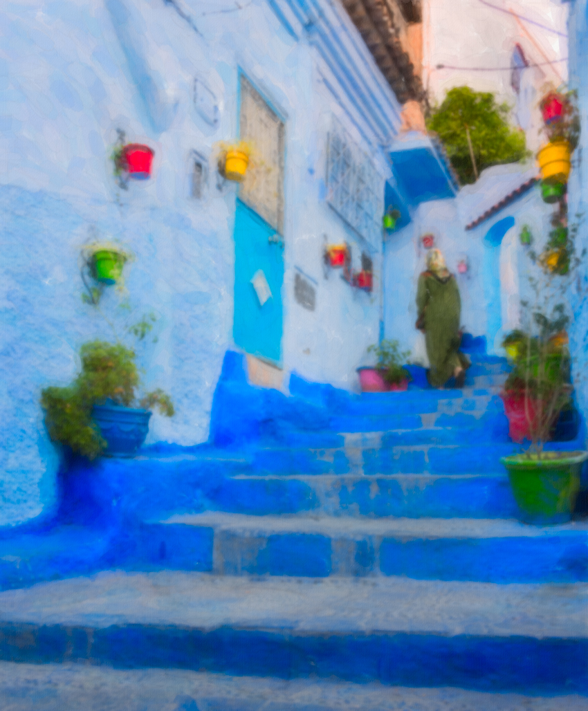
33 Images Posted
| = Current Round | = Previous Round |
| Group 56 | |||||||||||
|---|---|---|---|---|---|---|---|---|---|---|---|
 Jan 20 |
 Dec 19 |
 Oct 19 |
 Sep 19 |
 Aug 19 |
 Jul 19 |
 May 19 |
 Apr 19 |
 Mar 19 |
 Feb 19 |
 Jan 19 |
 Dec 18 |
 Nov 18 |
 Oct 18 |
 Sep 18 |
 Aug 18 |
 Jul 18 |
 Jun 18 |
 May 18 |
 Apr 18 |
 Mar 18 |
 Feb 18 |
 Jan 18 |
 Dec 17 |
 Oct 17 |
 Sep 17 |
 Aug 17 |
 Jul 17 |
 May 17 |
 Apr 17 |
 Mar 17 |
 Feb 17 |
 Jan 17 |
|||