|
| Group |
Round |
C/R |
Comment |
Date |
Image |
| 21 |
Mar 21 |
Comment |
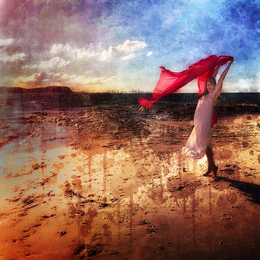
I really like how you have added colour to this image. The original is interesting but not as exciting as your adjusted image! |
Mar 25th |
| 21 |
Mar 21 |
Comment |
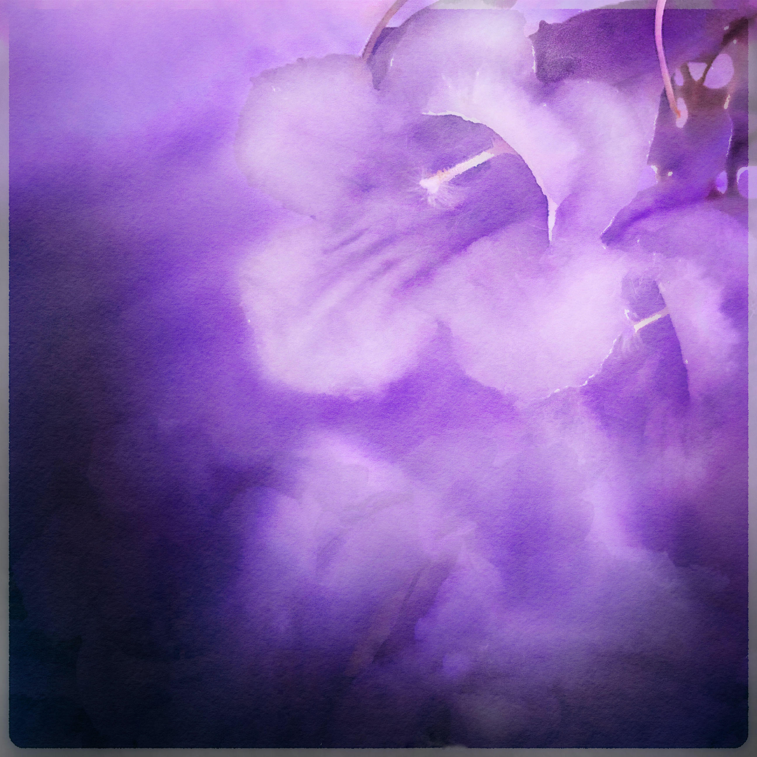
This is a beautiful study in colour tones. Perhaps a square format would show of your subject more? |
Mar 25th |
| 21 |
Mar 21 |
Comment |
Thanks for your comments! I'm inclined to agree about the first image! |
Mar 25th |
| 21 |
Mar 21 |
Comment |
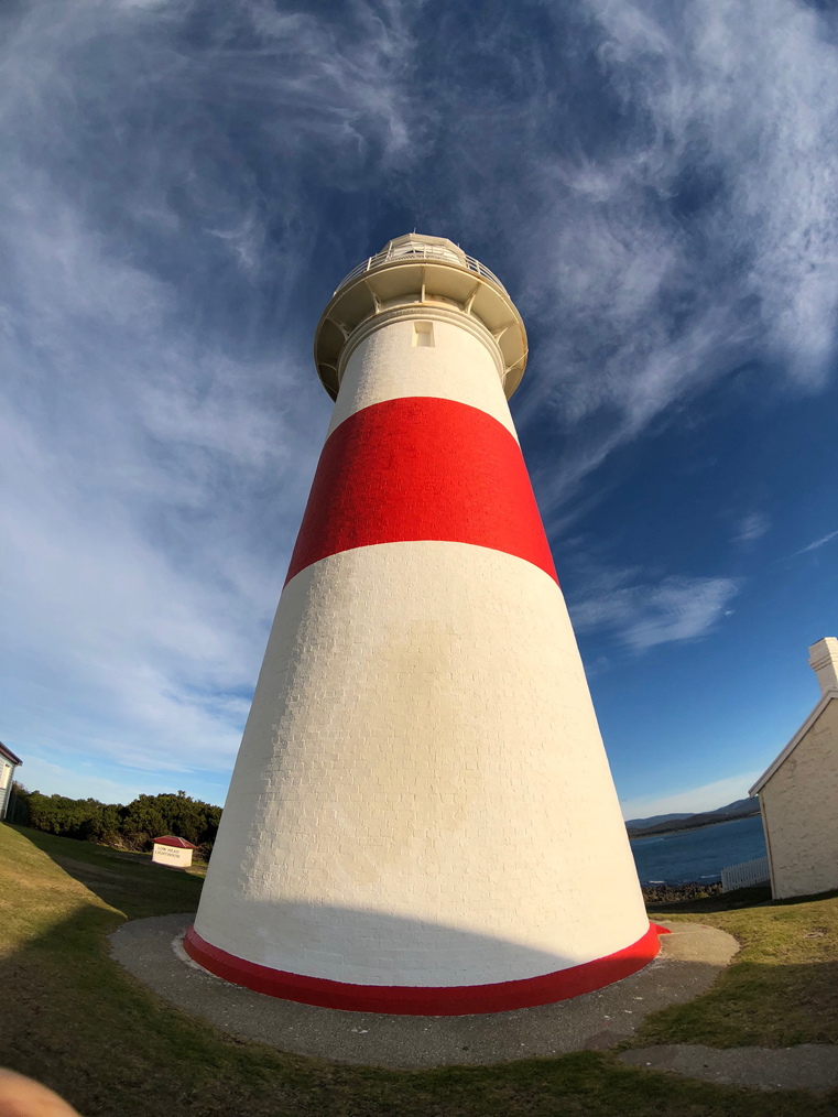
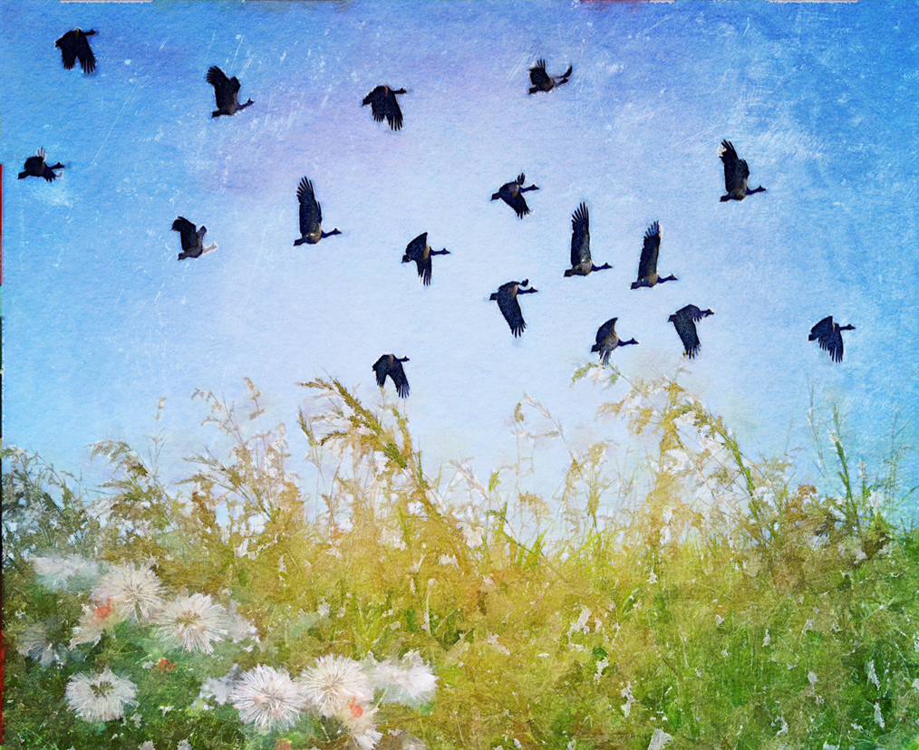
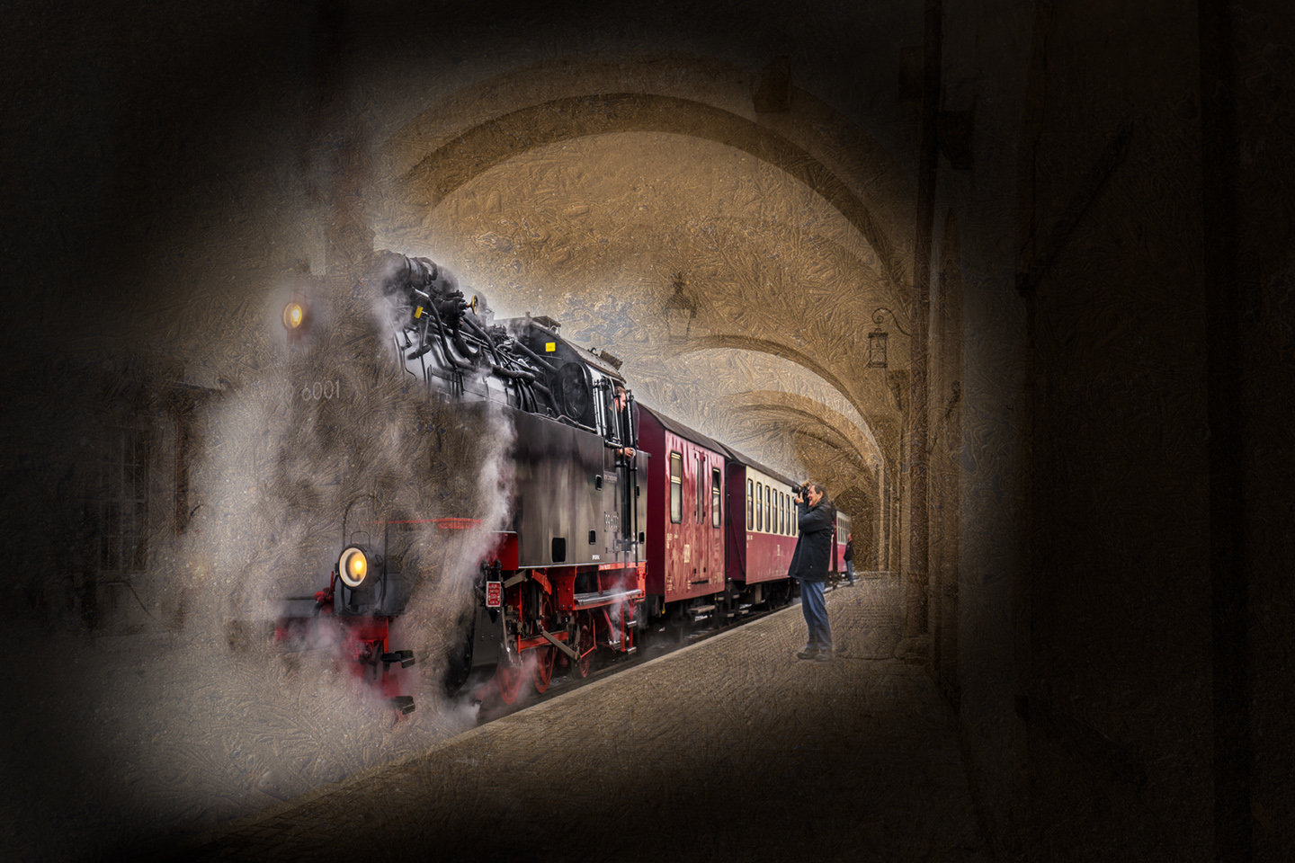
Good composition. I like it that the other birds are further away and the Trees are forming an interesting frame. You have minimised the circles around the sun. It seems to have a 1950's feel to the interior decorating of that time! |
Mar 13th |
| 21 |
Mar 21 |
Comment |
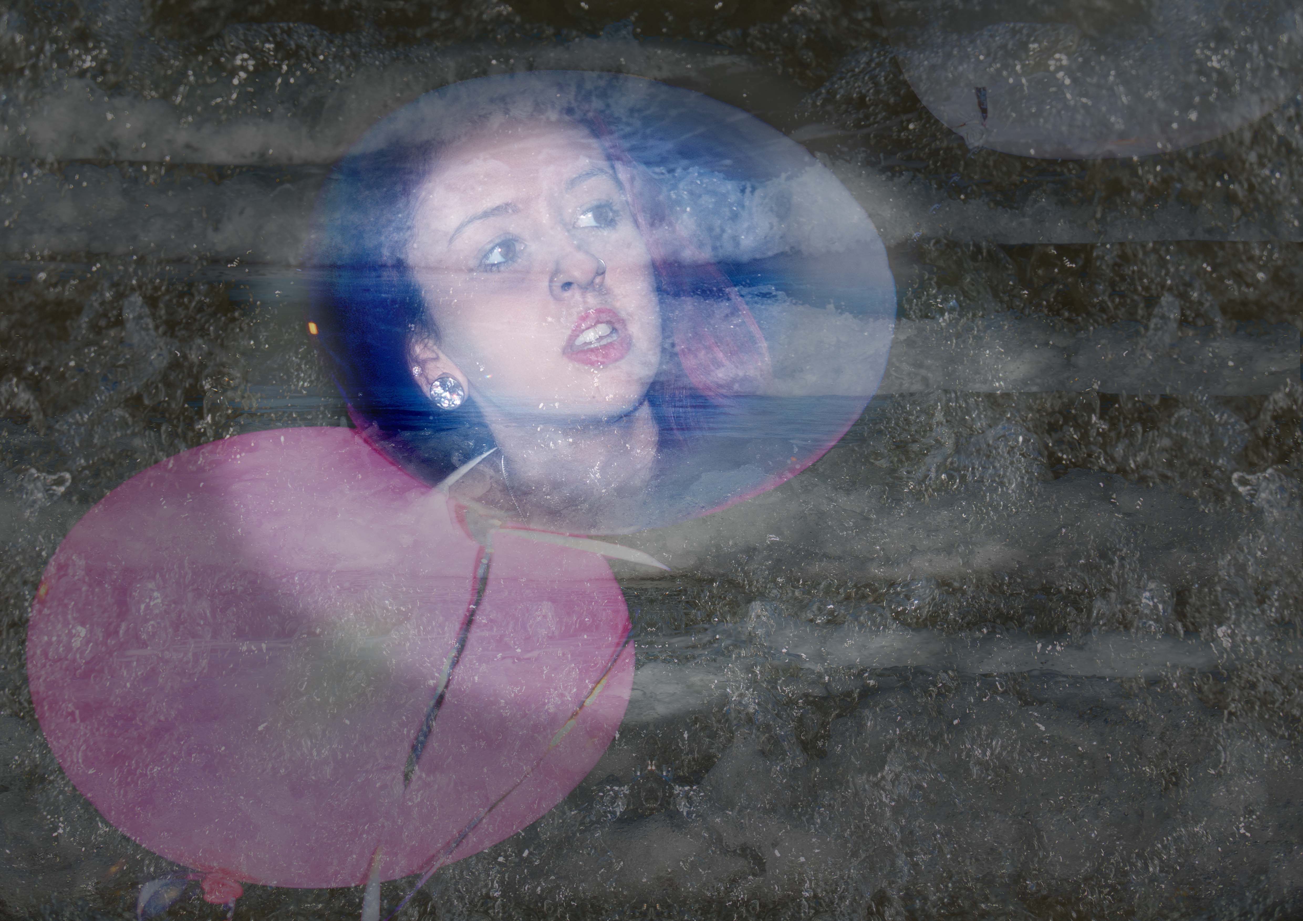
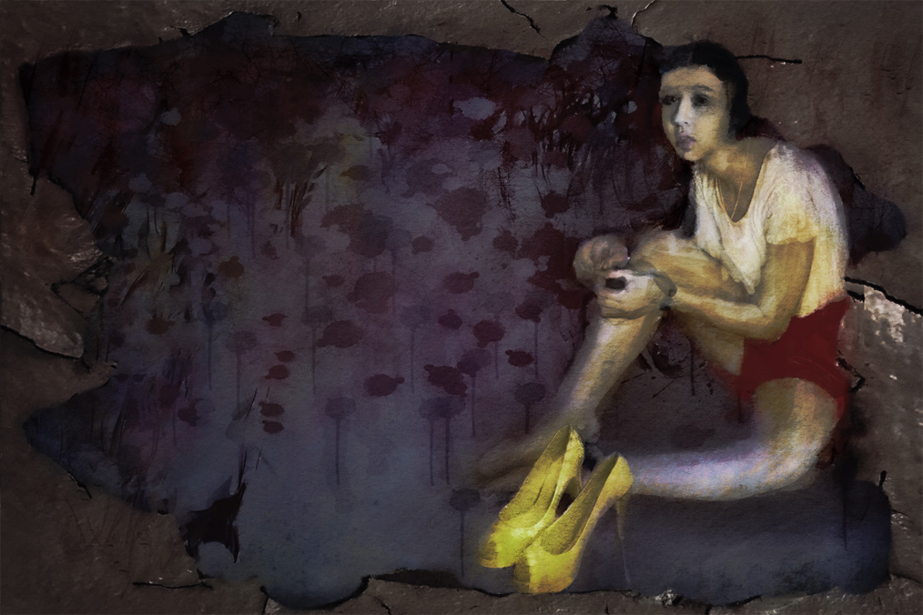
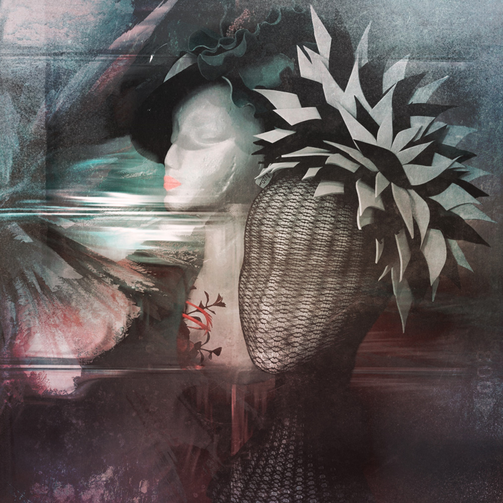
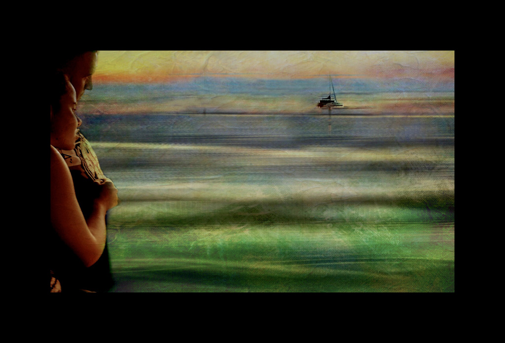
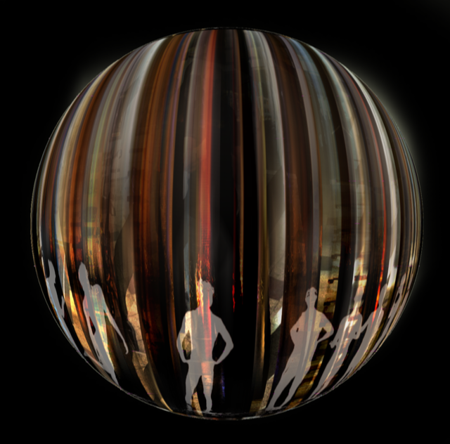
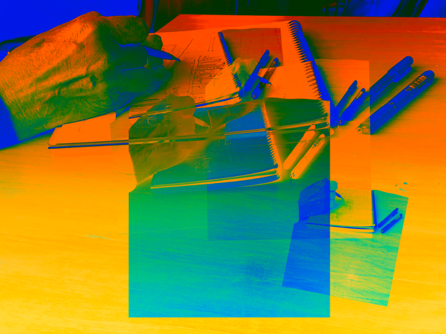
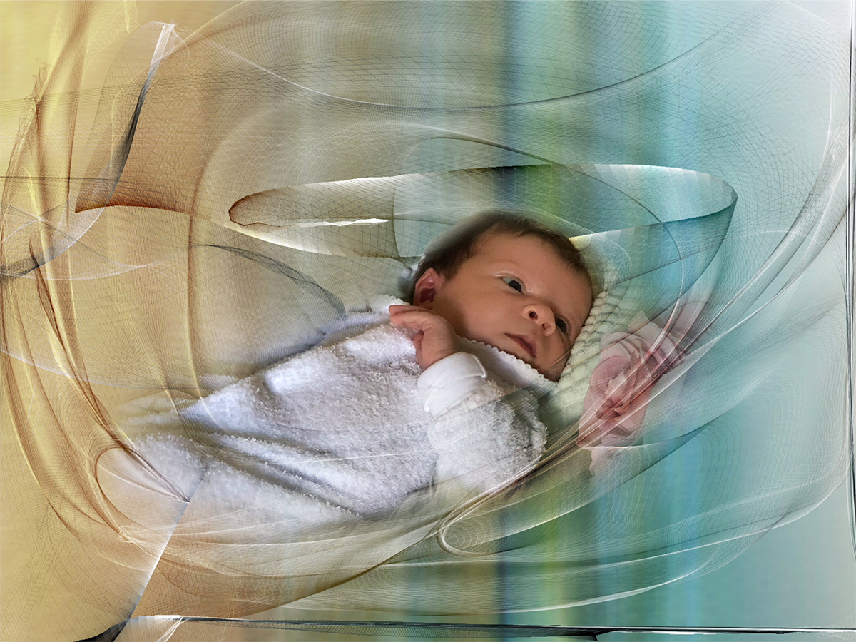
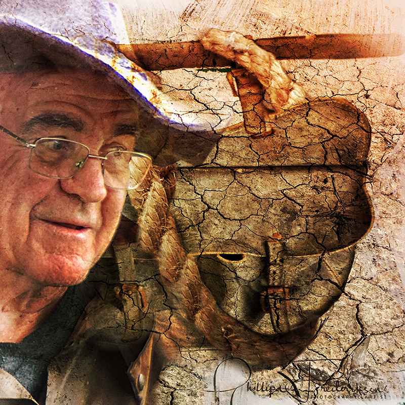
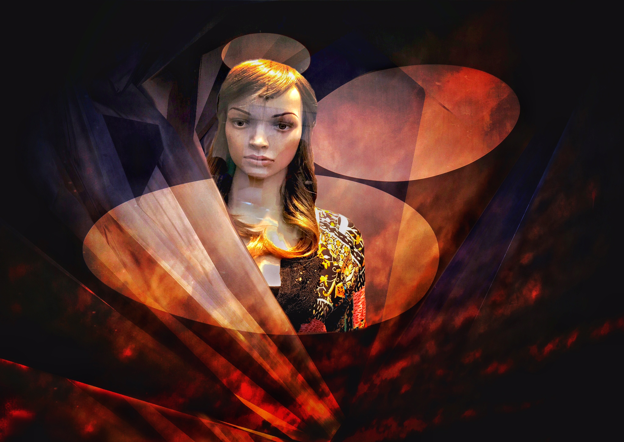
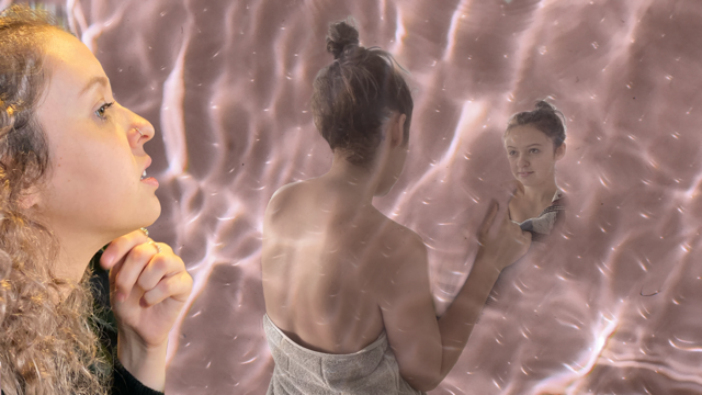
OH! That was soooooo naughty of you! Personally I feel that you could have softer edges around the "cutouts". On my screen it looks a little over saturated. Good interaction between mother and child. |
Mar 13th |
| 21 |
Mar 21 |
Comment |
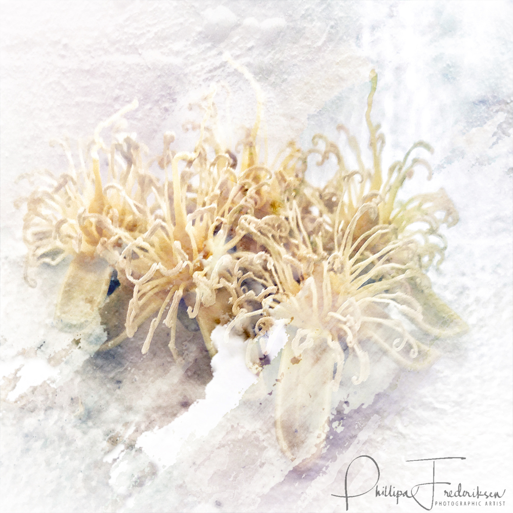
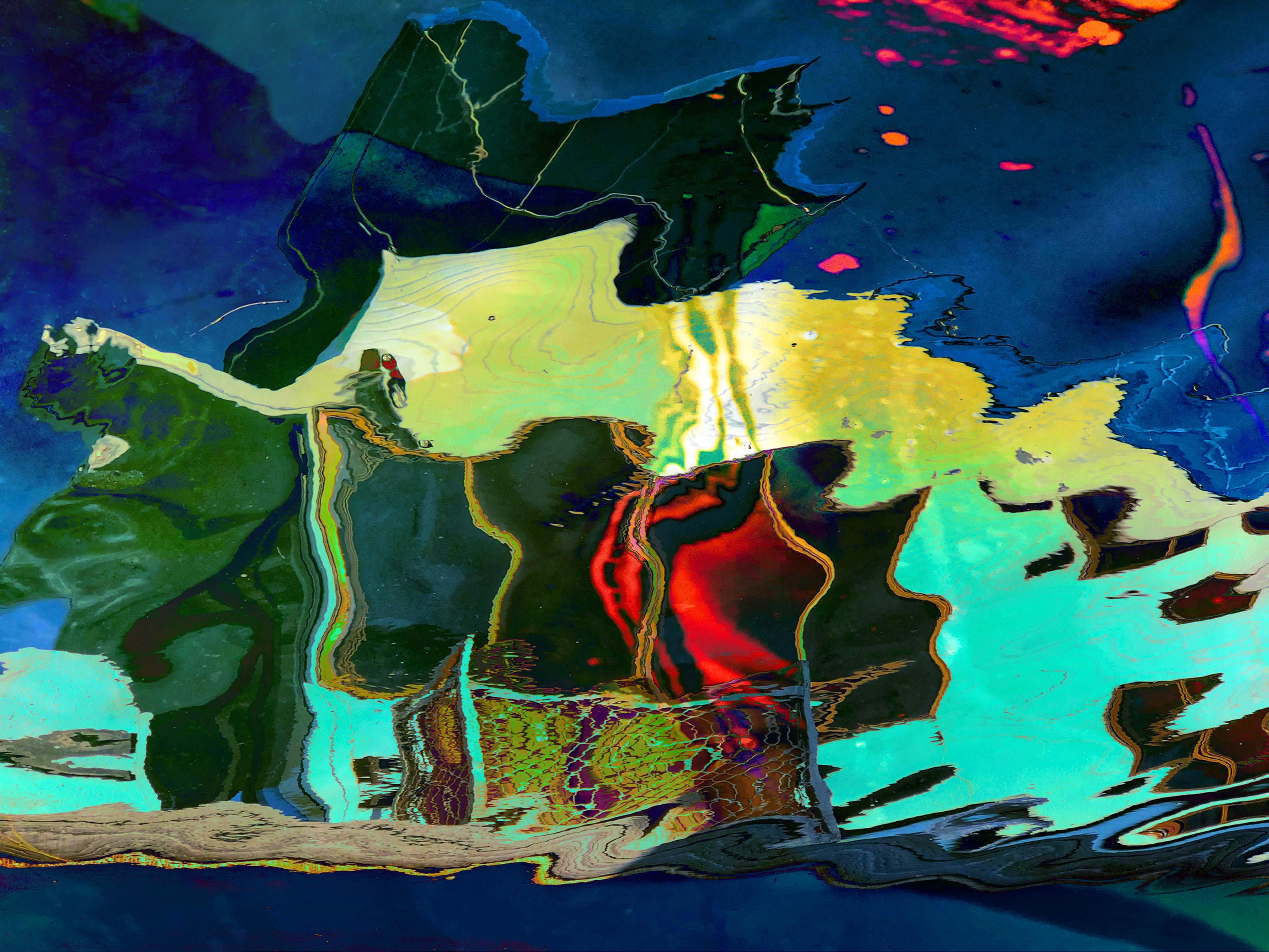
At first I couldn't see where the icicles were! They go very well with the boards and the colours are beautiful.....then I was confused about the fine lines on an angle...but when I enlarged the icicles I found that texture!
I feel that this month you are a conjurer.... you have used "slight of hand" to develop your image! Love those colours. |
Mar 13th |
| 21 |
Mar 21 |
Comment |
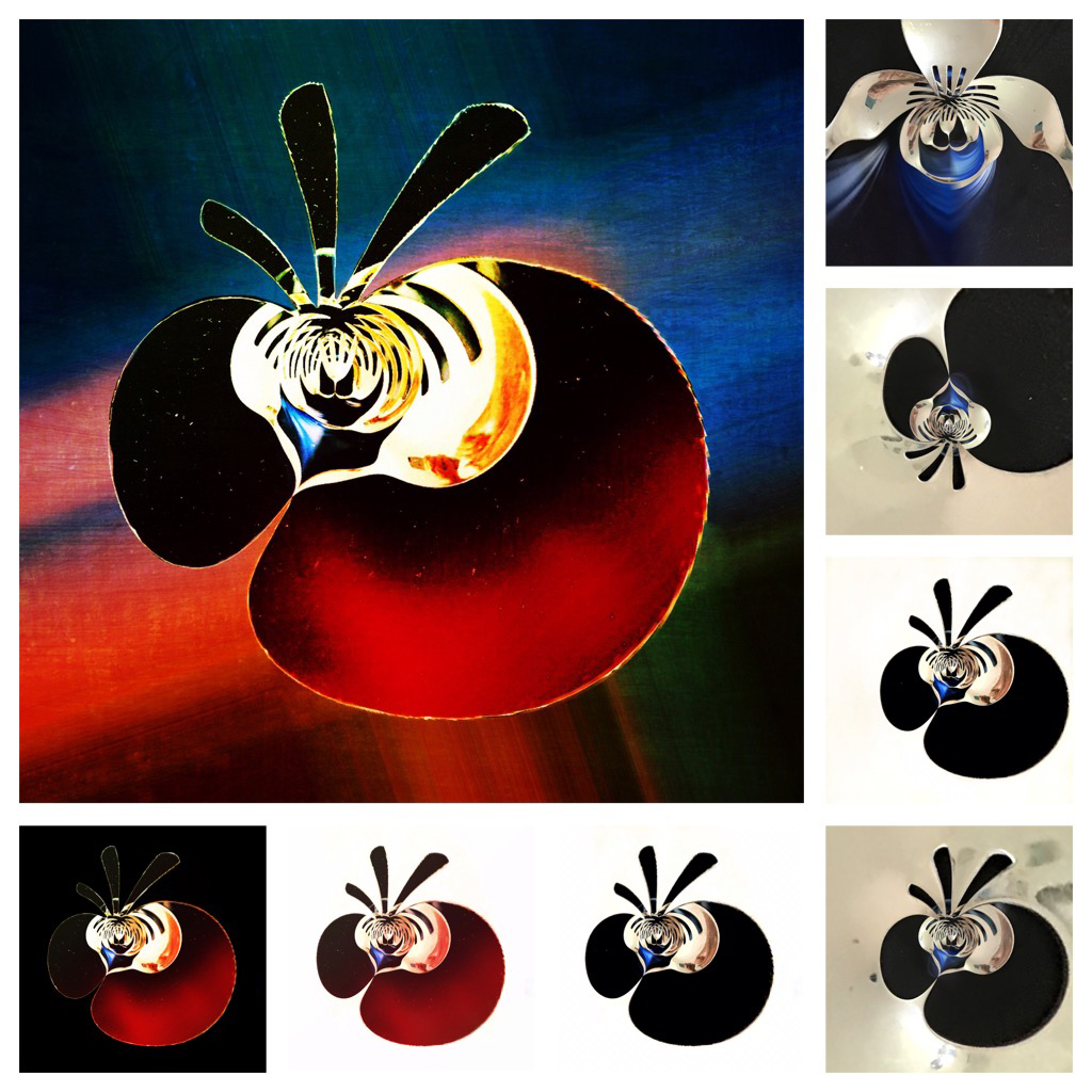
Good composition and good colour. I really like the way that you have somehow made the fish 3D! It looks like they are going to come out of the screen! |
Mar 13th |
7 comments - 0 replies for Group 21
|
| 86 |
Mar 21 |
Comment |
Thanks for your comments everyone! |
Mar 11th |
| 86 |
Mar 21 |
Comment |
Good detail in the fur! Buttercup is looking particularly regal and I like the way she is matching her background! |
Mar 7th |
| 86 |
Mar 21 |
Comment |
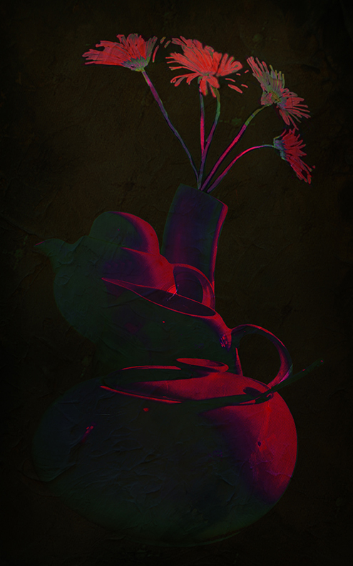
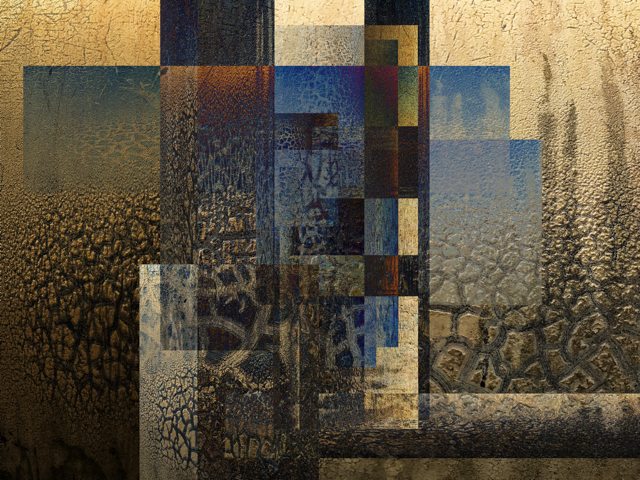
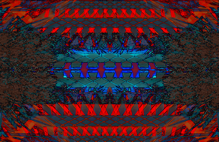
There are different ways you could crop (or not!!!) this and it would still be an interesting abstract image. IF you wanted it to be perfect you could straighten the perpendicular line....but I like it anyway and I DO like the brown part of the base. |
Mar 7th |
| 86 |
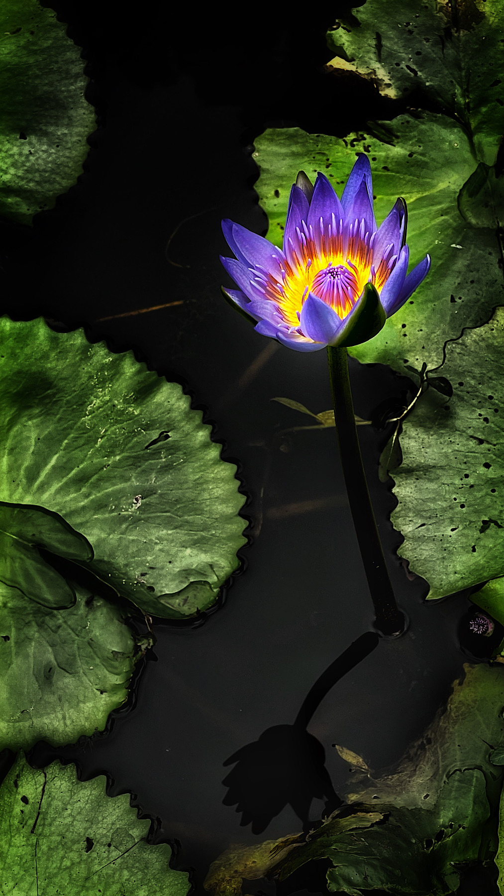
Mar 21 |
Comment |
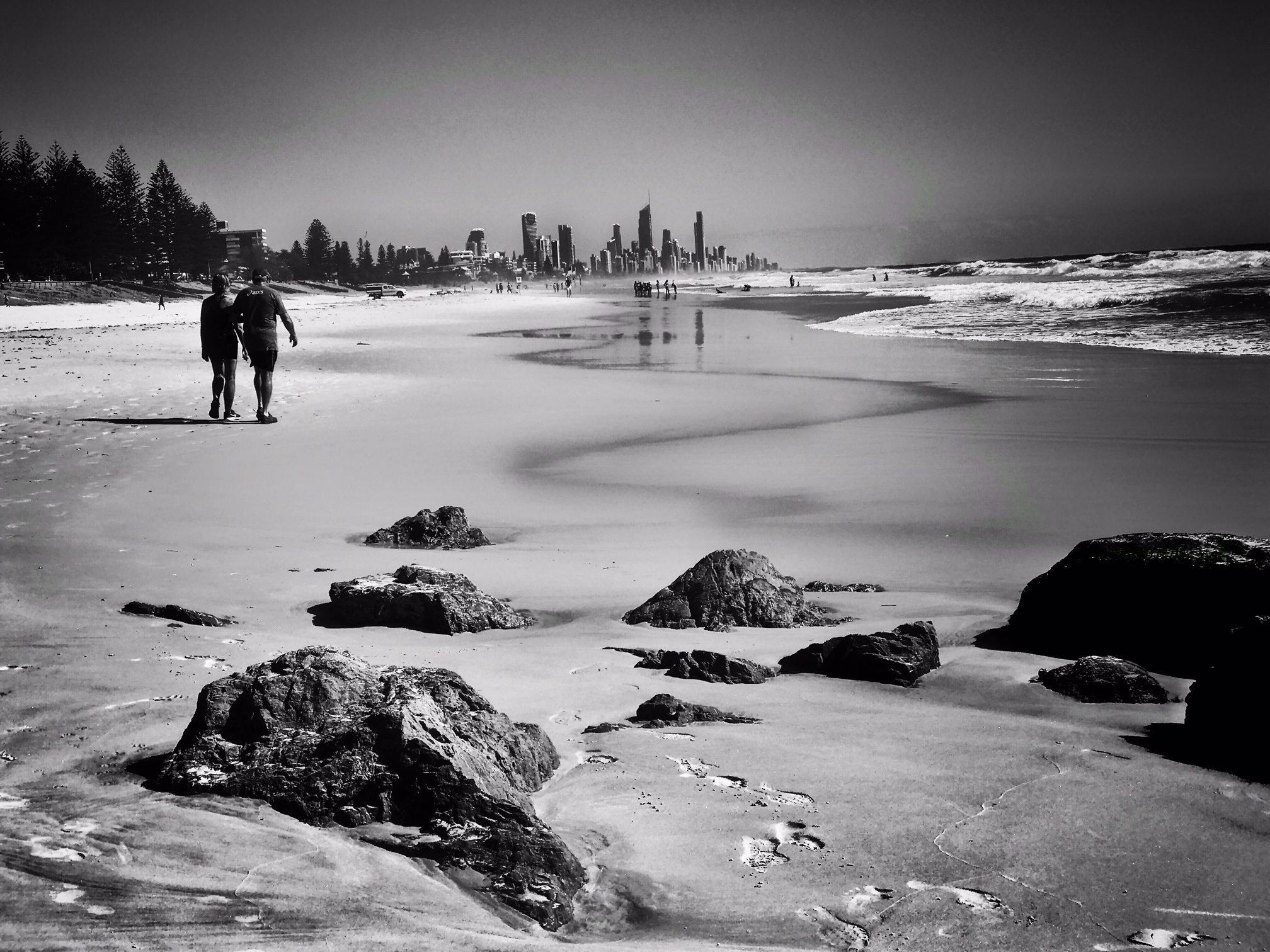
What a wonderful capture! You have given your subject the story/history of where it is. Nice diagonal line in the reflection. The placement of the angel is very fortuitous! Well caught! |
Mar 7th |
| 86 |
Mar 21 |
Reply |
Why Didn't I think about moving the reflection?! THEN I could crop! |
Mar 3rd |
| 86 |
Mar 21 |
Reply |
what I SHOULD have done was to clone some leaves down there! I was trying to save the reflection!. |
Mar 2nd |
| 86 |
Mar 21 |
Comment |
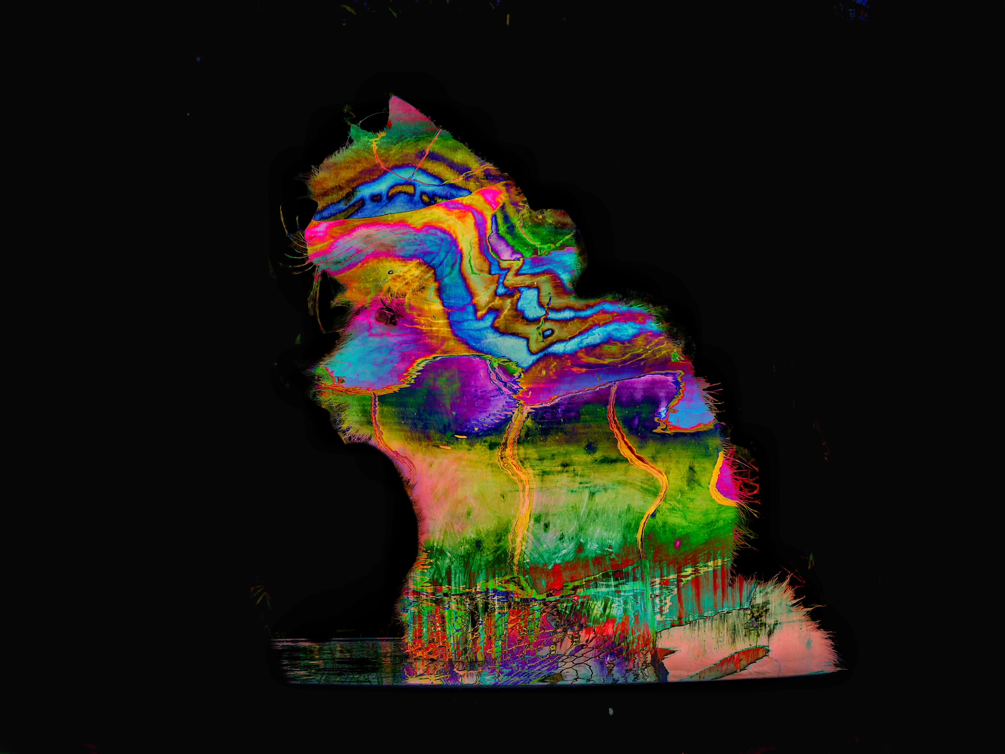
I feel that there is more light in the original at the moment. The mono version seems to need a little more contrast to bring out those patterns. I'm not sure why you left parts of the image in colour. Love that dotted line in its feeler! |
Mar 2nd |
| 86 |
Mar 21 |
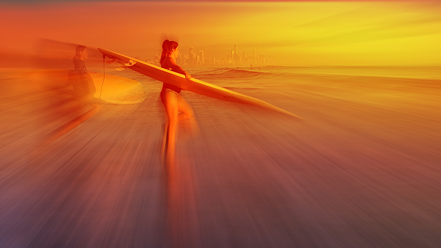
Comment |
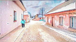
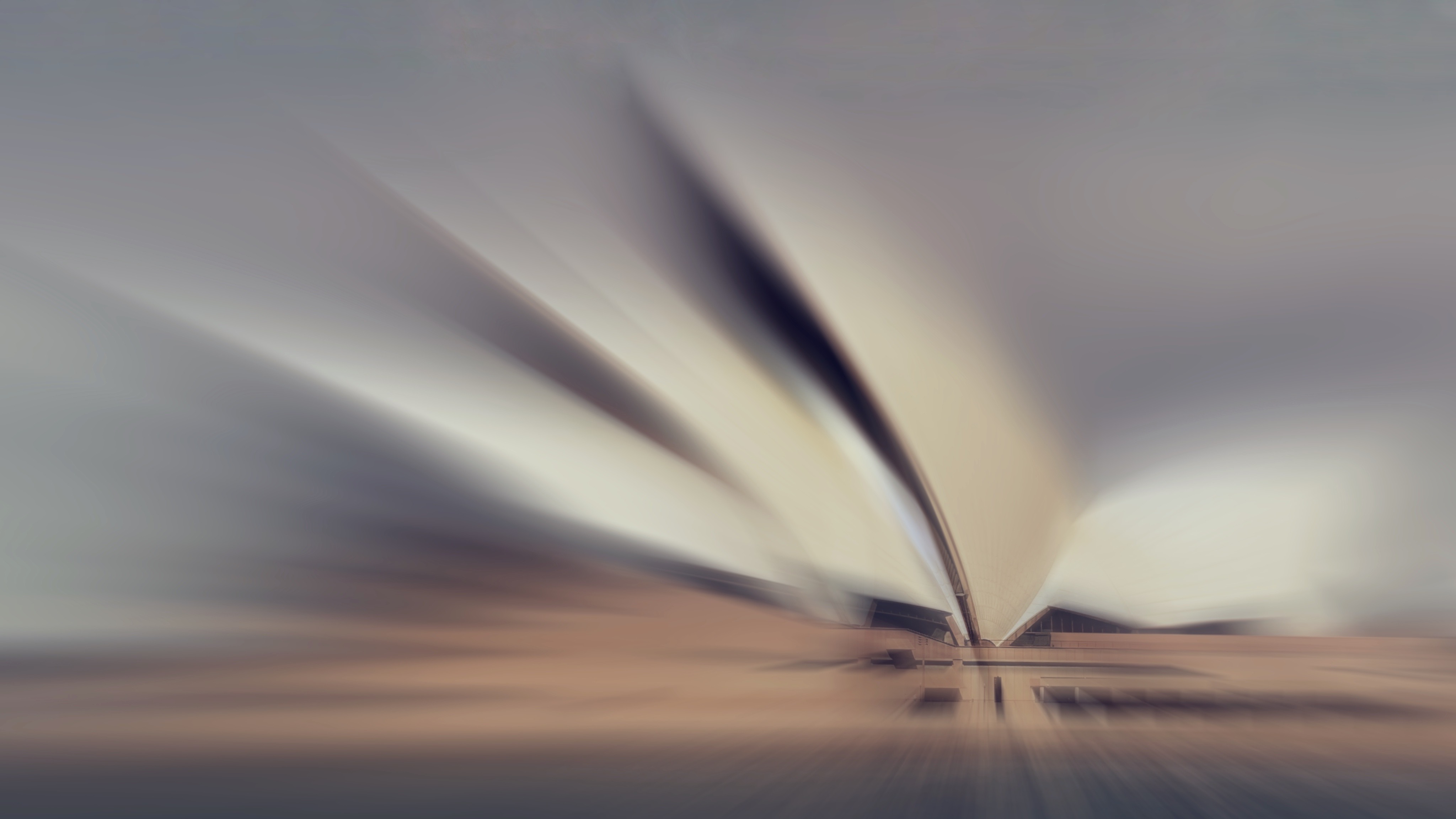
You have certainly brought this building to life! I actually like whacky perspectives so this doesn't both me! Love the Pink in the building! |
Mar 2nd |
| 86 |
Mar 21 |
Comment |
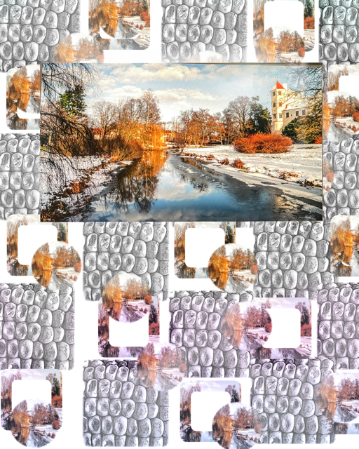
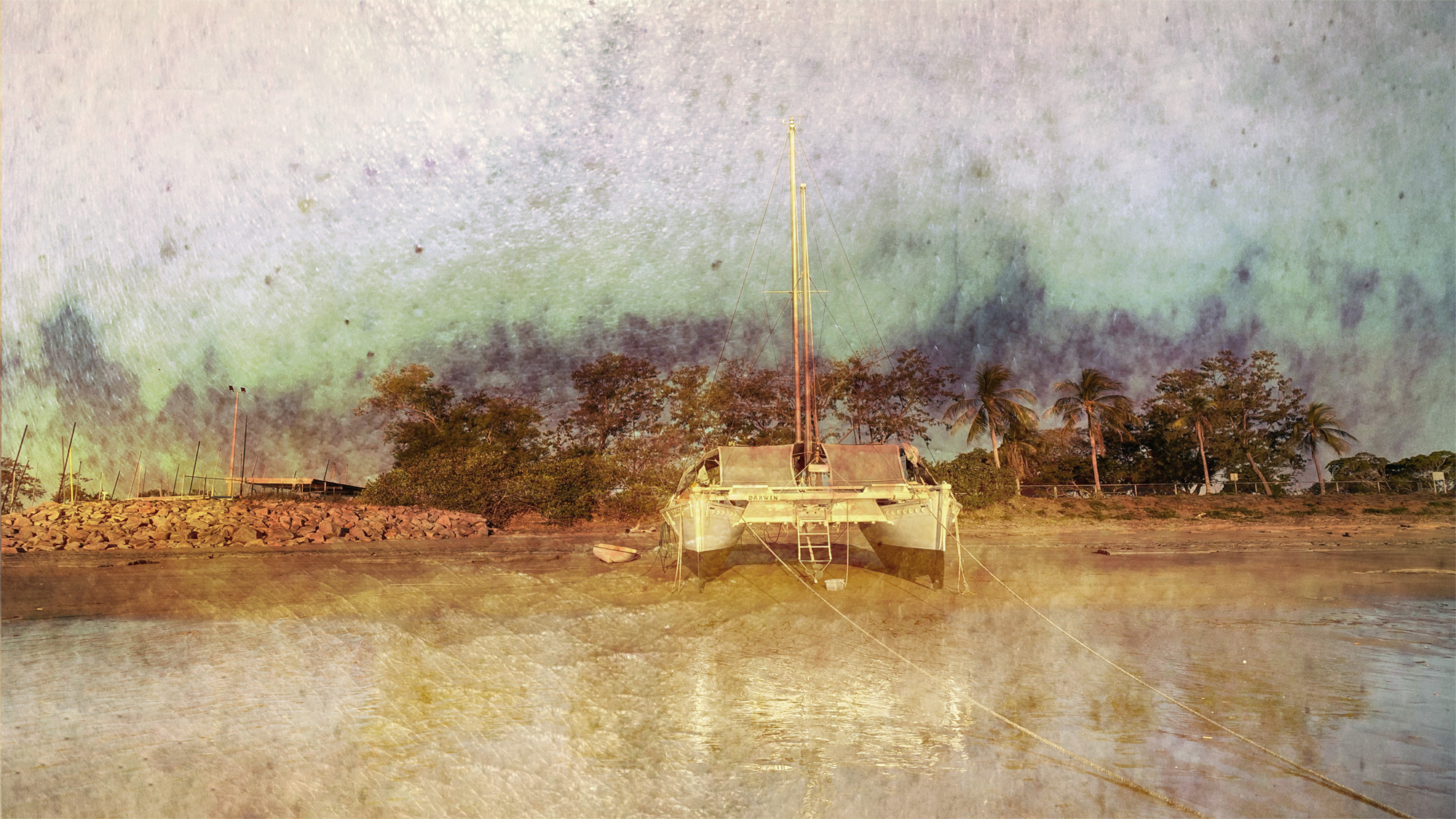
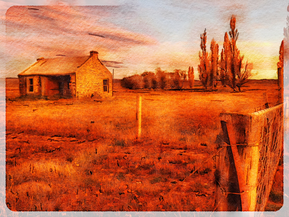
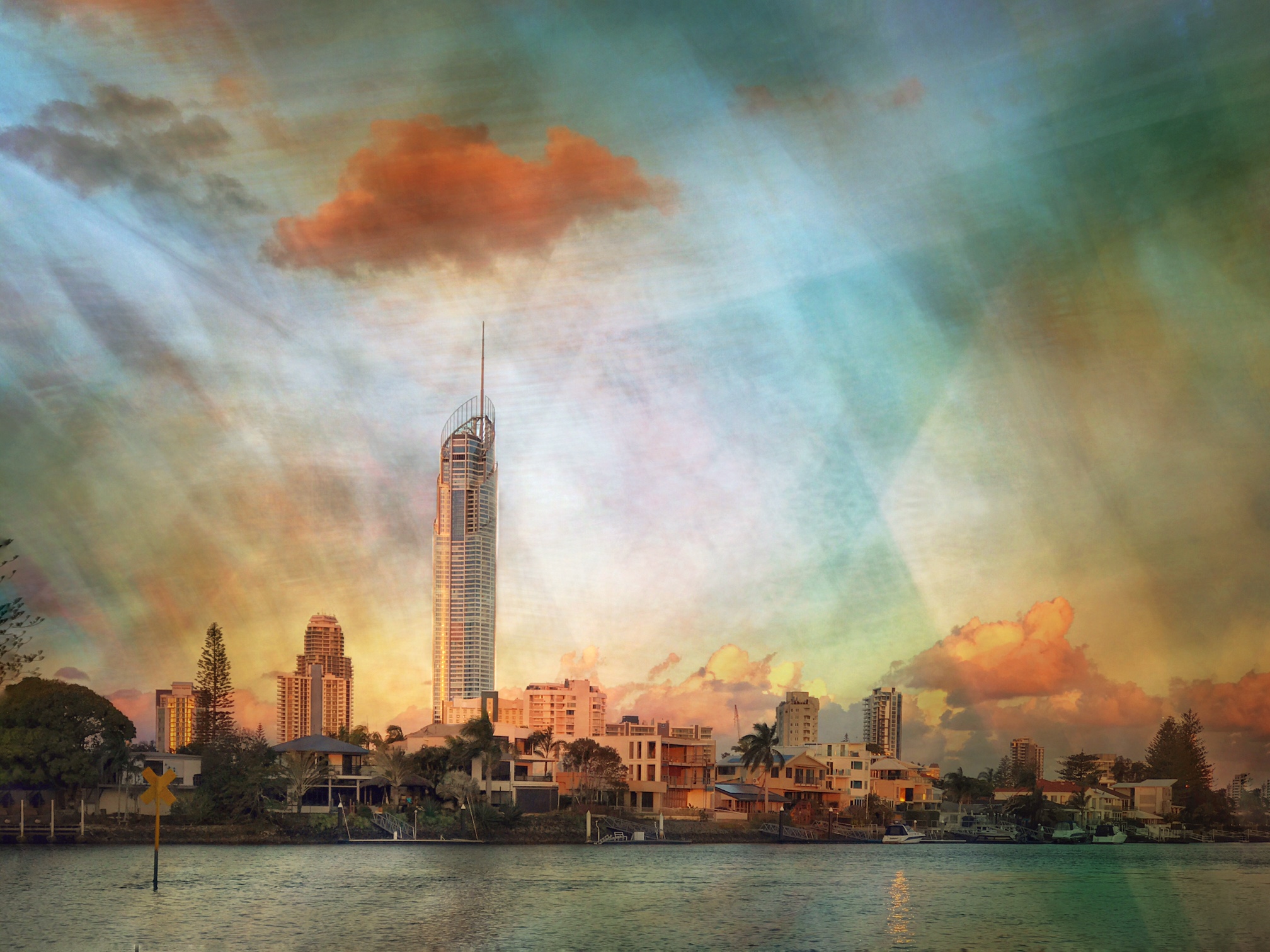
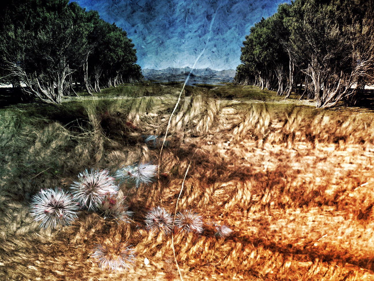
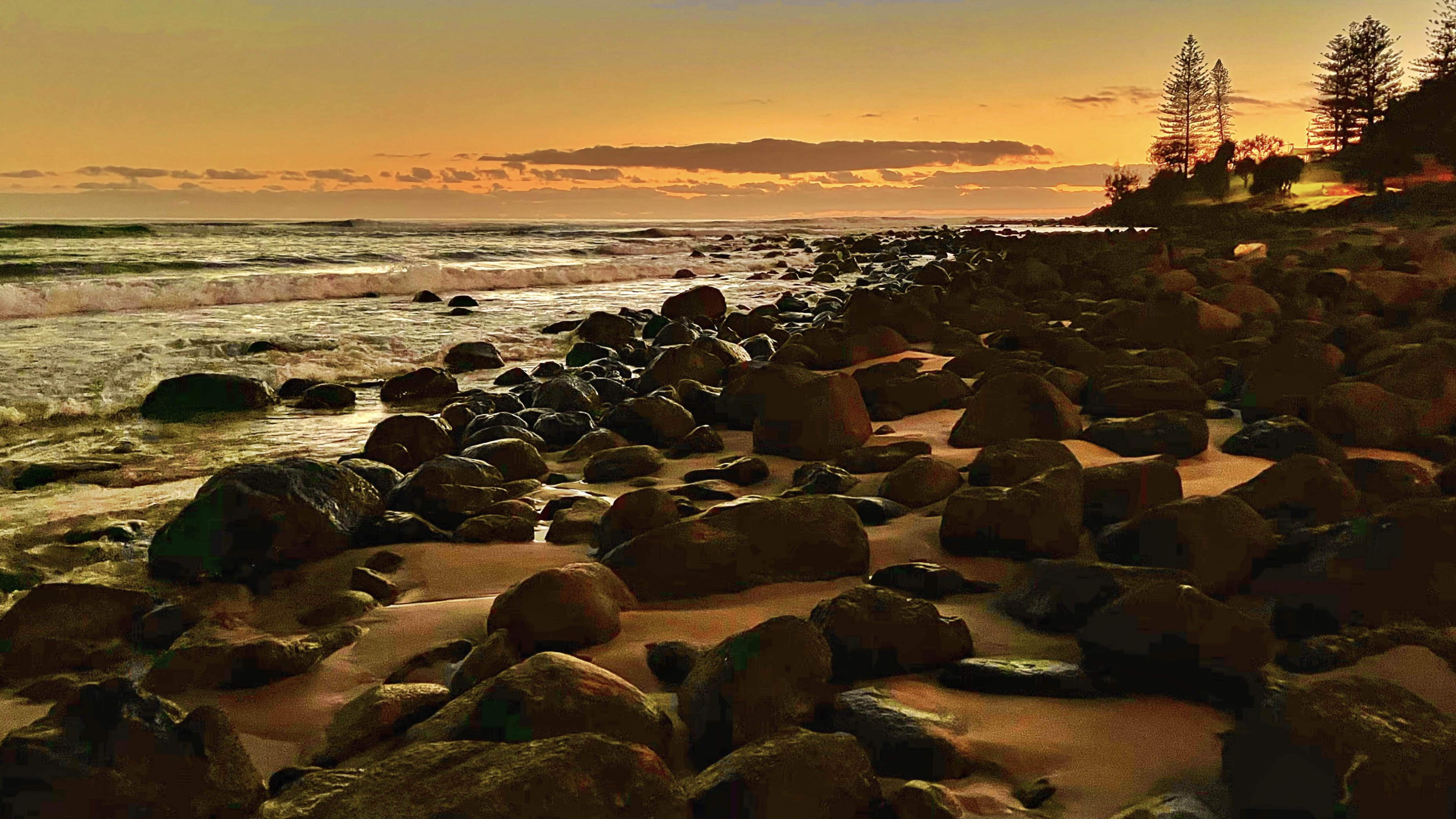
You have increased the saturation and light of the landscape beautifully.
You need to watch the sky as the same edits for the land do not, in this case, work for the sky. In a situation like this you CAN edit in Snapseed though If it was mine I would take it into the iOS App Superimpose, duplicate the image, work on the top layer then erase the sky in the edited layer so that you get the more natural sky colours showing through then save it like that.
There are tutorials in the Bulletin Board above.
|
Mar 2nd |
7 comments - 2 replies for Group 86
|
14 comments - 2 replies Total
|