|
| Group |
Round |
C/R |
Comment |
Date |
Image |
| 21 |
Aug 20 |
Comment |
Thanks for your helpful comments everyone! |
Aug 18th |
| 21 |
Aug 20 |
Comment |
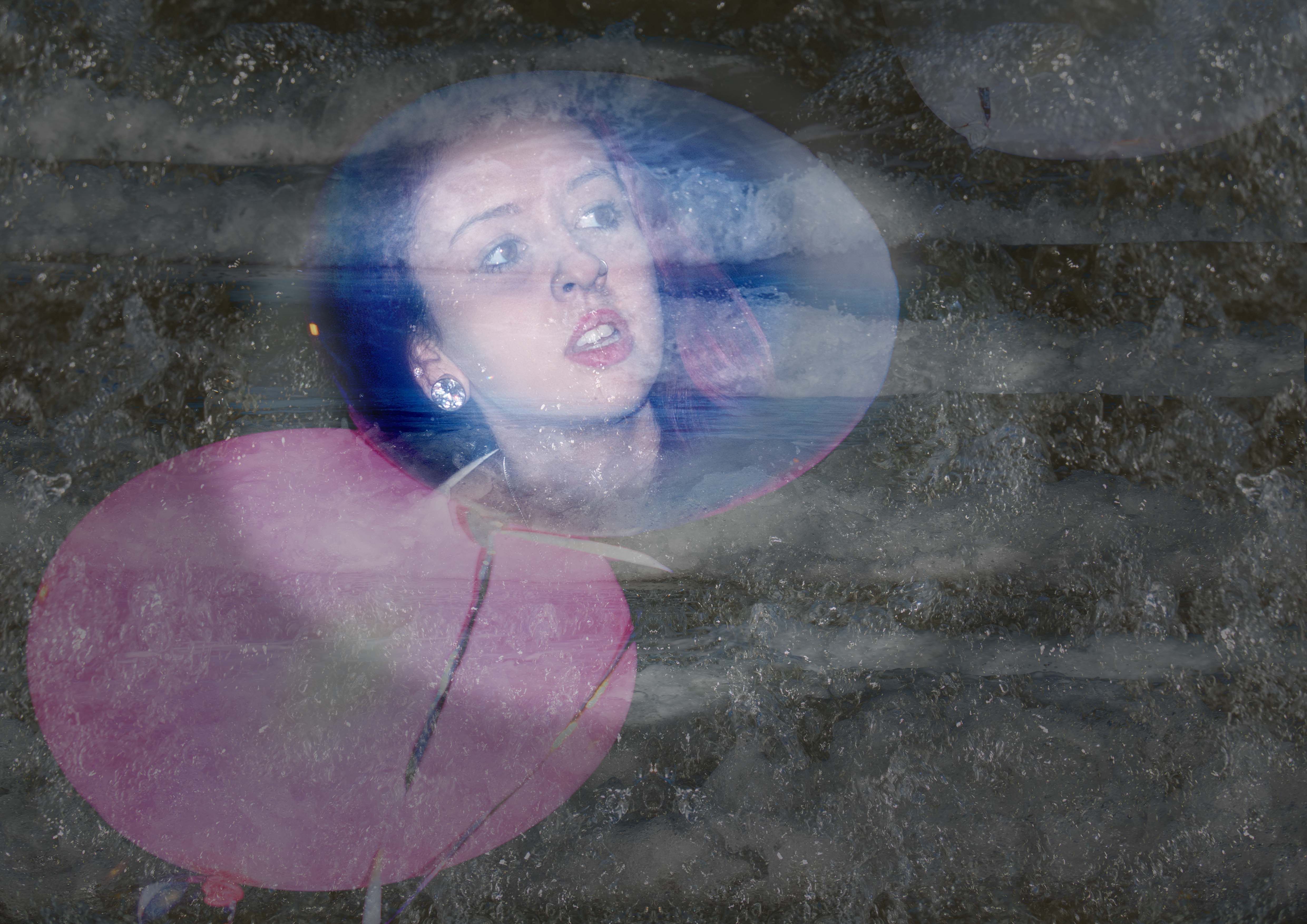
The balloons are standing out really well against the sky. I like the rippled sky...it is not distracting from the vista and the subjects.
I like the multi coloured outlines of the balloons. I personally am not keen about the "pixellated' type patterns on the balloons and the background/foreground......but that is a personal opinion! |
Aug 8th |
| 21 |
Aug 20 |
Comment |
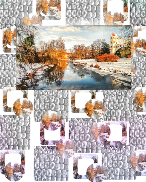
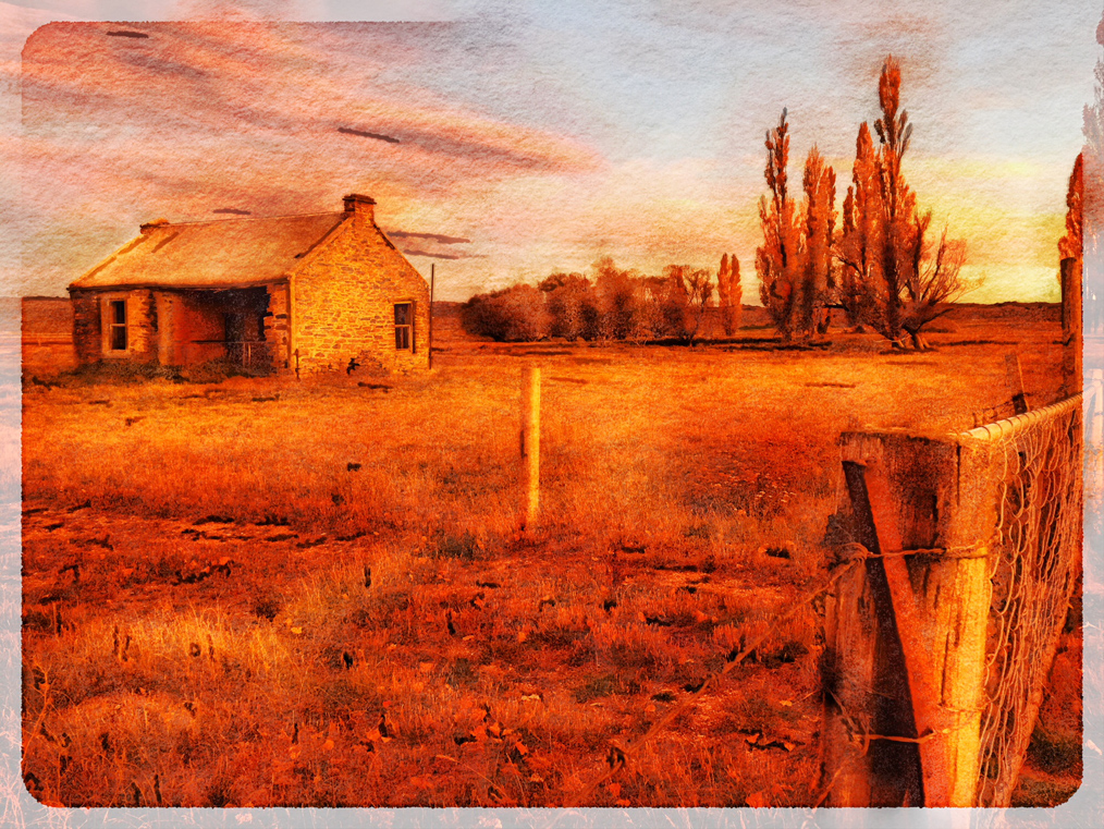
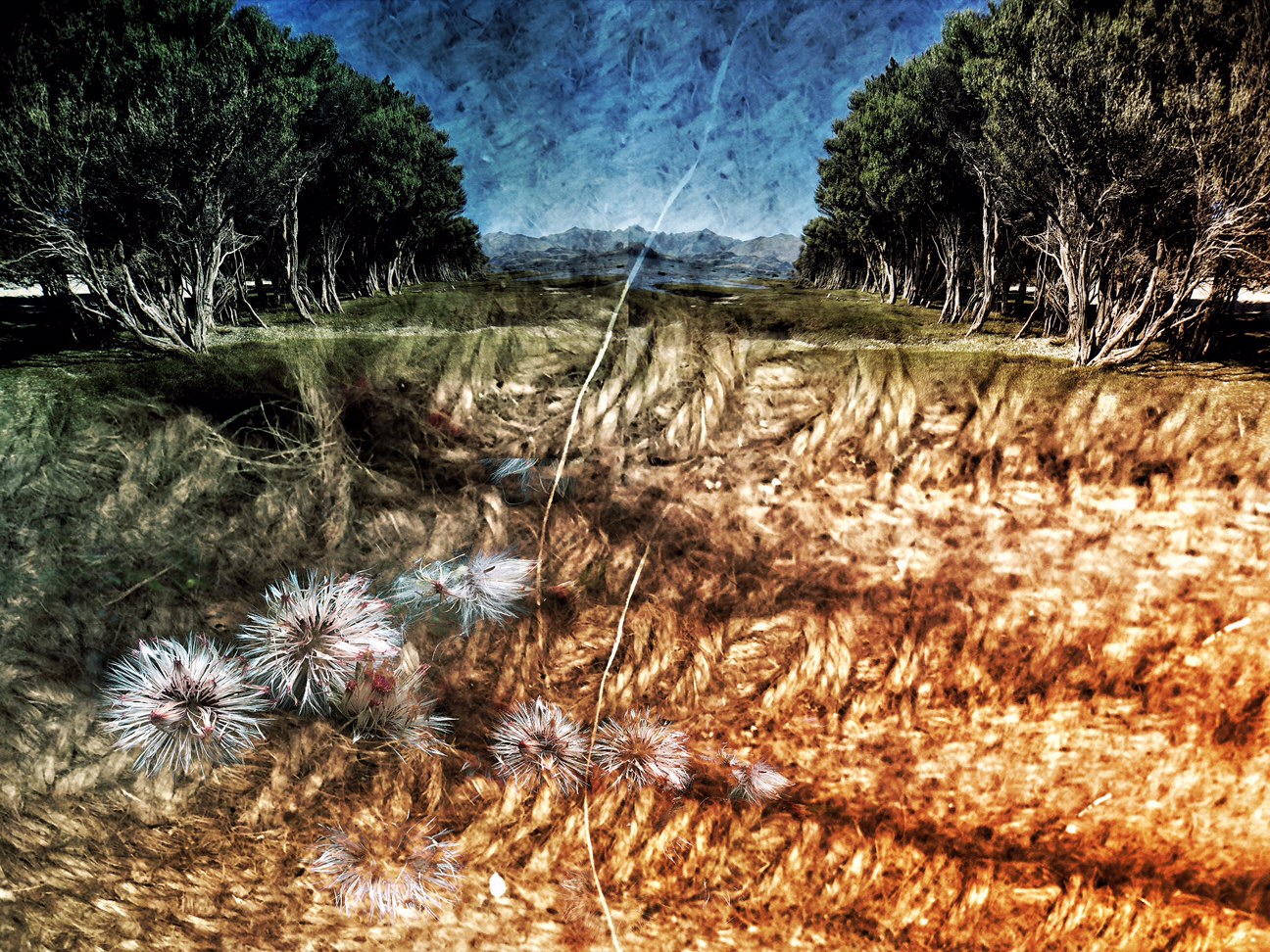
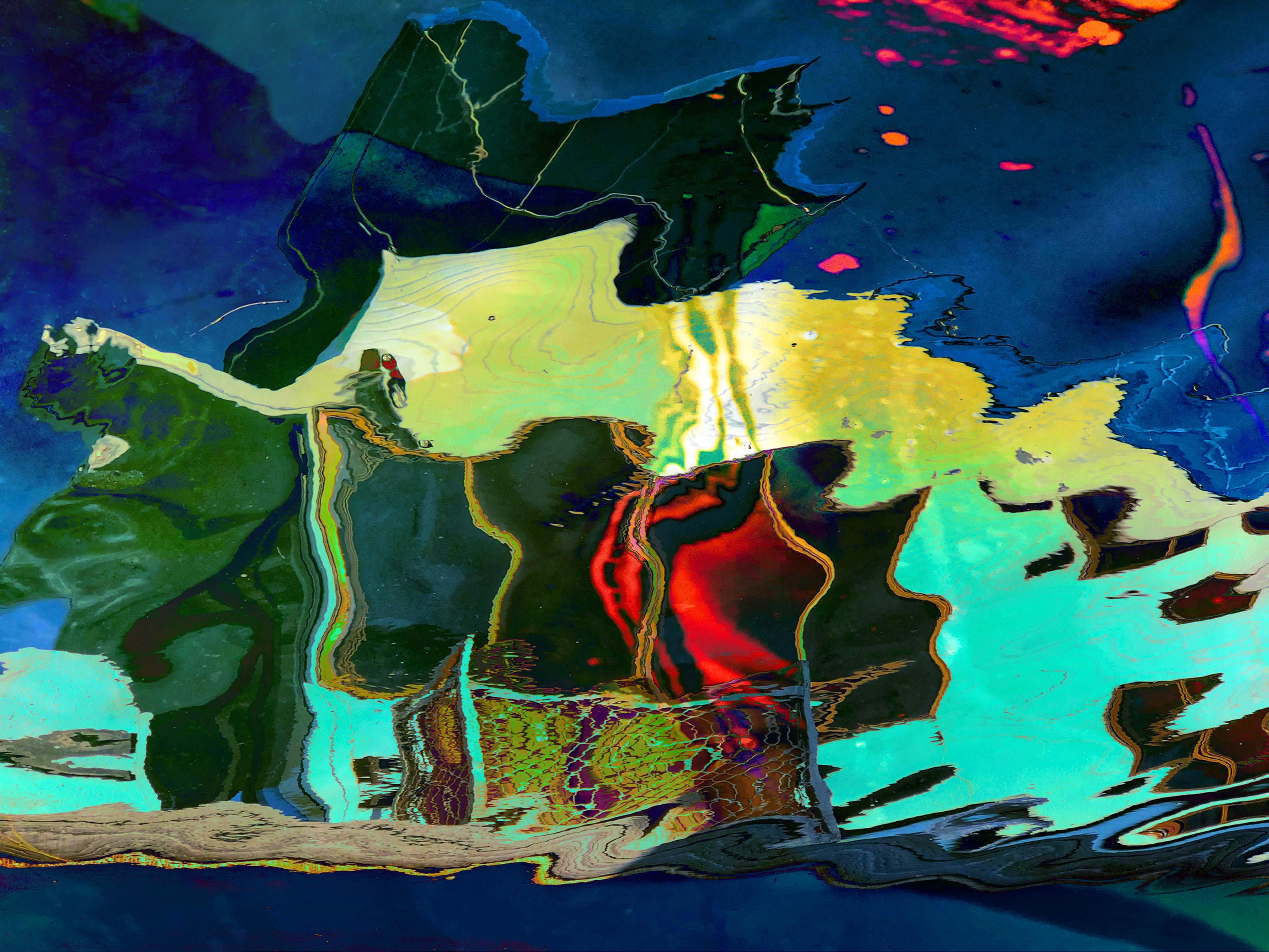
Your image is quite amazing when you look at it beside the original. You did well to get the detail and contrast. At first I thought I was look down on a river system......but it is in a way! |
Aug 8th |
| 21 |
Aug 20 |
Comment |
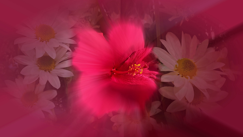
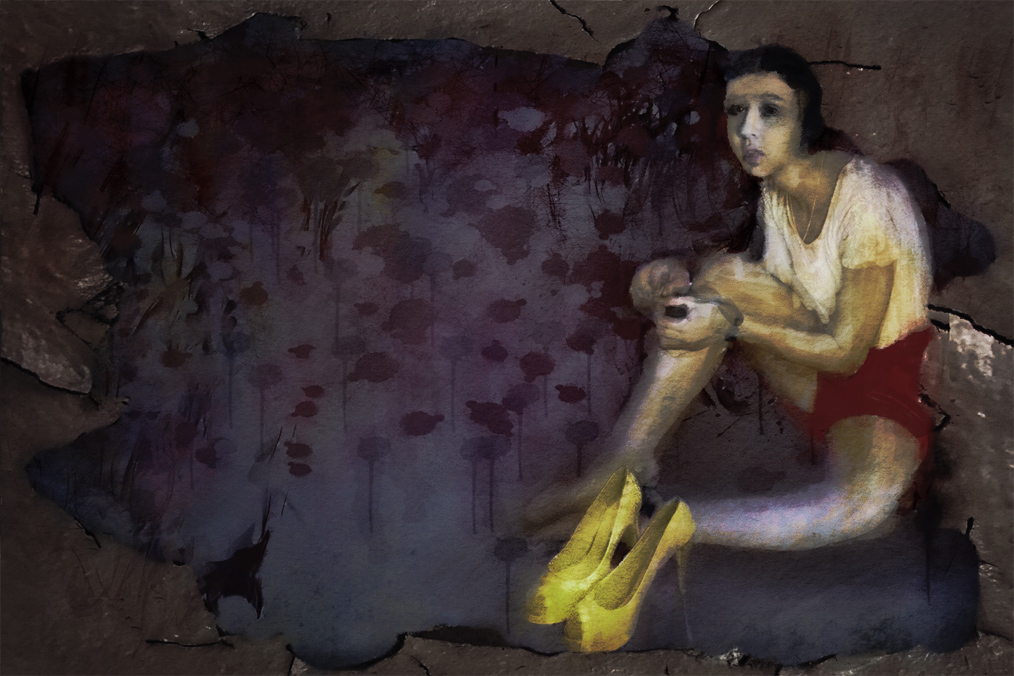
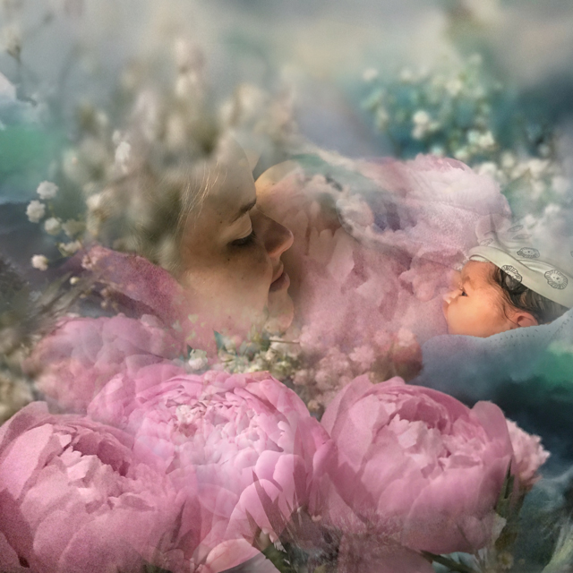
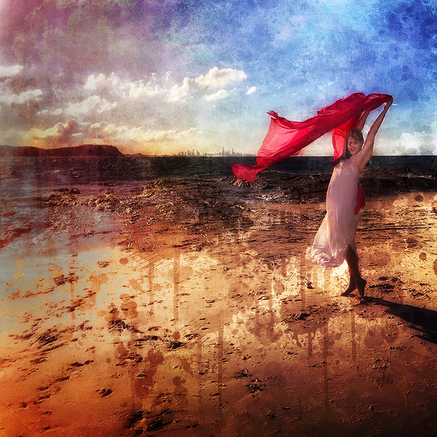
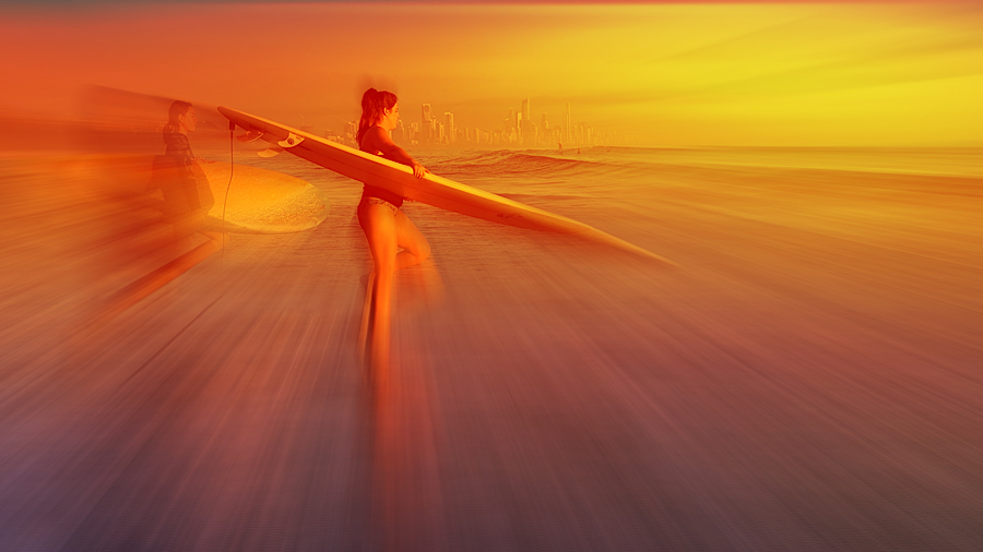
Charles, Your main image is a little small. I think you have done well with the "dressing" (her bra might be a bit high!!!) and I like the way you blurred the background.
I actually like the original colour of the flower and I think it goes well with the original background.
You could have had the part under her feet sharp as that is on the same Plane as the model. |
Aug 8th |
| 21 |
Aug 20 |
Comment |
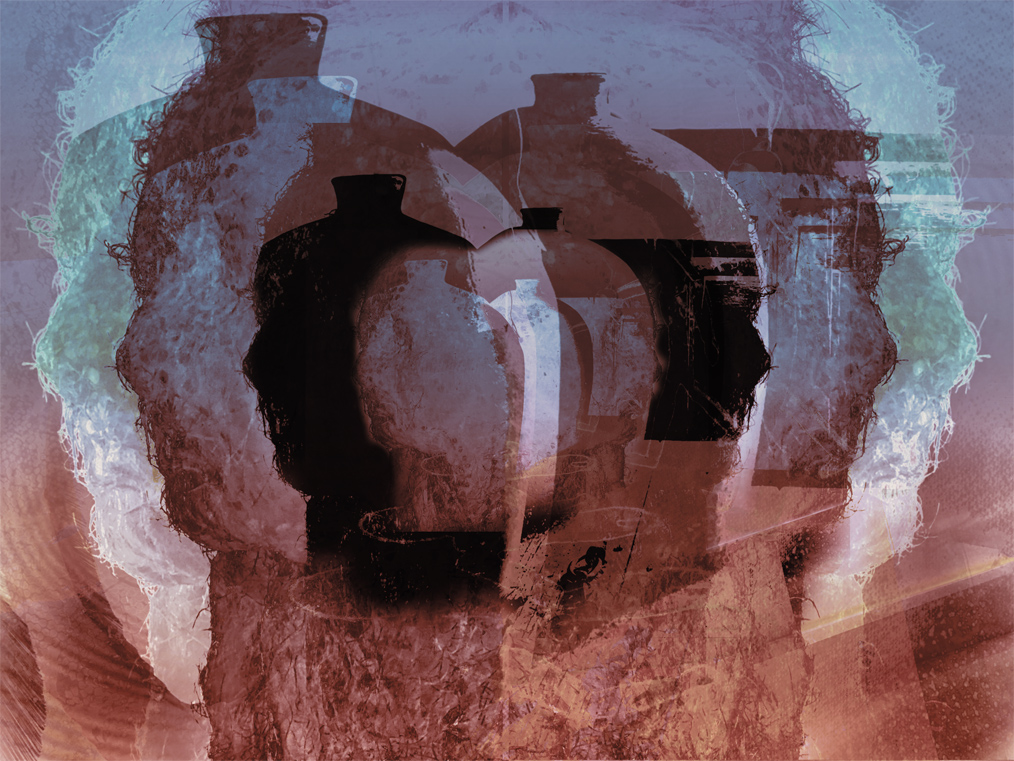
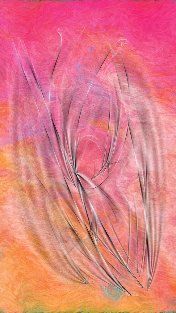
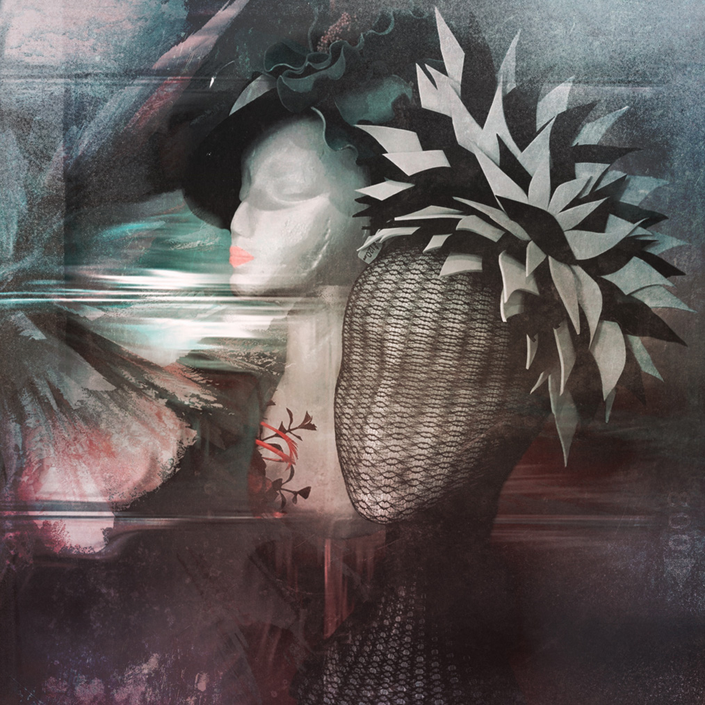
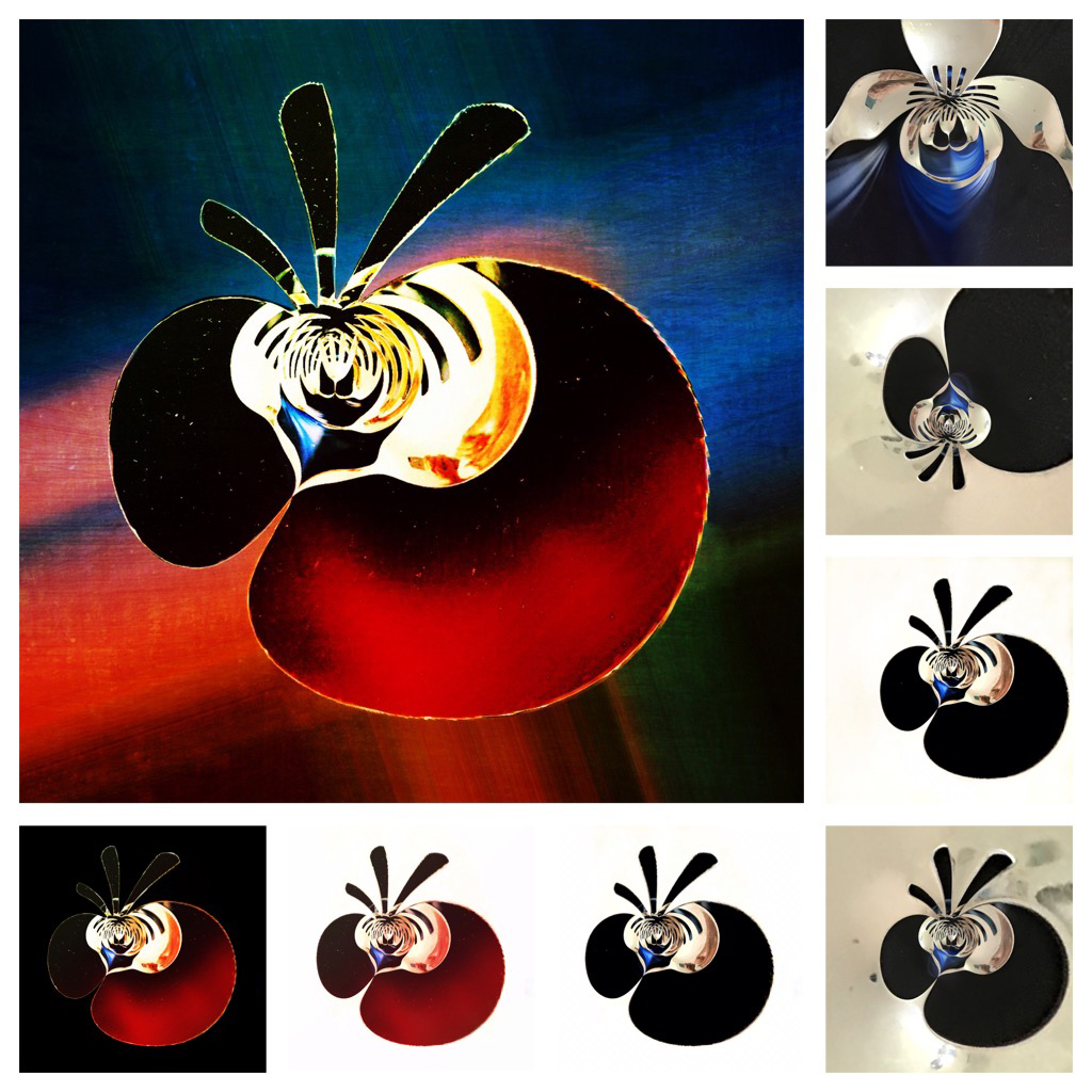
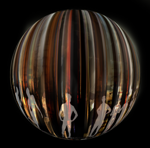
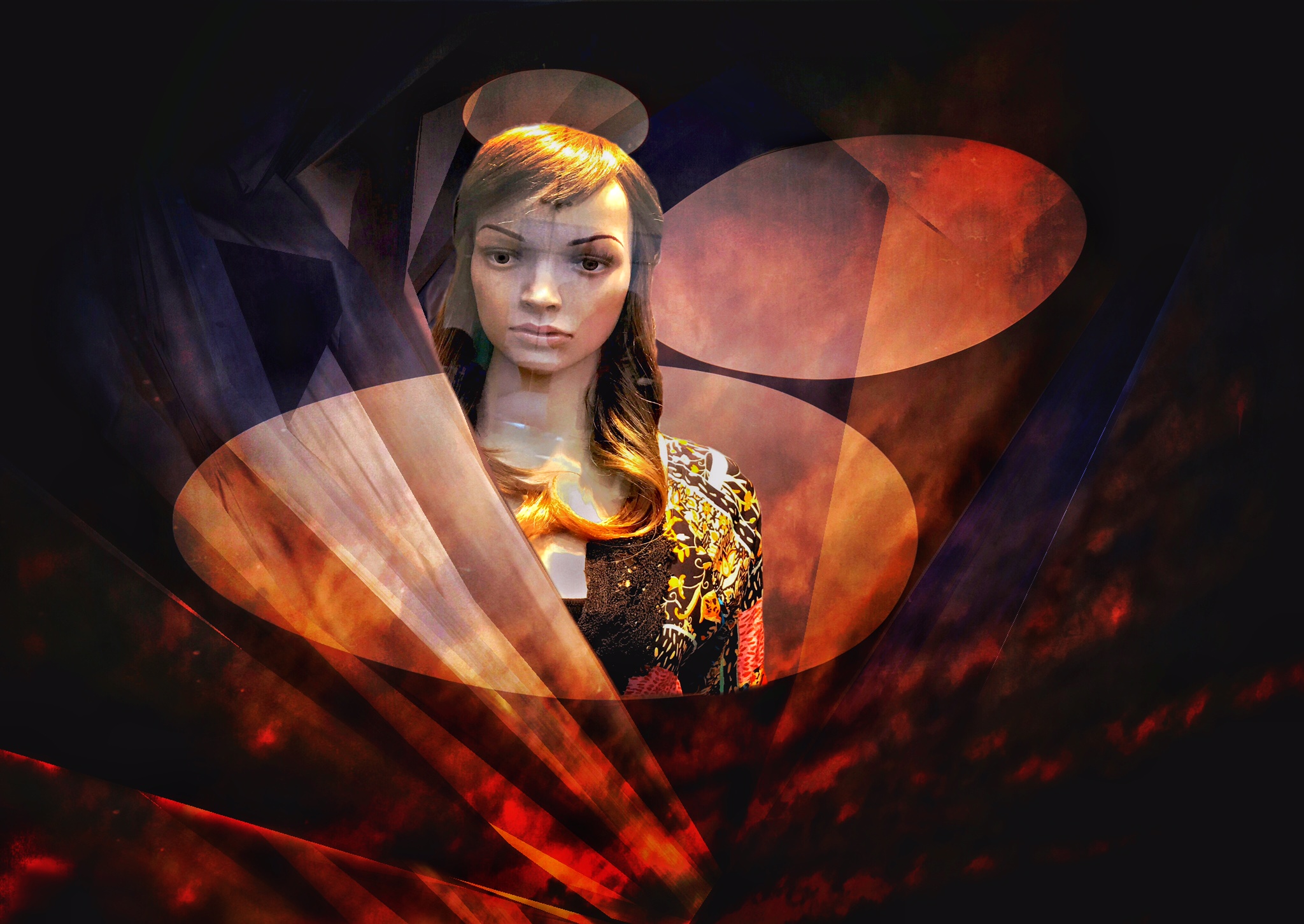
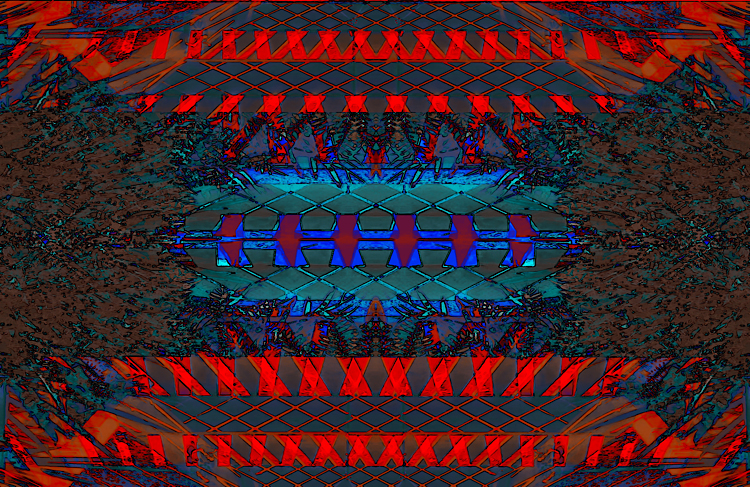
Oh Dear! I feel like I have had one too many! I really like the "woven" edges around the clock. I also like the monotone effect. Very pleasing to look at. |
Aug 8th |
| 21 |
Aug 20 |
Comment |
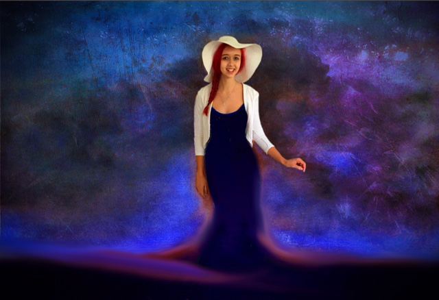
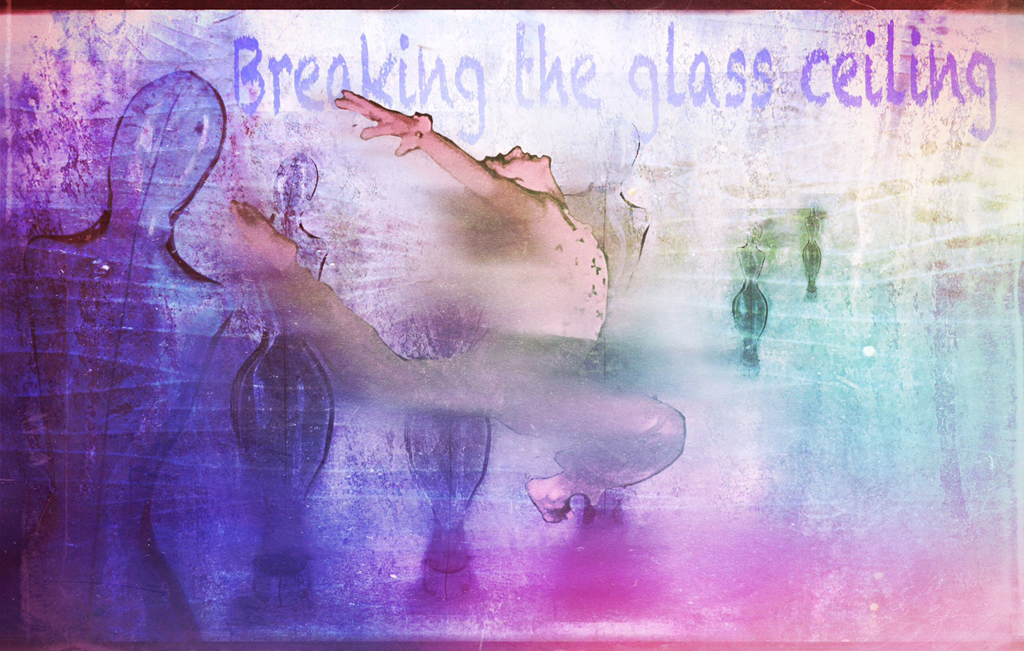
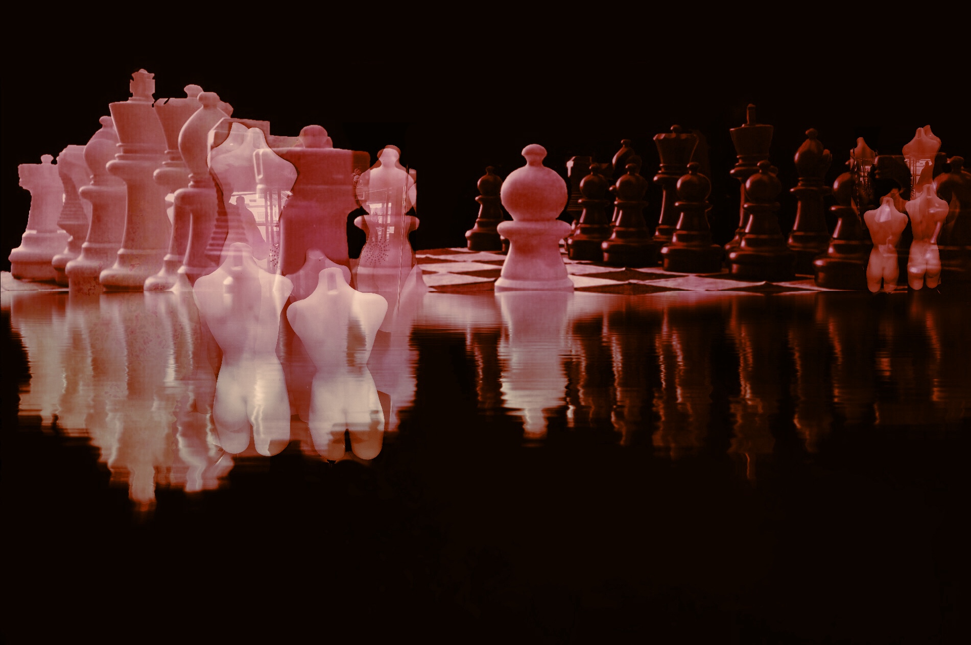
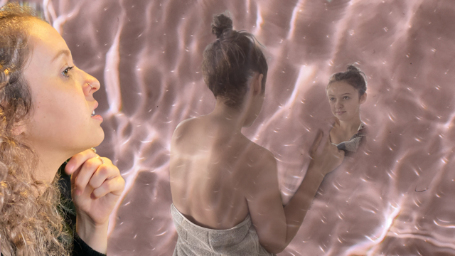
I think this is decidedly Creative because each Joan is in a slightly different position! Amazing! |
Aug 8th |
6 comments - 0 replies for Group 21
|
| 86 |
Aug 20 |
Comment |
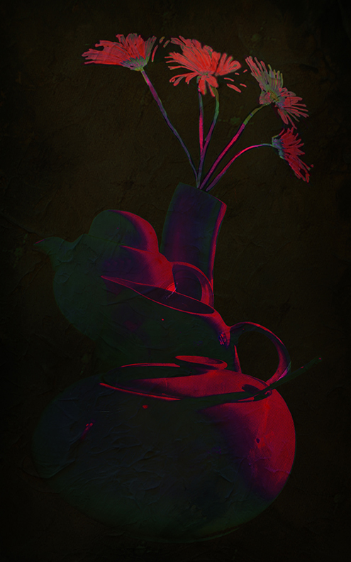
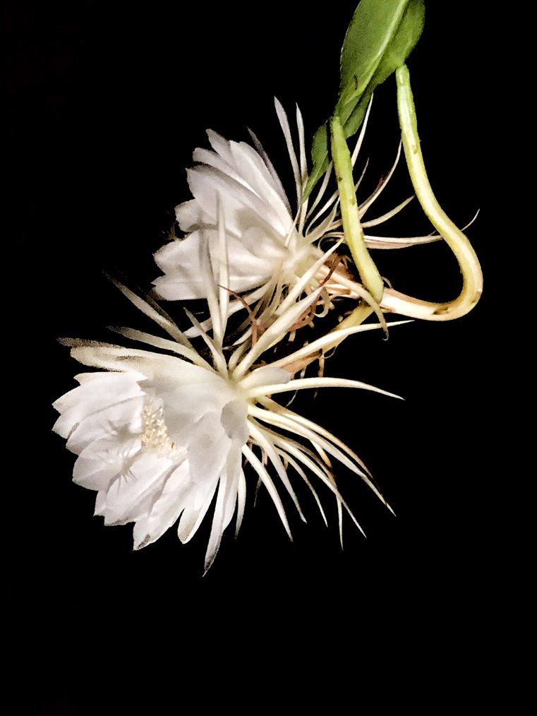
I like the way the clouds are only partly vignetting your subject. The flower really stands out in that background. You could also try a square format..... perhaps shrinking the clouds in closer around the flower. |
Aug 21st |
| 86 |
Aug 20 |
Comment |
Personally I LOVE the clouds in the main image! Those colors really suit it. YEs, you COULD lighten the banks along the water a little but it is Quite eye catching as it is. |
Aug 20th |
| 86 |
Aug 20 |
Reply |
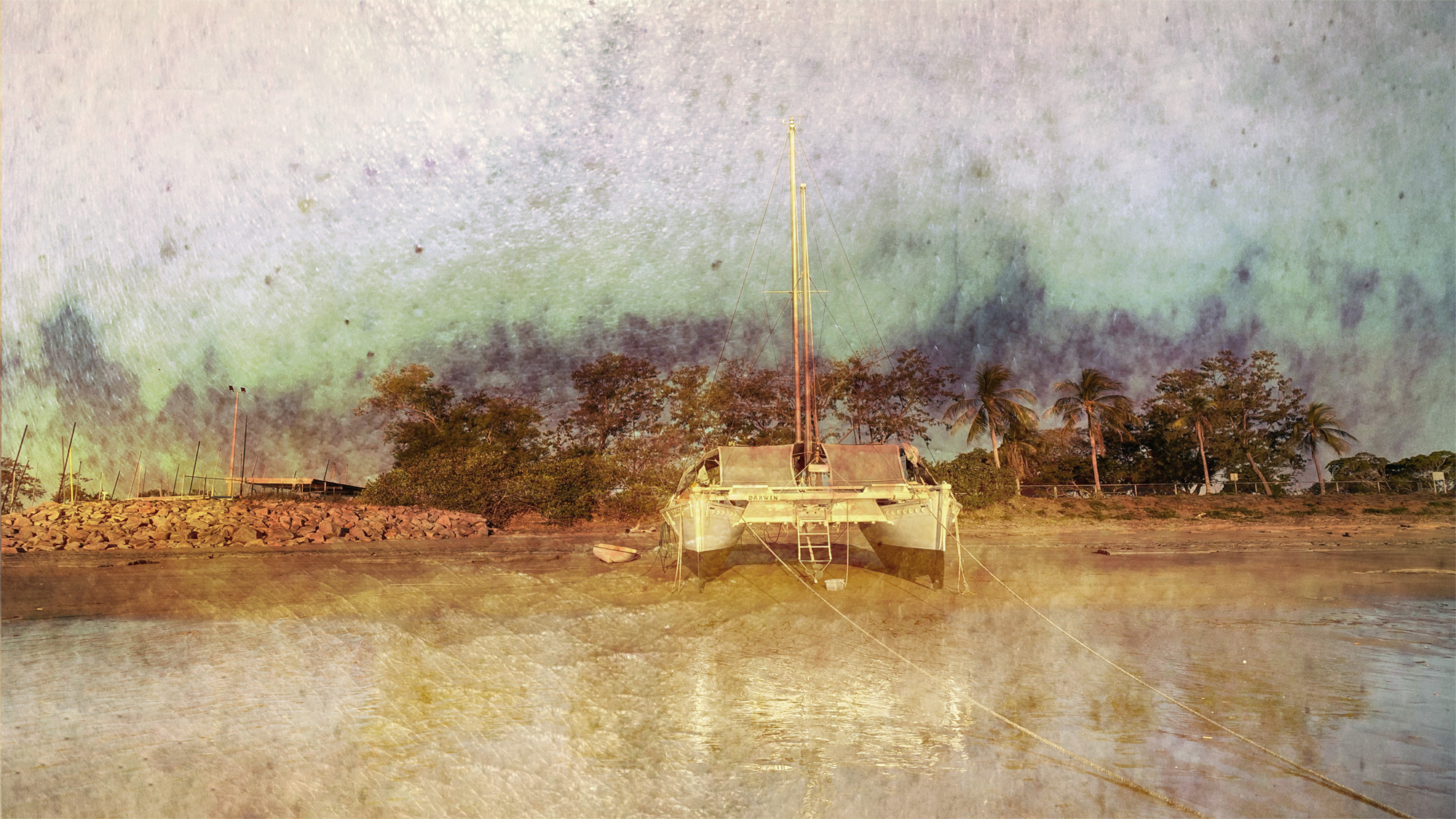
Yes, It is my fault that I did not get the correct images up! My apologies, Marilyn. I HAVE found out how to exchange images now but have run out of time before we leave for 10 days in Darwin (OZ). I think commenting on the one that is there is the best way to go. |
Aug 20th |
| 86 |
Aug 20 |
Comment |
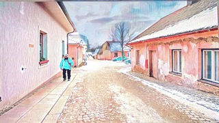
Hi Kieu-Hanh, You did well to take this photo without any window reflections! I really like your background story....I did not know about this.
The image is clear and tells a good story. Have you thought about cropping off above the door ways? The story is still quite strong. |
Aug 6th |
| 86 |
Aug 20 |
Comment |
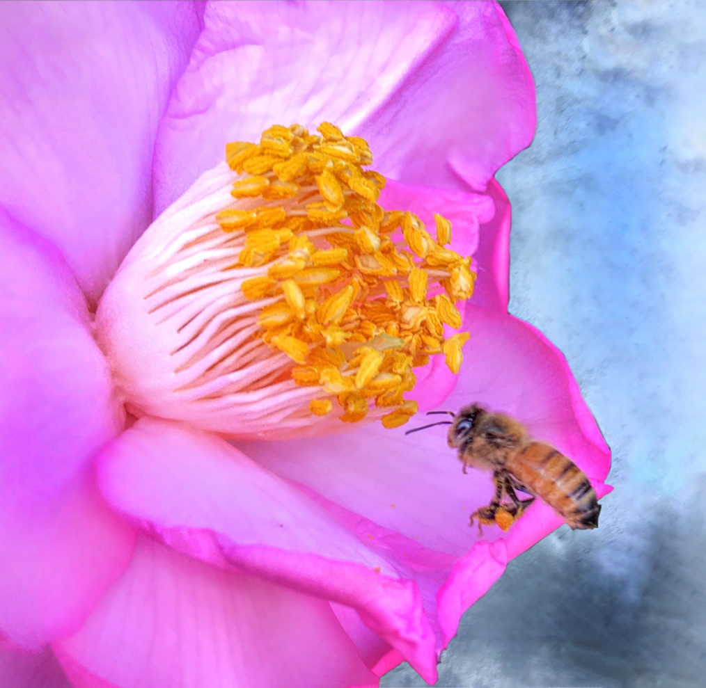
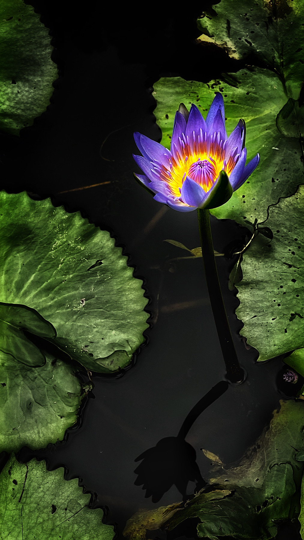
Hi Tom, it is very eye catching. I like the way you have cropped right in to the flower and removed the distractions of the background with a vignette.
If you wanted to make it really stand out you could blacken that background even further!
I like the way the stamen are quite sharp. Really good detail. |
Aug 6th |
| 86 |
Aug 20 |
Comment |
Hi Belinda, Your processes are amazing! THe soft image has a lovely moody, misty feel to it and I also like the 3 D effect.
Thank you for the tip about where to find the Snapseed Tutorials......I tend to forget that myself. Would you like to add it to our Bulletin Board.....or is that something that I should be doing, I wonder? |
Aug 6th |
| 86 |
Aug 20 |
Reply |
Yes! I often go overboard with colour ....black and white probably shows more of the shadows! |
Aug 6th |
| 86 |
Aug 20 |
Comment |
HI Ruth,
I love how you managed to get in so close. Yes....we have them here in Australia as well!
Looking at the body of your locust, it is possible that you are just a tad too close to his eyes. If you look at it's back it is quite sharp just beyond the eyes.
I'm not trying to be "picky" but I have done this so many times myself and I understand how frustrating and disappointing it can be. It is just a matter of learning exactly how far back you need to be to get the eyes (or what ever the most important part of your subject is) sharp. |
Aug 6th |
6 comments - 2 replies for Group 86
|
12 comments - 2 replies Total
|