|
| Group |
Round |
C/R |
Comment |
Date |
Image |
| 51 |
Aug 17 |
Comment |
Thanks Lynne! I have, in the past, made books but not for the last few years and my work has changed so much in that time! I think we should all make books! |
Aug 15th |
| 51 |
Aug 17 |
Comment |
Thanks for your comments everyone! |
Aug 12th |
| 51 |
Aug 17 |
Comment |
Oh, He is my type of photo artist! LOVE his photos. I am there as Phillfoto but I usually go to Facebook first then when I remember I upload to Instagram. I'm actually still not really conversant with Instagram....still a little confused. Am on Facebook ashttps://www.facebook.com/phillipa.frederiksen |
Aug 8th |
| 51 |
Aug 17 |
Comment |
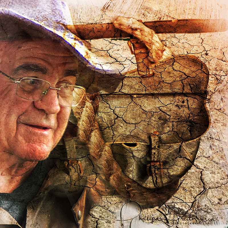
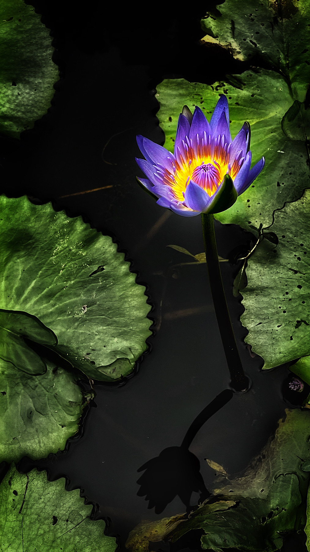
I really love the cross hatching effect. Have you tried deepening some of the shadows to add definition? I have not been able to get my head around Enlight but would like to work out Refit! |
Aug 6th |
| 51 |
Aug 17 |
Comment |
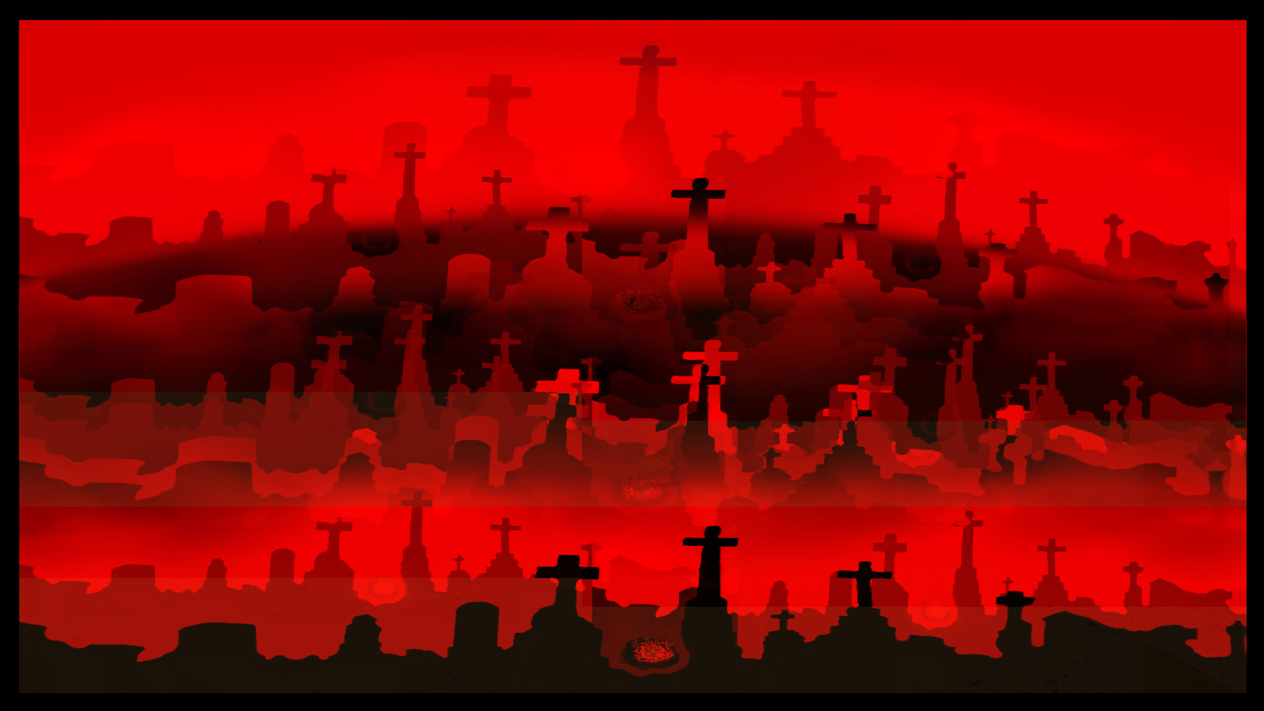
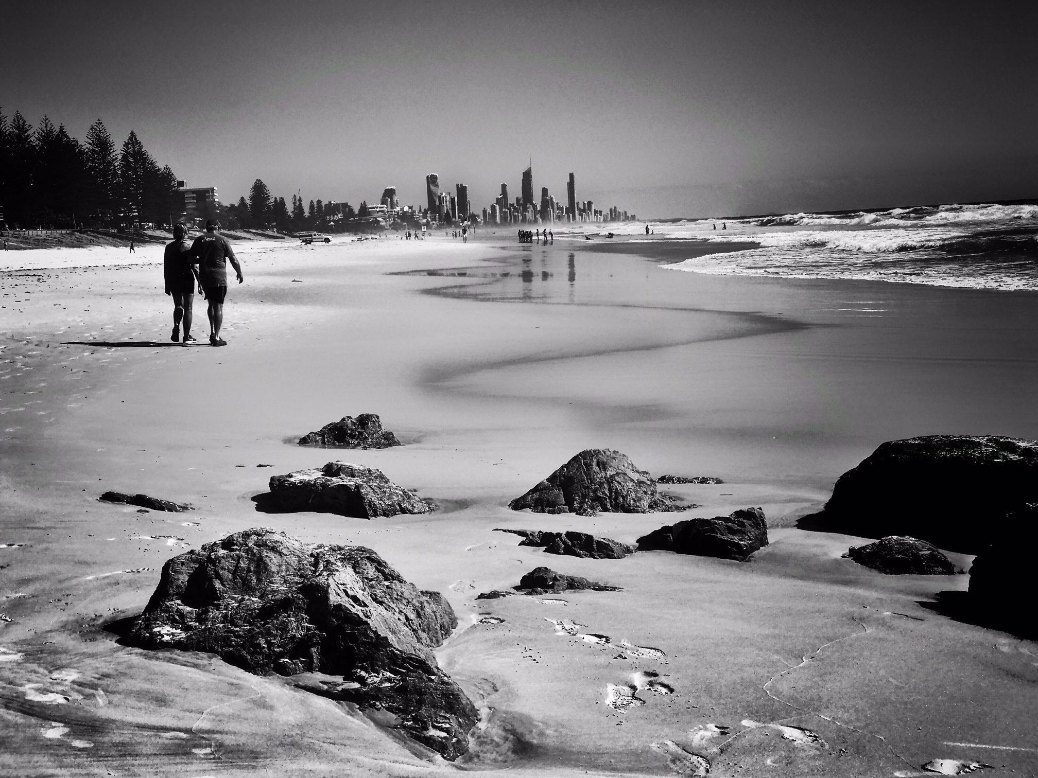
The headstand stands out really well in he mono version..
As do the rest of the headstones. Excellent editing! |
Aug 6th |
| 51 |
Aug 17 |
Comment |
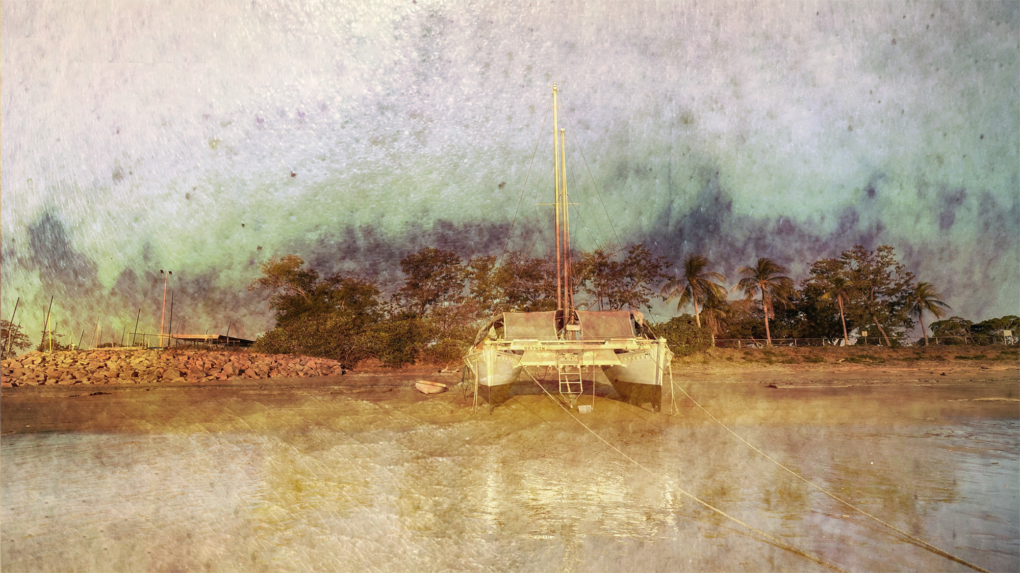
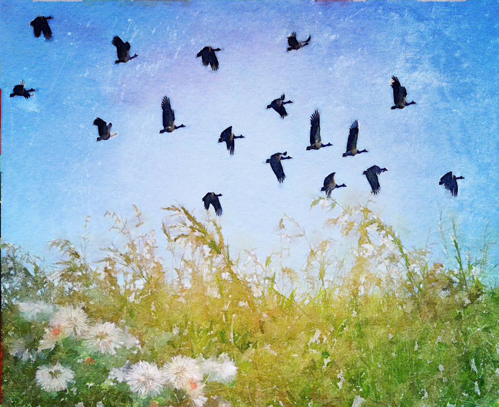
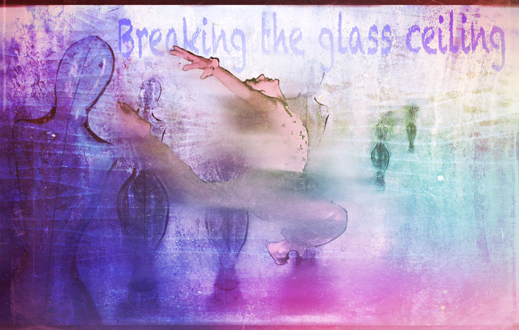
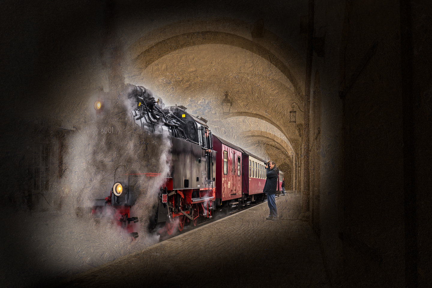
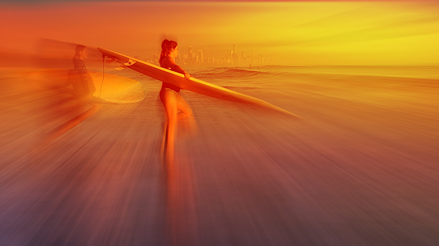
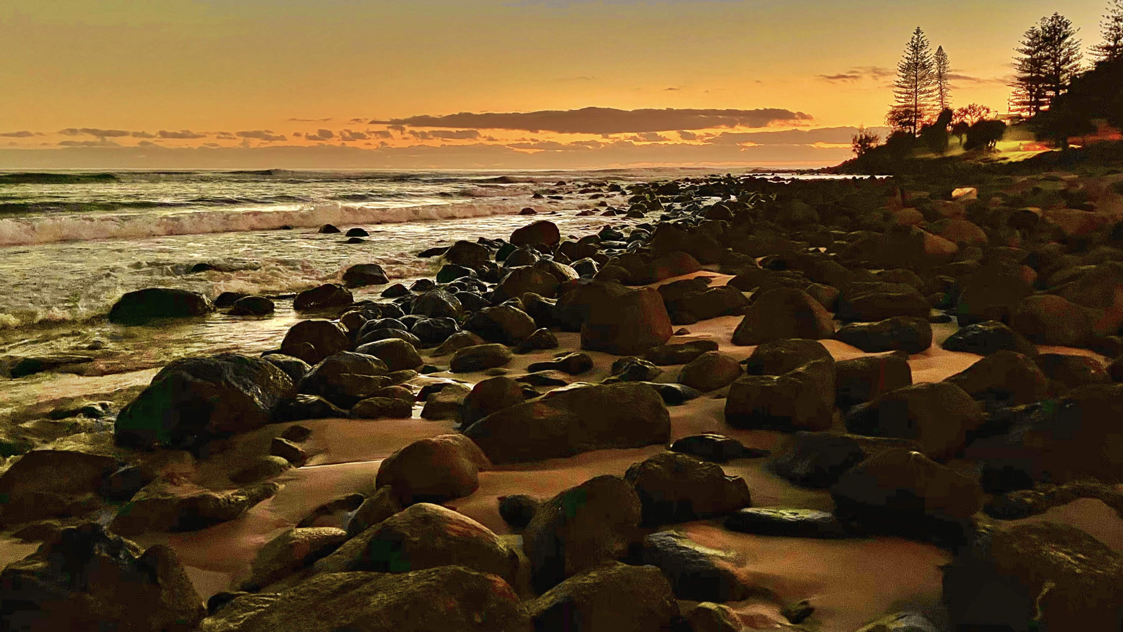
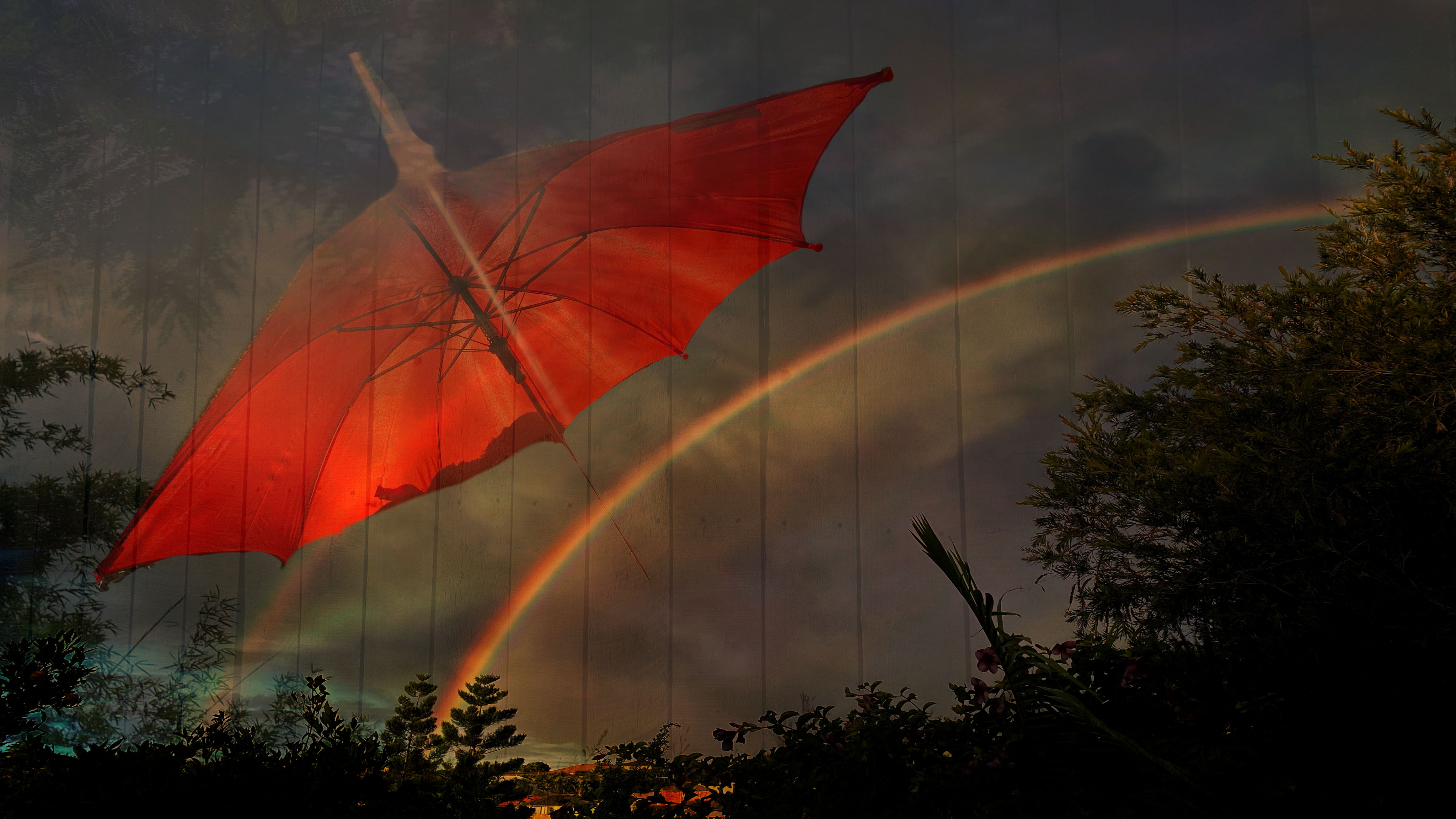
Lynne, you might know there is a white line in the sky but it looks pretty good to everyone else! I think what you have done here works really well.
The men look like they are in a very dangerous position. What WERE they doing? |
Aug 6th |
| 51 |
Aug 17 |
Comment |
Well seen!!!! Opposing signs! The edit has brought out the detail. |
Aug 6th |
| 51 |
Aug 17 |
Comment |
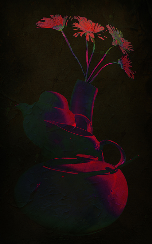
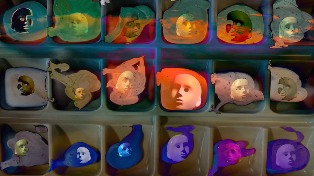
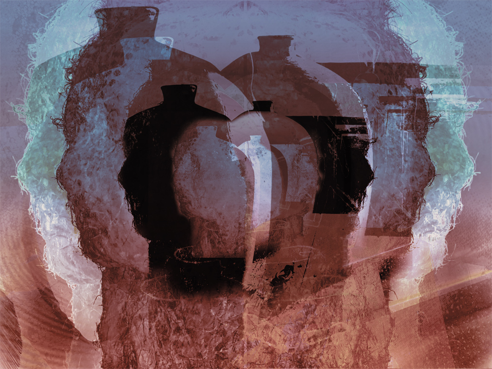
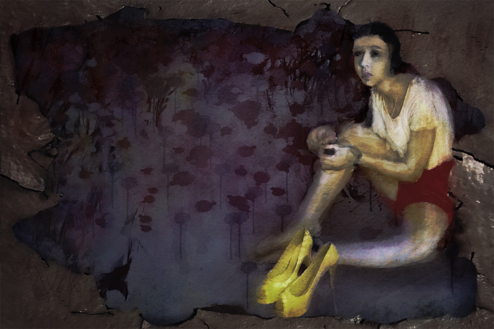
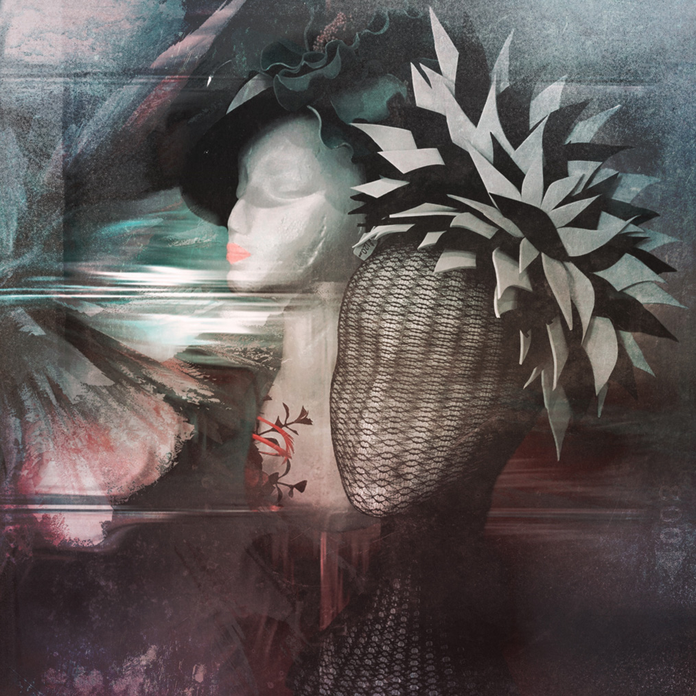
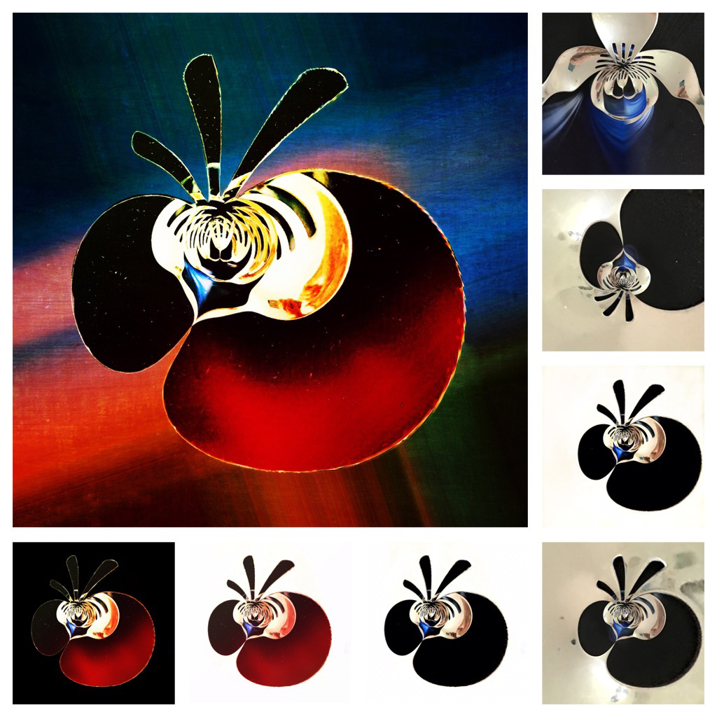
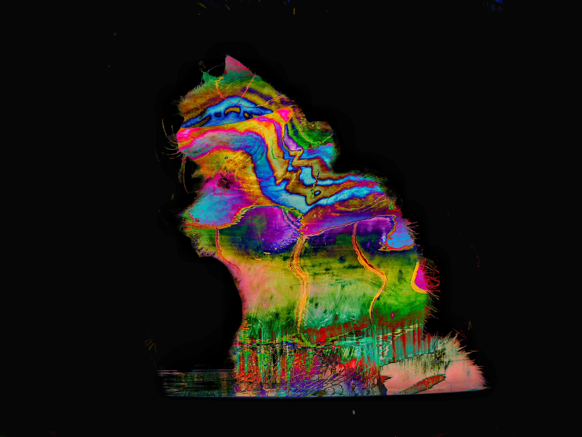
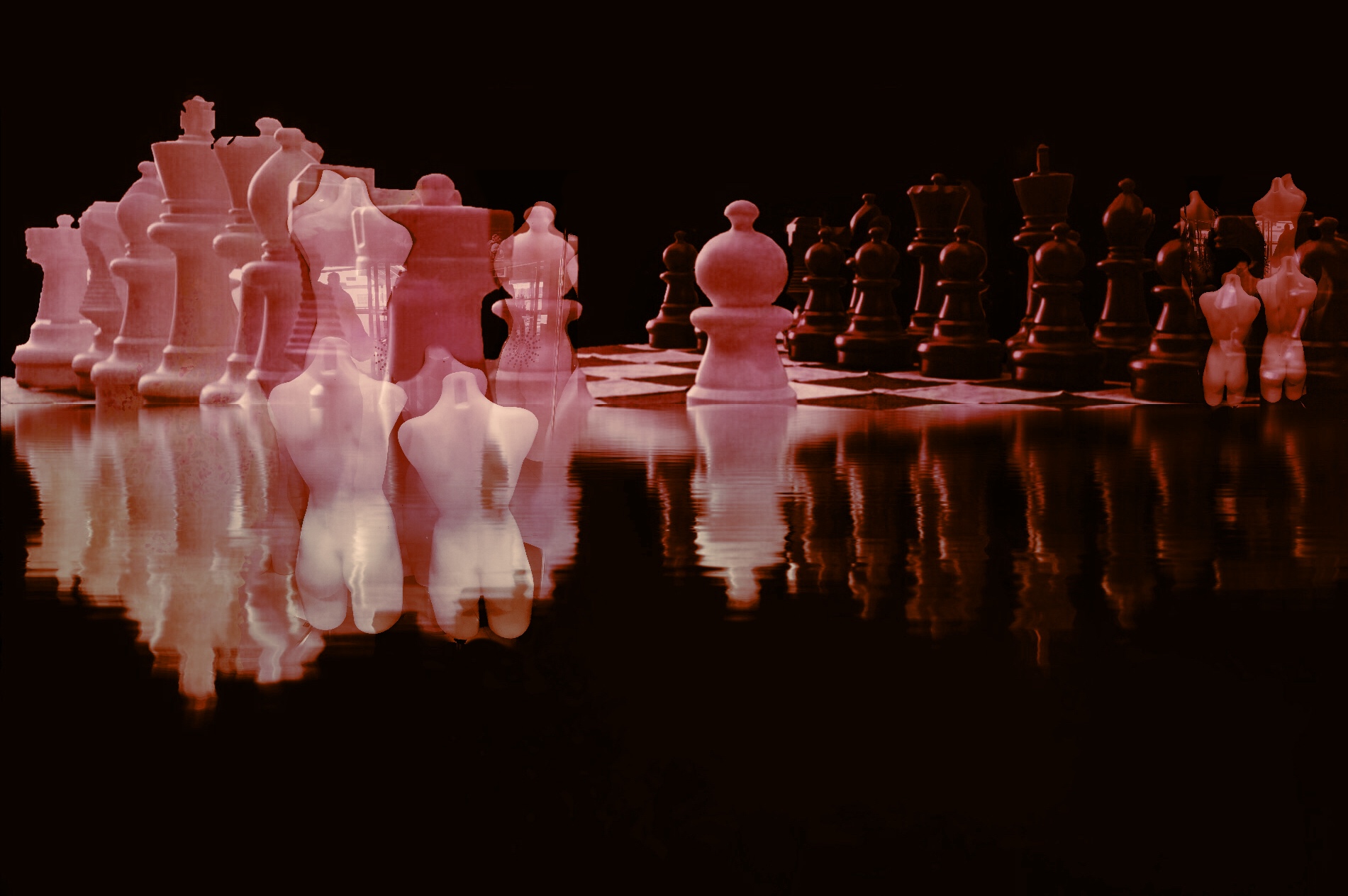
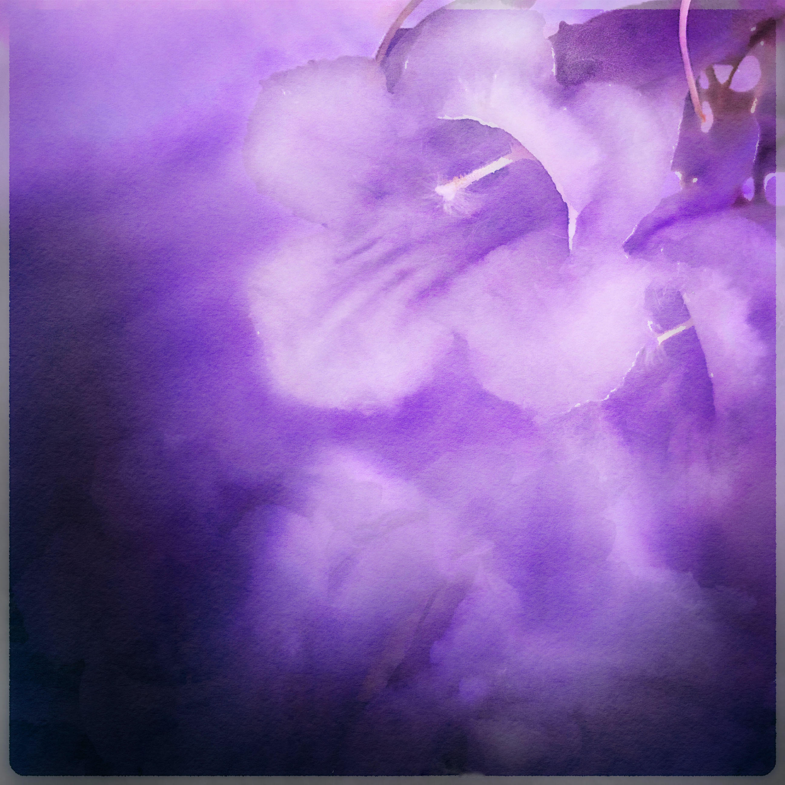
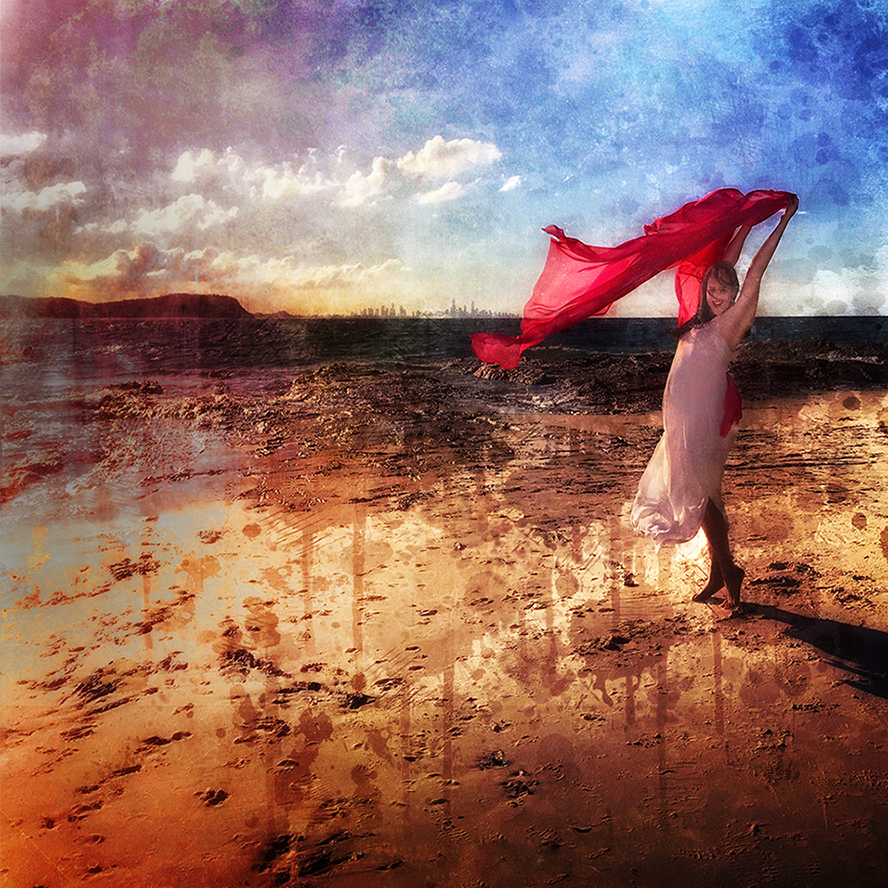
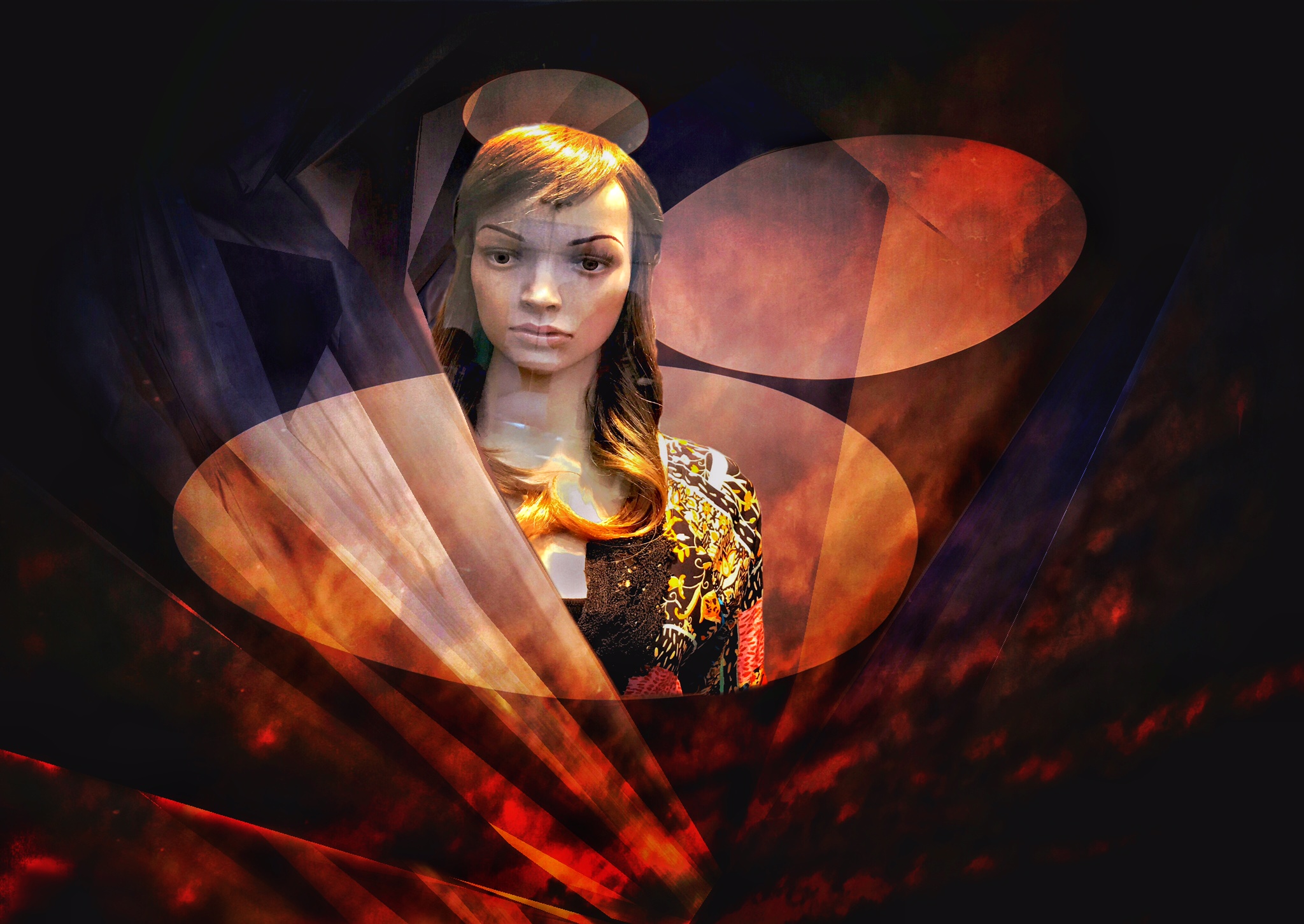
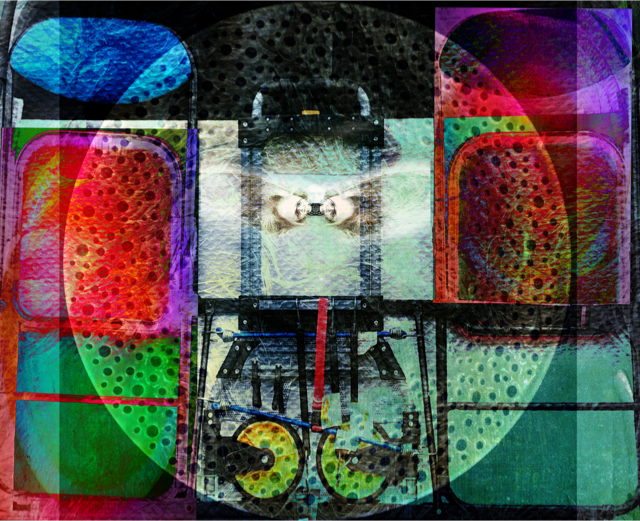
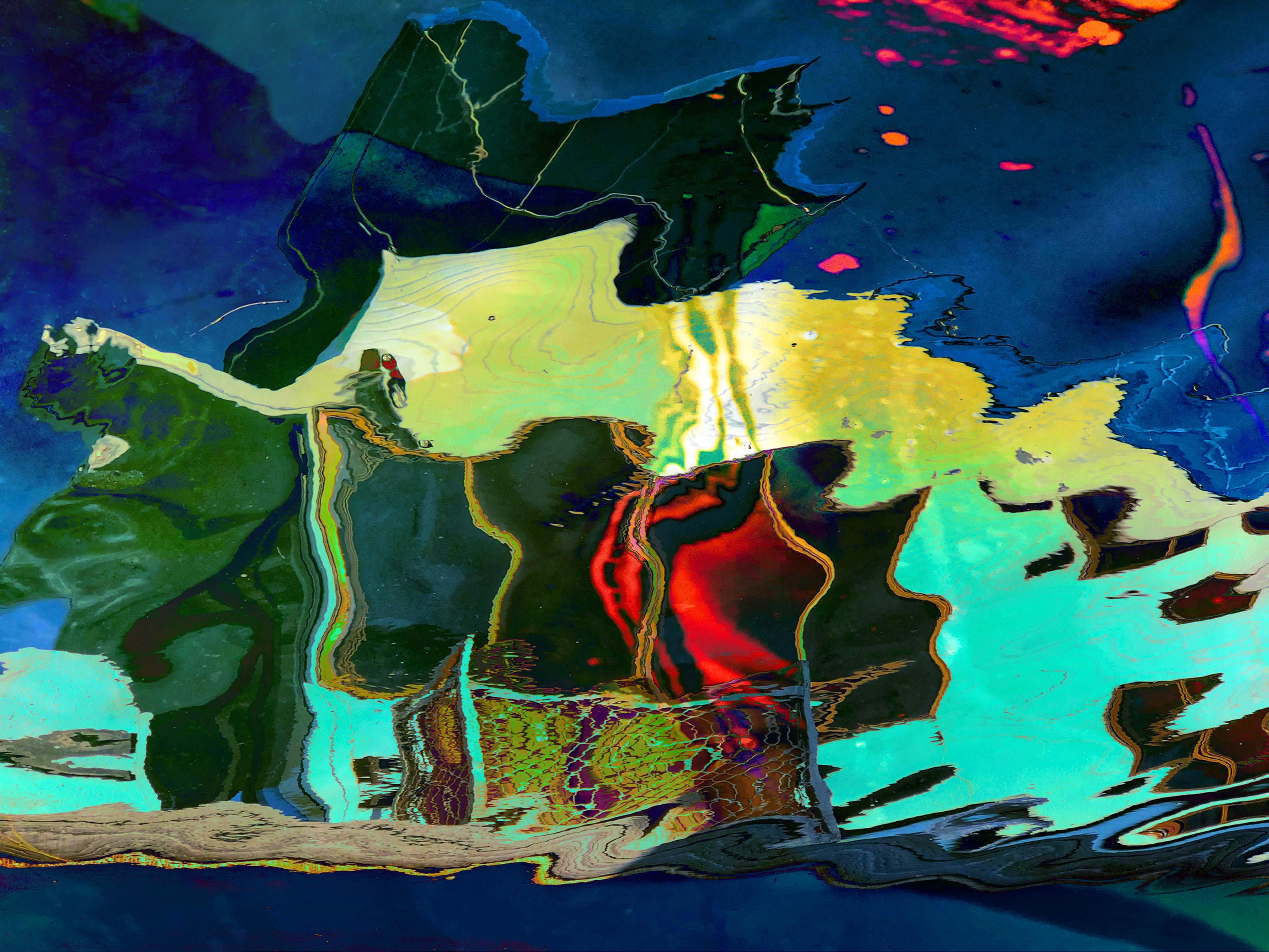
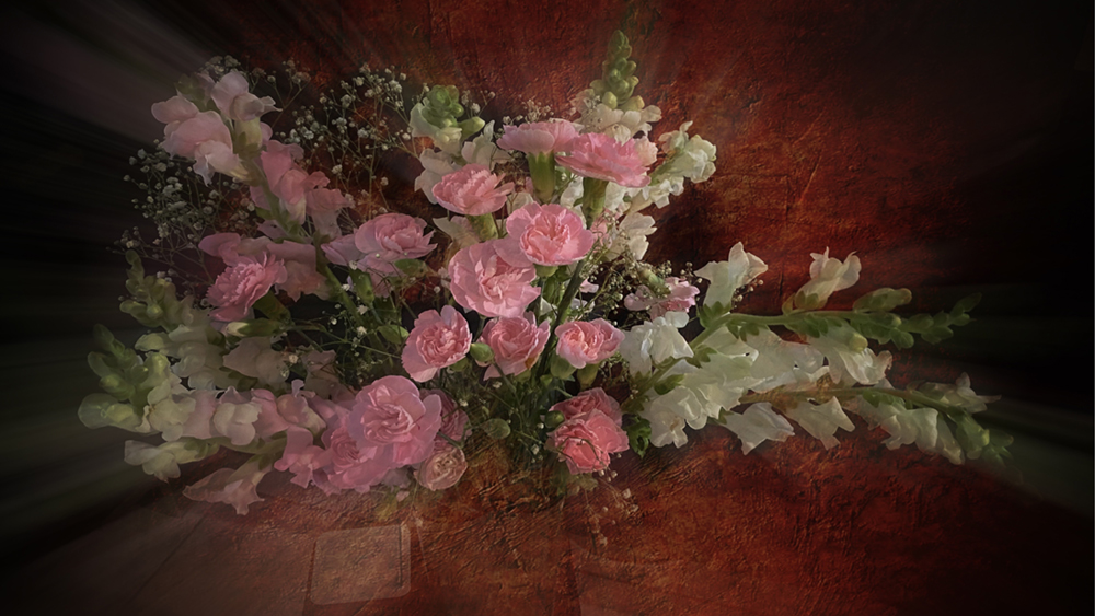
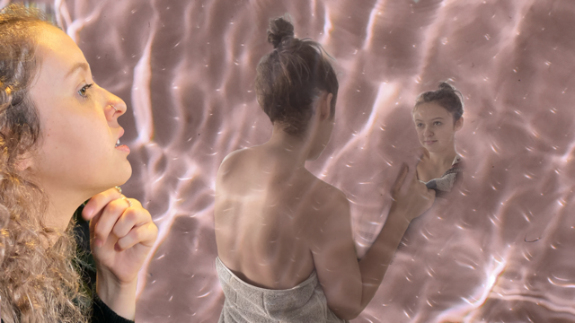
The background was a vase of flowers which I put into the App. IColorama to create a zoomed tiled area. Then I added the mannequins
|
Aug 6th |
| 51 |
Aug 17 |
Comment |
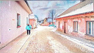
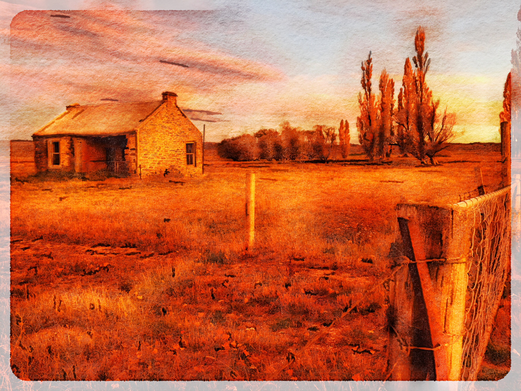
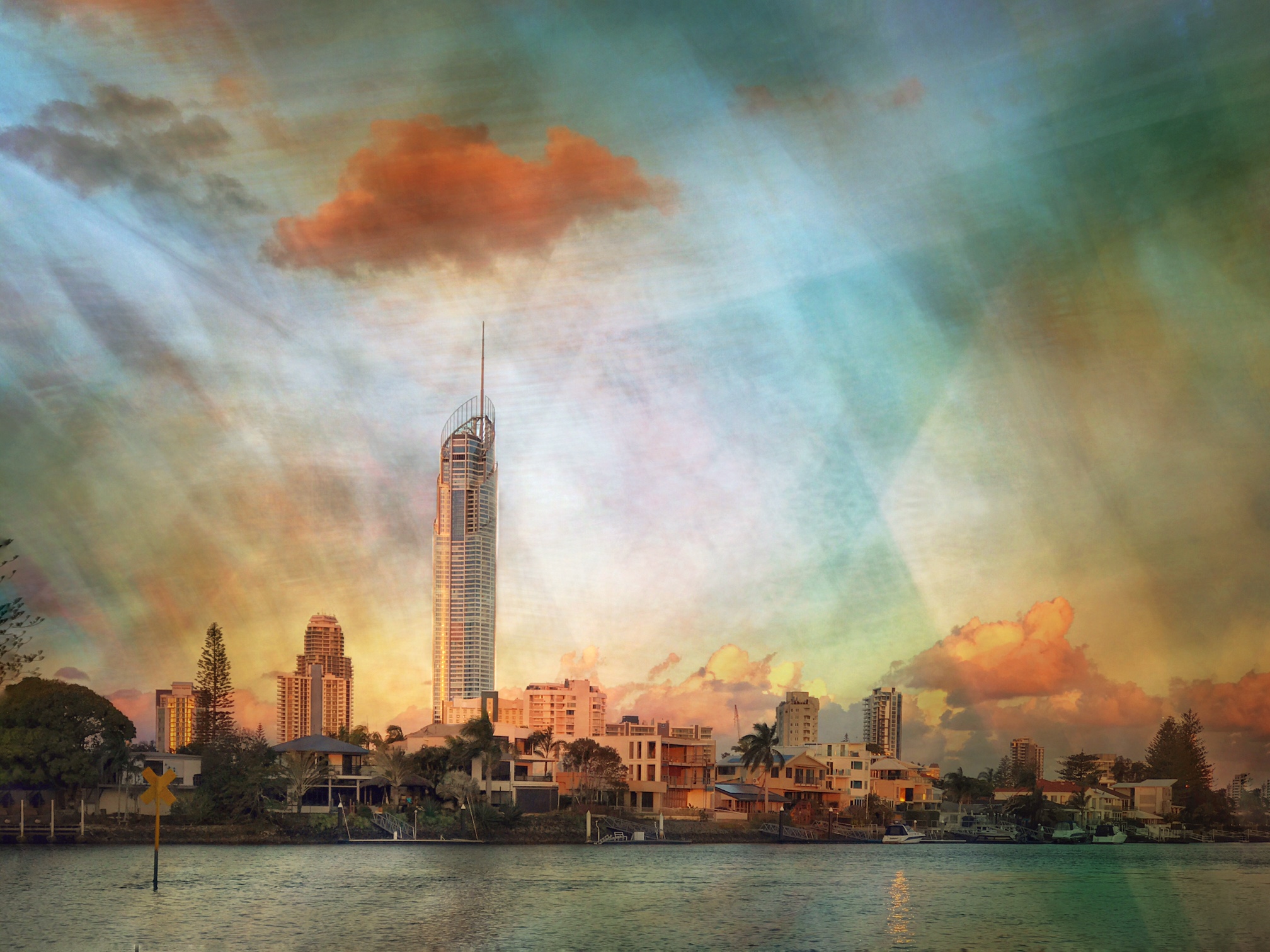
Straightening the building and editing has helped to bring the detail into more prominence. The Color saturation looks really natural! |
Aug 6th |
9 comments - 0 replies for Group 51
|
| 54 |
Aug 17 |
Comment |
At first I thought that little bird had laid those bright orange balls! I felt sorry for it! Great composition.... though I rather like Peggy's version too! The saturation of the balls brings light into the image. |
Aug 6th |
| 54 |
Aug 17 |
Comment |
Good idea, Kurt. I should reduce the opacity of the drips! |
Aug 6th |
| 54 |
Aug 17 |
Comment |
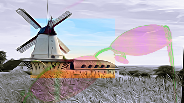
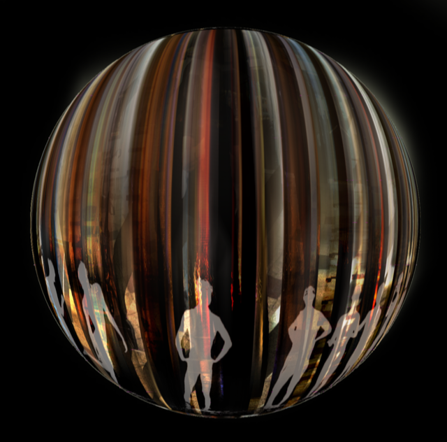
For me, I feel it is a little busy. I would definitely removed the red flags as I feel they spoil the mystery. I like the way your figures are just blending into the forest (apart from the color!).
I find the angle of your main subject rather awkward. I wonder how she would look if she was covered in grass up to her waist? I like the top part of her body! |
Aug 6th |
| 54 |
Aug 17 |
Comment |
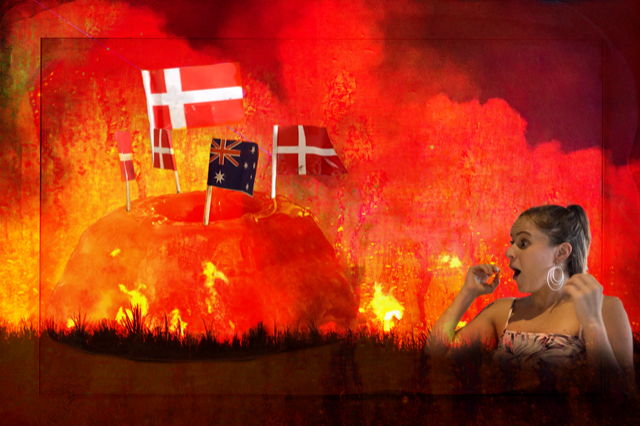
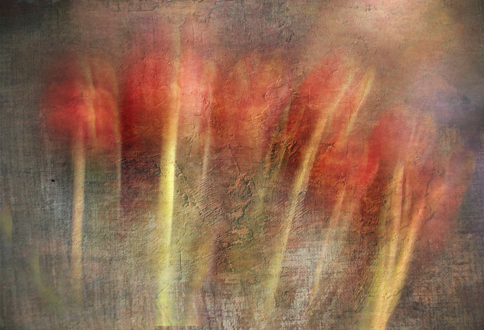
Excellent image! Love everything about it. Great expression on the boy's face. I think the lines around the figures just show that the flames are lighting them up. |
Aug 6th |
4 comments - 0 replies for Group 54
|
13 comments - 0 replies Total
|