|
| Group |
Round |
C/R |
Comment |
Date |
Image |
| 51 |
Jul 17 |
Reply |
Lynne, Leonardo is the big brother of Superimpose.... which IS available for Android. I believe it will do most things that Leonardo can do! |
Jul 19th |
| 51 |
Jul 17 |
Reply |
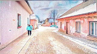
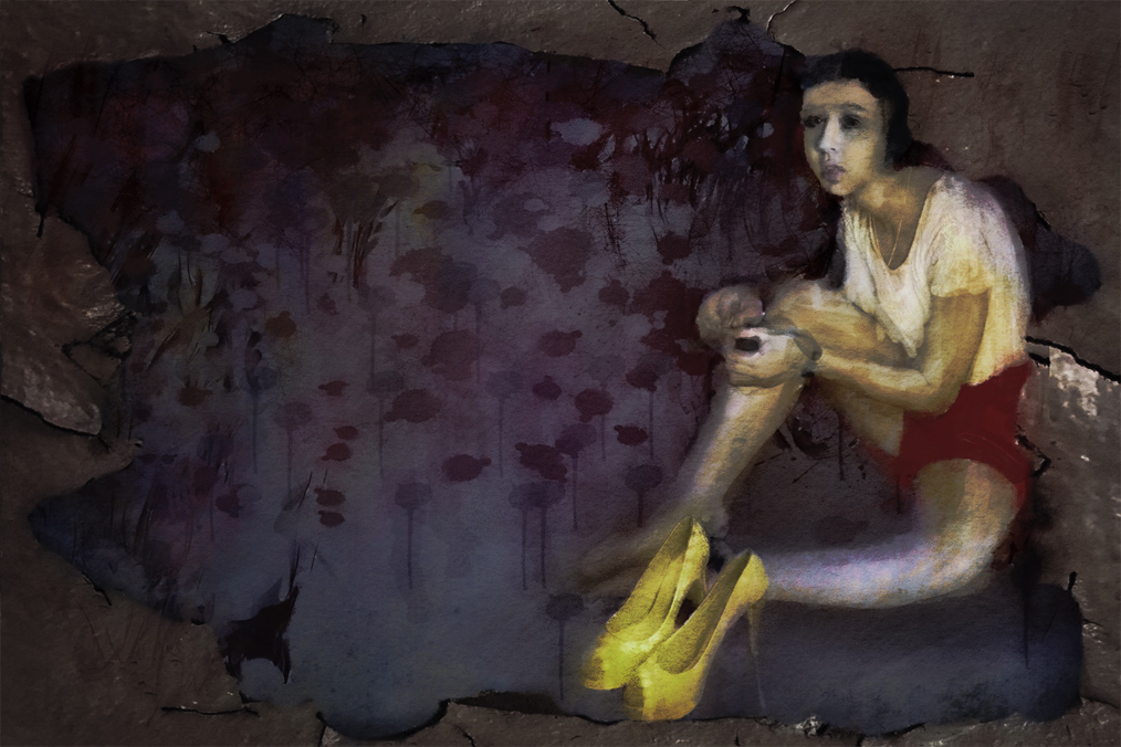
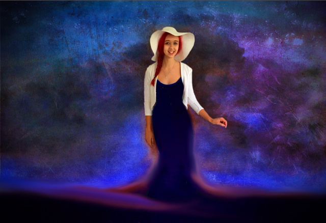
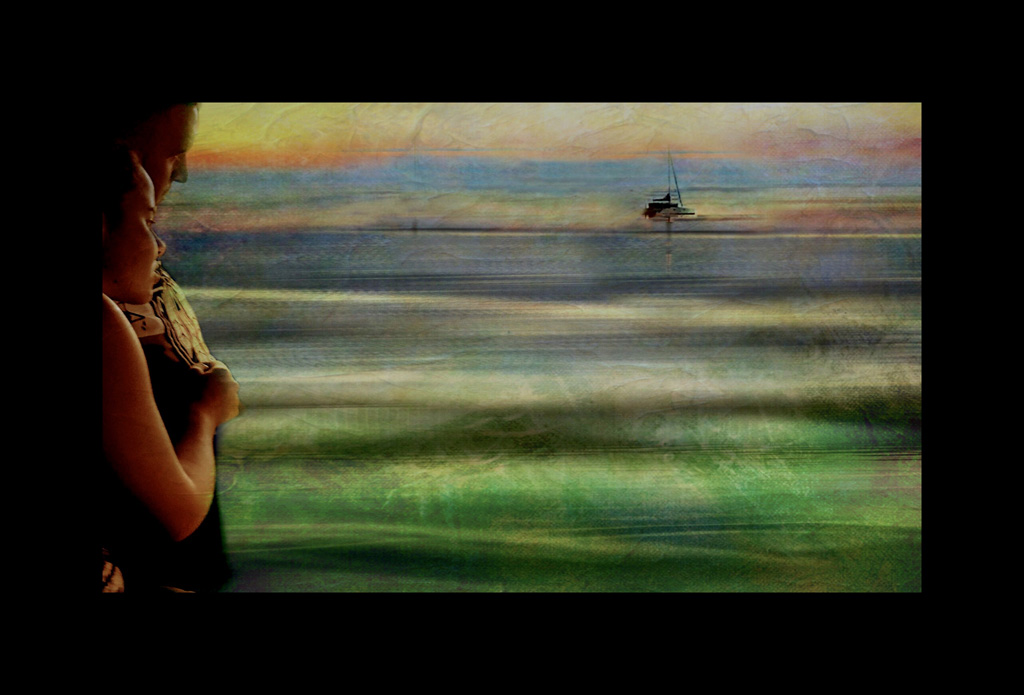
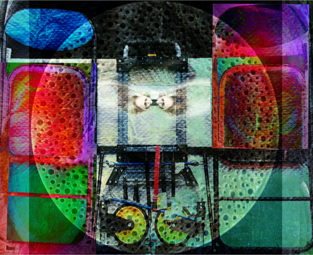
HI Sol, My grand daughter was standing outside our front door.....so she has been added to the multilayered background that had it's colour changed in the App. iColorama. Sorry I should have explained more. |
Jul 11th |
| 51 |
Jul 17 |
Comment |
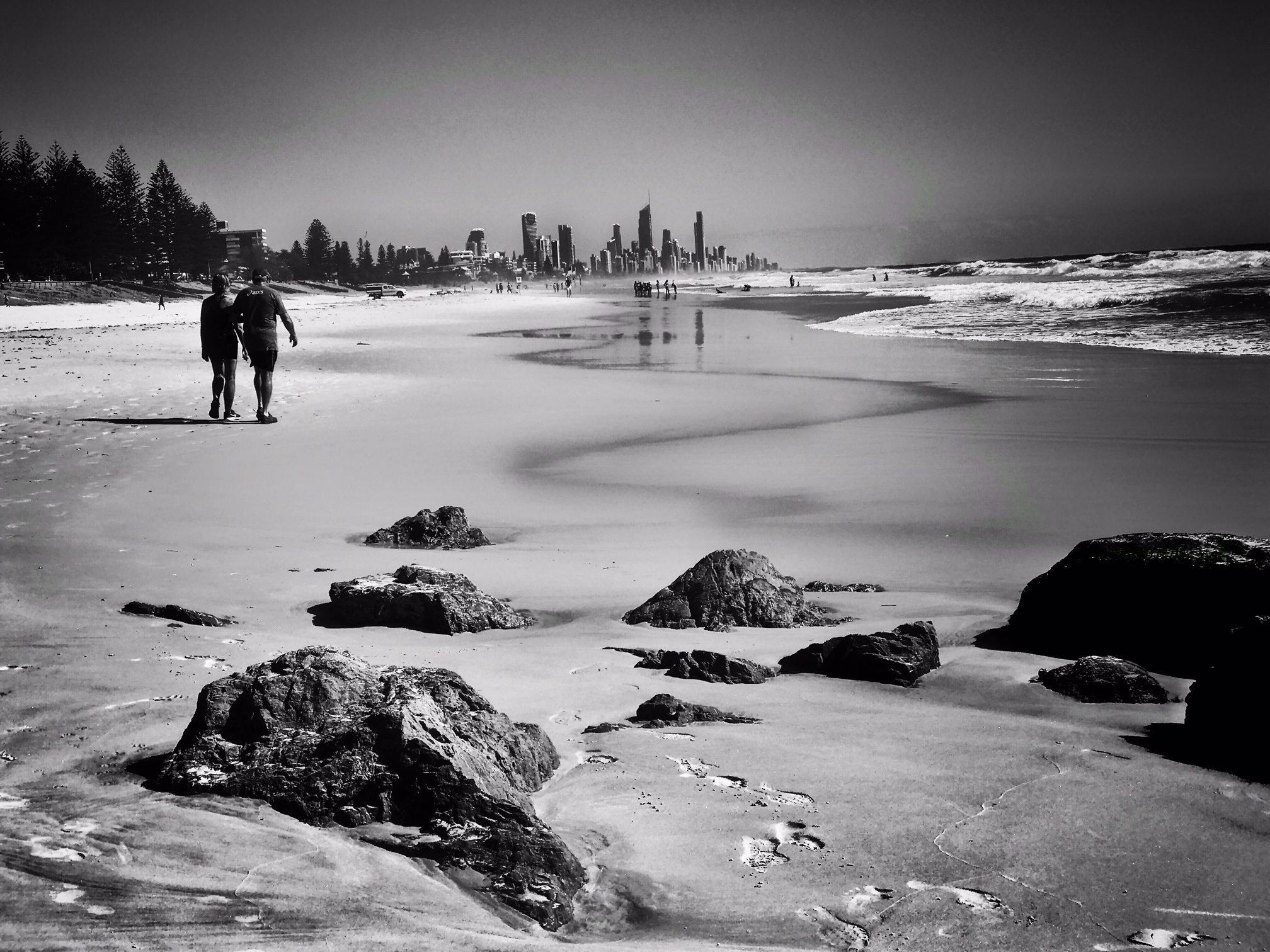
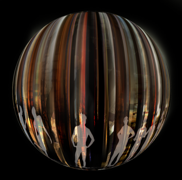
Personally I wouldn't worry about the size of the people. We can see a bit of the bench in the background and that helps to tell the story! Very clever! |
Jul 6th |
| 51 |
Jul 17 |
Comment |
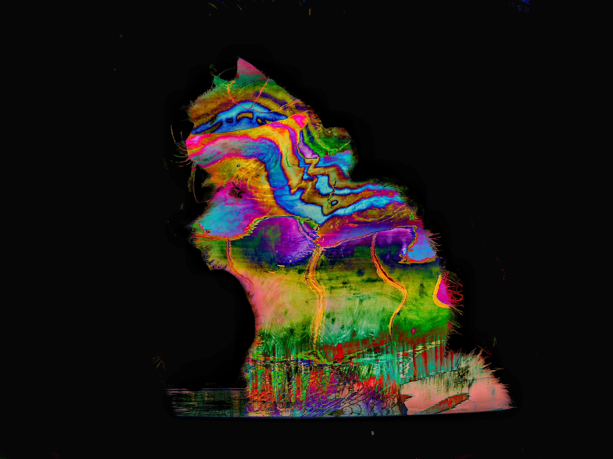
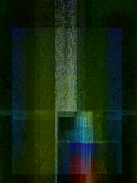
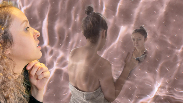
Oh, I can see a wonderful, creative, "Ghosty" type image coming on here! Fabulous backdrop! |
Jul 6th |
| 51 |
Jul 17 |
Comment |
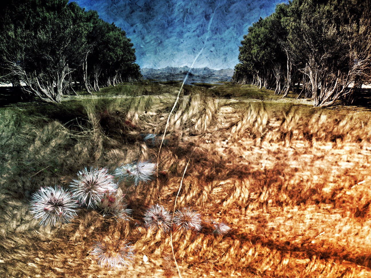
What a magnificent garden! That must take quite a bit of looking after.....but you have lots of places to just sit and admire it! I am quite envious! |
Jul 6th |
| 51 |
Jul 17 |
Comment |
Well seen! I'm wondering what it would look like cropped right into the setting and the shadow....would it make it more abstract? Mind you I DO like the lines on the concrete as well! |
Jul 6th |
| 51 |
Jul 17 |
Comment |
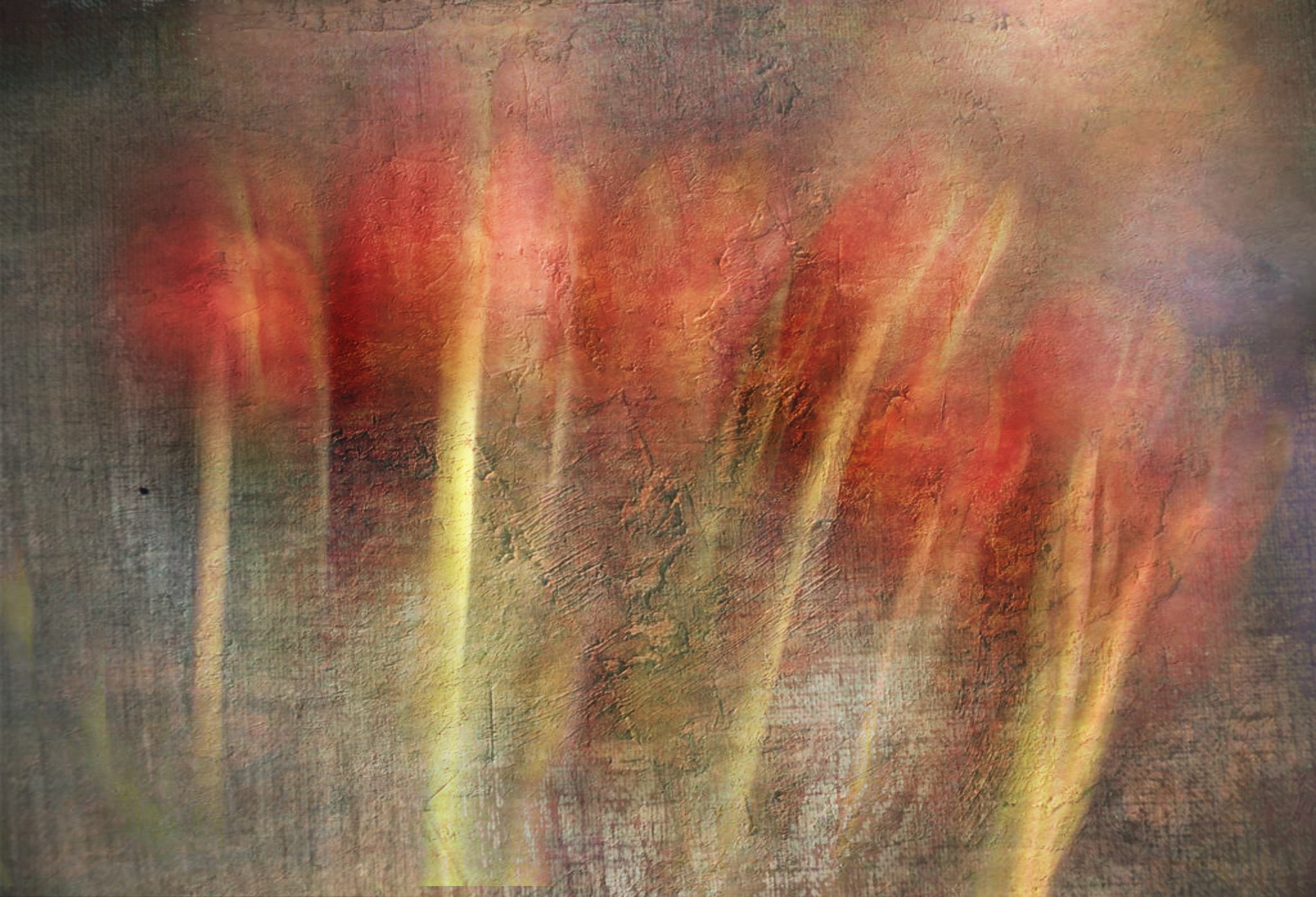
I have not heard about this app...that's not really surprising....am still learning! I think your process is extremely interesting. Not being a technical person I would never have thought that slo-mo would give more single frames. Love the action, the muted colors and the texture! |
Jul 6th |
| 51 |
Jul 17 |
Comment |
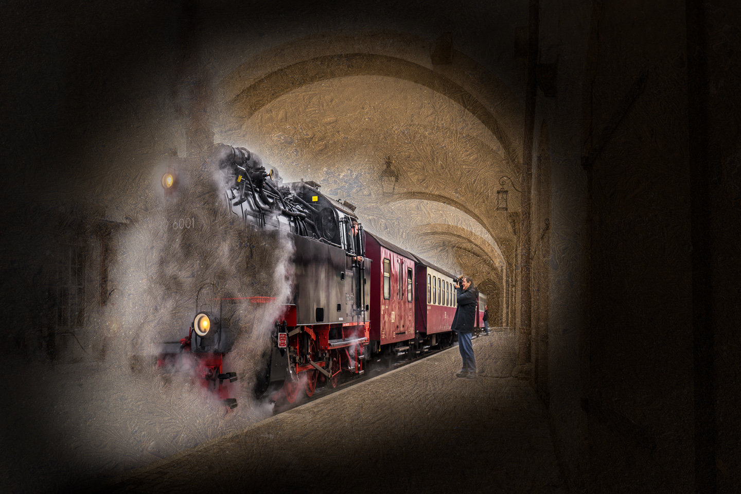
PJ= Photo Journalism! It is a big responsibility to be the Assigned Photographer! I'm glad it wasn't me....but I'm sure, like this image, you have many great shots!
|
Jul 6th |
6 comments - 2 replies for Group 51
|
| 54 |
Jul 17 |
Reply |
Having said that about my own textures....sometimes I DO use effects from different Apps....so I need to clarify this also. |
Jul 9th |
| 54 |
Jul 17 |
Reply |
...and I am also doing the Awake course!....well, in theory. my internet was so bad that I could not download the lessons. Any moment now we are to get a better internet service so that I should then be able to see the lessons. The only thing that I do NOT agree with is use other people's textures etc. I take my own. |
Jul 8th |
| 54 |
Jul 17 |
Comment |
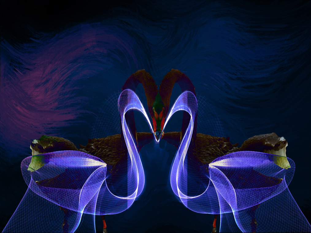
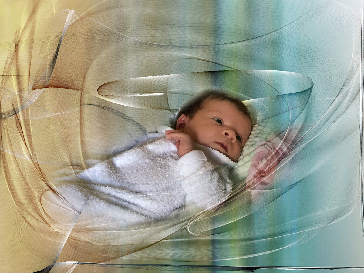
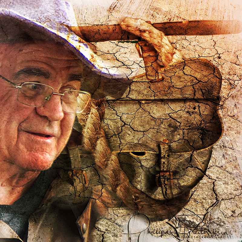
Welcome Kurt! I was going to start commenting on my iPhone when I realised it would take me all day to say what I wanted to say....so I waited till I opened up my computer!
Firstly, I love the gentle tones and painterly feel to your image.
Your original bird is free but in your image it looks like he is caught behind some rocks! ....so at first I felt sad for him!
What I WANTED to say that there are now quite a few Nature photographers from around the world who are now using their images to create art and, in doing so, are promoting/bringing to our attention, conservation of our wild life.
In Australia there is Steve Parish and in New Zealand there is Judi Lapsley Miller. The latter is especially worth looking up: http://www.artbyjlm.com/about.html |
Jul 8th |
| 54 |
Jul 17 |
Comment |
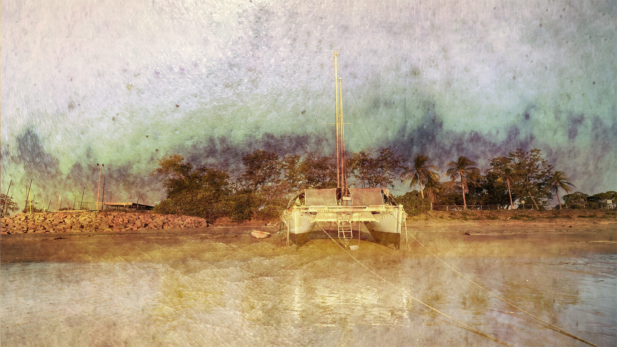
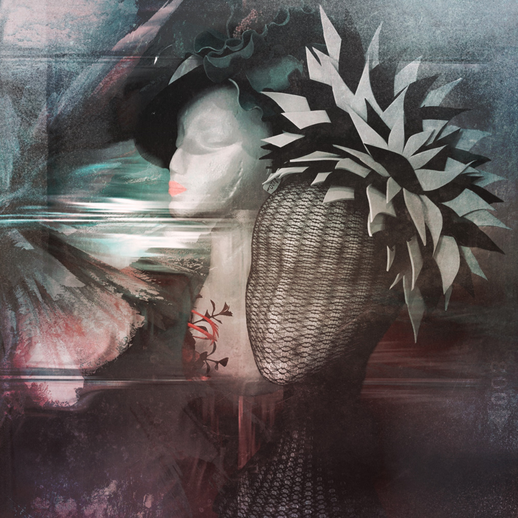
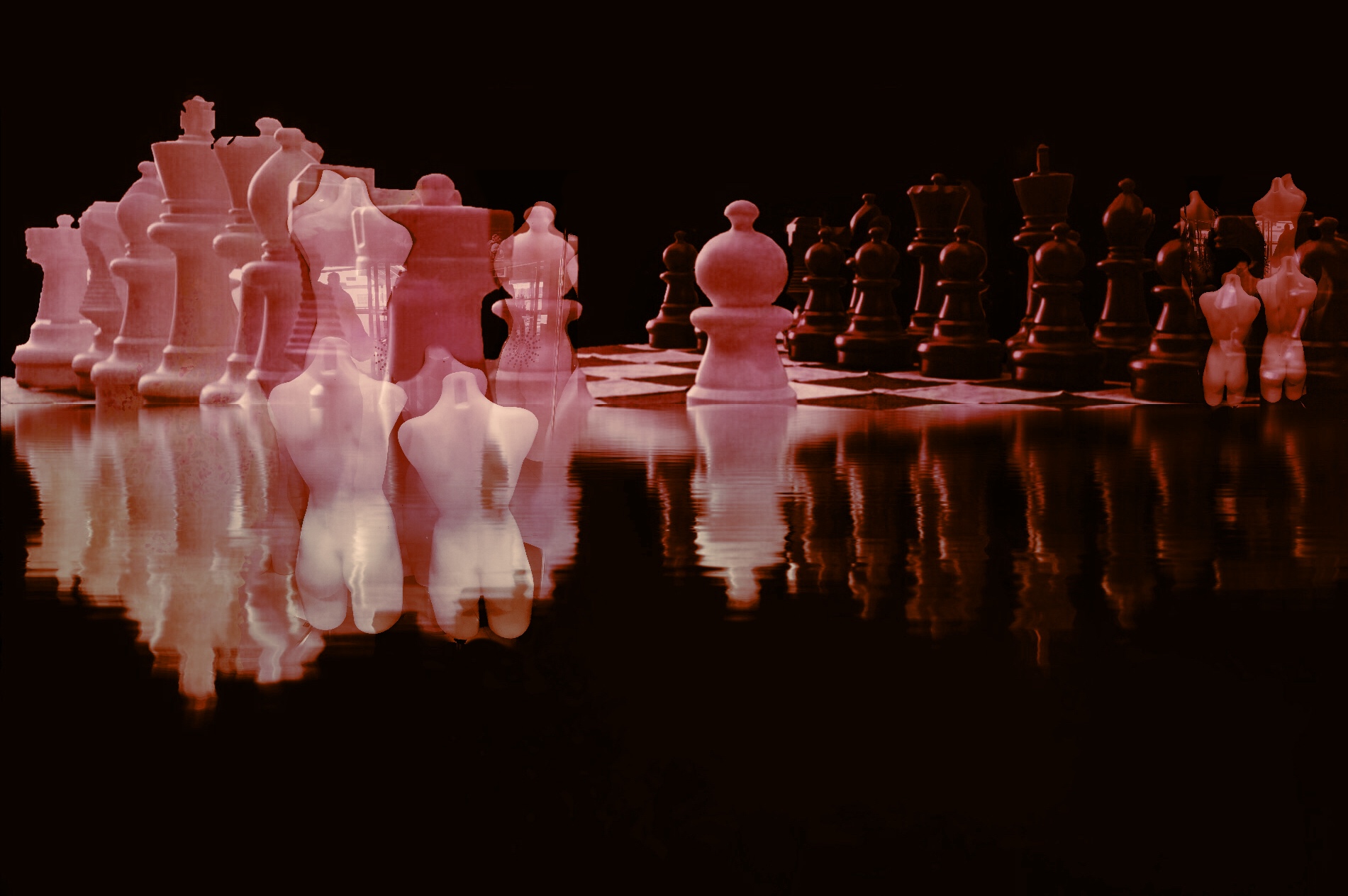
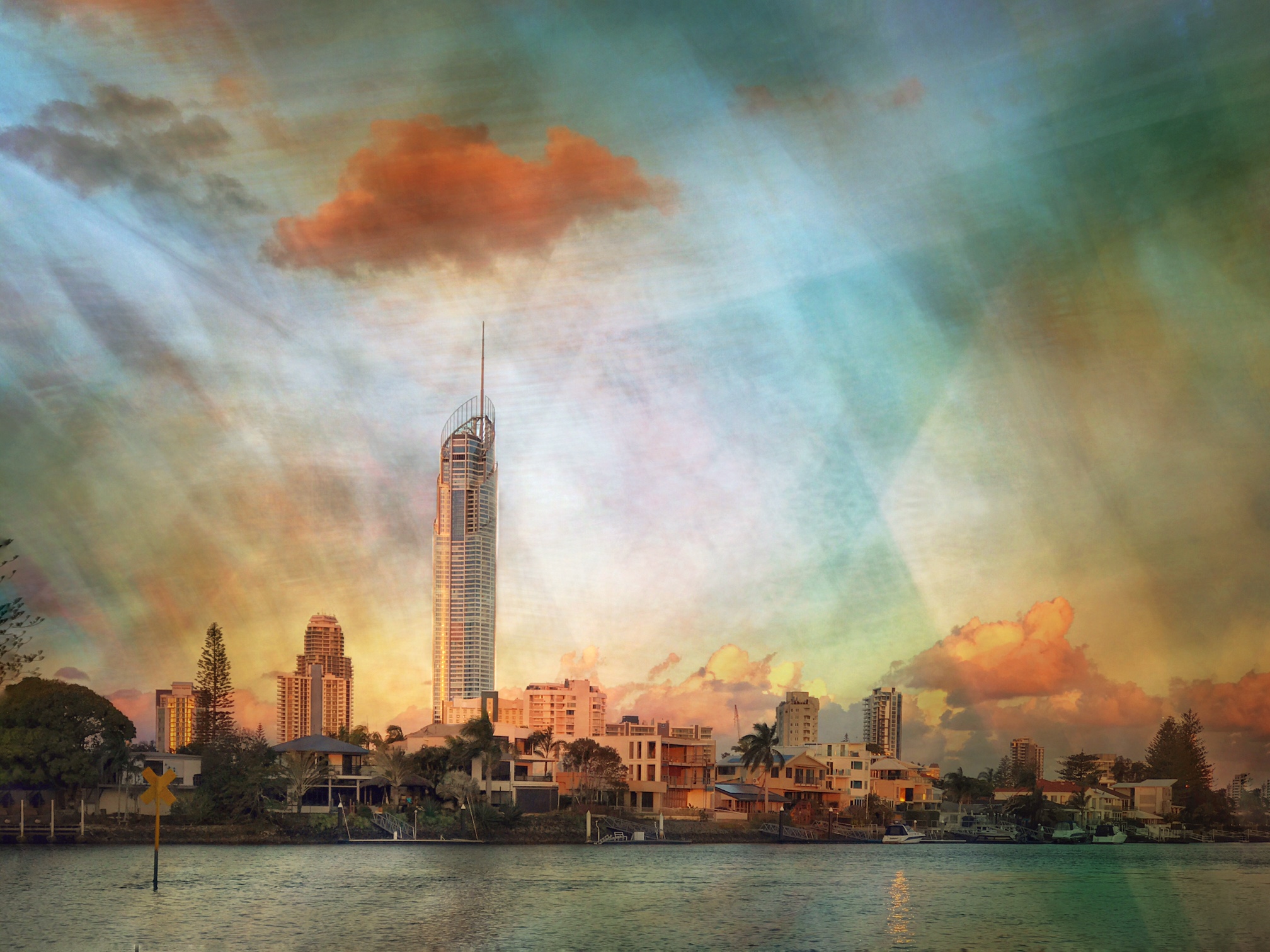
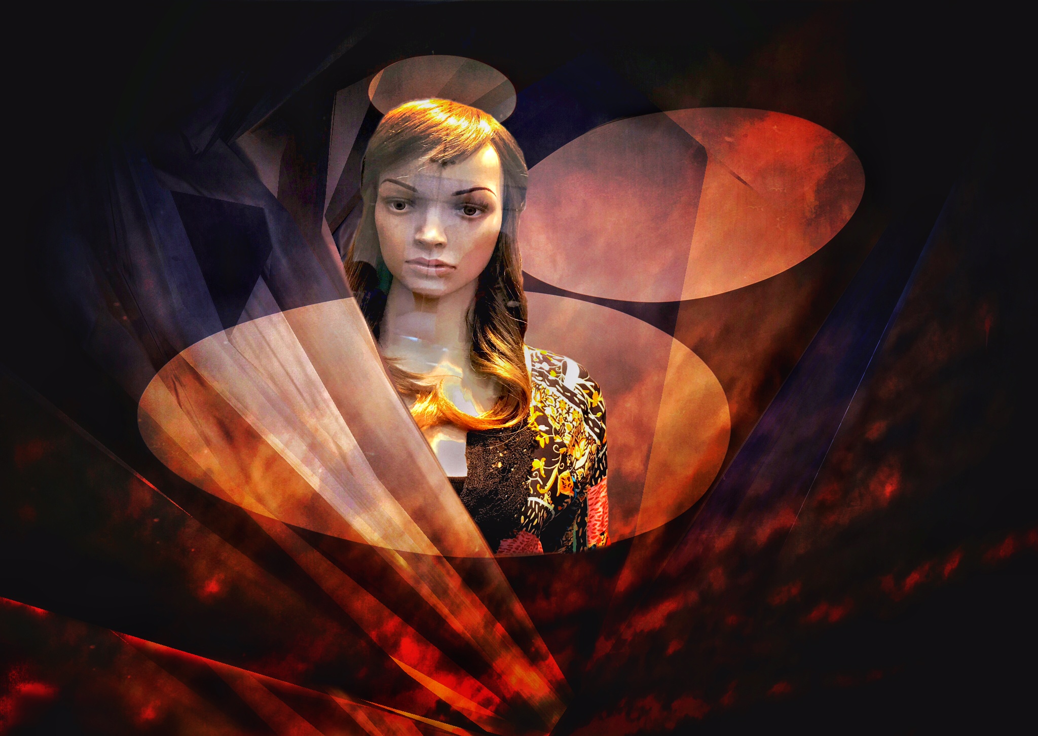
I have to apologise everyone, was travelling when I sent this and didn't have time to write the details.
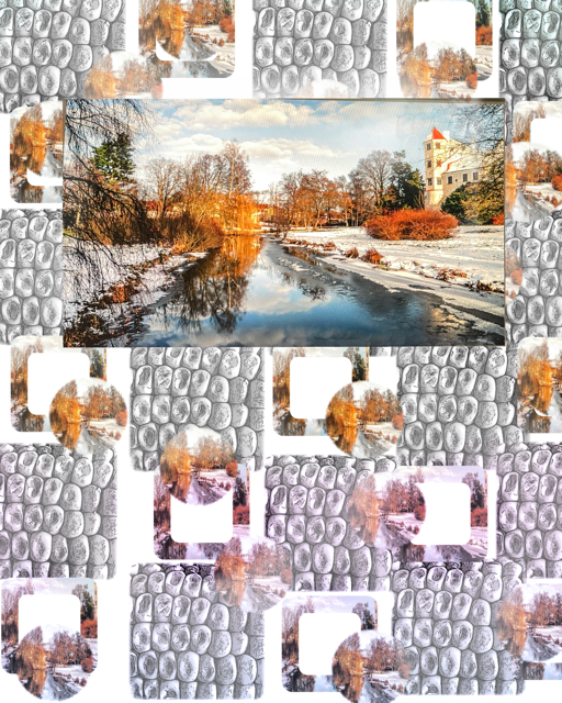
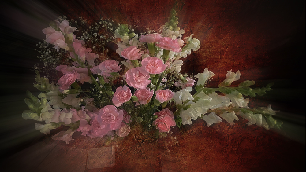
The first original was another image that I have warped in the App. iColorama.
The second is some lights and the third has a sunset sky added to it.
The mannequin was taken from this side of the display window which has all sorts of weird reflections on it....which I don't mind.
Peggy...yes, I should have darkened the second light! Thank you!.
Forgot to say that I combined the images in the App Leonardo. I guess you have realised that all my images here and on Facebook are iPhone images and edited on the iPhone or iPad. |
Jul 5th |
| 54 |
Jul 17 |
Comment |
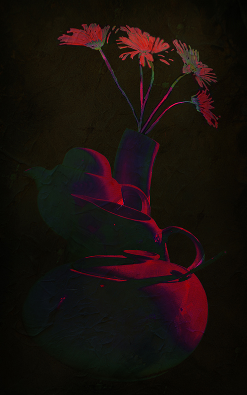
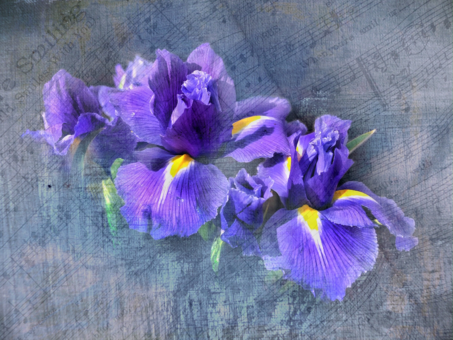
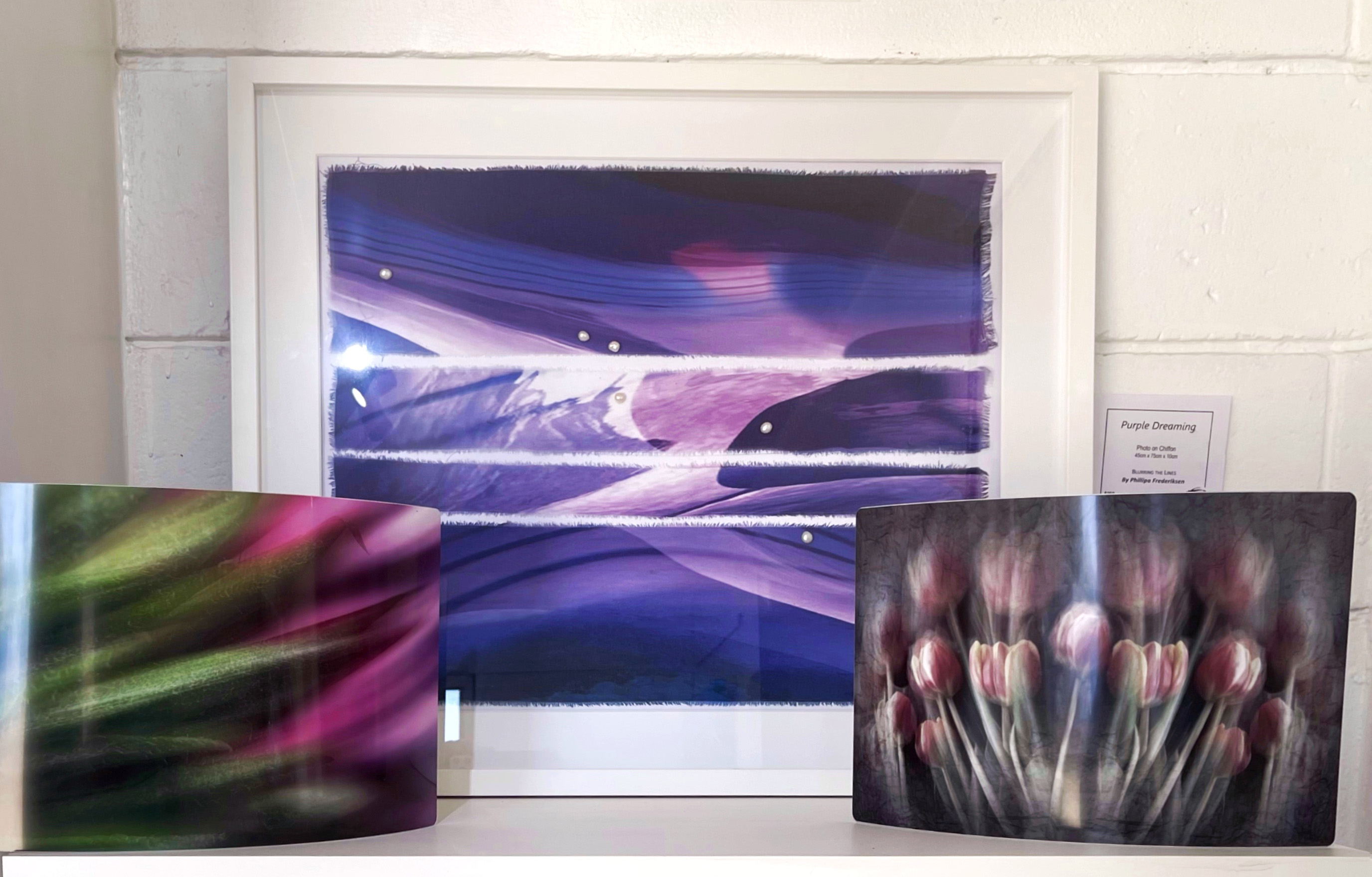
Those Pears look delicious! I LOVE the flowers....so delicate.
The clock could possibly have a slight loss of opacity and could be bigger to fill more of the top right space. I wouldn't worry about the finer lines of the clock frame....just use the solid frame......we won't know! Love the colors of the image itself but I feel the frame is a little heavy and doesn't really match the image. Perhaps a fine line of the pears Color? |
Jul 2nd |
| 54 |
Jul 17 |
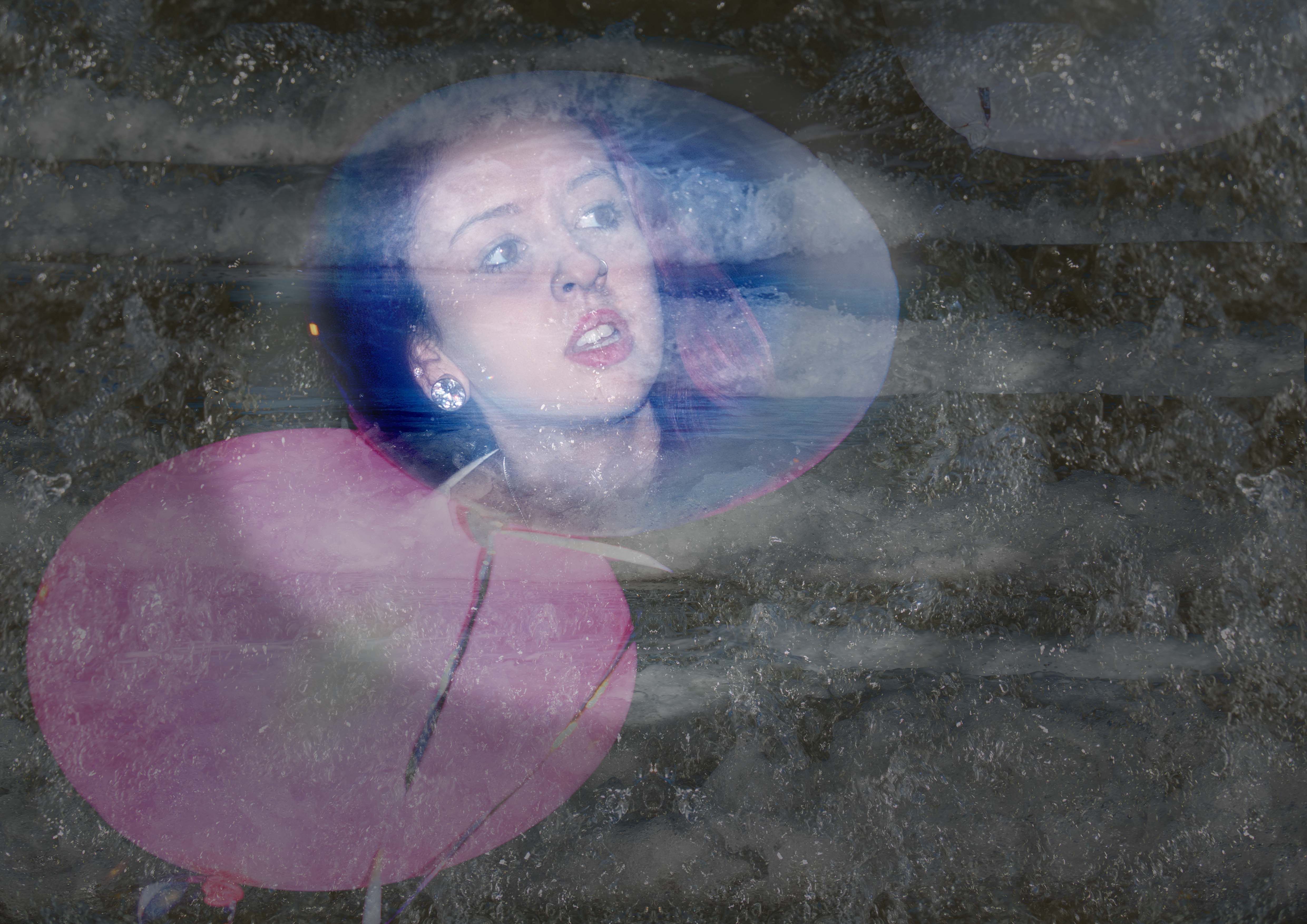
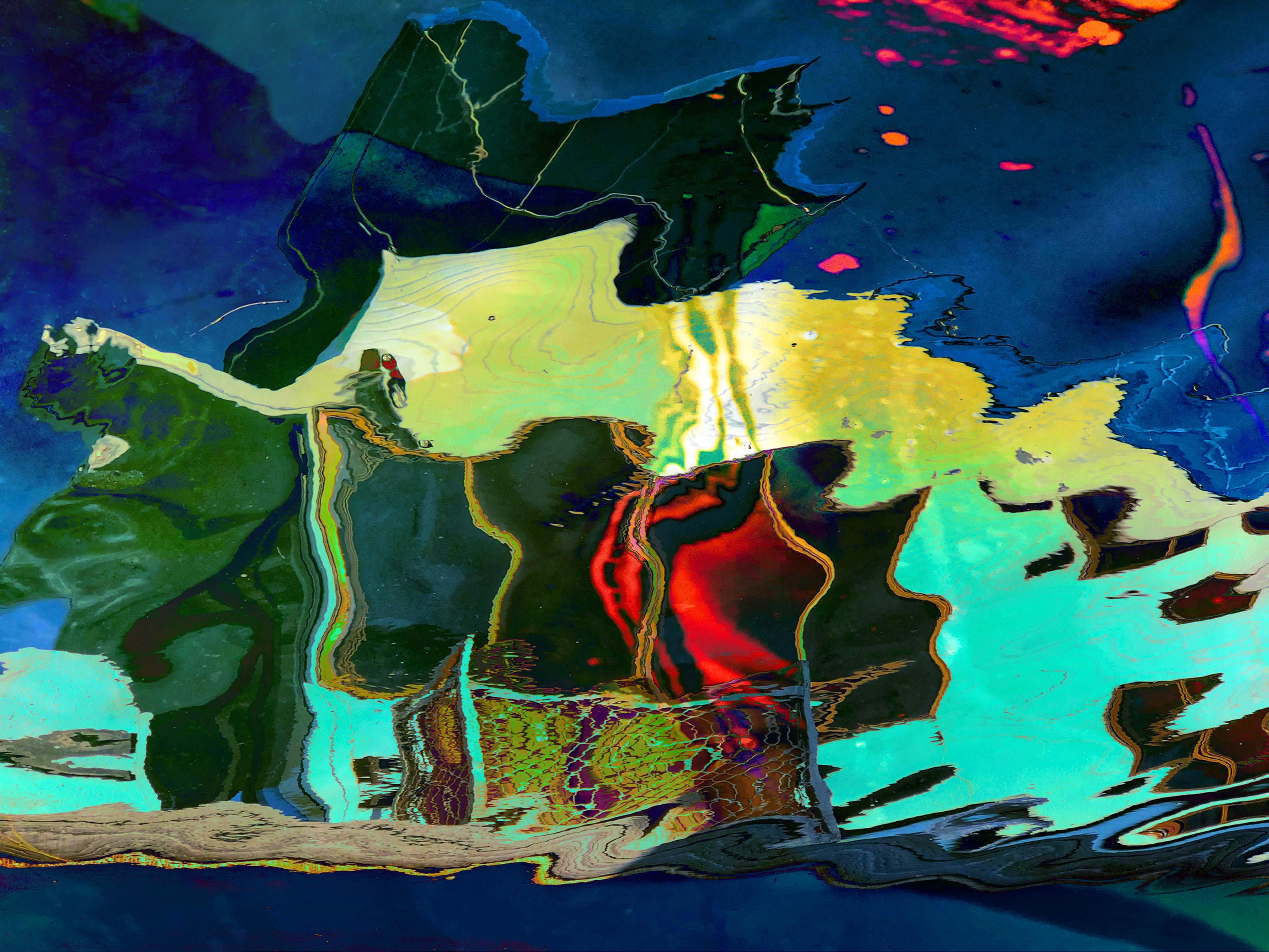
Comment |
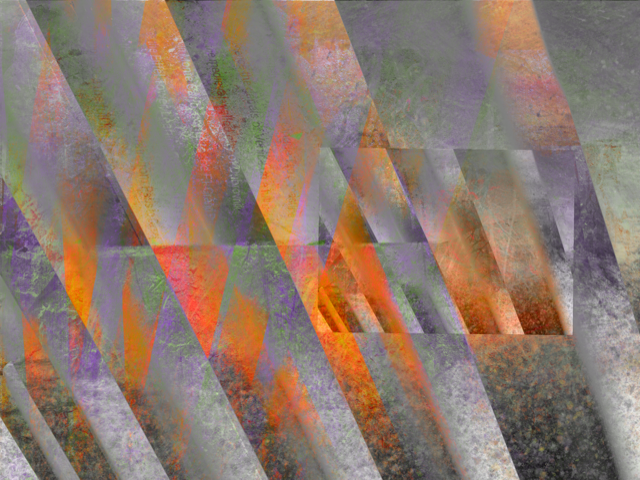
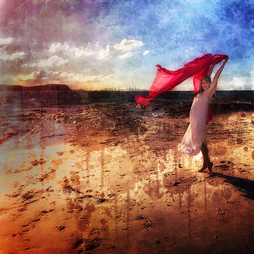
Great compositions and concept! Possibly my suggestion would be to smooth out the edges of the "ghost cloud"....to make it more ethereal!
I have a feeling that the sea and cliffs might need levelling a little. ....I always notice this in other people's images....just not mine!
Great Story! |
Jul 2nd |
| 54 |
Jul 17 |
Comment |
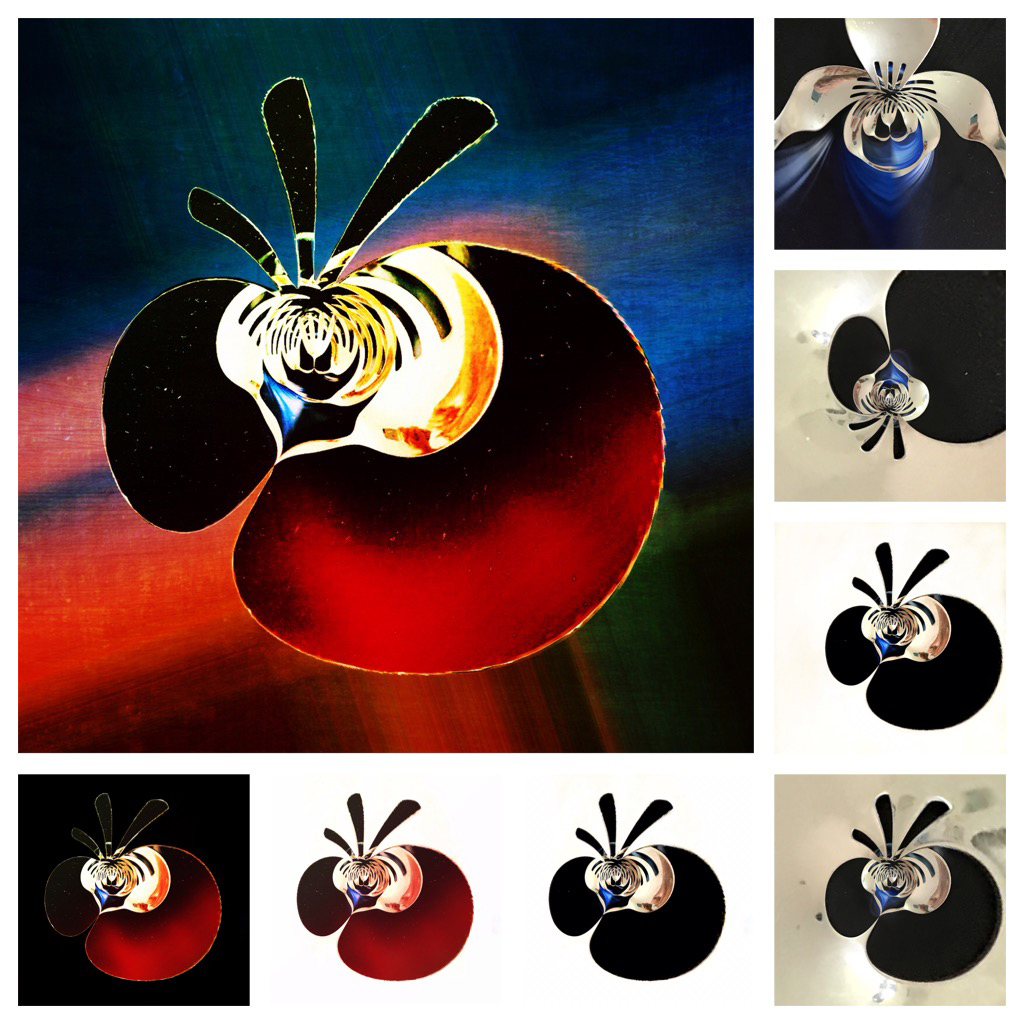
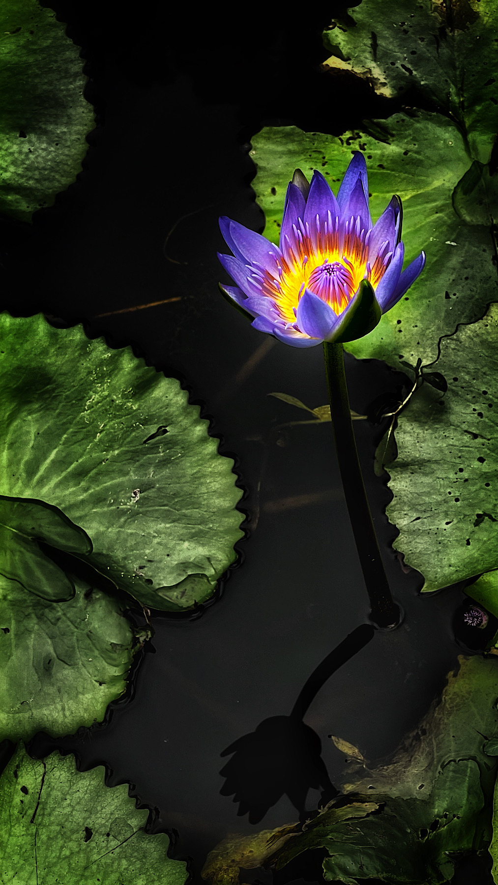
Absolutely amazing! Great Subject and your process of image construction has left me gobsmacked! Can't stop looking at it! |
Jul 2nd |
5 comments - 2 replies for Group 54
|
11 comments - 4 replies Total
|