|
| Group |
Round |
C/R |
Comment |
Date |
Image |
| 56 |
Nov 23 |
Comment |
I guess the consensus is right about the white; so it's back to the drawing (painting) board on this one area. Thanks for pointing that out, everyone. |
Nov 30th |
| 56 |
Nov 23 |
Reply |
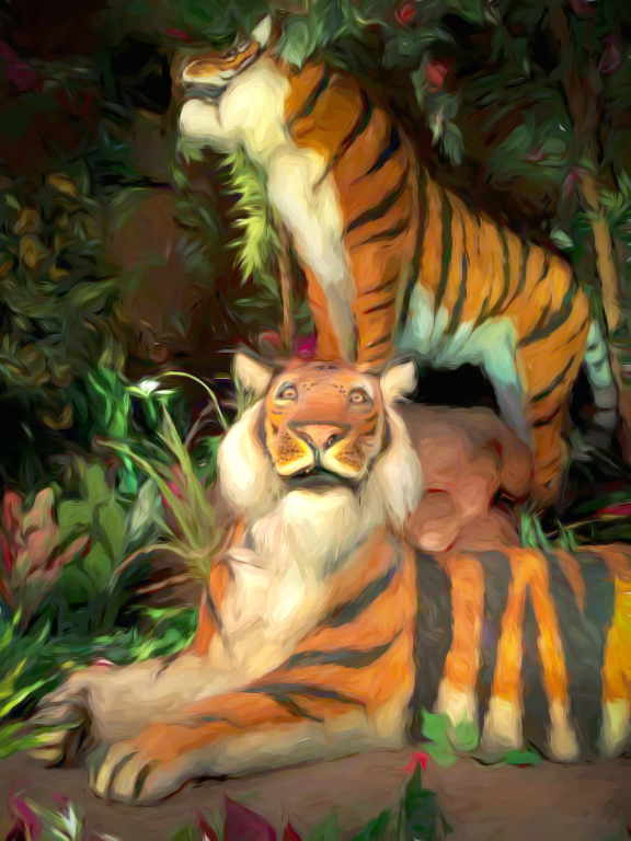
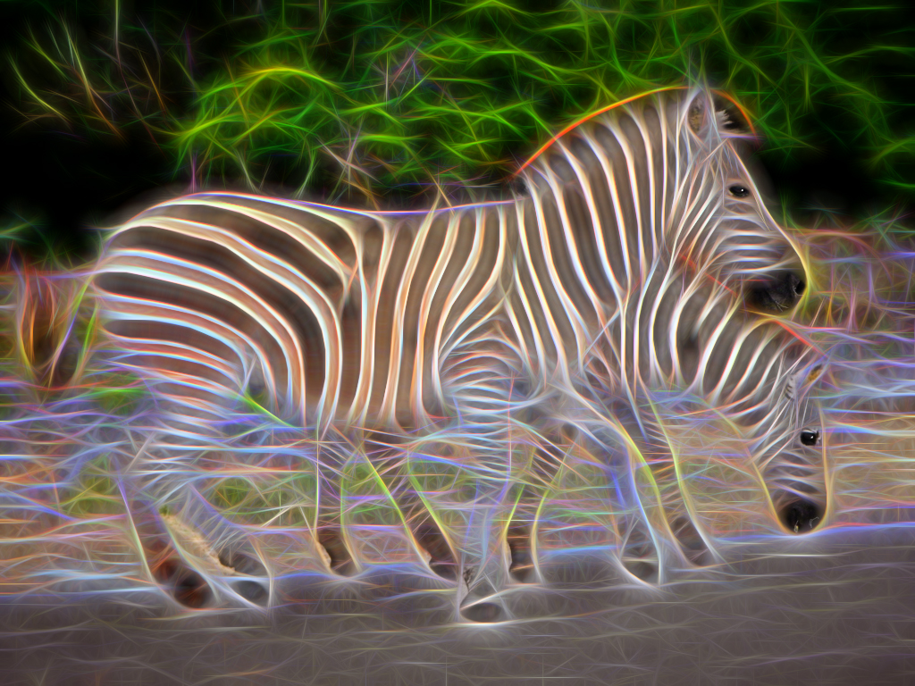
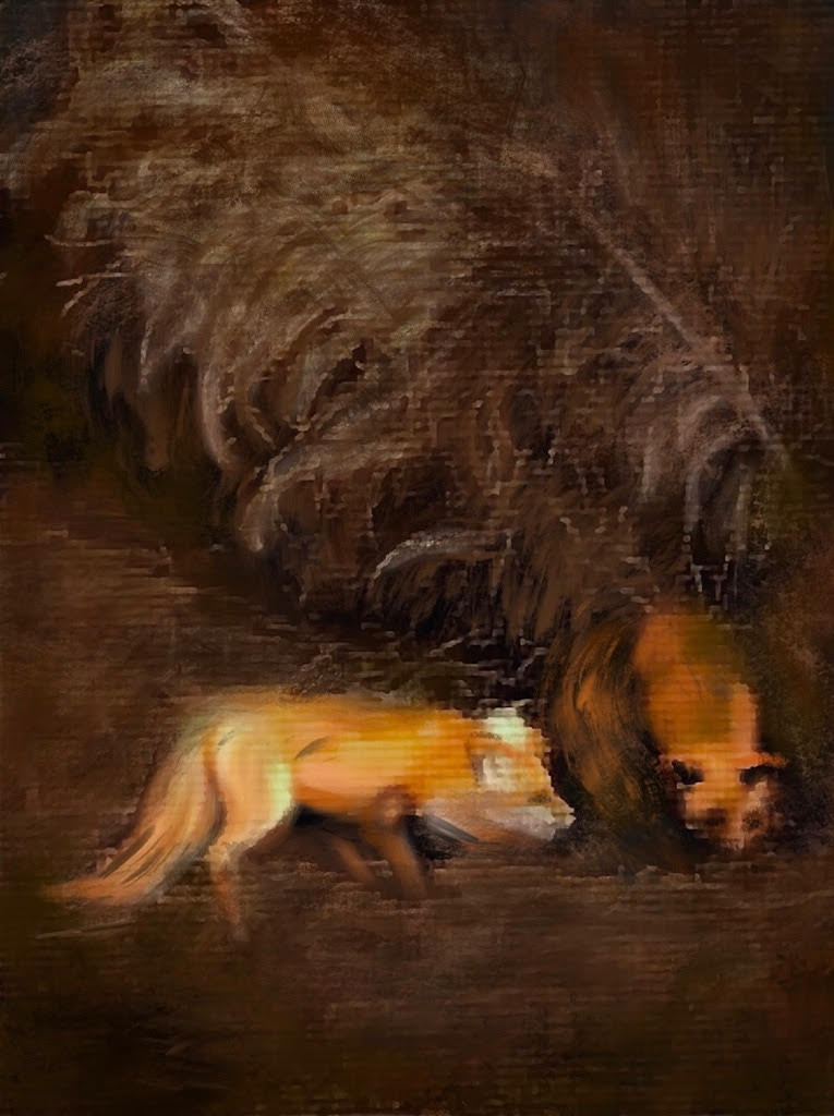
You're right; India, of course. And since you've shot so many of the real life animals and posted the results for us to enjoy, I hesitated in posting some fake wild animals, but was still dying to see what your comment would be. ;-) |
Nov 30th |
| 56 |
Nov 23 |
Comment |
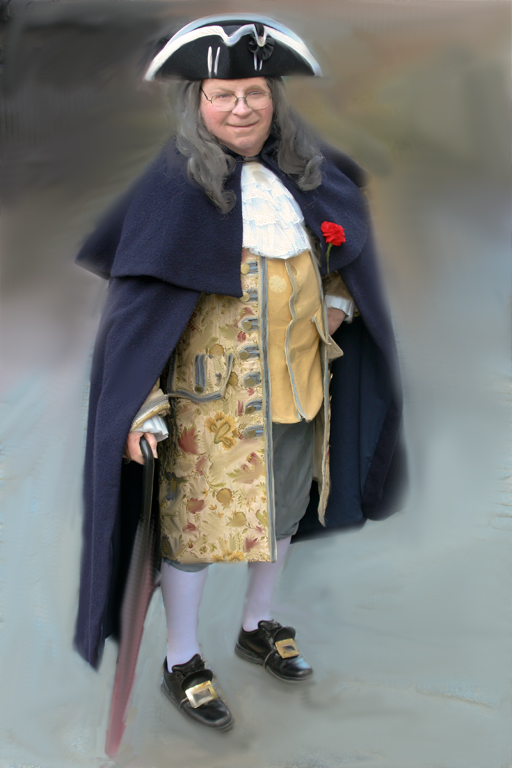
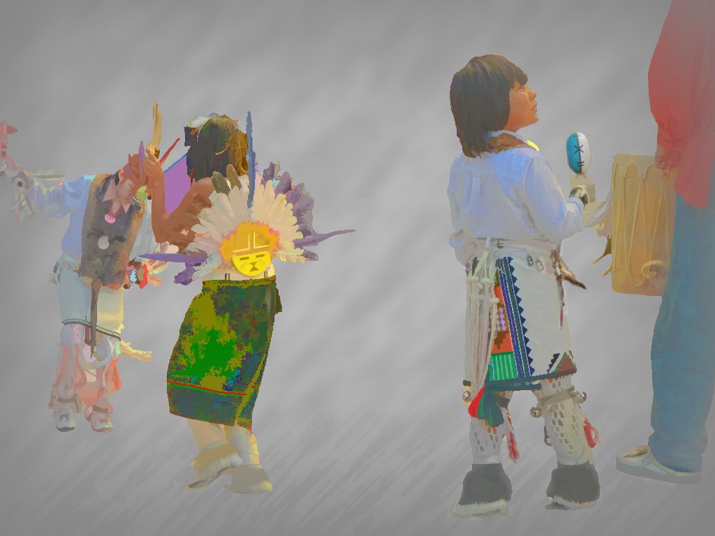
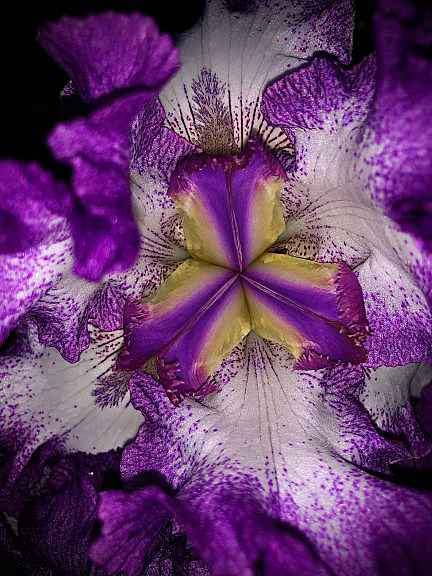
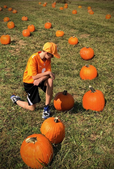
This sure seems like a challenging subject, Cindy. Especially to make all that plaid look right. The background you added certainly added to the look of your painting, especially the greyish teal shade you chose. The brush strokes give the fur some life after 40 years of loving by your once little boy. Make sure he gets to see this. |
Nov 30th |
| 56 |
Nov 23 |
Comment |
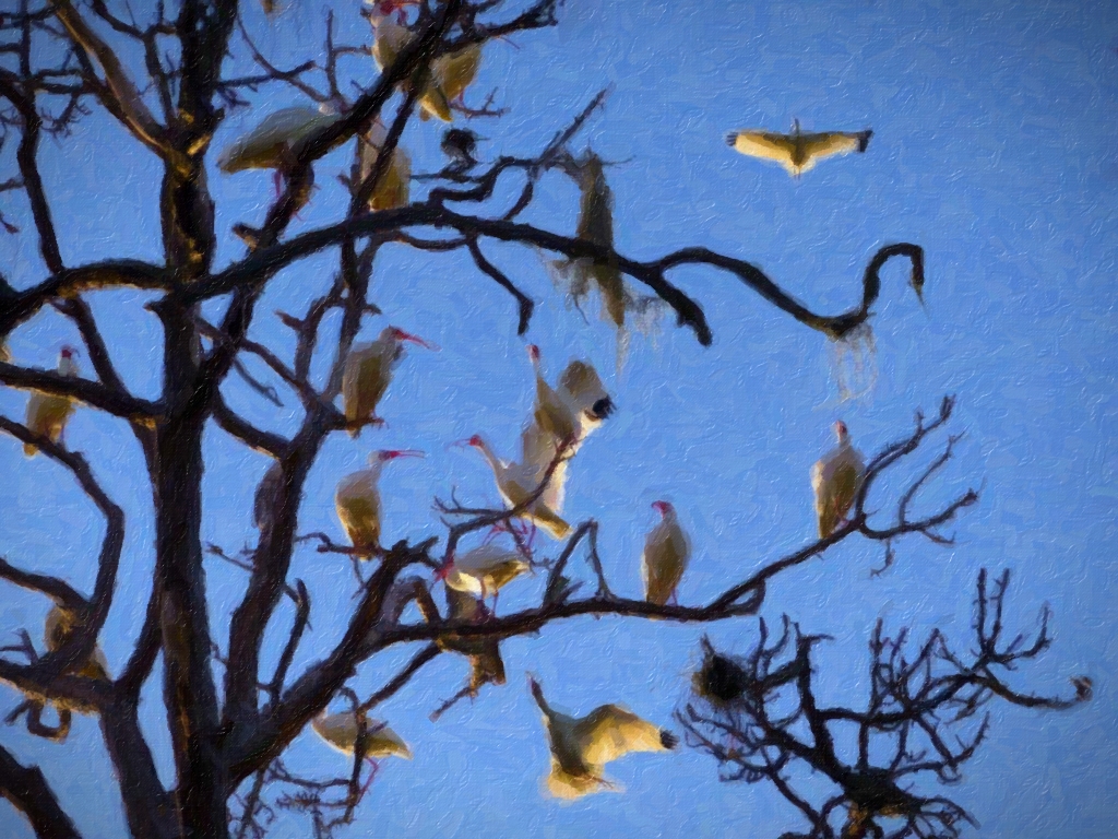
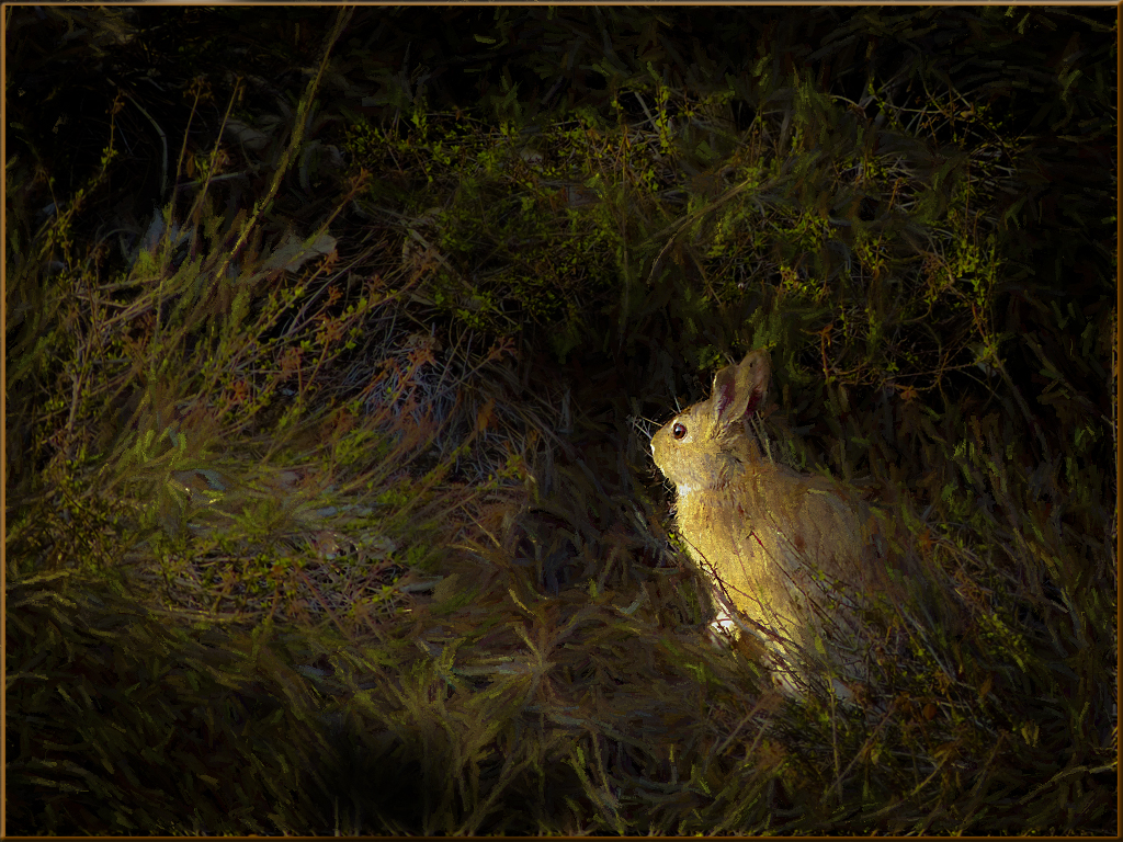
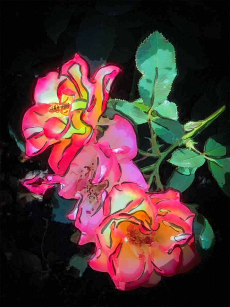
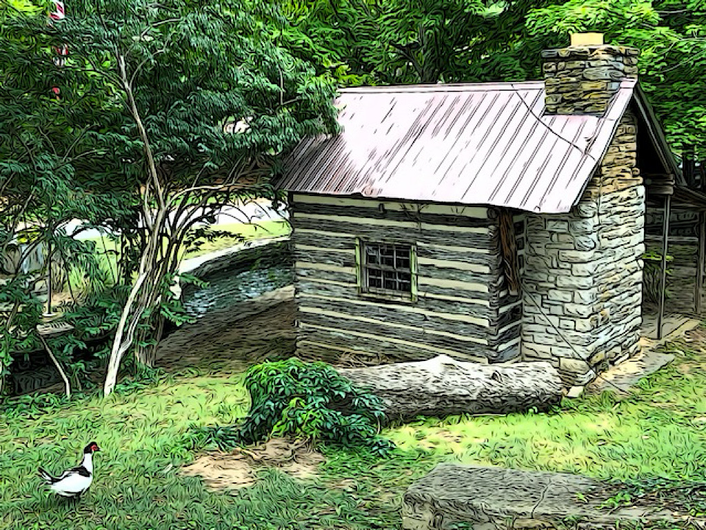
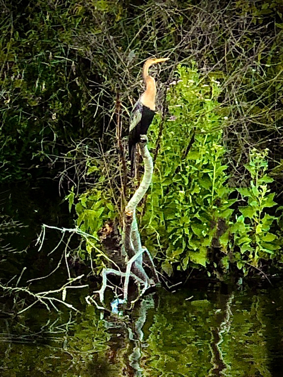
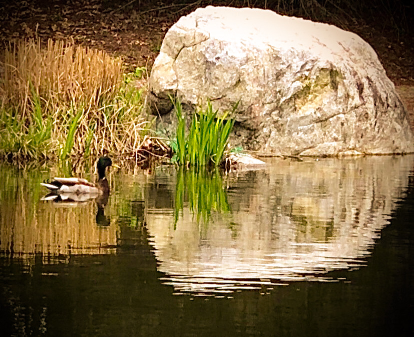
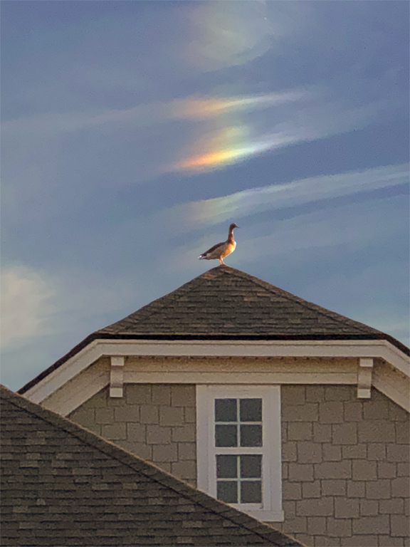
Being nearsighted, I likely wouldn't have noticed this far-off bird, so thanks for bringing it right up close, Martha! Your painting work eliminates all but the most important parts of the bird and its house-perch. Then your expert brushstrokes turned it into a terrific painting, with just enough detail and color. |
Nov 30th |
| 56 |
Nov 23 |
Comment |
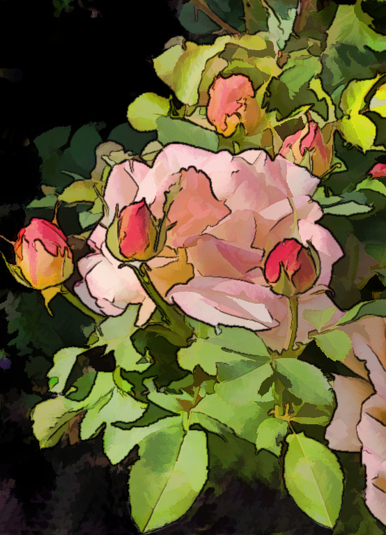
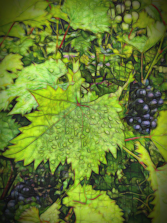
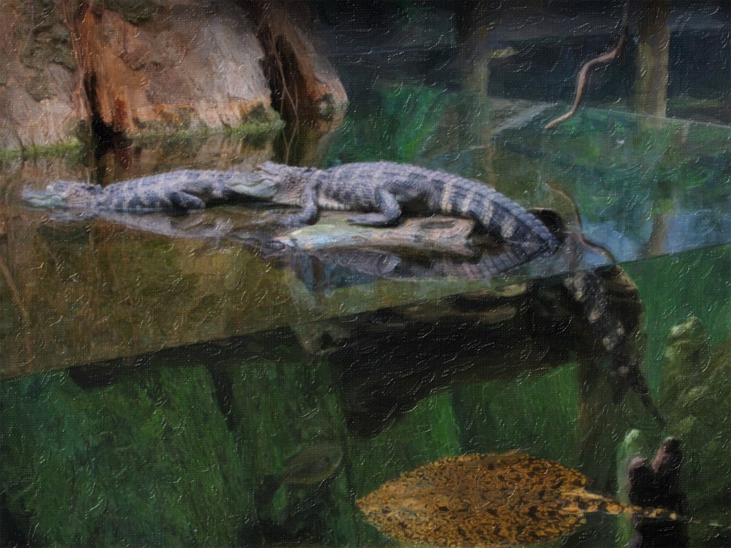
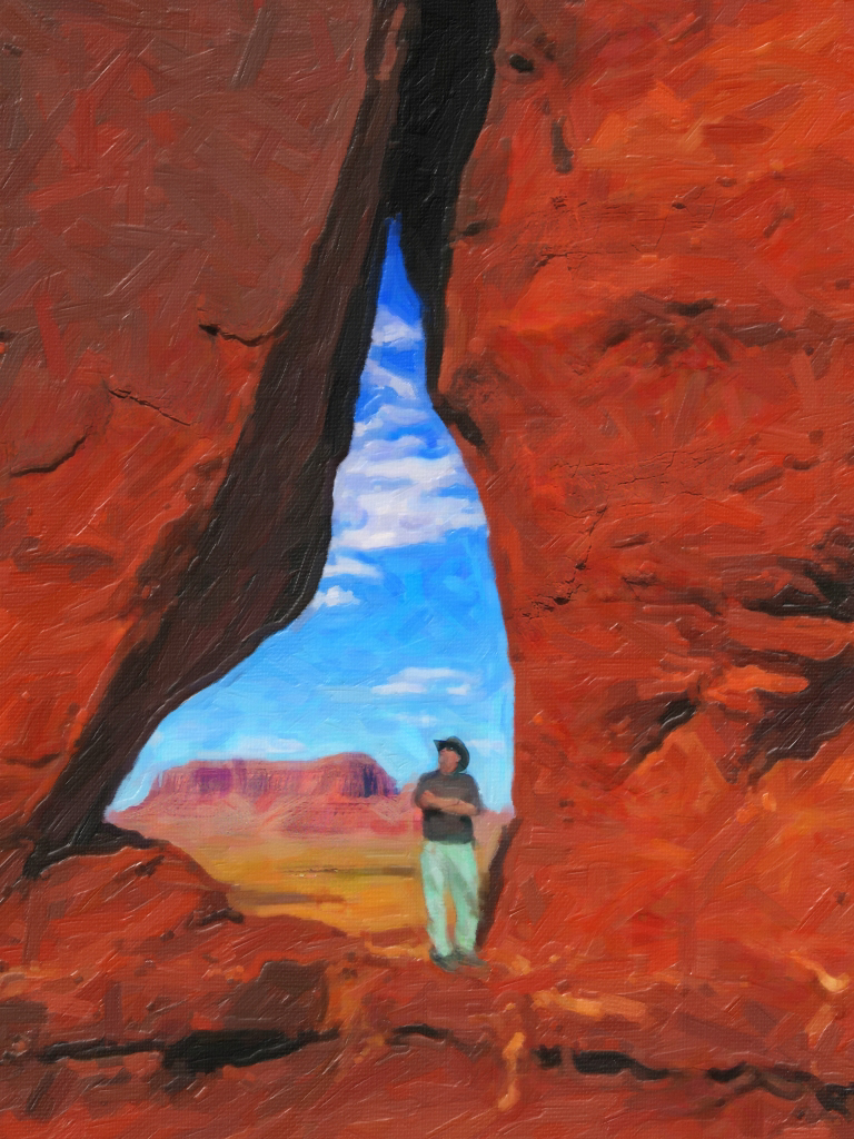
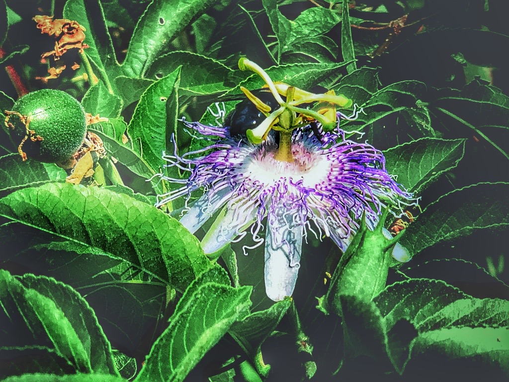
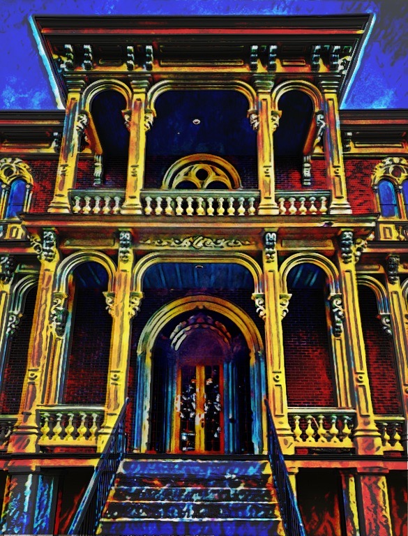
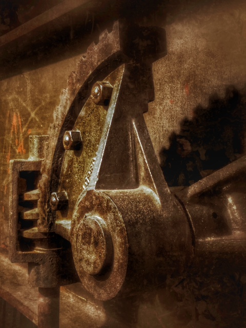
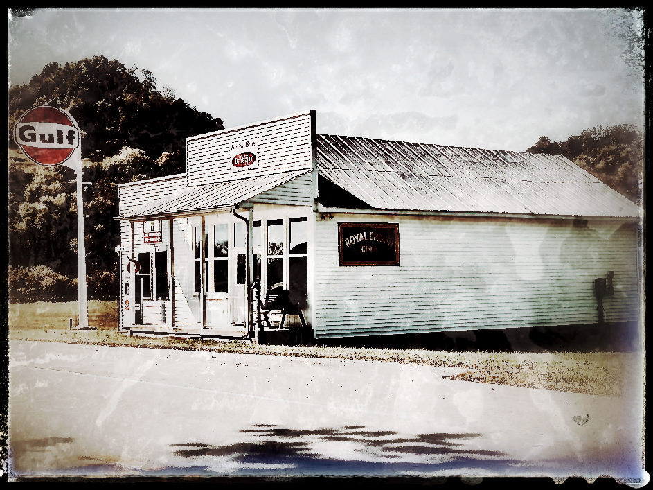
Your photo original is elevated into a drawing and looks like it was done on actual yellowish drawing paper. The textures seem spot-on and it looks like it was drawn from a subject outside, perhaps near a wall in the desert. The objects by the plant add to the interest, with their unusual shapes and angles. |
Nov 30th |
| 56 |
Nov 23 |
Comment |
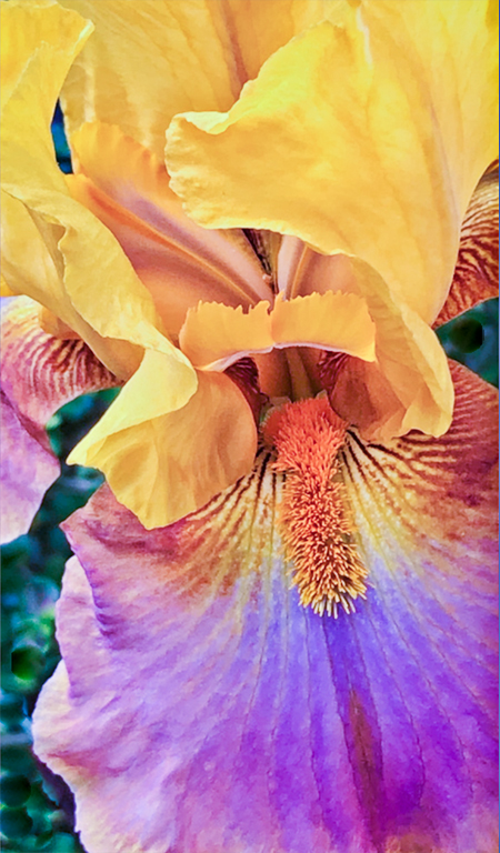
I like the way the final painting looks, as the photo original looked like the teapot was tilting slightly. Your brush strokes are so smooth that they hardly seem there, very photo-realistic to my eye. The painting smooths out the blotchy skin of the pomegranates, yet the flowers stay sharp. |
Nov 30th |
| 56 |
Nov 23 |
Comment |
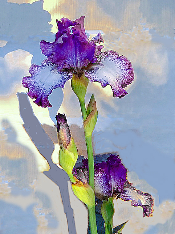
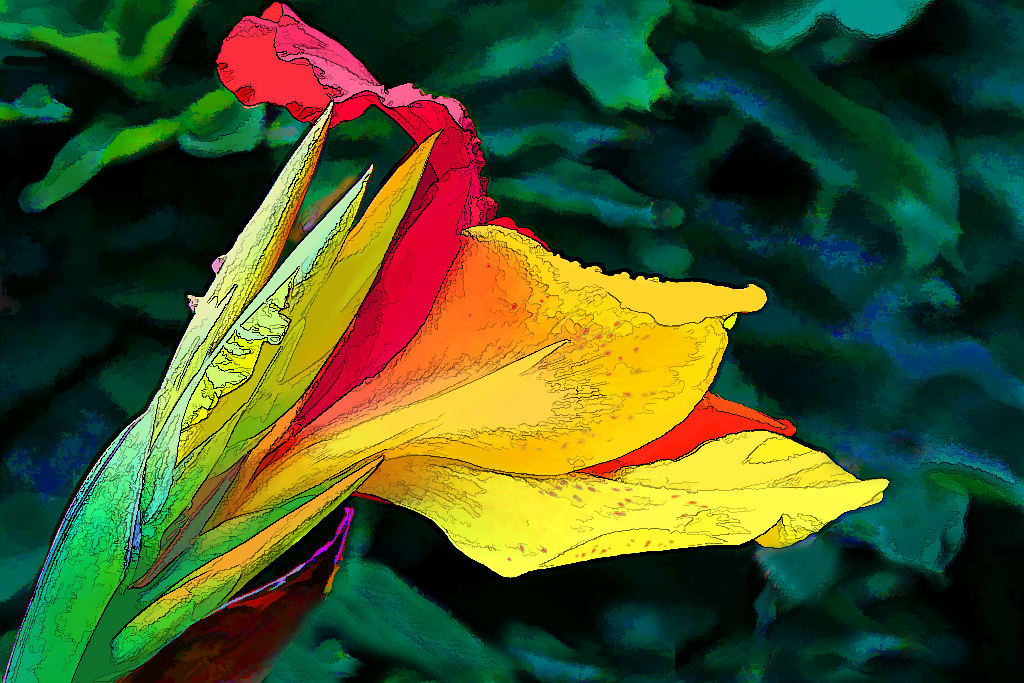
Trey, this really, really is a painting! If I had to make any suggestion it would be to slightly trim away the right side to remove the brighter area on the leaf, so it won't compete with the lily flower. But, again, great job. |
Nov 30th |
6 comments - 1 reply for Group 56
|
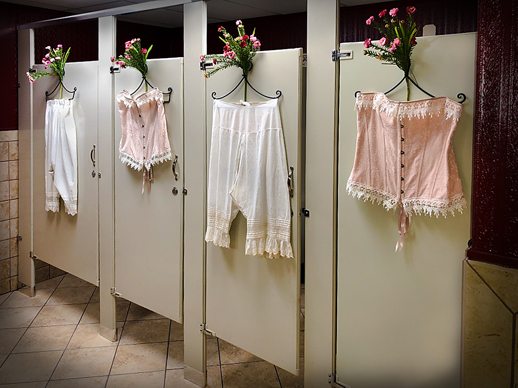
| 86 |
Nov 23 |
Comment |
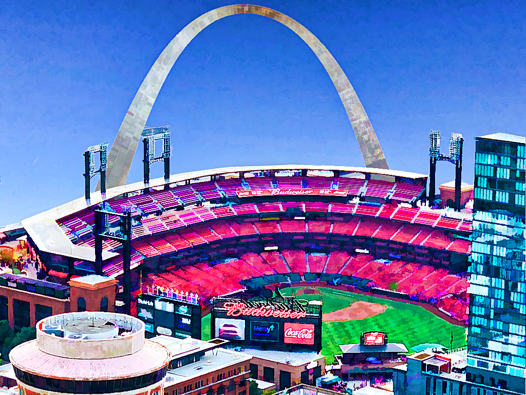
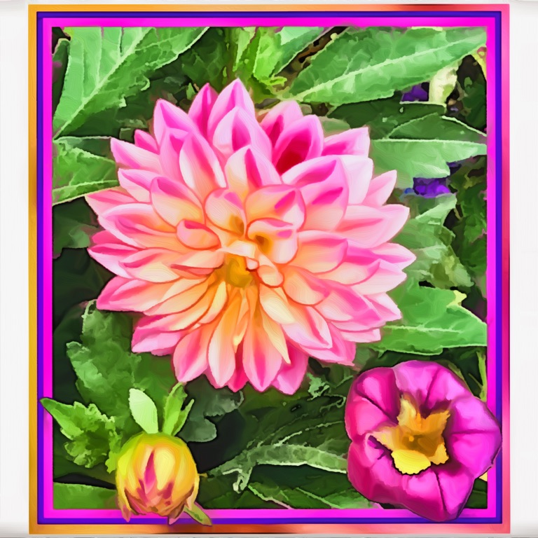
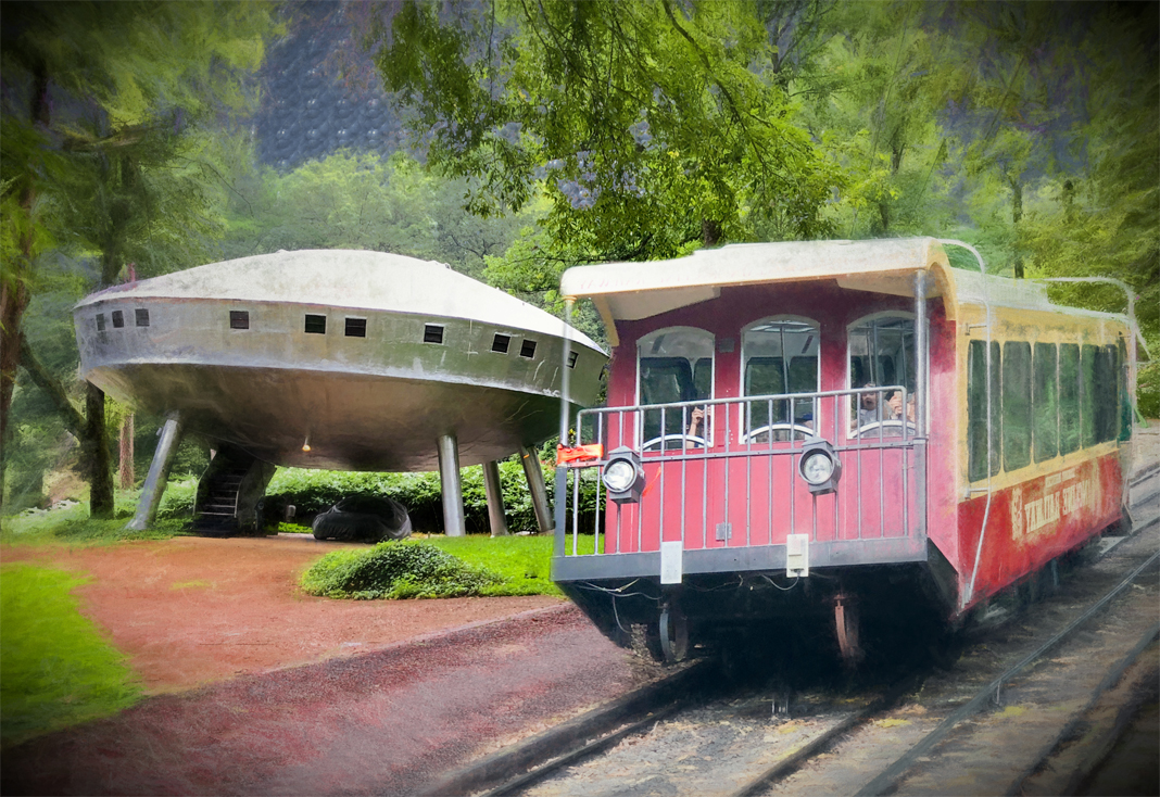
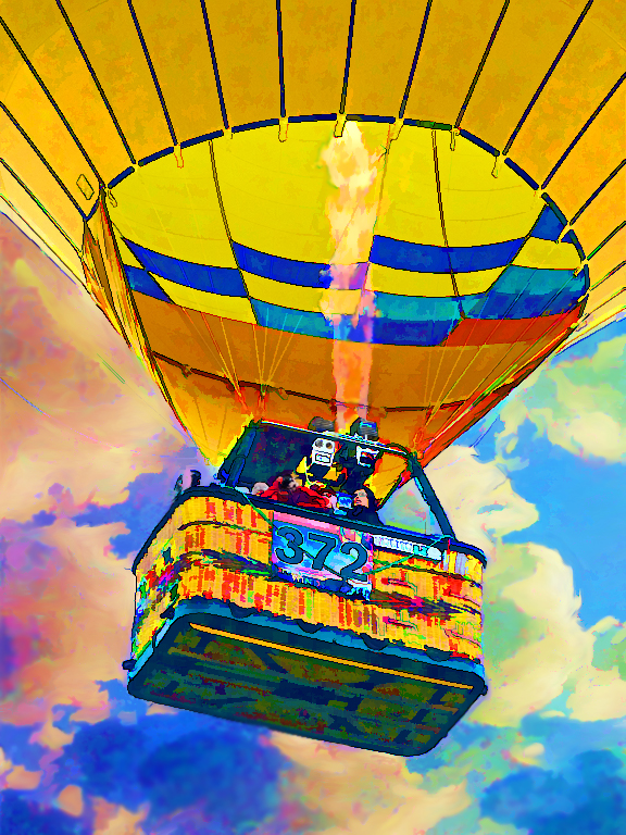
I see why you couldn't resist taking this photo, Kieu-Hanh. It really POPS! I enjoyed your seasonal shot, especially after I saw it with Steven's tone-down of the background. Price tags? I can take them or leave them. Just wondered why you preferred to keep it on (?) |
Nov 30th |
| 86 |
Nov 23 |
Reply |
I'm not sure how I'd fix the overexposed sun, unless I just filled its shape with red or orange coloring. and you're both right about the yellow sign which is distracting, now that I see it. |
Nov 30th |
| 86 |
Nov 23 |
Reply |
You're right, of course. I don't know why I was in such a hurry that I didn't notice the leftover parts of what I had cloned out. Now I can't stop seeing those smears and dots. |
Nov 30th |
| 86 |
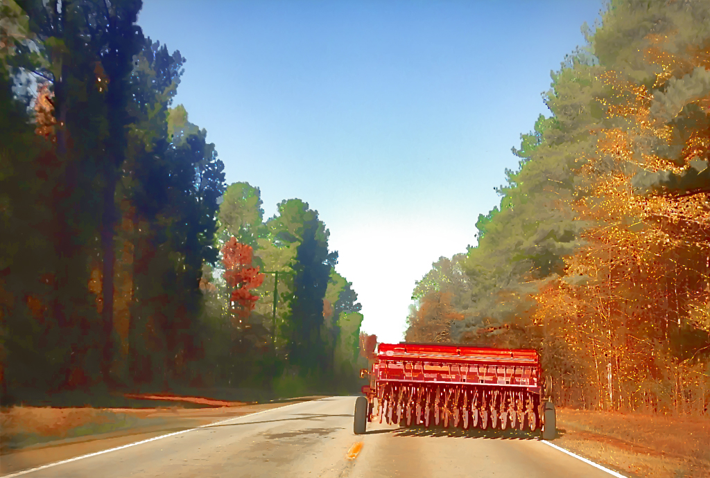
Nov 23 |
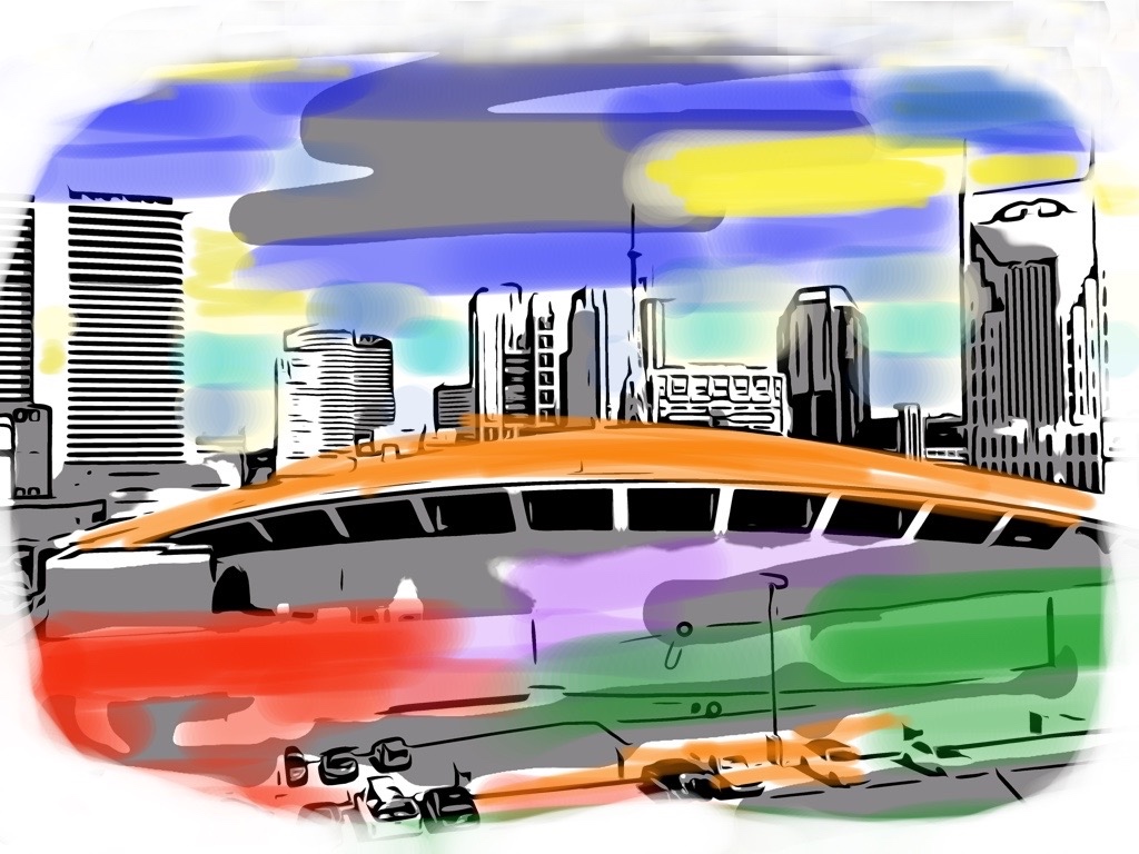
Reply |
I wouldn't mind adding just a little more of the road below, but I was trying to crop to a certain rectangular shape and a lot of the road just didn't look good to me with all the lines. I was trying to get rid of them and show more sky. |
Nov 30th |
| 86 |
Nov 23 |
Reply |
Yes, I should definitely remove that sign. Thanks, Ruth! |
Nov 30th |
| 86 |
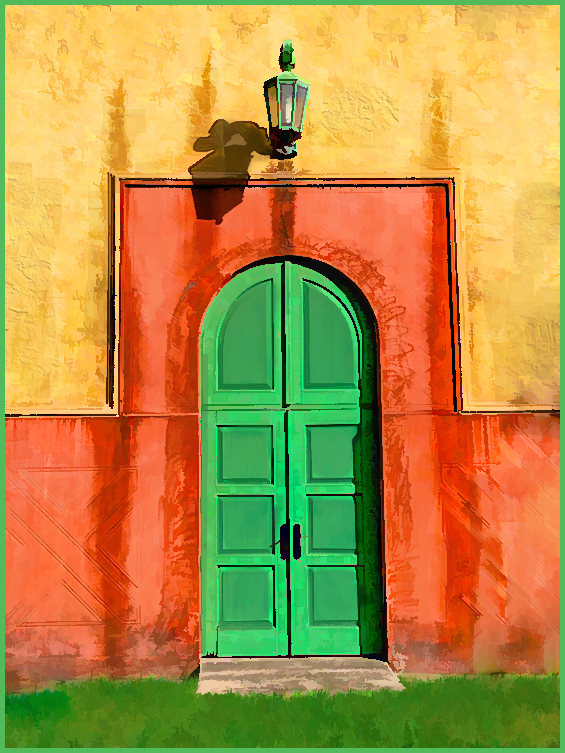
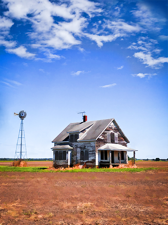
Nov 23 |
Comment |
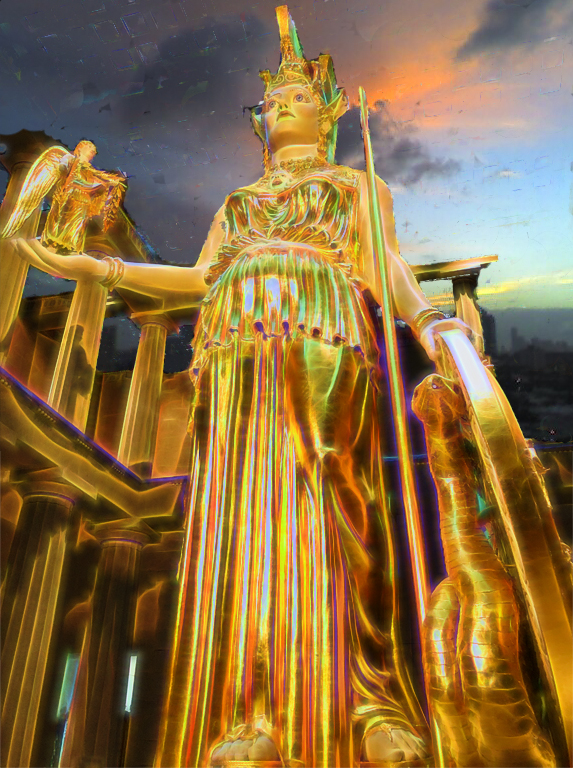
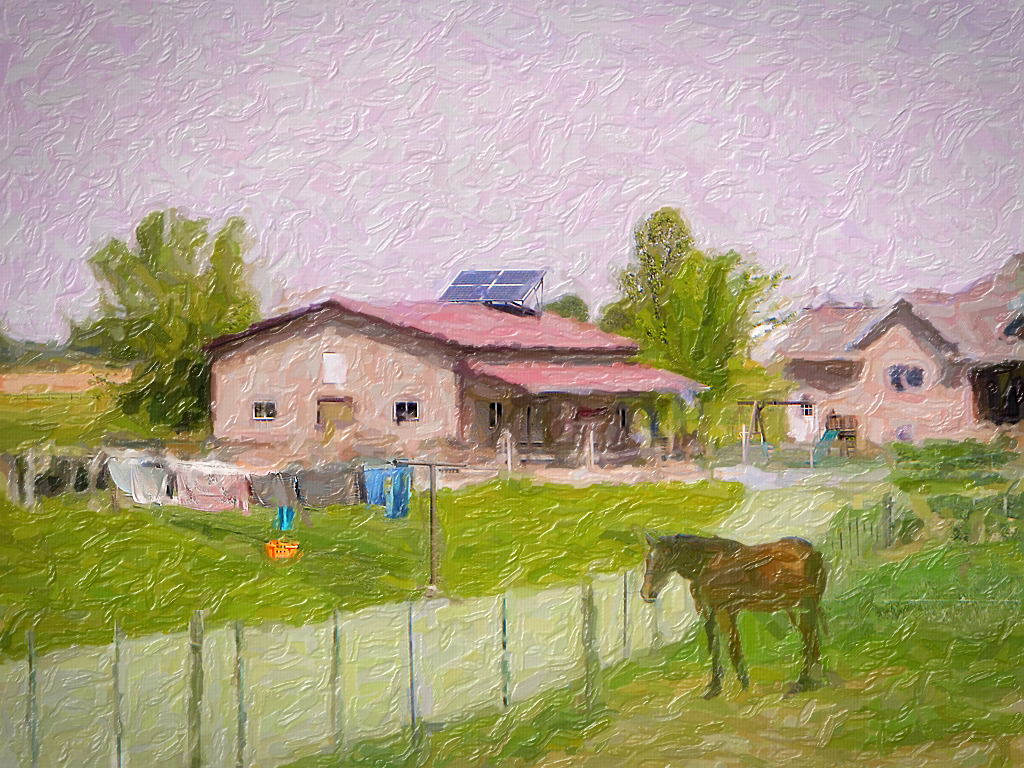
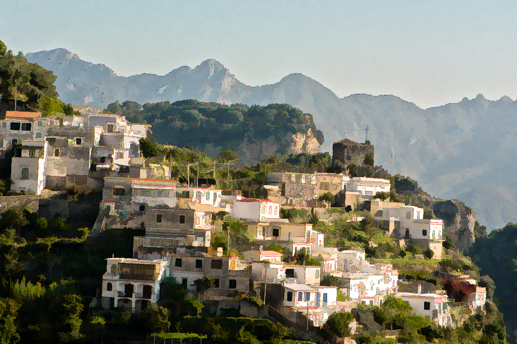
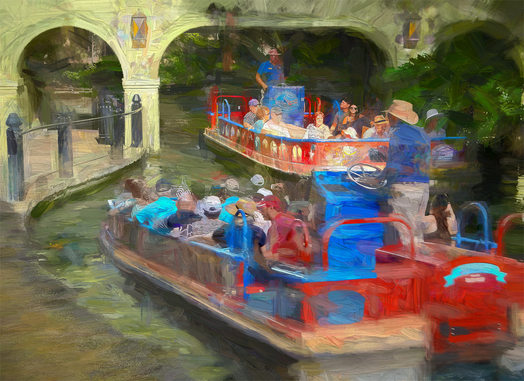
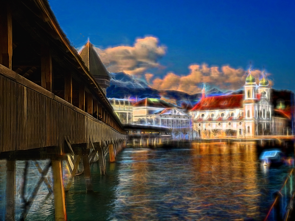
I am glad you posted the "overall view" image, which makes me appreciate even more the way you selected one specimen of the statues to focus attention on. I think the only thing I would add is a slight vignette in the upper corners. |
Nov 30th |
| 86 |
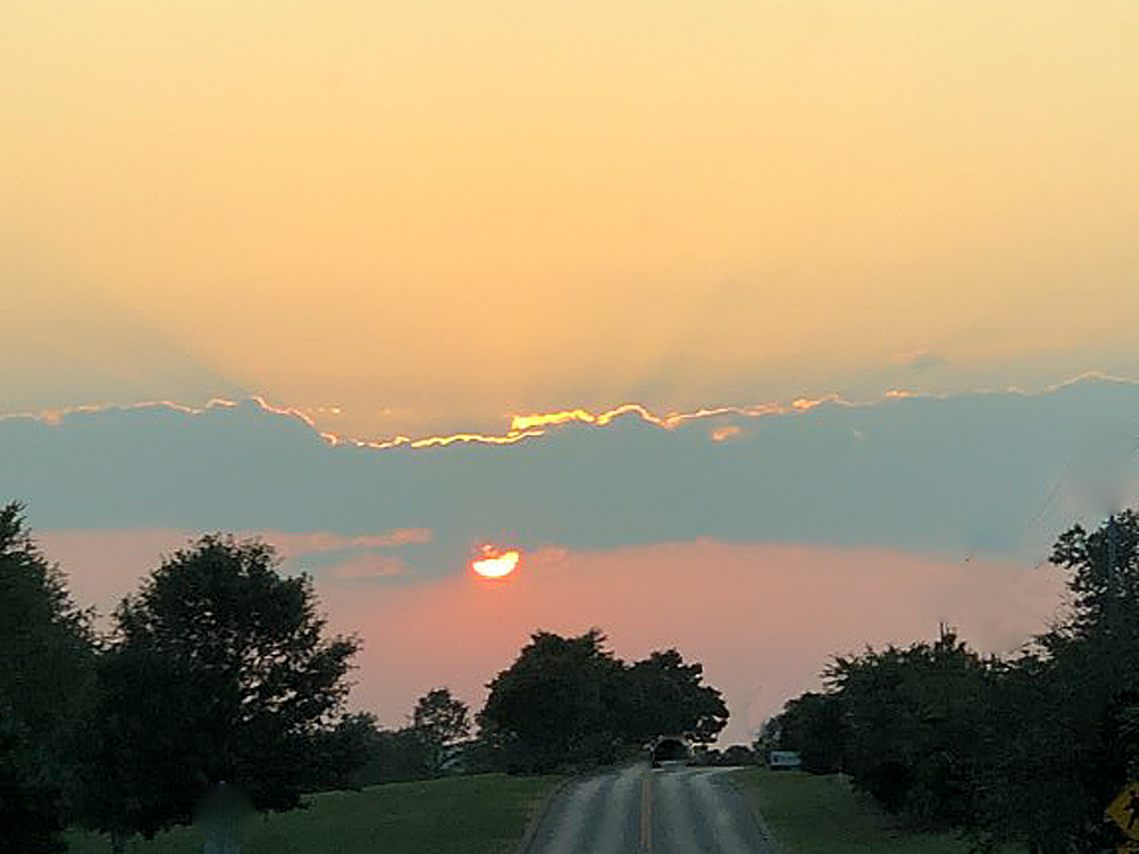
Nov 23 |
Comment |
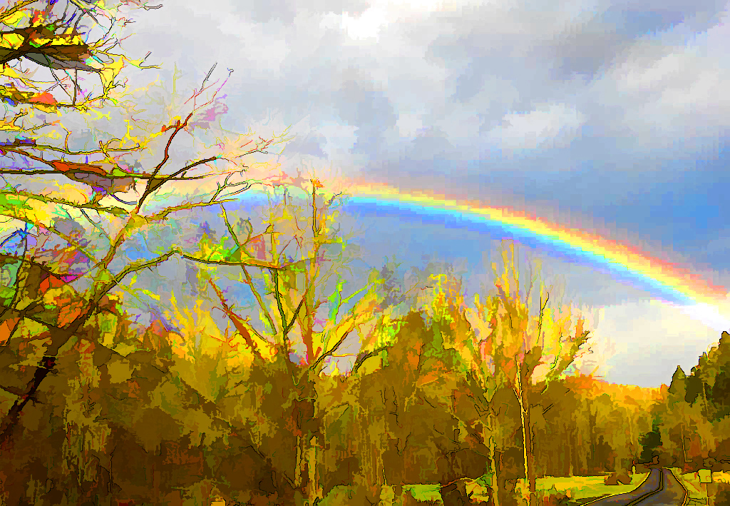
You captured those "God rays" coming down from the clouds very well and they set off the dark clouds very well. This would even look nice in black and white, since it's nearly there. |
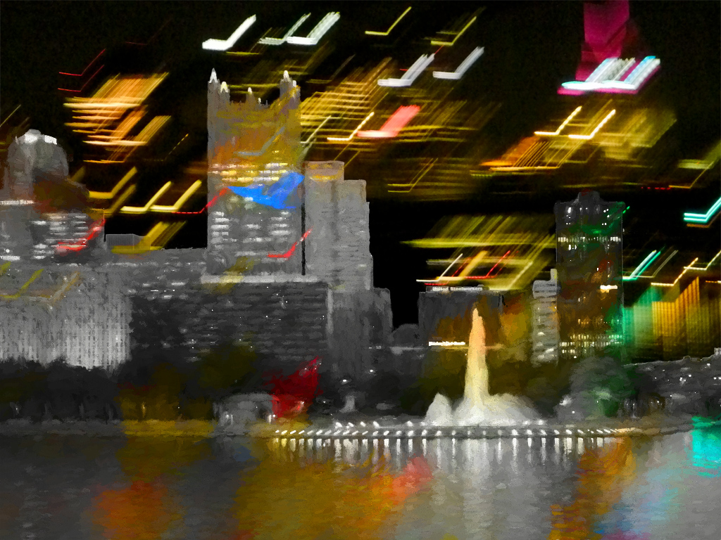
Nov 30th |
| 86 |
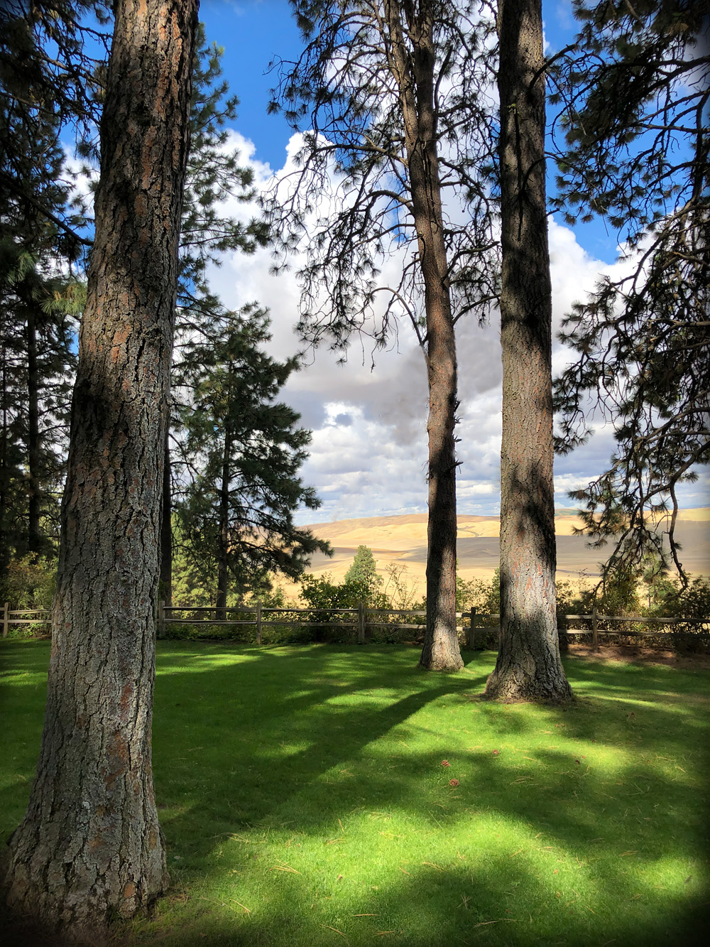
Nov 23 |
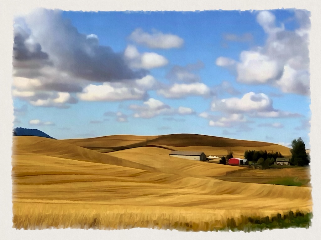
Comment |
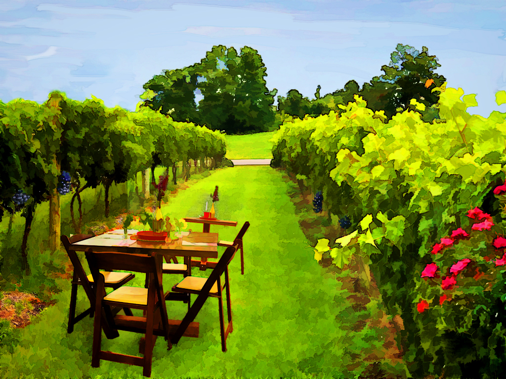
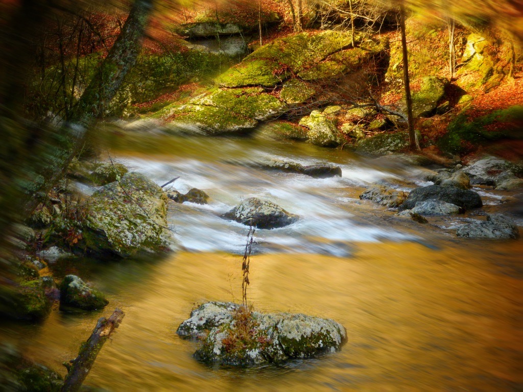
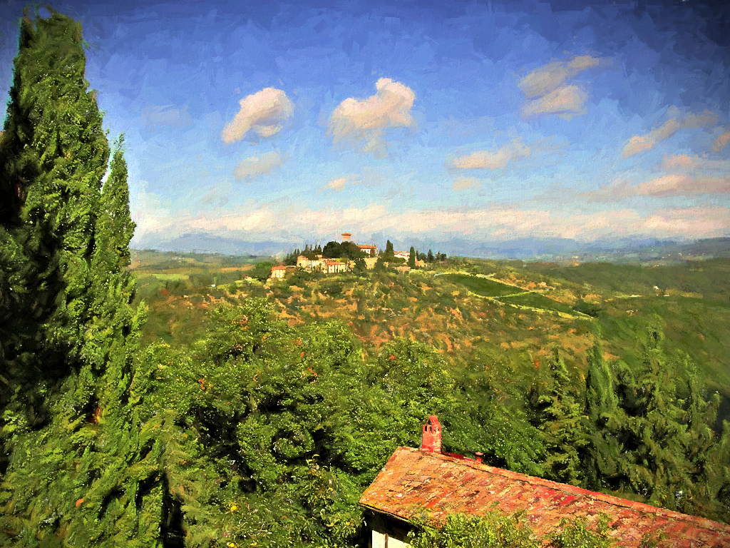
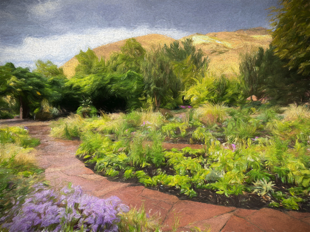
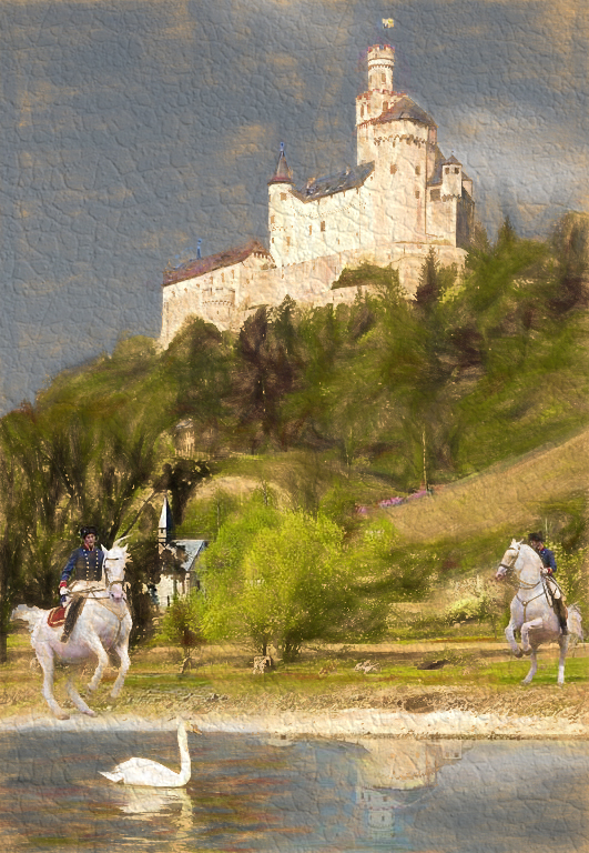
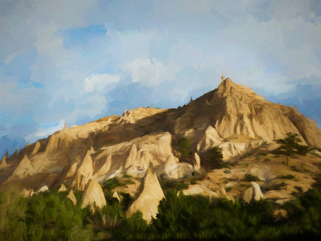
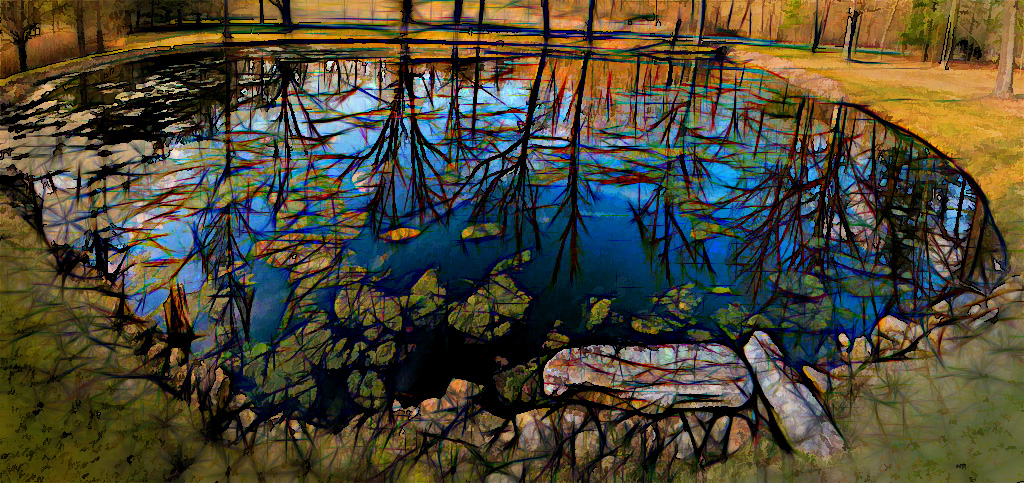
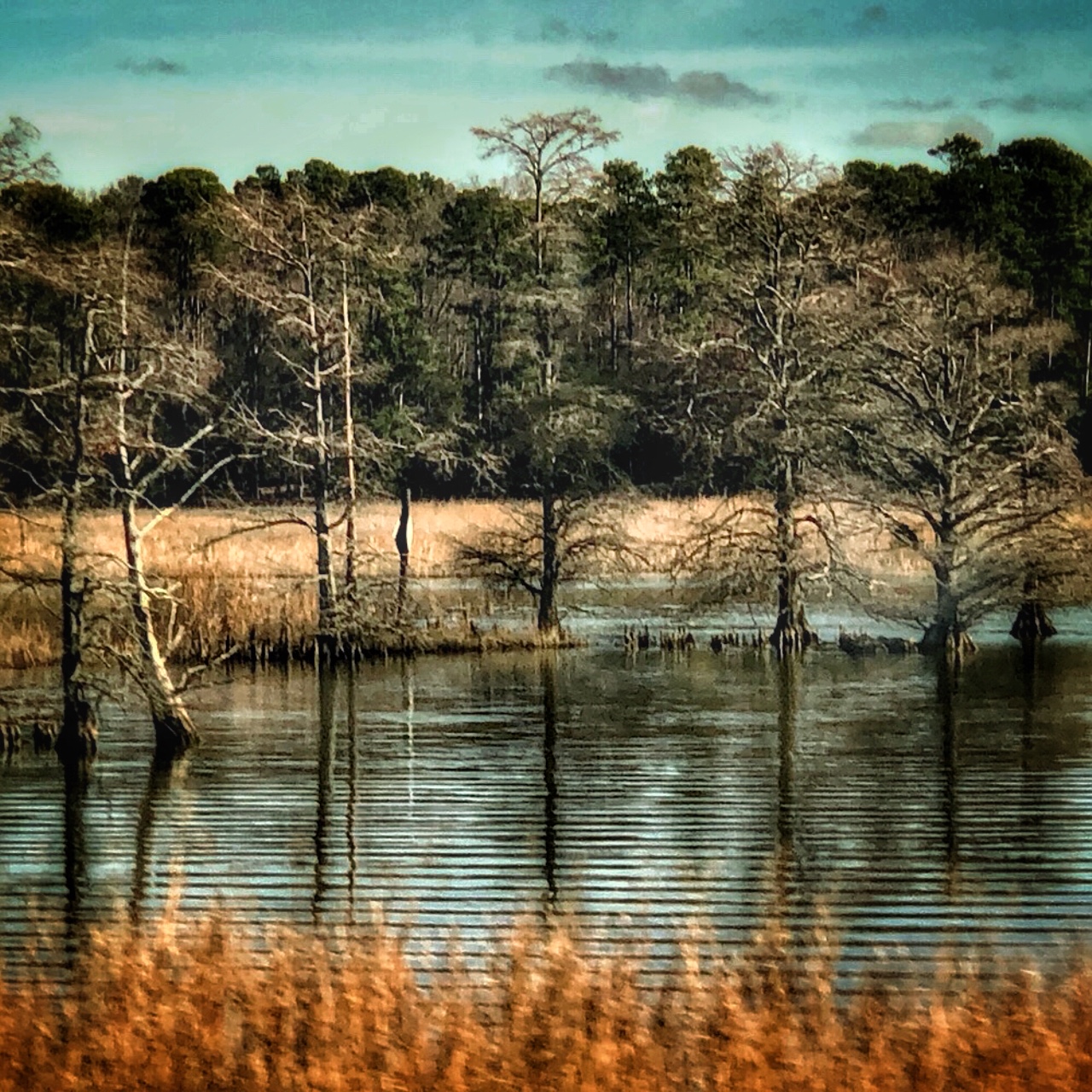
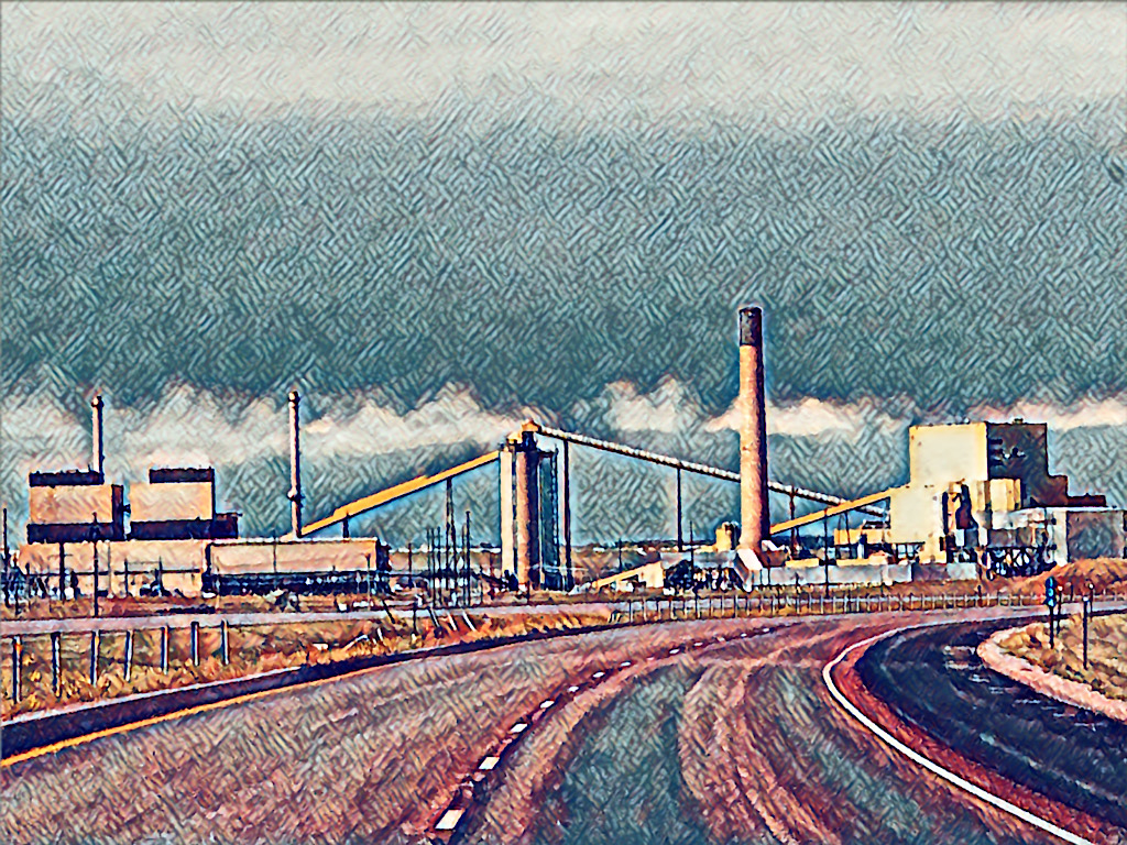
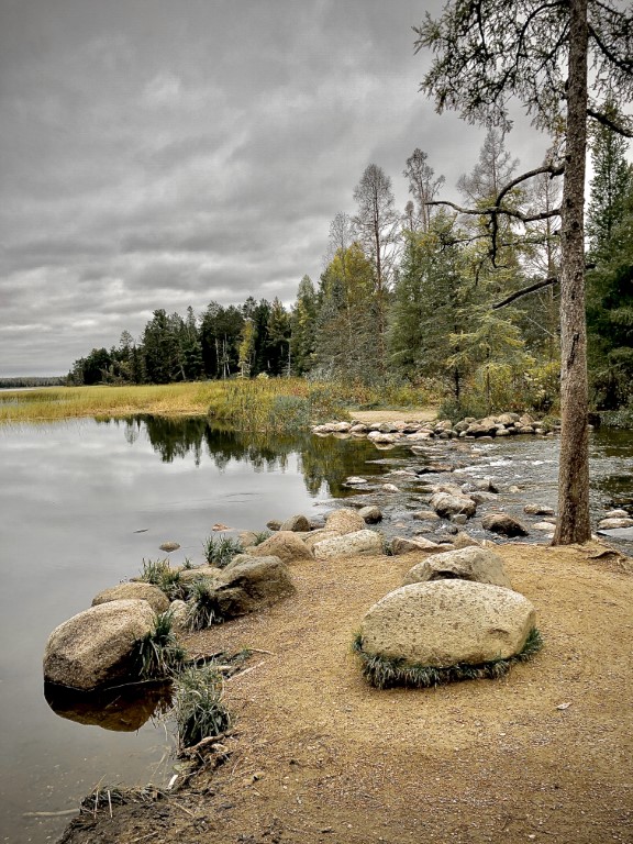
I like this curve and the entire peaceful scene. You did well removing distracting elements that would have taken away from that. I agree with Steven that a little more sky would have added some "breathing space", but it might have altered the shape of the image. The colors on the big hill/little mountain reflect well. Since some trees seem to be changing color, it might be nice to work on the leaves a little to bring up the colors a bit, as they seem lost in the browns behind them. |
Nov 30th |
| 86 |
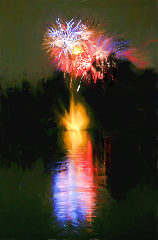
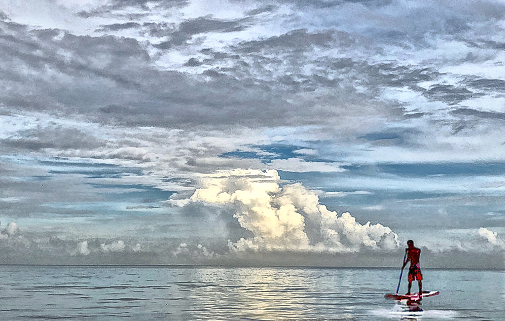
Nov 23 |
Comment |
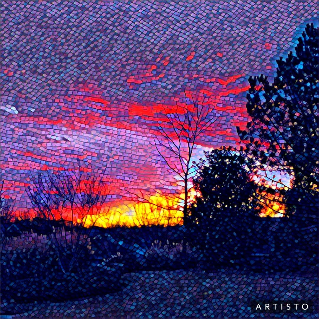
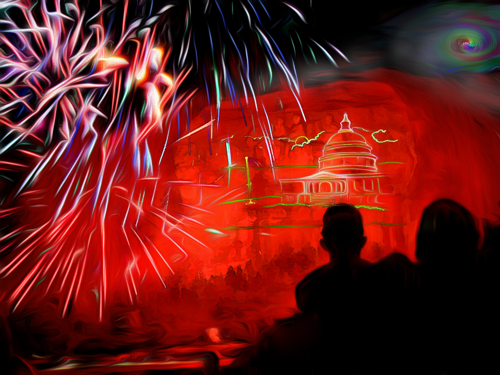
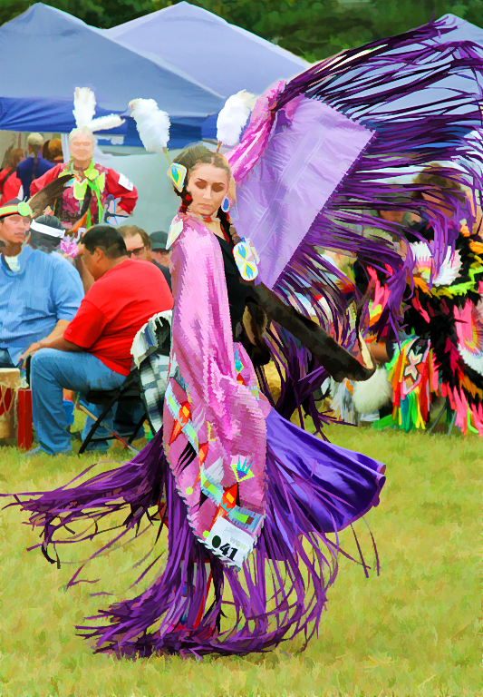
The sunrise colors, while "punched-up" appearing, feel to me like they were real, since that's what our eyes usually expect to see and what we like so much about sunrises and sunsets. I even like the natural blue-grey at the top of the original which keeps the eye in the photo--although cropping it off does give more size emphasis to the people in the foreground. I think I would prefer to keep some of it at the top and trim off some black at the bottom. (The variegated ombre streaks of color remind me of a blanket.) |
Nov 30th |
5 comments - 4 replies for Group 86
|
11 comments - 5 replies Total
|