|
| Group |
Round |
C/R |
Comment |
Date |
Image |
| 56 |
Jul 23 |
Comment |
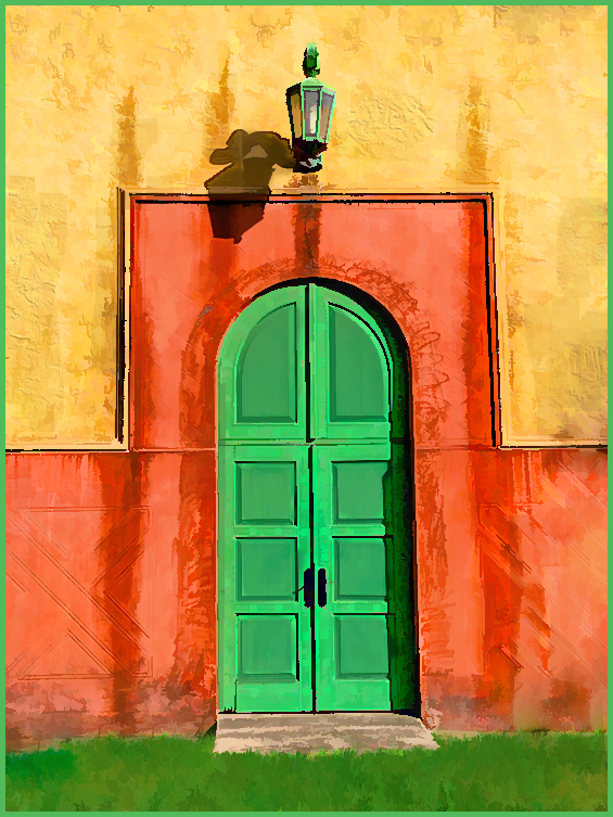
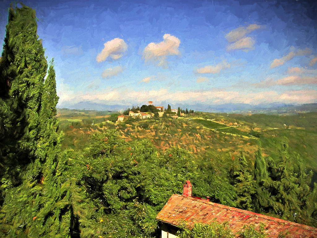
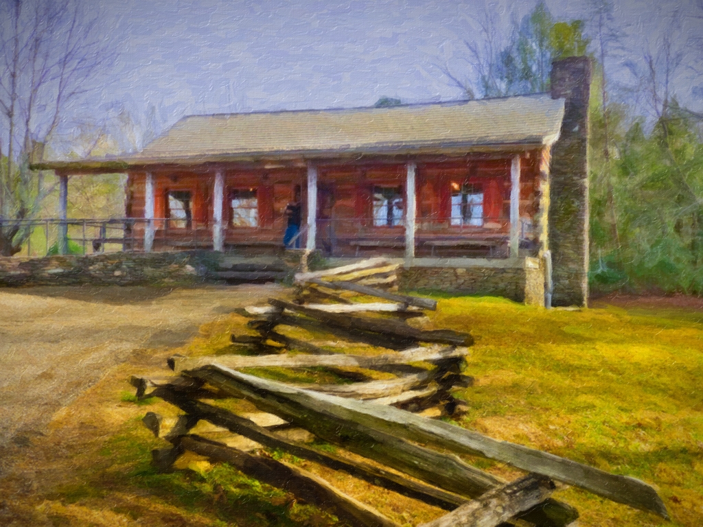
While your original shot was nice, it was a tad too dark, even with the brighter sky. Your final painting really plays-up the sugar shack as a focus and keeps the eye from wandering away too much. The snow, woodpile and piney-type of tree suits this subject better than the stark tree trunks lining the original, to make us think of a cooler season while it's yet a super-hot summer all over. |
Jul 30th |
| 56 |
Jul 23 |
Comment |
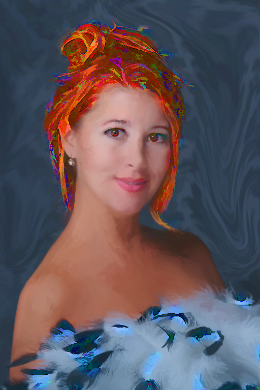
I didn't realize it was a potato. It could pass for a jicama or other smooth root veggie. You'll have to find a different potato with more "eyes" and dents. OK, now you've made me hungry. Seriously, it is a really nice job of painting and interesting to hear how/why you made the choices you did (leaving out the pestle, changing the background, etc.) You put a lot of thought into this work as well as deft strokes! |
Jul 30th |
| 56 |
Jul 23 |
Comment |
Great composition, Gerhard! The background of the original was also a wonderful image, and I appreciate how you changed the elephant and baby on the right so the little one doesn't block its parent. This is a very colorful and engaging painting! |
Jul 30th |
| 56 |
Jul 23 |
Comment |
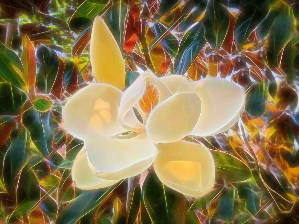
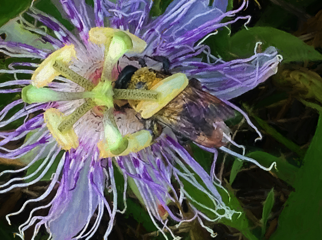
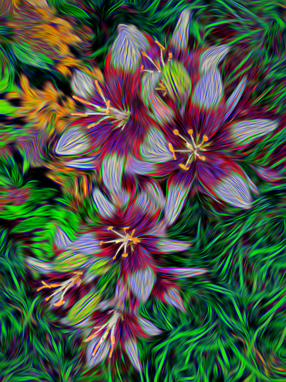
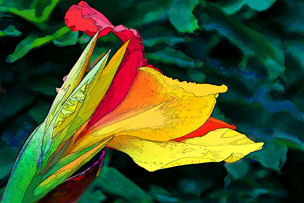
Your blossoms look like 3 dancers whirling through the stage in frilly dresses (more than eggs!) I would never have thought these were poppies. A delightful painting, for sure. |
Jul 30th |
| 56 |
Jul 23 |
Reply |
Thanks for your ideas about the grass, Cindy. It does appear blotchy, like camoflage, the way I left it. |
Jul 30th |
| 56 |
Jul 23 |
Reply |
Thanks for the straightening. It does look better your way. |
Jul 30th |
| 56 |
Jul 23 |
Comment |
Thanks, all for your helpful comments. I'll see what I can do to paint the grass better when I rework this. And Martha's version did improve the straightness. I'm glad you enjoyed the bright colors. |
Jul 27th |
5 comments - 2 replies for Group 56
|
| 86 |
Jul 23 |
Reply |
Thanks for showing me an alternate cropping I hadn't thought of, but for this, I had to consider that I actually had TWO subjects, so I wanted to keep it horizontal to show his interaction with the boat--and not to lose its distinct shape. |
Jul 30th |
| 86 |
Jul 23 |
Comment |
The subject and the cropping really enhance the image and since your intent was to show the subject looking out to the harbor, your choice of silhouetting the statue is entirely appropriate. I do believe Steven is going to convert our group to monochrome (ha) but it sounds like this would also be an appropriate way to handle your shot, just for an alternate look. |
Jul 30th |
| 86 |
Jul 23 |
Comment |
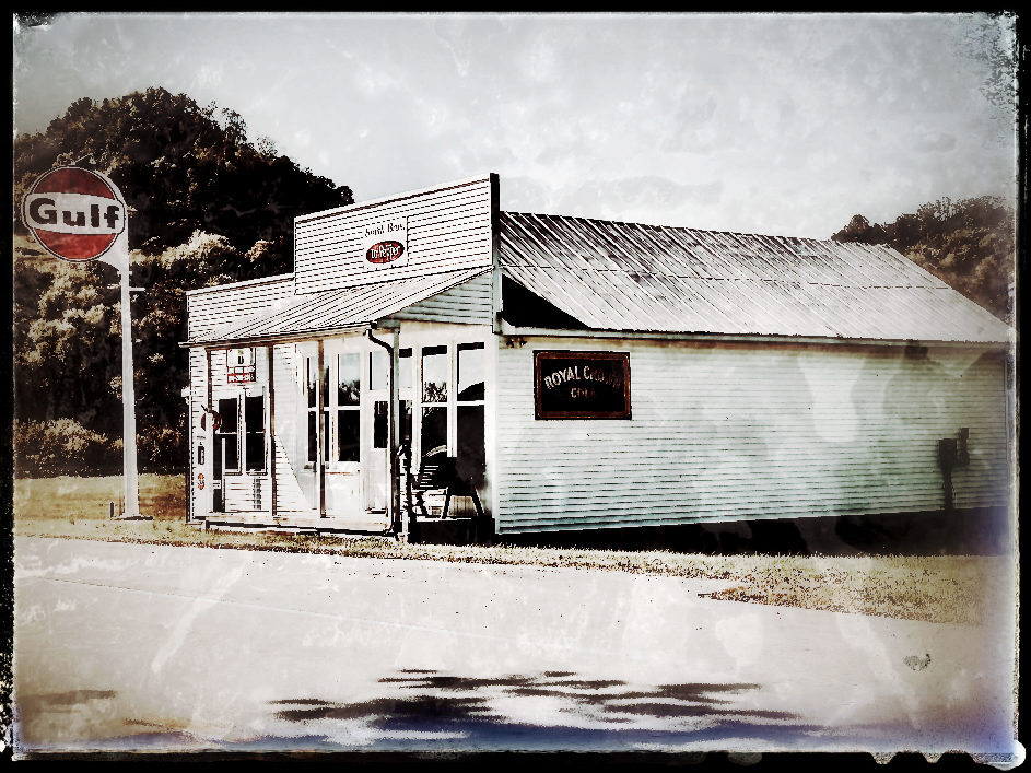
I know my older iPhone would not have made such a brilliant looking original shot, but sometimes I am surprised at what it still captures in barely-existing light situations. I'm surprised you didn't try an app on this to attempt to correct the leaning tower, which was the first impression I got and what made it look less "real". Thanks for the added camera info and I think it looks more believable after the adjustments Kieu-Hanh made. You certainly have seen some amazing places. |
Jul 30th |
| 86 |
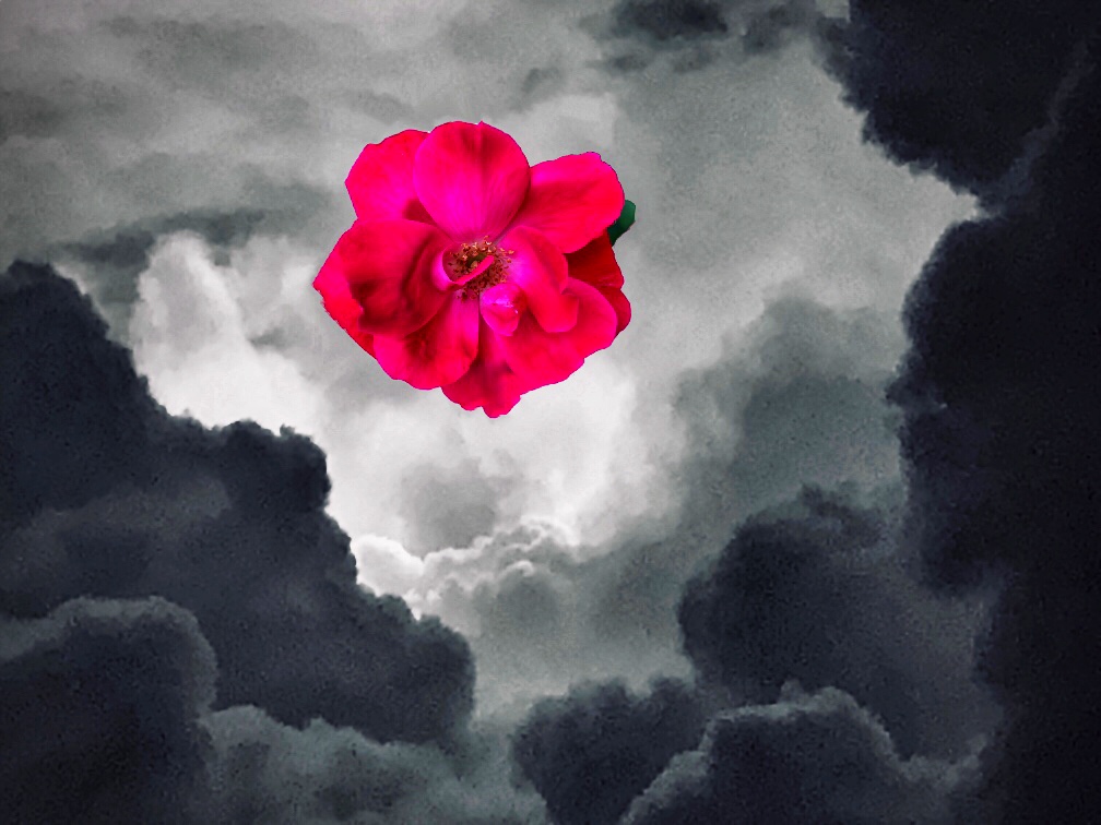
Jul 23 |
Comment |
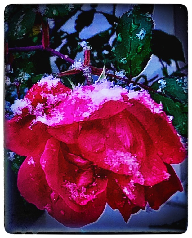
Ditto to Kieu-Hanh's comments. While the sunset gave extra color to the rose, it also lost a lot in shadow and had an overall muddied cast instead of a soft brighter look remniscent of a sunset. In Steven's B&W version, there is more detail in the interesting outer petals as you shot them. |
Jul 30th |
| 86 |
Jul 23 |
Comment |
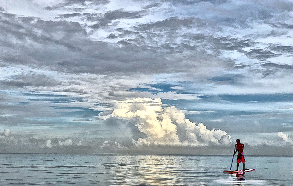
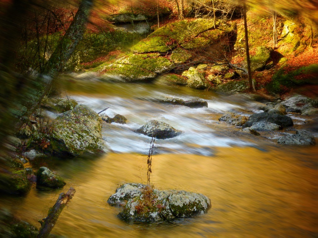
My first impression was that I was viewing cloud level from an airplane window, before I realized the "clouds" were in fact: foam on the water. I think it was because you got down to the level of the surface. Snapseed was a really good choice because it made me want to look at it, more than the somewhat duller muddied shades in the original shot. Another thing I like about this was the diagonal angle with the shore. Well done. |
Jul 30th |
| 86 |
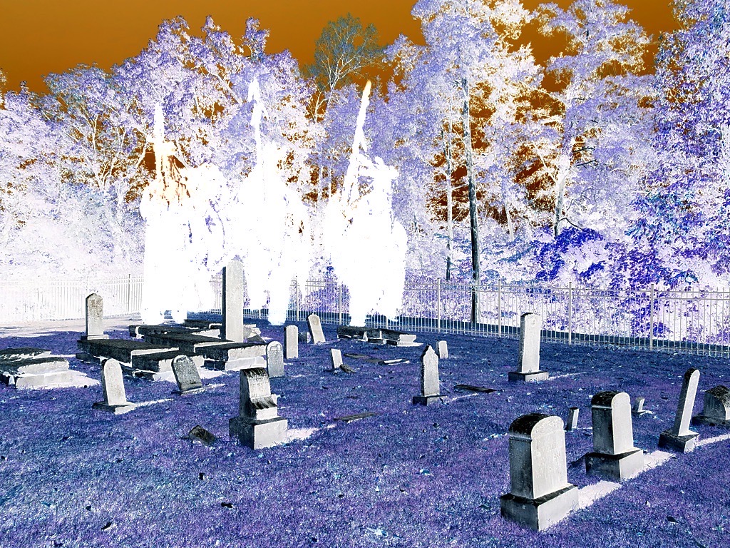
Jul 23 |
Comment |
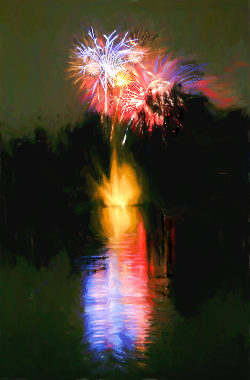
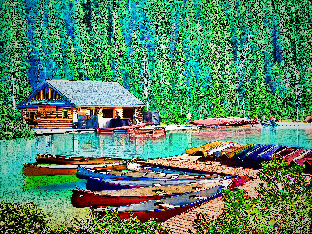
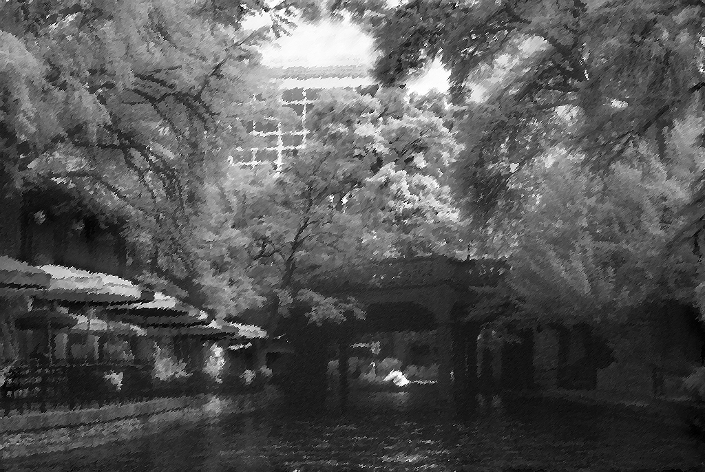
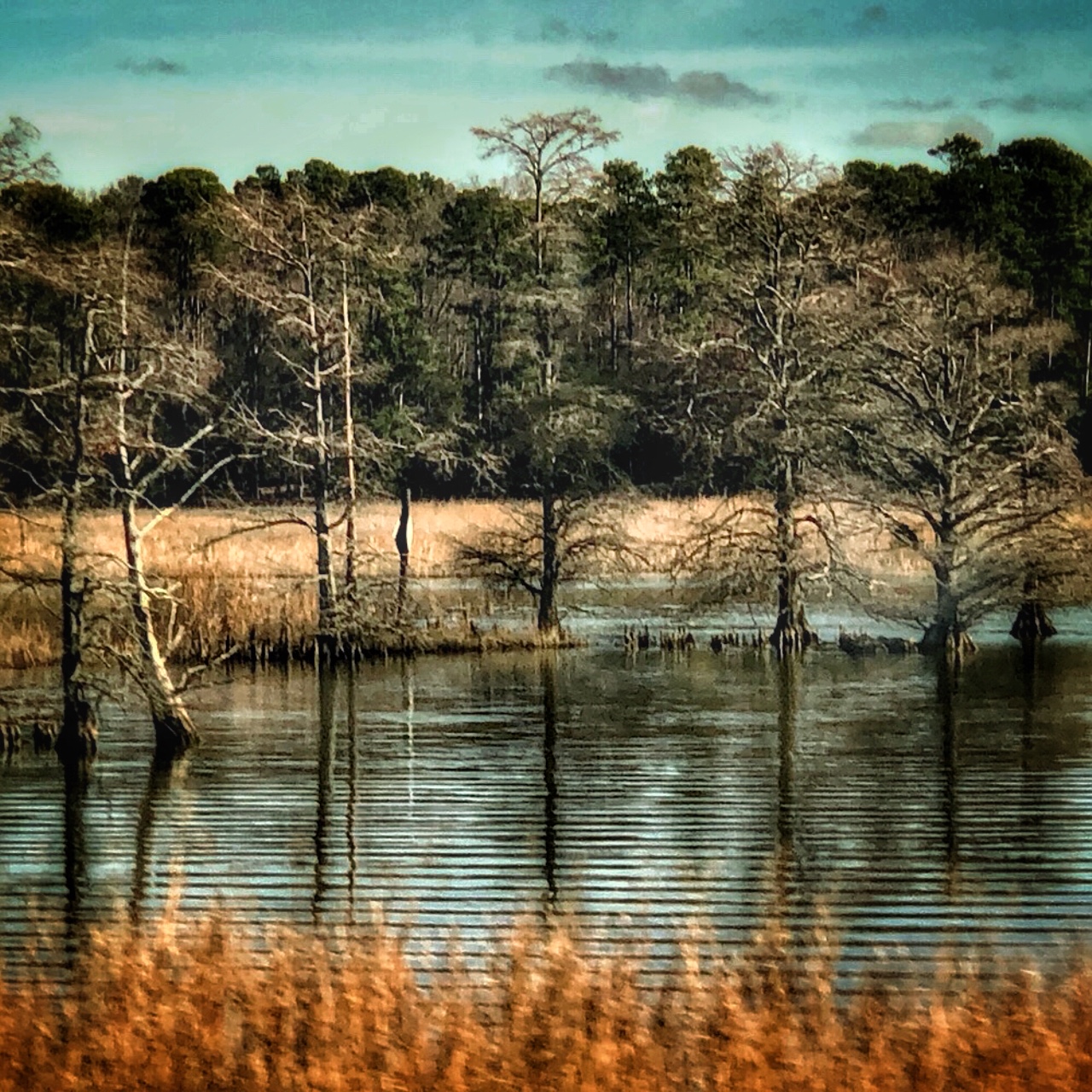
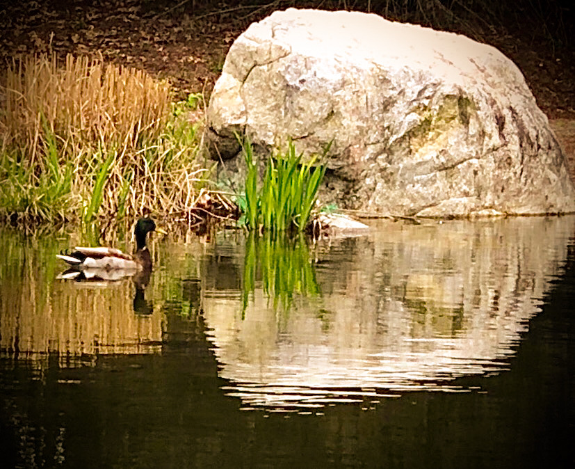
You certainly chose a peaceful spot with lovely scenery and good subject matter for your experiment with I/R on your cellphone. Since I don't recall this particular lagoon in Evanston, it looks as though I missed a nice place. I have always loved how InfraRed and Polarizing filters enhance this type of subject. It was funny how different leaves were differently affected, like the few scattered brighter bunches here and there on the edge of the darker ones. Also, thanks for adding the .dng original, so we can appreciate the entire process. And YES, I really like your shot! |
Jul 30th |
5 comments - 1 reply for Group 86
|
10 comments - 3 replies Total
|