|
| Group |
Round |
C/R |
Comment |
Date |
Image |
| 56 |
Mar 21 |
Comment |
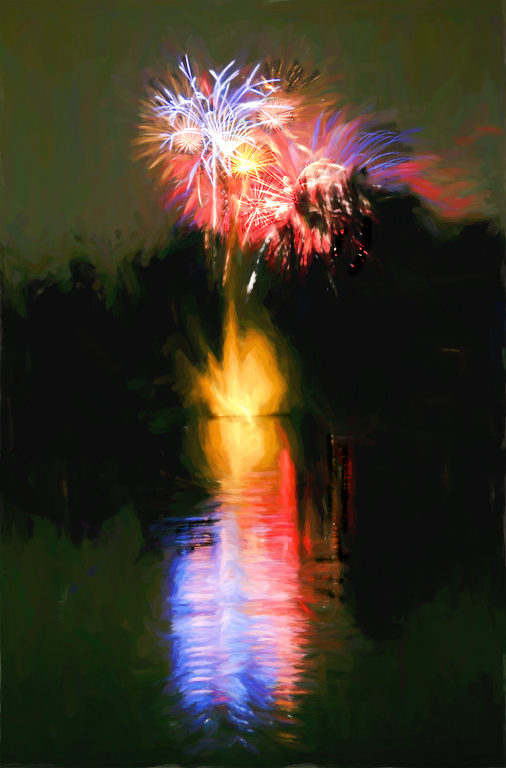
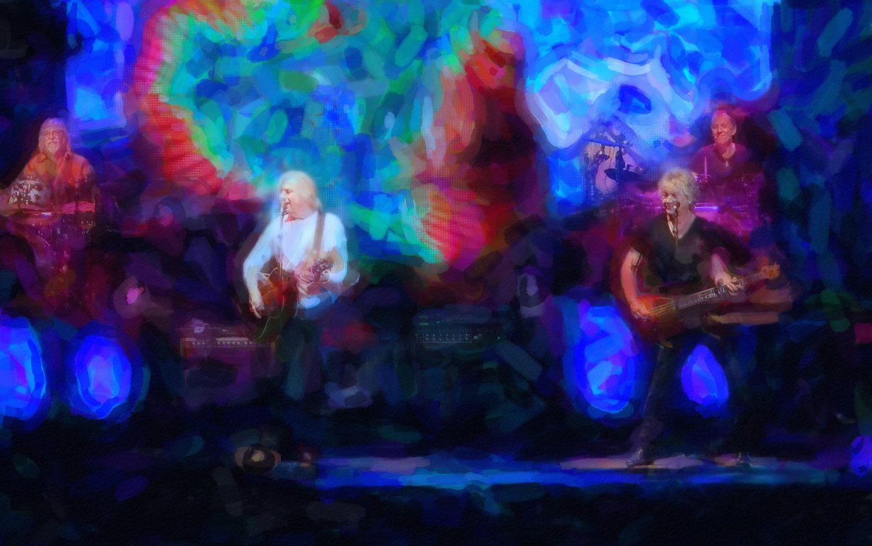
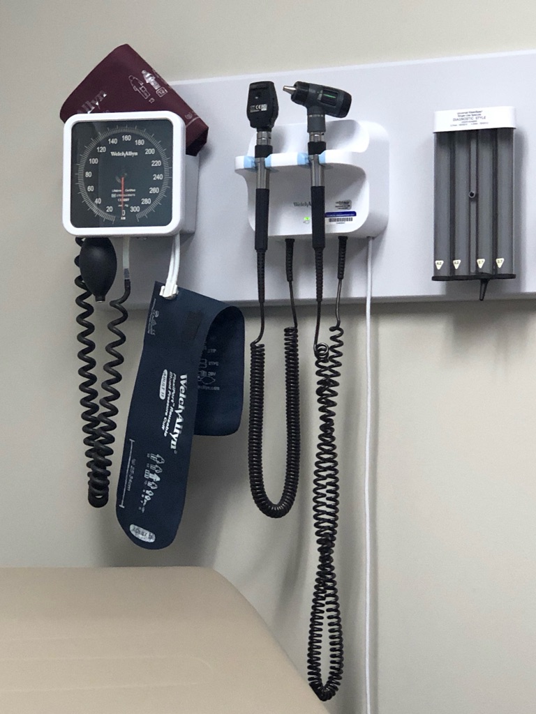
It was interesting to see how this image came together through your use of the 2nd original as a work in progress. Thanks for providing that. Clever and most appropriate title, too. I like the festive little swirls you term a veil because they add a little bit of interest beyond the instrument itself, kind of bringing back the texture from the wall in the original. |
Mar 17th |
| 56 |
Mar 21 |
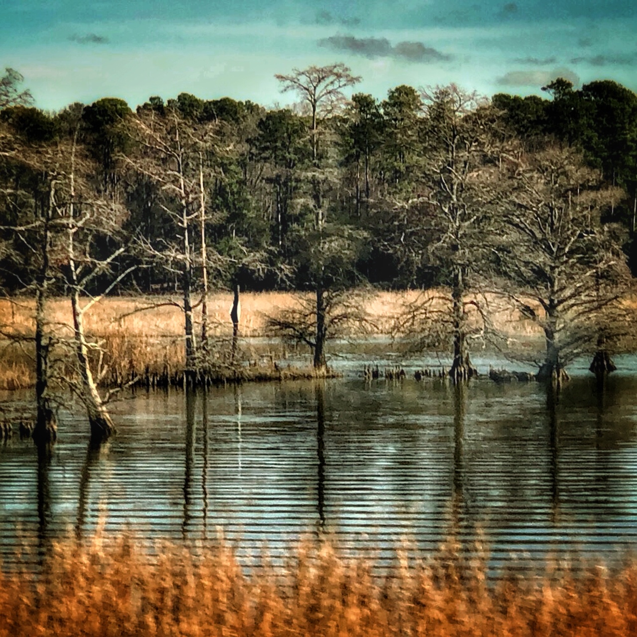
Comment |
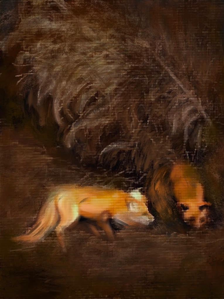
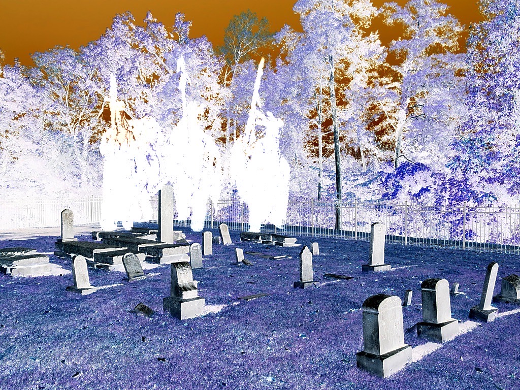
I knew where this was as soon as I saw it, as I was impressed by the unique look of this scene when we were in Maine for PSA conference some time ago. I love what you did with it, Terry, autumning-up the trees with enhanced colors that add to the reflections. Your handling of the abstract painting on this is superb! This deserves a hanging spot on a wall. |
Mar 17th |
| 56 |
Mar 21 |
Comment |
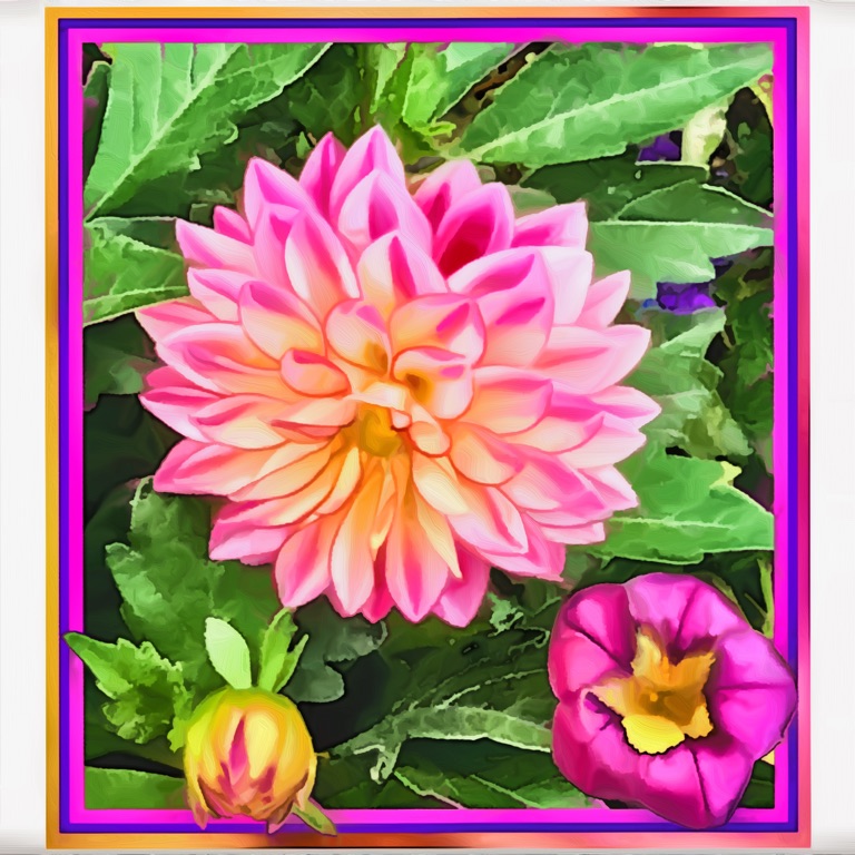
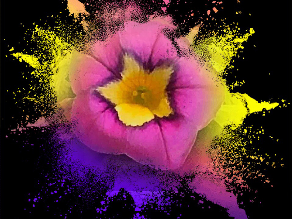
Gerhard, it's nice to see you're experimenting with new techniques and other types of subjects. The bright colors of the Protea flower don't compete with the main subject of the gorgeous and sharp bird; they nicely balance with it. What a pose, swooping tail and all! And to think: it was perfectly posed and holding still for its portrait. Even though I liked the look of that interesting bud in the original shot, you did right to keep it in the well-textured background. Good call. |
Mar 17th |
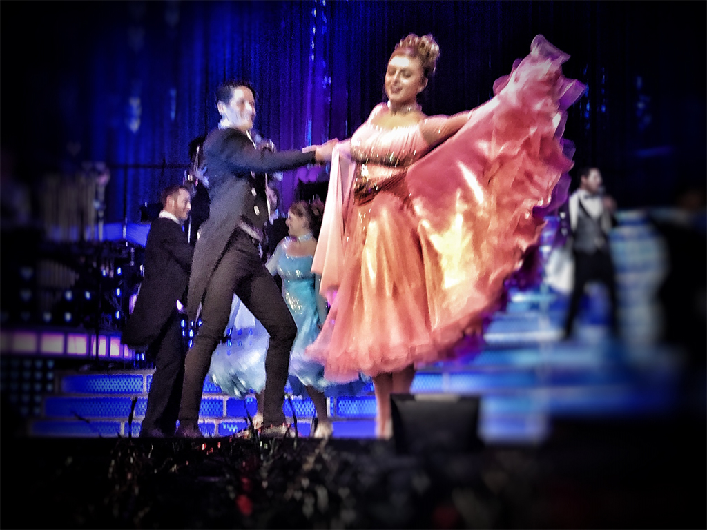
| 56 |
Mar 21 |
Comment |
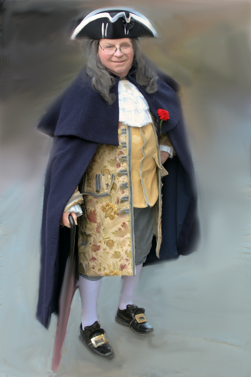
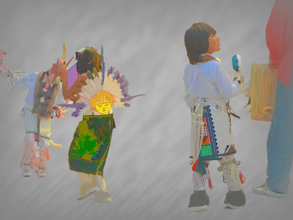
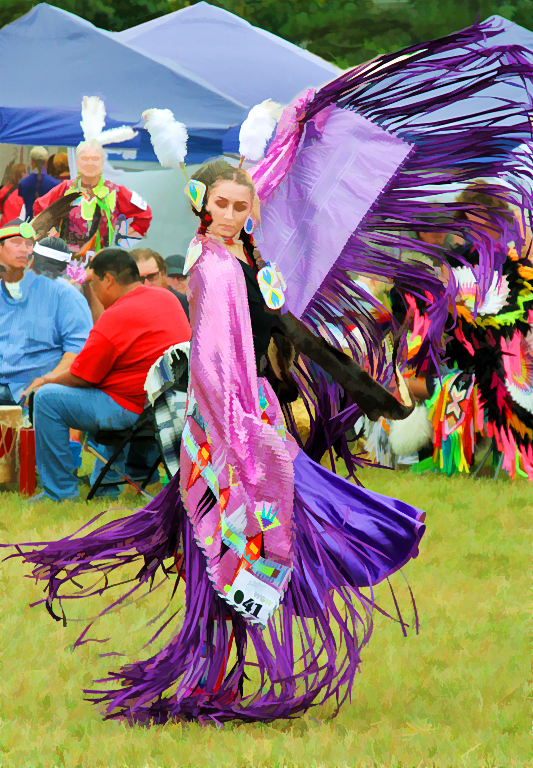
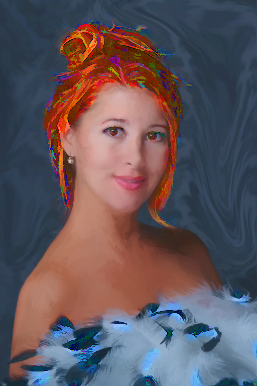
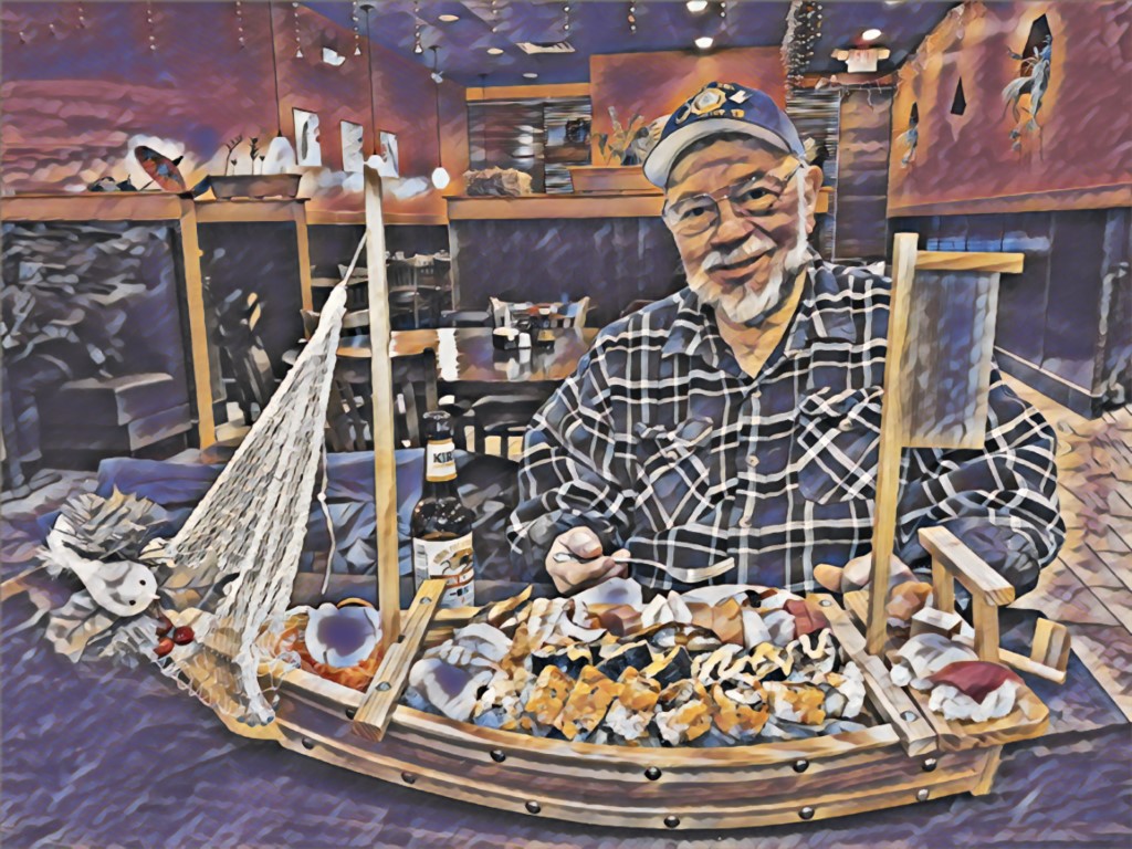
The first thing I noticed was that you had removed the background man and the second, that you changed her from seated to standing! Wow, the final image you pulled out of the great-looking original shot seems as though it took a lot of planning and work. Your changes and brush strokes created such a powerful image, Nancy! |
Mar 17th |
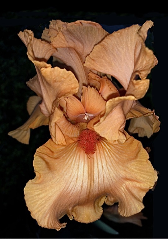
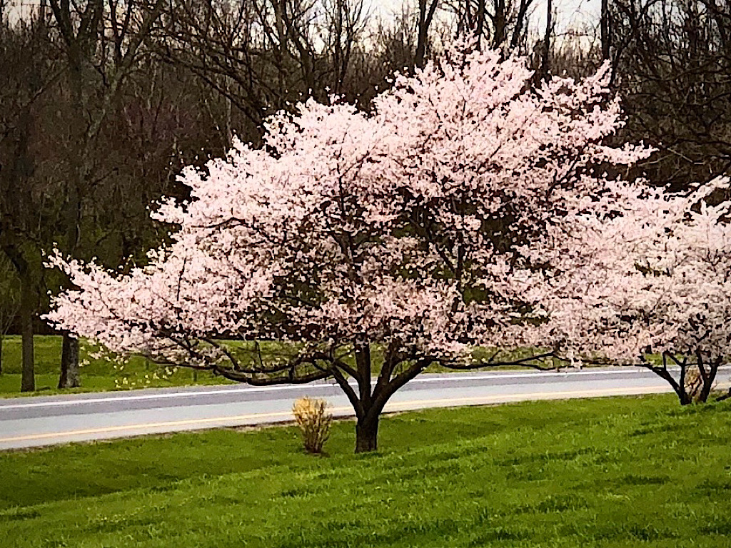
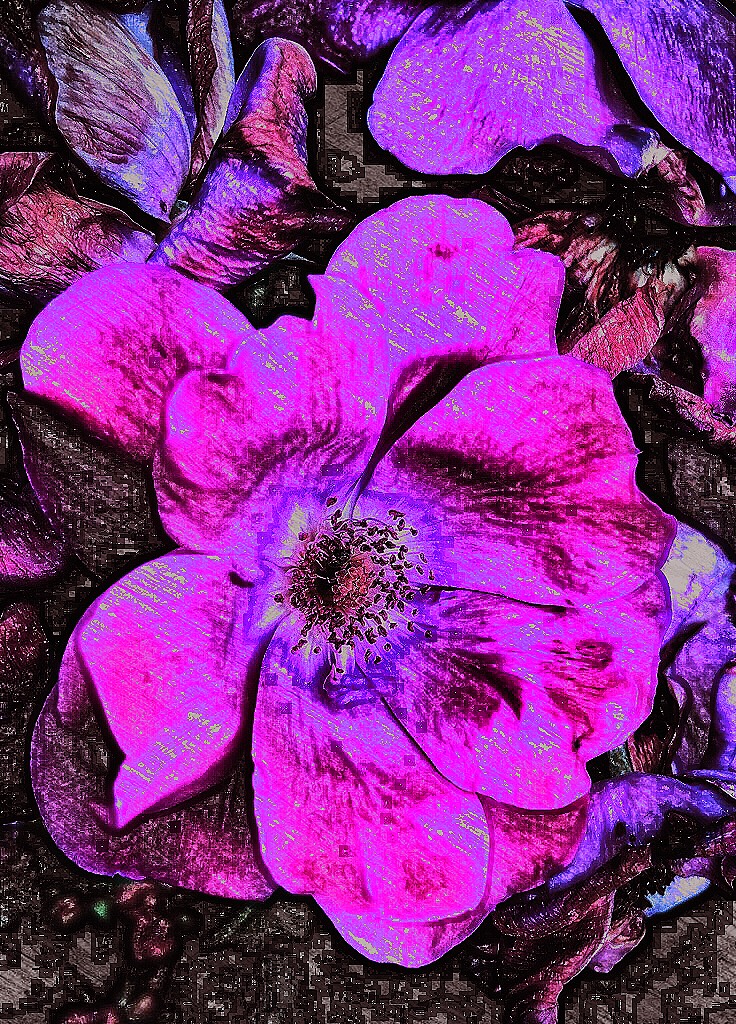
| 56 |
Mar 21 |
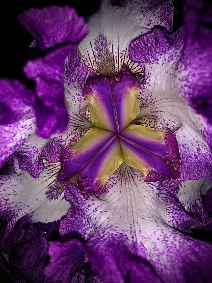
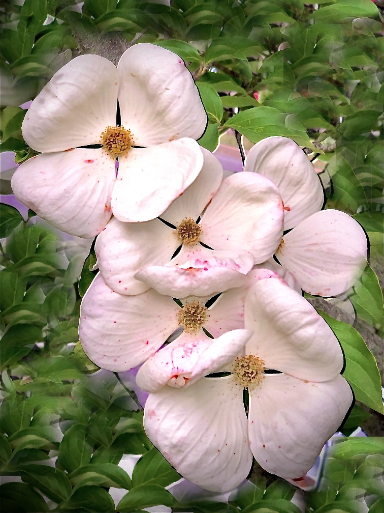
Comment |
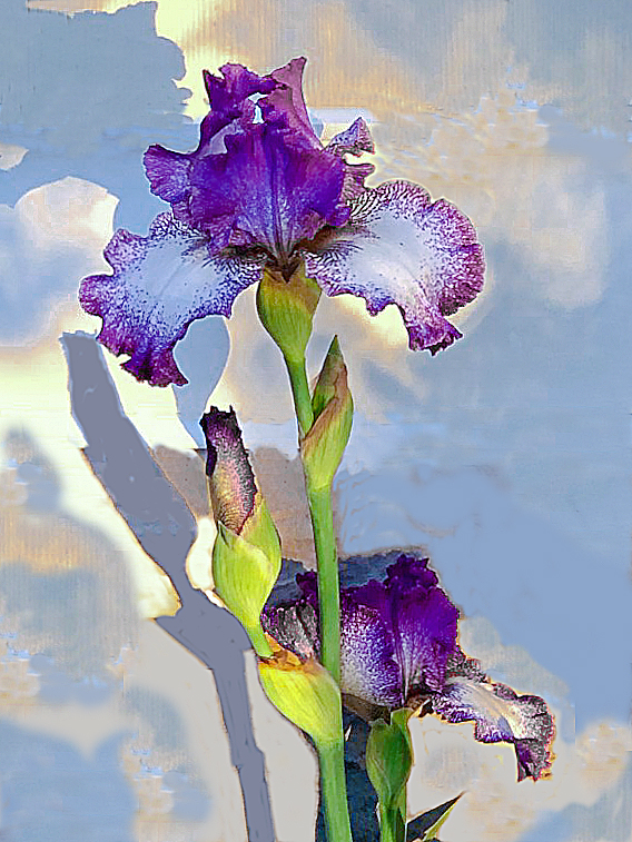
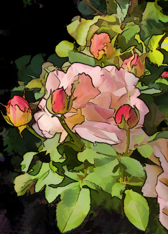
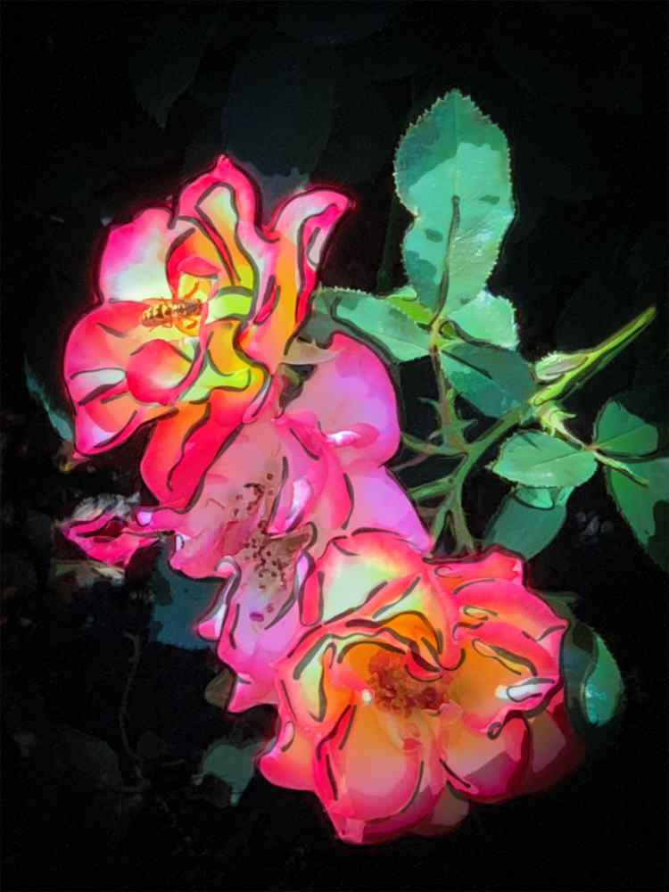
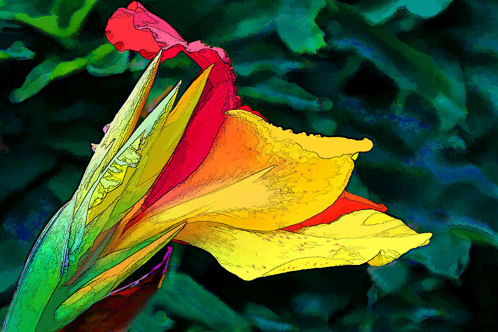
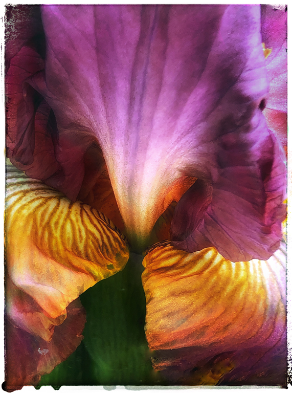
This is a beautiful image for spring. In the final image, the petals take on an almost iridescent coloring that is most attractive. The pink and white colors look so fresh and rich! |
Mar 17th |
5 comments - 0 replies for Group 56
|
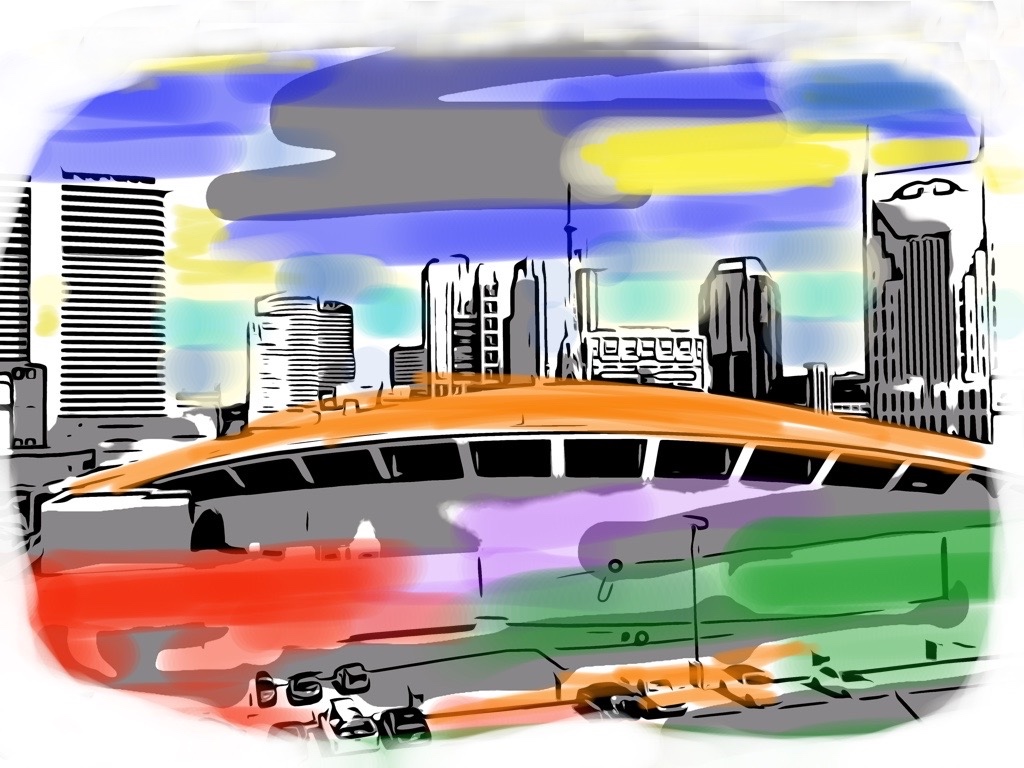
| 86 |
Mar 21 |
Comment |
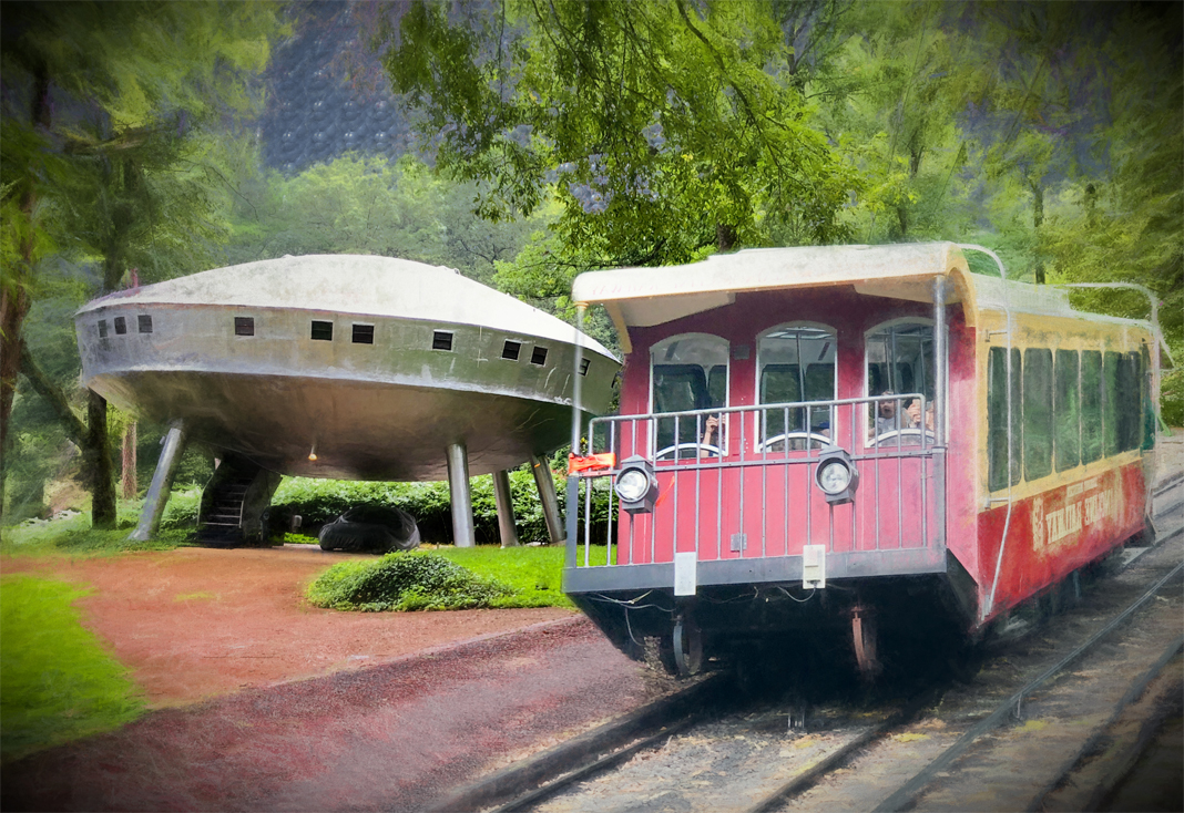
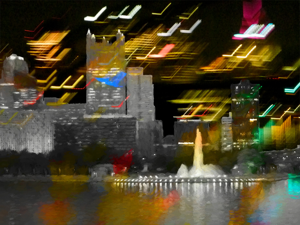
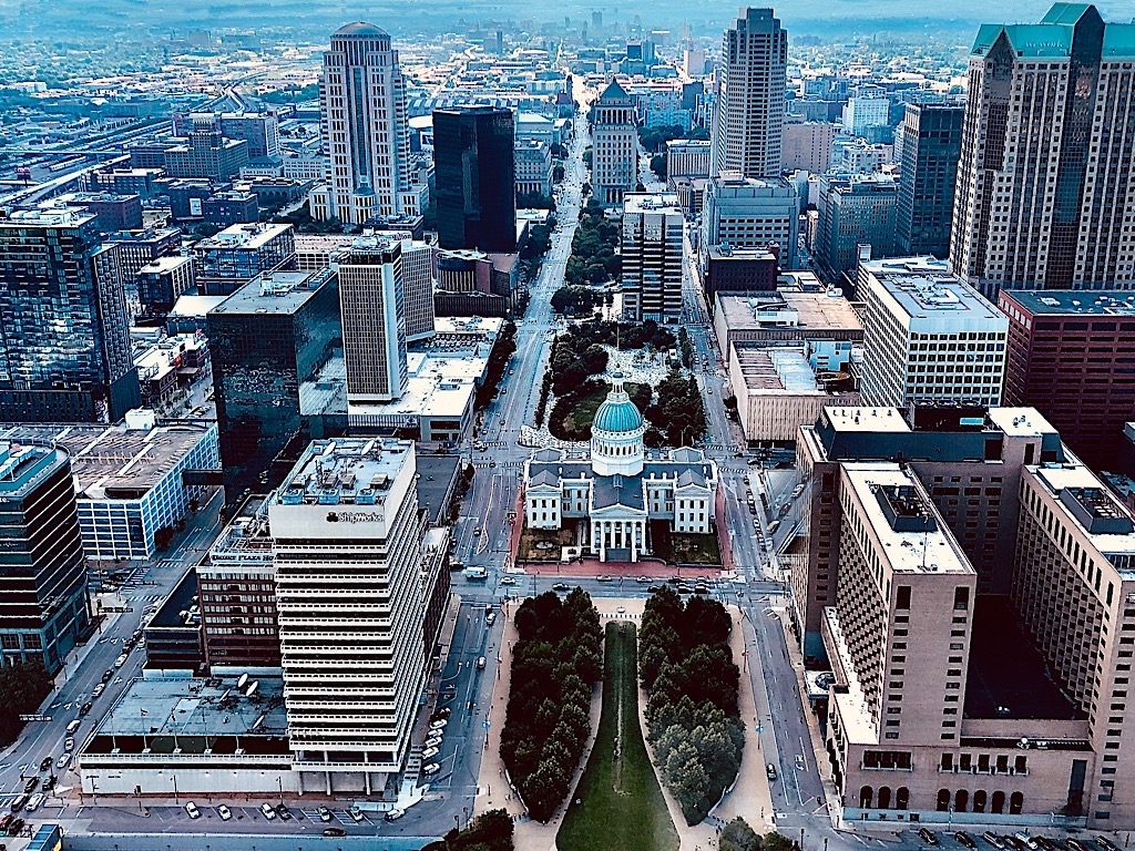
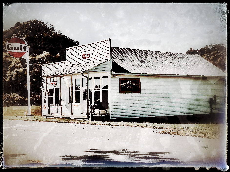
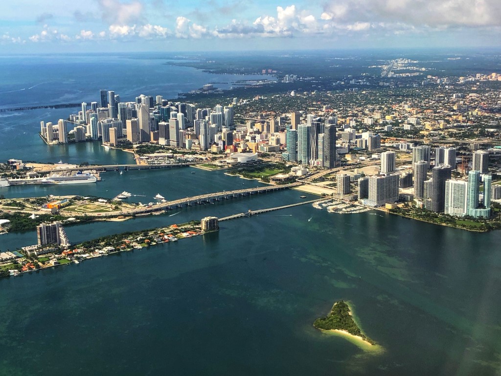
I have never had the good fortune to get such a helpful reflection from a bus window. Usually I end up having to crop out reflections of overhead lights or other passengers' heads. You certainly did the right thing to keep it in because it adds so much! It's almost as though the city was in the clouds above the building. I see why you hurriedly took this shot of the gorgeous building. |
Mar 17th |
| 86 |
Mar 21 |
Reply |
Thanks, Belinda. I did consider "smoothing" the crinkles in both leaves, but decided to keep it in for a touch of realism so that it wouldn't seem like a plain pattern. Maybe I could have kept the brown spots in but repainted them to match the leaf better. |
Mar 17th |
| 86 |
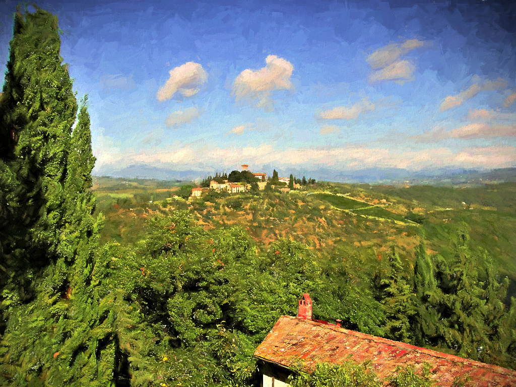
Mar 21 |
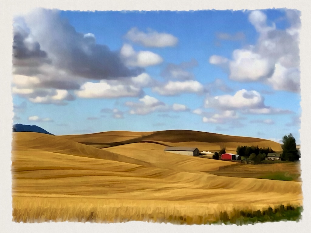
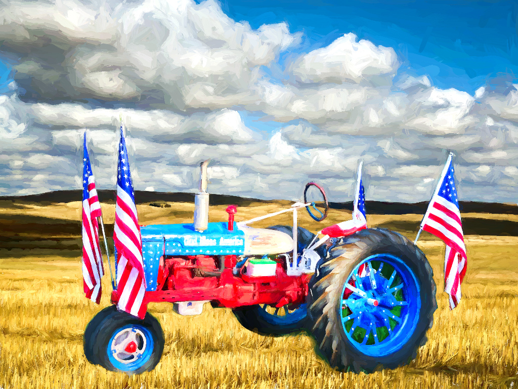
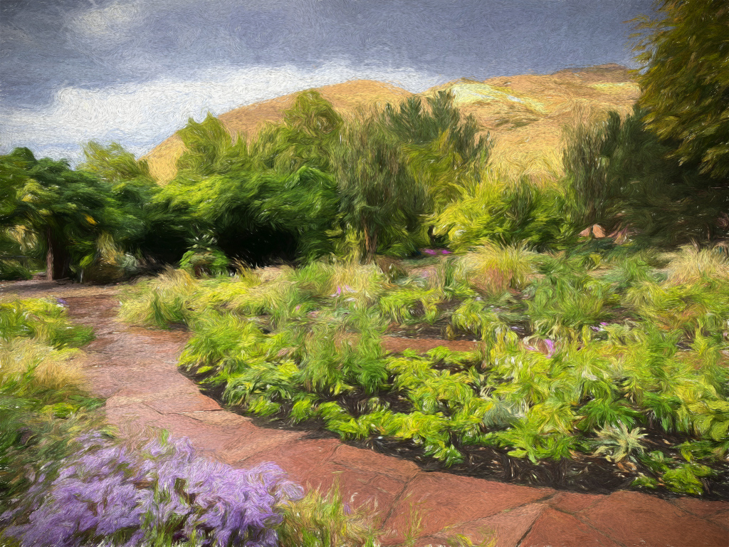
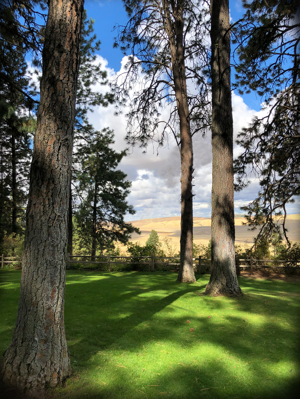
Comment |
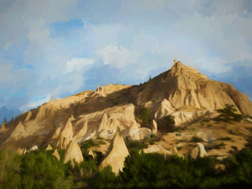
Glad you joined our cell phone group, Jack! I like the leading lines and rolling hills in this shot. You did a perfect job of opening up the shadows on the lower left for the final image. That being said, I also got the impression that the brilliance of the blue sky was a tad overpowering. It sounds as though Phillipa has a good suggestion for fixing that without disturbing the lower half of the shot. |
Mar 17th |
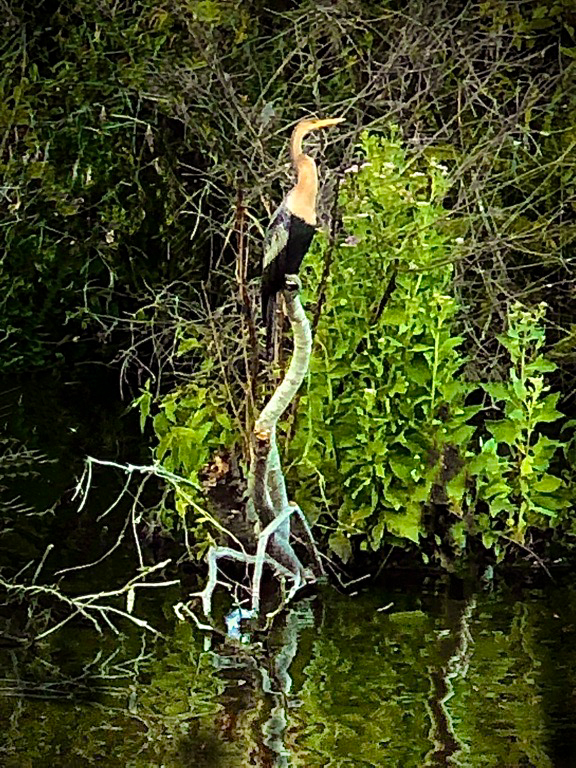
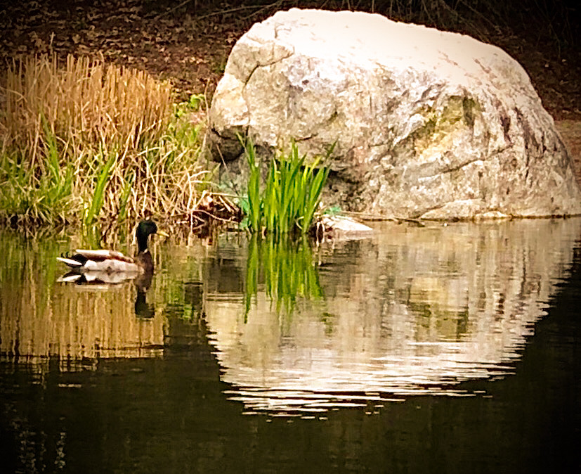
| 86 |
Mar 21 |
Comment |
It appears that Buttercup grew up quickly last year as she no longer has a kittenish look, but as Phill noted, a healthy "regal" appearance. She found a place to pose where the background matches her orangey fur markings, as if she wanted camouflage. I fail to see any evidence of your having used the "expand" tool on the right side, as it looks perfectly done.
I'm glad to hear things are mostly getting back to normal in Texas, but hope your computer will get itself sorted out. |
Mar 17th |
| 86 |
Mar 21 |
Comment |
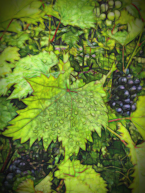
While the original appears washed-out on a bright day, you have done a magnificent job drenching the final waterlily with attractively deep colors! Now it really brings out the veins in the rounded leaves in a well-defined way. And you did manage to keep a hint of the reflection without emphasizing the dead debris floating in the water. That's a much more colorful lily than the white or pale yellow ones I usually encounter. |
Mar 17th |
| 86 |
Mar 21 |
Comment |
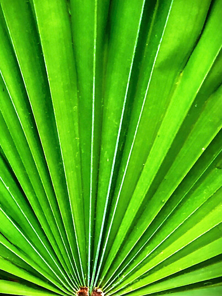
The straightened closeup is a far cry from the ordinary-looking "grab-shot-type" original. Your edits resulted in a more artistic image. You had a good vision to enhance this shot! |
Mar 17th |
| 86 |
Mar 21 |
Comment |
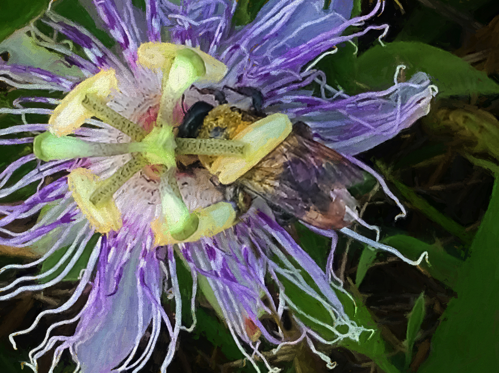
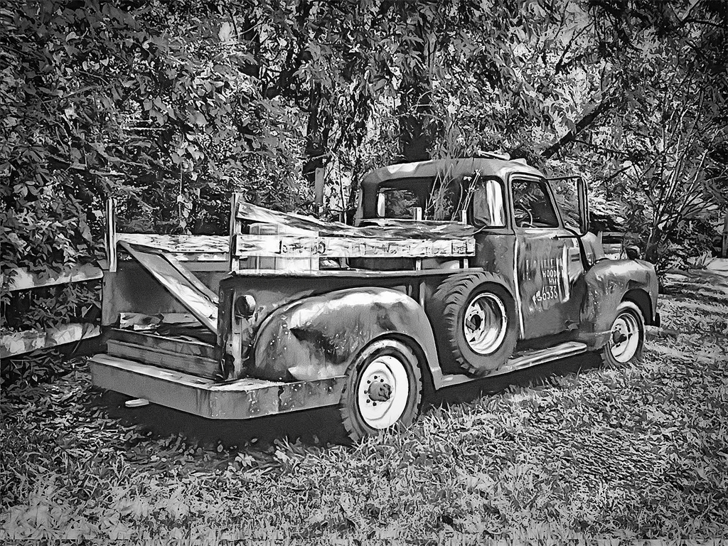
I have to concur with the consensus that the vibrant original was my preference. Although I usually enjoy black and white photos, this outcome was just somewhat blurry for some reason and the color left in the upper right didn't seem to add anything special. The one thing that I think was improved by the monochrome version was the antennae were now quite visible. |
Mar 17th |
6 comments - 1 reply for Group 86
|
11 comments - 1 reply Total
|