|
| Group |
Round |
C/R |
Comment |
Date |
Image |
| 56 |
Oct 20 |
Reply |
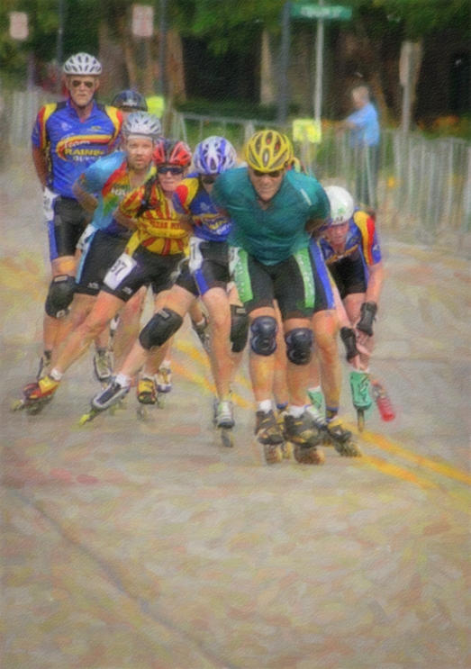
I think I like what you did with it, Nancy. They did need extra space for their speed racing. I hadn't thought of adding any, although I usually consider space in front when cropping. |
Oct 23rd |
| 56 |
Oct 20 |
Comment |
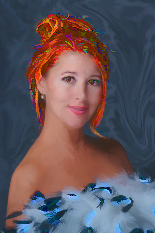
That's so funny that you had to reconstruct a "butt" on your flamingo, Cindy! Certainly NOT a one-click job in Photoshop! Although the feathers show up better on the darker background, I have to agree with Trey that I prefer the lighter version, focusing on the tenderness between the two. |
Oct 23rd |
| 56 |
Oct 20 |
Comment |
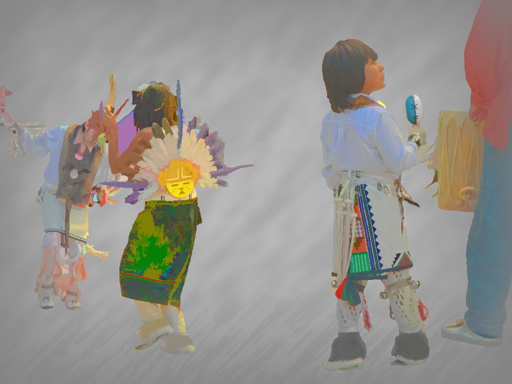
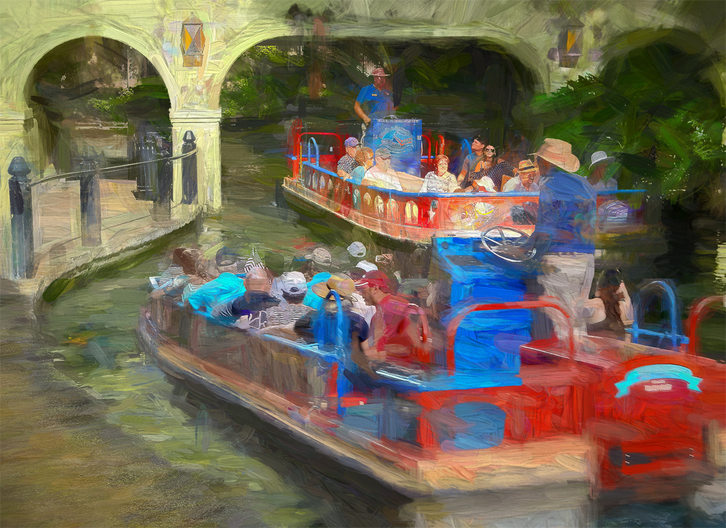
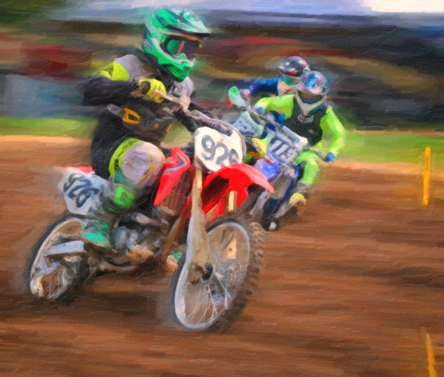
Anybody who has ever shared a seat with someone else on the Scrambler can certainly identify with this pair! I totally agree with the way you extended the background foliage to remove the distracting & not-attractive building from view. The tilted ride makes it more dynamic, too. You did a bang-up job with the faces (and hair) to make them show up against the background. Good idea. |
Oct 23rd |
| 56 |
Oct 20 |
Comment |
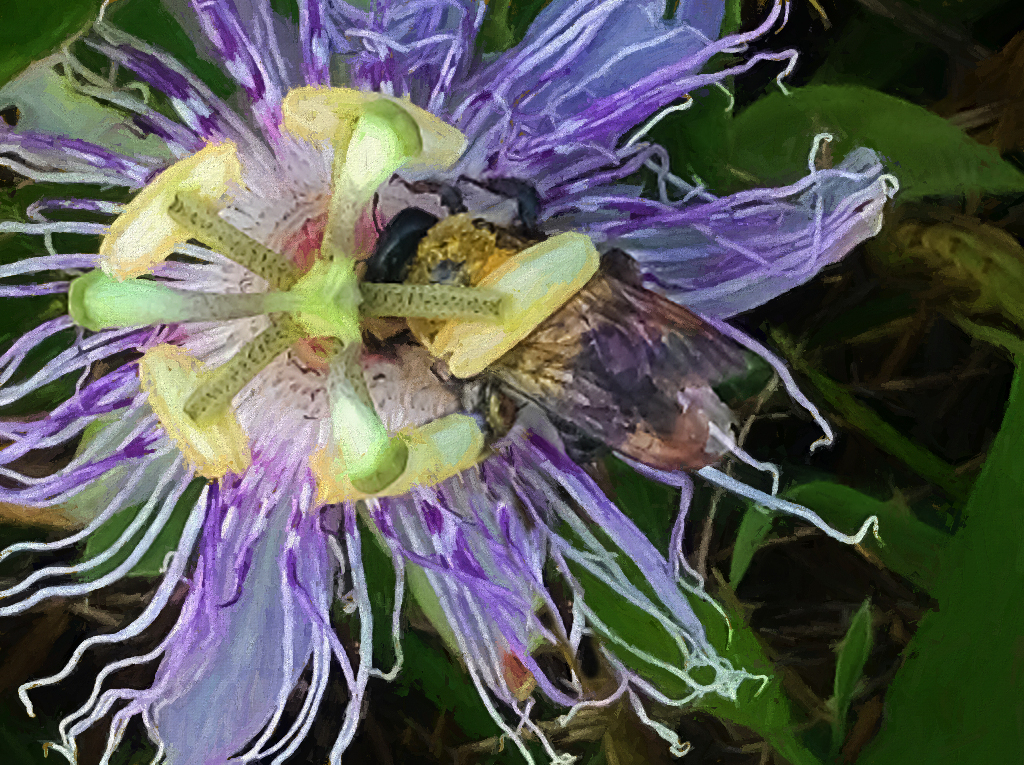
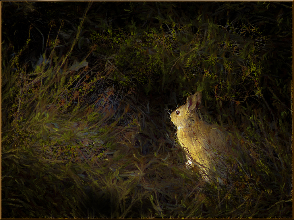
I am drawn to the little one's eyes where they were quite dull-looking beforehand. I like the change in the nostril area that Nancy demonstrated because that was the only area that looked overly-affected by the wrinkles and fur that showed up in the final painting. This was such a great-looking closeup that it really didn't require many changes/enhancements to improve on it. Nice work with Adobe CC. |
Oct 23rd |
| 56 |
Oct 20 |
Comment |
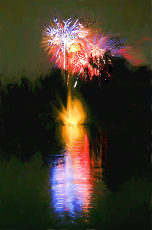
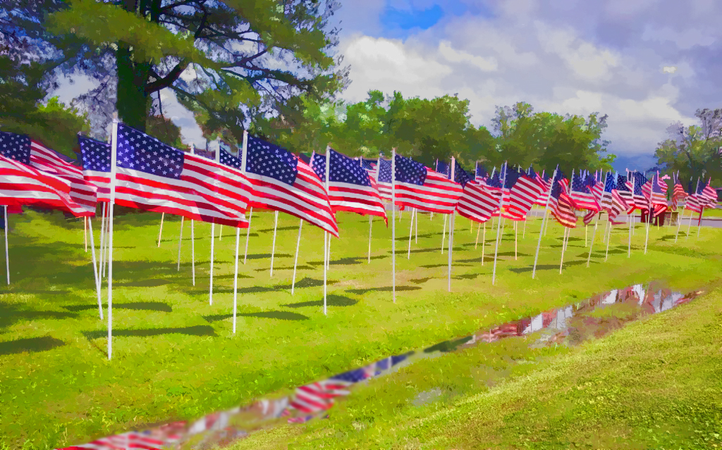
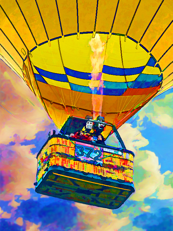
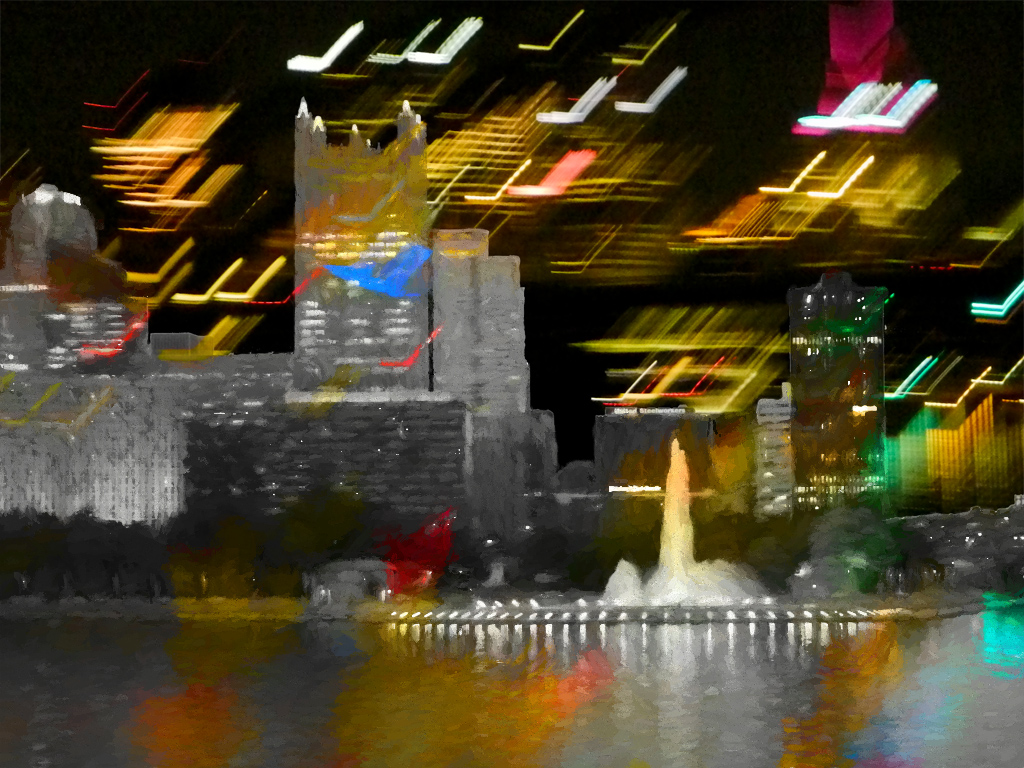
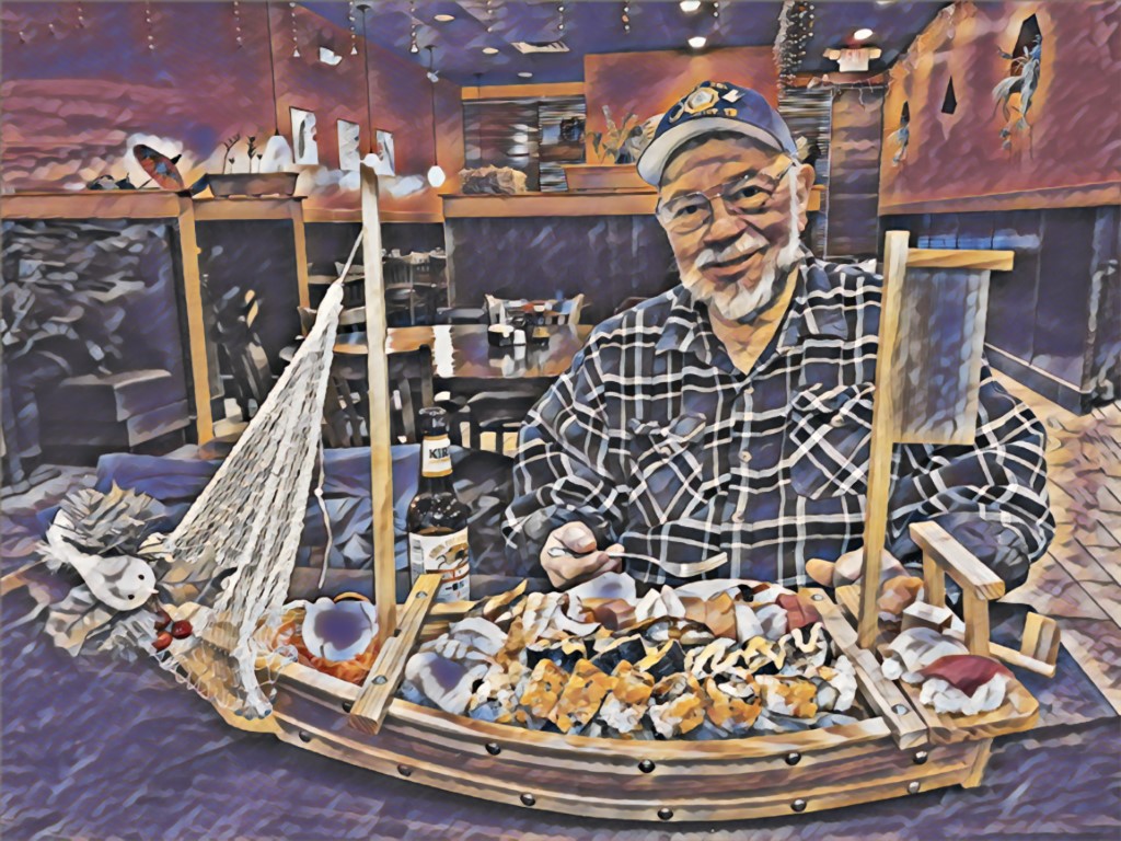
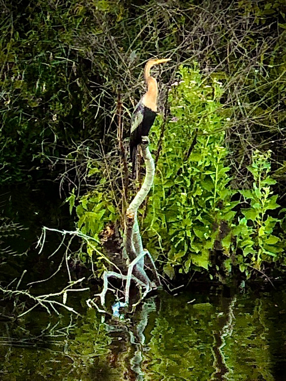
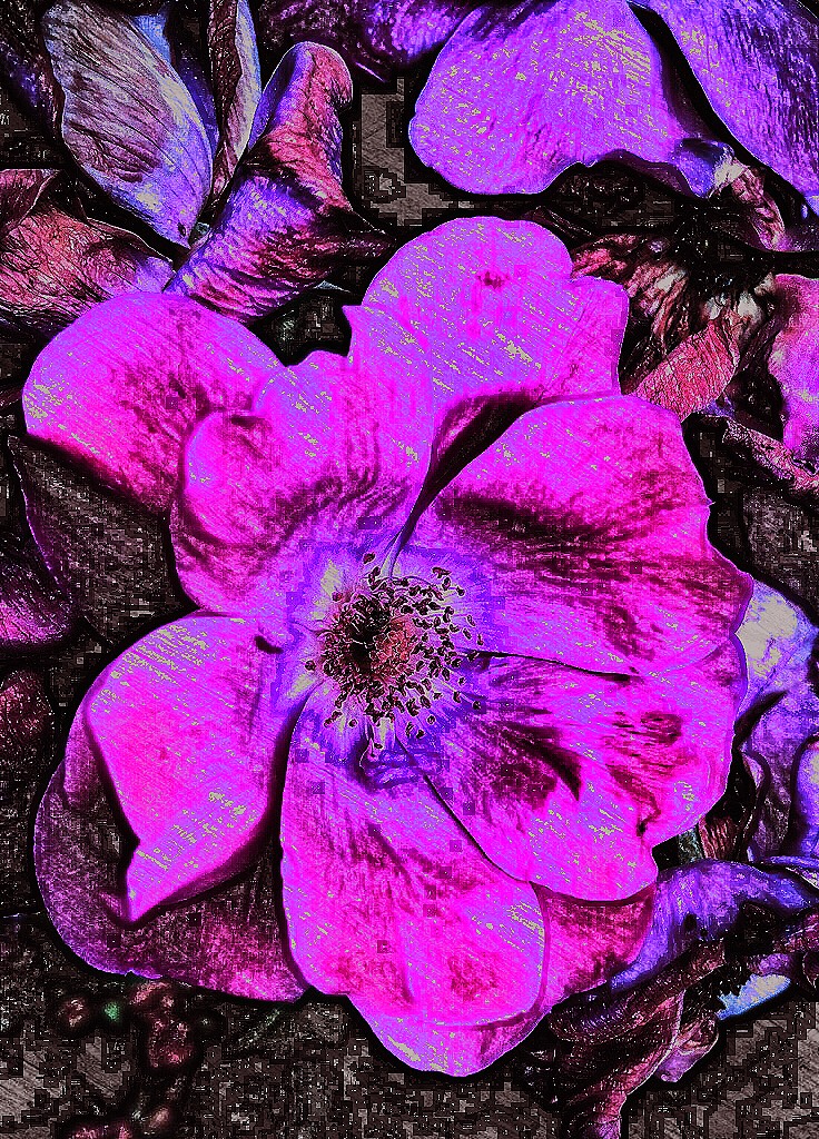
Nancy, you did great burning down the hot white areas of feathers. I like the way they seem grouped together, so the title seems apt (although they don't look like "hens" with those tailfeathers. I thought those were the toms, but I could be wrong.) You have about every color in the painting even though they're not peacocks. At first glance, their heads look too fluorescent or neon or something, but the original looks just about the same, so I guess that's OK after all. I like the background of the hint of fence and ground and I don't think it would be necessary to paint them in the wild surroundings. (My 2 cents.) |
Oct 23rd |
| 56 |
Oct 20 |
Comment |
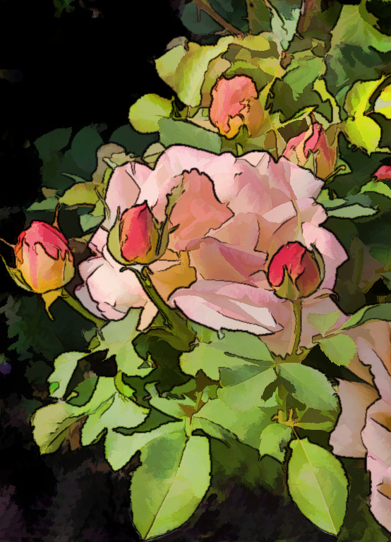
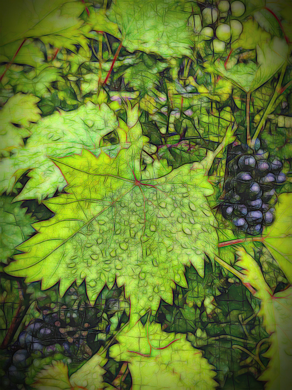
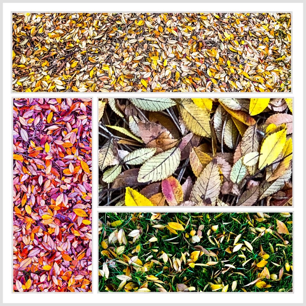
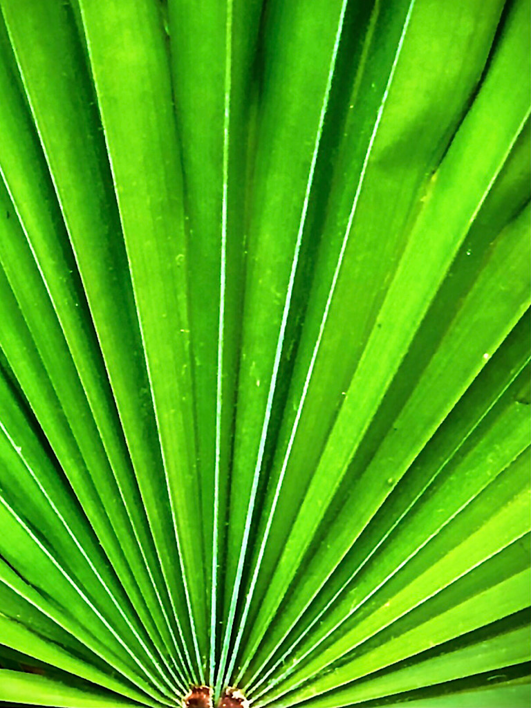
I really like the random pattern of the leaves and the variety of color. I got a kick out of you mentioning using one of my favorite filters. ;-) I think you used it very well to enhance what was already a colorful shot. I am always hungry to see those vivid leaves this time of year. I just about want to put them on and WEAR them. I agree with Nancy about the triangular shapes being appealing. |
Oct 23rd |
5 comments - 1 reply for Group 56
|
| 86 |
Oct 20 |
Comment |
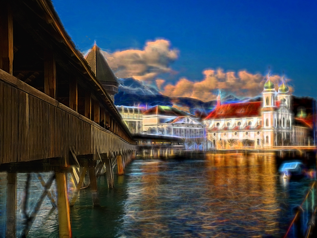
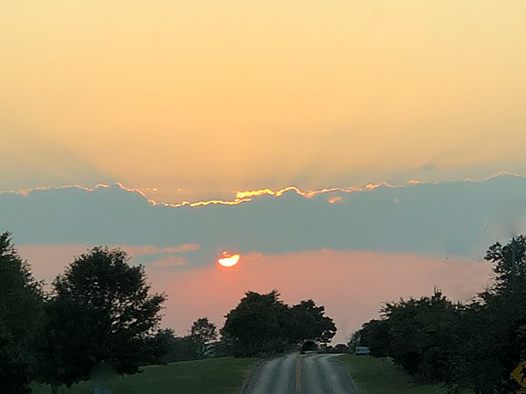
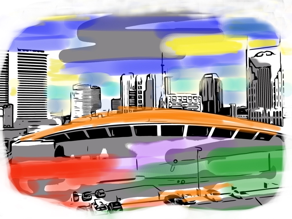
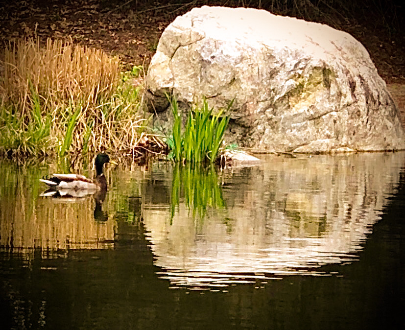
The dramatic diagonal of the bridge certainly leads us over to the sun. What a happy coincidence--or planned composition--for this image. The sharp diagonal held my eye to the left, so I didn't realize the horizon sloped until I read other comments. So your photo worked its magic on me. |
Oct 17th |
| 86 |
Oct 20 |
Reply |
Seeing it on the computer screen, I'd have to agree that the top of the rock needs burning down darker. On the cell-phone, though, I'm not entirely sure which tool could isolate that area and give me the desired effect. (Really, it didn't look that overly-bright when I was working on it on the small screen.) |
Oct 17th |
| 86 |
Oct 20 |
Reply |
You're welcome, Ruth. I hope it helps us both in future work. |
Oct 17th |
| 86 |
Oct 20 |
Comment |
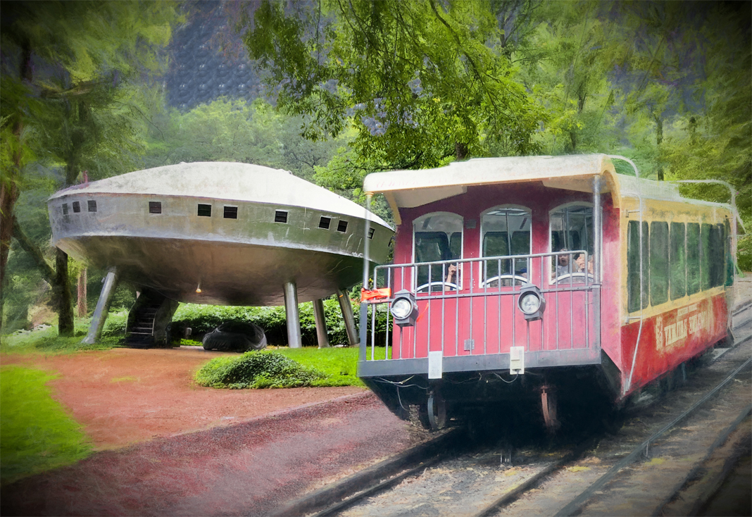
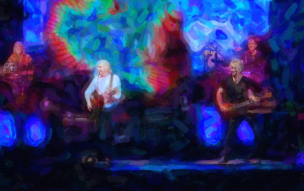
Oh, yeah! I can see how much fun you had with a simple chair seat. So psychedelic. Reminds me of strange futuristic round towered buildings in computerized movies or tubes out in space. The moire-diamond effect between the tube-towers really play with the negative space, too. I like the color you used naturally from the chair seat. (Who knew how far you could take a chair from reality?) |
Oct 17th |
| 86 |
Oct 20 |
Comment |
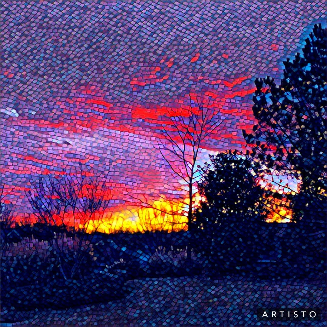
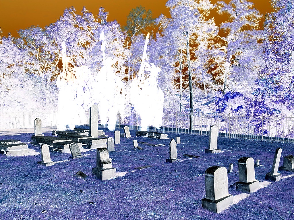
So, now the moon is part of your yard-art. ;-) I sure love those variegated colors of sky between the earth and moon, like a fabric. I also found the fence gate a little distracting because its brightness competes with the moon. It gives a sense of place, but if you could darken it by a few shades, that might help the composition. If the small white pole distracts, there are some healing spot tools that work in the apps mentioned. |
Oct 17th |
| 86 |
Oct 20 |
Comment |
I had a Deja Vu moment when I saw this and sure enough--I looked at a similar, if not same image on our site back in March. So, I liked what you did to it then, and now still, Phillipa. |
Oct 17th |
| 86 |
Oct 20 |
Comment |
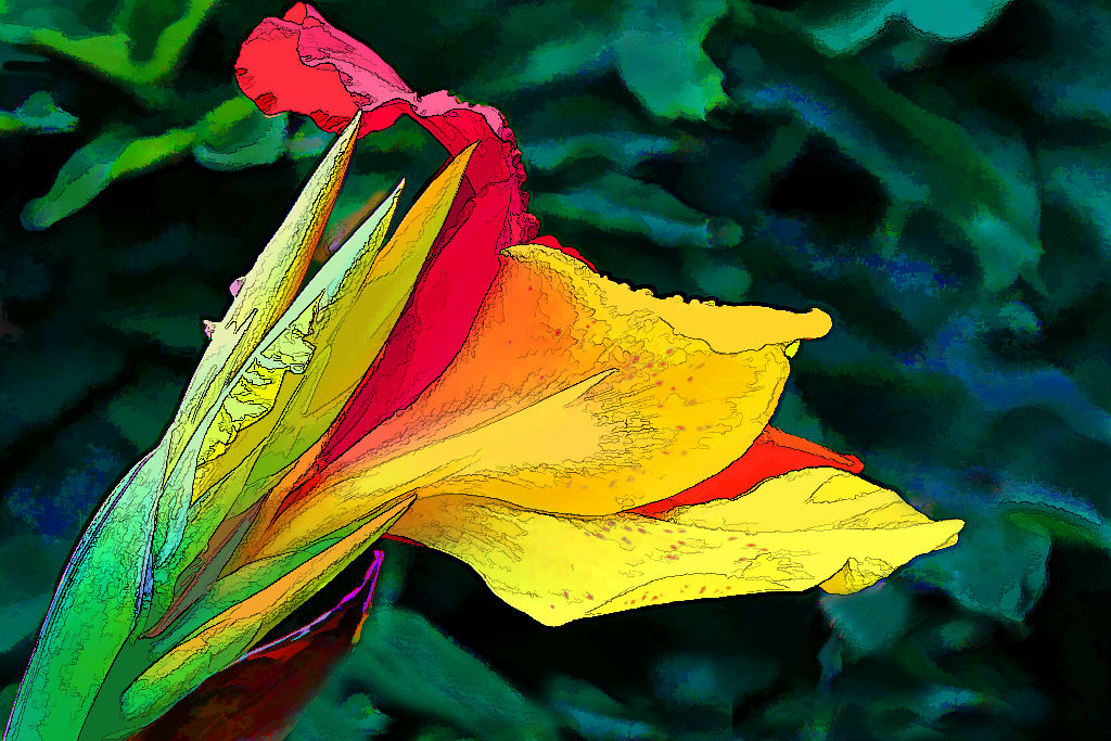
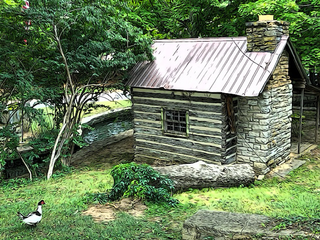
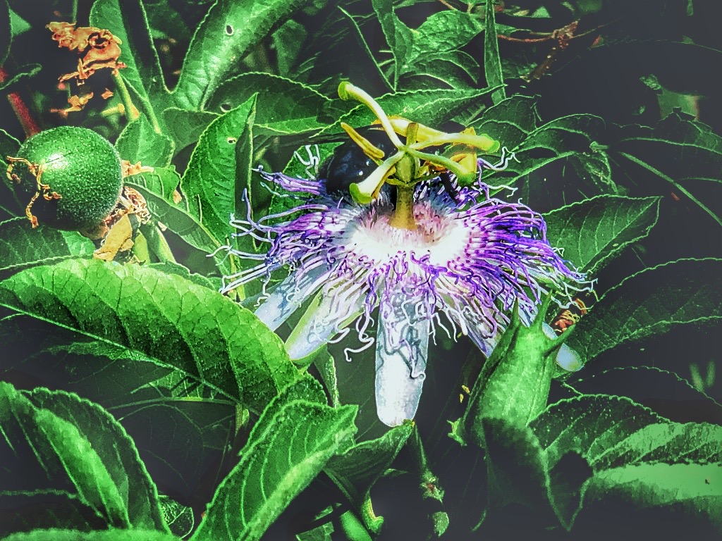
If hostas were red, this would be a nice valentine for next year. The ribs/curved lines in the leaves remind me of the lines in a pumpkin, too. You did such a deft handling of this with the limited tools that the fence isn't all that annoying, as it's barely visible. The dark vignette made a big difference in hiding all the competing bright foliage. I agree with Ruth that it's a ready-made card! |
Oct 17th |
| 86 |
Oct 20 |
Comment |
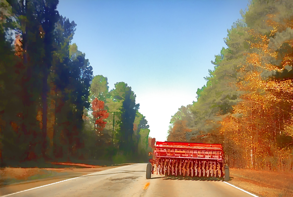
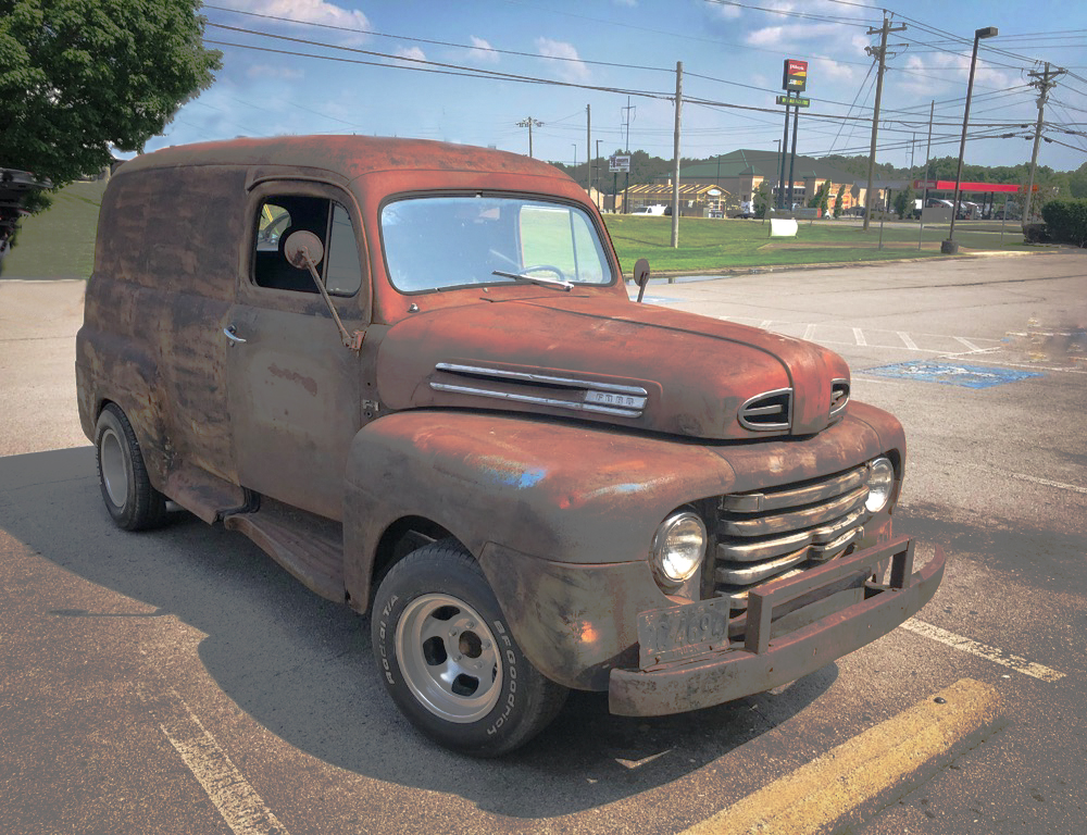
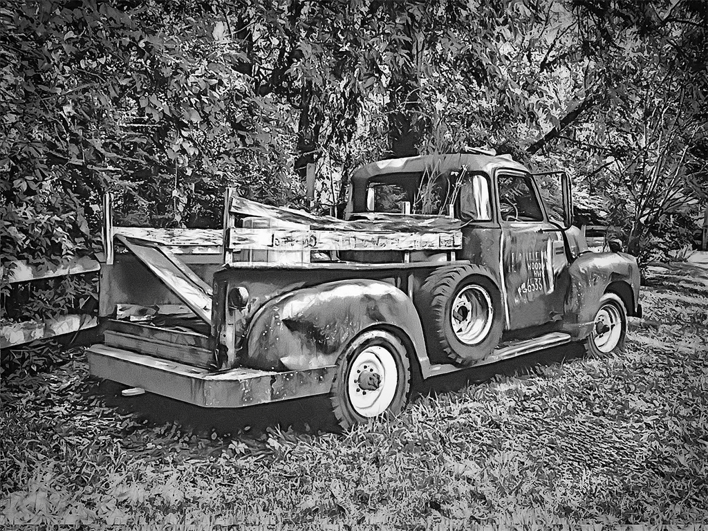
We all like the diagonal angle and although the tilted horizon background line feels a little disturbing, I think I actually like the dynamic of the downward tilted truck just a little more than Tom's version with the upward-climbing one. It is more unusual and eye-catching to me. Plus the bright red on monochrome sets it off very well. I'll bet your son's buddy liked the result. I know I did. |
Oct 17th |
6 comments - 2 replies for Group 86
|
11 comments - 3 replies Total
|