|
| Group |
Round |
C/R |
Comment |
Date |
Image |
| 56 |
Aug 19 |
Comment |
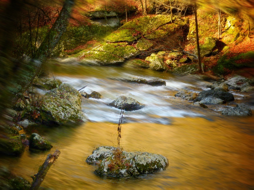
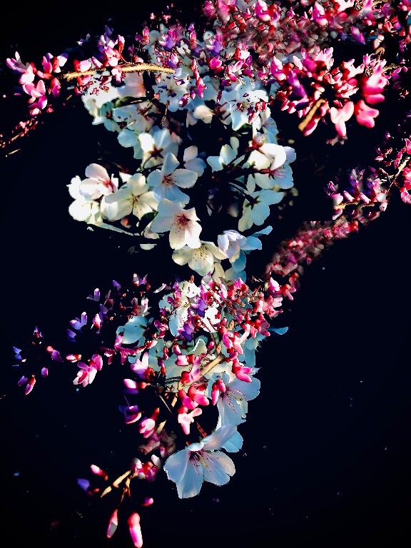
I like the unusualness of these colors together: the dark grey of the sky and tree trunks accented by the bright reddish foliage. I feel like something is missing with the little branches painted out of the upper right corner, though. So I have to concur with Nancy that it will look more dynamic with more red leaves in the big blank area at upper right and top--but maybe just leave a touch of that dark grey sky at the top and side as a sort of border area for good measure, instead of filling it all in with red. That's my 2 cents, Elinor. |
Aug 21st |
| 56 |
Aug 19 |
Comment |
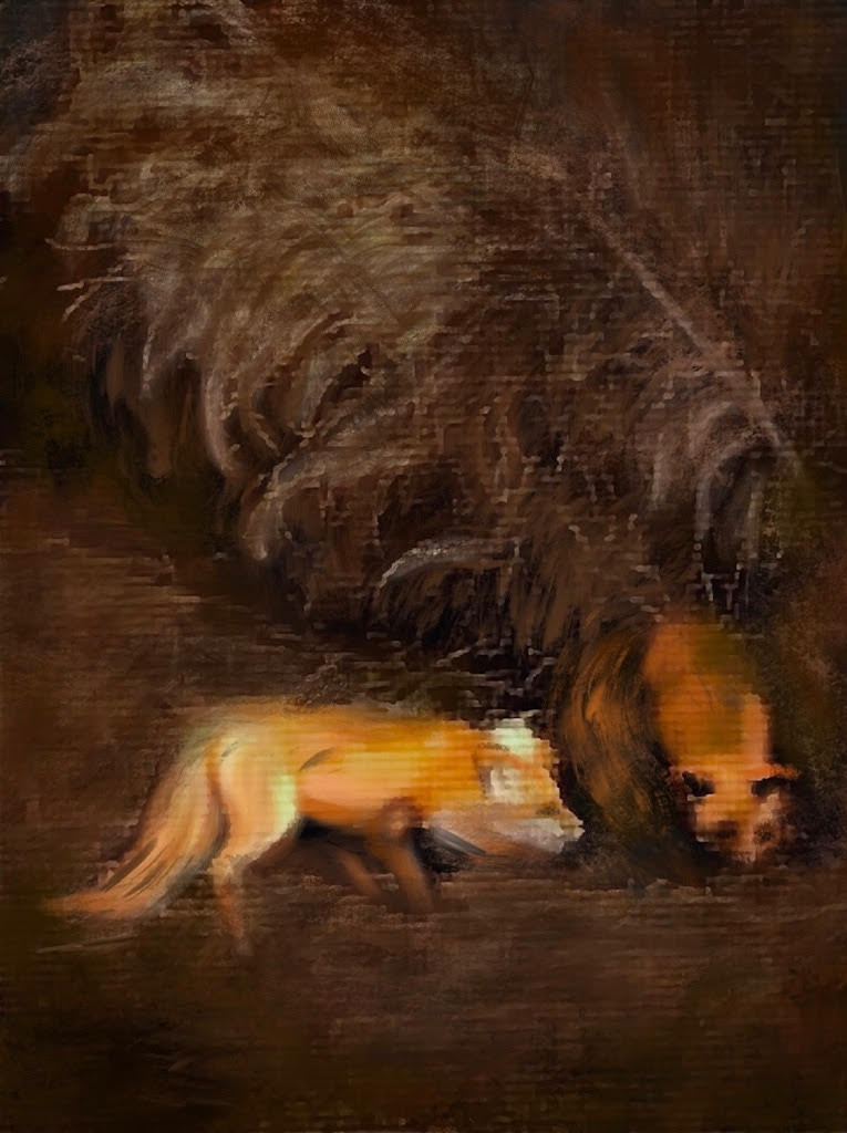
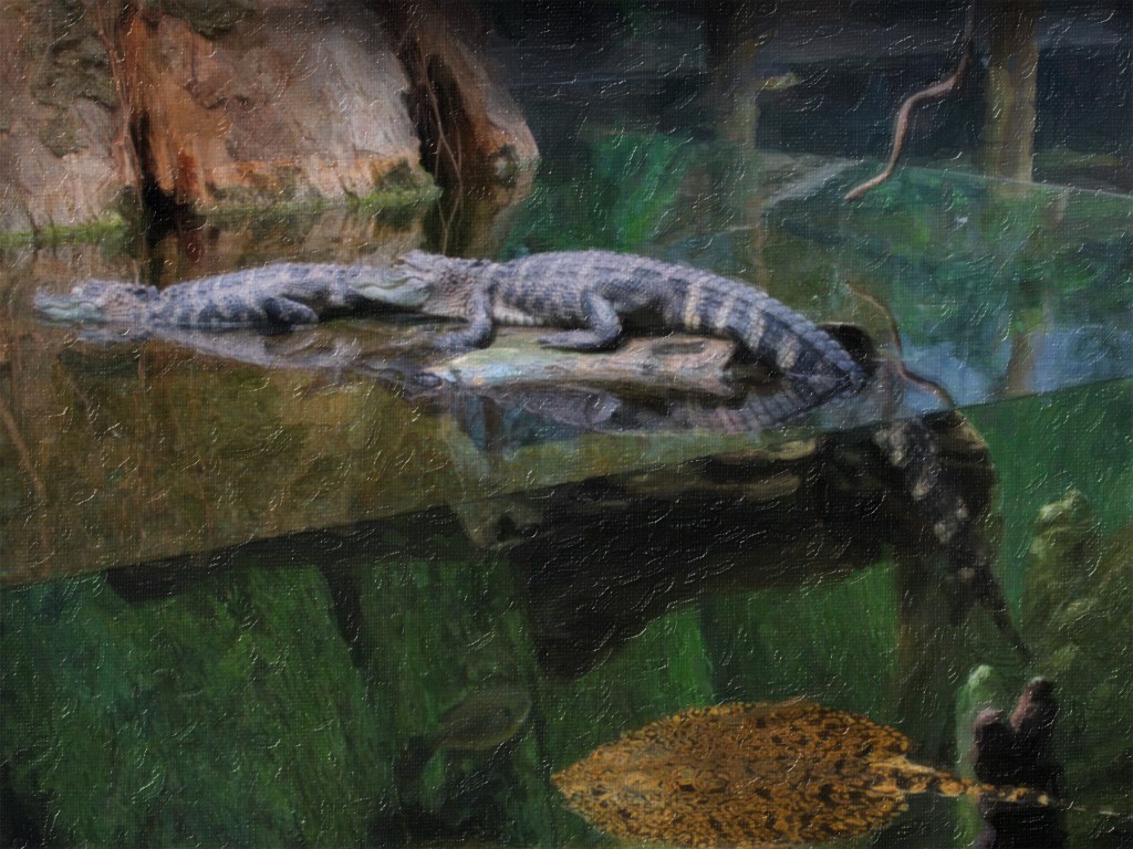
Cindy, I like the way you brightened up the straight-at-me gaze in the bear's eyes and a terrified look in the fish's eye you brought out in the final painting. The smooth rush of water in the background is the perfect counterpoint to the gorgeous rough bear fur. I definitely like the final product more than the texture of "Original 2". Boy, he looks wet and you caught a magnificent pose while the bear caught a magnificent fish! |
Aug 21st |
| 56 |
Aug 19 |
Comment |
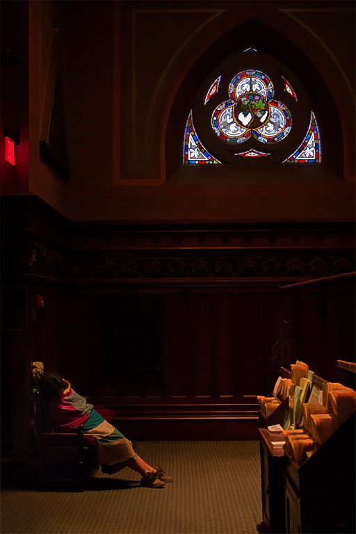
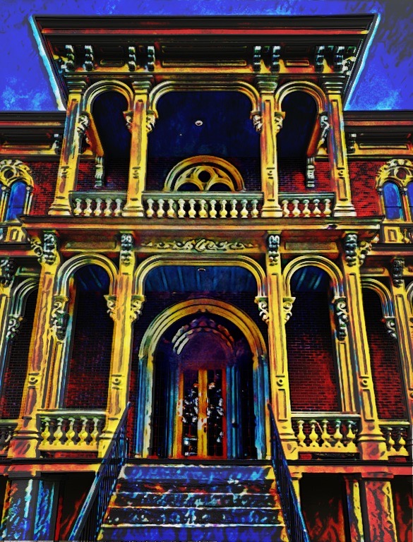
I, too, prefer the diagonal line of the top uncorrected. It sort of seems to be balanced by the diagonal of the open window. The opalescent colors in the windows give a dreamlike quality to your painting and it is very interesting to be able to peer through the glass to the old brickwork yet at the same time, to see reflections. Nice job. |
Aug 21st |
| 56 |
Aug 19 |
Comment |
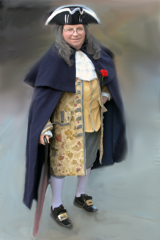
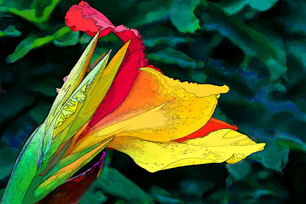
I think the small elephant's trunk needs to be there, as it is a real attention-getter, but you could support the idea that the little fellow is gasping for air in the dust cloud if we were able to distinguish a bit more of its little body under the larger animals. You did a wonderful job completing the painting by "dusting" the corner details away. Amazing shot, Gerhard! |
Aug 21st |
| 56 |
Aug 19 |
Comment |
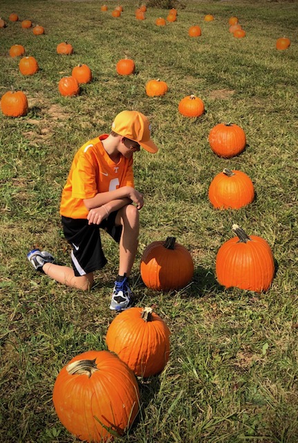
What a peaceful scene in its simplicity. The original had no distractions and converted into a painting, works very well. The pastels you worked into it make it look good for a young girl in a world of her own. Although I like the clarity of the shadow in the original, you probably did right to blend it in as you did, to unify the painting. I like this a lot. |
Aug 21st |
| 56 |
Aug 19 |
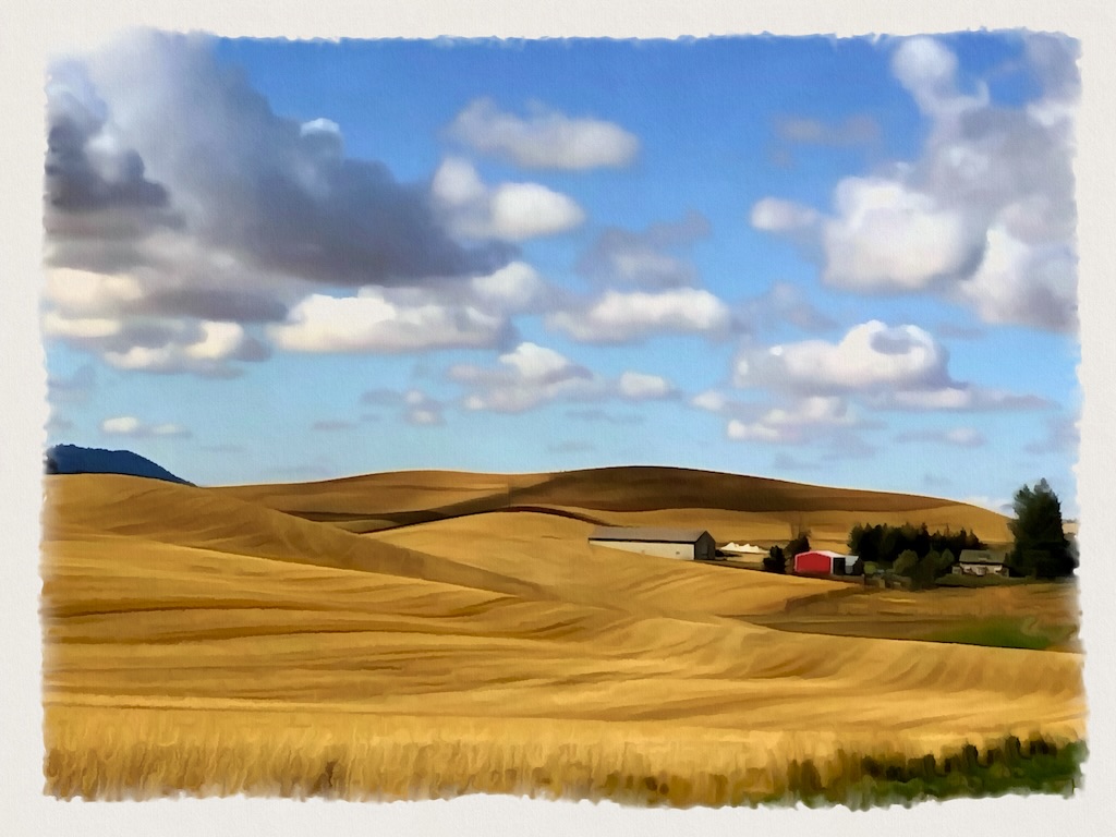
Comment |
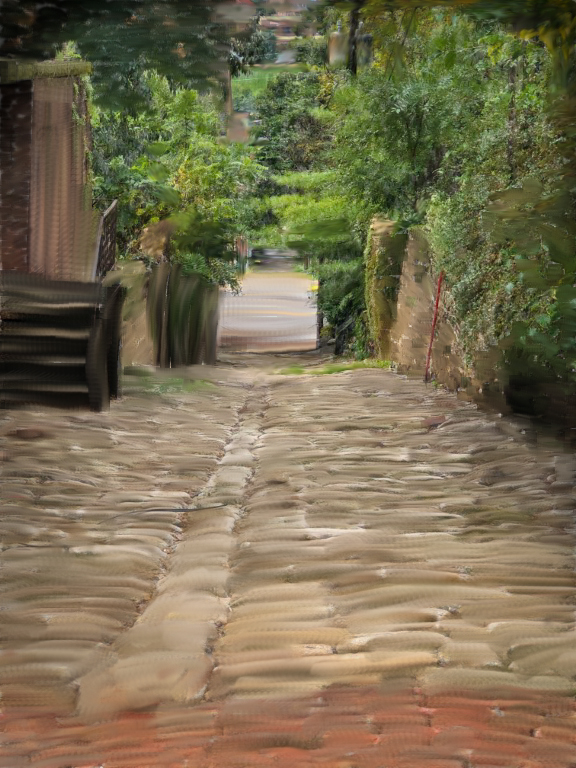
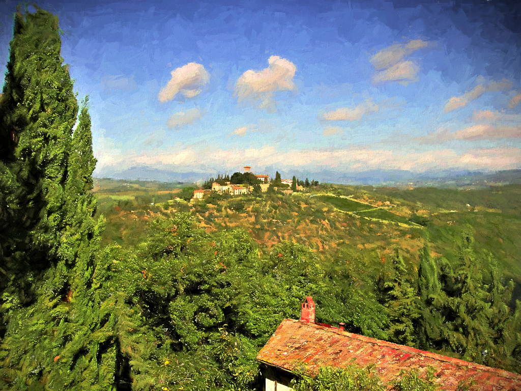
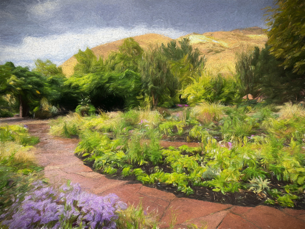
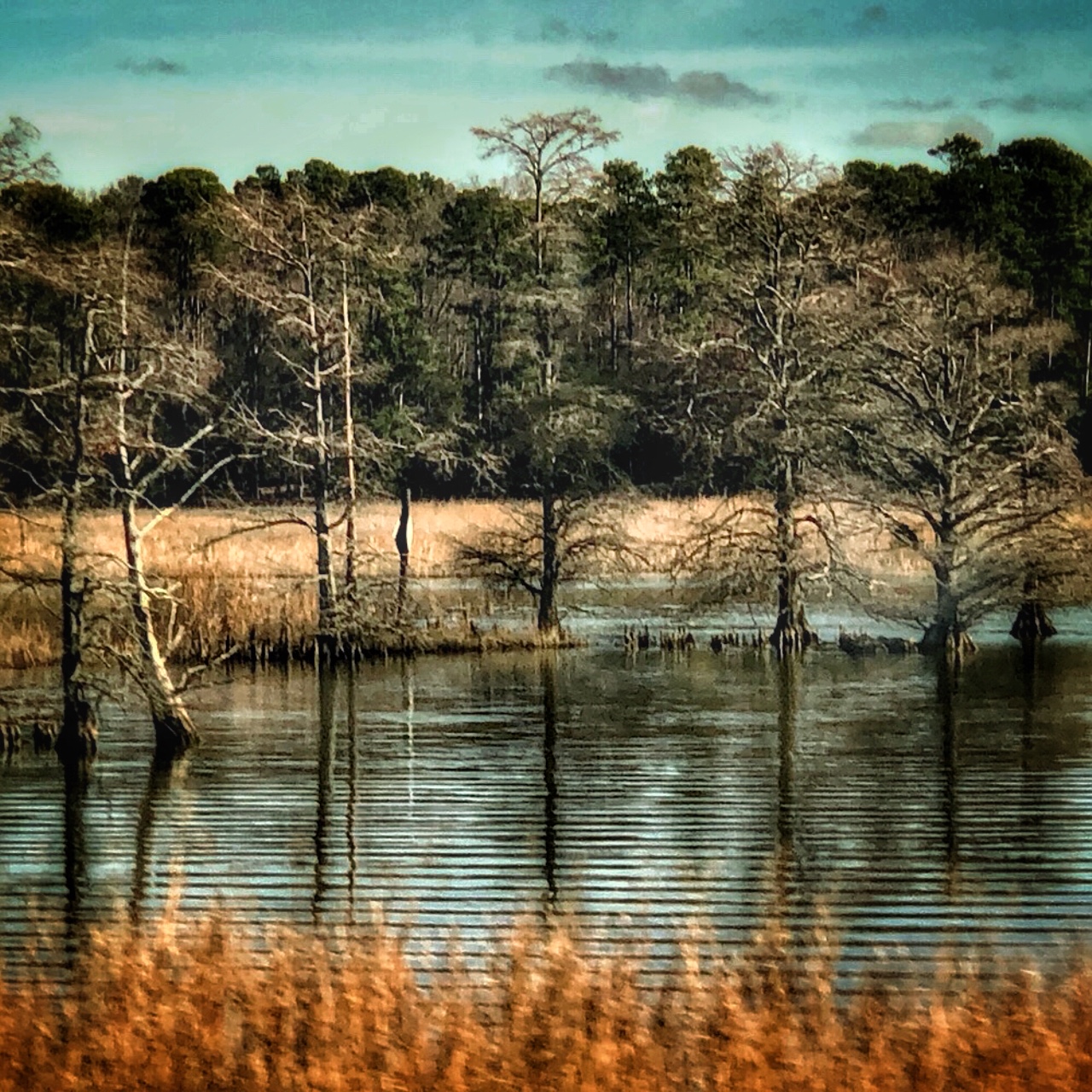
Thanks, everyone for your insightful comments. I agree with Nancy that it looks better with a more straight line as a horizon. Since the gardens were not flat, I suppose it was a natural low hillside terrain, but it never occurred to me to try straightening it for a more natural appearance. Yes, Cindy & Nancy, you're right that the rain did add a more saturated color enhancement. |
Aug 21st |
| 56 |
Aug 19 |
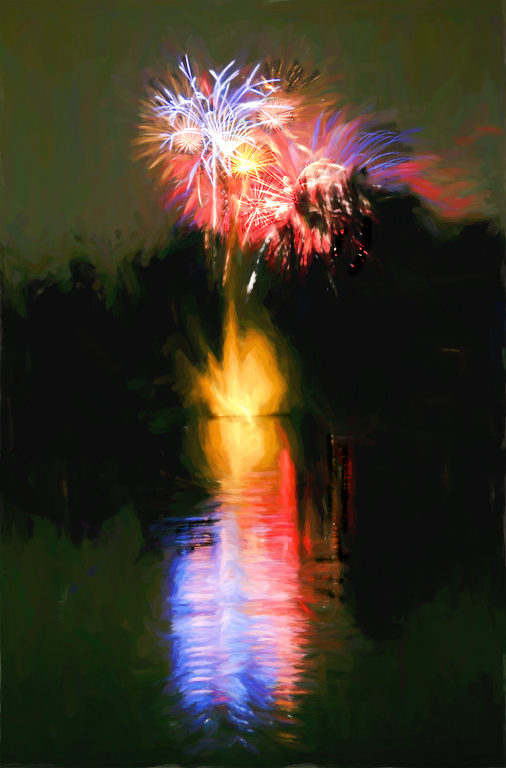
Comment |
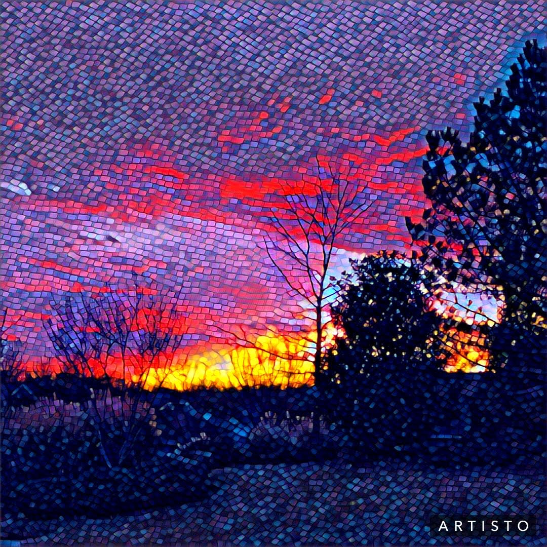
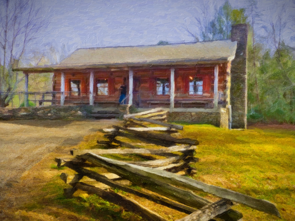
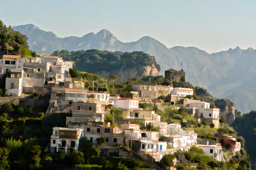
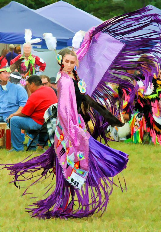
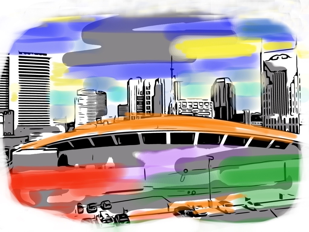
Nancy's comments, added to yours, enhanced my enjoyment of this painting, now that I can appreciate what went into shooting this image. It appears that you nailed the shot you were after! The composition is just great and I like the way the bridge shadows are lightened up a bit. I think that overall, though, the brightness could be toned-down just a tad, because the original seems just about light enough. You sure found the perfect vantage point for this shot. |
Aug 21st |
7 comments - 0 replies for Group 56
|
| 86 |
Aug 19 |
Comment |
Definitely, your amended cropping is the one I prefer. Even though the children are blurry in motion, it helps to see as much of their bodies as you have available in the grab-shot to get a sense of their 3 different actions. How fortunate that they line up in such a way to lead my eye right into the photo. |
Aug 21st |
| 86 |
Aug 19 |
Comment |
I like your final image a great deal and also what Carl showed us with the more intense blue color and darker areas. You had such a good idea to work with this image and turn it from an everyday sight into such a gem! |
Aug 21st |
| 86 |
Aug 19 |
Comment |
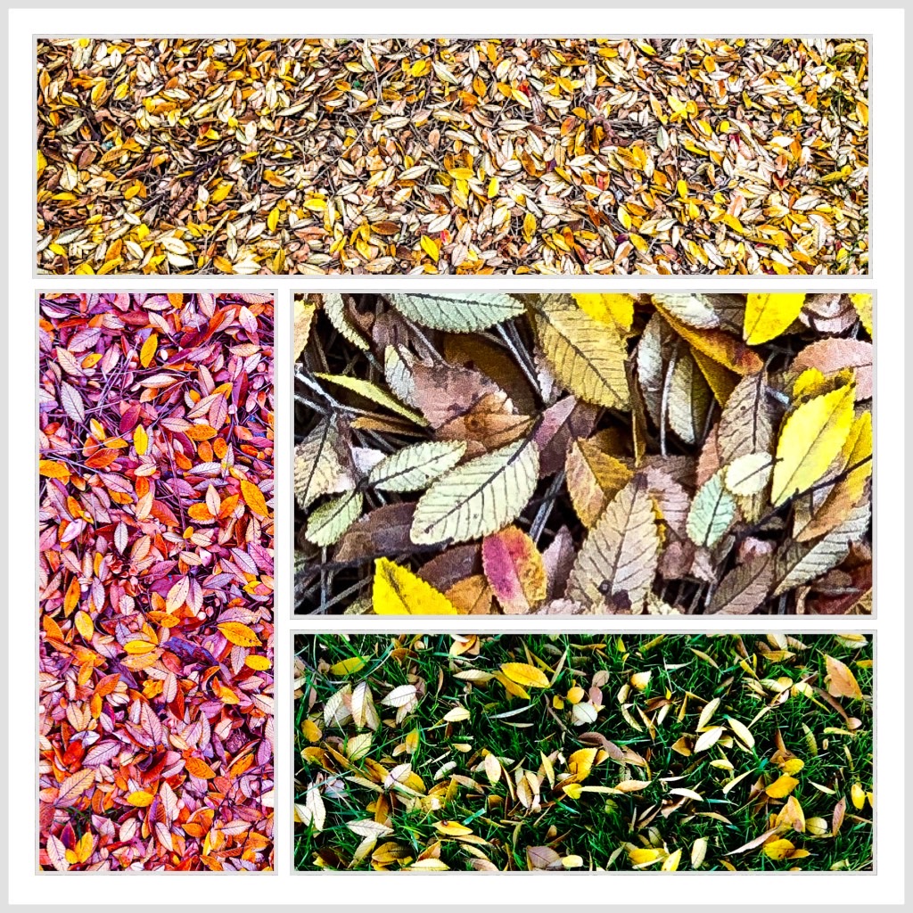
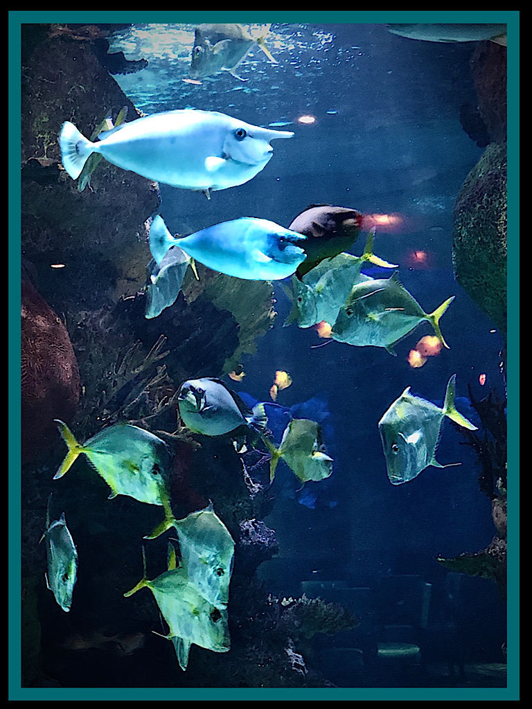
I really love this shot, Ruth! The only thing I found a little distracting was the leaves at the very bottom. So these lovely critters are still alive in your ice chest? Surprised to see so many together, spaced out carefully and displaying their subtle designs, arranged as well as if in a museum. I like your idea of a series, since your yard apparently has such a wealth of possibilities that you don't have to travel to find interesting subject matter! |
Aug 21st |
| 86 |
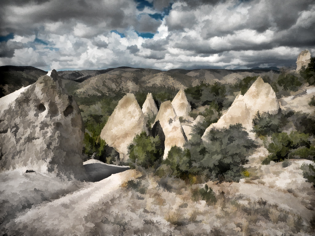
Aug 19 |
Comment |
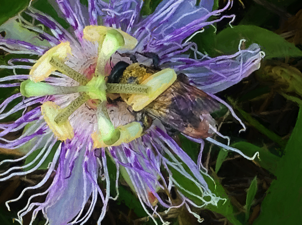
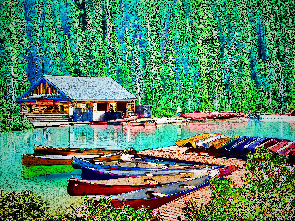
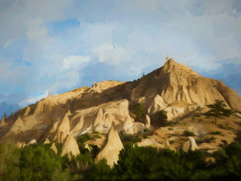
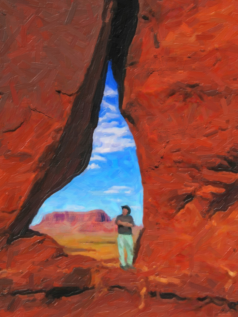
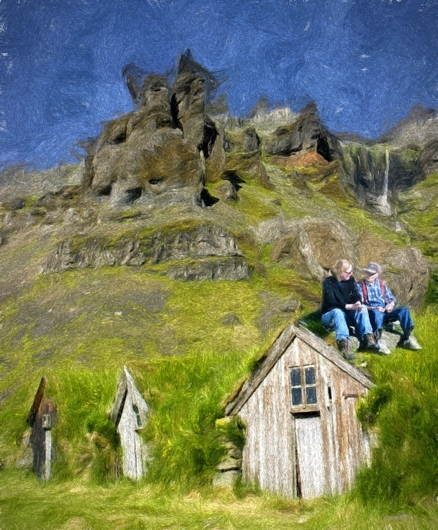
Until I read your commentary, I thought sure that you had cloned in some hoodoos to cover the lower left. This is one of our favorite spots and this image captured the look very well particularly the depth of the place in this view. The redness and variegation in colors comes through well. |
Aug 21st |
| 86 |
Aug 19 |
Comment |
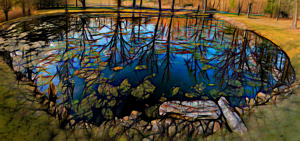
Definitely your mastery of lighting created this final image and the added cloning of flowers and rocks totally supports your vision. I've seen rings of toadstools in wooded areas in the Midwest that look as natural as this turned out. |
Aug 21st |
| 86 |
Aug 19 |
Comment |
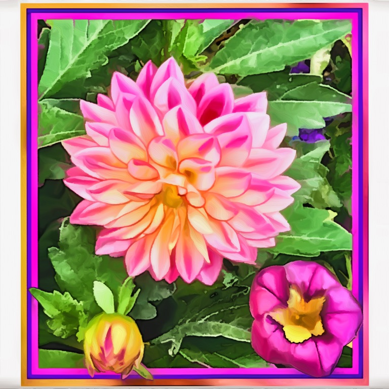
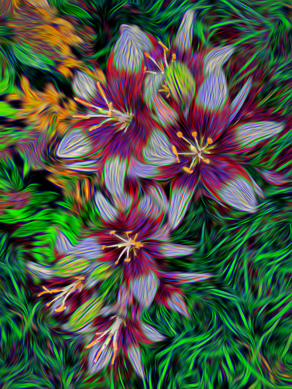
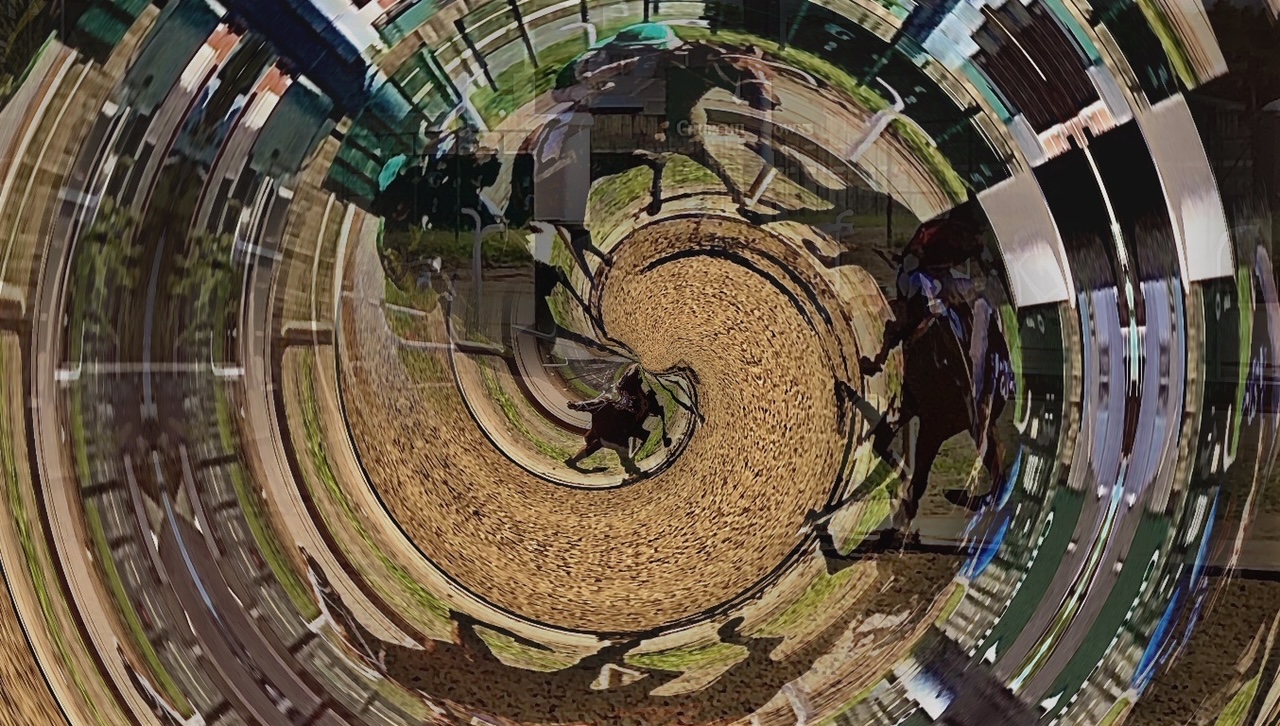
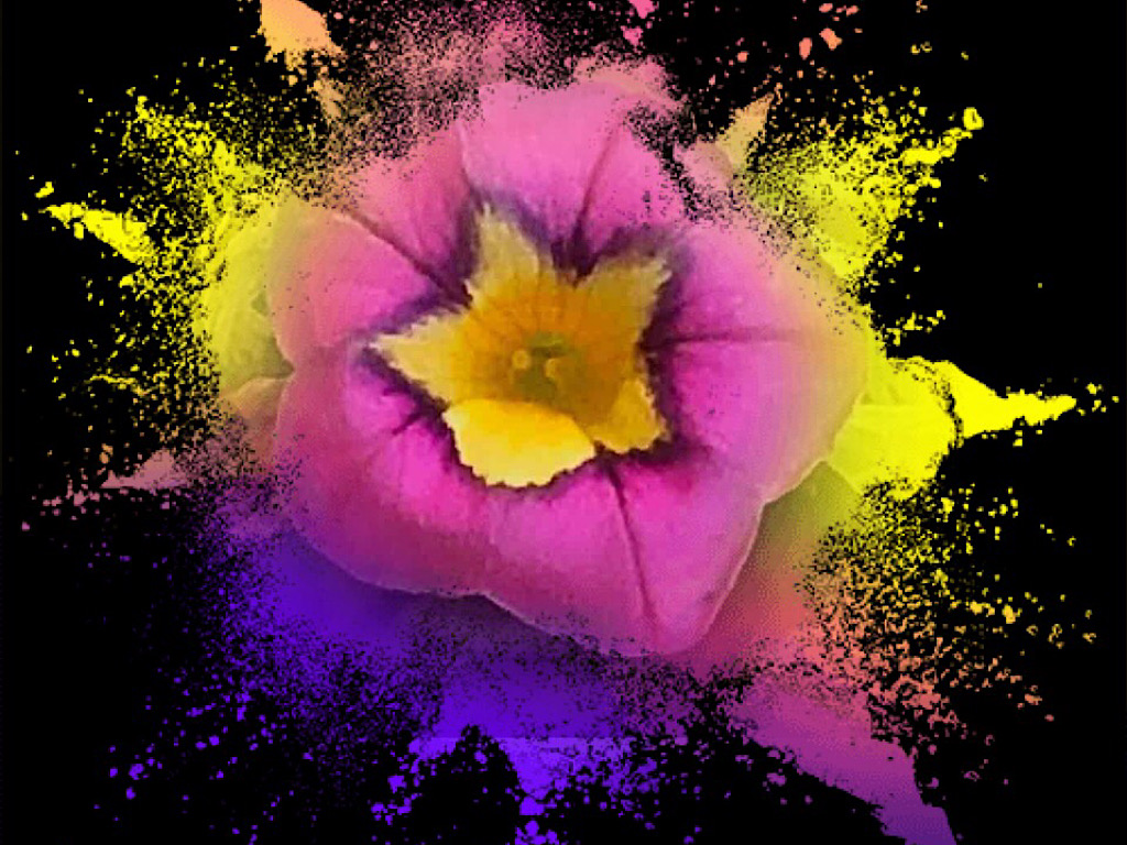
Always a good thing to find out about other software for our images, Carl. Thank you. I like the way the mirrored image creates interesting shapes, like the heart-shaped center of one daisy and a sort of regal crest with a monogrammed letter "A" at the top center of the grasses/weeds. All the images are fun and bright, but the final one is the one I prefer. |
Aug 21st |
| 86 |
Aug 19 |
Comment |
Thanks, all, for the suggestions. I do like the alternative horizontal cropping Janet tried out on my image, as well, but I'm glad you also noticed the "leading line" of the sun on the rocks in foreground, which caught my eye when I captured the scene. |
Aug 21st |
7 comments - 0 replies for Group 86
|
14 comments - 0 replies Total
|