|
| Group |
Round |
C/R |
Comment |
Date |
Image |
| 28 |
Sep 19 |
Comment |
You have turned an already nice photo into a real work of art. Beautiful choice of textures. |
Sep 28th |
1 comment - 0 replies for Group 28
|
| 45 |
Sep 19 |
Reply |
That's a good Idea.
|
Sep 24th |
| 45 |
Sep 19 |
Reply |
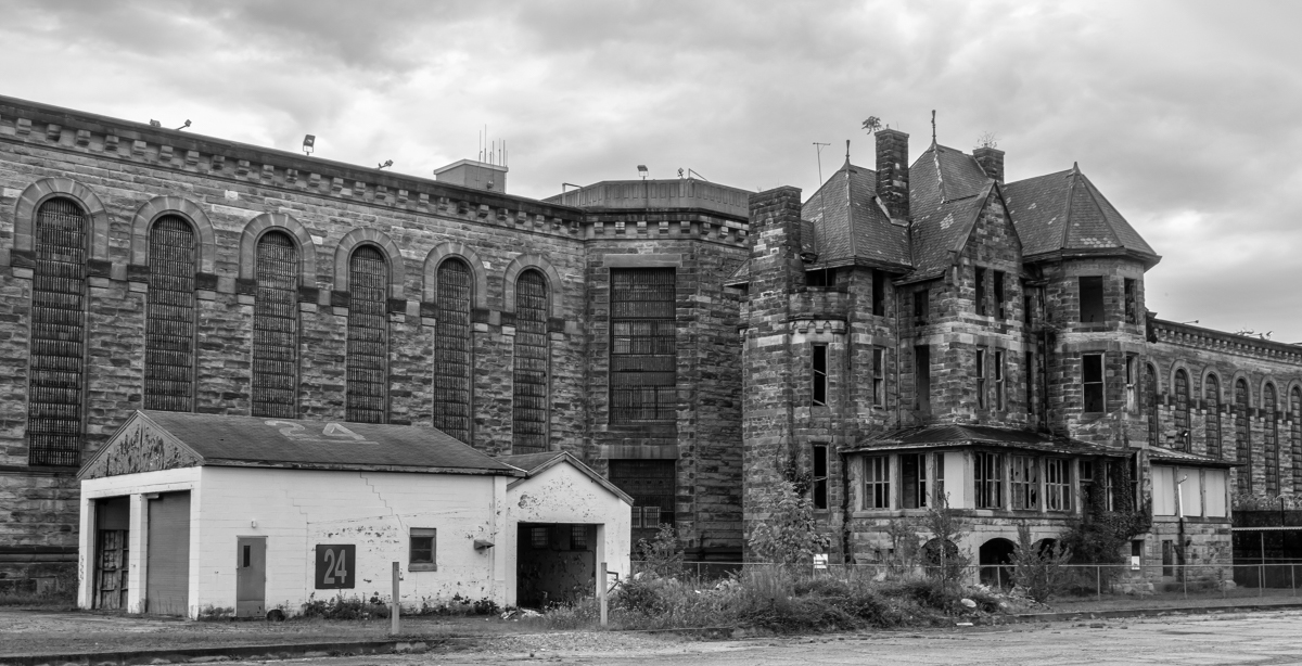
Thank you Stephen. I like it in monochrome, too. I have another monochrome image from this penitentiary in Group 50. |
Sep 11th |
| 45 |
Sep 19 |
Reply |
Thank you very much, Don. I was pleasantly surprised to open the Journal and find the photo.
I just read in the newspaper this week that the state is reopening two of the three old penitentiary buildings for tours. |
Sep 9th |
| 45 |
Sep 19 |
Comment |
What a remarkable transition from your original to your final photo. The bird stands out nicely from the blurred background and you have a catch-light in his eye. I really like the black and white against the color of the background. I only wish that there was a little more detail in the feathers, but I'm sure that would be impossible with the distance from which this was shot. Congratulations on getting this good of a shot of this elusive bird. Your post processing is awesome. |
Sep 9th |
| 45 |
Sep 19 |
Comment |
You have good detail on your building which looks very foreboding. You were able to maintain some detail in the sky which adds to the image. There are so may interesting details in this building that I hope you also got some closer shots of different sections, too. I would suggest adding even more contrast to make the building details stand out even more. Where you able to get other angles? I like that you have building 24 included, but in the composition, it seems to be the focal point and for me the beautiful front with broken windows is the "main attraction". Moving way to the right (if possible) may have given the front of the building more prominence. |
Sep 9th |
 |
| 45 |
Sep 19 |
Comment |
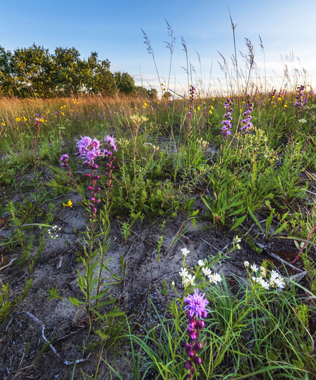
I love beach scenes like this with the beautiful wild flowers. Your focus is very good and the colors are pleasing. My only suggestion is to lighten the foreground some. |
Sep 9th |
 |
| 45 |
Sep 19 |
Comment |
Such a fun shot with great color and contrast. You did a good job capturing the moment is a very interesting way. I like that you left the environment to the top of the photo. You have great focus. The players in the dugout are very sharp. My only suggestion is to crop the bottom of the photo to remove the black with the large white words. I find my eye pulled down there and I don't want to leave the scene above it. Nice job! |
Sep 9th |
| 45 |
Sep 19 |
Comment |
I like the idea of the fog and I love lighthouses. In this composition, I find my eye darting back and forth between the lighthouse and the structure to the right. Maybe shooting from a little to the right would have brought the two closer together in the frame. The light in the sky seems to be the sun burning through the fog and is quite pleasing. On my monitor, the sky seems to have quite a bit of noise. I would also suggest, as Don did, that you clone out the tiny birds that appear as specks in the sky. |
Sep 9th |
| 45 |
Sep 19 |
Comment |
Good advice, Don. Bai, I especially like the time of night which you shot this photo. I like the deep blue tone in the sky, rather than the black sky you would have at a later time. The composition and design of the fireworks are great. I would have liked to have seen the buildings sharper and I would suggest cropping the light green leaf in the far right cropped off. |
Sep 9th |
6 comments - 3 replies for Group 45
|
| 50 |
Sep 19 |
Reply |
Yes, it's a stronger image now. |
Sep 24th |
| 50 |
Sep 19 |
Comment |
Definitely better in monochrome. I like the sky and clouds very much, as well as the sharp focus of the metal. For me, the bottom is a little busy. I think you could crop the bottom. |
Sep 20th |
| 50 |
Sep 19 |
Reply |
Will do. Thank you. |
Sep 20th |
| 50 |
Sep 19 |
Comment |
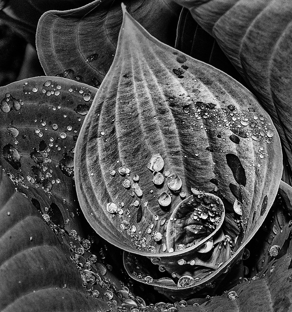
Your focus is great. I love the water drops and velvet feel to the leaves. I would suggest adding contrast and darkening the leaves around the center leaf to draw attention to it. |
Sep 20th |
 |
| 50 |
Sep 19 |
Comment |
You captured the right moment with a good shutter speed. I rally like what David did to the image. I really like this! |
Sep 20th |
| 50 |
Sep 19 |
Comment |
I agree with Chuck that the exposure, contrast and clarity are excellent. I like the details inside the covered wagon. My only suggestion is to find a way to clone out the cars to the left. |
Sep 20th |
| 50 |
Sep 19 |
Comment |
You have really nice lines and details. I usually like the buildings straight, but in this image it doesn't bother me because it's more artistic. It appears very cramped in the frame to me, especially at the top. |
Sep 20th |
| 50 |
Sep 19 |
Comment |
Update: the state is reopening 2 of the 3 buildings for tours. |
Sep 9th |
6 comments - 2 replies for Group 50
|
| 57 |
Sep 19 |
Comment |
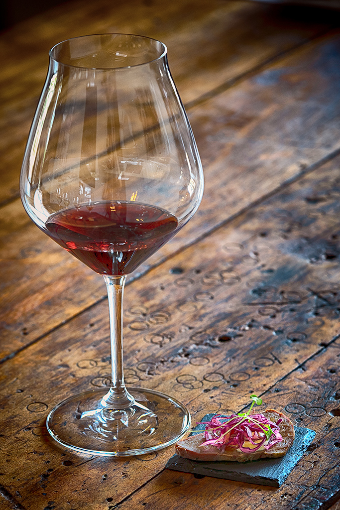
I love the texture and markings in the wood. They are unique and add interest to the photo. Your crop is very effective and you have nice focus and depth of field. My only suggestion is to desaturate the upper left fourth of the frame/wood. I has more color than the rest of the wood and pulls my eye from the wine glass and wood in the foreground. |
Sep 12th |
 |
| 57 |
Sep 19 |
Comment |
Awesome focus - everything that needs to be sharp is. Your composition is strong and the colors are very nice. Good choice to turn to the flowers! I have no suggestions for improvement. Nice job! |
Sep 12th |
| 57 |
Sep 19 |
Comment |
Your focus is excellent. The flower and moth are so sharp and the background has a nice amount of blur. I like the tilt of the flower and the composition. I wish it hadn't been such a sunny time of the day, though, since the photo is quite bright. Sometimes I try to stand in front of the flower to block the sun and cast a shadow over my subject. |
Sep 9th |
| 57 |
Sep 19 |
Comment |
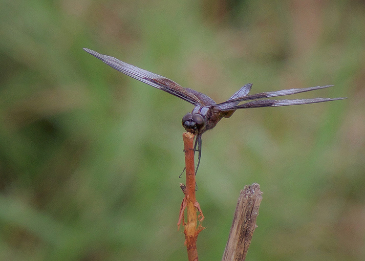
I love your depth of field with the dragonfly so nice and sharp and the background beautifully blurred. The dragon fly pose is unique and interesting. My only, very small suggestion is to slightly darken the edges to help keep the eye in the frame. I tried that with Nik Color Efex Darken/Lighten Center. Nice job! |
Sep 9th |
 |
| 57 |
Sep 19 |
Comment |
I really like the lines and color in this and think Marcella has a good idea to also try monochrome. I would consider flipping it vertically, so the darker/heavier area is at the bottom. For me, it would give it more balance. I wish the center was in focus. |
Sep 9th |
5 comments - 0 replies for Group 57
|
18 comments - 5 replies Total
|