|
| Group |
Round |
C/R |
Comment |
Date |
Image |
| 3 |
Aug 19 |
Comment |
Wonderful details and textures. I really like the framing and agree with the comments above that a square format would be good. The patch of light with the small cross in the top center adds interest. I'm glad you included it. |
Aug 8th |
1 comment - 0 replies for Group 3
|
| 5 |
Aug 19 |
Comment |
Beautiful details and subtle colors. Adding the man, who is obviously in awe, adds emotion and tells a story. Beautiful image! |
Aug 8th |
1 comment - 0 replies for Group 5
|
| 6 |
Aug 19 |
Comment |
The lighting and color are both gorgeous and the water drops make this an outstanding image. Just beautiful! |
Aug 8th |
1 comment - 0 replies for Group 6
|
| 45 |
Aug 19 |
Reply |
I agree that after removing the blurred bud, a vertical crop would be great. |
Aug 7th |
| 45 |
Aug 19 |
Comment |
The waterfalls are beautiful. You have a great shutter speed that gives the water a soft motion while still maintaining some detail. The dark surrounding setting, with green leaves, add interest and highlight the water fall. Excellent job with high interest for me. This is really lovely and conveys a peaceful feeling. |
Aug 5th |
| 45 |
Aug 19 |
Comment |
Such a beautiful, serene landscape with good details and depth of field. You have good foreground, mid and backgrounds. The puffs of clouds add interest. I do not have any suggestions for improvement. Nice job! |
Aug 5th |
| 45 |
Aug 19 |
Comment |
What an interesting flower! The colors and details are great and the dark, plain background show the flower well. I agree with Don that the bloom to the left could be cloned out. It is blurred and doesn't add to the image. Nice capture! |
Aug 5th |
| 45 |
Aug 19 |
Comment |
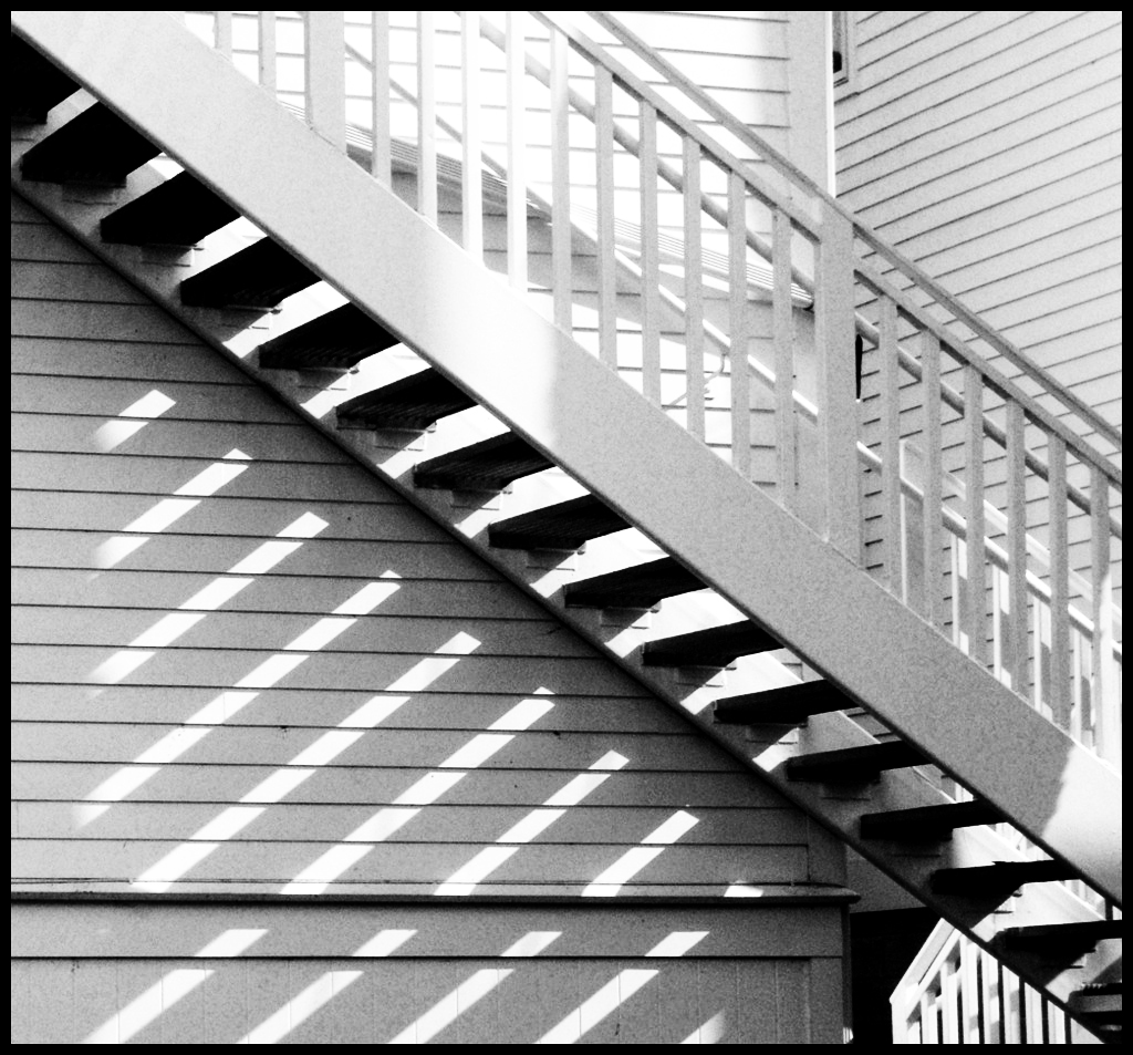
First, congratulations for seeing the photo in all the lines and shadows. It's a study of geometry and very effective. I might suggest increasing the contrast a little to give it more drama. |
Aug 5th |
 |
| 45 |
Aug 19 |
Comment |
You have wonderful details and clarity in this image. You did a nice job of blacking out the background so the focus is on the armor. I think including the blurred opponent to the right of the frame, increases the interest and adds to the story. I have no suggestions for improvement. Great job! |
Aug 5th |
| 45 |
Aug 19 |
Comment |
The clouds and rays of light are spectacular. You have nice details in the clouds and the colors are very pleasing. For me, the sky is the focus of this image and should have more than half of the frame. I'm not sure the black foreground in the bottom of the frame adds anything to the image. By cropping it out, the sky would have more than half of the space and, in my opinion, have more of the focus. You did a great job of stitching your images together. |
Aug 5th |
6 comments - 1 reply for Group 45
|
| 50 |
Aug 19 |
Reply |
Interesting! I hadn't thought of that. Thanks! |
Aug 29th |
| 50 |
Aug 19 |
Reply |
I like this crop very much, David. |
Aug 20th |
| 50 |
Aug 19 |
Reply |
Thanks, David. I wonder if that introduces too much noise?
Congratulations on your 1st Place in Star Mono and Second Place in Star Color in the June Print of the Month competition. |
Aug 20th |
| 50 |
Aug 19 |
Reply |
|
Aug 16th |
 |
| 50 |
Aug 19 |
Reply |
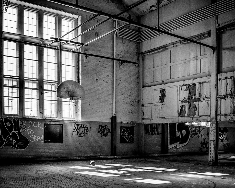
I dodged the backboard as you suggested and it makes a big difference. Thanks! |
Aug 14th |
| 50 |
Aug 19 |
Comment |
Very sharp and crisp scene with awesome reflections. I find the title misleading because the geese on the log are not the main focus, for me, but rather, part of the scene. They do add interest and contribute to the image. I think the image would be stronger if you cropped out the top half of the sky, moving the horizon off-center. As it is, the sky has equal importance for me and I think the reflections of the lake are the focus. |
Aug 14th |
| 50 |
Aug 19 |
Comment |
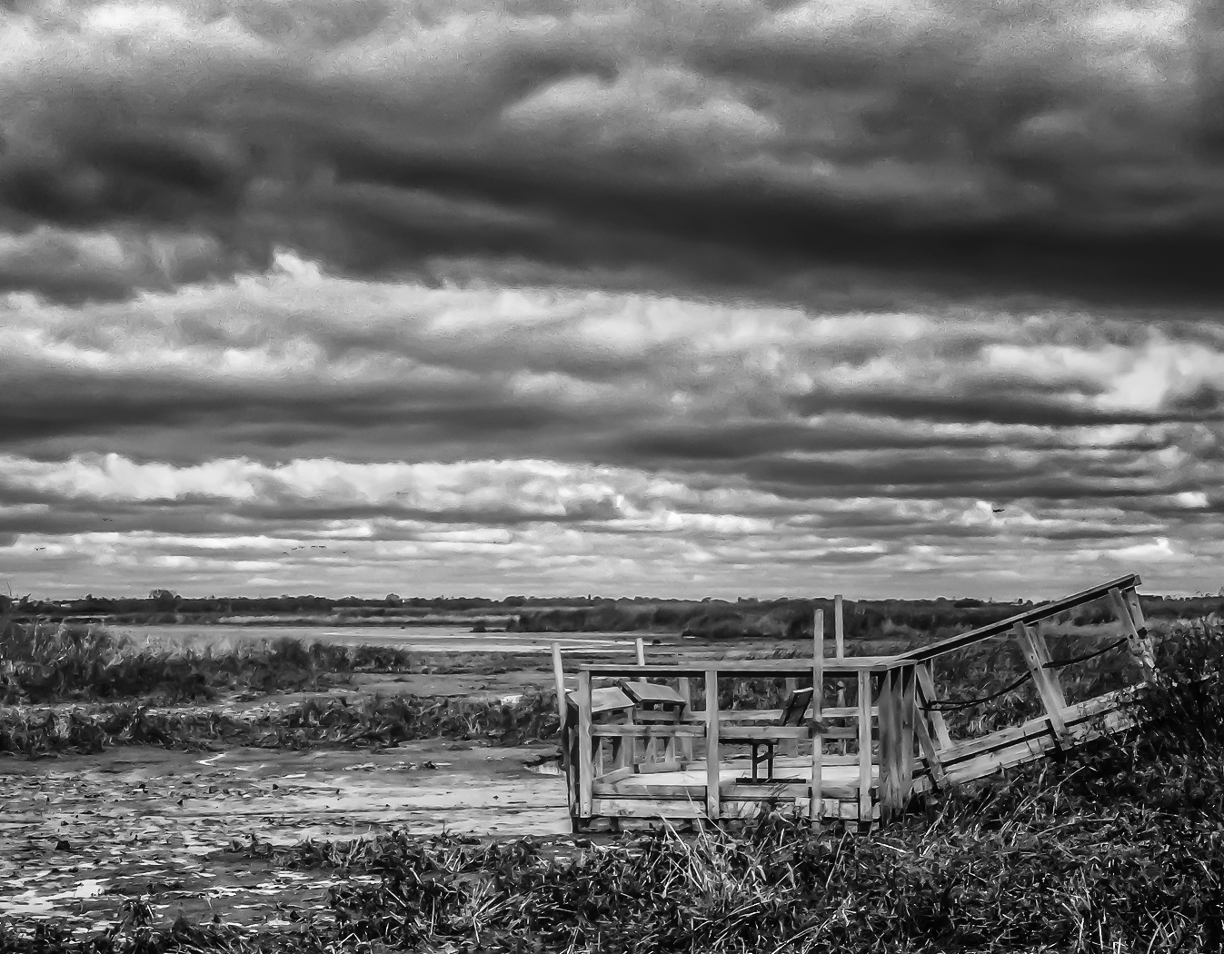
A very serene, peaceful scene. You have placed the horizon at just the right spot. I wish I had that sky in most of my landscapes! The foreground has interesting details. My suggestion is to add contrast to bring out some drama in the sky. I also used the Darken/Lighten Center filter in Nik Color Efex. |
Aug 14th |
 |
| 50 |
Aug 19 |
Comment |
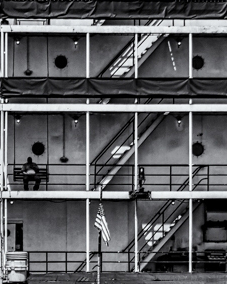
Technically, a great job with wonderful contrast and I like the monochrome version. For me, there is a lot to look at and it's quite busy. I never noticed the man eating lunch until I read your description. I agree that the design of the stairs and the man are the most interesting portions of this scene and wondered if it would be best to focus on just that. |
Aug 14th |
 |
| 50 |
Aug 19 |
Comment |
Excellent portrait with very effective corrections/additions on your part. Your editing made it a much sleeker, "cleaner" image. You have wonderful details and her skin is so smooth. You have a good eye for interesting portraits and wonderful editing techniques. I'm envious! |
Aug 14th |
| 50 |
Aug 19 |
Comment |
Very nice story. Technically, you have an image that is sharp where it needs to be and nicely blurred in the background. I love what David to your photo and agree with all of his suggestions. If you are going to crop the mother where you did, I would attempt to clone out the bright backpack. |
Aug 14th |
5 comments - 5 replies for Group 50
|
| 57 |
Aug 19 |
Comment |
You have good details on the necklace and beautiful colors in the background. I applaud you for experimenting. You may want to try different positioning or cropping for a different look. For me, the necklace looks like it is floating. |
Aug 14th |
| 57 |
Aug 19 |
Comment |
This is a creative image with interesting background colors that are nicely blurred. The double shadow is unique and interesting. The insect, itself, is quite blown out. Can you burn a little and bring back some of the details? |
Aug 14th |
| 57 |
Aug 19 |
Comment |
Nice shoot with good details. The antennae and legs are in focus and your background is nicely sharp. You may want to add a slight vignette to keep the eye in the frame.
I, too, would appreciate a larger image size to view. I size at 140 resolution and 1024 X 768 (can't be taller than that) pixels.
|
Aug 14th |
| 57 |
Aug 19 |
Comment |
I really like your shallow depth of field and the details and focus on the wine glass. I agree with Jessica that there need to be more room at the bottom of the glass and that the person needs to be cloned out of the reflection. Nice job and worth the effort to adjust. |
Aug 14th |
| 57 |
Aug 19 |
Comment |
Nice details on the feathers and beak of the flamingo. Your background is nicely blurred, as well. I agree with the comments above that the brown strip doesn't add to your image. I would either crop it out or clone the green to the bottom. |
Aug 14th |
| 57 |
Aug 19 |
Comment |
You were able to get good details and stop his motion. I would suggest cropping a little tighter and darkening down the background which is slightly distracting. |
Aug 14th |
6 comments - 0 replies for Group 57
|
20 comments - 6 replies Total
|