|
| Group |
Round |
C/R |
Comment |
Date |
Image |
| 12 |
Jul 18 |
Comment |
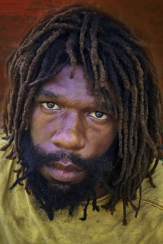
Such a simple and creative image which is very appealing. I love the background texture you have added. |
Jul 15th |
1 comment - 0 replies for Group 12
|
| 16 |
Jul 18 |
Comment |
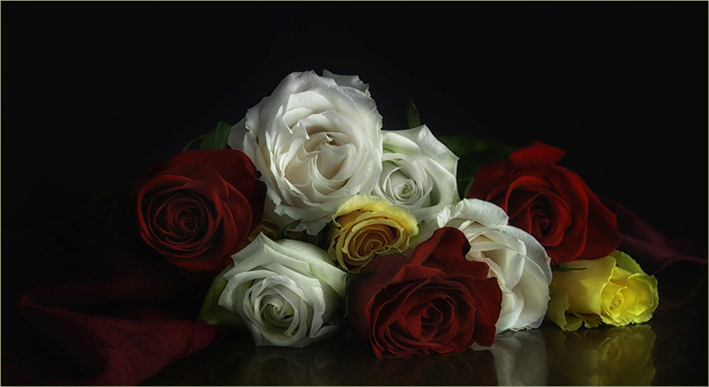
Also from a different group. I love the lighting and composition. You caught the right time to capture this shot. |
Jul 15th |
1 comment - 0 replies for Group 16
|
| 20 |
Jul 18 |
Comment |
I was surfing through several groups and your image stood out to me. I love the subtle colors, lighting and composition. It's lovely and I like your original better than the textured version. Beautiful work; I wish it were mine!
|
Jul 9th |
1 comment - 0 replies for Group 20
|
| 45 |
Jul 18 |
Reply |
What did they say? |
Jul 14th |
| 45 |
Jul 18 |
Comment |
Thank you for giving us the history behind this scene. It's so interesting and I learned something! You did a good job of bringing out the details in this image and I really like the aqua color against the orange and brown tones. The grunge look you have fits the scene. I only wish that you didn't have a merge of the machine and the border at the top. |
Jul 11th |
| 45 |
Jul 18 |
Reply |
It's a great shot, worth playing with. |
Jul 9th |
| 45 |
Jul 18 |
Comment |
|
Jul 9th |
 |
| 45 |
Jul 18 |
Comment |
Such an interesting photo, that I couldn't help myself from playing with it a bit. For my taste, the final version is too tightly cropped and you have introduced a lavender color to his face. I kept the original crop, added a background layer and then some more detail. Lastly, I used Nik Color Efex - Darken Lighten Center. |
Jul 9th |
| 45 |
Jul 18 |
Comment |
Good focus on the turtle which is set off nicely by the great, soft-blurred background. I like the stone wall gone, too. Nice job! |
Jul 9th |
| 45 |
Jul 18 |
Comment |
Another lovely flower abstract from you. I like the whimsical feel of this, as well as the soft colors. It makes an interesting image. |
Jul 9th |
| 45 |
Jul 18 |
Comment |
The details and lighting are excellent. You really were able to get good focus on the bee even though it is moving. The crop is a little tight for my taste. I think a horizontal crop rather than vertical would have worked better. The blue patch in the upper right pulls my eye to it. I also would suggest flipping the image so that the bee is flying into the image and not out of it. |
Jul 9th |
| 45 |
Jul 18 |
Comment |
I like your vivid colors and the rays of light. I think the blue may be a little too blue, however. I wish we could see the horizon, but that is not always possible. |
Jul 5th |
| 45 |
Jul 18 |
Reply |
I see what you are talking about. Does this look better? |
Jul 5th |
 |
7 comments - 3 replies for Group 45
|
| 50 |
Jul 18 |
Comment |
This image has a nostalgic feel for me. You have great focus and strong contrast. For my taste, the image is a little too bright and looks a little flat. You might consider cropping some off the right because the scene is heavy on the left side. |
Jul 9th |
| 50 |
Jul 18 |
Comment |
I like both the color and monochrome versions. The shadows are just as nice as the stairs itself without competing with them. The contrast and shapes have a great deal of interest. Great composition. |
Jul 9th |
| 50 |
Jul 18 |
Comment |
Great shot! I like the clarity and drama of the "stand out" cliff against the clouds. Well done, I wouldn't change a thing! |
Jul 9th |
| 50 |
Jul 18 |
Comment |
Once again, you have done an outstanding job of stopping the action for awesome focus on the people. The expression on the middle player is exceptional. I really like Gordon's crop which focuses me on that expression. |
Jul 9th |
| 50 |
Jul 18 |
Comment |
For me, the focus is on the top half of the image and not much going on in the bottom half. Perhaps dodging rays of light into the water would tie the two halves together. |
Jul 9th |
5 comments - 0 replies for Group 50
|
| 57 |
Jul 18 |
Reply |
You've got a point, thanks. |
Jul 30th |
| 57 |
Jul 18 |
Comment |
Cute idea. I think a closer crop would make it stronger. You don't need so much beyond the subjects. I know rules are made to be broken, but, in this case, I think the magic # of 3 would be better than 4. |
Jul 15th |
| 57 |
Jul 18 |
Comment |
I can see why you were drawn to the textures and subtle colors of the pier stone and metal rods. I feel like your composition can't decide whether to go abstract or landscape. If you want it to be an abstract, I would crop to eliminate the water. If you want it to be a landscape, I think you need to pull back and show more of the environment. |
Jul 15th |
| 57 |
Jul 18 |
Comment |
You have good clarity and composition with the main focal point slightly off-center. I don't feel like your background (placemat) really showcases your subject very well. I would change that. Another suggestion would be to blur the coffee in the cup. As, it is now, it is too detailed and gritty looking for my taste. |
Jul 15th |
| 57 |
Jul 18 |
Comment |
I really like what you have created here. I've always wanted to try this post processing treatment. You have inspired me. Well done with great color and clarity. |
Jul 15th |
| 57 |
Jul 18 |
Comment |
The graceful shape of the Canna leaf really draws me in. The leaf has great focus and the slightly blurred background leaf really adds to the image. My only suggestion is to crop the left side to 1) make the focal point a little off-center and 2) to eliminate the top left corner which is distracting.
|
Jul 15th |
5 comments - 1 reply for Group 57
|
20 comments - 4 replies Total
|