|
| Group |
Round |
C/R |
Comment |
Date |
Image |
| 51 |
Nov 24 |
Comment |
You are way beyond me in using these apps. I too thought the right foot was missing but then thought maybe her pant leg was covering her foot. Robert pointed out things I didn't even notice. I'm glad you have fun playing with different apps and the results you can achieve. |
Nov 17th |
| 51 |
Nov 24 |
Reply |
Thanks Rita |
Nov 17th |
| 51 |
Nov 24 |
Reply |
Thanks Jerry |
Nov 17th |
| 51 |
Nov 24 |
Reply |
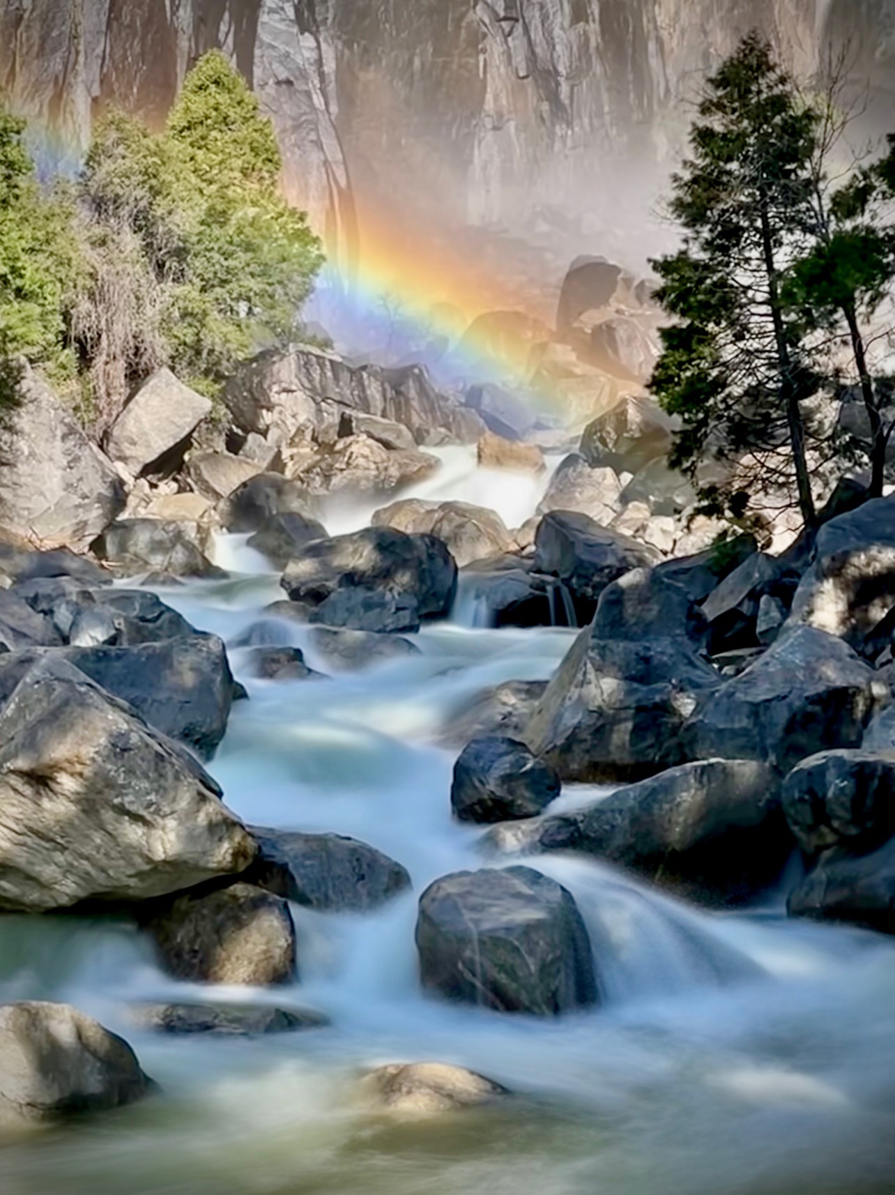
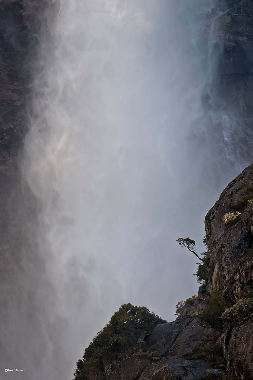
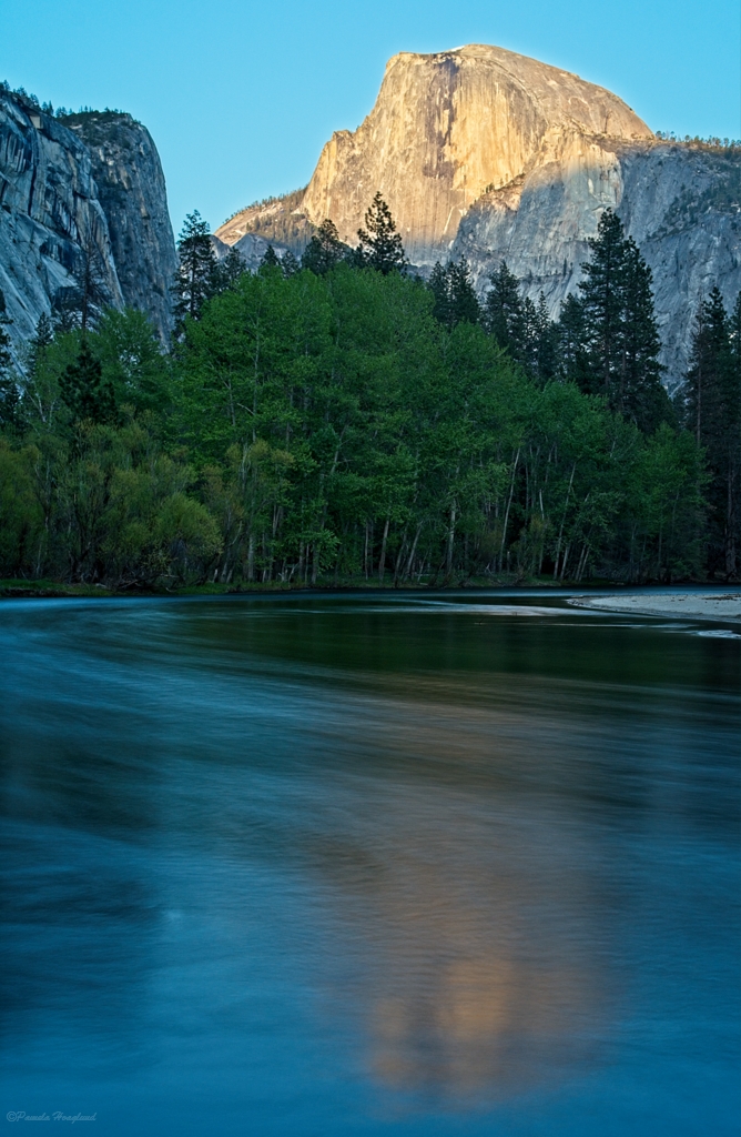
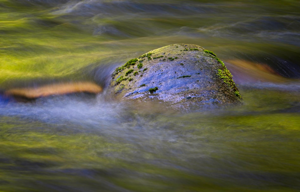
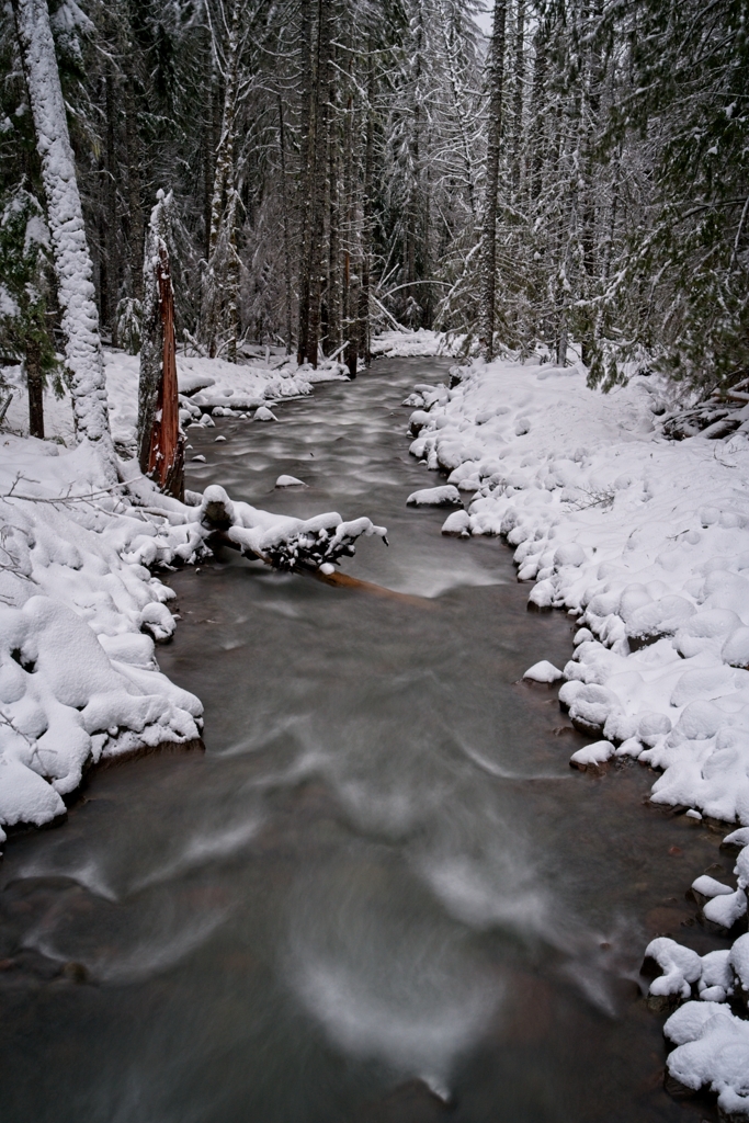
Yes the river was pretty clam where I was standing. I didn't think about using "live" and then selecting long exposure. |
Nov 17th |
| 51 |
Nov 24 |
Reply |
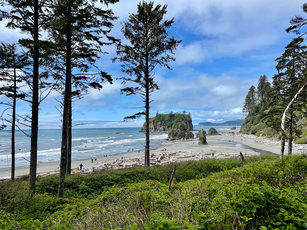
Thank you Sol. I was as far out as I could get without going into the river. I wish I could have gotten beyond the bushes to take the image. |
Nov 17th |
| 51 |
Nov 24 |
Reply |
Thank you for the suggestion Richard. So many decisions in editing. |
Nov 17th |
| 51 |
Nov 24 |
Comment |
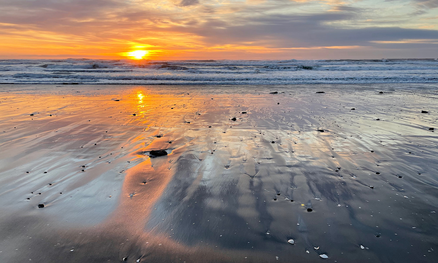
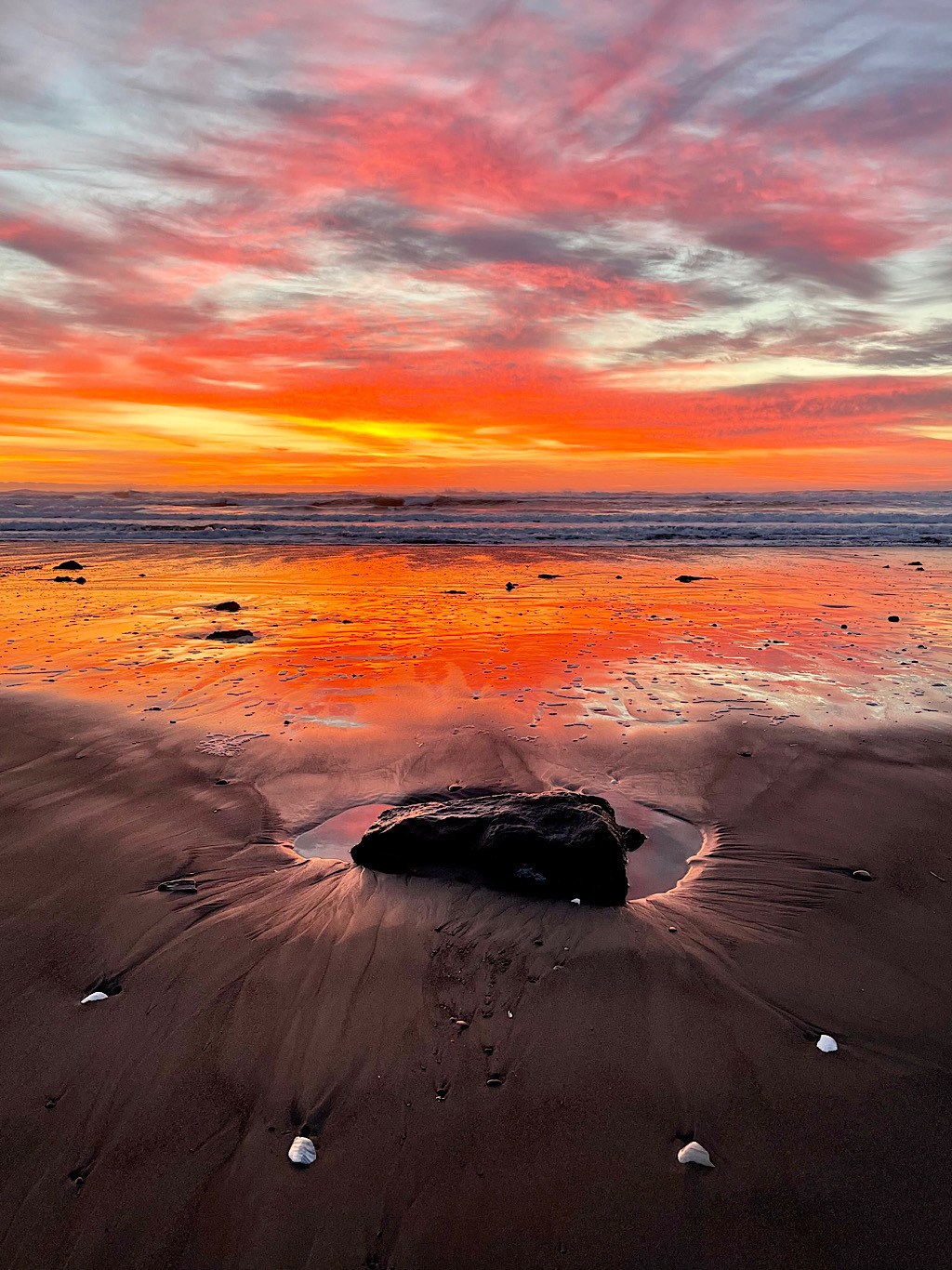
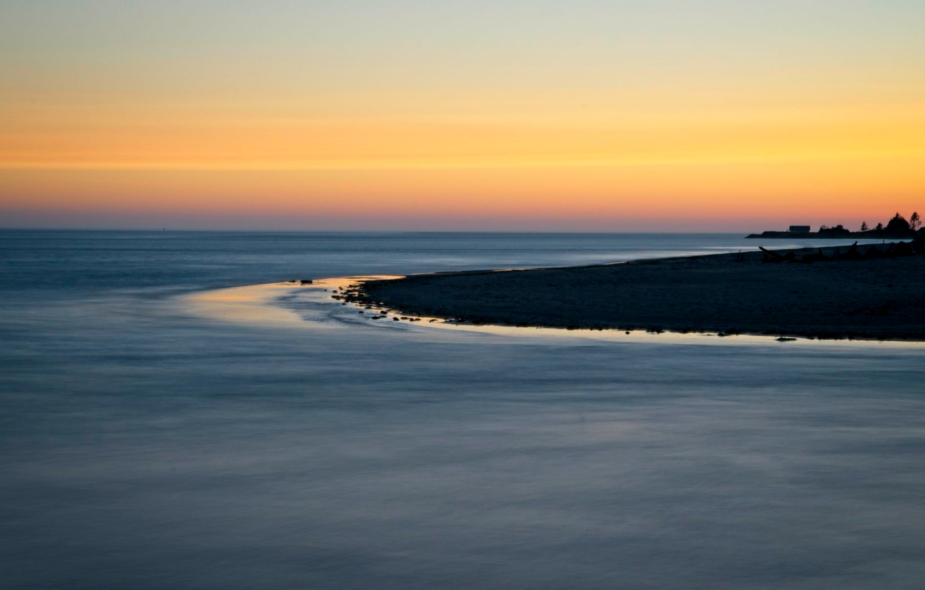
You capture some very interesting images at the sea shore. I really like the composition, the motion of the waves, the woman walking and seemingly watching the waves lest they get too close. The umbrella really adds a great point of interest. My only suggestion is I feel she needs a little more room behind her. To me it feels like she is about to be cut off. |
Nov 17th |
| 51 |
Nov 24 |
Comment |
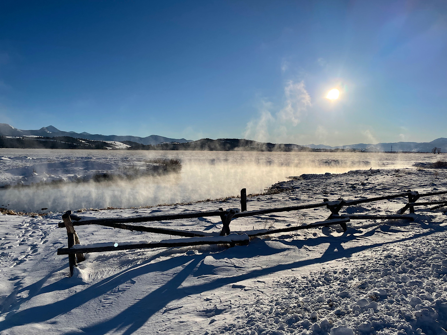
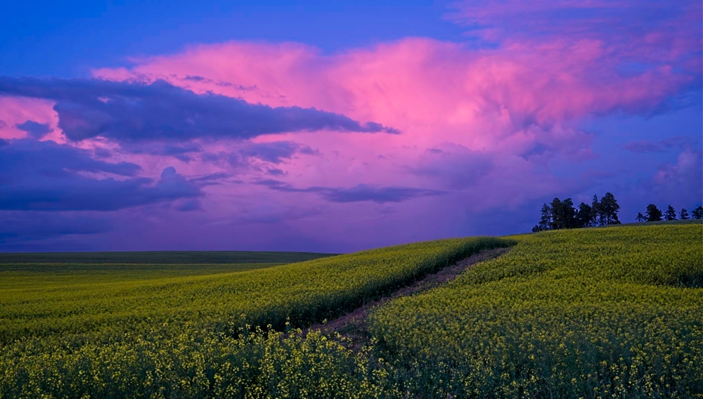
Beautiful example of fall in a pastoral setting. Using the leading line of the fence works well. I agree with Rita in maybe less fence and sky to put more of the focus on the fall trees. |
Nov 17th |
| 51 |
Nov 24 |
Comment |
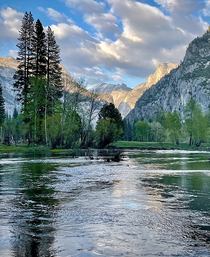
An interesting idea in your cropping. The image has lost some sharpness from the original, not sure why. I think some contrast and increase in vibrance or saturation would help the image to not look so flat. A good example of "look behind you." |
Nov 17th |
| 51 |
Nov 24 |
Comment |
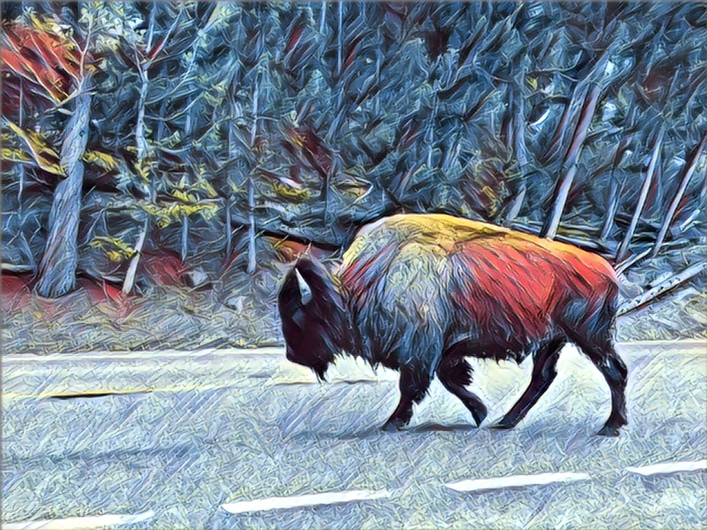
Jerry, are you sure you gave the correct app you used? When I looked it up in the app store Bimostitch appears to be an app to stitch images into a panorama.
I love the effect the app you used did to this image. I love the artistic impression it gives. Well done. |
Nov 17th |
| 51 |
Nov 24 |
Comment |
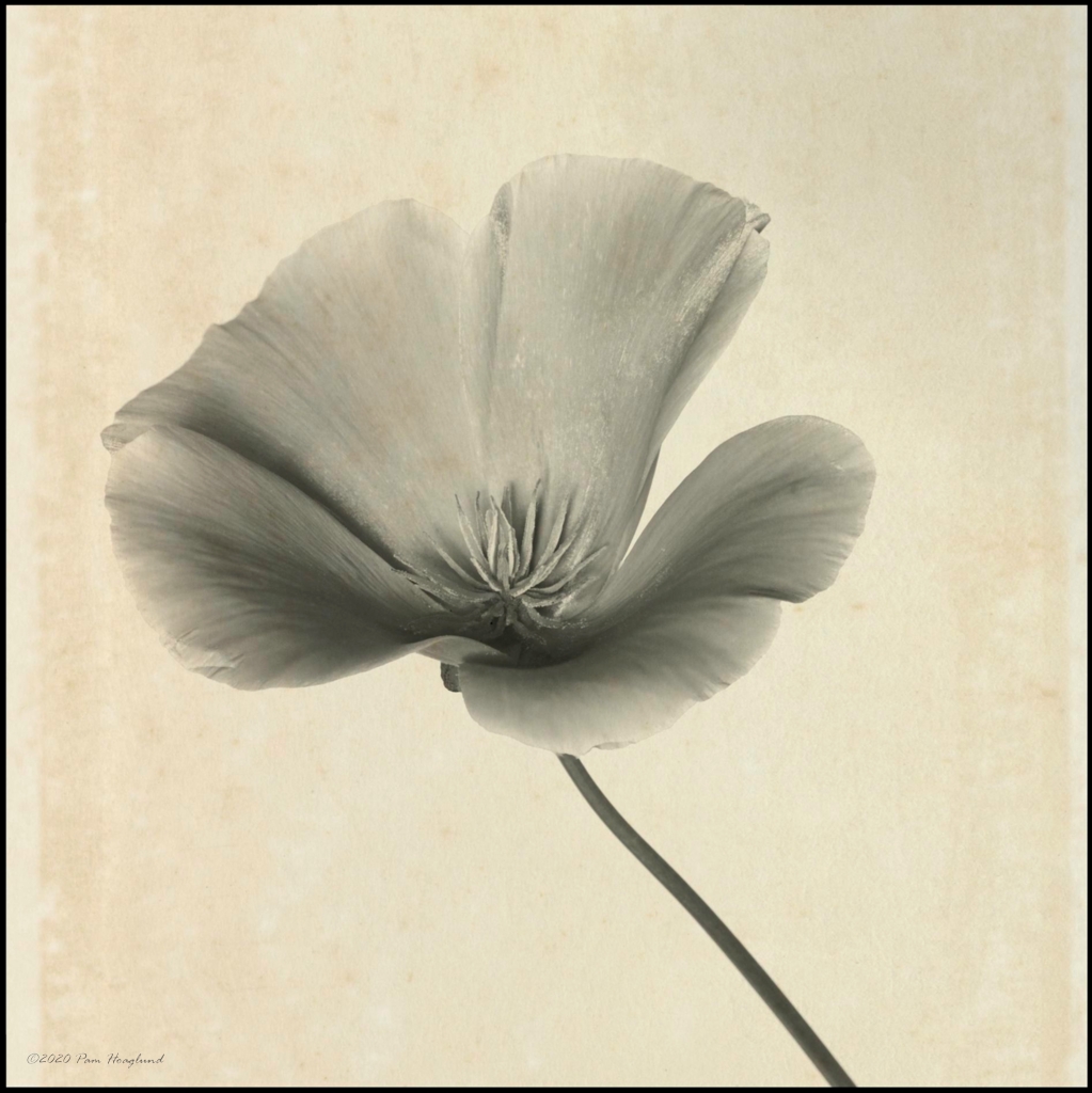
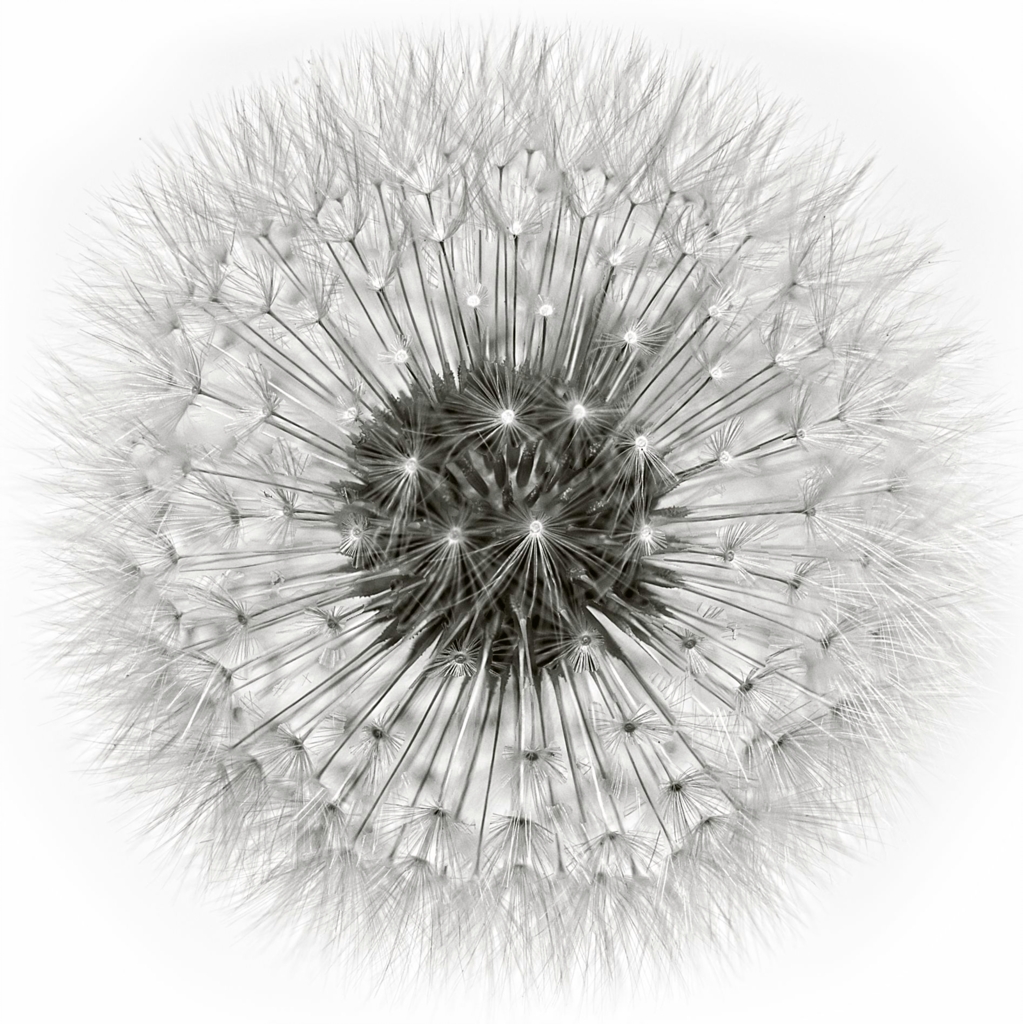
I like your composition and agree with the others about toning down the highlights. A vignette is often helpful in darkening the surrounding area thus focusing the viewers eye on the main subject. The vignette should be subtle enough to not be noticeable. What a beautiful flower. |
Nov 17th |
6 comments - 5 replies for Group 51
|
| 52 |
Nov 24 |
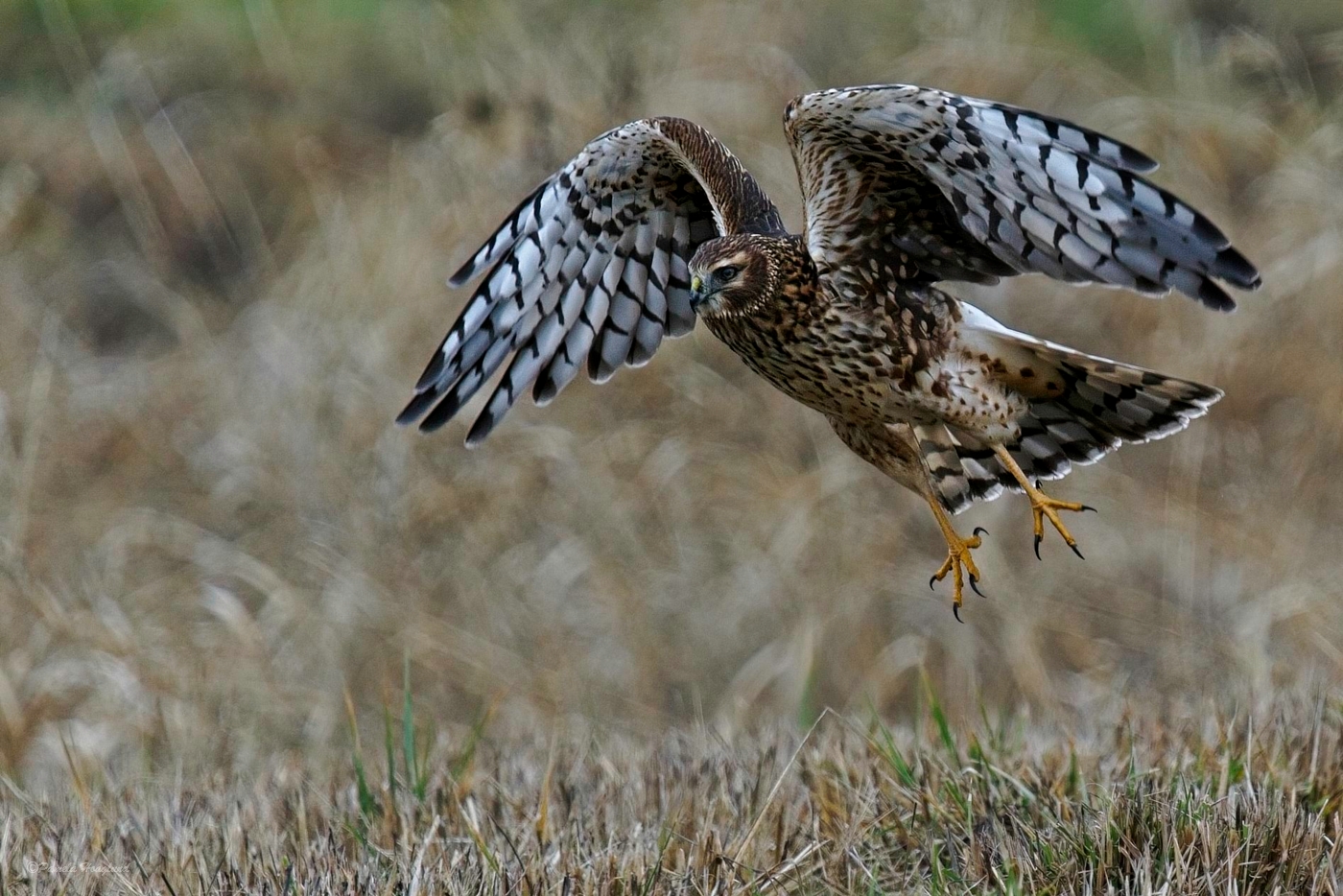
Comment |
A great action shot. The position of the bird doesn't bother me as it is apparent the bird is coming in for a landing and the background is straight. I don't believe I have ever seen a Spoonbill let alone photograph one so I have no idea what the coloring should be. I agree that the background is a little too dark and refer the lighter background of the original image. Well done. |
Nov 17th |
| 52 |
Nov 24 |
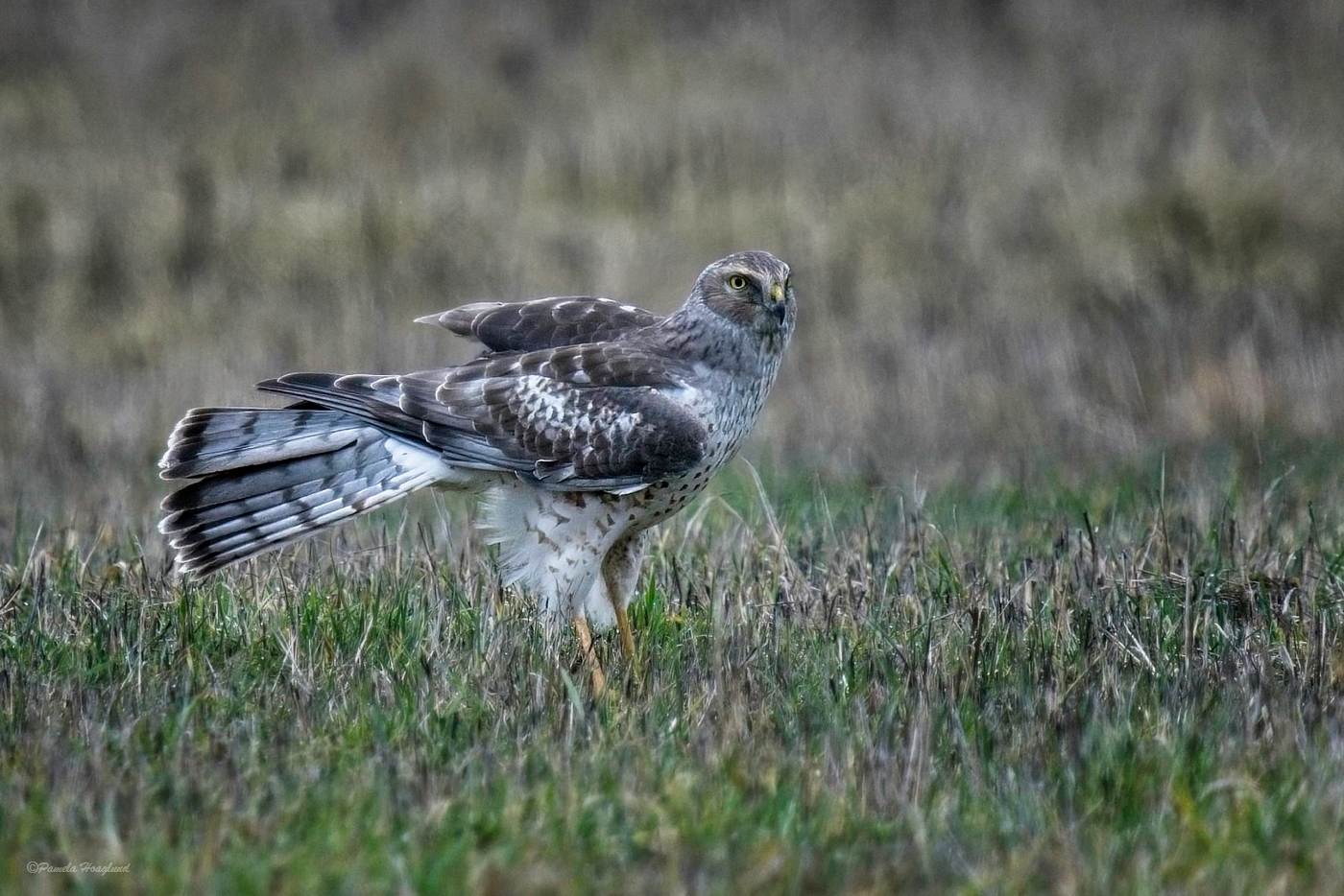
Comment |
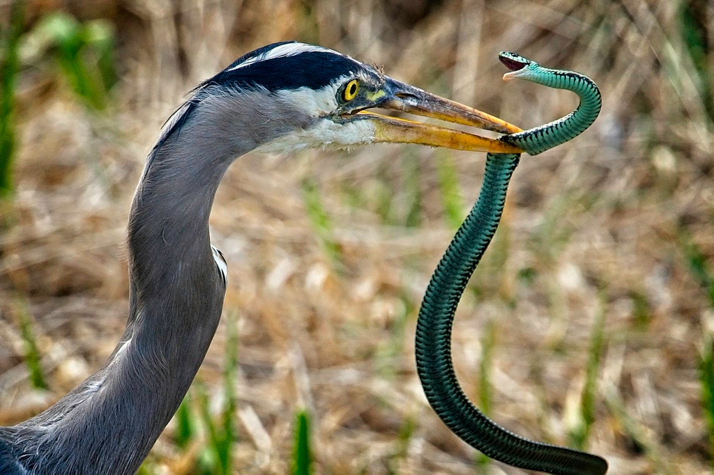
This is a great blue heron. According to my bird book the grey heron is a bird of Asia, Africa and Europe. I agree with Mike that the horizon looks crooked. You have a have a nice grouping of subjects with many stories. I agree with the other comments that have been made and the suggestions so won't repeat what has been said. You got a remarkedly sharp image handheld at 1/55 sec. |
Nov 17th |
| 52 |
Nov 24 |
Comment |
Like Judith I can not see your edited image, not even trying Judith's method and opening in another chrome window. I can however see it on my phone. I think your crop is just right as it places the subject front and center with no distractions around it. Very sharp and I love the eye contact. The angle of the water behind him looks crooked so I might try straightening the image and then cropping to see what it looks like. Well done. |
Nov 17th |
| 52 |
Nov 24 |
Comment |
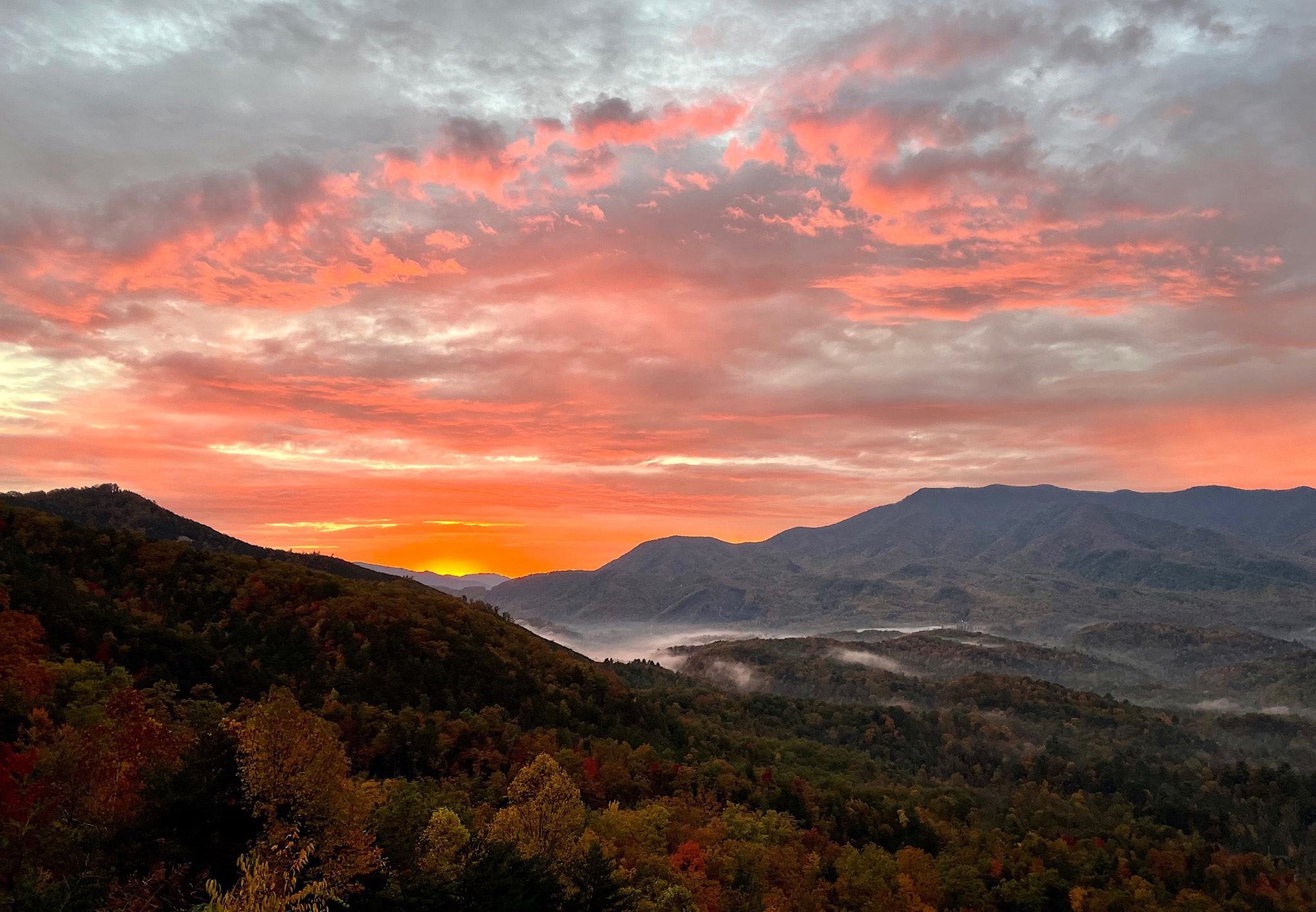
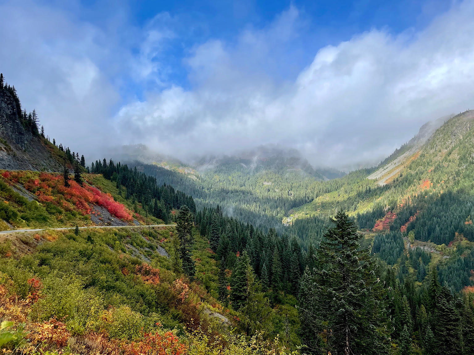
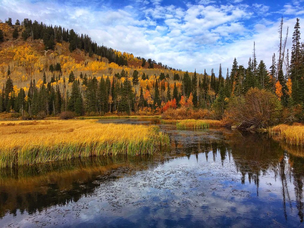
A nice scenic showing the beautiful fall topography of the area where you live. The road wandering through the valley and over the hills is a nice addition and focal point. Makes one wonder where the road leads. To my eye I'm not so sure the horizon is crooked as it might be an illusion as the eye travels from near to far mountains. The trees on the right are definitely leaning while the others look pretty straight. My thought was the same as Polly in cropping in from the right and eliminating those trees. I think cropping more of the sky also would put more emphasis on the topography as the sky is mostly empty. I might suggest adding some dynamic contrast to all but the sky as it will boast the detail and add some sharpness. A beautiful area to hike. |
Nov 17th |
| 52 |
Nov 24 |
Comment |
A great action shot of this Downy Woodpecker. You had enough shutter speed to freeze most of the motion in the wings. It appears very sharp with nice catch light in the eye. A nice bonus was that he had a seed in his beak. Possibly a little tighter crop on the left and top while removing the twig and a slight vignette would in my opinion really focus in on the bird. Love the softness and coloring of the background as it helps set off the bird. Well done. |
Nov 17th |
| 52 |
Nov 24 |
Reply |
Thanks Polly. I did notice the branch and thought about working on it. Sometimes trying the detail removals leads me into more trouble and distortion. |
Nov 17th |
| 52 |
Nov 24 |
Reply |
Thanks Sharon. Sometimes I'm not sure what direction to take in my edits. I did mask the deer and added dynamic contrast and sharpening. I didn't think about adjusting the WB on her. Good suggestions. |
Nov 17th |
| 52 |
Nov 24 |
Reply |
Thanks Ally |
Nov 17th |
| 52 |
Nov 24 |
Reply |
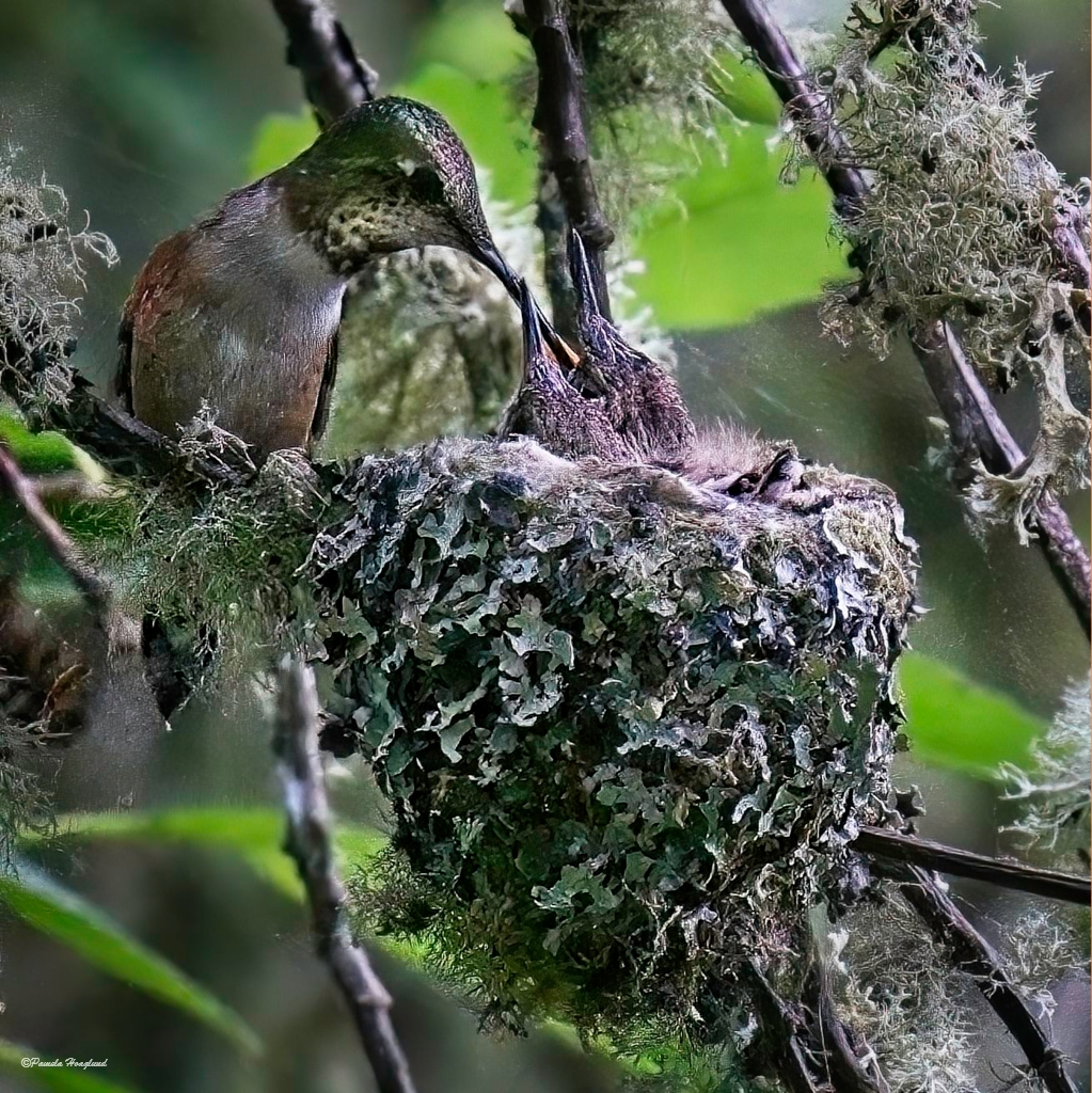
Photographing a subject in a dense forest is a challenge and editing for me is more of a challenge in trying to figure out what to do. I appreciate your suggestions. |
Nov 17th |
| 52 |
Nov 24 |
Reply |
Thanks Judith |
Nov 17th |
| 52 |
Nov 24 |
Comment |
Turkeys are like moose, they are so ugly they are cute. I like how you cropped to isolate this majestic fella from the rest. The one thing that pulls my eye away is the different feather in the bottom left corner. I might suggest trying a vertical crop as that might eliminate that feather and see what you think. I like the suggestions from the others so won't repeat them. The wattle in the original is a deeper red and to me it looks flat in the edited version. Maybe mask the head and bring out the reds and blues more. I hope he escapes the Thanksgiving table. |
Nov 17th |
6 comments - 5 replies for Group 52
|
12 comments - 10 replies Total
|