|
| Group |
Round |
C/R |
Comment |
Date |
Image |
| 66 |
Sep 24 |
Comment |
Great rendering of this scene, Gary. It is a bit heavy as the others say, but then again it focuses attention on the cemetery crosses beautifully. It's bold, especially the cross on the right, but it works. I like it. |
Sep 5th |
| 66 |
Sep 24 |
Comment |
The positioning of the three cars is perfect, and with the two further back, works great. I can see this with a pitch black sky, but your use of the blue is in keeping with your style of late and contributes its own unique feel. I can see Palli's point about having just a bit too much of the neatly mowed grass foreground. Overall, great mood and another compelling image Arik. |
Sep 5th |
| 66 |
Sep 24 |
Reply |
Thank you for taking the time, Emil. Your crop definitely shows the ruins better. I think I'm still partial to the wider shot, but both work. |
Sep 3rd |
| 66 |
Sep 24 |
Reply |
I really like your version, Palli! The right to left, and the tonal adjustments, it works better, thanks.
|
Sep 3rd |
| 66 |
Sep 24 |
Comment |
I can understand the accolades, Henry. The way you've rendered this is just beautiful. The crop is perfect, and the way the leaves go right up to the other stem is as well! Seeing the original makes me appreciate what a great job you did in seeing this, and then making it your own. |
Sep 1st |
| 66 |
Sep 24 |
Comment |
It's a lovely peaceful, tranquil, scene, Emil. It looks like maybe you didn't have full sun, as the foliage has beautiful, varied tonalities, and a softer feel. The river provides a nice leading line, and subtle reflections. Some might say to increase the contrast, but I like it like this. |
Sep 1st |
| 66 |
Sep 24 |
Comment |
I like how on one level it's just the side of a metal barn, Palli, but then when one ponders it, one can begin to appreciate the graphical qualities. I like taking images like this, too.
I like the way the branches reach up into the empty space from below. I also like the darker foliage on top, and the vertical lines of the building. The slanted line of the building frame (center) provides a lot of tension! Part of me wants it to be vertical, but I think it's necessary as is.
My only nitpick is that at the far left, I can see beyond, a little bit, and I wish the foliage was thicker here to prevent that. |
Sep 1st |
| 66 |
Sep 24 |
Comment |
The blue tint is a good choice, Charles. That along with the observatories and the arc of light, creates an eery mood. It could also be cropped into more of a pano, as there is a lot of empty sky, even taking into account the arc. The clouds down below also make it a little other-worldly, although we have scenes like that here often in California as well. Nicely rendered. |
Sep 1st |
| 66 |
Sep 24 |
Comment |
There is a lot of interesting context here, Melanie. There is the clothesline, the second woman, and I particularly like the mural, which provides a bit of mimicry for the main woman. Another image would have been to get closer in, show her eyes, etc, but this one also works fine. Have a good trip! |
Sep 1st |
7 comments - 2 replies for Group 66
|
| 86 |
Sep 24 |
Comment |
Good way of simplifying what was probably a busy scene. I agree with the others, the overlap detracts just a bit. But I like the saturated colors. |
Sep 22nd |
| 86 |
Sep 24 |
Reply |
Thanks Steve. I do have other versions that address these issues, but I don't like the overall scene as well.
For Travel images in club competitions, etc, I think cloning isn't allowed. Thanks for the input! |
Sep 6th |
 |
| 86 |
Sep 24 |
Comment |
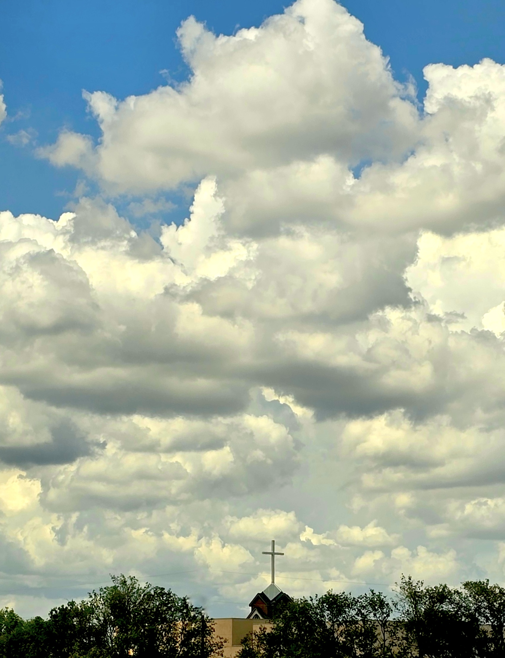
Great sky and clouds, Ruth! I like to punch it up a bit on skies like that, bring out the blue more, etc. Just takes a little contrast and saturation. Also, by cropping out the very bottom the viewer concentrates more on the church. |
Sep 4th |
 |
| 86 |
Sep 24 |
Comment |
Nice color, nicely blurred background, Kieu-Hanh. As a nature image I like how we can see all the stages of bloom, from the buds, to the spent flowers. |
Sep 1st |
| 86 |
Sep 24 |
Comment |
I like fall leaves in urban scenes, Sue. The blue car makes this work well, as the color complements the gold in the leaves. And look at the reflections on the windshield and hood, nice. I'm not sure you needed to clone out the second car, as it's already and urban scene, but let's see what the others think. In your edit you could crop some off the bottom, as we can see your phone taking the picture ;) unless you wanted to include that. |
Sep 1st |
| 86 |
Sep 24 |
Comment |
Nice abstract, Steve!
You passed on the more obvious version, which would have been like the original (maybe without the lobby). The tilt, and then accentuating the darker every other row, really makes this work. And it's a great fit for black and white. |
Sep 1st |
5 comments - 1 reply for Group 86
|
12 comments - 3 replies Total
|