|
| Group |
Round |
C/R |
Comment |
Date |
Image |
| 66 |
Nov 22 |
Reply |
Thanks Charles, I hadn't noticed the lamp post. I agree! |
Nov 6th |
| 66 |
Nov 22 |
Reply |
I think your version is spot on Palli as it controls the highlights and has good contrast throughout, thanks! |
Nov 4th |
| 66 |
Nov 22 |
Reply |
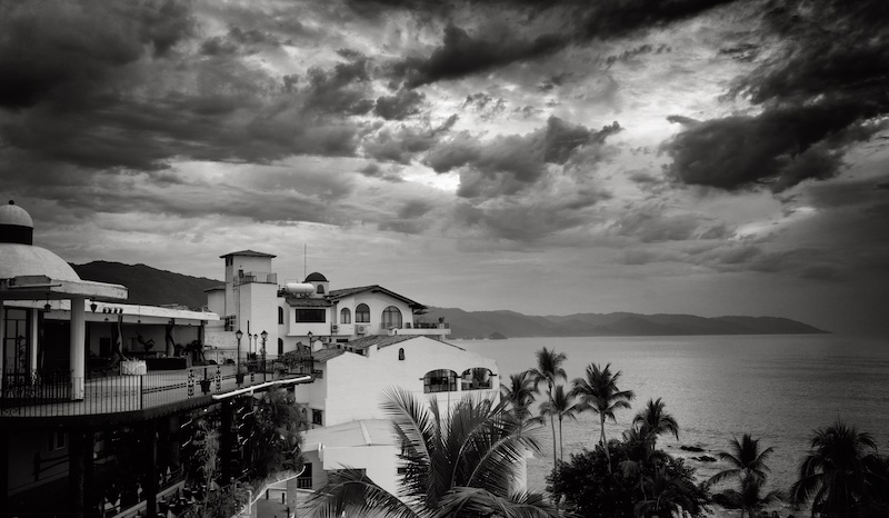
Thanks, Gary, I always appreciate your taking the time. Your sky is definitely more striking! I think with a little finesse on the building (I did a shadows adjustment and brightened the top) this would work for me. |
Nov 3rd |
| 66 |
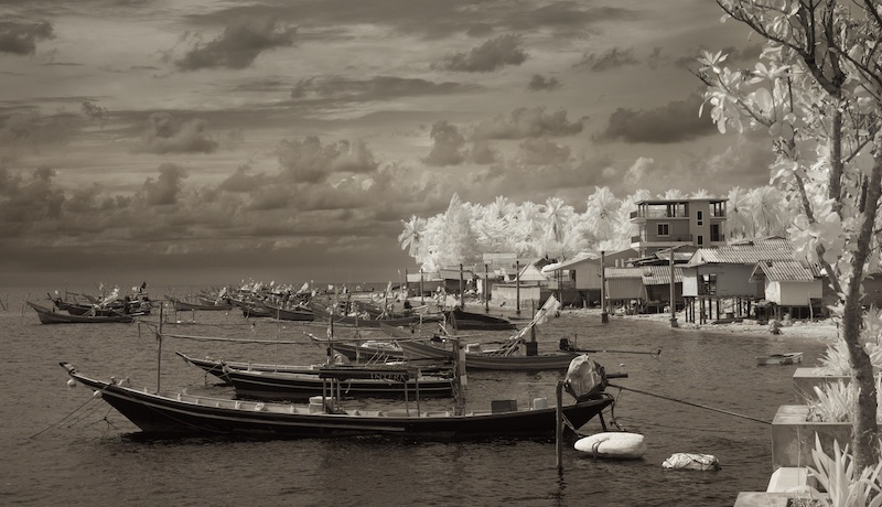
Nov 22 |
Comment |
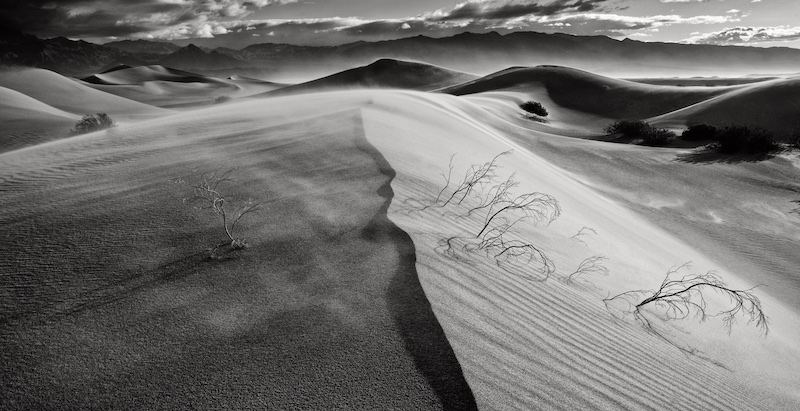
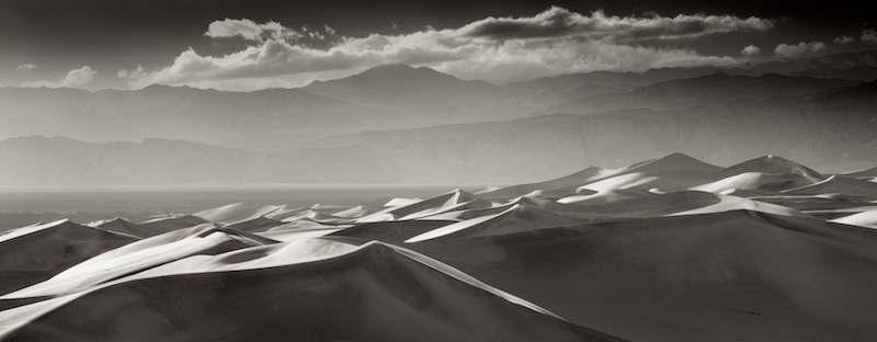
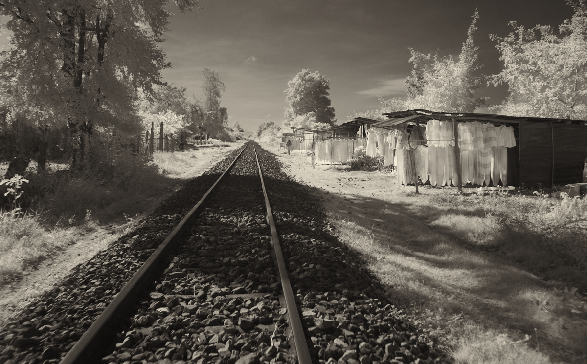
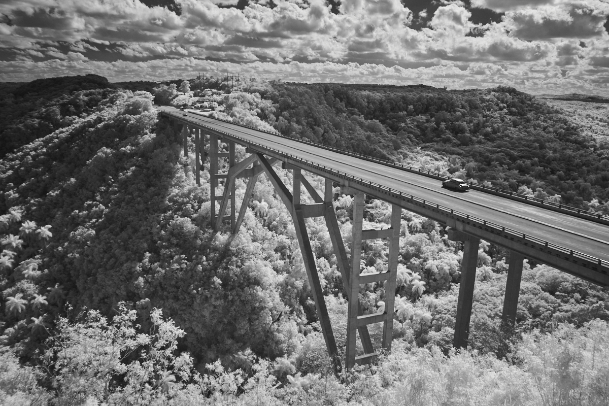
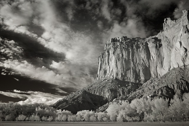
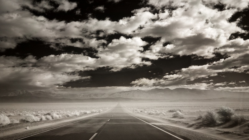
Setting up your shot with those two boats in the lower corner makes this shot, Henry. It's a very effective composition, the river makes a great leading line. One could say there's too much empty space in the river itself, though you have some nice reflections on the left side, and a nice sky. This looks like mid day light, and like you I often find IR does a better job of handling it. |
Nov 3rd |
| 66 |
Nov 22 |
Comment |
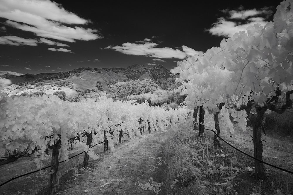
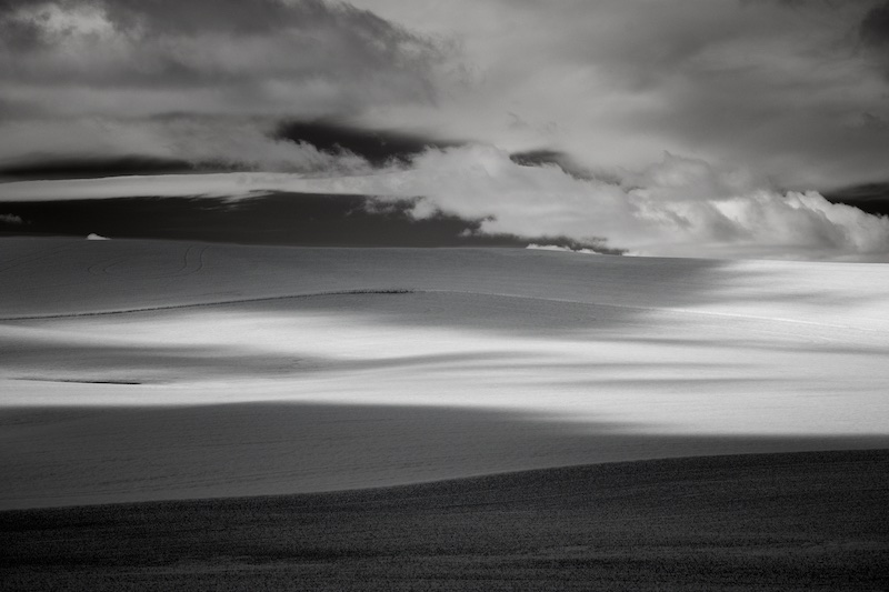
You have an eye for composition, Emil, the way you have positioned and set this up is classic. But for me you have perhaps just a bit too much sky, and I'd crop down just a little. Also, and while I realize this is your style, I think the sky could use a little more contrast, but not so much that it competes with the very tranquil landscape.
I just noticed I can see a glimmer of a third silo beyond the front two, which I like as a little detail and it adds some depth. I like the mood and sense of place you've conveyed here. |
Nov 3rd |
| 66 |
Nov 22 |
Comment |
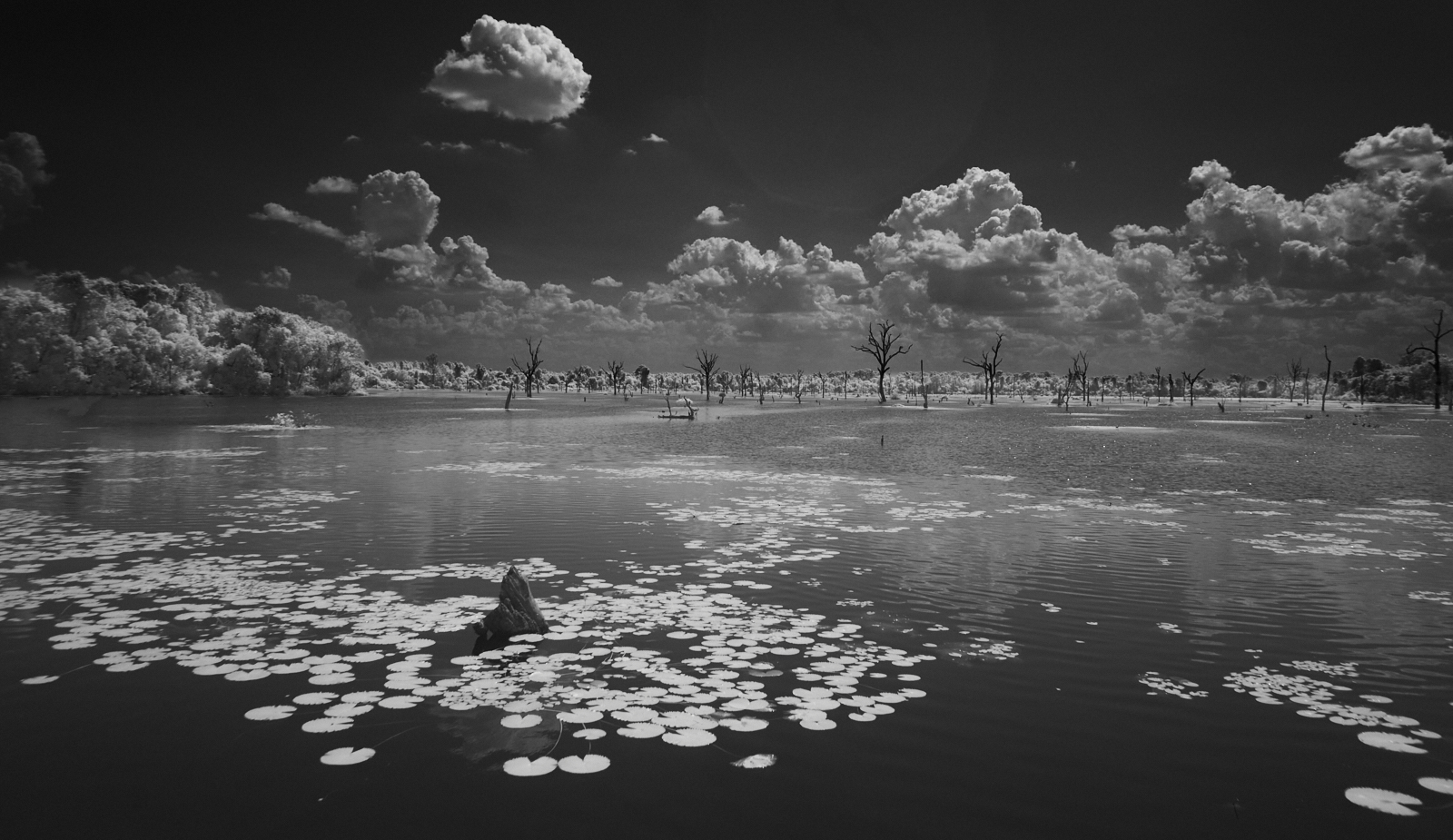
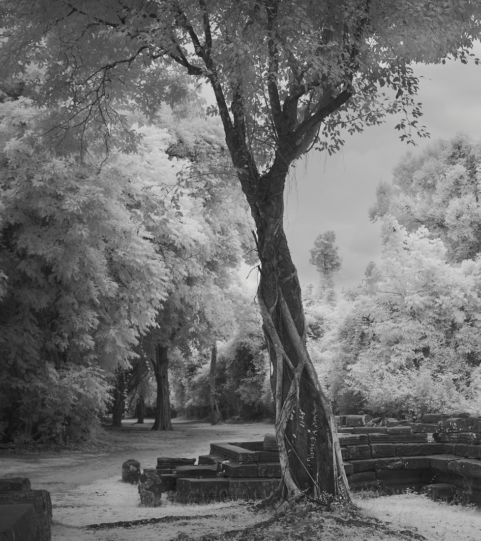
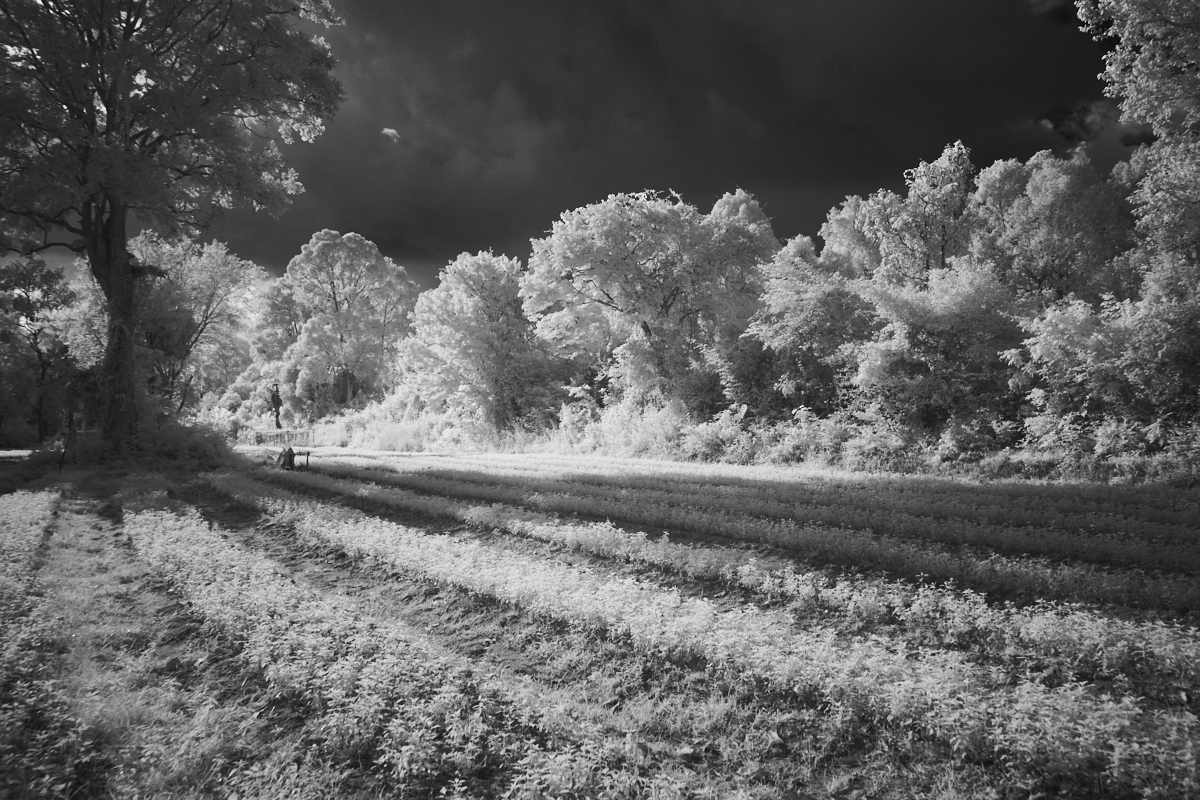
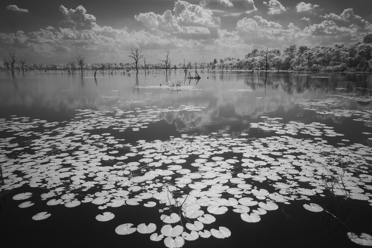
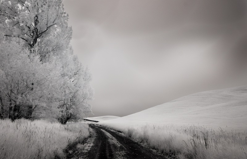
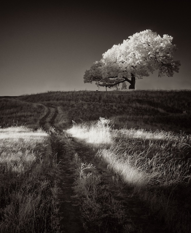
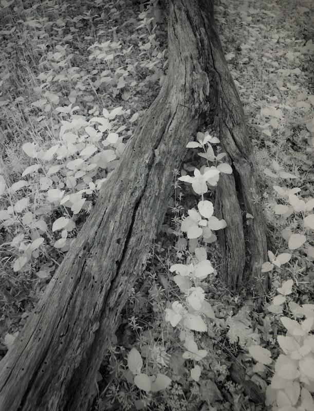
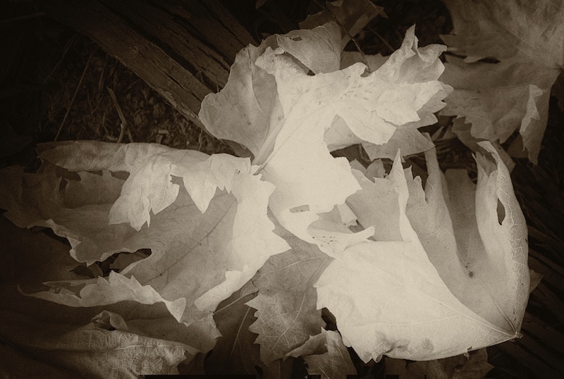
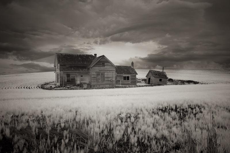
We don't often see photo journalism done in infrared, Palli, so good for you doing something different. I like the way the grass stands out in white. For some reason, I like this lots more just cropping down from the top a little, so one can't see the sky. It's because my eye goes right to that edge, (roots/sky) the area of highest contrast. With that cropped out, my eye can enjoy the rest of the scene. I will be curious to see what others think. |
Nov 3rd |
| 66 |
Nov 22 |
Comment |
Wonderful creativity and execution on this, Gary, with the caveat Arik mentioned.
My favorite part are the painted nails.
I often have difficulty with images taken from behind people, for some it adds tension in a good way but for me it's more discomfort, unless there's a visible reason for it. So, the realist in me has a hard time buying into this scene, but I love what you've done with the processing of it. |
Nov 3rd |
| 66 |
Nov 22 |
Comment |
Charles, I too get a little sense of unease with this, maybe it's because the bridge and pond compete with being the subject? I think the original works a little better, because the colors are more natural, and I like seeing bits of the sky through the trees. In the edit, I think the blue is too pronounced, and my taste would be for a more subtle blue. |
Nov 3rd |
| 66 |
Nov 22 |
Reply |
Thanks Arik, I agree with you about the contrast, looking at this again I may have submitted it too hastily. Here is an edit. |
Nov 3rd |
 |
| 66 |
Nov 22 |
Comment |
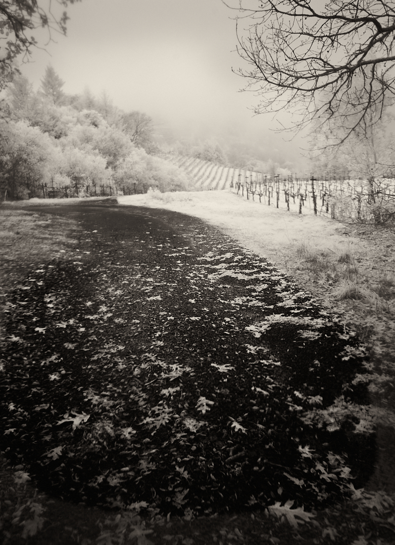
Even without the nice pastel tones, this is a compelling composition Arik. I think you set up just right, I love being able to see through to the beyond. And I always enjoy leaves on a country road. There's a great sense of place and mood which takes this beyond so many we see of this type of scene.
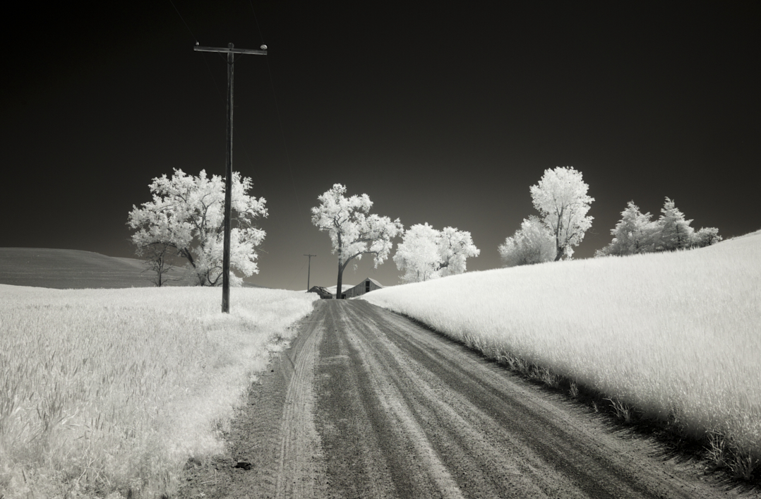
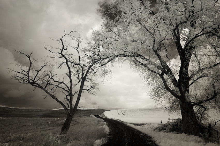
But as to the sky, while I can see and appreciate what you were after, it's not quite there, the processing feels incomplete and too noticeable. I think it's the darker edges of the trees, something I always struggle with too. I'm not sure how I would address it, but I'm sure others will have ideas. |
Nov 3rd |
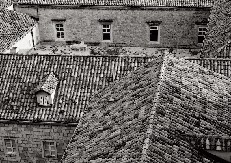
| 66 |
Nov 22 |
Comment |
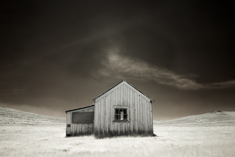
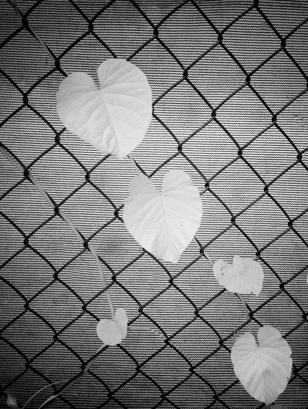
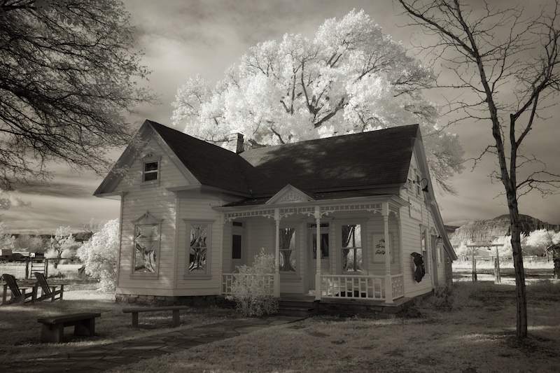
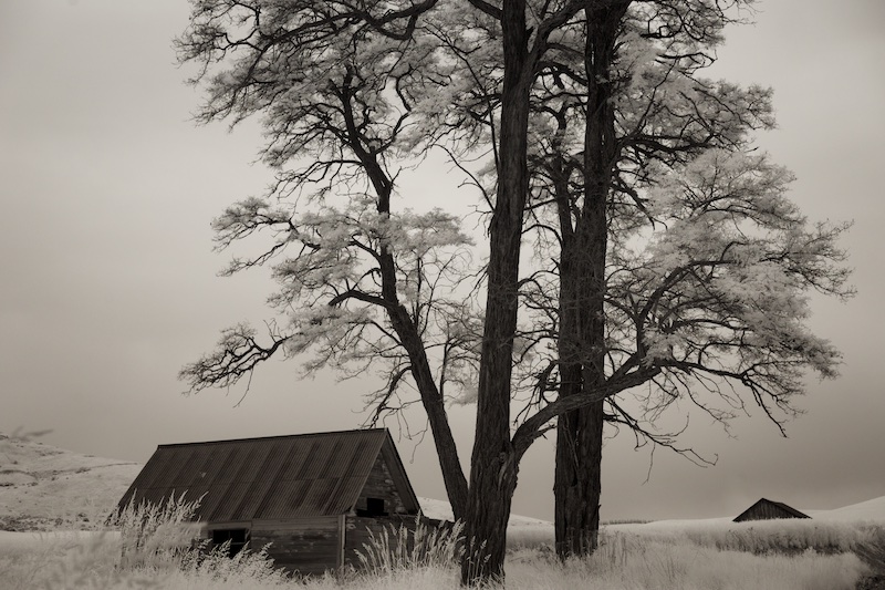
It's a nice IR scene, Melanie, the bonuses for me are the shadows on the roof, and the mimicry of the diamond with the roofline. Also, the chain link gate adds a bit of grunge. |
Nov 3rd |
7 comments - 4 replies for Group 66
|
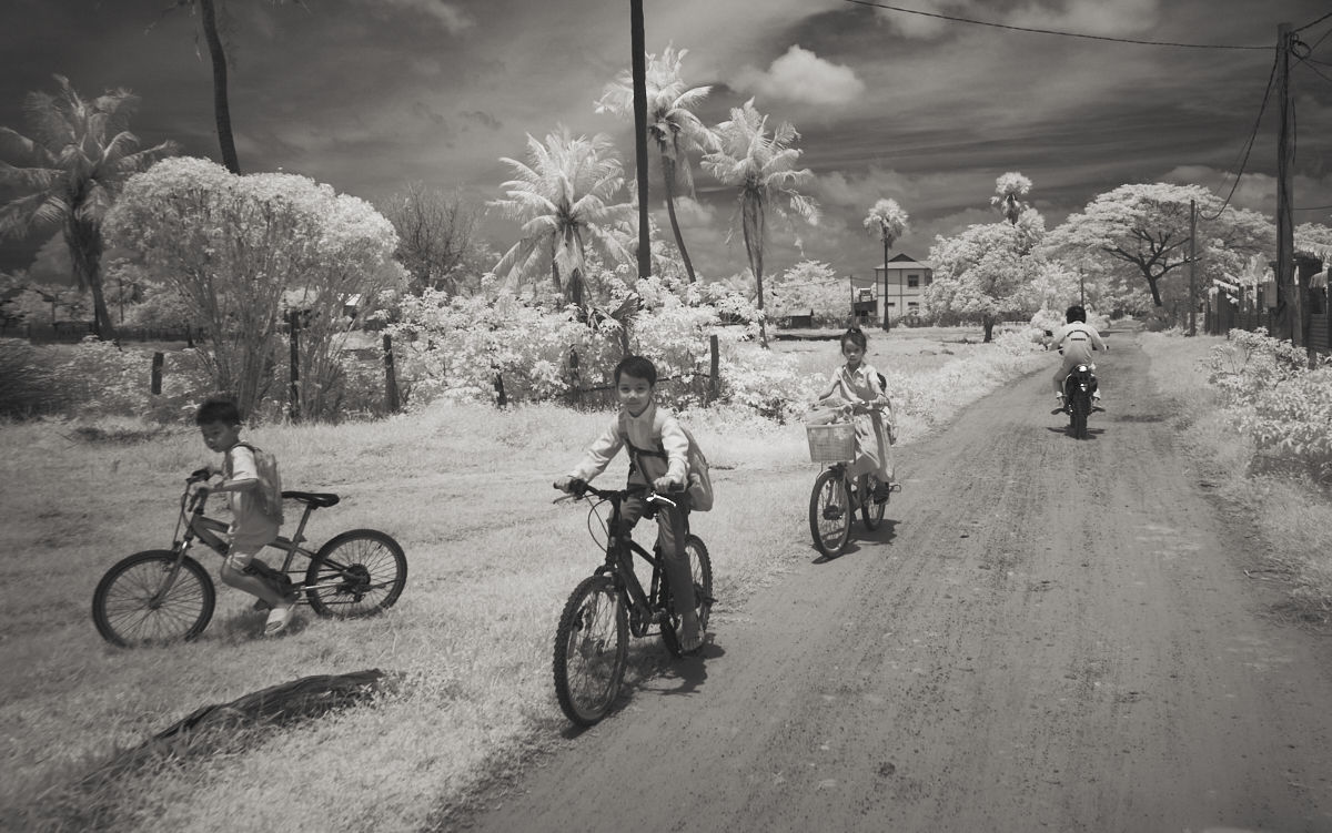
| 86 |
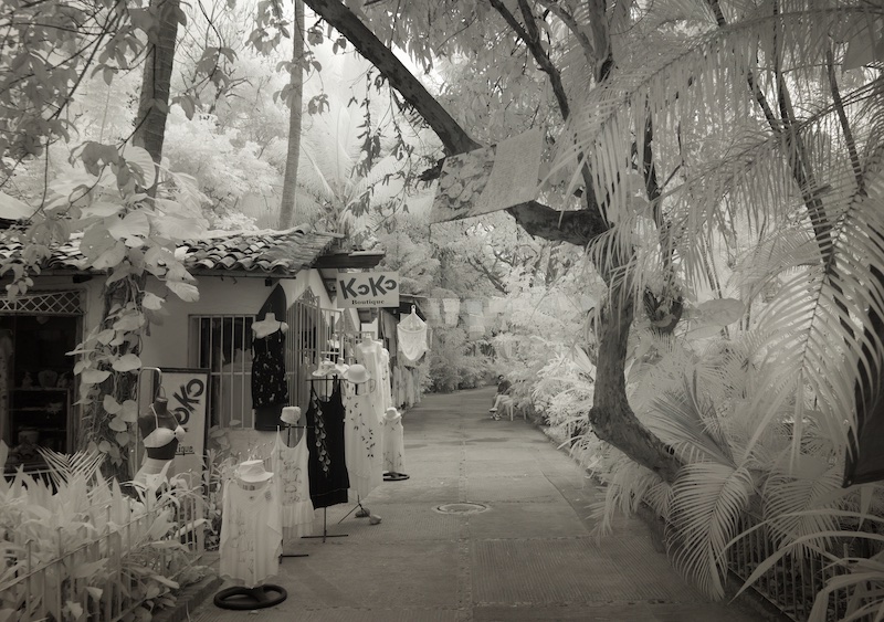
Nov 22 |
Comment |
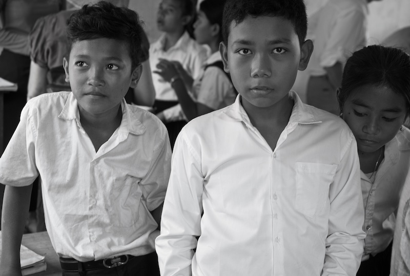
While Steven's is certainly a cool effect, I think of this more as photo journalism, so another way of reducing the urban scene is just to crop in a little closer. We sometimes think we need to include people in their entirety, yet it's common in advertising and product shots to crop into people. See what you think about this closer crop. It focuses the eye more on the great scene you captured. |
Nov 10th |
 |
| 86 |
Nov 22 |
Comment |
Your treatment gives a nice old feel to it, Pat, fitting for the old truck. The vignette works well. I can't think of anything I'd do to improve, except my personal preference would be for a little bit of sepia tone to contribute to the effect. |
Nov 10th |
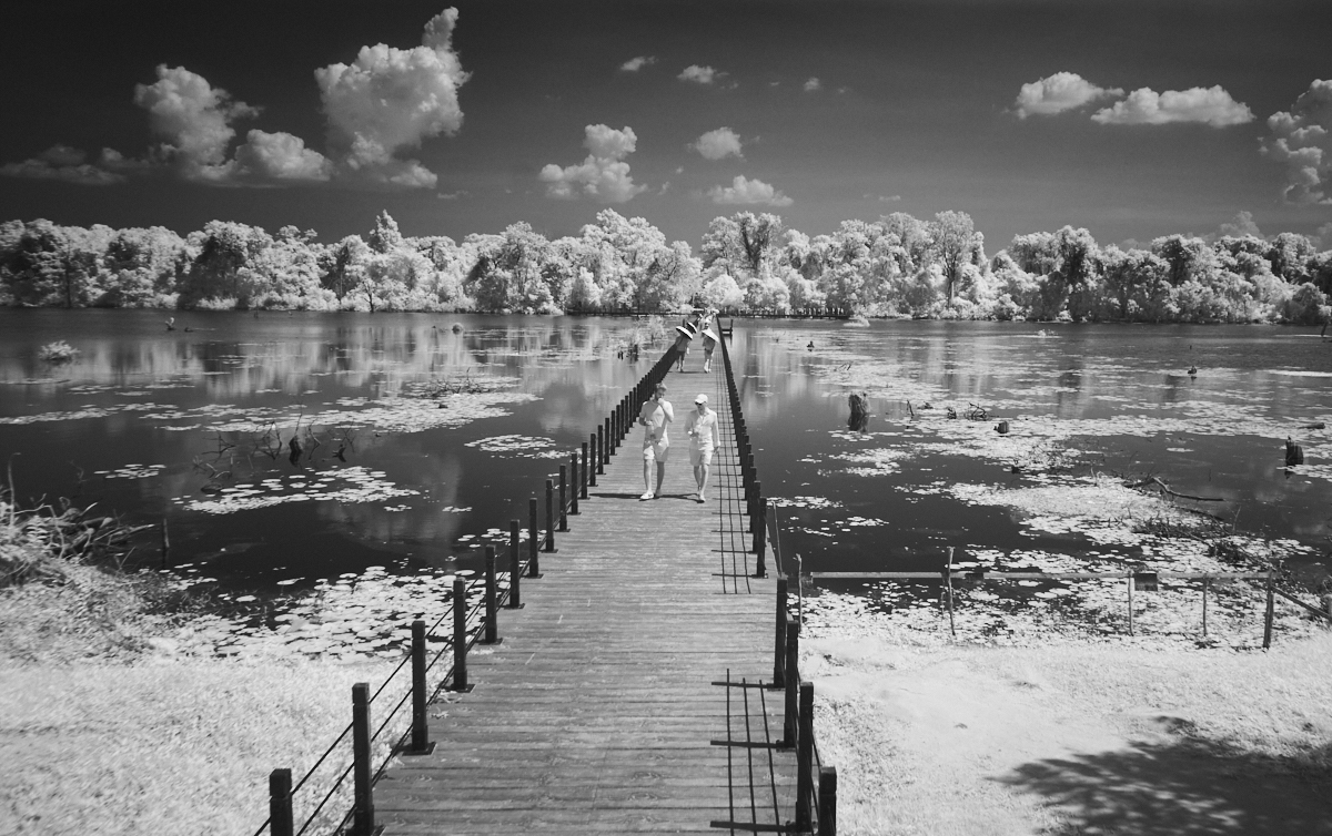
| 86 |
Nov 22 |
Comment |
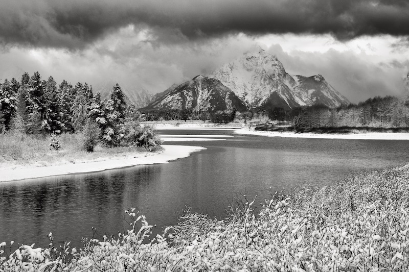
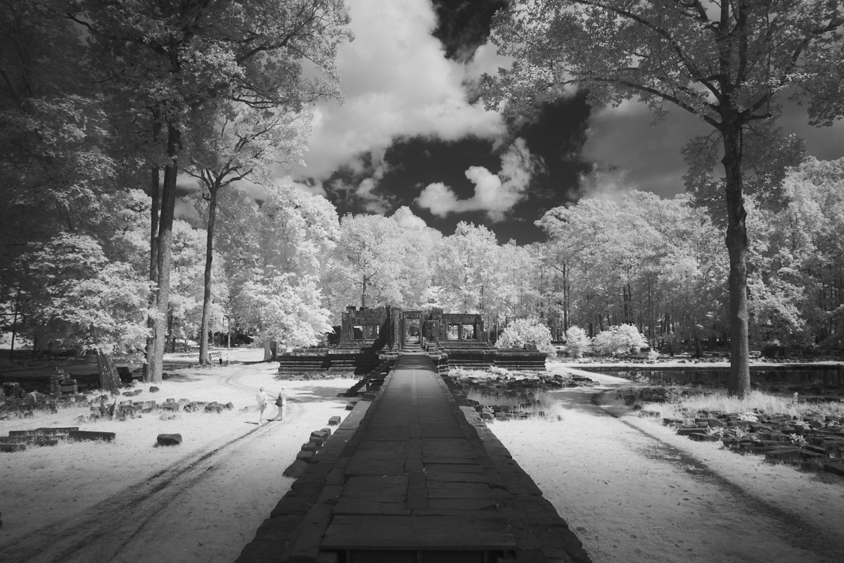
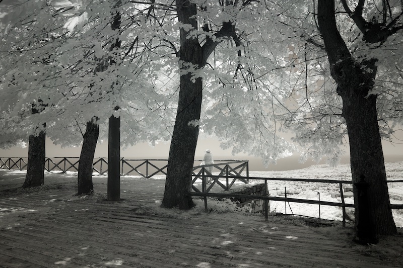
It has a nice wintry feel. I like Steven's comment about using light to lead the eye through the scene. Alternatively, I might have set up so the camera is looking down the walk way (just a little to the left); this might have given a better leading line. I don't think the person adds much interest, and possibly detracts. We don't need her for scale, and she's not doing anything of interest. Overall a nice travel image Gene. |
Nov 10th |
| 86 |
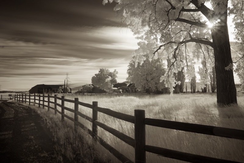
Nov 22 |
Reply |
Thanks, Steven. I agree with the darkening by .25, it brings out even more richness in the sky, and is more effective overall.
I could go either way on the crop. On the one hand, the subtler tones are out near the top, so those are lost. But the focus is then on the more striking tones. I look forward to seeing what the others think. |
Nov 3rd |
| 86 |
Nov 22 |
Comment |
Very nice, Ruth, I think we're making progress on sharpness! I agree with Steven's comments, it's an enjoyable macro and think you've done a good job on this. |
Nov 3rd |
| 86 |
Nov 22 |
Comment |
Thanks for the hint, Quang, I could still make it out, but much more pronounced when squinting. I second Steven's comments, and his suggestion about the shadow. It's very creative and different, and I think you chose a good and timely subject, to use with this filter and make an enjoyable image. |
Nov 3rd |
| 86 |
Nov 22 |
Comment |
Design-wise, I love this, Steven, the three sections perfectly laid out, and the beautiful fall colors tell the story, to me, of the "change" of the seasons.
It's said that if one includes legible text in an image, the eye goes right there, and in that sense, I think the prominence of the text detracts from the rest of the scene. Although your caption is helpful in understanding the story you are trying to convey, on its own the image can't convey that of course.
I often find too that for mid day or any suboptimal light, that my iPhone shots are more pleasing; I think this is just the fact that the phone's built in processing has just gotten that good! - one could achieve the same result with a "real" camera, after an hour or so behind the computer in post processing. Even though this looks like diffuse light, the saturation of the yellows is just beautiful and there's no harsh light coming through the leaves. All in all very nice. |
Nov 3rd |
6 comments - 1 reply for Group 86
|
13 comments - 5 replies Total
|