|
| Group |
Round |
C/R |
Comment |
Date |
Image |
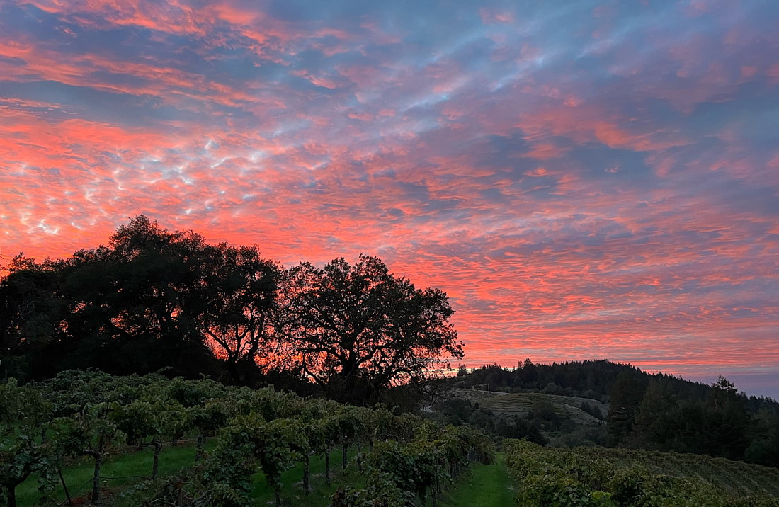
| 45 |
Jul 22 |
Comment |
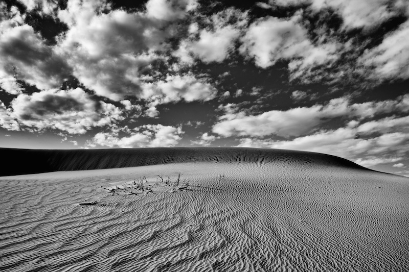
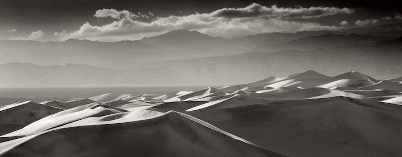
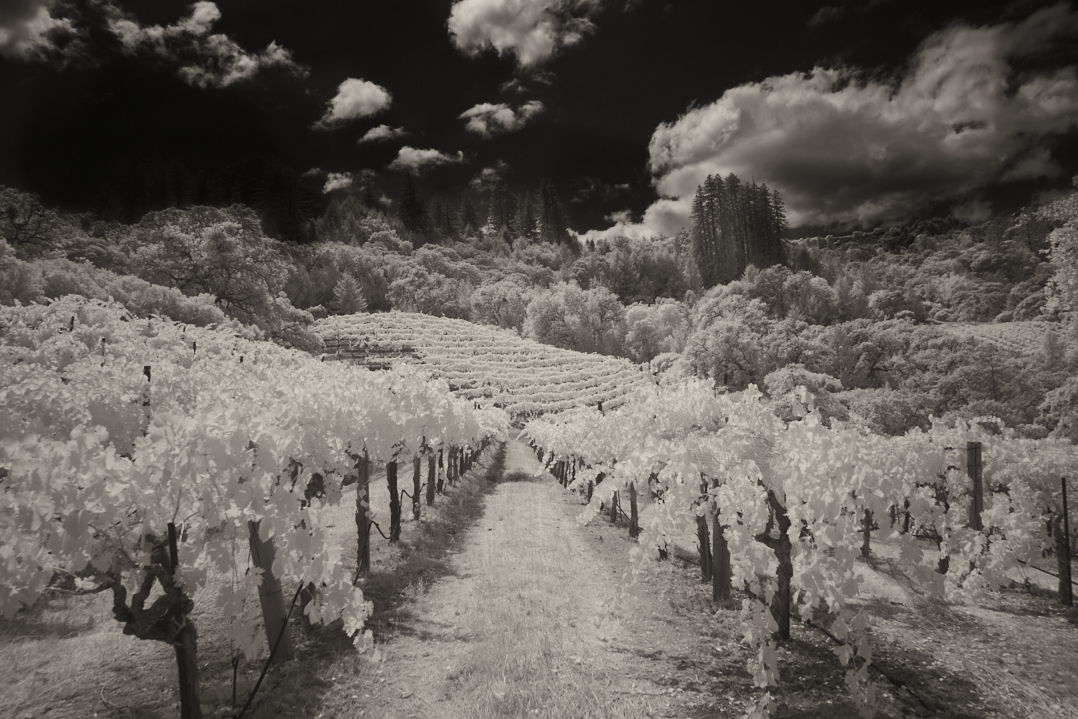
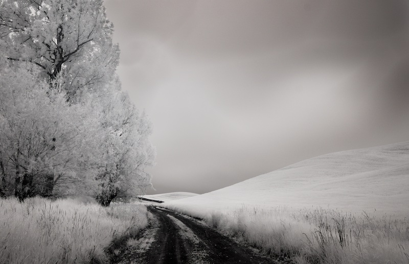
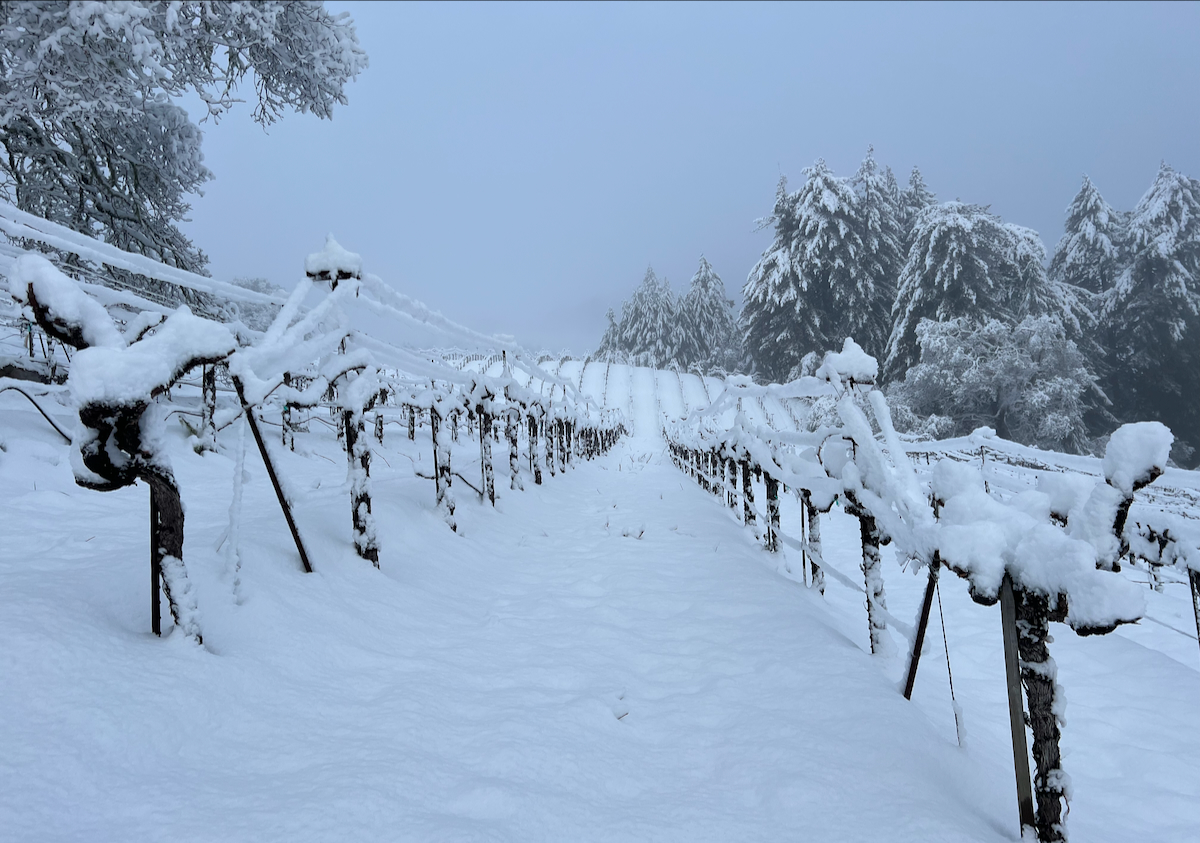
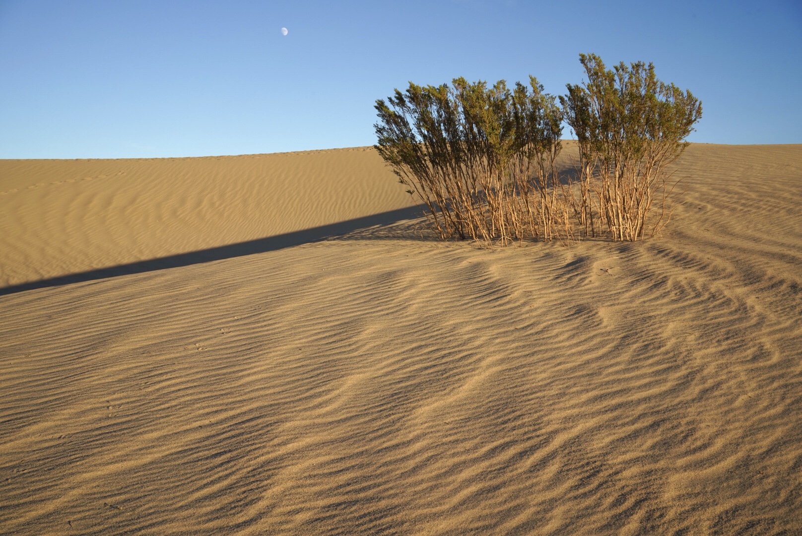
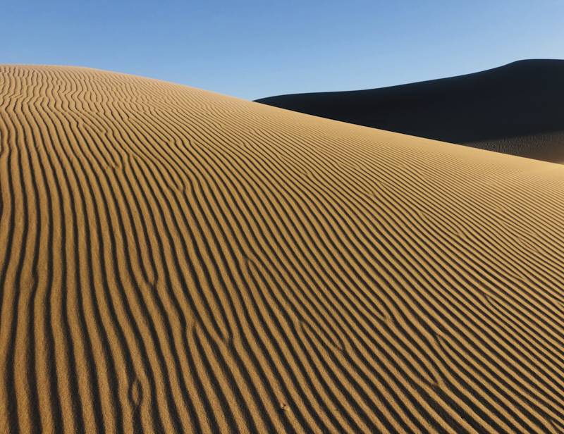
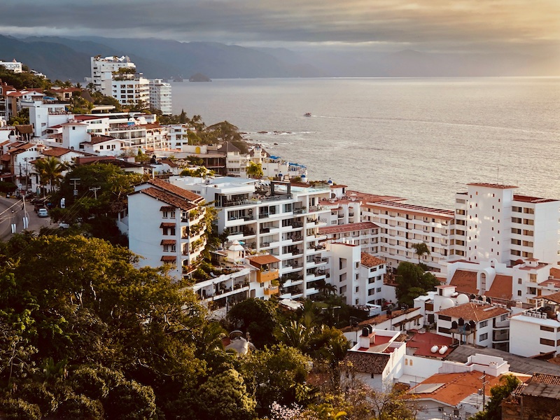
Nice image, Charlie.
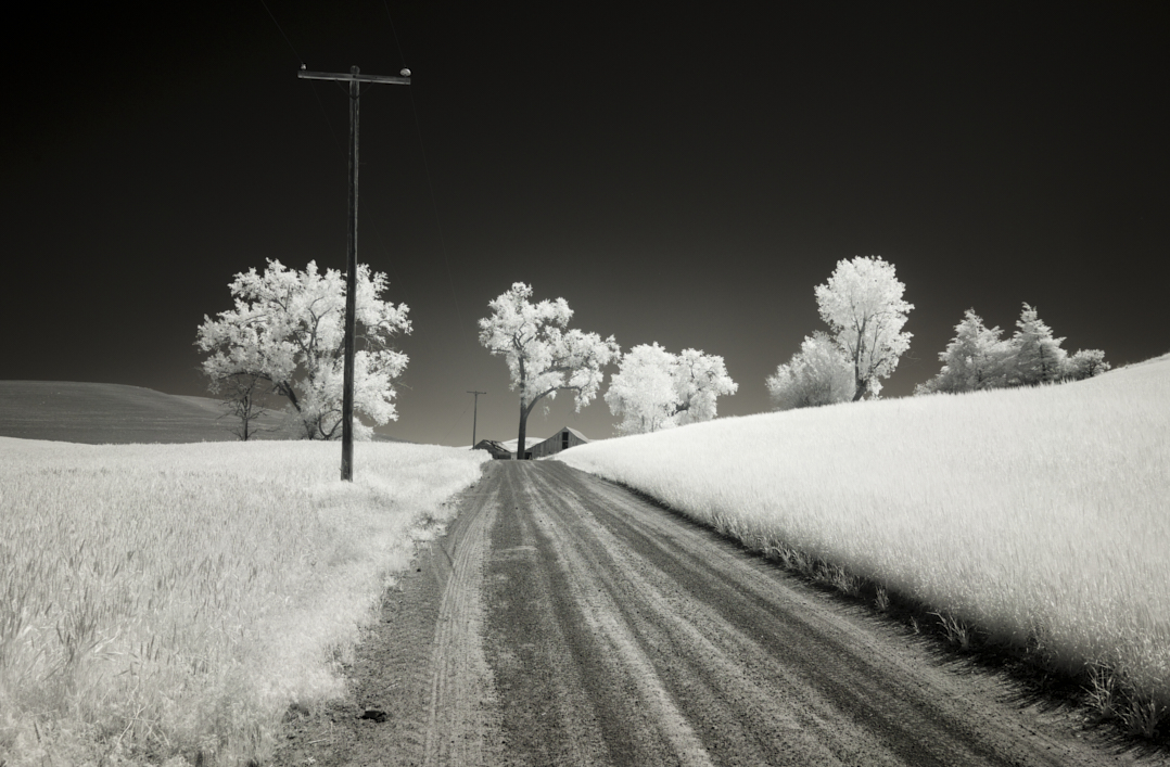
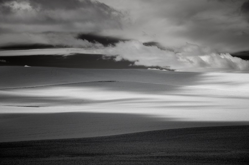
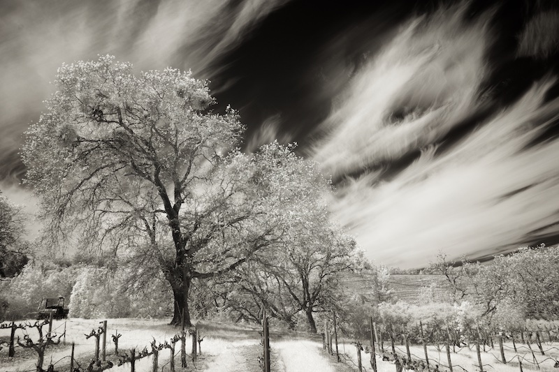
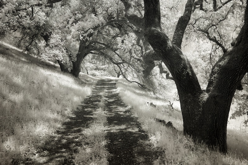
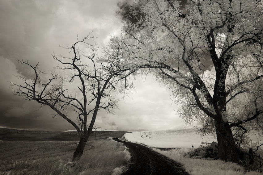
I just stopped by to mention I really like your original one this one. The hint of a path provides a nice leading line, and there's that nice curve of the slope of the hill, more expansive sky, very nice! |
Jul 4th |
1 comment - 0 replies for Group 45
|
| 66 |
Jul 22 |
Reply |
Yes, now that you mention it Gary, I was feeling the same way about the two components. |
Jul 7th |
| 66 |
Jul 22 |
Reply |
Thanks, Gary and Palli, good point on the foreground. Unfortunately, I don't have photoshop, but I do have another image fortunately |
Jul 7th |
 |
| 66 |
Jul 22 |
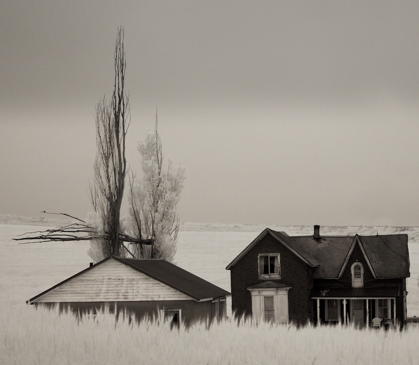
Comment |
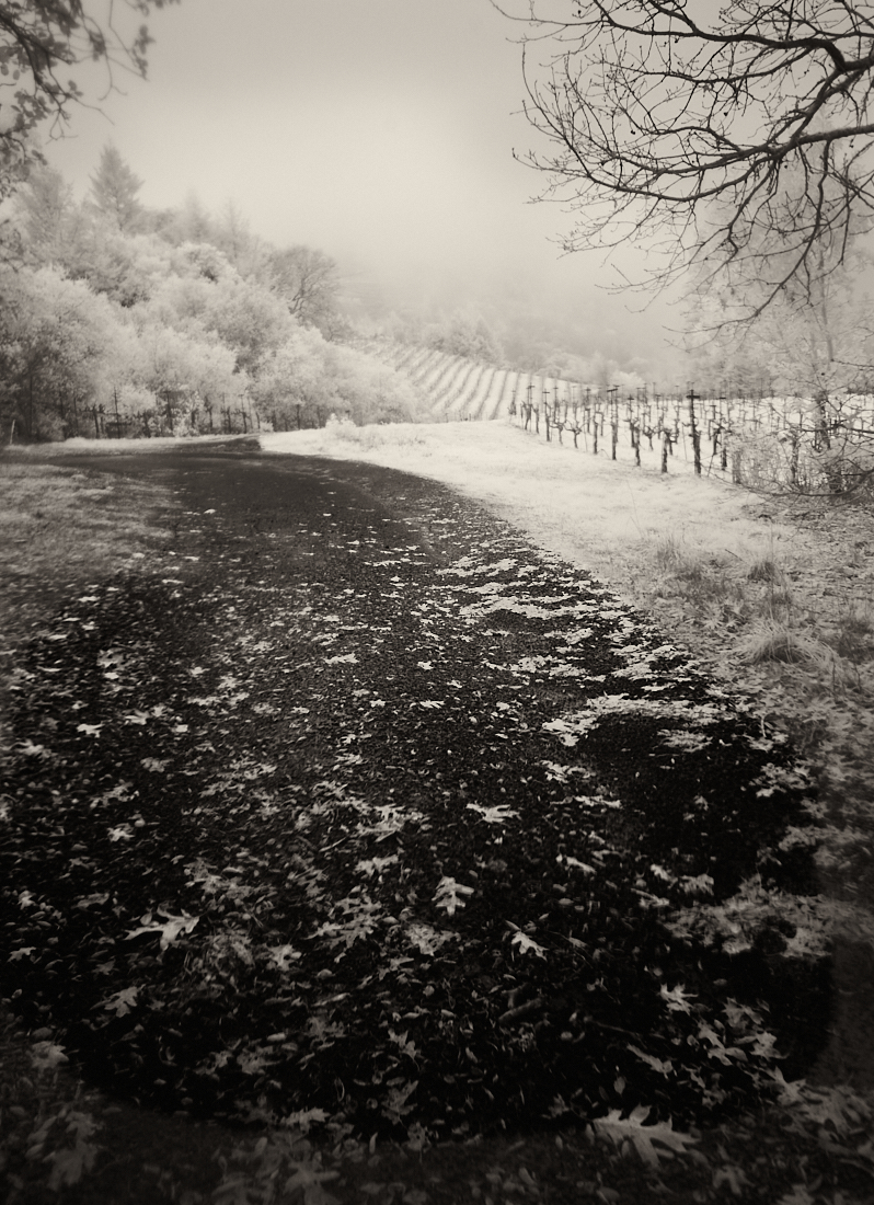
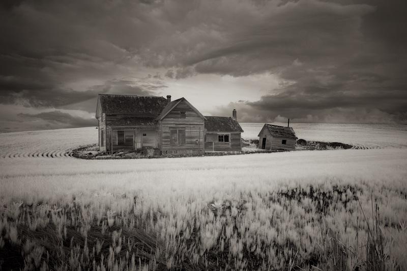
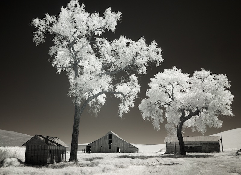
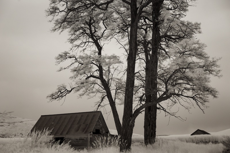
You've got a sprinkling of white in the trees, Melanie, which it looks like was added in post, and does contribute to the image. Although, right above the barn, it looks a little abrupt, and perhaps that could be spread out a little. The sky's a little off right there, too. But otherwise, it's an interesting scene, well laid out. Some might say the vignette is a little much, at bottom right, but I like it; it makes it feel like an old photograph. |
Jul 6th |
| 66 |
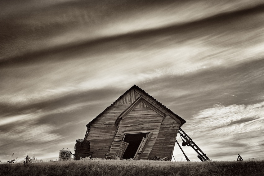
Jul 22 |
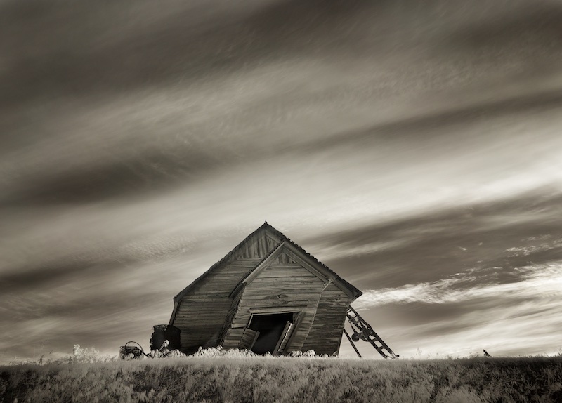
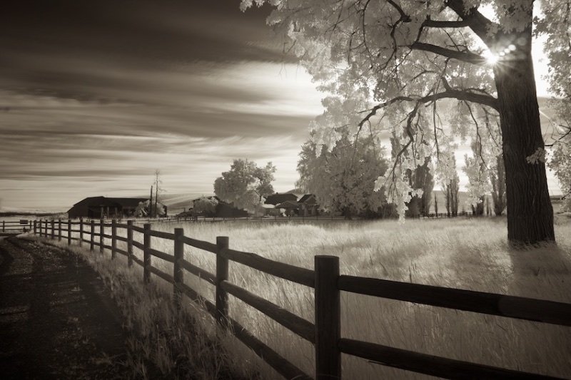
Comment |
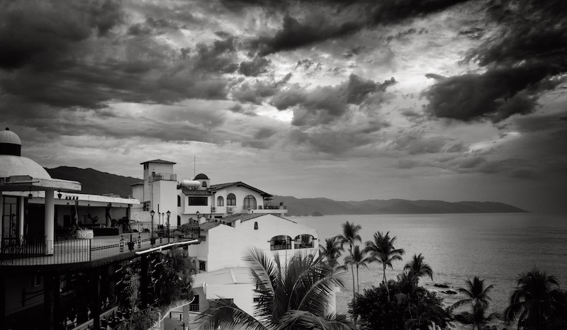
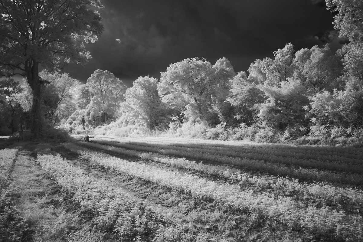
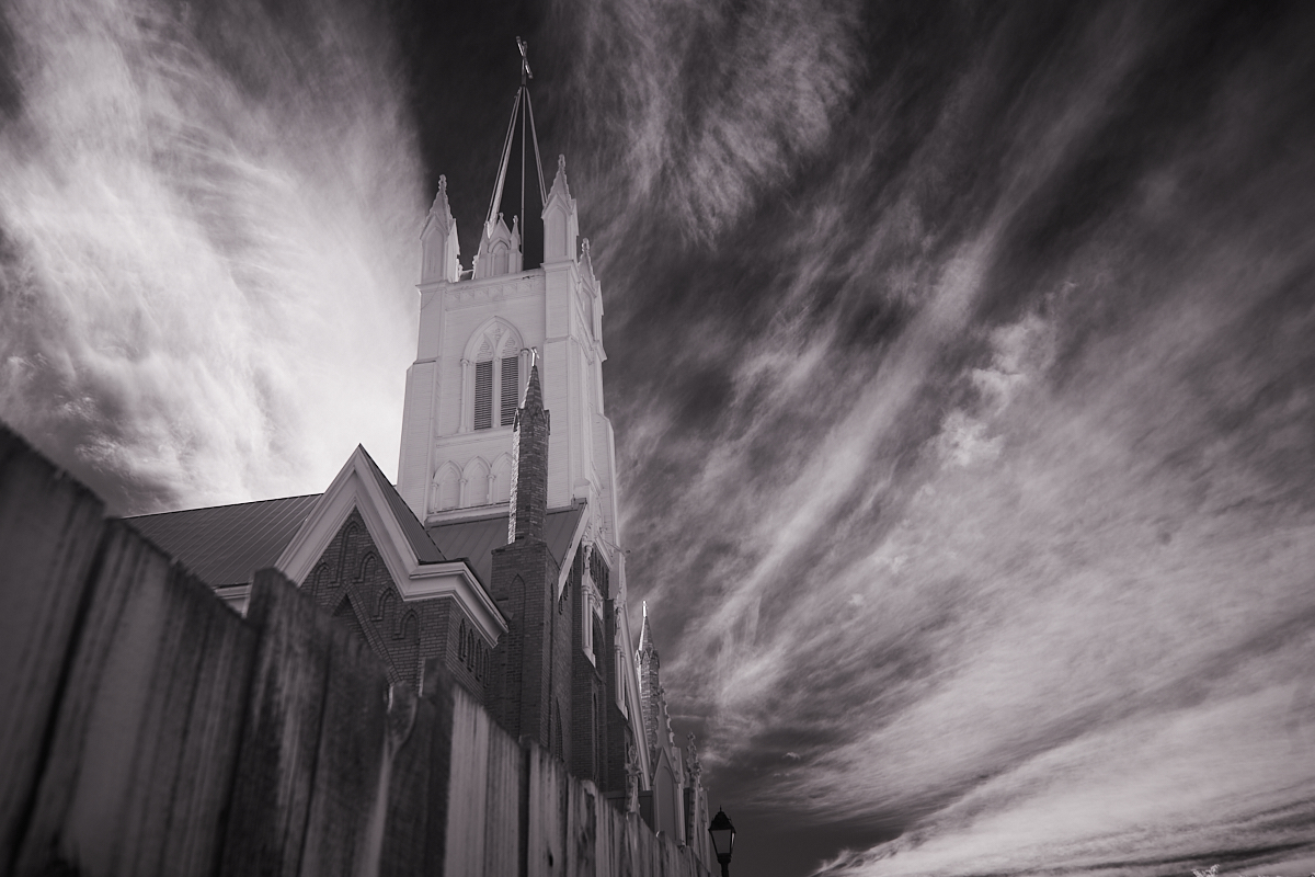
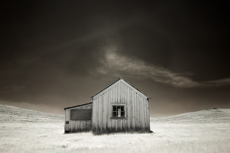
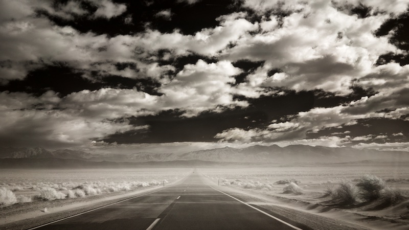
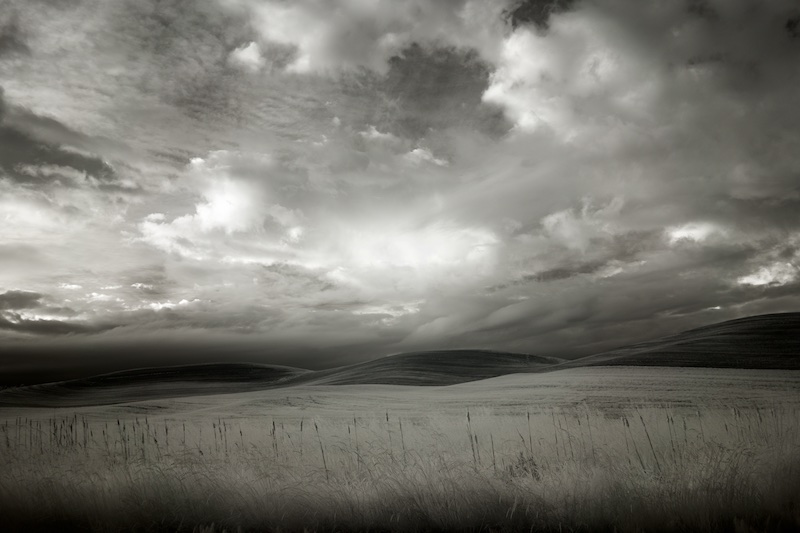
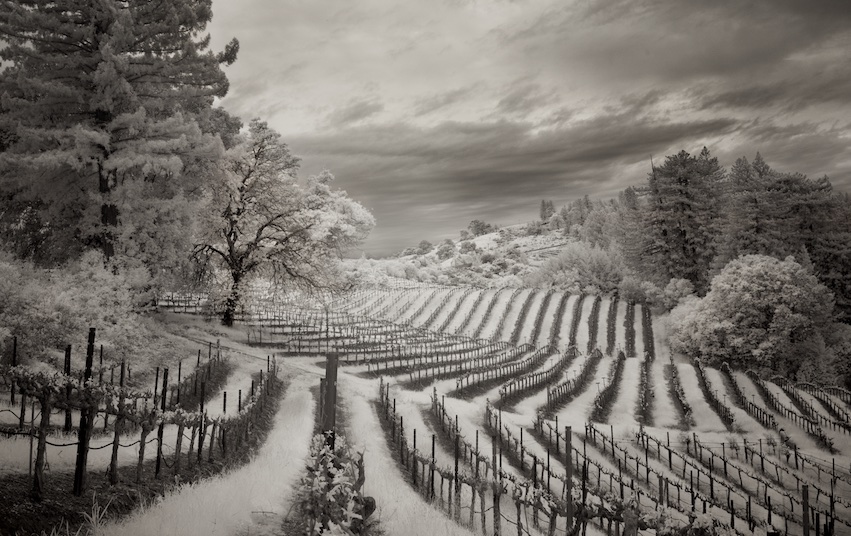
I agree, Henry. The building, but especially the clouds, are of interest. Perhaps I'm coming around to Gary's way of thinking, but I'd like to see the sky punched up a bit, closer to black up top and more contrast in the clouds. Another version of this could be to crop in closer to the church, as I'm not sure the bit of river in the foreground adds to the scene, but I'll look forward to others' comments on this. |
Jul 6th |
| 66 |
Jul 22 |
Comment |
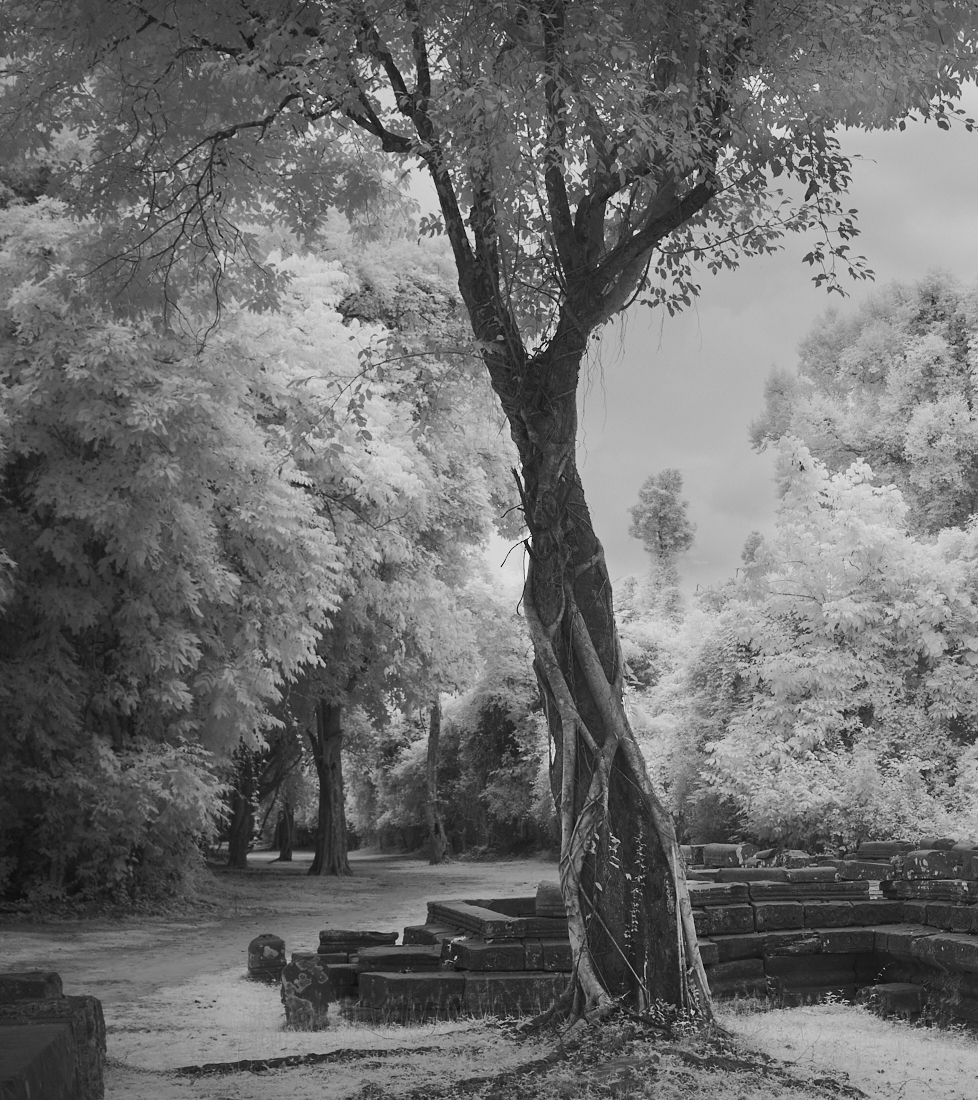
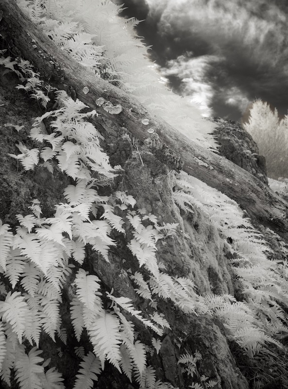
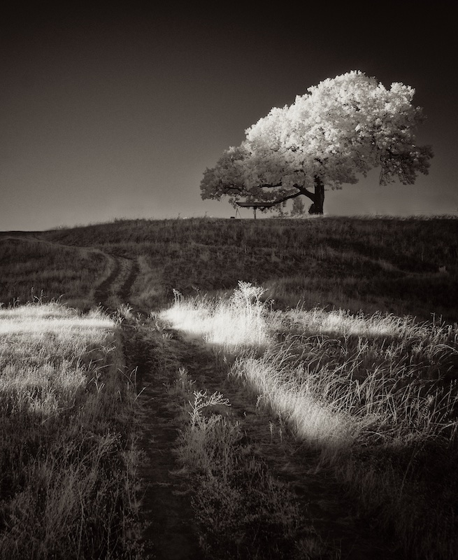
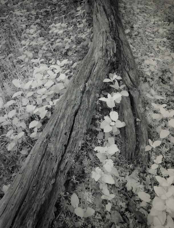
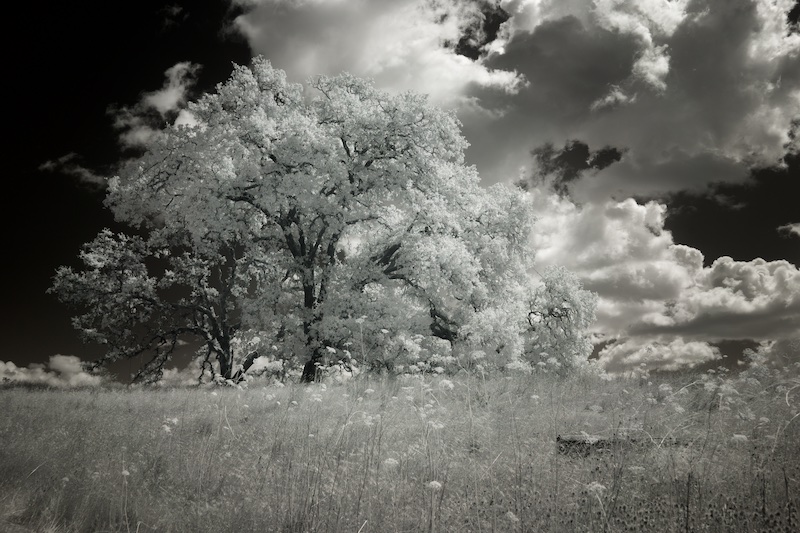
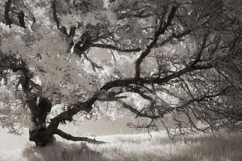
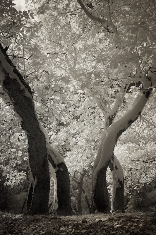
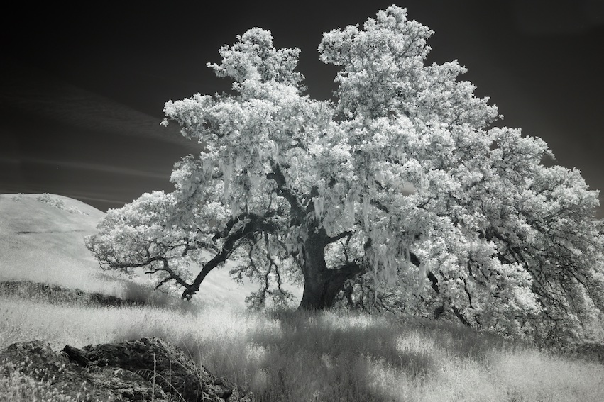
I like the perspective, Emil.
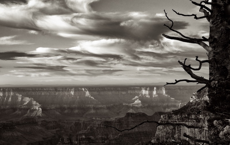
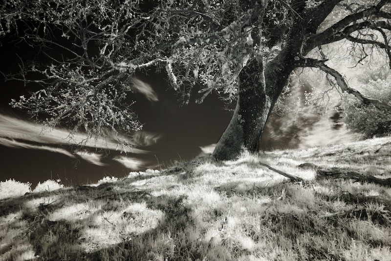
I have gotten into trouble with judges because of foreground blur, and I will be curious to see what the others think about the lower half of the trunk being blurred. If I can get past that, the top of the tree is quite elegant, nicely seen and composed. |
Jul 6th |
| 66 |
Jul 22 |
Comment |
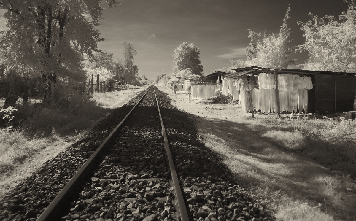
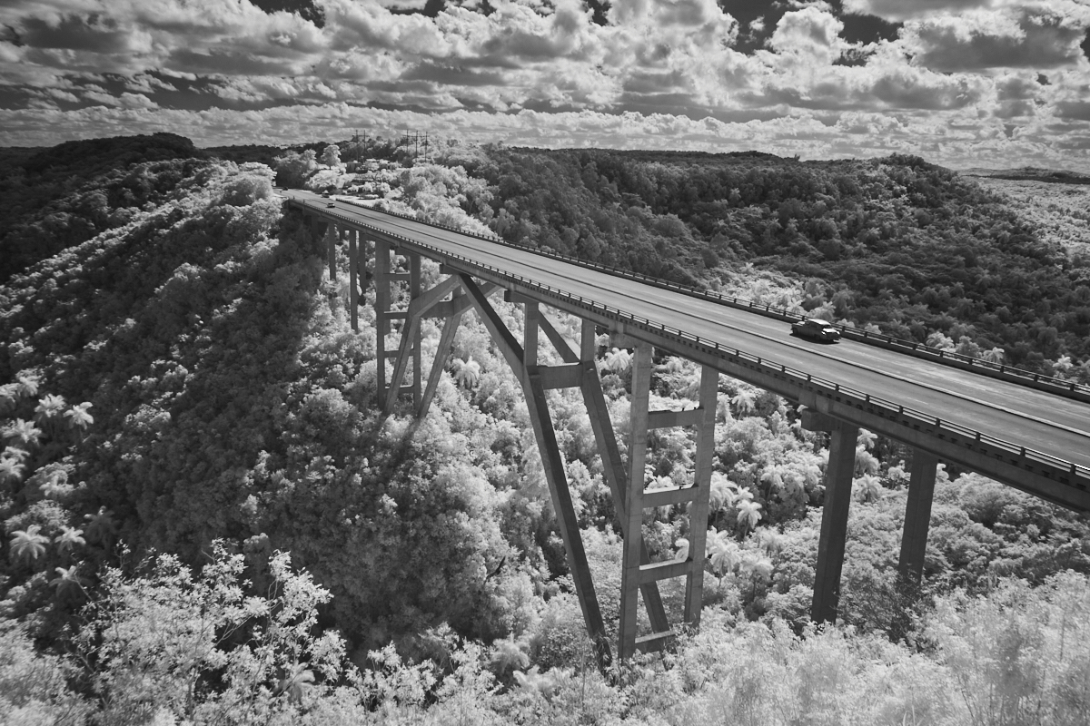
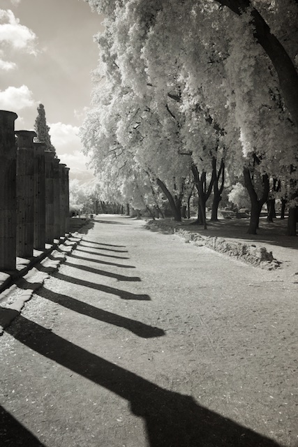
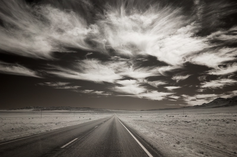
With the bridge and a curving train track, you have the basis for a successful composition, Charles, simple and effective. I would have like to have seen the bright sky controlled better, if possible, although the bridge might have gotten lost if the sky were darker. Also, my eye keeps going back to the wall at the left edge, the changes in tones there and the white residue. Maybe not best to have an area of interest so close to the edge, and I might consider cropping after the dark section. |
Jul 6th |
| 66 |
Jul 22 |
Comment |
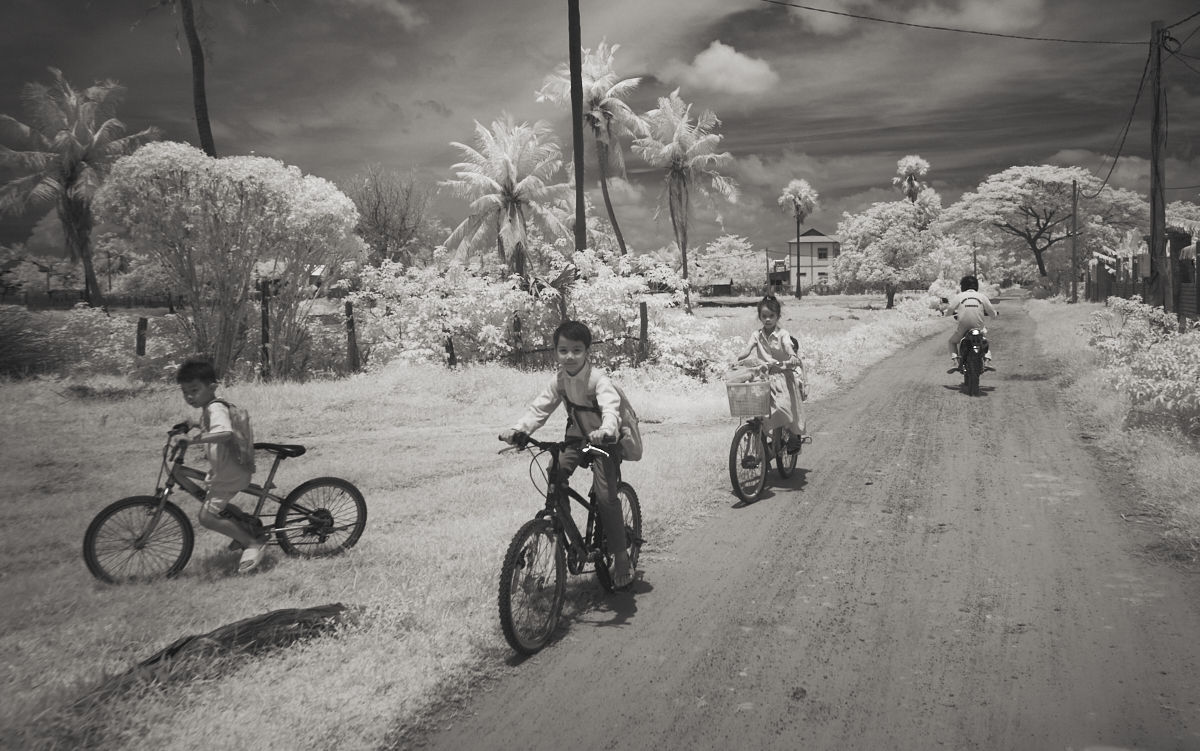
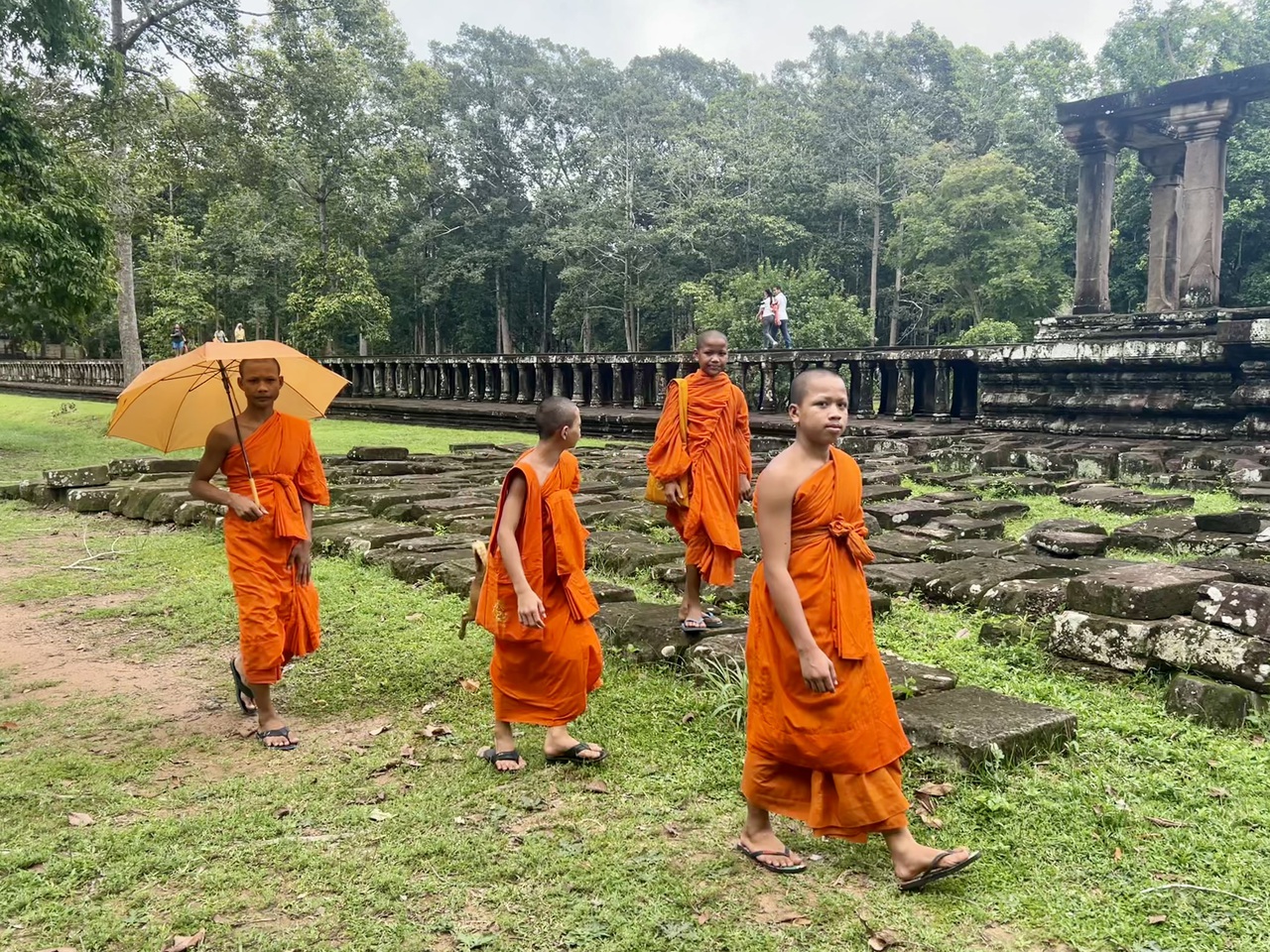
And yet, his face is reasonably sharp (or at least IR porcelain sharp). This must have taken a lot of practice, Arik! I like the way the cyclists behind him render, more than the ones in the front. I like the bits of blue. It's interesting and creative. |
Jul 6th |
| 66 |
Jul 22 |
Comment |
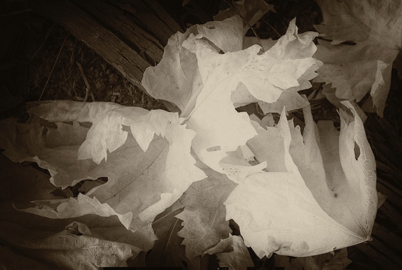
You seem to be getting into repeating lines and shapes more, Palli, which I'm a big fan of too. I really like your idea here, and agree it was a good one to take in more creative directions. I think what you did with the water is fun, and it works. My only nitpick is it feels a little dark, heavy, even the original. But that does play into the rain theme. I'm not sure that much sepia improves it, but its a stylistic choice. Overall, great seeing Palli I like this genre. |
Jul 6th |
| 66 |
Jul 22 |
Comment |
It's bold, compelling, all you Gary! On first sight, I thought for sure the girl was added, maybe even the clouds. Most images like this seem to be shot from behind the person, and I've always thought it was a case of a surreptitious shot from an undetected photographer. Here, was it a planned shot? Part of me wants to see her walking towards the camera, but perhaps her walking away adds a bit of mystery.
I love the symmetry here, the way you did it right down the middle, the beautiful clouds and even the shadows on both sides.
I'll leave it to others to explain the rendering of the dress ;) |
Jul 6th |
7 comments - 2 replies for Group 66
|
| 78 |
Jul 22 |
Comment |
I think your use of selective color works well here, Mitch. I'm even a fan of the original colored flower, I think it plays nicely off the tones in the lower part of the building.
By the way, we've got an opening in Group 86, iPhone photography ;)
|
Jul 4th |
1 comment - 0 replies for Group 78
|
| 86 |
Jul 22 |
Comment |
I think Quang makes some good comments here, Pat, which I would second.
What I like about this is what attracted you to the image; the way the bird seems to be one with the curvy branch. I would not be surprised if this is nature's intention here and the way for the bird to blend into it's surroundings. |
Jul 9th |
| 86 |
Jul 22 |
Reply |
That's a good point about the eyes in the upper half, Quang, I hadn't considered that. |
Jul 9th |
| 86 |
Jul 22 |
Comment |
Although we know its a flower, Gene, I think this works as an abstract; soft and wavy with no borders. A phone camera can't achieve the detail and sharpness that a regular camera would here, but even so it works in the way you've presented it. I especially like the very dark center. |
Jul 9th |
| 86 |
Jul 22 |
Comment |
I appreciate when photographers put thought into an image before they click the shutter, as opposed to just focusing on post processing. Here, your including more of the image than you were going to need, is what makes this work. Seeing the very top is unexpected and adds dimension, interesting patterns and tones. These low light settings used to be challenging for phone cameras; apparently not anymore!
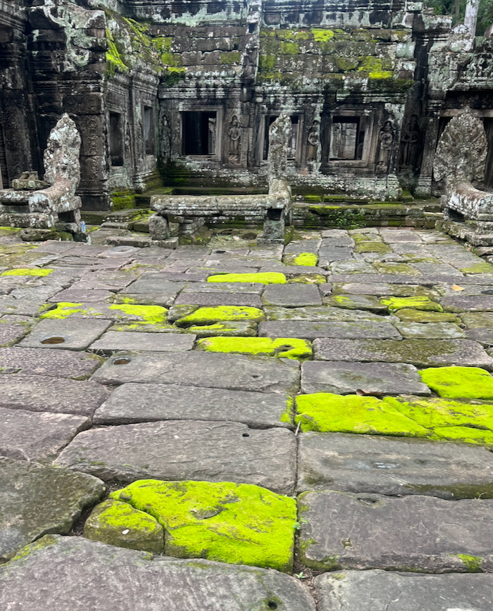
I do have to ask about including this much foreground, Quang, the decals in the front seem to detract from the ancient church feeling, or is that part of your story? |
Jul 9th |
| 86 |
Jul 22 |
Comment |
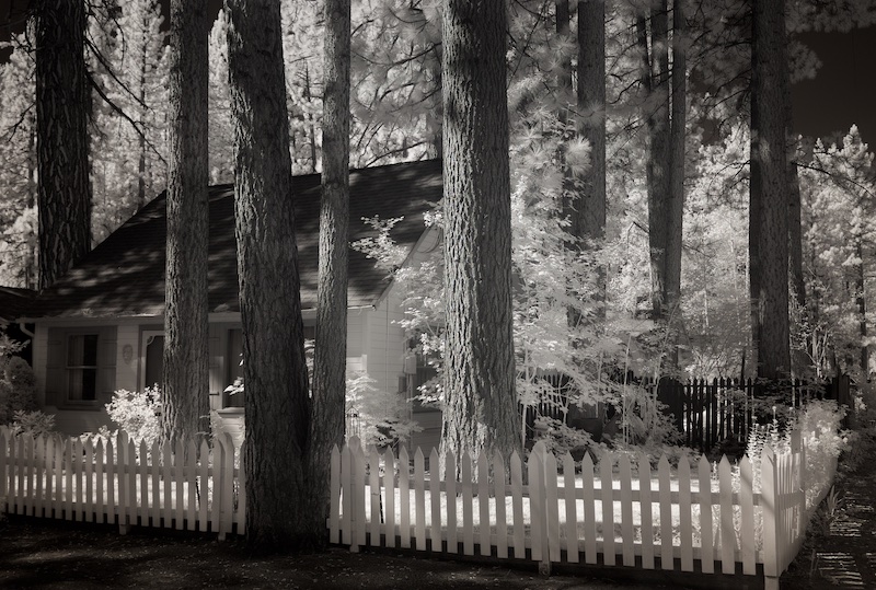
To me, its the framing of the trees that makes this image, Bob. But what detracts, in the original, is that the house is not as interesting as the setting. With your filter, the house becomes more rustic, something more interesting, and it even has more interesting reflections in the top windows. I think to that extent, your filter was successful. |
Jul 9th |
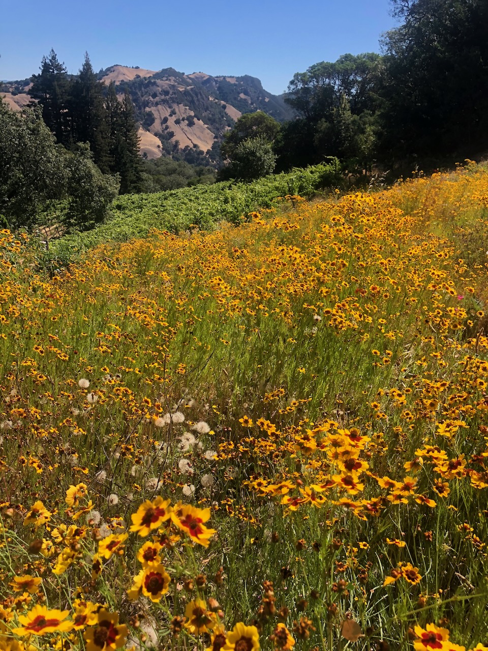
| 86 |
Jul 22 |
Reply |
Thank you Kieu-Hanh. Yes, I was trying to convey the sense of whimsy that comes with the "endless field of flowers". I also noticed that a slight tilt of the phone gave me a nice diagonal which improved it; I'm glad you noticed. |
Jul 7th |
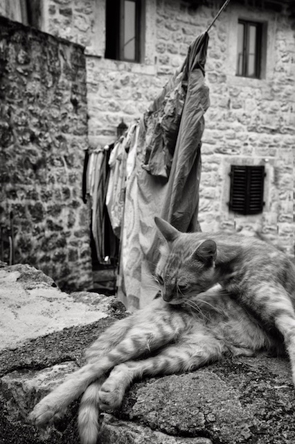
| 86 |
Jul 22 |
Comment |
Very nicely done cat portrait, Ruth! It's sharp, and she has such a pensive expression! I like how the green eyes are complimented by the green fabric in the foreground. |
Jul 4th |
| 86 |
Jul 22 |
Comment |
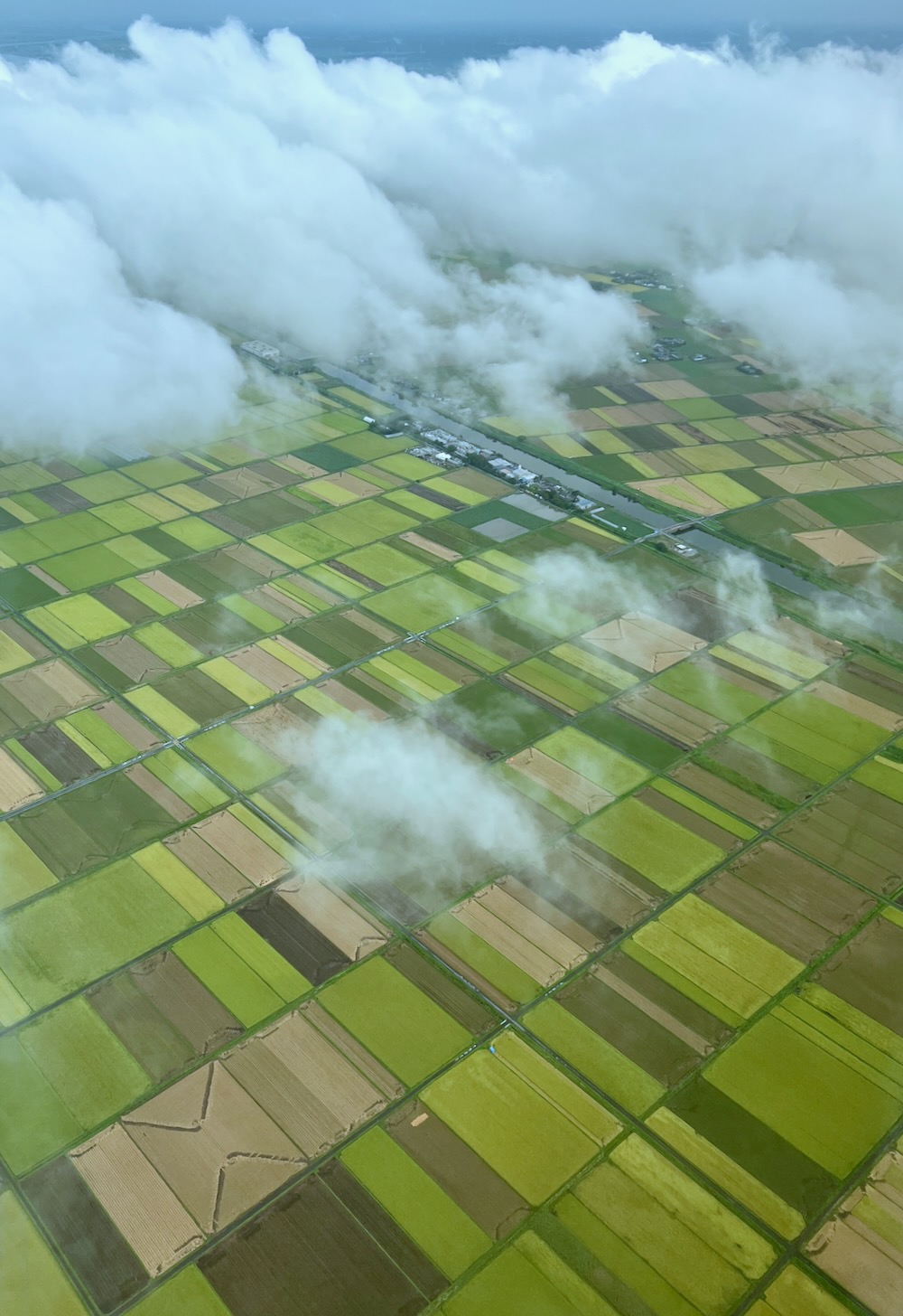
It's lovely, Kieu Hanh. This image really exemplifies the importance of good light, which is even more important than composition. At mid day this wouldn't have been nearly as impressive.
What also makes this special is the way you've divided it right down the middle, as you point out. The sharpness is impressive for a phone camera, it feels very "crisp". And wider angle lenses like the iPhone's camera tend to create interesting divides in cloud patterns. Here, the axis of that division aligns with the beach, it all comes together! |
Jul 4th |
6 comments - 2 replies for Group 86
|
15 comments - 4 replies Total
|