|
| Group |
Round |
C/R |
Comment |
Date |
Image |
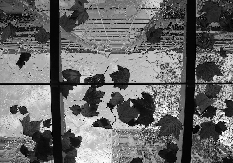
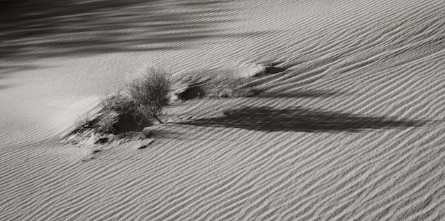
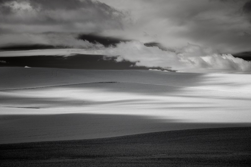
| 5 |
May 22 |
Comment |
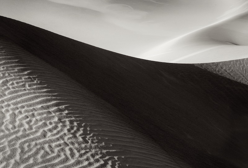
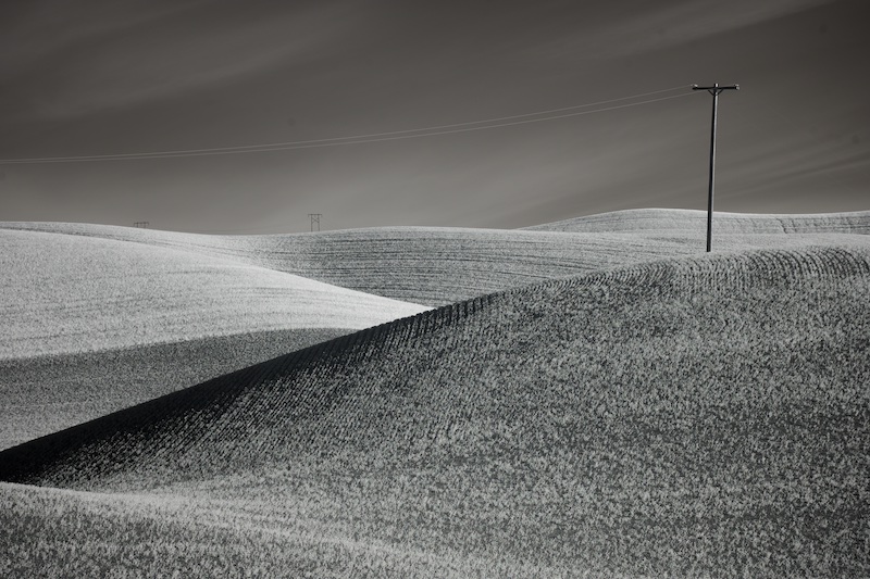
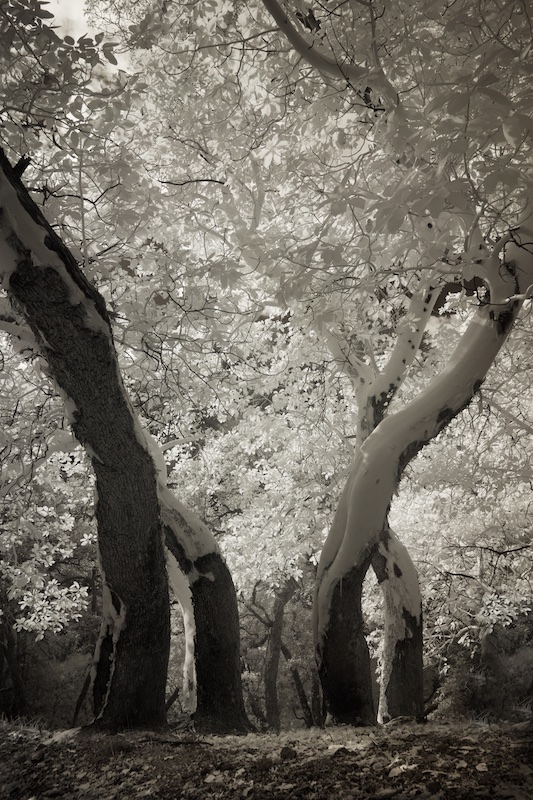
Your editing, by diminishing the background, has added to the depth, or 3-D feeling, of this image. But of course it's all about that curve! The window into a story book scene; very nice Mark! |
May 2nd |
1 comment - 0 replies for Group 5
|
| 14 |
May 22 |
Comment |
Beautiful composition, light and mood, Tom. For me, the editing is pushed just a bit farther than necessary (although I'm sure I'm in the minority on this) - it's just that the light is so beautiful, that something closer to natural would also work just fine. |
May 2nd |
1 comment - 0 replies for Group 14
|
| 27 |
May 22 |
Comment |
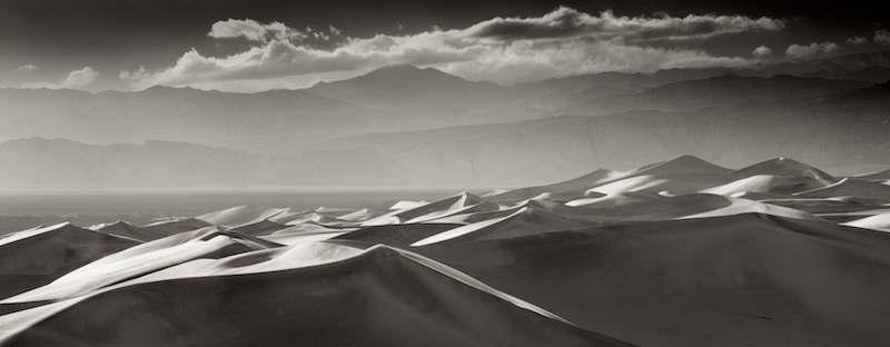
Your composition has taken this beyond what might have been an ordinary scene with so so light. The three layers with the water, trees, and the mountains with stream come together nicely. Well seen, Jon. |
May 2nd |
1 comment - 0 replies for Group 27
|
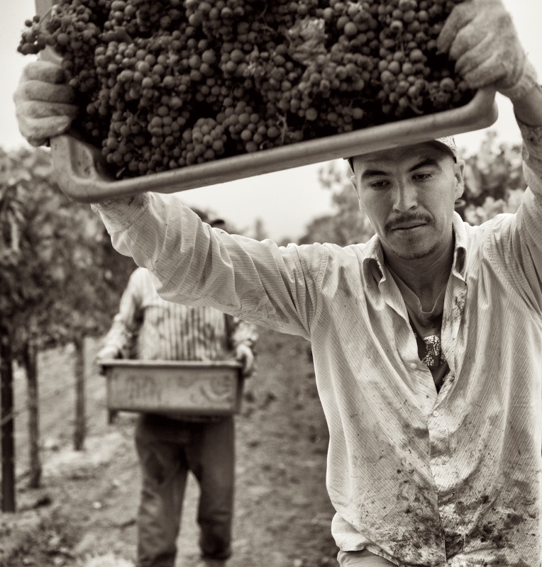
| 28 |
May 22 |
Comment |
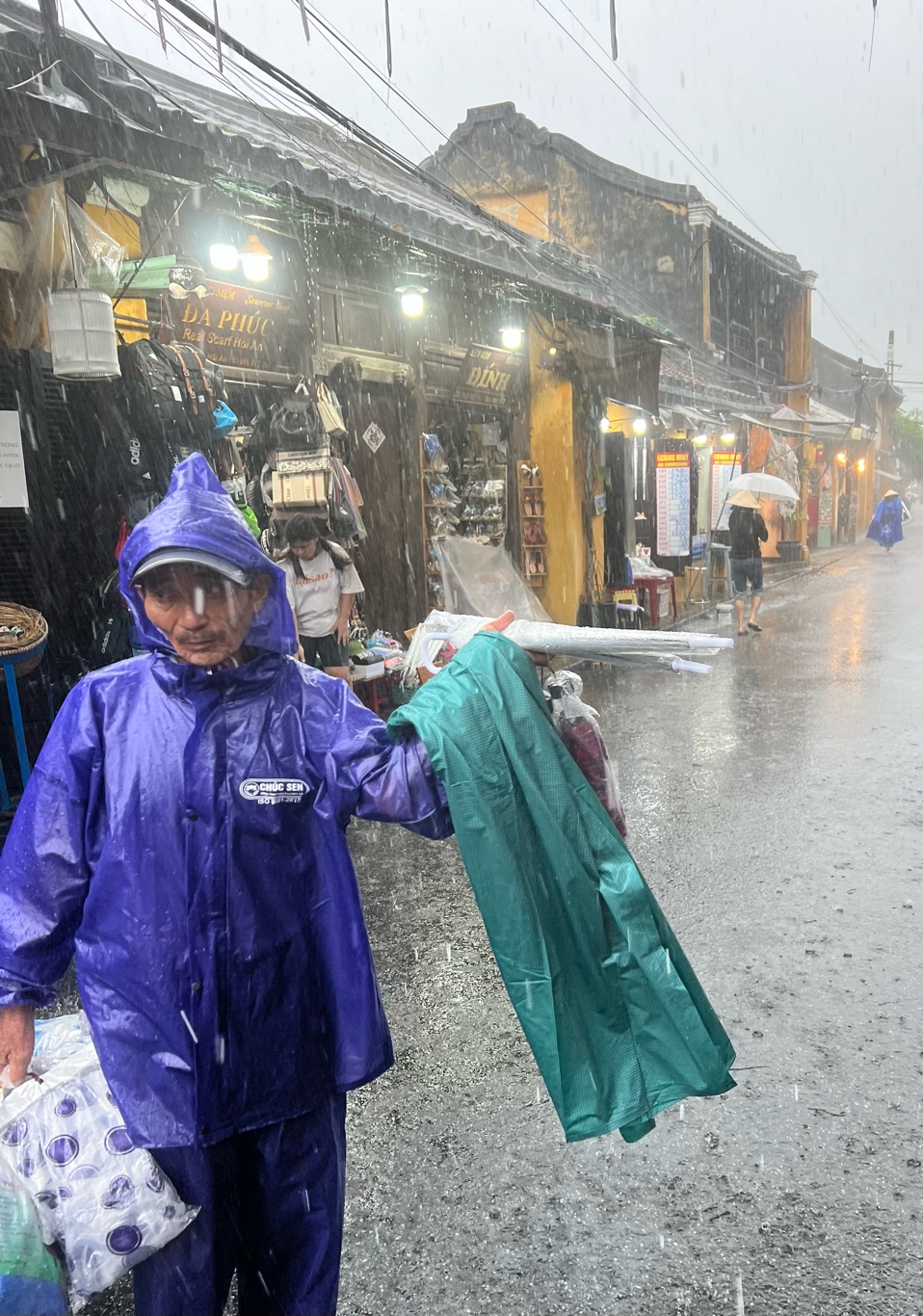
Great job on the use of selective color, Deborah, you toned it down just right. The hints of brown in the jacket are also lovely. Because of the resolution limits of the website, I can't be sure his eye is tack sharp, but if it is, its an excellent portrait. |
May 2nd |
1 comment - 0 replies for Group 28
|
| 43 |
May 22 |
Comment |
The sky gives this such beautiful mood, Linda, I can almost feel as if I am there. Very nice image, and I don't mind the person in the field. |
May 2nd |
1 comment - 0 replies for Group 43
|
| 48 |
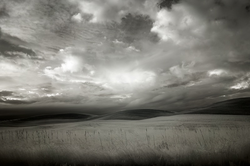
May 22 |
Comment |
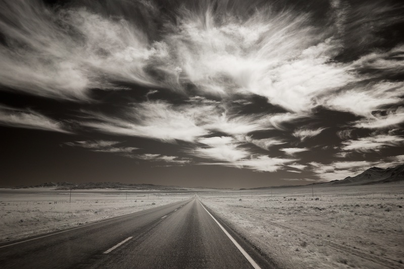
Very nicely done, Paul! I love the sense of wind, and motion, and the shallow DOF adds a unique dimension to this. |
May 2nd |
1 comment - 0 replies for Group 48
|
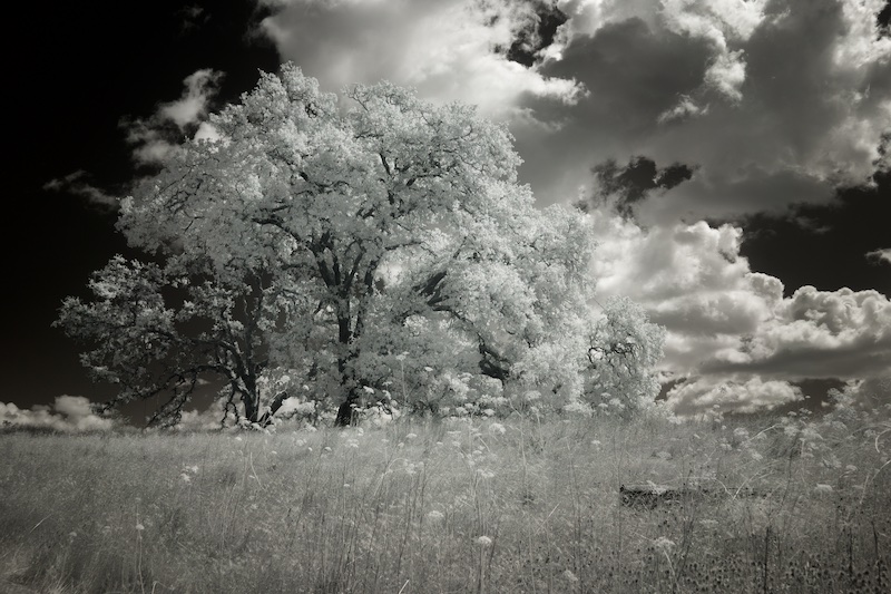
| 66 |
May 22 |
Comment |
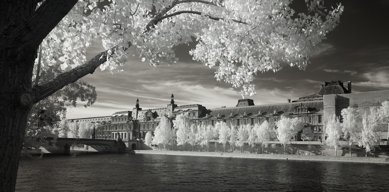
Welcome again, Henry. My family had a similar cruise planned last year, which was cancelled due to Covid, and your image makes me want to visit all the more. I also tend towards monochromatic, so I'm always intrigued by IR images with partial colorization; the decision on what gets colored and why adds another level of artistic expression to the image. Here, you've accentuated the clouds and how the roll up behind the castle, which is effective, and I like Gary's edit even more. |
May 6th |
| 66 |
May 22 |
Reply |
Love it, Gary! You're always one step ahead of me. |
May 3rd |
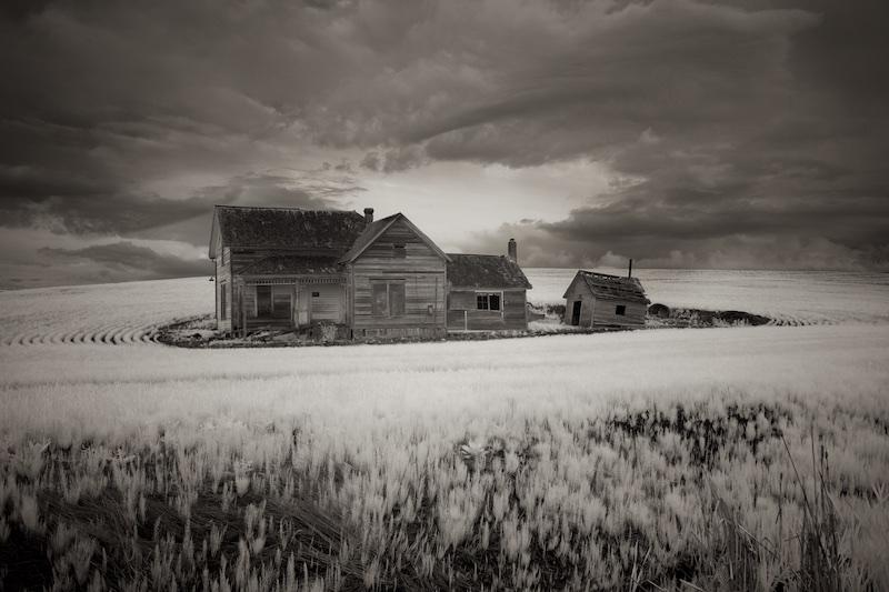
| 66 |
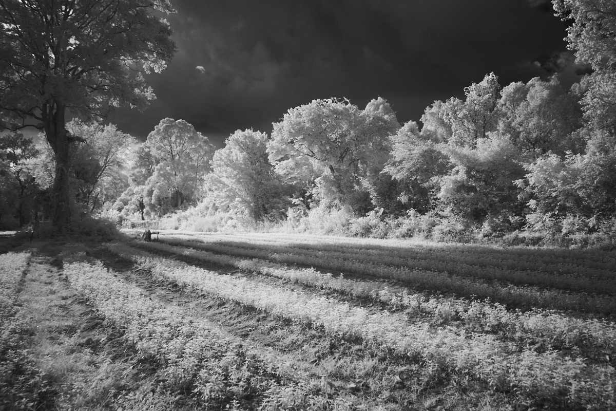
May 22 |
Comment |
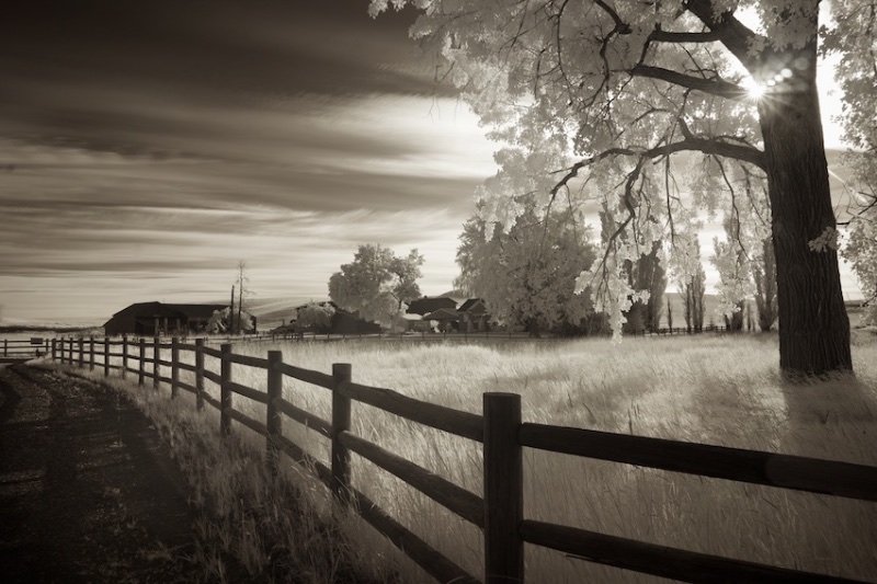
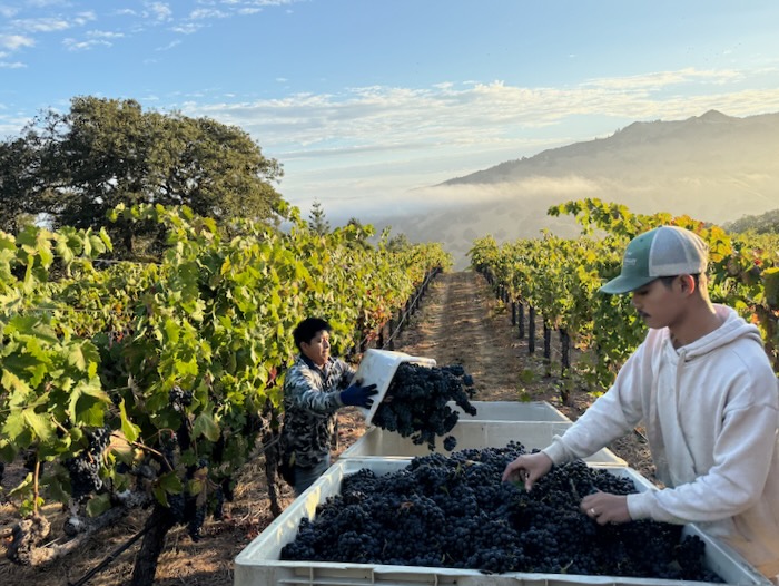
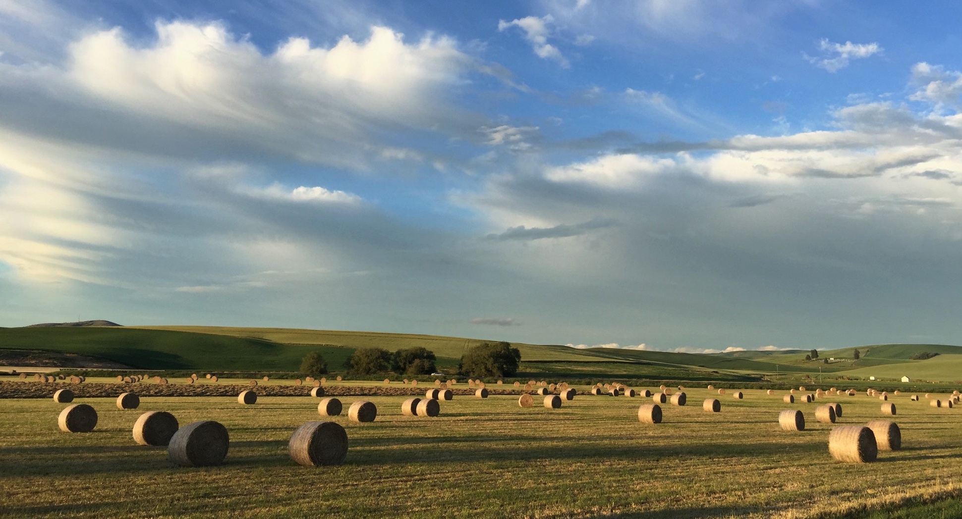
There is some nice light especially on the hay bale here, Emil, as evidenced by the original. As pointed out by the others, a bit more contrast will really bring out more of what this scene has to offer. As so much of the image is of the same tones, it causes the image to flatten, lose depth. But its a lovely scene with great potential. |
May 2nd |
| 66 |
May 22 |
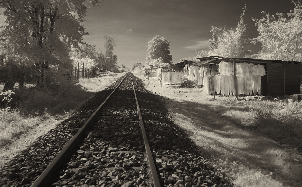
Comment |
Very creative, Palli! With this effect, we can see the other people in the scene, but they don't interfere with the little girl. I also like the way the vignette works here, and you've done a great job correcting the exposure. |
May 2nd |
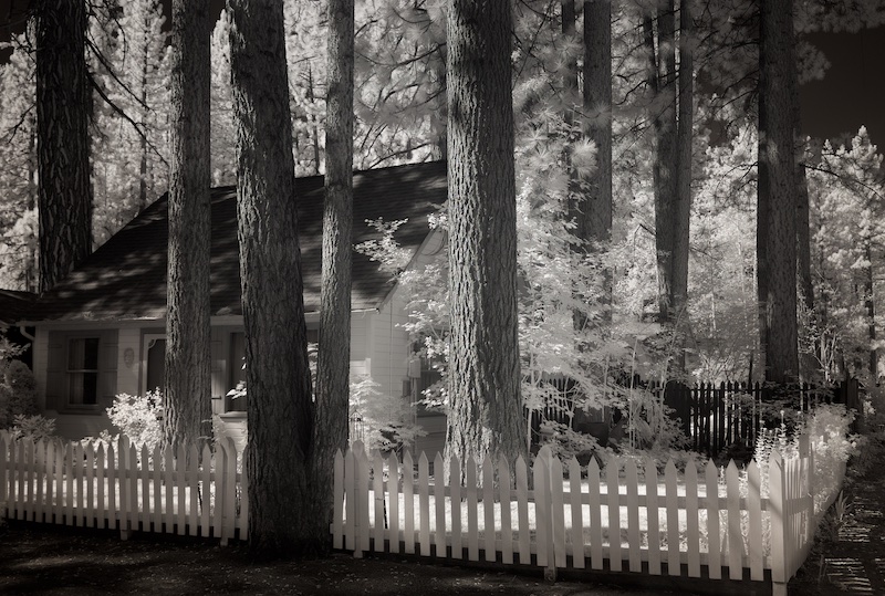
| 66 |
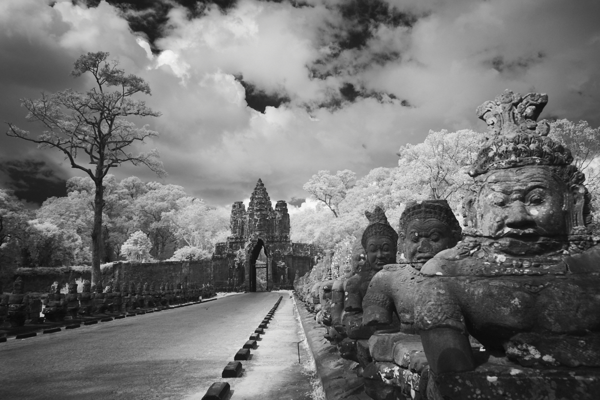
May 22 |
Comment |
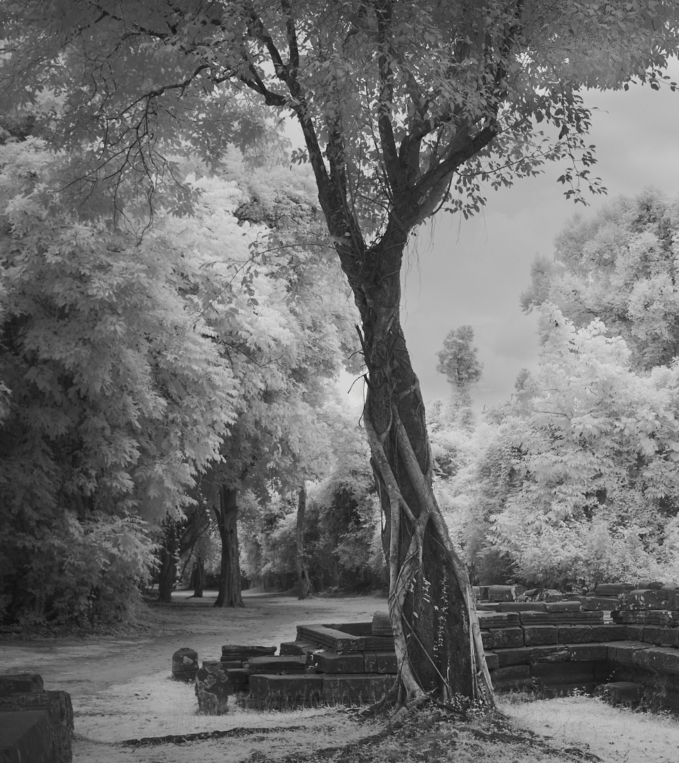
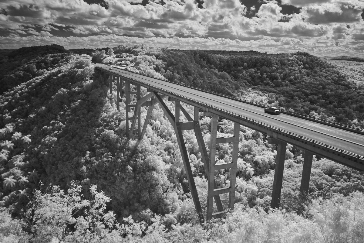
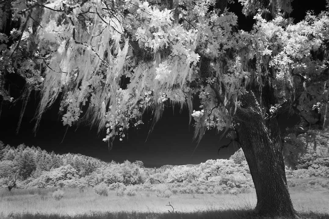
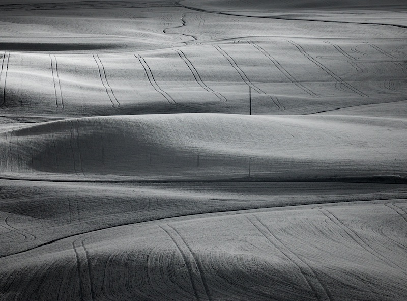
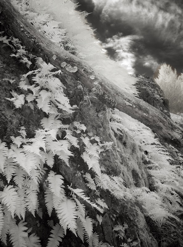
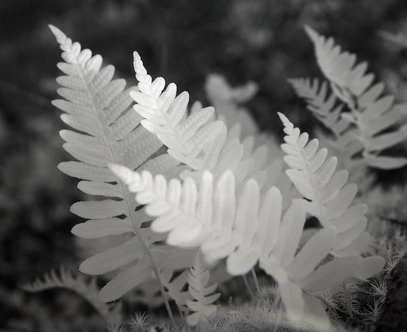
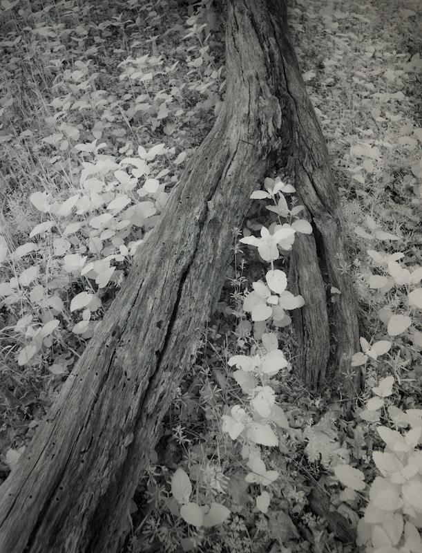
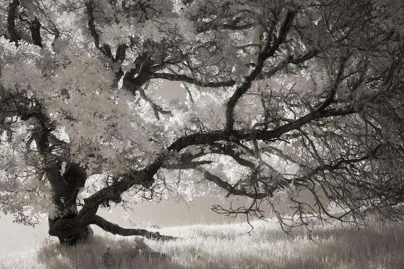
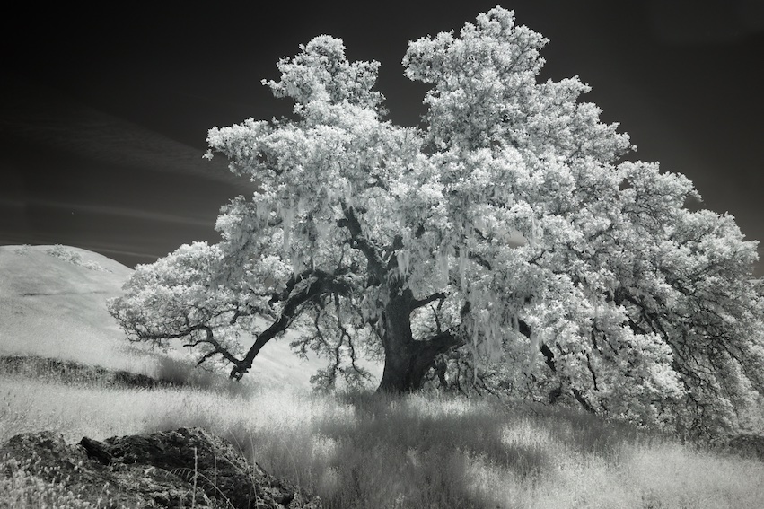
The whites in this are so compelling, Gary, they make the image. The trees on the left feel a little stretched, not sure if this is because of the perspective correction. Nicely done. |
May 2nd |
| 66 |
May 22 |
Comment |
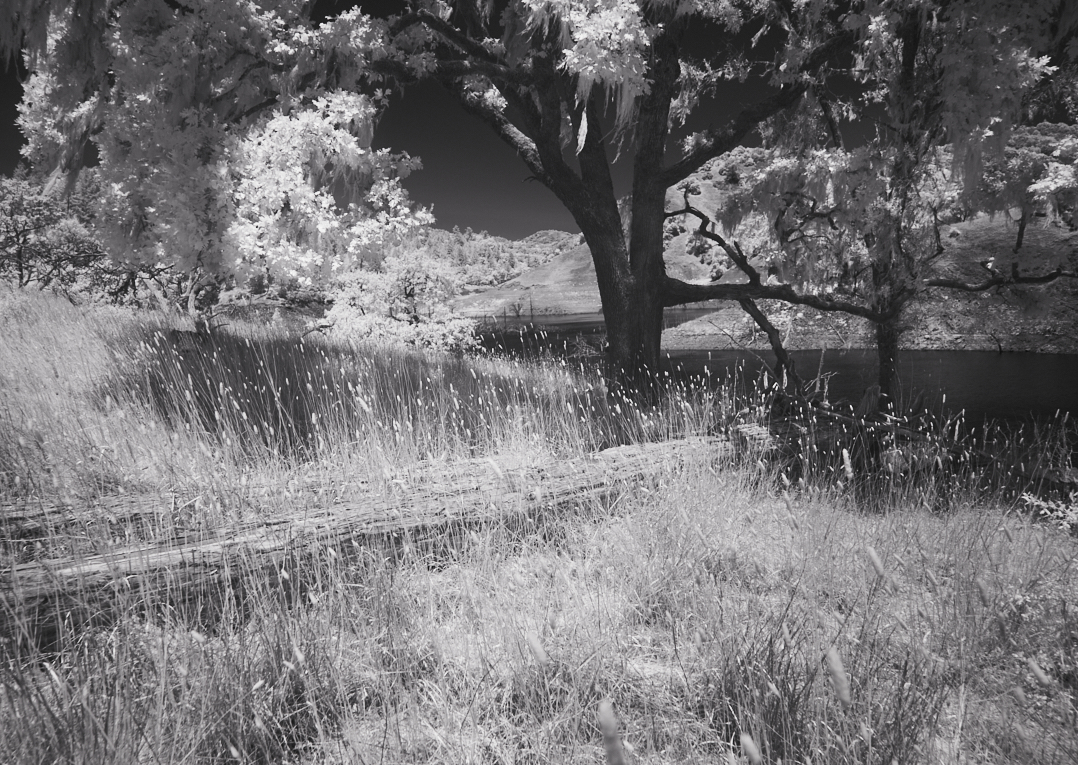
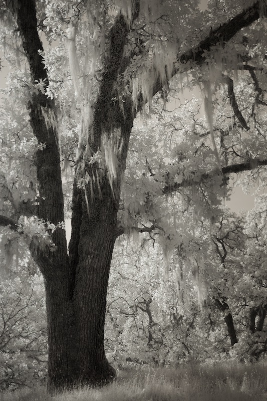
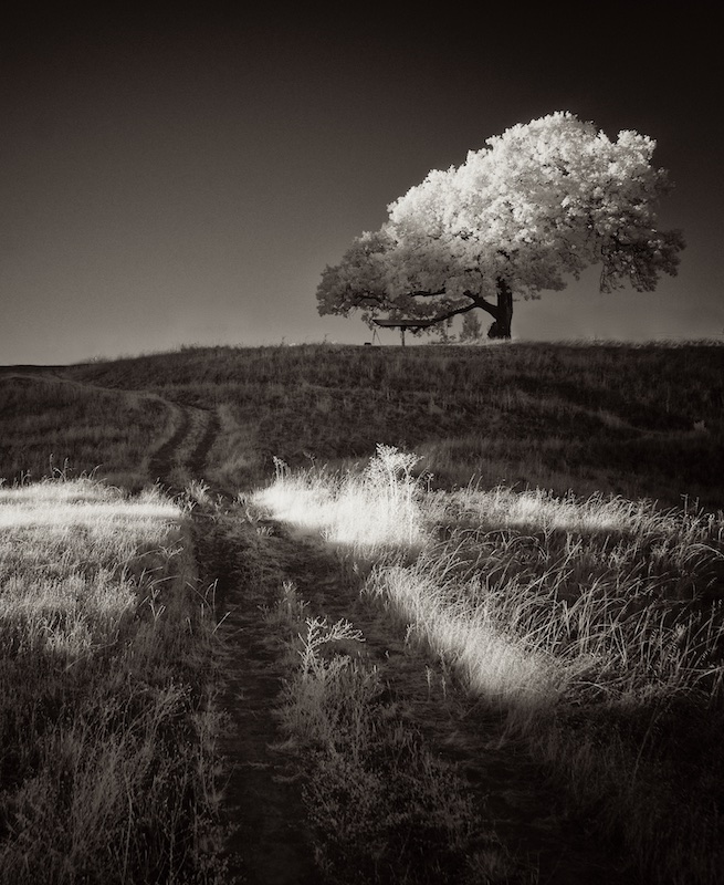
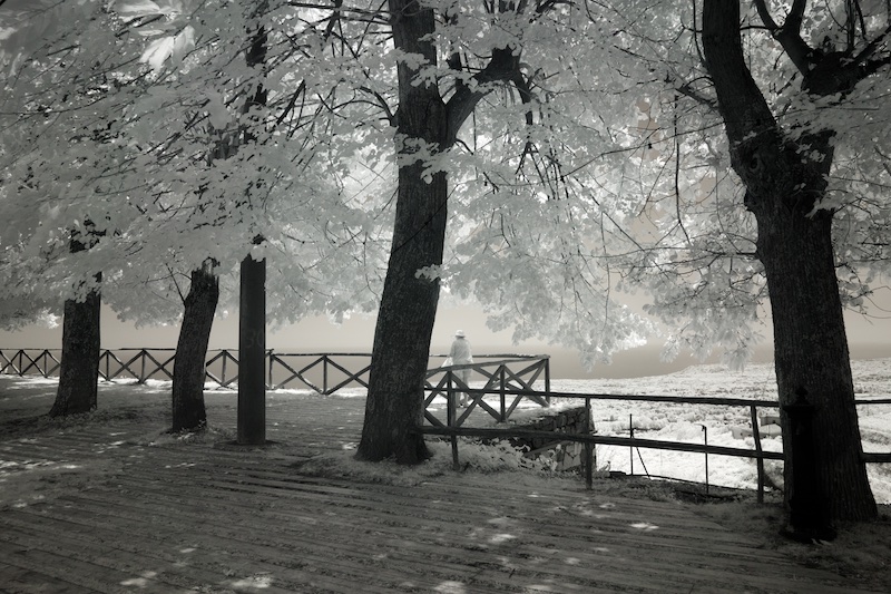
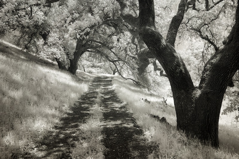
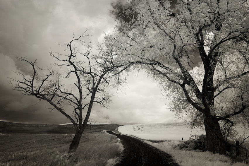
As Henry points out, Charles, the eye goes right to the bench. There's such a nice sense of mood to this, tranquility, and love the reflections. I might be tempted to punch up the tree trunks a little (more contrast, blacks) but then you might lose that nice mood. I enjoy looking at the original on images like this - this one makes a nice companion image, the sunset version ;) |
May 2nd |
| 66 |
May 22 |
Comment |
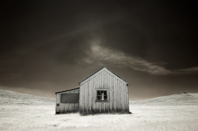
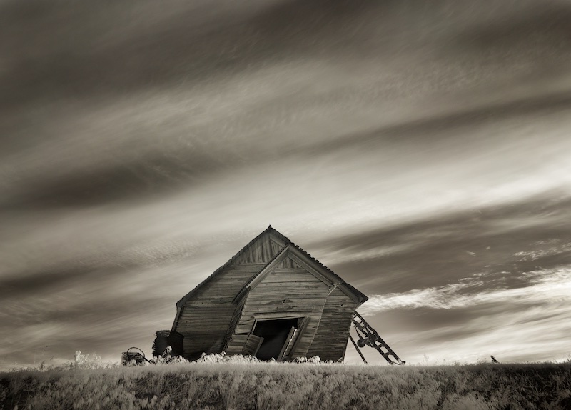
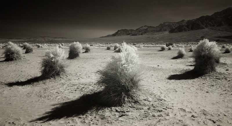
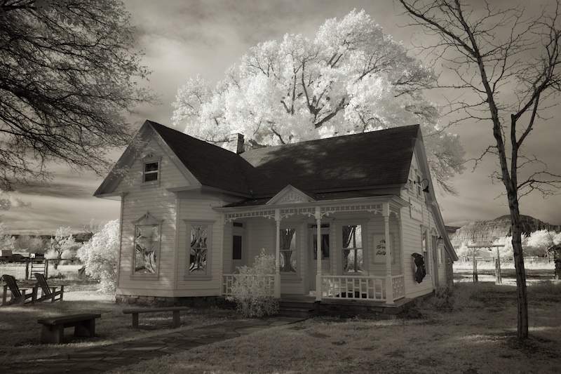
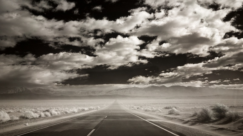
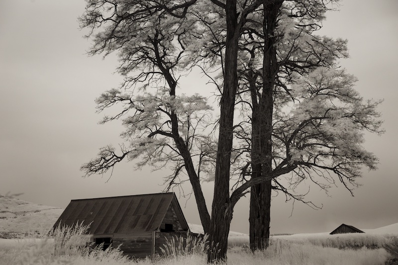
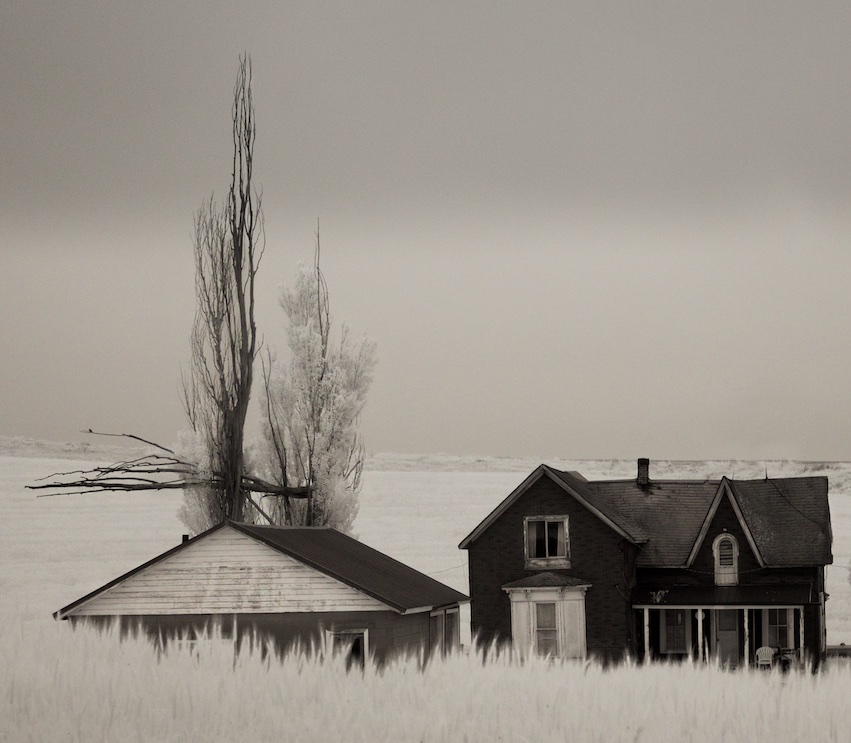
I love the minimalist nature of this, Arik, and enjoy not only the placement of the cloud, but as Stephen points out the siding on the house vs the roof shingles; there's so much to enjoy. My "pet peeve" on images like this, is I wish there a tiny white frame around it, as its difficult to see where it ends on the bottom, also the thumbnail of the original distracts, but this is more of a website issue. |
May 2nd |
| 66 |
May 22 |
Comment |
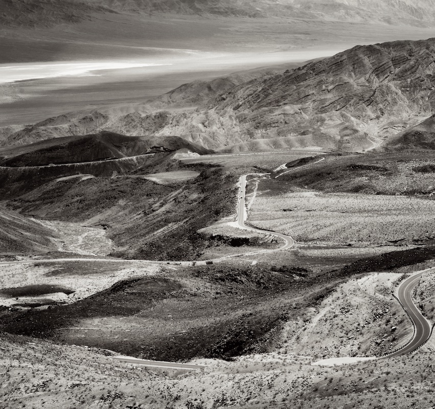
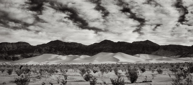
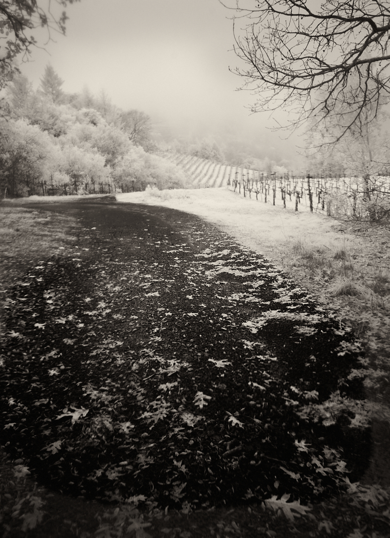
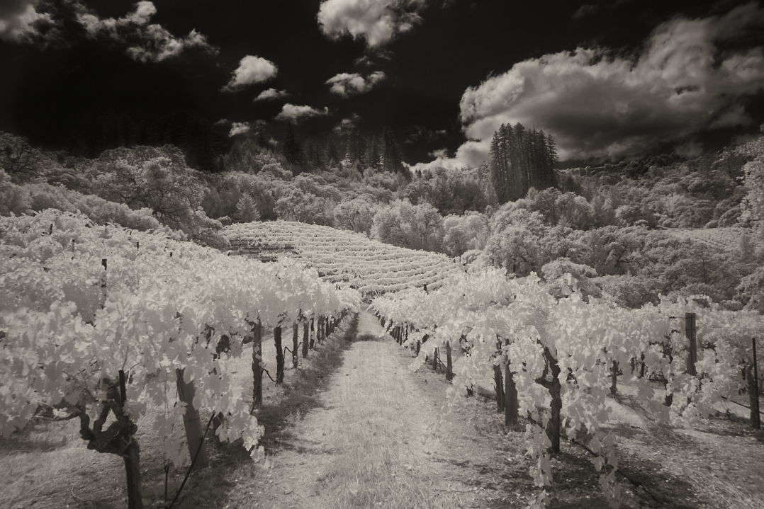
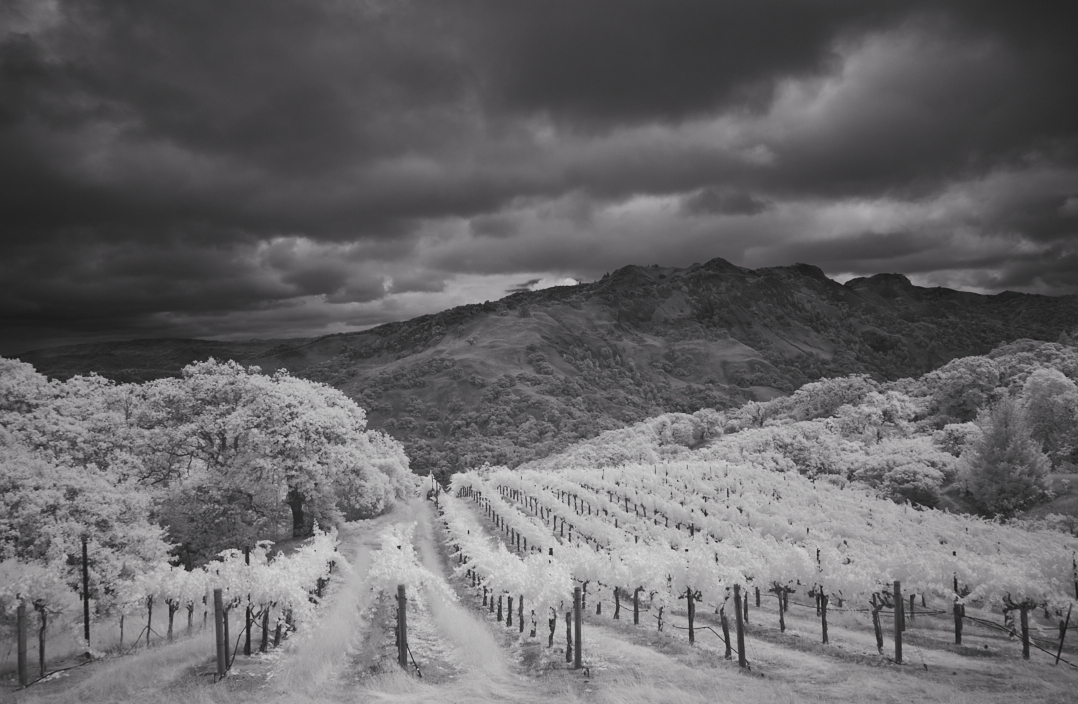
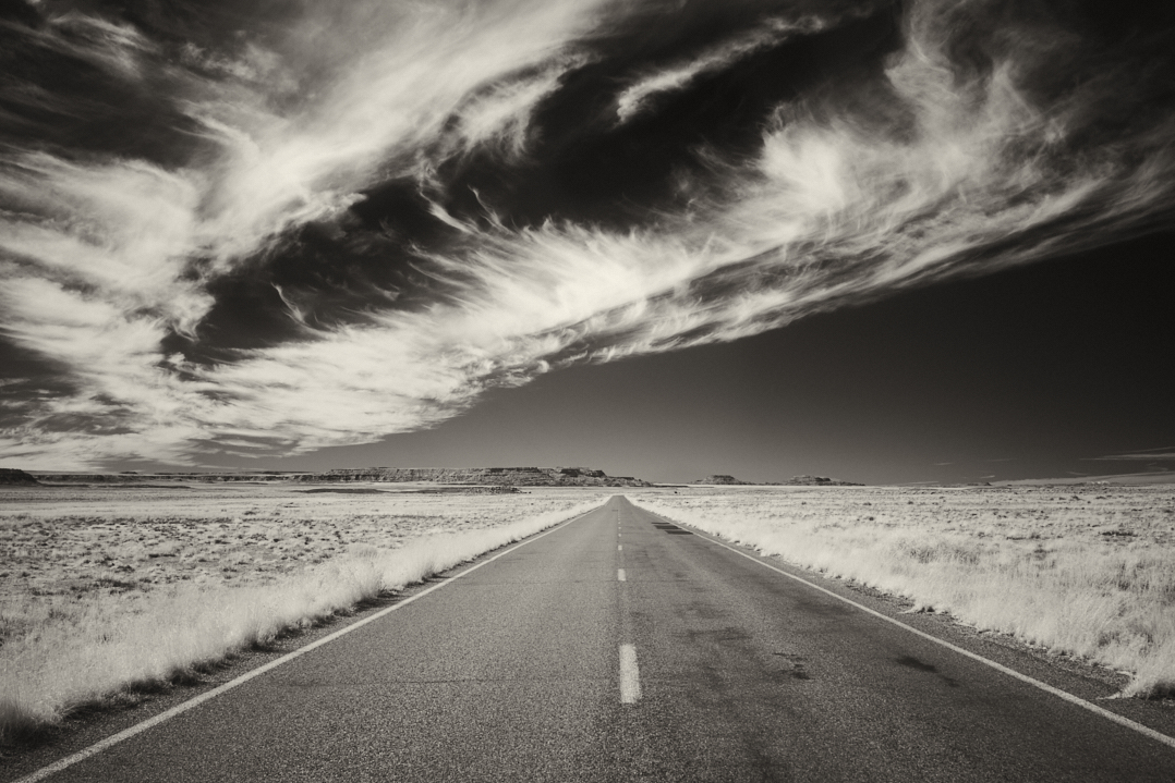
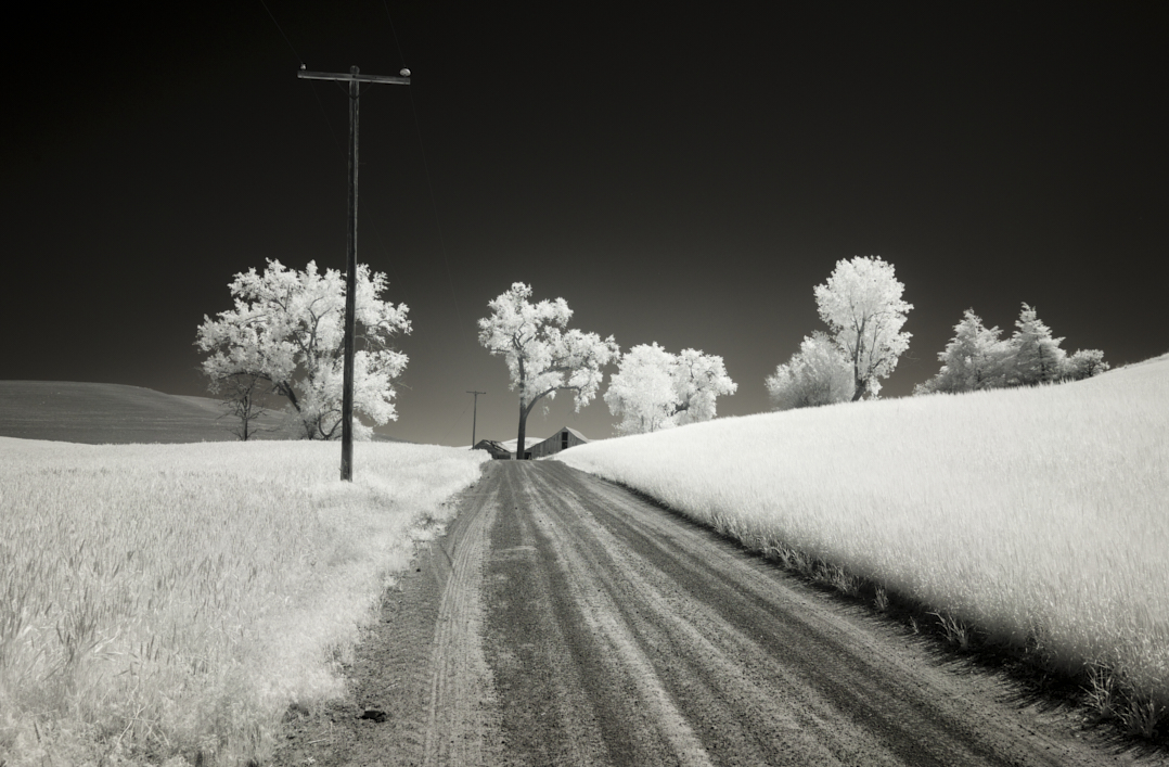
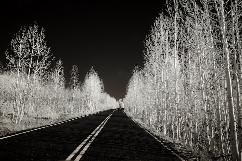
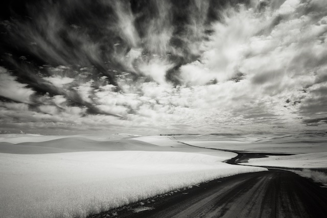
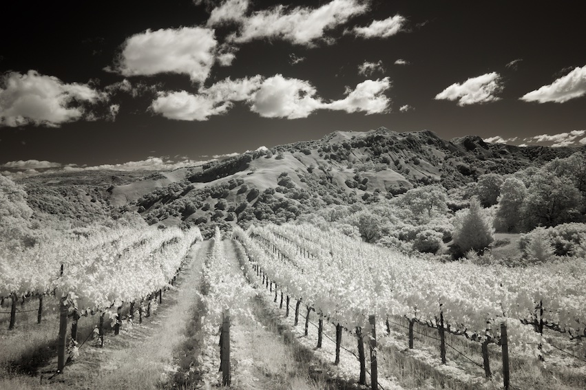
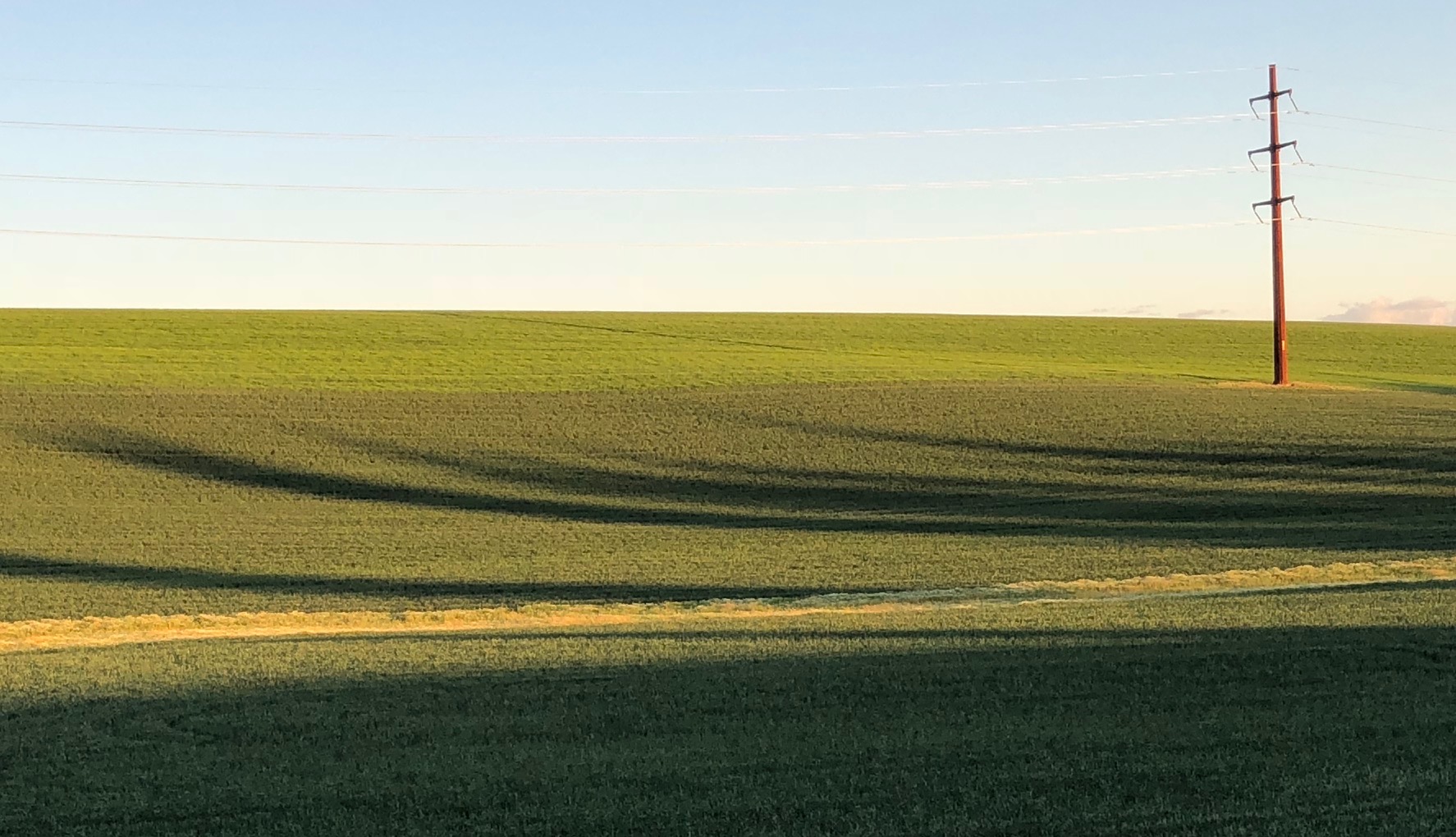
We were definitely thinking alike, this month, Melanie! While I do like the softer feel of your original, we all have different preferences for contrast. I'm thinking your road might have had more traffic, and it can be tough to get out there on the center line. Regardless, its such a beautiful area, you can't go wrong with a landscape like this. |
May 2nd |
| 66 |
May 22 |
Reply |
Thank you Palli, I think you're on to something, which Henry picked up on also; I agree. |
May 2nd |
| 66 |
May 22 |
Reply |
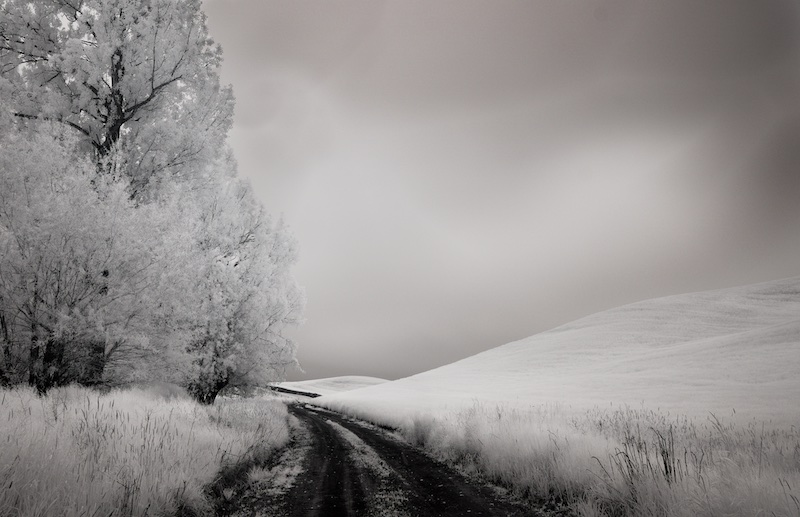
Thank you, Henry and welcome to the group! I hadn't noticed I was just a bit off the center line. And good point on darkening the fields just a bit. |
May 2nd |
7 comments - 3 replies for Group 66
|
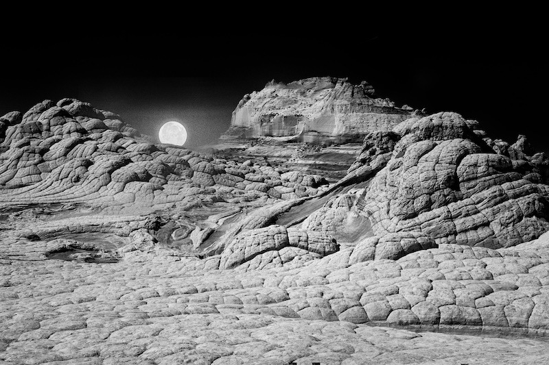
| 86 |
May 22 |
Reply |
Thanks Pat. Funny no matter how large the moon looks in person, it's always tiny when photographed! |
May 9th |
| 86 |
May 22 |
Reply |
Thanks Belinda I agree, the lines and textures tend to work great in black and white, I will give it a try. |
May 9th |
| 86 |
May 22 |
Comment |
This is beautiful Kieu-Hanh, so elegant! While Bob's version is excellent, I think your original is lovely too. The background is a little distracting, but there's enough blur there for me so that it still works. I also like the vertical orientation and the cascading feel to it. |
May 7th |
| 86 |
May 22 |
Comment |
I agree, Pat, the colors are more like fall, unusual for an iris! The flash really makes it pop, without being too noticeable. |
May 7th |
| 86 |
May 22 |
Comment |
Wow that's a tiny flower, Ruth. The oil paint filter works well here. I like the way the leaves underneath render, and the second flower makes for nice "mimicry". |
May 7th |
| 86 |
May 22 |
Comment |
I like the dreamy mood of shallow DOF flowers; very nice Gene. |
May 7th |
| 86 |
May 22 |
Comment |
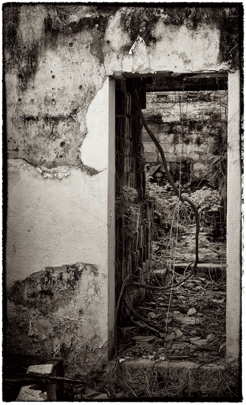
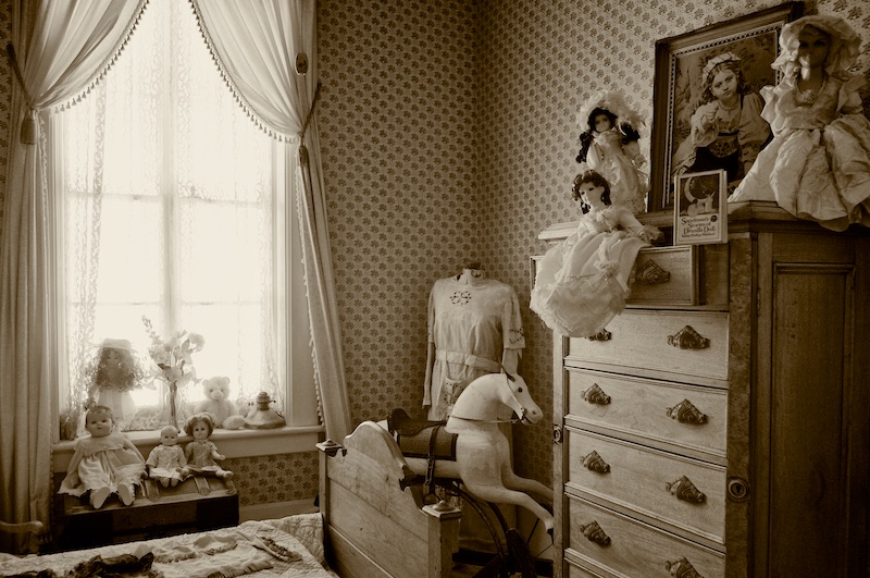
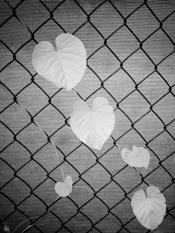
Your story helps understand the image, Belinda, but even without that, it has interest, and an air of mystery, with the fence figuring prominently, and the industrial feel of the buildings in the distance adding to the story.
It also shows you thought about the composition; the curve in the fence falling right along the surface of the grass, and the buildings fitting between two horizontal bars, these little touches make a big difference; nicely done. |
May 7th |
| 86 |
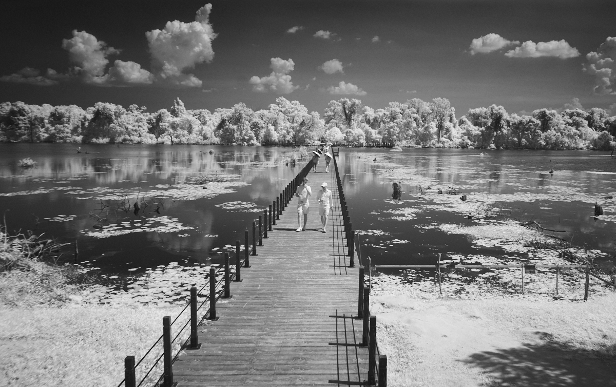
May 22 |
Comment |
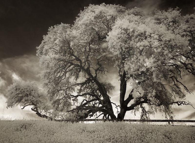
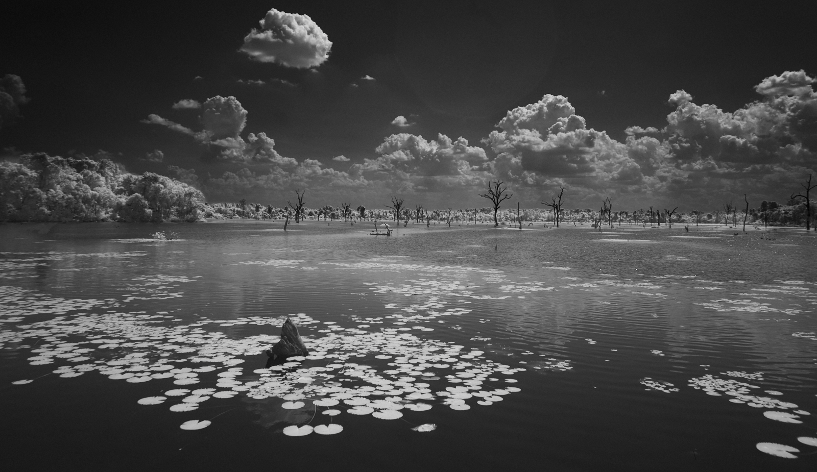
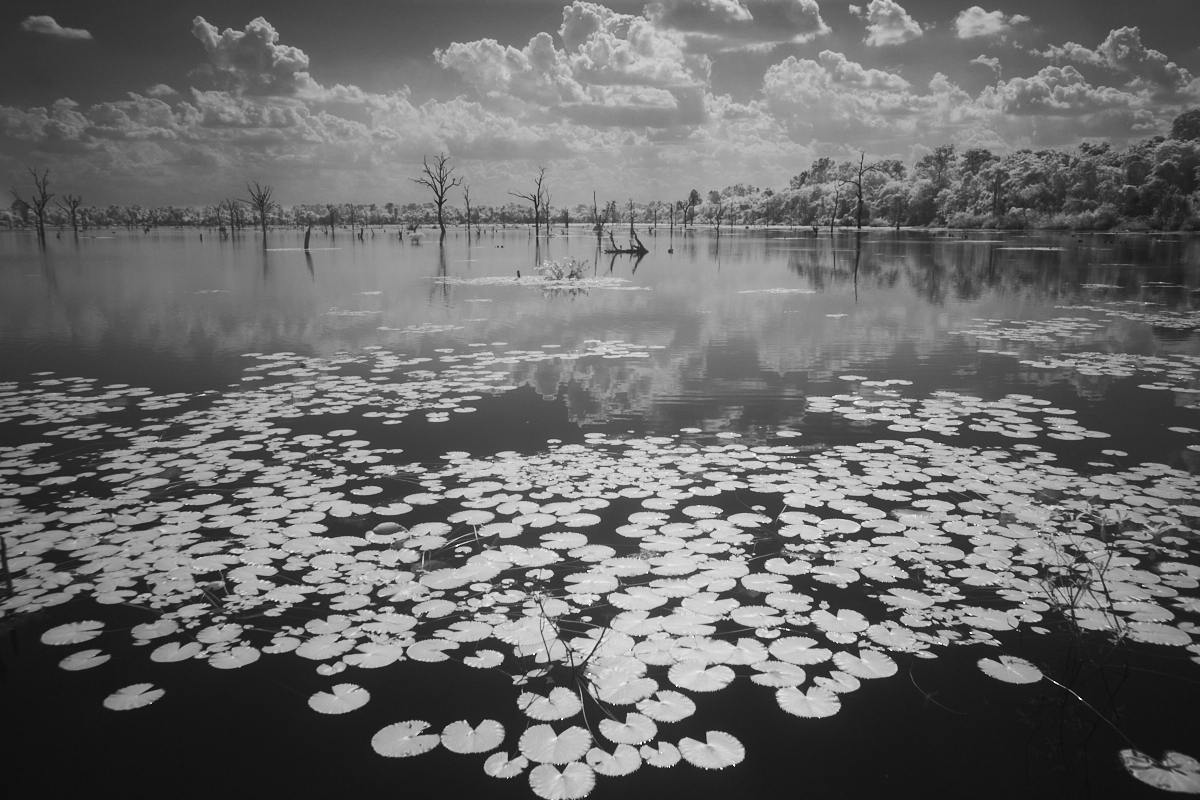
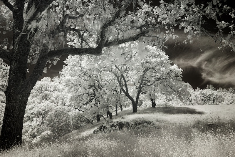
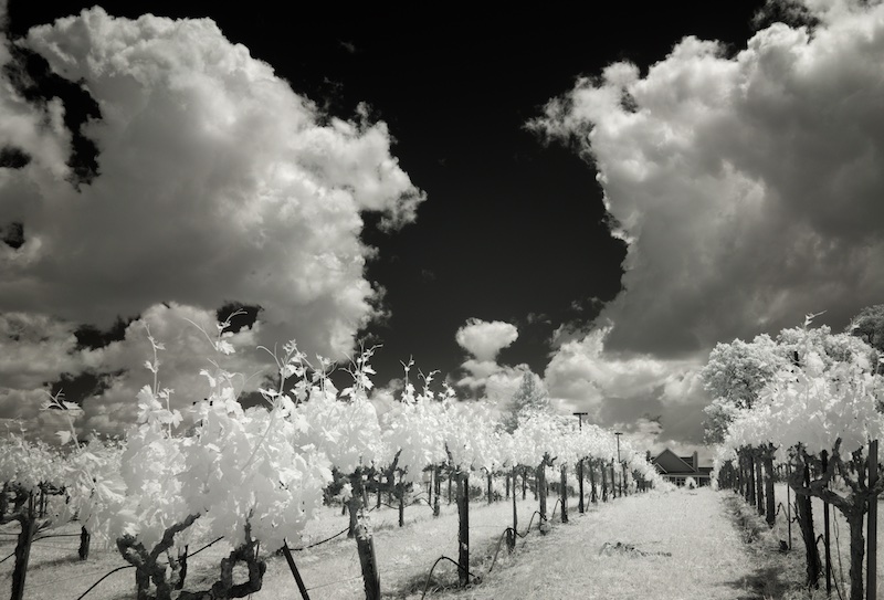
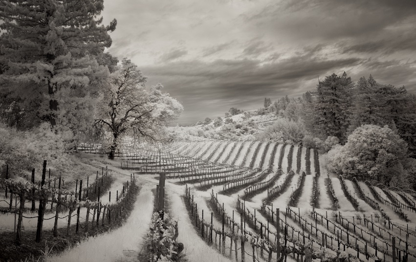
For a filter, this does a pretty good job, Bob. I especially like the water, the rich blacks, white lily pads, even some nice reflections. I also have a Sony mirrorless converted to infrared - great fun! I use my IR mid day, and the regular camera for early and late light. For those of you interested, there are two infrared groups on the Digital Dialog - 35 and 66, the latter of which I'm a member. |
May 7th |
6 comments - 2 replies for Group 86
|
19 comments - 5 replies Total
|