|
| Group |
Round |
C/R |
Comment |
Date |
Image |
| 8 |
Feb 21 |
Comment |
Very creative, and thoroughly enjoyable Mark! |
Feb 7th |
1 comment - 0 replies for Group 8
|
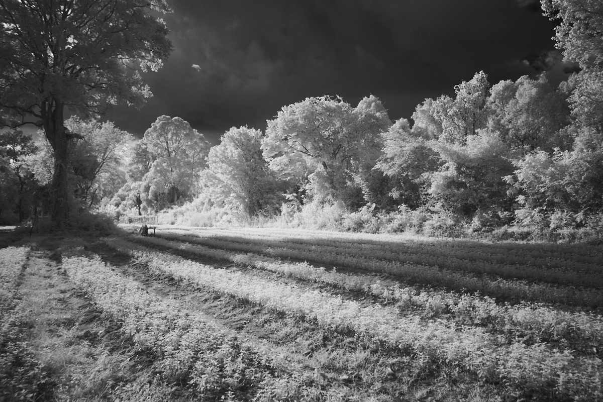
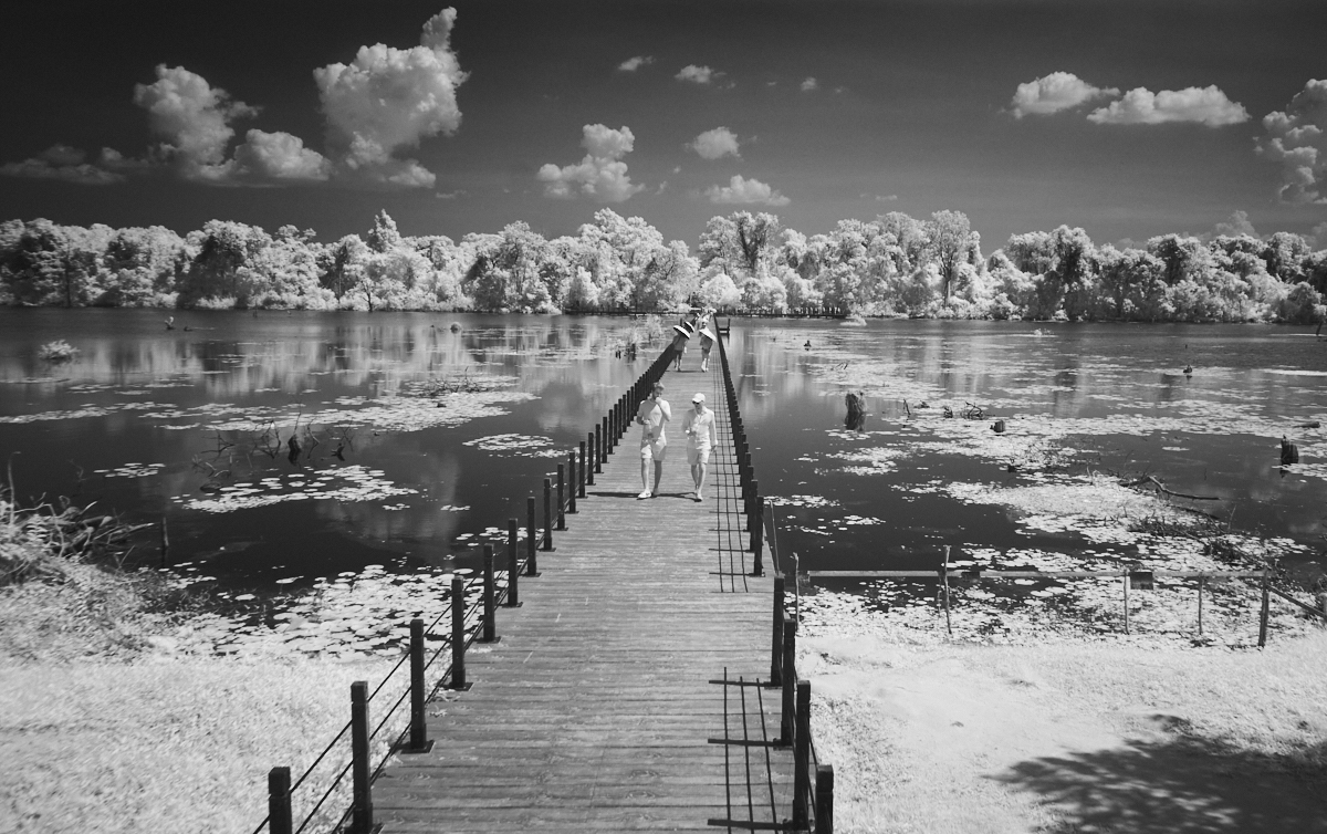
| 16 |
Feb 21 |
Comment |
Nicely done Bud! Although one has seen scenes similar to this before, what makes this special are that you still have some reflection along with the waves, and that bit of light on the side of the pier. The clouds leaning left adds a bit of tension. The exposure and processing are just right, to my taste. I am a little unsure about the two boats near the right edge, and look forward to seeing what your colleagues think about these. |
Feb 7th |
1 comment - 0 replies for Group 16
|
| 26 |
Feb 21 |
Comment |
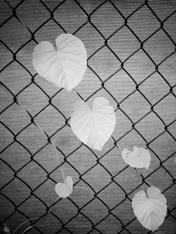
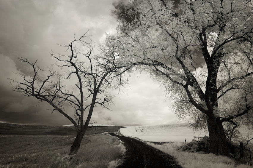
Very nice, Mervyn. Since you took out the wires, could you be convinced to remove the chain link fence also? There's a lovely mood to this. |
Feb 7th |
1 comment - 0 replies for Group 26
|
| 30 |
Feb 21 |
Comment |
It's enchanting! I particularly like the piece of fabric, and the rainy window. It's dark to the point of almost being too dark...or perhaps its dark and low contrast, gives it a bit of a muddy feel. Perhaps you've considered this and prefer it as so. |
Feb 7th |
1 comment - 0 replies for Group 30
|
| 45 |
Feb 21 |
Comment |
I think it's exquisite, David! In addition to succeeding with the focus stack technique, I like both the colors and the composition; I think it's the reflection that makes this speciail. |
Feb 7th |
1 comment - 0 replies for Group 45
|
| 47 |
Feb 21 |
Comment |
Thanks everyone for the good comments. It's interesting and helpful to see how an image like this works with different viewers. |
Feb 23rd |
| 47 |
Feb 21 |
Reply |
Thanks, Kirsti. Good point about the midtone contrast; I will work on that! I also thought about the top sliver, on balance, I think I like the bit of tension it provides to the image as you say. |
Feb 7th |
| 47 |
Feb 21 |
Comment |
It's a lovely scene, Jen, very well composed. As Kirsti mentions, the foreground flowers make this extra special. One minor issue for me, is that the toning, the sepia effect seems uneven. Maybe it's because of the vignette, and maybe it's not a problem, was just noticeable to me. |
Feb 6th |
| 47 |
Feb 21 |
Comment |
The toning adds another level of interest to this, Albert, and works very well. Beyond that, while the patterns of the feathers are interesting, to me its one of those with "no where to land", where I'm looking for the photographer to guide me. I look forward to reading how others react. |
Feb 6th |
| 47 |
Feb 21 |
Comment |
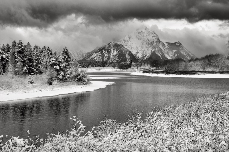
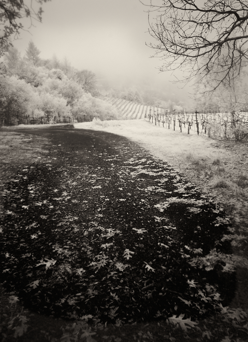
There is lovely mood to this image, Kirsti, and I admit my first thoughts were similar to Larry's regarding the distracting elements. It had more of a photo journalism feel in that version, which is fine, too if that's what you're after.
Your pano crop feels just a little tight to me. Perhaps I like Larry's crop best. There is lots to enjoy in this image -- the shadows on the snow, the sky -- but as is often the case, it doesn't fit neatly into a rectangular crop. Cropping out the car and guard rail in a way improve the image, but in another way diminishes it, and I can't explain quite how.
Finally, the blue tint is just a bit strong, for my taste. I prefer a hint to where it's barely noticeable. Thanks for an interesting image and welcome again! |
Feb 6th |
| 47 |
Feb 21 |
Comment |
Very nice nature shot, Adrian. I think I am partial to the original in this case, both the wider crop, and softer contrast. The post processing definitely brings out the detail, and has a gritty feel, but perhaps too much so for me. But even so it's an enjoyable image. |
Feb 6th |
| 47 |
Feb 21 |
Comment |
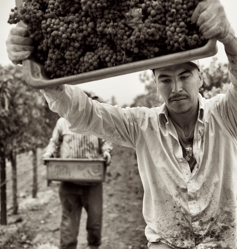
Well, you've certainly taken the scene to another level with this processing, Ed, and dealt with some harsh lighting that you were presented with. The effect on the two men in front, is particularly interesting! Beyond that however, it starts to have the effect of a filter, by which I mean its the first thing that comes into my head when I see the image. I think this is where opacity and blending of filter effects might be played with to improve the end result. But I definitely see and appreciate what you were after, and it works on a certain level. |
Feb 6th |
| 47 |
Feb 21 |
Comment |
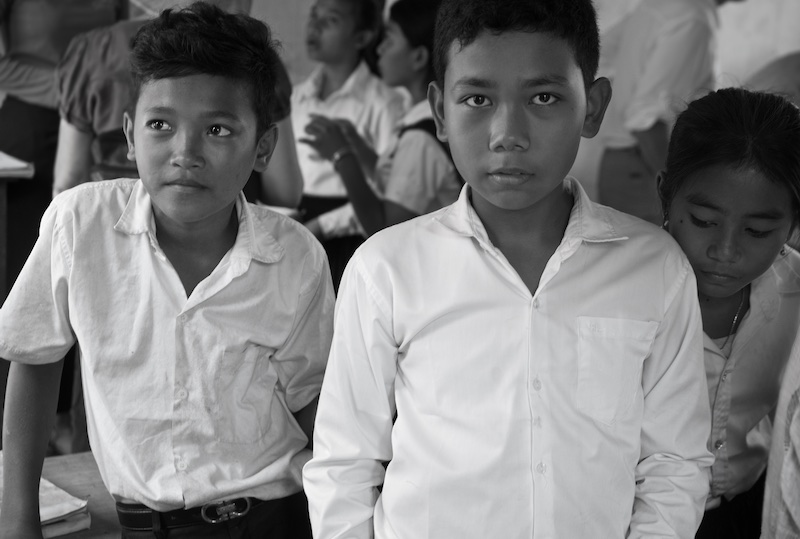
This is a great portrait, Colin! The lighting, and detail, are excellent. I especially like the way your subject has engaged with the photographer, and by extension the viewer, in a way that looks totally natural, not posed. |
Feb 6th |
7 comments - 1 reply for Group 47
|
| 66 |
Feb 21 |
Comment |
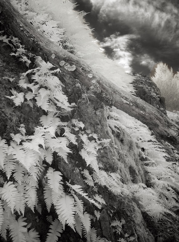
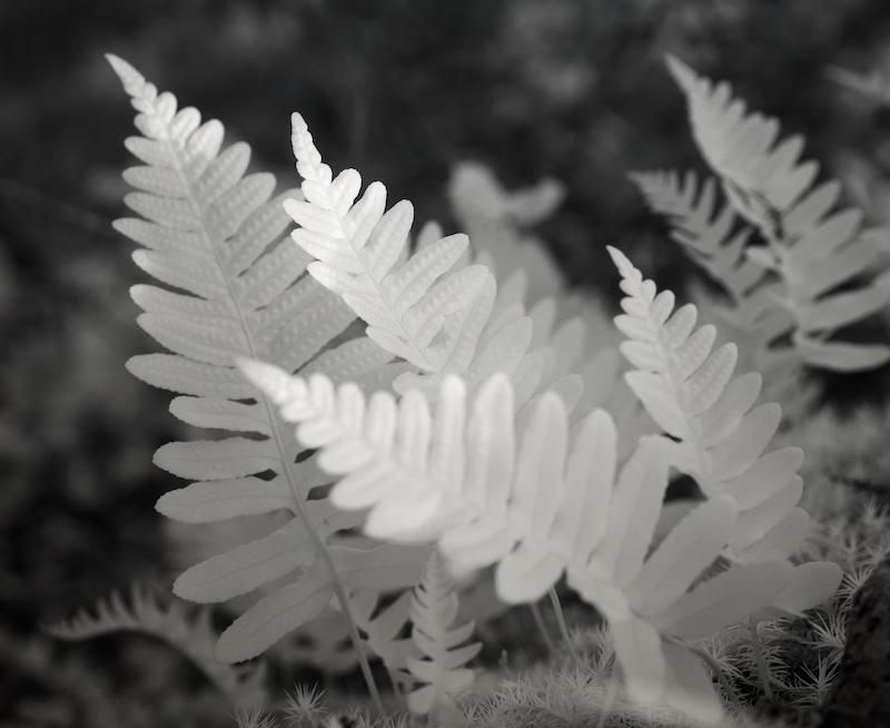
Thanks, Emil. I think it's a toss-up on the flip, and I agree there is some initial confusion to the eye, I got that feeling to, coming back to it. I do like the way you've separated the ferns from the sky, but I'm thinking framing the image without any sky at all would be another image to consider. |
Feb 6th |
| 66 |
Feb 21 |
Comment |
You have a good eye for flipping images, Emil. In this image, even though I'm usually a fan of your lower contrast black and whites, here I agree with Gary and Palli about some needed contrast. However, in Gary's version, though this is an interesting sky to work with, I think it starts to take away from the rest of the scene. I would prefer some added contrast to the buildings, some local contrast, to bring out more detail and show the age and grittiness therein. |
Feb 6th |
| 66 |
Feb 21 |
Comment |
Nicely done, Palli! The little tip of orange at the top, conveys hints of a setting sun. It is -- and then again it isn't -- definitely adds tension and interest to the image. It's a nice way of putting your personal vision into this scene. I agree with Gary's comment regarding the bottom, but understand your explanation. |
Feb 6th |
| 66 |
Feb 21 |
Comment |
This is great, Gary. The original shows the wonderfully simple patterns you had to work with. I'm not sure I like the way the shapes have outlines in your final version, but I agree that the image is definitely one of those to try some creative processing on. It's also interesting that in the final, one can sense this is a pond reflection, where I didn't see that in the original. It's indeed eery and impressionistic. |
Feb 6th |
| 66 |
Feb 21 |
Comment |
I like what Gary's vignette does for this, Charles. But even before that I like the way you've worked with the dreamy IR effect in this color image -- its far enough away from reality not to be confused with it. I think it conveys well the melancholy you were after. |
Feb 3rd |
| 66 |
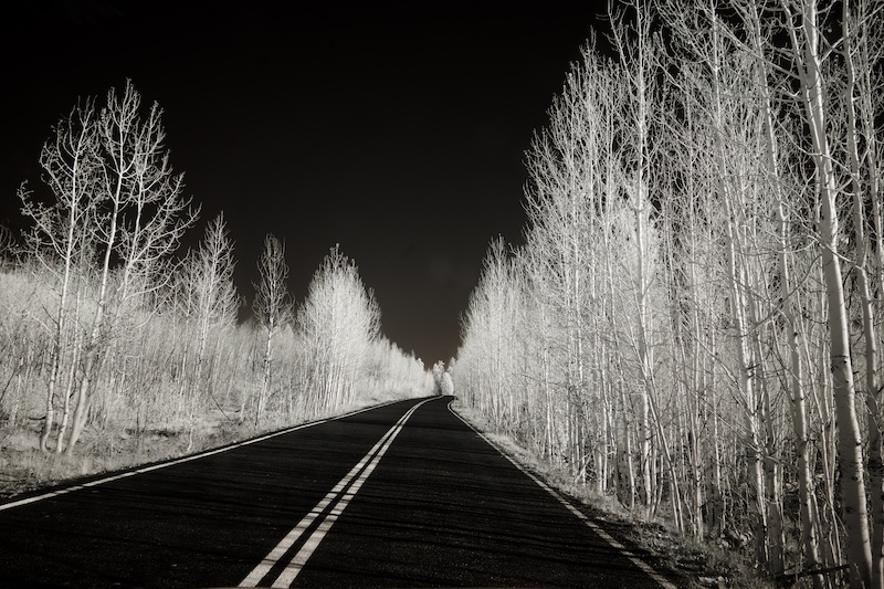
Feb 21 |
Comment |
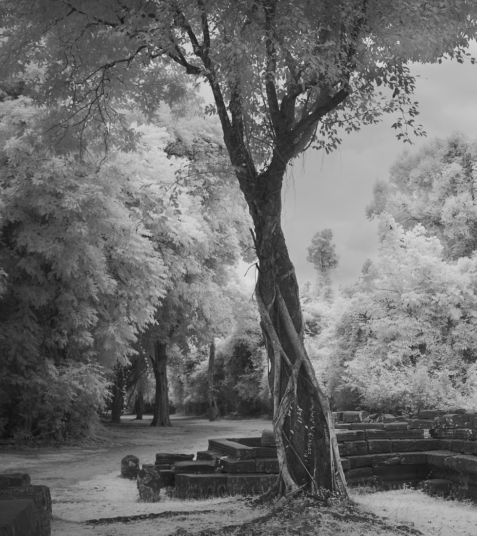
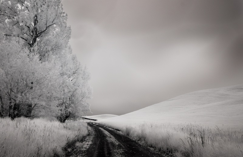
I love repeating trees down lanes, Melanie, and what makes yours unique is the lean! Is it the wide angle lens, or did they really grow like that? Prevailing wind sometimes does that. I like what it does for the image, and enjoy it very much over all. |
Feb 3rd |
| 66 |
Feb 21 |
Comment |
I agree with you, Gary, thanks! You can see from the original, I did brighten the whites somewhat, but your version shows I was only half way there. The details work better too. |
Feb 3rd |
7 comments - 0 replies for Group 66
|
| 86 |
Feb 21 |
Comment |
I like the repeating lines in this, Kieu-Hanh, and as to the warmer version you posted, I think something between it and the original, would be to my liking. I also think there is perhaps more foreground than is needed, and cropping the lower 1/4 off might be even better, but it's very nice as is. |
Feb 17th |
| 86 |
Feb 21 |
Comment |
I like the repeating lines in this, Kieu-Hanh, and as to the warmer version you posted, I think something between it and the original, would be to my liking. I also think there is perhaps more foreground than is needed, and cropping the lower 1/4 off might be even better, but it's very nice as is. |
Feb 16th |
| 86 |
Feb 21 |
Comment |
Nice, creative take on your original, Pat. |
Feb 16th |
| 86 |
Feb 21 |
Comment |
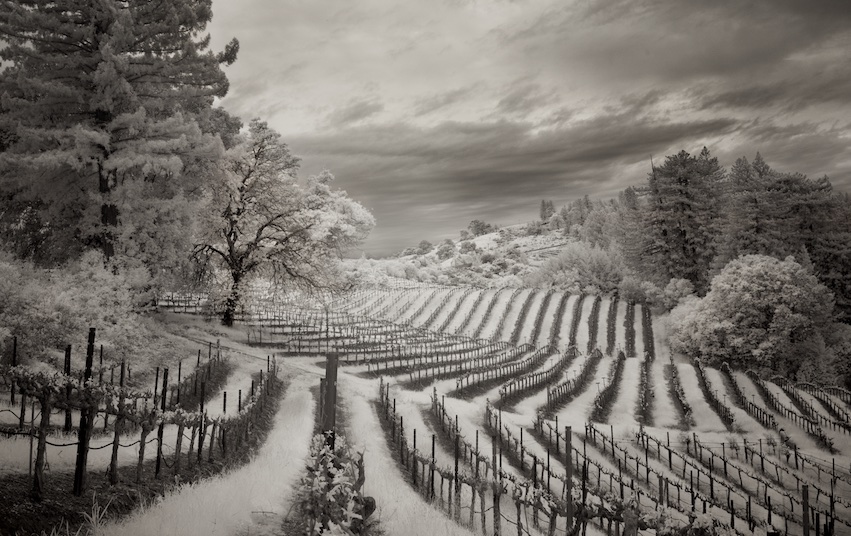
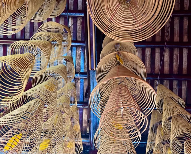
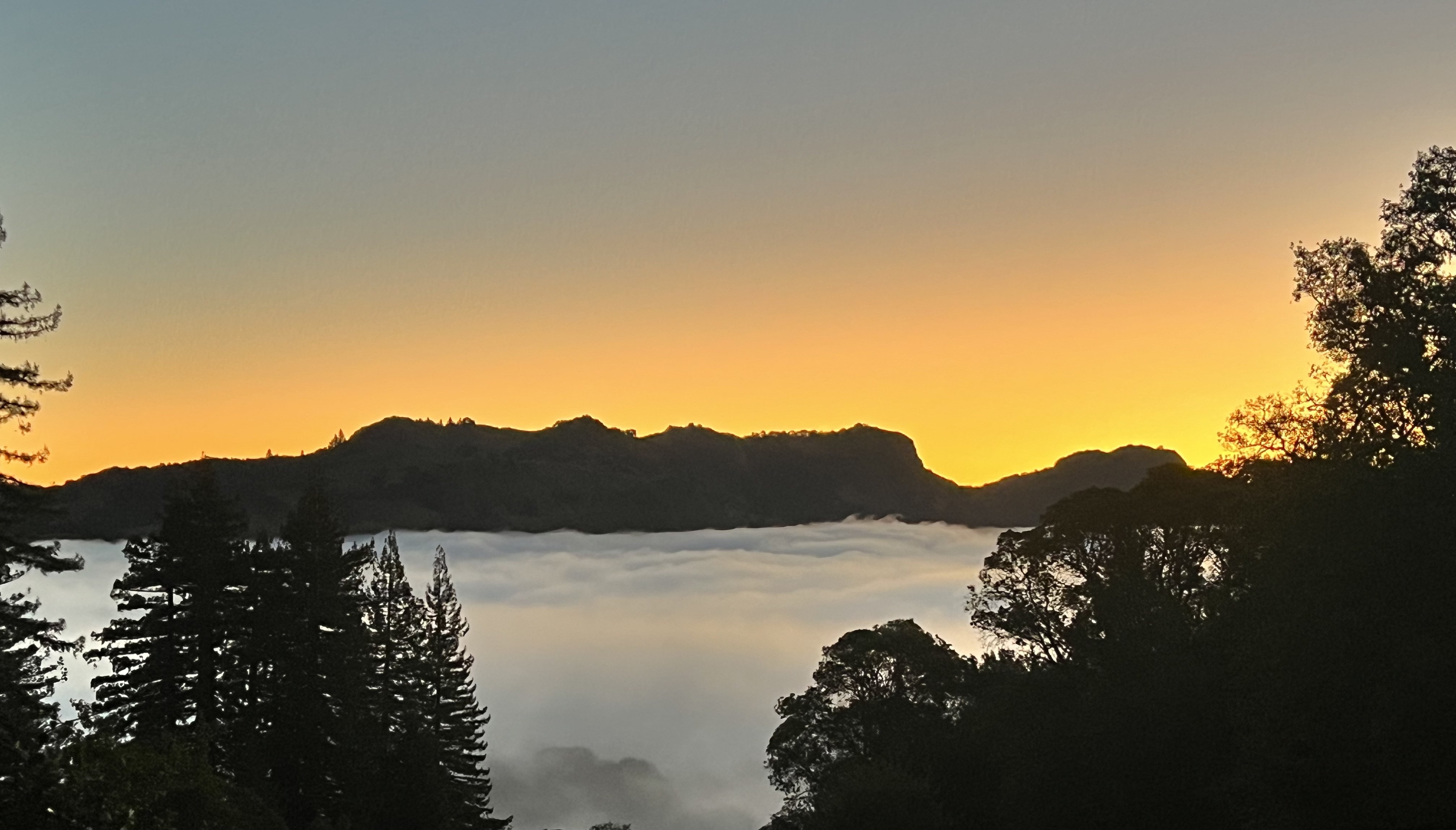
Seeing images like this is what makes "the camera you have with you", often your phone camera, so valuable. No time to run back for the other camera!
The bits of red up top play nicely off the reds in the center. |
Feb 16th |
| 86 |
Feb 21 |
Comment |
There's a nice hdr feel to this, Belinda. As Phillipa mentioned you've brought out some color that wasn't evident in the original. I particularly like the warm lights under the arches on the left edge. |
Feb 16th |
6 comments - 0 replies for Group 86
|
25 comments - 1 reply Total
|