|
| Group |
Round |
C/R |
Comment |
Date |
Image |
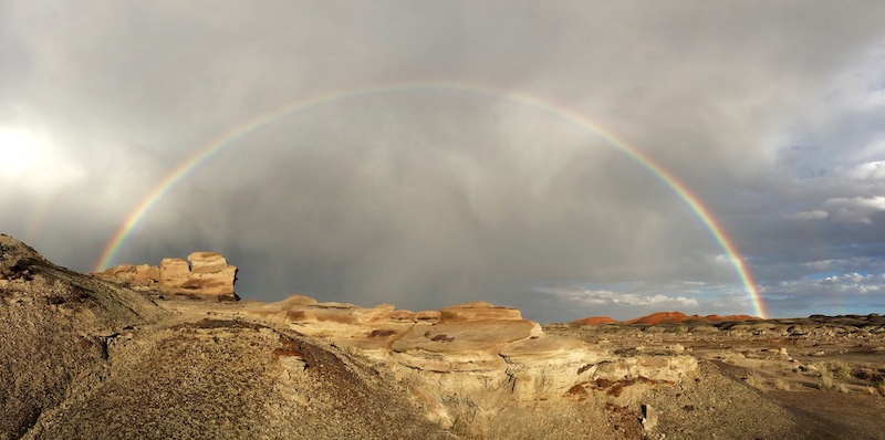
| 16 |
Nov 20 |
Comment |
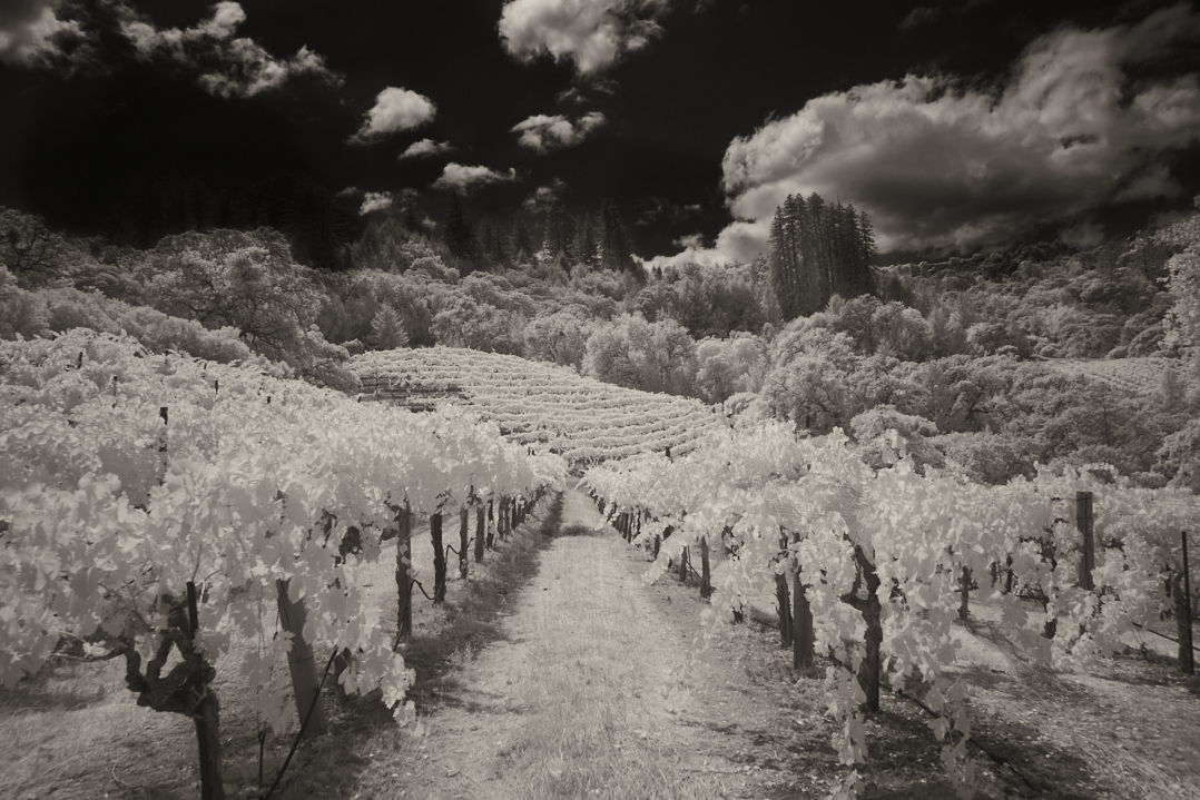
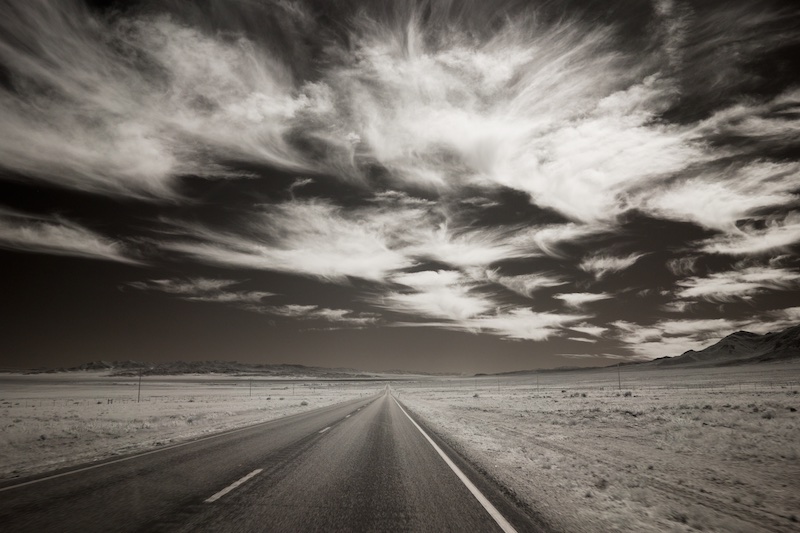
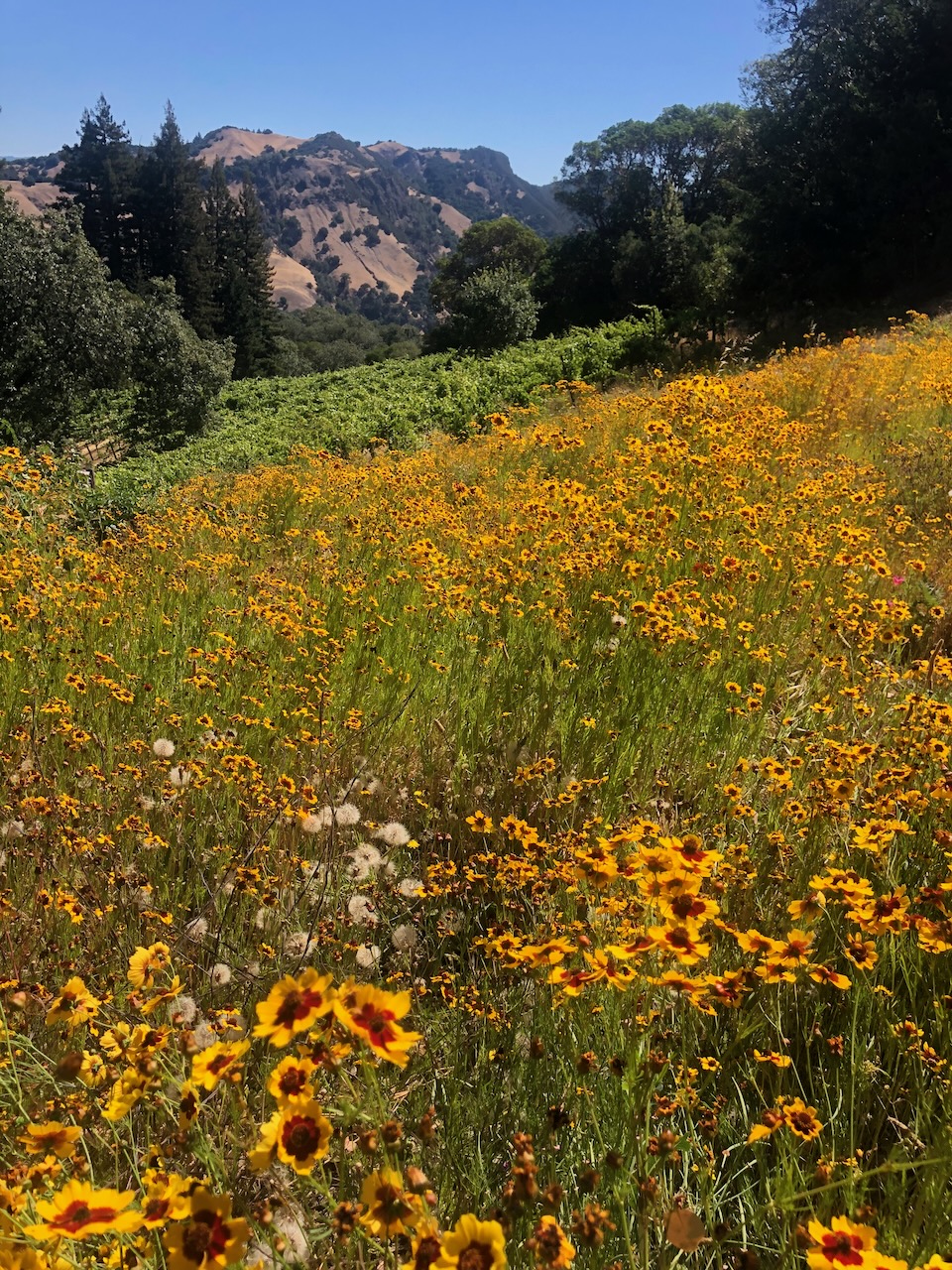
I like the symmetry here and you have an unresistable sky, Joan, very nice.
It feels a little bright and of low contrast, to me. Increasing contrast in the sky just a bit would give you some richer blues. |
Nov 3rd |
1 comment - 0 replies for Group 16
|
| 31 |
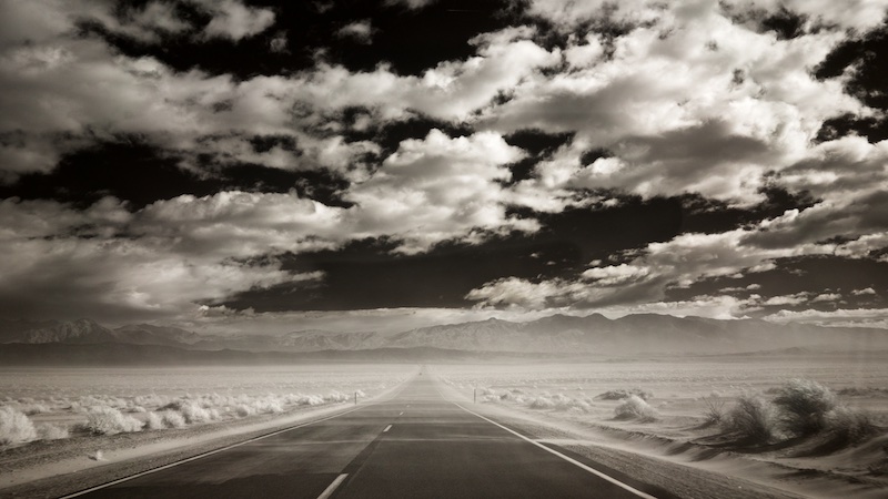
Nov 20 |
Comment |
It's breathtaking, Peter. Wonderful use of light! |
Nov 3rd |
1 comment - 0 replies for Group 31
|
| 39 |
Nov 20 |
Comment |
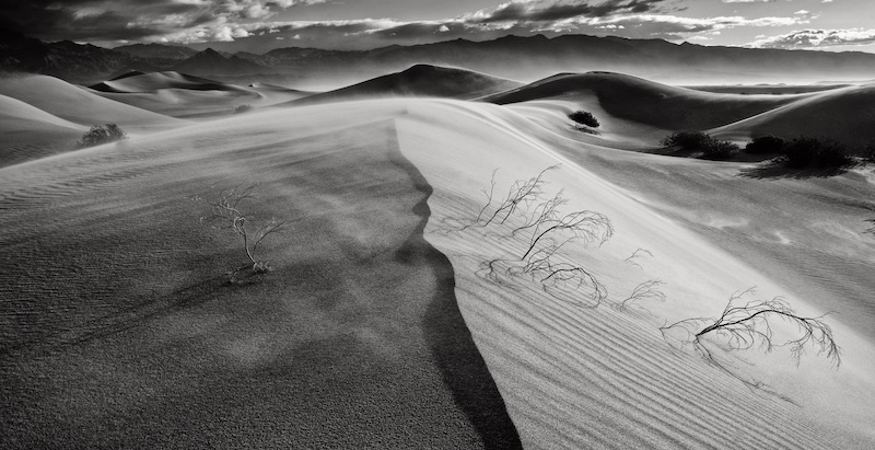
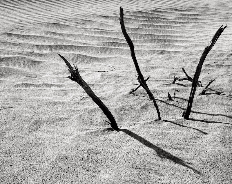
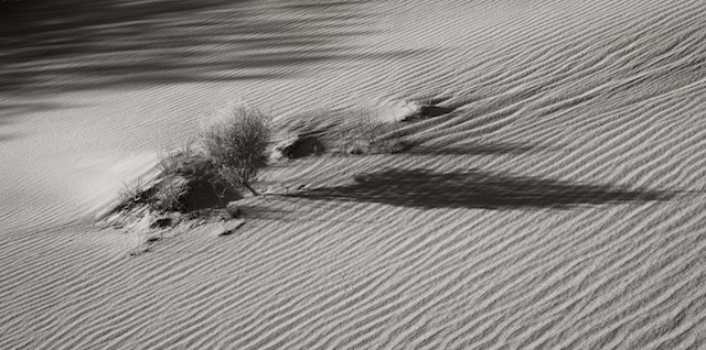
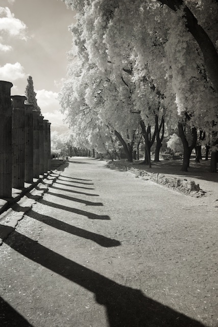
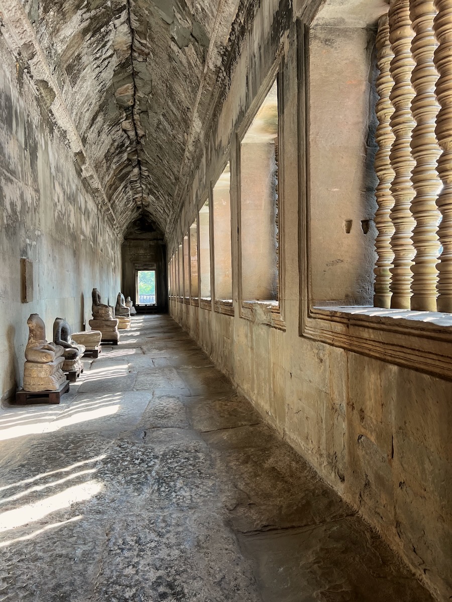
Black and white just takes this to another level, Steve. It really brings out the repeating lines of the shadows. Love the black sky. Well conceived! |
Nov 3rd |
1 comment - 0 replies for Group 39
|
| 45 |
Nov 20 |
Reply |
Yes, of course, David, good point. I meant dead center horizontally. |
Nov 3rd |
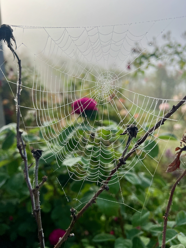
| 45 |
Nov 20 |
Comment |
Great choice for black and white, David. Positioning the spider web center is bold, and the fly of course is the cherry on top. Well done! |
Nov 3rd |
1 comment - 1 reply for Group 45
|
| 47 |
Nov 20 |
Comment |
Yes, Ed, you were able to bring more detail out, and good point about it still being monochromatic, very nice. I will go back to the raw file and I should be able to bring more detail out, will give it a try. |
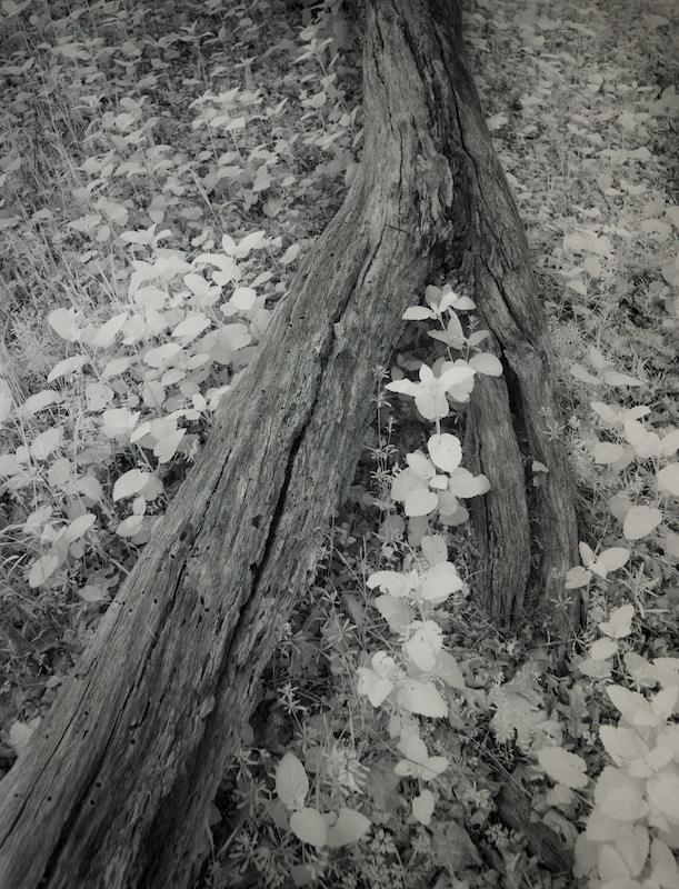
Nov 21st |
| 47 |
Nov 20 |
Reply |
Yes, Adrian, I think this is much improved. |
Nov 8th |
| 47 |
Nov 20 |
Comment |
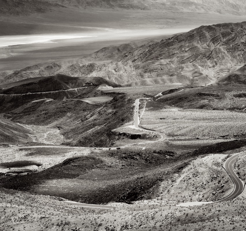
I will be awaiting others' comments on the crop, Jen, as I'm undecided. The pelicans at the bottom provide context, as do the woods in the background, yet the main subject ends up being too small to fully enjoy, and it looks like he has a great pose and is quite sharp. Maybe a little cropped off all around would help. The birds' being such a nice white in an overall dark gray scene really makes him pop, and gives this, or another version of this, some potential. |
Nov 3rd |
| 47 |
Nov 20 |
Comment |
This is certainly a unique nature portrait, Don. Being able to eliminate any indication of the setting being a zoo, really makes this. You've got great sharpness and detail on the cat, and a wonderful sky to boot! Very nice. |
Nov 3rd |
| 47 |
Nov 20 |
Comment |
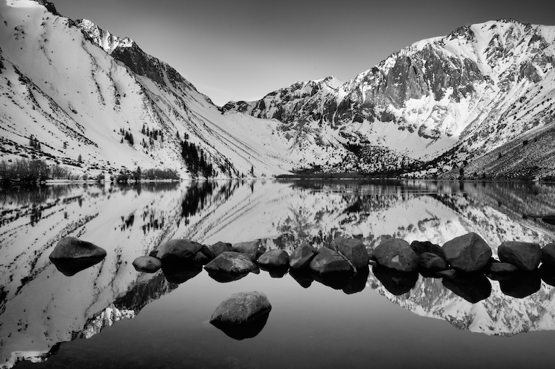
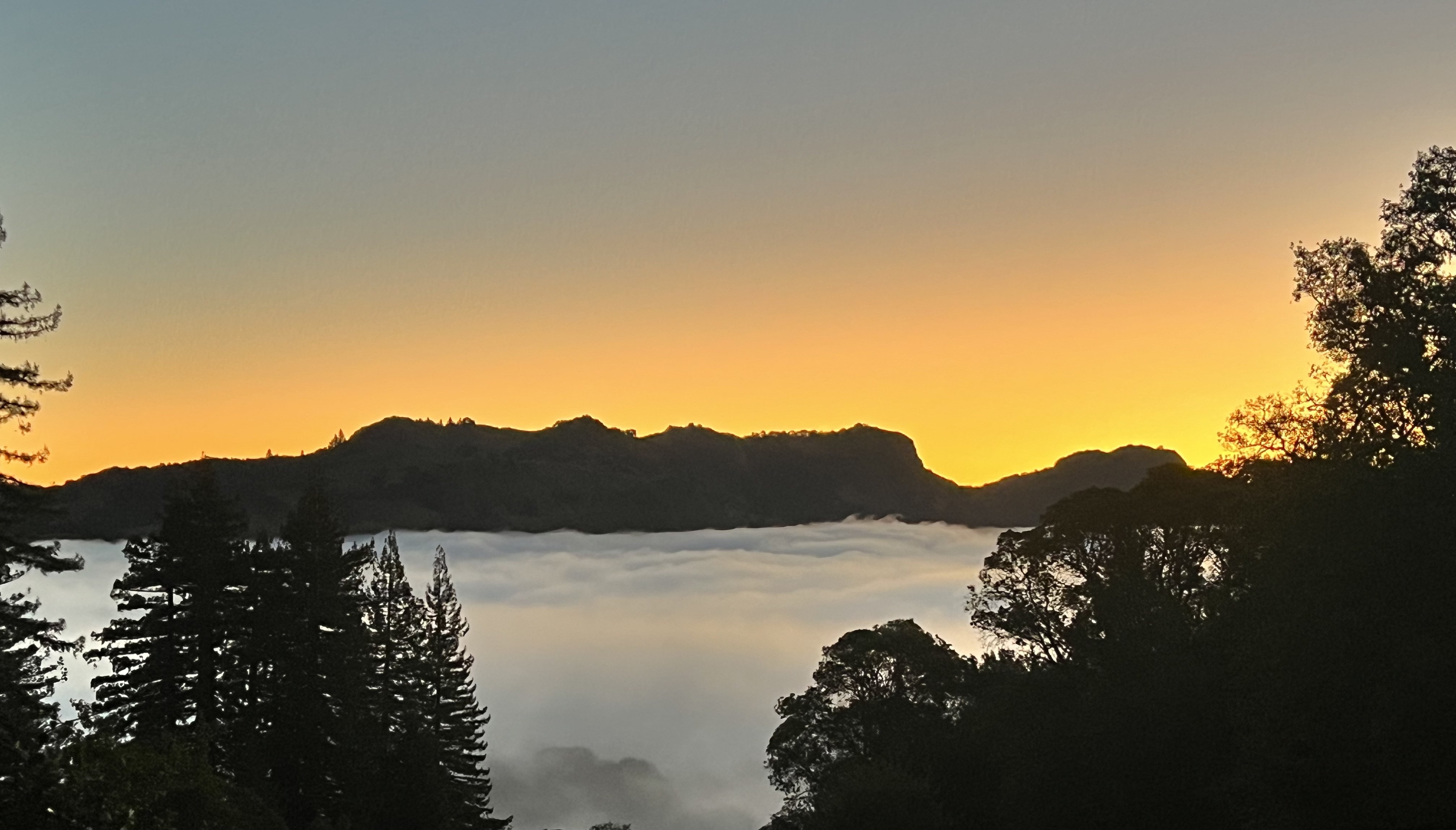
Familiar, indeed, Adrian, having taken this shot just last year. I enjoy seeing it at another time of year, and you have lovely reflections here.
Per your last sentence, yes, I think you have under done the contrast. There is some nice contrast in the foreground, but the mountains, the crown jewel as it were, are still distinctly hazy. Some might say this haze is a natural way of conveying distance, depth of field, but I think this could be improved by increasing contrast both in the sky, and in the mountains themselves. |
Nov 3rd |
| 47 |
Nov 20 |
Comment |
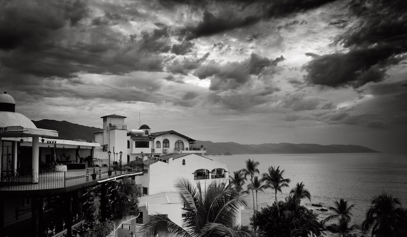
I prefer the black and white version, Ed. I think the colors in the original distract from the leading lines and the symmetry, which are very nice and more evident in the monochrome. My only issue is with the exposure, which feels a little dark, heavy. While some might say, it's suitable the hour, I feel the lights in particular could be brighter, it would make the image pop more. Thanks for sharing the story also. |
Nov 3rd |
| 47 |
Nov 20 |
Comment |
I find this to be quite the compelling portrait, John. Your model has distinctly androgynous features, and an intense gaze, she's quite engrossing. I am curious as to what others think about the blur, however. I would consider reducing it a bit, or even eliminating the blur altogether around the eyes, which I prefer to see tack sharp in a portrait. Although providing context, I think the white headdress distracts just a bit because of its brightness. You might consider burning the top edge (or burning it more), or even cropping down just a tad, as we'd still be able to know it's a headdress, but the face would be more centered. Very nice, John! |
Nov 3rd |
6 comments - 1 reply for Group 47
|
| 50 |
Nov 20 |
Comment |
What a great image, Chuck! I'd have to disagree with Cindy, in that for me it's the cars, and those great reflections, that make the image. I don't find it busy, but rather one of those images I discover more of interest as I look around. Well conceived! |
Nov 7th |
| 50 |
Nov 20 |
Comment |
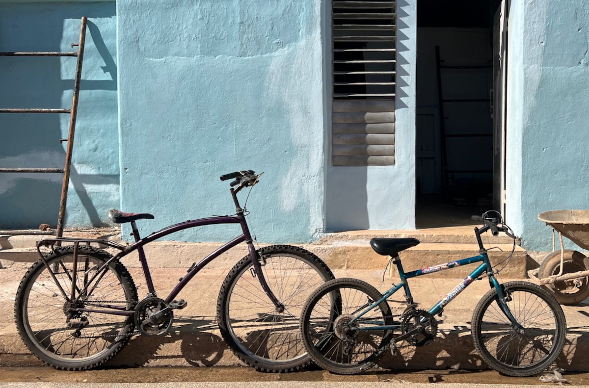
I very much like your image, Lorna, for its simplicity, and all the repeating components. I do like the original pano crop. What I like from David's version, is the increased contrast bringing out more texture on the walls. Although I wouldn't want to overpower the bicycles, which stand out nicely in your version, just a touch more local contrast would bring out what are some lovely textures there. |
Nov 7th |
2 comments - 0 replies for Group 50
|
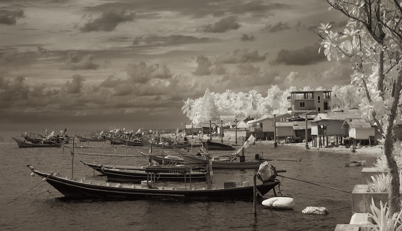
| 62 |
Nov 20 |
Comment |
I like your composition, Emil, very much. The single headlight place almost dead center adds tension, and it's complimented by the two Mack signs. The sliver of light is what makes the image special, and while I know from our IR group your style is low contrast, just a touch more here would bring out that light and the textures a bit more. |
Nov 7th |
| 62 |
Nov 20 |
Comment |
Wonderful, minimalist image LuAnn. While the rusty textures are nice, it's the way you've framed and cropped the diagonal here, with the soft and non distracting background, that makes this special for me. Congrats on making such a compelling image out of an everyday object. |
Nov 7th |
2 comments - 0 replies for Group 62
|
| 66 |
Nov 20 |
Reply |
This was just this past October, Gary, and it was still reaching the upper 90s!
Thanks for all the comments everyone. |
Nov 13th |
| 66 |
Nov 20 |
Reply |
This was just this past October, Gary, and it was still reaching the upper 90s!
Thanks for all the comments everyone. |
Nov 13th |
| 66 |
Nov 20 |
Comment |
I echo Palli's comments, Emil. I think a little more contrast would help the whites pop more. Using the waterfall as the point of interest, I might also crop in a little closer. |
Nov 7th |
| 66 |
Nov 20 |
Comment |
I like "odd" images like this, Palli, so interesting and original! So much more creativity is called for by the photographer in setting up the position of the curves and angles, etc. Nice job!
The window is what makes this, and if I could change one thing, I'd have set up just a little bit to the left so that I might eclipse the bit of frame just to the left of the window, which is a distraction for me.
I think the treatment works very well in creating a night time mood. |
Nov 7th |
| 66 |
Nov 20 |
Comment |
Wow was my first thought too, Gary!
And then my reaction was, it's a shame these fountains have ruined this natural landscape, till I read your description. That's amazing that these are geysers! Well done throughout, and nice contrast as usual.
The color version is a bit oversaturated to my taste (surprise), but certainly piques my interest. I travel to Nevada a lot and will have to visit this place some day. |
Nov 7th |
| 66 |
Nov 20 |
Comment |
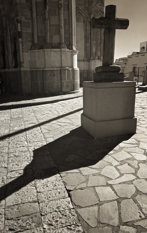
Wonderful image, Charles. It can often be hard to avoid distracting elements taking a wider shot in a cemetery, but your set up on this feels like the edge of cliff or hill in that there is no background.
I also just love the original version. Even though it's mostly just sky you've cropped out, the larger scene seems to create a sense of vastness, which actually works better for me. That, and the softer treatment of the sky, just make for additional possibilities, I think. I once knew a photographer who kept the red tint in all his IR images, and while it gets old fast, here, the orange hue I find mesmerizing.
Nice image with lots of possibilities!
|
Nov 7th |
| 66 |
Nov 20 |
Comment |
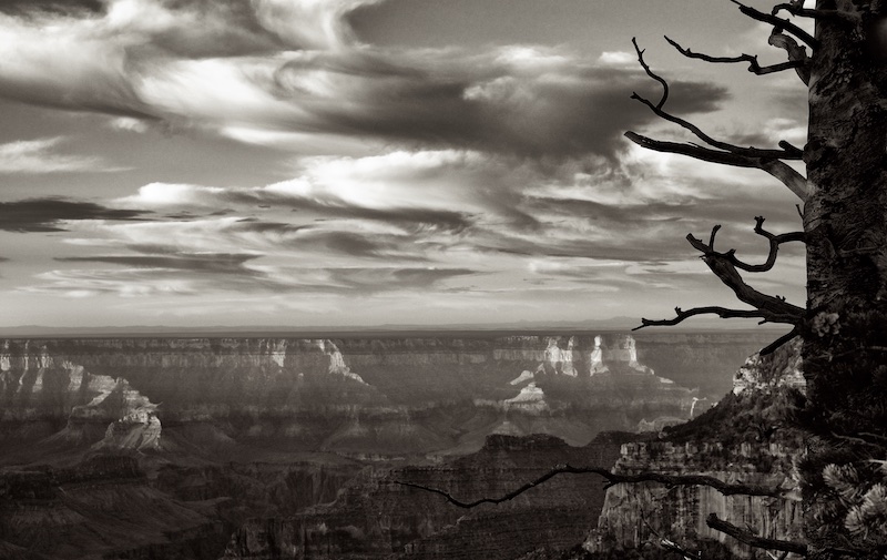
One of my initial reactions, John, was, given what you were after, might it actually be easier to approach this scene with a conventional camera? But of course, after reading your description, of course, shooting into the sun, I agree the infrared camera handled the harsh light much better than a traditional sensor would have.
I think as to the composition, I might have taken a closer in approach to the various markers. |
Nov 7th |
| 66 |
Nov 20 |
Comment |
This worked great, Melanie, I love the mood you've created.
As one of the "purists" haha, I expected to like the black and white more, but I find myself liking the tint. I think almost any tint would work, and the one you've chosen conveys it's own special mood.
For anyone else trying to recall the camera tilt discussion, it was on Emil's image, and it basically is..."you focus on your scene, reset to manual mode, and set your tripod ball head fairly loose so you can tilt it up to the "sky" during the exposure smoothly. You want pure vertical movement and a long lens. " |
Nov 7th |
| 66 |
Nov 20 |
Comment |
Yes, I saw that too after posting, Palli, good catch! I try to set up just right, but missed it this time. Your edit corrects it, thanks! |
Nov 5th |
7 comments - 2 replies for Group 66
|
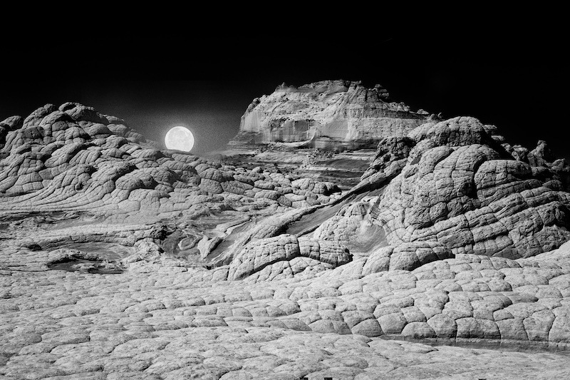
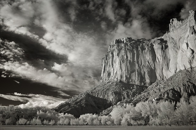
| 70 |
Nov 20 |
Comment |
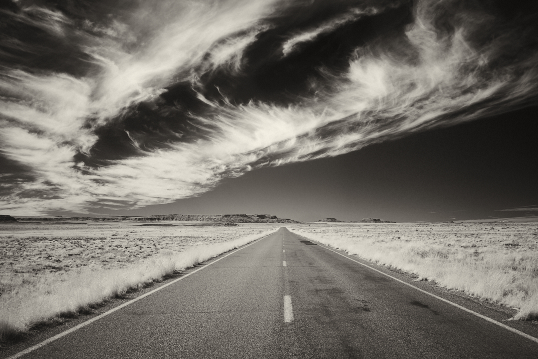
Just beautiful, Kathryn. I've been to Utah so many times, I'm surprised I've never seen this spot before, one of those hidden gems! And you've caught it at perfect light, and yes the leading line does work and it all comes together so well. |
Nov 7th |
1 comment - 0 replies for Group 70
|
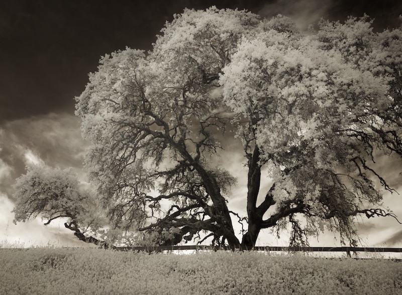
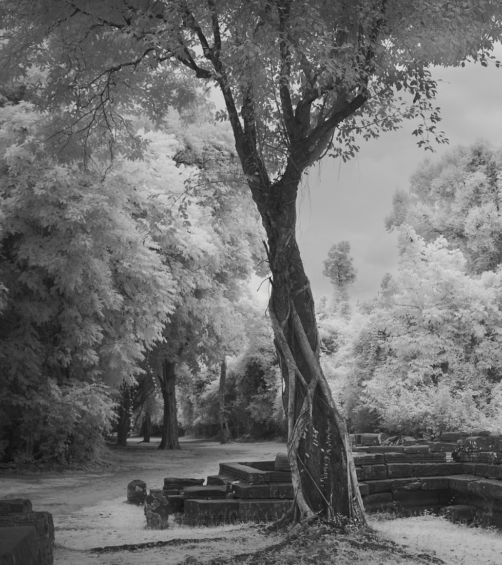
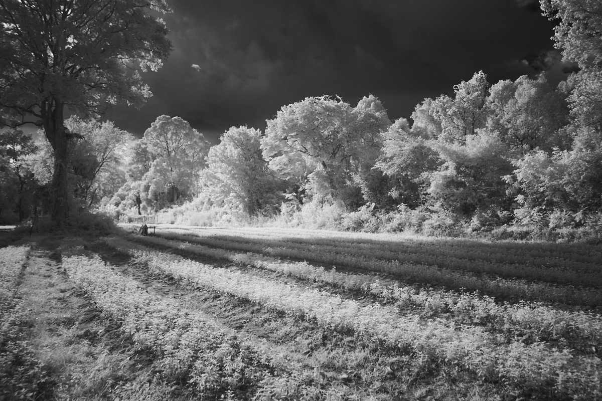
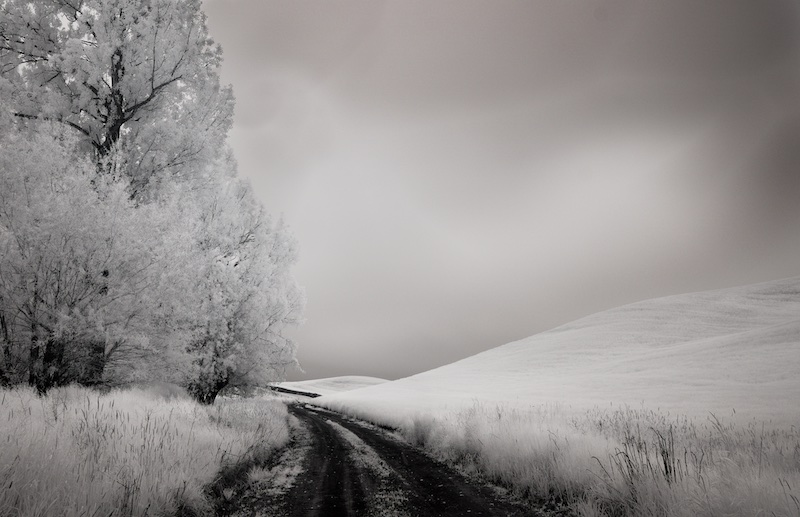
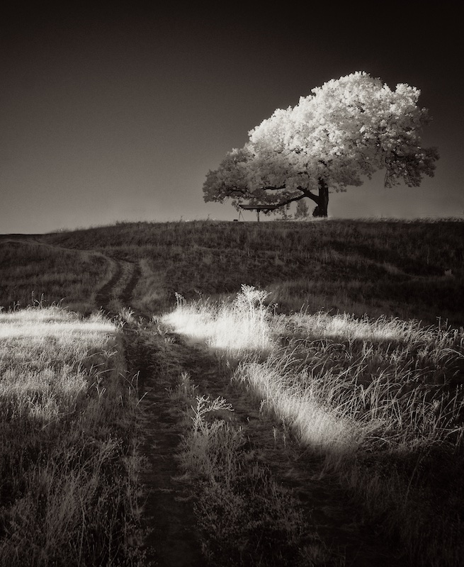
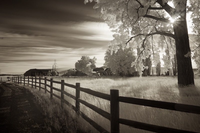
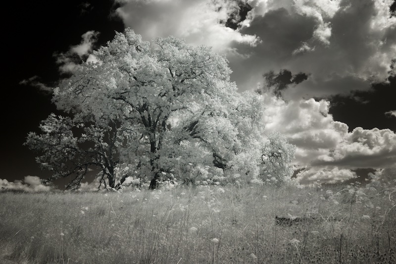
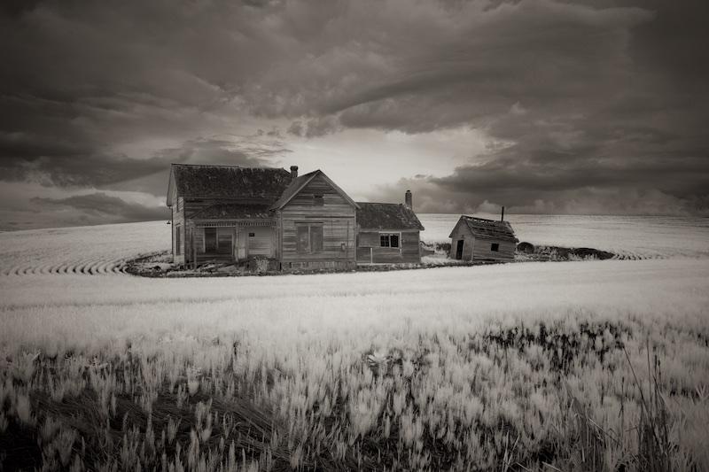
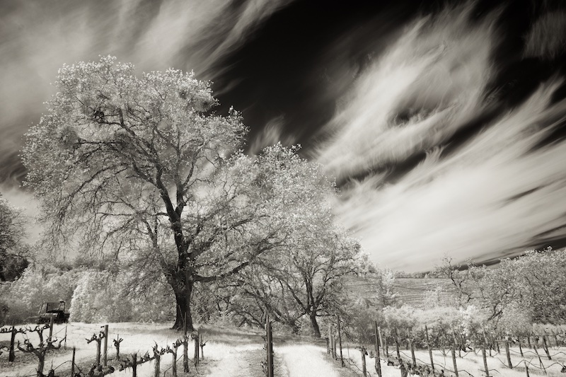
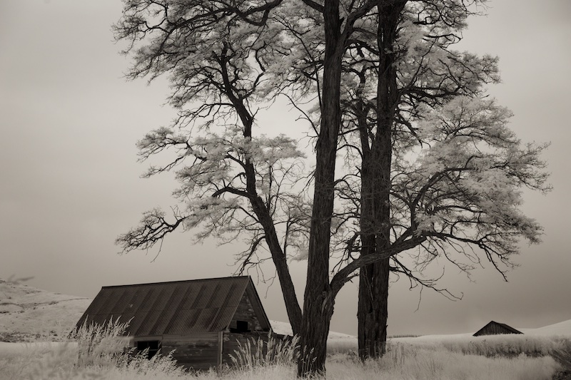
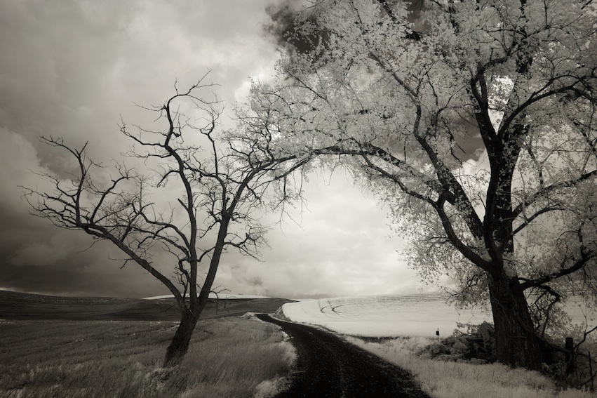
| 74 |
Nov 20 |
Comment |
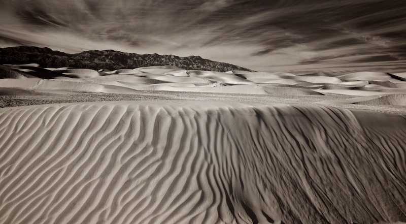
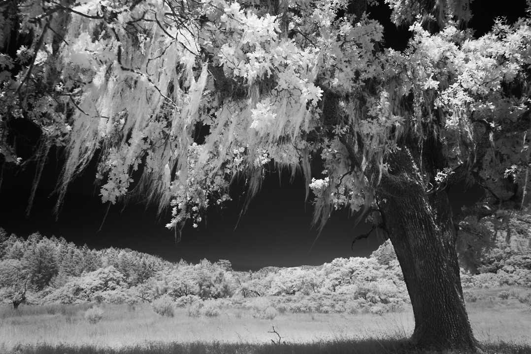
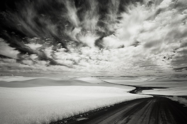
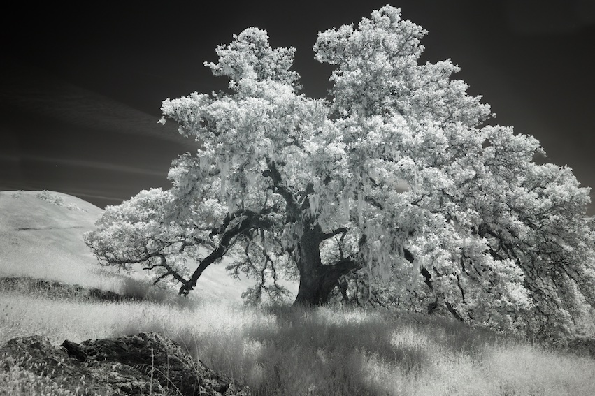
I like that the slow shutter speed captures the movement of the clouds, it makes the image dynamic, and it does focus our attention on the tree. Perhaps the sky could take just a touch more contrast, as Ata suggests, without competing for attention with the tree.
I'm feeling like I wish the tree were just to the left, but it's still very nice as is. |
Nov 7th |
1 comment - 0 replies for Group 74
|
23 comments - 4 replies Total
|