|
| Group |
Round |
C/R |
Comment |
Date |
Image |
| 47 |
Feb 26 |
Reply |
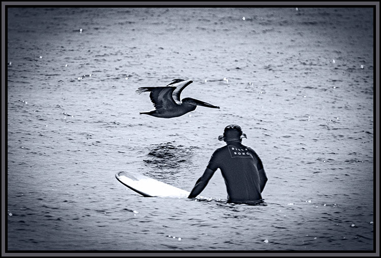
Thank you very much Robert, It was a special moment and I caught it just right - sometimes the timing falls into your lap. This was one of those times. I love the results and was happy to share in monochrome - better than color in this case. |
Feb 16th |
| 47 |
Feb 26 |
Reply |
Hi Barbara, thanks for your thoughts. I will give your suggestion a try. In line with what you said about context, an image without some sense of context quickly loses my interest. The context helps me build a story around what I see which in turn keeps me interested in the image. |
Feb 13th |
| 47 |
Feb 26 |
Comment |
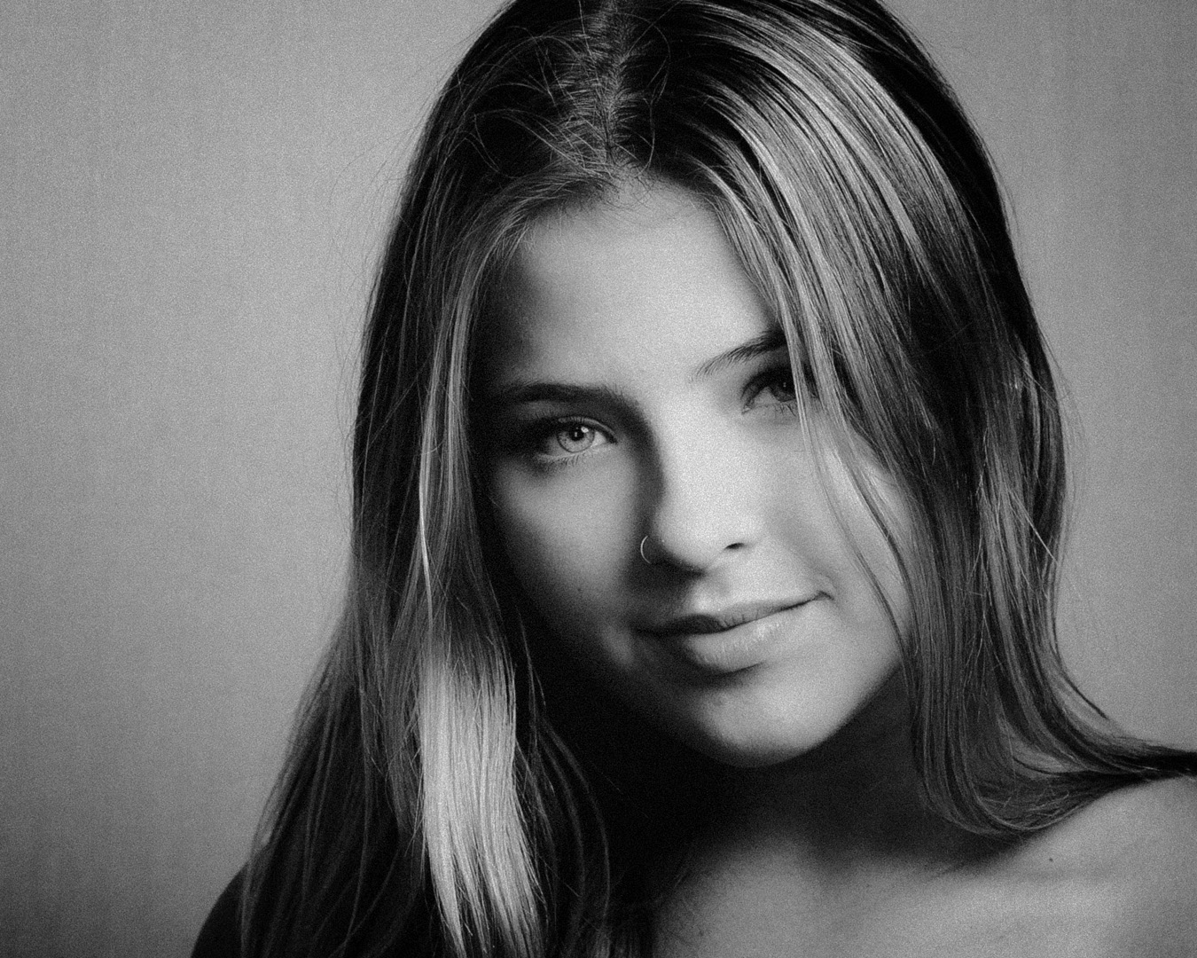
Hi Barbara,
I really liked this portrait of the young lady. I do not know enough about film noire to comment on that.
What I really like is the sense of friendliness in her expression which was accented for me by being framed by her hair. Also the clarity of her eye is wonderful, to my eye it really adds to her expression.
Looking at some of the other comments I chose to play with the image in Photoshop and SilverEfex Pro. Added a vignette, flipped the image so my eye enters the left side and travels to the right resting upon her face. What do you think?
|
Feb 10th |
 |
| 47 |
Feb 26 |
Comment |
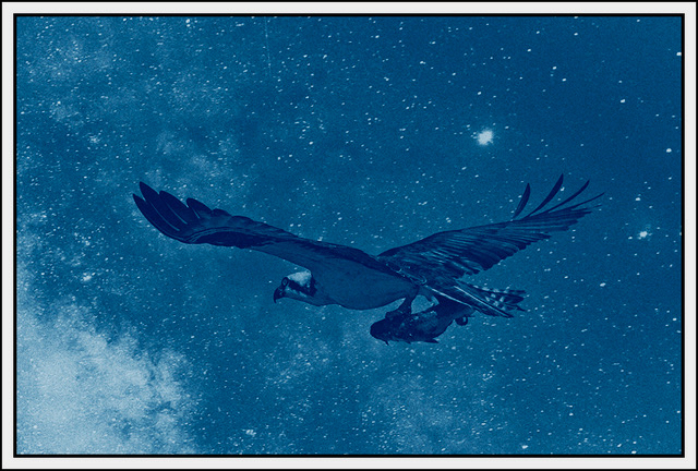
Hi Al,
Great image of the lizard (iguana?). To my eye the detail in the scales gives the image some depth. Also the contrast in the clarity of the Lizard versus the grainy background gives a real sense of separation between the lizard and the background. I kind of like Douglas' concept and played with the idea some but was not satisfied enough with the result to post a version.
Those guys are really fast when spooked. Were just very still or did you have a long lens?.
A nice image Al - thank you for sharing it with us. |
Feb 10th |
| 47 |
Feb 26 |
Comment |
Hi Kirsti,
First, I really liked the original. The juxtaposition of the fisherman and the trees producing a triangle. I also like the imagination the want into the version you submitted. I am impressed with the idea of taking the image to negative then applying to blue tint - a strong impression of cold.
My only suggestion is that the trees and fisherman are blown out - like search lights, although it also causes them to stand out. Still if you could tone them down some to give more detail especially of the fisherman.
Great imagination and effort on your part. Thanks very much for sharing it with us. |
Feb 10th |
| 47 |
Feb 26 |
Reply |
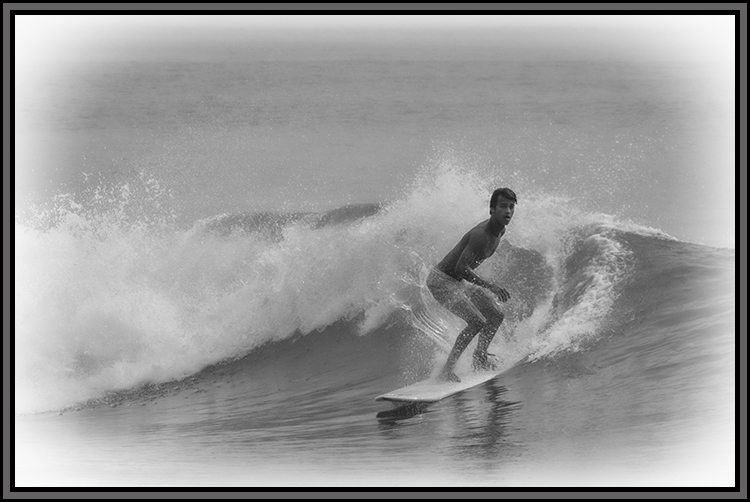
Hi Douglas,
Thank you for your thoughts and the effort in the variation over the original. I like what you have done and would consider that for a future variation of the image.
I chose to leave both the wider aspect and a little of the water in front of my daughter to give the scene a sense of context as she was waste deep in the water and the wave caught her by surprise as it was larger than what we had been experiencing that day on the beach at Fenwick Island State Park.
Thank you again for your comments and effort that went into your version. |
Feb 10th |
| 47 |
Feb 26 |
Comment |
Hi Robert,
I really like this as a landscape (sea scape?). I like the sense of depth I get looking down the fjord. Of the three versions the appear I tend toward your original. I like the dark and brooding nature of your version.
If I had to make a change I would simply all a little light to the almost black areas closest to the lens in order to give them a little more character.
Really nice Robert - thank you for sharing it with us. |
Feb 10th |
| 47 |
Feb 26 |
Comment |
Hi Douglas,
I like your approach of bright against a black background. Focus and texture make for an interesting appearance. As a geometric study in shapes and perspective it works well for me. To my eye, I also found the image being centered side to side as a good choice
Since I cannot see your original I do not know if the top of the image was cut short when you took it, or if you cropped it tightly. In either event I find that my eye is drawn away from the central image and out of the frame. On the other hand if the object is complete then the upper "rays" being so close to the top edge give the appearance of exiting the image with the effect being the same.
All in all though I like the imagination behind the image - thank you for sharing it with us. |
Feb 10th |
5 comments - 3 replies for Group 47
|
5 comments - 3 replies Total
|