|
| Group |
Round |
C/R |
Comment |
Date |
Image |
| 47 |
Sep 25 |
Reply |
Thank you Barbara. If the Lord grants me time on this earth I want to go back, perhaps in the mid spring before the weather gets really hot and view the site again. |
Sep 21st |
| 47 |
Sep 25 |
Reply |
Thanks Robert - spot on with your comment as I have mentioned to the others. |
Sep 21st |
| 47 |
Sep 25 |
Reply |
Hi Kirsti - thank you for the comments. Not sure how it would look today but would give my eye teeth (if I still had them) to go back and check it out. I am considering a trip back in the spring - this time no tour, just a local tour guide and wander the city at a leisurely pace and soak in the atmosphere. |
Sep 21st |
| 47 |
Sep 25 |
Reply |
Good call Doug. Thanks for the changes (reference my comment to Jeff). As I mentioned to him - I was too focused on removing clutter from the foreground. |
Sep 21st |
| 47 |
Sep 25 |
Reply |
Thank you Jeff - I had not noticed that during my processing as I was focused on cleaning up the foreground of distracting clutter. Thank you for the suggesting as Doug followed up on your suggestion - a good change. |
Sep 21st |
| 47 |
Sep 25 |
Comment |
Hi Barbara, I have been having a difficult time on what to say.
First I do like what I believe you were trying to do with the glowering sky and the marsh foreground. Part of the issue is also the bridge in the distance being a center of focus but difficult to make out in your B&W version.
I believe cropping the original to remove the upper portion of the sky and a little of the foreground would have been a good choice much like Douglas did in his version. That also (to my eye) allows for the pier to remain in the scene (again like the Douglas' version).
I think you had a great idea here and appreciate your sharing it with us. |
Sep 21st |
| 47 |
Sep 25 |
Comment |
Good evening Al,
I like what you have done with this image. Unlike the other comments, I believe the moon gives me a sense of context as the basis for why we can see anything in the image. I do agree with Kirsti that the lights on the shore line are important to me - again context.
My only suggestion would be the slightest amount of brightening of the mountains in the image to provide a little more definition - some more information for what we are seeing.
I really nice image thank you for sharing it with us. |
Sep 21st |
| 47 |
Sep 25 |
Comment |
Hello Kirsti,
I really like your concept with this - highly creative and very interesting. The cord on the right of the image is a definite distraction to my eye as I look at this image.
I also have to ask what we are seeing in the lower left corner of the image? It acts to take my eyes away from the model.
Between that and the white cord my attention wanders from the Model - she kind of get lost being in the background. Still I love the creativity, it is something I have never really tried and may not try as I am slowly rotating to only using my iPhone 16 pro (perhaps 17 pro) in the near future.
Thank you for sharing it with us and the creativity the image shows - well done. |
Sep 21st |
| 47 |
Sep 25 |
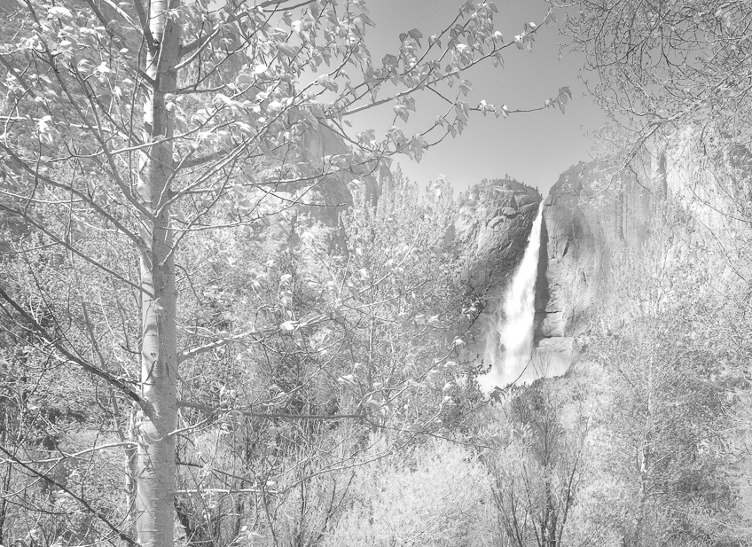
Comment |
Good evening Jeff, I really like your high key appearance. My eye is drawn to the water fall through the opening in the trees.
At issue for me is that it is so small with respect the overall scene. While the trees frame it, it almost gets lost in the busyness of the forested area below it.
I copied it into Photoshop and cropped it some in order to bring more focus on the falls in the background.
Your thoughts?
Thank you for sharing it with us Jeff. |
Sep 20th |
 |
| 47 |
Sep 25 |
Comment |
Hi Robert,
This, to my eye, is both interesting and a bit confusing, perhaps because I have not seen the sculpture in person.
I was caught between whether I was looking at the front or the back (I suspect the back as I cannot see his head, but …). There are also other elements in the image that I do not understand.
The other thing that keeps my eyes jumping is the busyness of the church facade contrasted with the dark sculpture.
I like the idea, but the image is - at least to my eye - a bit unsettling, too much activity (perhaps that is my ADHD kicking in).
As for the tilted buildings - I do not have an issue with that since they do, as has been observed, bring my eye to the central object effectively (to me) framing the sculpture.
I do like your post processing. Thank you for sharing it with us. |
Sep 20th |
| 47 |
Sep 25 |
Comment |
Good evening Douglas, I have seen that crane many times - live in that area as well (near Bellevue Park). Never saw anyone on it like that - great catch.
I like that she is absorbed in her book and not posing for the camera.
I do agree that the vignette helps to bring my eyes to the young lady. I did like your lighter tonality, on the other hand the darker tonality of your revised version coupled with the vignette, to my eye, gives a little more of a sense of depth to the immage.
Very nice image, thank you for sharing it with us. |
Sep 20th |
6 comments - 5 replies for Group 47
|
6 comments - 5 replies Total
|