|
| Group |
Round |
C/R |
Comment |
Date |
Image |
| 47 |
Apr 24 |
Reply |
You are most welcome Kristi. When I was a member of a camera club one of the members was always suggesting flipping the image. In fact we nicknamed him "Flipit". Where is works it works very well, however it is always only an option. You do very nice work Kristi. I do not think I am adding that much, only garnishing an already good image. |
Apr 20th |
| 47 |
Apr 24 |
Comment |
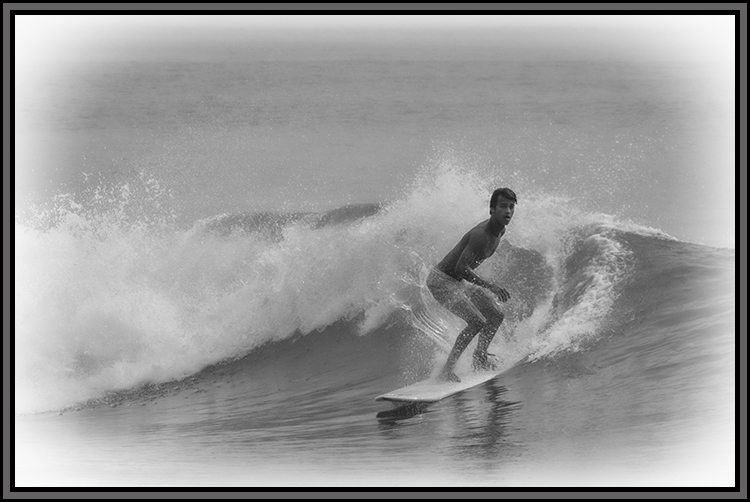
Good evening Trung, I must agree with Kristi in all she said.
To my eye the lighting on her face is wonderful and her skin tone is as good.
What disturbs me about the image is its segmented appearance. Her bathing suit and the background appear the be the same color making her legs appear completely detached from her upper body.
I tried making some slight adjustments, just enough to show her suit over her midriff giving her a more connected appearance. However, it does shift the mood.Your thoughts? |
Apr 15th |
 |
| 47 |
Apr 24 |
Comment |
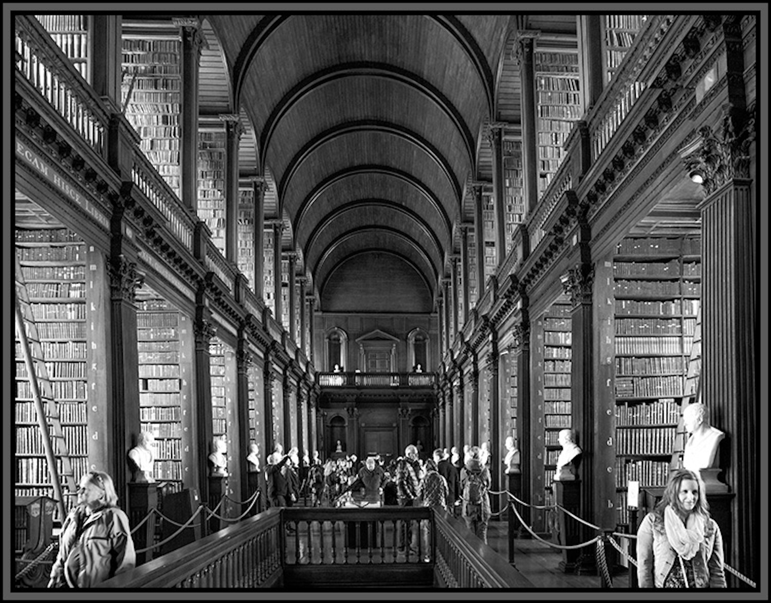
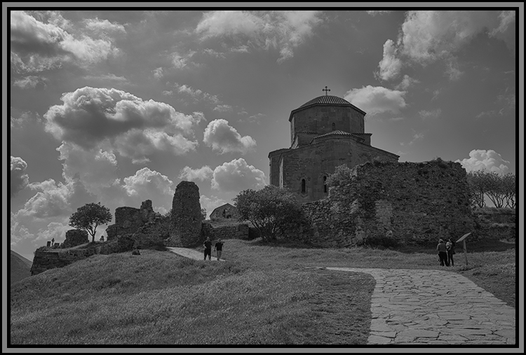
Good evening Al,
I like the wider image - it gives more context to the scene with the river and the small village surrounding the church. The grave yard in the church yard also adds to the context of life and death in that area. A lovely image.
I went back and reviewed what Kristi did and I do think that works better than your tighter crop, still I liked the larger image the best. The cool color really adds to the effect of the scene.
A very nice image, (to my eye) well taken and processed Al. Thank you for sharing it with us. |
Apr 15th |
| 47 |
Apr 24 |
Comment |
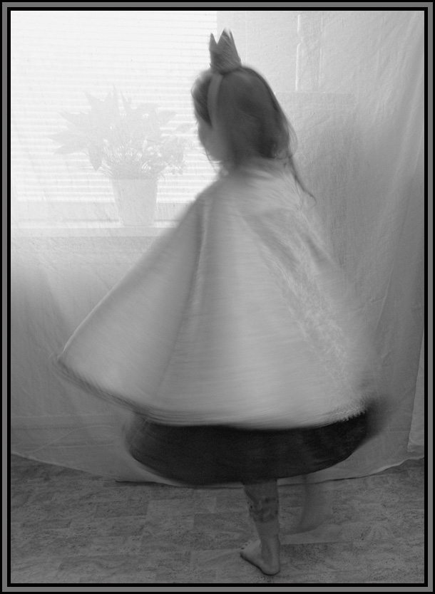
Hi Kristi,
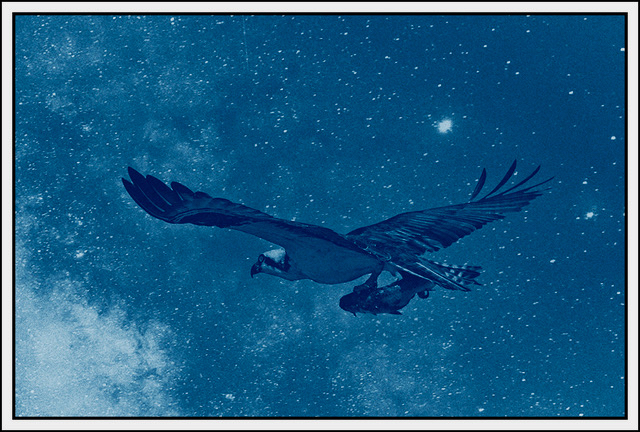
I think your choice to convert to monochrome was a good one. Looking at Original 1 and the submission I liked elements of both. In your submission the flower in the window is almost invisible while in the image "original" it is more distinct. On the other hand in that image the grain seems very heavy. The heavy grain, to my eye, masks the swirl of the cape, which as I see it, is very interesting and is a great indicator of the motion matching her foot in movement.
I do not know if it is better or not, but I did some work starting with the color original using both Photoshop and Silver Efex Pro. I wanted to show the motion. I also chose to flip this one as well as It (to my eye) presented a better balance.
|
Apr 15th |
 |
| 47 |
Apr 24 |
Reply |
Thanks very much Kristi. I like your edit, thank you for your input and your effort with the edit.
You are most welcome for the input last month - very glad the image was accepted, it was a good image and (to my mind) deserved to be. |
Apr 15th |
| 47 |
Apr 24 |
Comment |
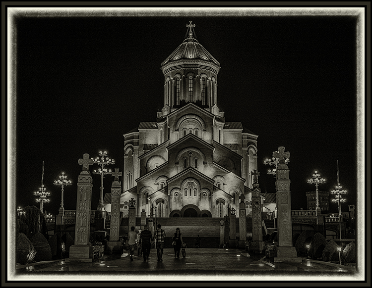
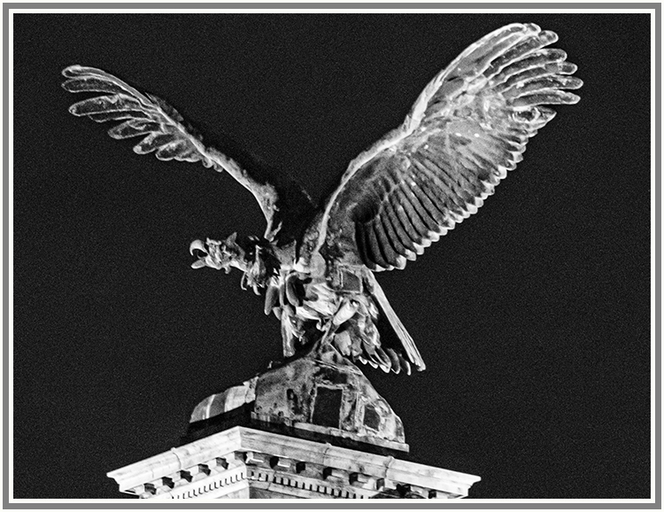
Hi Robert,
With Kristi - congratulations on the new camera.
I like this as a real, very symbolic shot. Looking at how you processed it, it is almost like the dark branches of the tree are enveloping the Capitol Building. Even, it seems, as the divisive and polarizing nature of political dialog today seems to be enveloping our society.
I like how you positioned the steps and guard rails to guide my eyes, as the observer, to the Capitol Building. The light, to my eye also worked very well. I really cannot come up with any suggestions for improvement.
A very pertinent image Robert - thank you very much for sharing it with us. |
Apr 15th |
4 comments - 3 replies for Group 47
|
4 comments - 3 replies Total
|