|
| Group |
Round |
C/R |
Comment |
Date |
Image |
| 47 |
Oct 23 |
Comment |
Hi Albert,
This is, to my eye, a really dynamic image. The dark tone with the looming clouds (perhaps a coming storm?) really works well for me. I also like the rich detail in the boats, the land and the sky.
It gives me a real sense of sadness about the impermanence of the world we live in. Once these were probably brightly colored boats that provided a living for a family, maybe even a village. Now they lie abandoned on the beach and falling apart. The sky adds to that sense of sadness - a wonderful story telling image and one I would be willing to hang on a wall in a room with a nautical theme to remind us to appreciate today and what we have knowing that tomorrow ��
Thank you so much for sharing this image with us - for a great story Albert. |
Oct 15th |
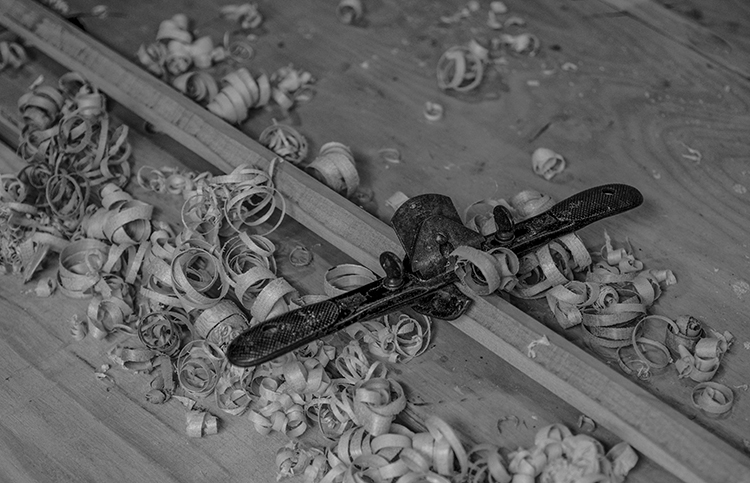
| 47 |
Oct 23 |
Comment |
Kristi - this to me is a wonderful story telling image. I am not sure you could have pulled any more from the image than you did - to my eye a wonderful effort on your part.
I love the expression on the boy's face as he looks at the balance and the globe - perhaps thinking about becoming a scientist - to my eye an expression of either awe or wonder - perhaps surprise?
As I see it the black and white version works very well and your processing brought out excellent detail on the globe along with the exquisite tool work on the balance.
I love the image and the story it tells - thank you for sharing with with us Kristi. |
Oct 15th |
| 47 |
Oct 23 |
Comment |
Hi Jeff, as I mentioned to Robert I have not read the other reviews before making my own.
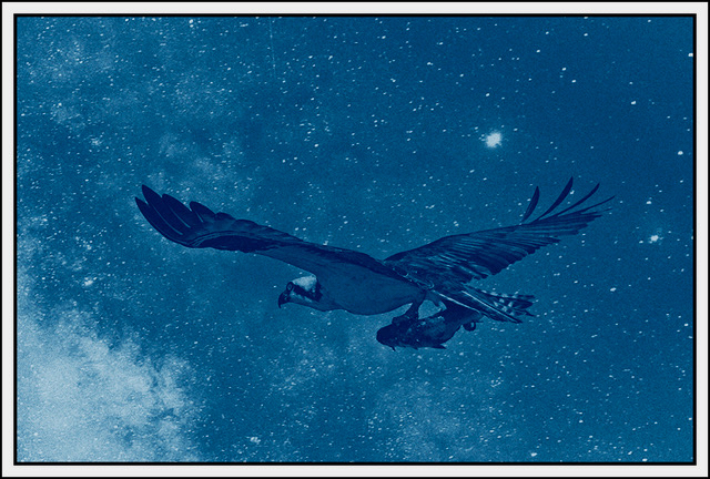
I find this a very intriguing image. The road leading into the distance with all of the cars coming toward the viewer - away from the bright light almost as if they were fleeing something in the distance (I love story telling).
To my eye darkening the land on the sides of the road worked very well emphasizing the road and the vehicles. I also liked the way you brought out the details in the vehicles as they are coming toward me as the viewer.
Part of me feels that the bright white rectangle overpowers the lower part of the image dragging my eye away from the vehicles and the other part of me likes the concept. I wonder how it might have worked had you replaced the sky with storm clouds?
All told as I view it a well processed and intriguing image - thank you for sharing it with us. |
Oct 15th |
| 47 |
Oct 23 |
Comment |
Good afternoon Robert. What you will read below has been done without reading anyone else's thoughts. I try to avoid being influenced by others - not always but the large percentage of the time.
To my eye this is an interesting study in geometric shapes - the fire escapes and the windows. I like how you handled the detail and the contrast/exposure in the image. To my eye the focus on the image was also spot on.
When I study the image I do get a sense of incompleteness - the tops cut off of the tall window areas and also the top level of the fire escape being cut off. I am not sure what to suggest as that may have been the entire original image. If not, perhaps a different crop, or If you could go back to the same building turning the camera 90 degrees - taller and less width?
Just some questions on my part. All told still a very nice image. Thank you for sharing it with us. |
Oct 15th |
| 47 |
Oct 23 |
Comment |
Hi Dom,
I like this image. It conveys to me the sense of age and "falling apart" (at 77 I can identify). It gives me the same impression as when I see cars that were once bright and shiny, someone's pride and joy, now dull and deteriorating.
I like the way you processed the image for the dark and subdued feel to it. I also like the contrast you chose and the detail of the walls surrounding the door - but still some light on the other side of the door - perhaps a way out of the deterioration.
Thank you for sharing it with us. |
Oct 15th |
| 47 |
Oct 23 |
Reply |
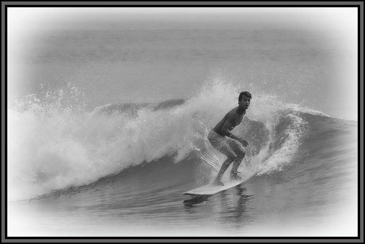
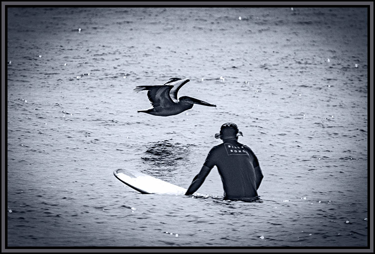
Hi Robert. It is a little soft, but increasing the contrast really overplayed the wake from the surf board - especially the spray of water from the wake.
As I mentioned to Dom, I should have included the original and neglected to so so.
Thank you for your analysis - it is worth revisiting the image taking yours and Dom's into account. |
Oct 15th |
| 47 |
Oct 23 |
Reply |
Hi Dom. This is one of those images for which I should have included the original as it took a fair bit of processing to pull out the details I wanted.
For one thing the surfer's face was highly shadowed and without that work I do not believe the image would have worked at all.
Having said that I do appreciate your feed back and will try to revisit it for a little more depth. |
Oct 15th |
| 47 |
Oct 23 |
Reply |
Thanks for your comment Kristi. I am glad you see the story behind my intention. You are correct the piece that looks like land is part of the frame I chose for the image. |
Oct 15th |
| 47 |
Oct 23 |
Reply |
Thank you Jeff. I had not even noticed that. My primary focus was bringing out his face it was so heavily shaded and I missed that object all together. |
Oct 13th |
5 comments - 4 replies for Group 47
|
5 comments - 4 replies Total
|