|
| Group |
Round |
C/R |
Comment |
Date |
Image |
| 47 |
Jul 23 |
Comment |
Good evening Trung,
I really like the feel of this scene. I would like very much to go back to Viet Nam and visit Hanoi and other cities and villages on a photographic trip. Perhaps combining the trip with one to Cambodia to visit the area where my daughter in law was born, Siem Reap.
There really is nothing that I can add to what has already been said. Tone down the highlights a little bit and perhaps a slight crop as suggested. But all in all a really great story telling image - one I would be proud to hang on a wall in my office.
Nicely done and thank you for sharing it with us. |
Jul 22nd |
| 47 |
Jul 23 |
Comment |
Hi Albert,
I like your concept and the feeling of distance with the mountains "guarding" the village(s). I do not think, as was already mentioned, tighter crop with make the image better. The image, to my eye, has great depth - almost a sense of 3D, and as I see it your post processing was well done.
I will say the name threw me a bit. The villages themselves are such a small part of the overall image compared to the majestic mountains around them that they almost get lost in the grandeur of the mountains. If that was your intent it worked. For my own part I would have like a lower camera angle giving the villages more prominence in the image.
Stil, all in all, a really nice image. Thanks very much for sharing it with us. |
Jul 22nd |
| 47 |
Jul 23 |
Comment |
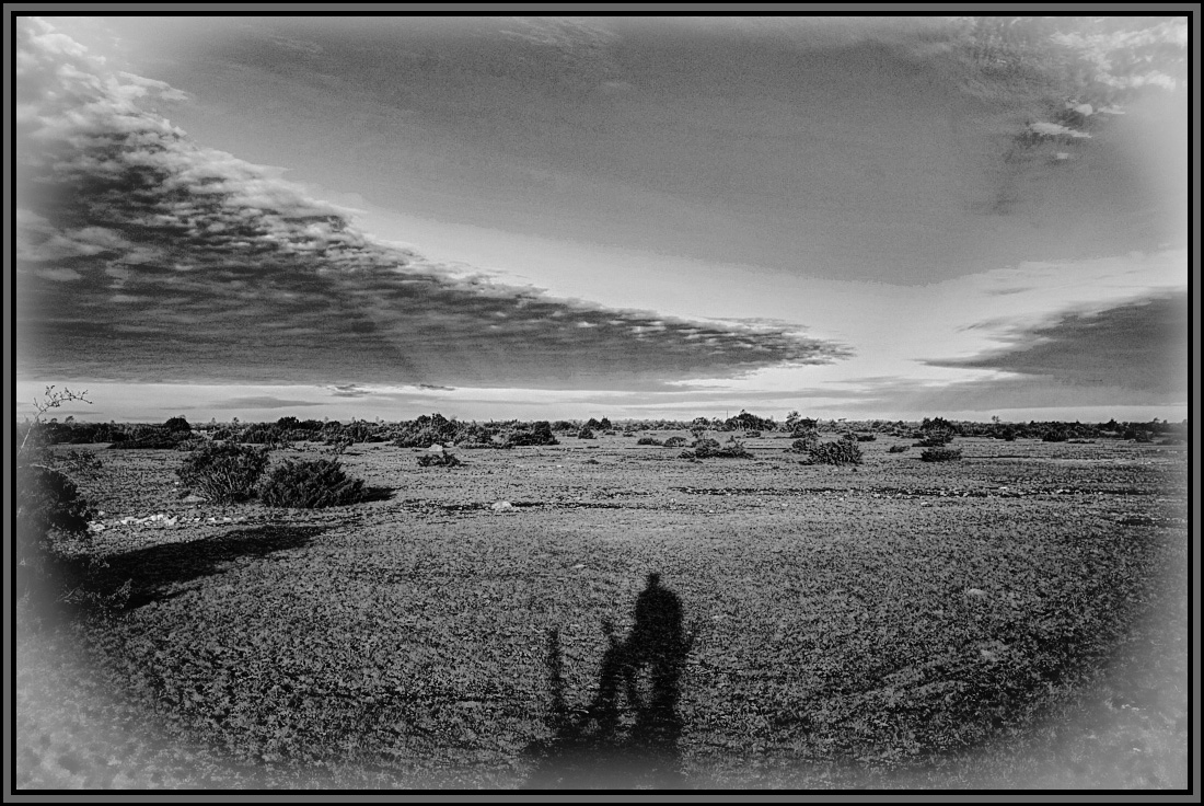
A really nice image Kristi - I really like your concept of the sense of solitude in the Alvar. And, yes I can see the "throne" upon which the ruler is sitting. I agree with Robert both versions are effective.
Myu comment about the monochrome version is the area in front of the silhouette is very bright and, to my eye, overpowers the silhouette. I also thought that a white vignette would help direct the viewer's eye into the image and might also help bring out the sun's rays.
I did some work on the image in PS and also SilverEfex Pro. I would be interested in your thoughts.
All told a really nice concept and realization of the concept. Thank you for sharing it with us. |
Jul 22nd |
 |
| 47 |
Jul 23 |
Comment |
Hi Jeff,
I love this a the type of scene to build a story as you study it. It looks like it might have come out of a Fairy Tale - where does the road into the woods lead? What might be waiting just out of sight.
Photoshop has to power to add some to the right side without making it obvious - but to my eye there is no need for that. I think your post processing is wonderful in this image and I really have no suggestions for improvement, with one possible exception - addition of a border of some type - but that is nitpicking at best.
Thanks very much for a "wall hanger" that engages the imagination. |
Jul 22nd |
| 47 |
Jul 23 |
Comment |
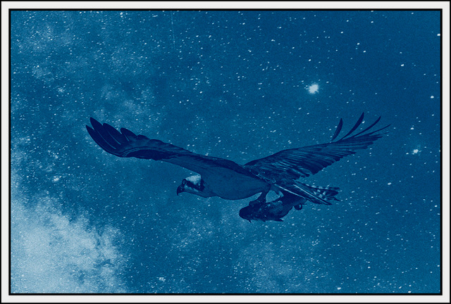
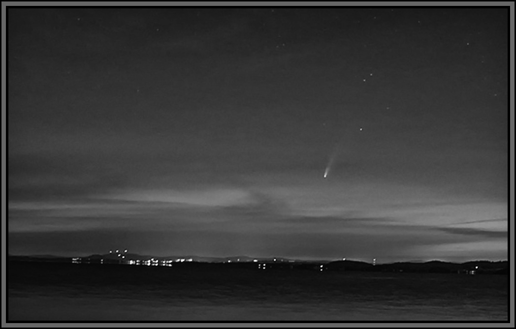
Hi Robert. This was a great catch early in the morning. I agree that the sky was brighter and that masked the comet, to me, such that I thought it was actually a meteor.
I chose to do some work on it in PS with a heavy crop moving the comet to the left side of the image. Then played with exposure, contract etc. in the color version before converting it in SilverEfex Pro 3 to mono. The down side to my work is that the heavy crop caused some pixilation. Still it might work for you.
I would be interested to hear what you think of the work.
Having said all of that I still really like the "lake scape" with the comet for added interest. A great catch in your part. Thanks for sharing it with us. |
Jul 22nd |
 |
| 47 |
Jul 23 |
Comment |
Good evening Dom,
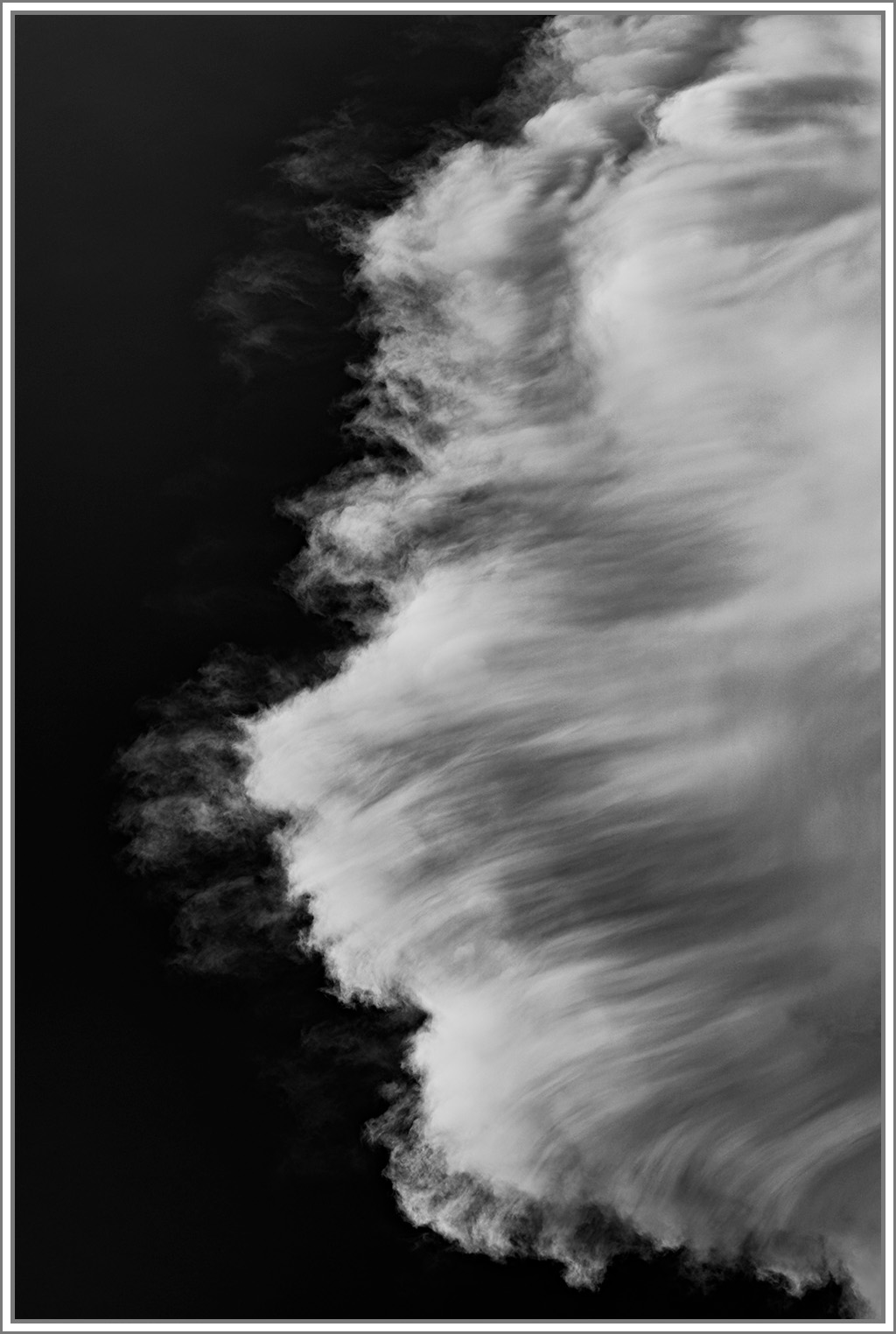
To my eye this is indeed very interesting and your thoughts about looking like a breaking wave from above are spot on. I cannot remember ever seeing such a cloud formation.
As I see it, your post processing was well done catching a good tonality and contrast. I believe you were able to pull all that is available in the image.
My down side is that because the left side is black I cannot tell where the image ends leaving the cloud hanging in space with no real boundaries. I would recommend a border to give the viewer's eye a sense of scale. The attached image has a suble border I put on it in PS. If you like the idea you might think of one more appropriate to your vision for the image.
A great catch Dom, thank you for sharing it with us. |
Jul 22nd |
 |
| 47 |
Jul 23 |
Reply |
Good evening Jeff, I had not seen that hot spot - heavy sigh!! Taking both your comments and Kristi's I reworked the image to incorporate both. I would be interested in your follow-up thoughts.
Thanks again |
Jul 11th |
 |
| 47 |
Jul 23 |
Reply |
Thanks Kristi. I looked at the two versions side by side. I like what you did. The difference is subtle but it works. I would be interested in your thoughts regarding the version in my response to Jeff.
Thanks again Kristi. |
Jul 11th |
6 comments - 2 replies for Group 47
|
6 comments - 2 replies Total
|