|
| Group |
Round |
C/R |
Comment |
Date |
Image |
| 47 |
May 23 |
Reply |
Hi Jeff, Thanks very much for your input. To be honest I had already considered both during my editing, and chose not to do so for the following reasons:
When I cropped to top down my eye lost a sense of context from the intended story - a refuge from business.
Cropping off the light pole left me with a sense of imbalance as that left the trees on the left side the only vertical elements in the image and they are all on one side. Plus it would have cut into the stairs.
I cannot say I won't do something different with the image in the future and will keep your suggestion for it in mind. They just did not fit my current purposes.
Thanks again for the suggestions, I value your input and that of all of the people in the group. |
May 16th |
| 47 |
May 23 |
Reply |
Hi Kristi,
Thank you for your efforts. Your version works for me. I had to choose to leave the lamp in or crop it out. I chose to leave it in because I believed the stairs leading to the bench overpowered it . That is true for the original and both of our versions as well. I actually see it as a positive limiting agent keep your eyes in the image.
Thanks again for the effort. |
May 13th |
| 47 |
May 23 |
Comment |
A nice landscape shot.
I do like the mountains in the distance. To my eye both those mountains and the sky make the image.
I too find the water pools in the foreground to be somewhat distracting.
I chose to do version from your submission, cropped it and played with it in the Camera Raw filter in Photoshop. My goal was to make both the sky and the distant mountains more prominent, more the focus of the image.I would be very interested in what you think of the work.
I do like the image as submitted and how your processed it as submitted. Thank you for sharing it with us. |
May 12th |
 |
| 47 |
May 23 |
Comment |
Hi Kristi,
I have to agree with Dom.
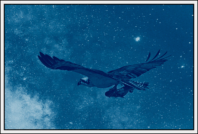
I do like the ephemeral feel of the image, the idea of the dead still being with us even when we cannot see them. I would be interested in how you put the image together.
Thank you for sharing it with us. |
May 12th |
| 47 |
May 23 |
Comment |
Hi Jeff,
I confess that I find the reflection of the trees on the right side a bit of a non-issue in fact I had to look for it. I like original 3 a slight bit better than #2 or the original, as the distant hills are a little lighter and give a slightly better definition. I like your crop, but also like the original as the near shore frames the lake. All are very good to my eye.
I like the concept including the reflection of the hills in the lake. I also like the sky though I think it might be slightly better if the highlights and whites were toned down a little.
Overall a very nice image. Thank you for sharing it with us. |
May 12th |
| 47 |
May 23 |
Reply |
Thank you Robert. I will say the same to you as I did the Dom. Still I would be very interested in your vision for the image. If you wish the original is attached. |
May 12th |
 |
| 47 |
May 23 |
Reply |
Thanks Dom. I liked the softer hues in order to give a sense of calm. B&W can be very harsh and I wanted a more peaceful air about the image. I may go back and revisit the idea. Thanks again for the input. |
May 12th |
| 47 |
May 23 |
Comment |
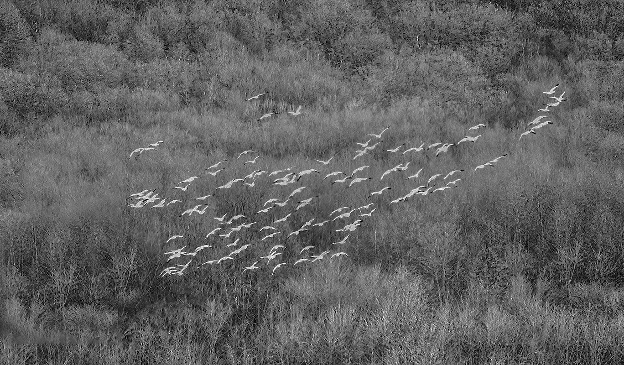
Hi Robert,
I do not see the connection between the submitted image and the original.
Having said that I like the concept. In addition I like the tonality of the image - the white geese against the foliage back drop.
I do think the image would have more impact if the flock of geese did not run off the left edge of the screen.
I did some work in it in PS not sure if you will like it or not - if it meets your goal. Comments welcome. |
May 12th |
 |
| 47 |
May 23 |
Comment |
Not much I can add to what others have said. Truly impressive work and vision. Well done Dom, well done indeed.
|
May 12th |
5 comments - 4 replies for Group 47
|
5 comments - 4 replies Total
|