|
| Group |
Round |
C/R |
Comment |
Date |
Image |
| 47 |
Feb 23 |
Comment |
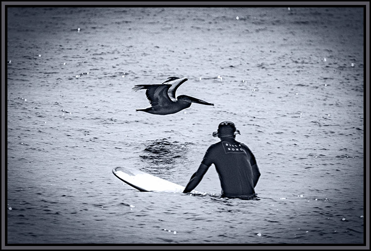
Hi Trung. I too would have liked to have been there with you. This is a wonderful image, a wonderful seascape modified by the pier.
I actually tried playing with the image to see if a slightly different crop or work on the shadows/highlights might, at least to me, have improved it. Your version came out on top of my own efforts.
All else I can say would only be echoing what others have said above. A great catch, thank you for sharing it with us Trung. |
Feb 20th |
| 47 |
Feb 23 |
Comment |
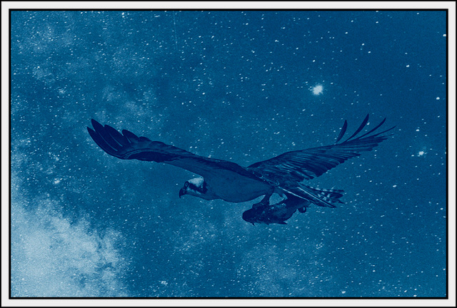
Hi Albert. This was, to my eye, a very different treatment to a wildlife shot.
I really like how you took the background out of play in the image allowing my eye undisturbed focus on the Anhinga. I like how the tonality appears to me to enhance the detail of the Anhinga's plumage.
No suggestions for improvement - it stands well alone. Thanks very much for sharing it with us. |
Feb 20th |
| 47 |
Feb 23 |
Comment |
Hi Kristi. To my eye you captured the sense of desolation, the detritus we sometimes leave behind. It is a shame that it will soon be gone. On the other hand, I do not think it would last much longer without a great deal of work to try to stop the progress of the decay. In the end nature would have won anyway - it always does. I also like how the perspective has the buildings appearing to close in on themselves giving me a greater sense of the pending disappearance.
Your capturing the image is a great archive of what had been there after it is gone.
I have to be the "odd man out" in this one. I like all of the variations on the page, but I do like your original submission the best. I think the higher key appearance brought out the desolation (at least as I see it) the best.
Thank you for the work of saving the image and the appearance in the image, and thank you for sharing it with us. |
Feb 20th |
| 47 |
Feb 23 |
Comment |
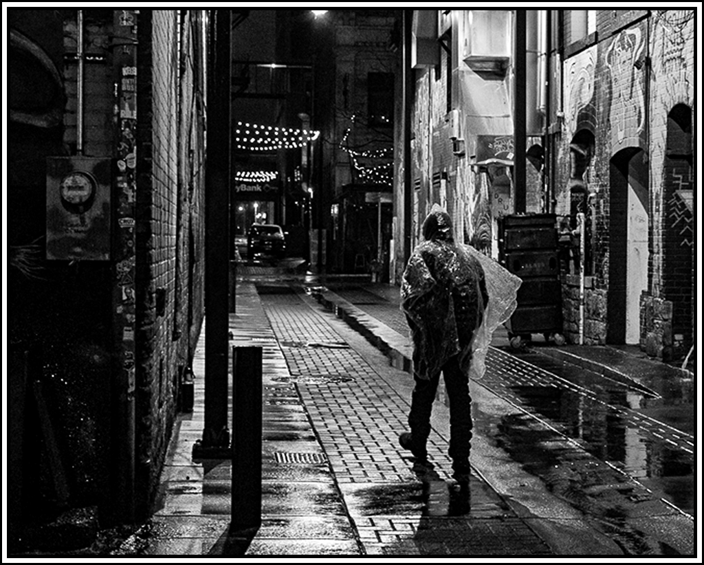
Hi Jeff. I found the image very intriguing. I liked the sense of mystery as the man was walking into what? The dark distance gave the image, to my way of thinking, a great sense of mystery. I like how you handled the post processing and crop to bring out the clear plastic poncho.
As I studied the original prior to making these comments I found that I also liked the detail in the distance which to my eye gave the image a sense of place. I did some work in the original in PS, converting to monochrome and making adjustments to the color filter sliders which allowed me to keep the darker presentation while still revealing some of the detail in the distance.
I could go either way as it was very good the way you chose. I would be interested in your thoughts on the way I processed it.
Thank you very much for sharing it with us. |
Feb 20th |
 |
| 47 |
Feb 23 |
Comment |
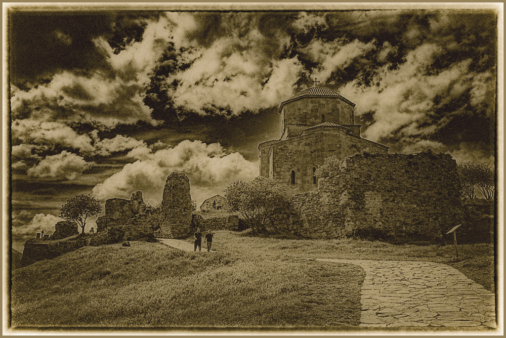
HI Robert, Thank you for this image. I like the way you framed the image, the circular pattern of the dome. It has, to my eye, a very nice balance. I have always "heard" never center your subject in the image - wrong. Your choice to center the pattern of the dome, at least to my eye, works extremely well.
I do like your rendition, keeping the pattern high key (at least that is how it appears to me). However I also like what Jeff did by darkening the image and applying more contrast.
Looking at the two side by side I find that I could go either way, especially were I to be using the image as part of a decorating scheme.
All in all in all, I think it was a great catch on your part thank you for sharing it with us.
|
Feb 20th |
| 47 |
Feb 23 |
Comment |
Hi Dom. I really like this image for a couple of reasons. The lighting makes the image, to my eye, striking with a wonderful tonal range. Not sure what time day it was though from the angle I suspect either early morning or late evening depending on which direction the was used to get the shot (E or W).
The second reason was the geometric patters and texture of the buildings.
I really have no suggestions to improve it. Thanks very much for sharing it with us. |
Feb 20th |
| 47 |
Feb 23 |
Reply |
Thanks Jeff. Per your thoughts I would be very interested in how this version fits with your idea. |
Feb 7th |
 |
| 47 |
Feb 23 |
Reply |
I think you are correct Trung. I really like the dynamic appearance, but that was a bit over the top. Please see the version in my reply to Jeff above. I am interested in your thoughts about that one. |
Feb 7th |
| 47 |
Feb 23 |
Reply |
I thought about what you and others have suggested. Please see the version in my reply to Jeff. Your thoughts? |
Feb 7th |
| 47 |
Feb 23 |
Reply |
Thanks Dom. Please see the version in my reply to Jeff above. Your thoughts? |
Feb 7th |
| 47 |
Feb 23 |
Reply |
Thank you Albert, please see version in my reply to Jeff - your thoughts?
Superb! :I would incease the foreground contrast. Then frame andexhibit it |
Feb 7th |
7 comments - 5 replies for Group 47
|
7 comments - 5 replies Total
|