|
| Group |
Round |
C/R |
Comment |
Date |
Image |
| 47 |
Jun 22 |
Comment |
This is, to my eye, an interesting but also somewhat confusing image. It does show a story, but I am confused about the man's appearance. I think I would like to see more of his face than just what appears to be mostly his beard. One thing I do really like about this image is that it forces me to study it, to look deeper into the image - that, to my way of thinking, is a big positive.
I do like the tonality and detail in the image which are, to me, very good making the choice of black and white a good one for this image.
Thank you for sharing it with us Gagandeep. |
Jun 14th |
| 47 |
Jun 22 |
Reply |
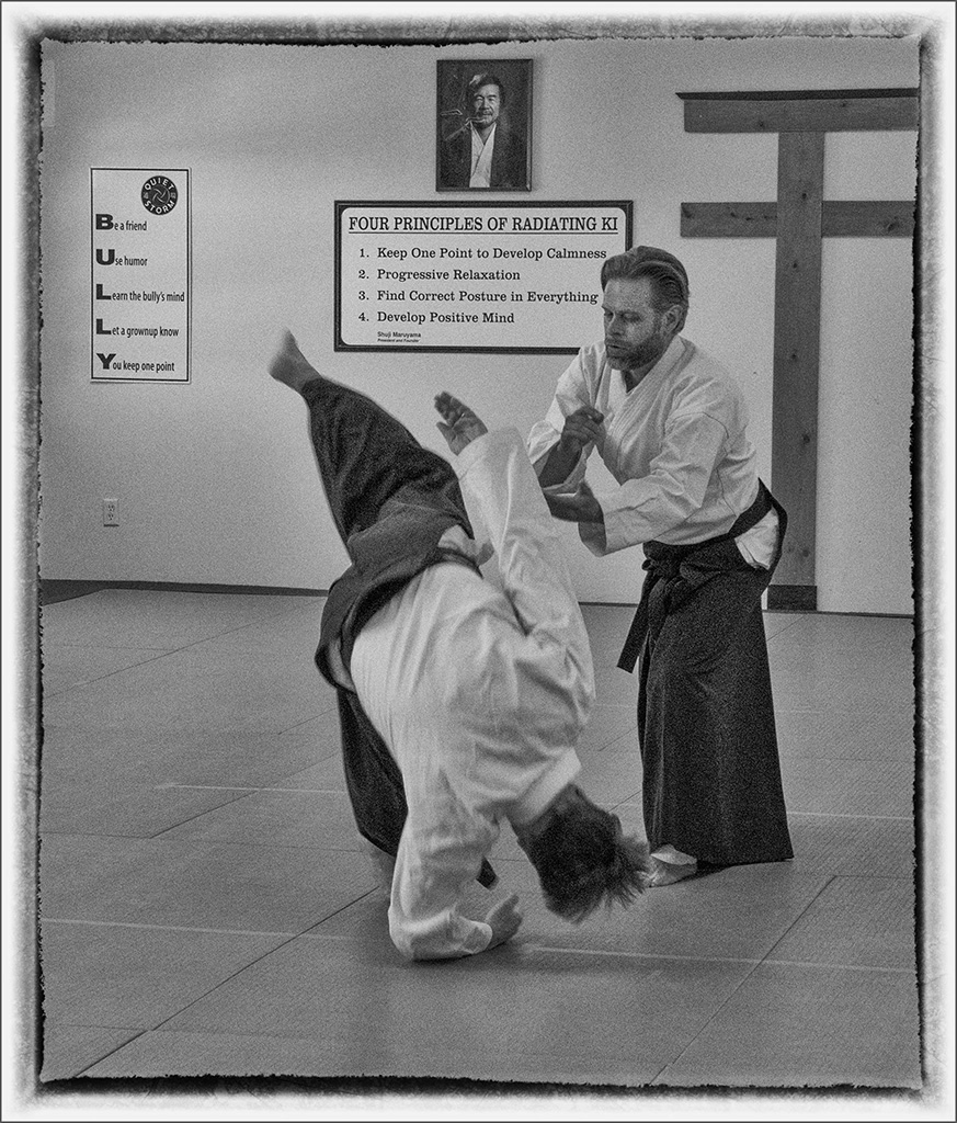
Thank you Robert. I agree that without the signs the walls do look too stark. I also agree with Kristi that while the bully sign did not particularly add to the image, it did serve to balance out the image. Hence the revision you see here going to a straight B&W look.
At issue with a slower shutter speed is that the person doing the throwing would also be blurred more and I figured that would take away from the presence in the image. |
Jun 14th |
 |
| 47 |
Jun 22 |
Comment |
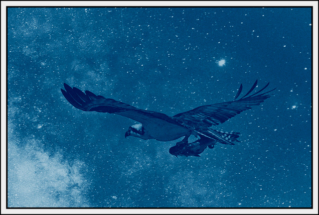
Hi Albert. I love the image - the mountains, sky and sense of cold it gives me. There is not much I would choose to add to what Kristi had to say with respect to the image you posted.
As I studied the image the very dark area at the bottom edge and also the prominent bald sky did cause me to wonder what would happen with a little work after cropping the image.
I copied the image and took into Photoshop. Did some work to bring out the cloud areas and shadows of the clouds on the mountains - make the shadows more dynamic. I also did a crop to give it more of a pano look reducing the amount of featureless sky. Finally I tried an experiment using content aware fill on the bottom right corner of the image to remove the very dark featureless area. You will see the result. Would appreciate your thoughts on the work.
A very nice image Albert, thank you for sharing it with us. |
Jun 13th |
 |
| 47 |
Jun 22 |
Comment |
Hi Kristi,
I liked the color version. I like your second monochrome image more than any of the others. I have no problem with the bright light at the end of the tunnel - it tells me a story of something better - light at the end of the dark passage. The second version with the walls lighter and the internal ice more obvious adds to the feeling I expressed leading my eye to the light. Normally I would have burned that area to darken it, but in this image it plays very well for me as I study the detail in the walls. The tint also gives me a sense of the cold the ice represents. It reminds me of something from the cover of a Fantasy book - something of the passage through a dark and cold time to something much better.
Great catch Kristi - thanks so much for sharing it with us. |
Jun 13th |
| 47 |
Jun 22 |
Comment |
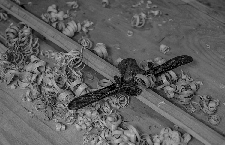
Hi Jeff. This was, to my eye, a good catch. If your disease does not have a cure, please send some of it my way, I could use some.
I worked in a foundry for a number of years. We made circular castings using centrifugal force and I suspect that Roto Molding is much the same. The material is fed into the mold as it spins distributing the material evening in the mold and giving the casting a very good surface finish - hope the explanation helps.
My only comment about the image is that I would reduce the intensity of the white walls and perhaps increase the intensity of the shadows a bit to give a more balanced tonality - not much else to suggest.
Good catch Jeff, thanks for sharing it with us. |
Jun 13th |
| 47 |
Jun 22 |
Reply |
That is a good point Jeff. I chose the Sepia tone because it warms to scene. I judged pure b&w to be too harsh. I will go back and look at it again. Thank you for your input. Taking into account your thoughts about the tint and also sign on the left I redid the image some - attached. Would appreciate your thoughts, and thank you. |
Jun 13th |
 |
| 47 |
Jun 22 |
Reply |
Hi Albert. That is a good thought I will revisit the original. I chose to leave all of the signs in, in order to convey the context of the dojo, but that sign does not add much to the image. It is actually there for the kid's classes to help them in the event of being bullied in school and to remind them not to be one. |
Jun 13th |
| 47 |
Jun 22 |
Reply |
Thanks Kristi you caught the feeling I wanted to convey. I appreciate your comments particularly with respect to the calmness of the teacher doing the throw. It is said in our Ryu of Aikido that if it looks real it is not. The defender uses the momentum and force provided by the attacker hence the sense of calmness - progressive relaxation. |
Jun 13th |
| 47 |
Jun 22 |
Comment |
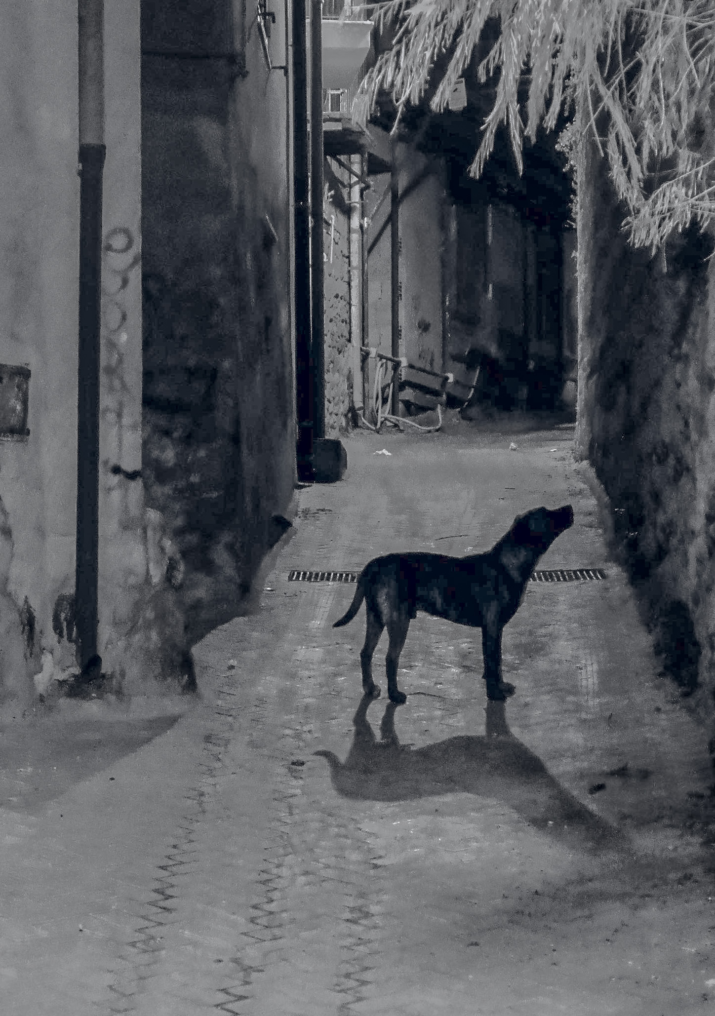
I think you had a very good idea and concept in this image. I like the content and it tells me a story - perhaps of the loyalty of the dog.
At issue for me with the original is the dynamic range leaving some areas very dark and others blown out in the version you posted. I liked the image enough to work on it in Photoshop. I recroped the original, burned the blown out whites to darken them. I also increased the exposure of the shadows while lowering both the highlights and the whites using a Camera Raw filter.
To my eye it brings out more detail for the dog and creates a more balanced tonality. I am very interested in your thoughts about the work.
A wonderful story telling image, thank you for submitting it Robert. |
Jun 13th |
 |
5 comments - 4 replies for Group 47
|
5 comments - 4 replies Total
|