|
| Group |
Round |
C/R |
Comment |
Date |
Image |
| 47 |
Sep 21 |
Comment |
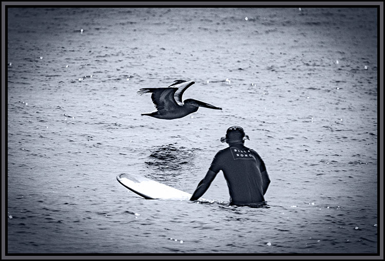
I like this scene Jen. I especially like the mountains in the background including the sky which gives a sense of place to the plateaus in the distance.The haze in the background, to me, adds a sense of distance to the mountains/mesas.
However the image also presents a problem to my eye - the foreground is so light that the people almost get lost in it while the mountain above them grabs my eye taking it away from the people. Plus, to my eye the contrast is also a bit harsh - perhaps softening it some?
I would be interested in seeing the original to see what else might be in the image.
I good catch Jen thank you for sharing it with us. |
Sep 20th |
| 47 |
Sep 21 |
Comment |
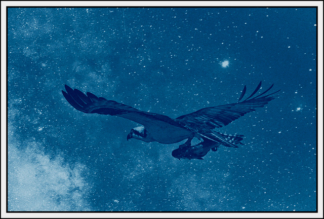
A great capture on the interaction of the two penguins. As per usual I have not read the other comments to avoid their influence in my own. If I am echoing what others have said I apologize.
I love the story and the intimacy this image shows. To my eye you handled the tonality and contrast well especially with the texture of their feathers(?).
My only suggestion would be to try to lighten the background so the detail in their heads would be more pronounced - easier to see. Other than that I cannot find anything I would change.
I wonderful view of the interaction between the two - thank you for sharing it with us. |
Sep 20th |
| 47 |
Sep 21 |
Comment |
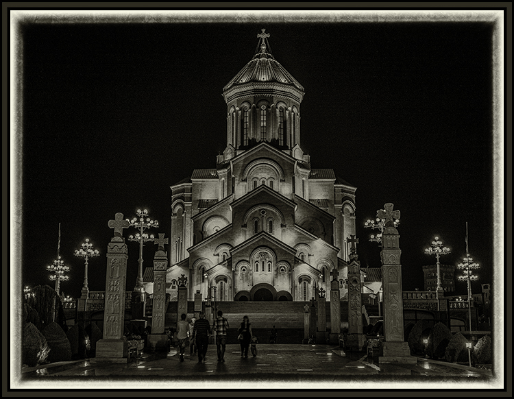
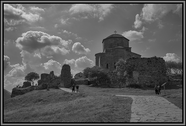
Hi Kristi,
Great catch on the building. In 2016 I had the opportunity to visit the country of Georgia and saw many such buildings. When the Russians left they cleaned all of the factories out completely leaving only the buildings behind. No one quite knows what to do with them today so they simply stand there empty. It never occurred to me to take pictures of them. They do tell a story of decaying material over time as all such things do.
I generally prefer not to read others comments so I will not be influenced by their opinions. In this case I can see Albert's changes and to my eye they do work a little better - the panoramic aspect especially.
Having said that, I also like the way the light rays seem to come up from the back of the building in your version - almost like a fan. So, to my eye both have a lot to say each in its own way. As for the graffiti - I like that your presentation - to my eye it adds to the story of the desolation and disrespect.
A great catch. Thank you for sharing it with us. |
Sep 20th |
| 47 |
Sep 21 |
Comment |
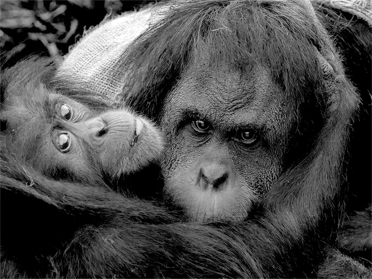
Hi Adrian,
This image tells a wonderful story of maternal care. I will confess that this is one of those few times I prefer the color to the monochrome image, in part because the mono image loses the bit of leaf in the youngster's mouth.
I find the contrast with respect to the eyes plus their clarity amazing. I am also very impressed with the detail in the hair (fur?) on both of the subjects.
Where I have an issue (I have not read the other comments) is the texture of the face of the mother. In the color version she has a natural looking complexion while to my eye in the monochrome version her complexion is harsh and unnatural looking. To my eye the hair on both is also very harsh appearing.
I copied the color version into Photoshop and used that for the monochrome conversion adjusting the color filters and also the Camera Raw filter to reduce the whites and highlights. I also backed off the contrast some. What i had trouble adjusting are the eyes of the little one - the bright highlights.
I would be very interested in your thoughts on the result.
Thanks very much for this image and this opportunity. |
Sep 20th |
 |
| 47 |
Sep 21 |
Reply |
Thanks Jen. Thank you for your comments.
|
Sep 19th |
| 47 |
Sep 21 |
Reply |
Thanks for the comments. I agree about the white border. Perhaps my commentary could have been clearer. I have used very fine grain film, though I was a stranger to dark room work. In this case it was my intent for the appearance of an old photo, perhaps showing signs of wear over the years. |
Sep 19th |
| 47 |
Sep 21 |
Reply |
Hi Kristi,
Thank you for your comments on the image. I have thought about your idea concerning a white border. I deliberately used colors in the image itself to create the border using Photoshop. I did that to create a sense of coherence between the border and the image. Thanks again for your thoughts. |
Sep 19th |
4 comments - 3 replies for Group 47
|
4 comments - 3 replies Total
|