|
| Group |
Round |
C/R |
Comment |
Date |
Image |
| 47 |
Jun 21 |
Reply |
Thank you Jen. I deliberately set out (as I mentioned in response to Kristi) get the appearance of two eyes and a moth with the grill being a kind of nose - a face if you will, with personality. The second one loses that sense, at least to my eye. |
Jun 22nd |
| 47 |
Jun 21 |
Reply |
Thanks for your thoughts Michael. I too like both images though in my second version it looks almost like the old truck is in kind of a jail with the fence running through the image. |
Jun 22nd |
| 47 |
Jun 21 |
Reply |
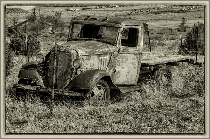
Thanks for the comments Colin. Actually I would have to retake the image in New Mexico as I chose a close "in camera" crop. My only crop in the original was to straighten the image some. However, it would have helped if I had moved back to give the image more context though I was also struggling to get a shot without the fence wire interfering with the truck itself. |
Jun 22nd |
| 47 |
Jun 21 |
Reply |
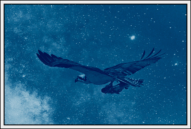
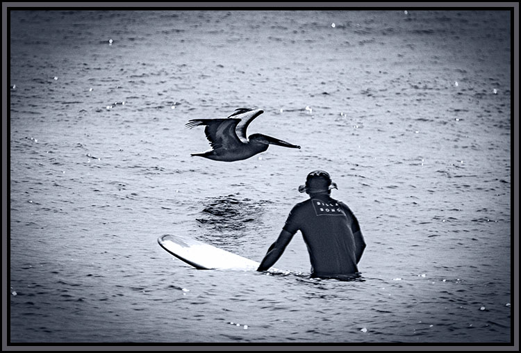
My first attempt at showing this image received an HM in the show. The original title was "They call me Rusty". I chose a different title for the mono version. I wanted the appearance of a 'face' and a sense of personality for the truck. |
Jun 22nd |
| 47 |
Jun 21 |
Comment |
Hi Jen. I try not to read the comments of the others in the group before I formulate my own. In this case, however, I have to agree with Albert - there is no central focus in your original image so my eye wanders all over the grave yard. The subsequent versions work better for me as they give me a much better anchor for my eye allowing me to study them which (at least for me) is part of the fascination of an old grave yard - who were these people? What were they like? Are they sitting, unseen, on the tomb stones watching us (shades of "Our Town")?
Of the two others I believe I like yours somewhat better though the contrast of the new grave stone versus the old one in Kristi's is interesting.
In my opinion it was a good and evocative effort Jen. Thanks very much for sharing it with us. |
Jun 22nd |
| 47 |
Jun 21 |
Comment |
Hi Albert. This is, at least to me, one of those "If I had not seen it I would not believe it" type images. While I do like what Kristi did, I like your original version a little more. The other snow elements give the image, as I see it, more of a sense of place or perhaps more accurately context - the larger context for the snow formation.
Good eye and a really nice catch. I grew up in the North East and lived in Northern Indiana for 4 years in college and I have never seen anything quite like it.
I like how you handled the post processing as well. Thank you for sharing it with us Albert. |
Jun 22nd |
| 47 |
Jun 21 |
Comment |
Hi Kristi - a very interesting and creative image. I like the concept and to me the tint you used worked well.
I also like the concept - it seems to fit the current times very well in light of the issues swirling around COVID-19. I confess that without the originals (thank you) I could not understand what I was supposed to see. Your version in response to Colin's comments is significantly better to my eye because I now know what it is that I am seeing.
To my eye, your composition work was wonderful.
Thank you for sharing this creative and interesting image with us. |
Jun 22nd |
| 47 |
Jun 21 |
Comment |
Hi Adrian. This image presented me with a wonderful puzzle. As I see it the conversion to mono could not have been done better. The drama of the clouds added to the image even more. It is a fascinating image I could study for hours and I expect I would find more in it.
The puzzle for me is which I like better the original in color or the monochrome version - I do not have an answer for that question. Both are wonderful. Perhaps if you were to submit one or both the the authorities in Yosemite they would be willing to purchase the rights to use them in their literature - to my eye both are that good.
Thank you very much for sharing both with us. |
Jun 22nd |
| 47 |
Jun 21 |
Comment |
A really nice portrait of a Heron. The water droplets do add another dimension to the image as I see it. Your processing, to my eye, worked very well to bring out the delicate detail of the plumage of the Heron. I also like how clear and sharp the eye of the bird is.
I like your use of depth of field. It focuses me on the bird instead of causing my eye to wander all over the image.
I have no suggestions for improvement - it was (to me) an excellently turned out image. Thank you very much for sharing it with us Colin. |
Jun 22nd |
| 47 |
Jun 21 |
Comment |
Hi Vinod. First I think the title is perfect.
When I saw that the image at first I was prepared not to like it. However the more I look at it the more I do like it. The shadows of the early morning winter light and the hint (to my eye) of mist do give the image an eery quality almost like something from the Twilight Zone. The track leading into the distance adds another good dimension leaving me wondering what is out there in the distance.
I believe that eery quality was enhanced by your post processing and I think it would do well on a wall given the right setting.
My only suggestion might be to open up the shadows slightly, not much, but ��
A very nice (to my eye) image Vinod - thank you for sharing it with us. |
Jun 22nd |
| 47 |
Jun 21 |
Comment |
Hi Albert - thanks for your thought Please see attached :-) |
Jun 14th |
 |
7 comments - 4 replies for Group 47
|
7 comments - 4 replies Total
|