|
| Group |
Round |
C/R |
Comment |
Date |
Image |
| 47 |
May 21 |
Comment |
Thank you Colin |
May 11th |
| 47 |
May 21 |
Comment |
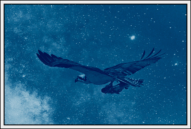
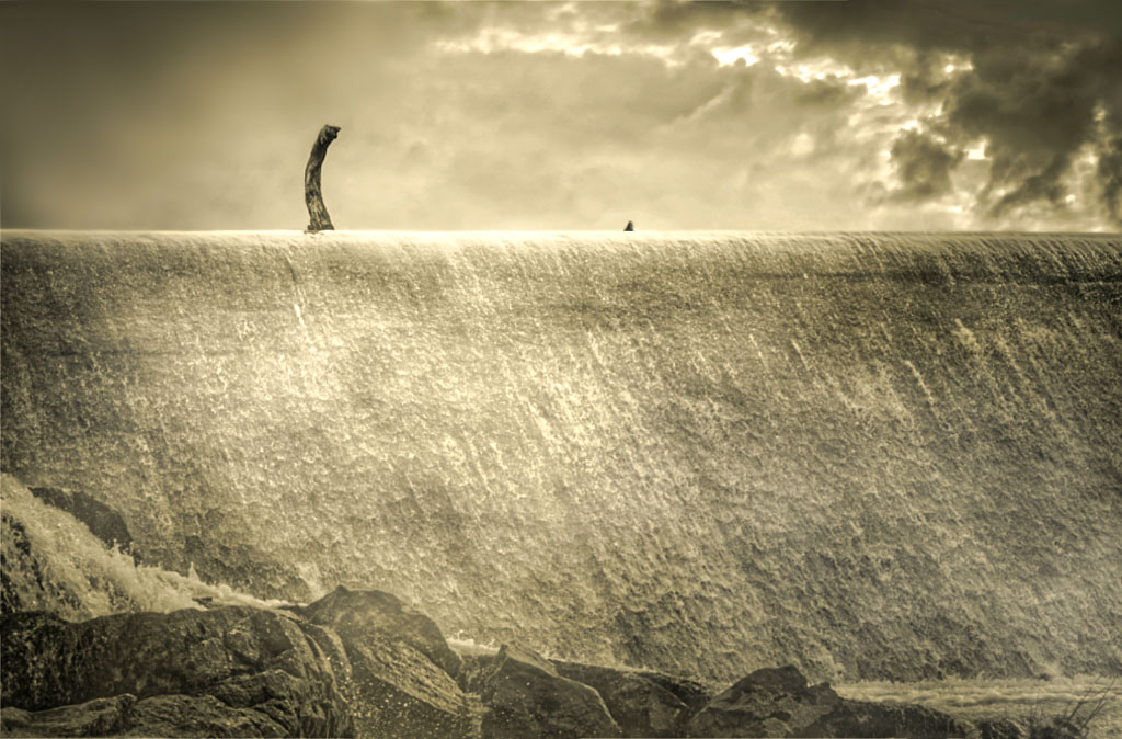
Thank you Kristi. I appreciate your remarks and your interpretation - one I had not seen looking at the image. I had contemplated making the background all black, eliminating the lighter areas in the lower left quadrant. I chose not to do so, and after reading your comments I am glad I did not do so.
Thanks again. |
May 10th |
| 47 |
May 21 |
Comment |
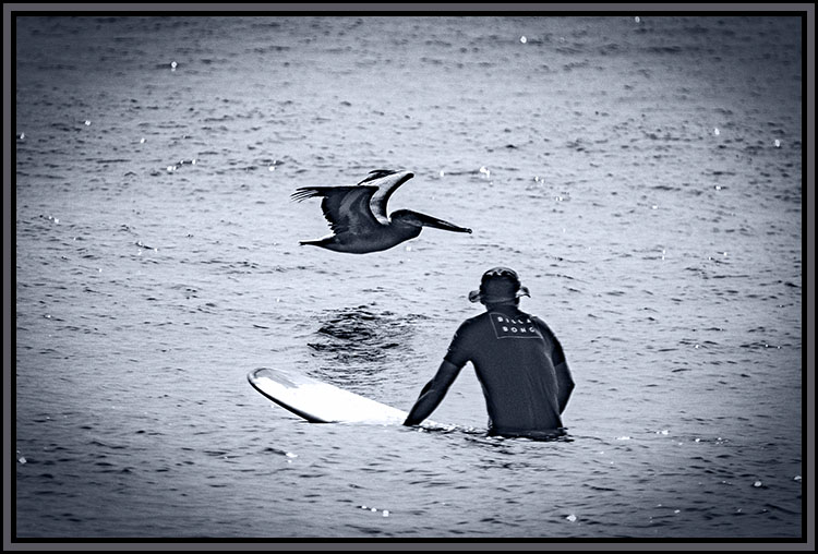
Great catch Jen. I really like this image, the placement of the viewing point and the concept of the landscape. I really like the context and your processing of the landscape. For myself I might have been tempted to increase the contrast - but on further study I believe it would have taken away from the impression of the landscape as opposed to adding to it.
The panorama idea is intriguing, but I also like the context, to my eye the foreground adds to the image. It gives me a great sense of context and place. Nicely done Jen.
Thank you for sharing it with us Jen. |
May 10th |
| 47 |
May 21 |
Comment |
Hi Albert. This was a perfect image for conversion to monochrome. I really like the concept and the contrast that you used. It tells me a story of focus and concentration - deep thought which, to my eye, is wholly appropriate for a chess match. As I look at the players in the image I really doubt they had any concept of what was going on around them - such was their concentration.
I cannot come up with even a minuscule nit to pick - to my eye you have gotten all you can out of this image. Were I a fan of chess (I think I lost 100% of the games I played) I would definitely hang this one on my wall. Maybe I would do so anyway :-).
Thank you so much for sharing it with us Albert. |
May 10th |
| 47 |
May 21 |
Comment |
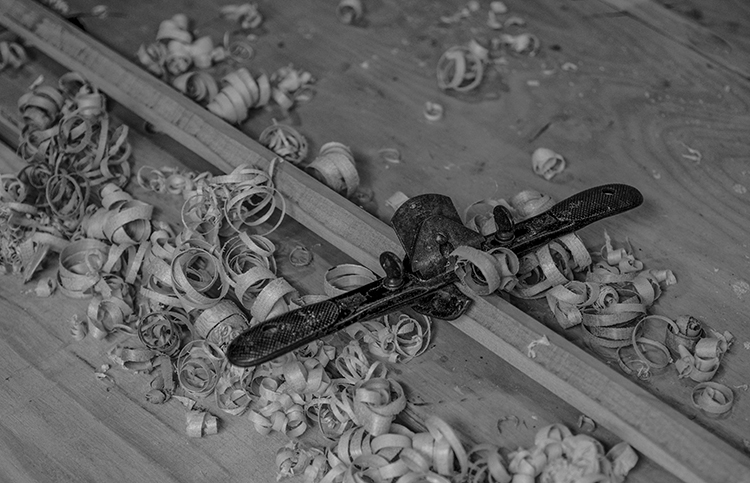
Hi Kristi - a truly unique concept. Also some great creative work on your part. It lends itself to a great story in the image. There is not much more to say - except well done. I do have a bit of a nit to pick. The piece of the tail on the right - I would move it closer to get more a sense of connection between the two.
I played with it a bit moving the tail a little closer just to see how it would appear - I will be interested and honored by your thoughts on the change.
Thanks you very much for sharing it with us Kristi - great imagery and imagination. |
May 10th |
 |
| 47 |
May 21 |
Comment |
Good evening Adrian. This is, to my eye, a really great portrait image in a wonderful context. I really get the feeling of the context and the impact of the setting. I really like how you toned down the whites so that there was more detail in the cloud of steam. I also really like the expression on the train man's face and the setting of the image.
All told I have no suggestions, nit picking or otherwise, to make concerning this wonderful (to my eye) portrait image. Great work sir!
Thanks for sharing it with us Adrian. |
May 10th |
| 47 |
May 21 |
Comment |
Good evening Colin. I do not generally read the comments of the other members before making my own - I do not want to be influenced by their thoughts in order to ensure that what I put down are my thoughts alone.
That being said, I did read Kristi's this time and there is nothing I can add to what she has said as I think she has captured the mode and the concept of the image perfectly. I also agree that the white line upper right quadrant is not an asset to the image - I would take it out. Other than that it is a beautiful image of a relationship between friends.
Thank you for sharing it with us Colin. |
May 10th |
| 47 |
May 21 |
Comment |
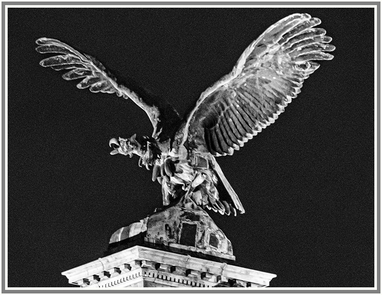
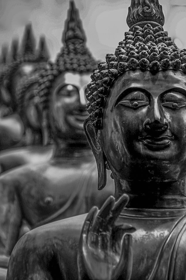
Hi Vinod. I like your concept of the repeating images giving me the impression of going back in time - perhaps because the is the sort appearance I get the I open Time Machine on my Mac and see the previous backups going back in time. I also like the shallow depth of field you used to build in a 3 dimensional sense of depth to the image. I think your choice of contrast was good.
One suggestion I have is to lighten the dark areas in the face of the front statue. The dark areas detract from the expression to my eye. To some extent that is kind of nitpicking, still ��
I chose to do a little work in the image and will be interested in your thoughts on the result.
Thank you for sharing it with us Vinod |
May 10th |
 |
8 comments - 0 replies for Group 47
|
8 comments - 0 replies Total
|