|
| Group |
Round |
C/R |
Comment |
Date |
Image |
| 47 |
Feb 21 |
Reply |
I like it, thanks. Actually had not occurred to me. Evidence I still have a lot to learn. |
Feb 23rd |
| 47 |
Feb 21 |
Reply |
Thanks Albert. Well worth the consideration. I would like to keep all of the detail of the bridge, not just the lower arch as I find the upper covered lovel every bit as interesting. However I can also see how it divides the viewers attention between the detail of the bridge and the street scene. Thanks again. |
Feb 23rd |
| 47 |
Feb 21 |
Reply |
It is unsettling and that was my intention. I also wanted branch out from standard processing concepts to explore more esoteric ideas. Not all will work and I accept that. This was to see what others thought and I appreciate the comments all have made. It is an idea I want to continue to explore so there may be more in the future. |
Feb 23rd |
| 47 |
Feb 21 |
Comment |
Wow Jen - that has to some of the worst navigation of a boat I have every seen :-) .
Ship wreck is spot on for a title. To my eye you chose a great subject and a wonderful context. Without reading what others have said, I would have liked to see the boat lower in the image. I do not know if this is cropped or not, but having the boat so close to the upper border of the image detracts (at least to my view) from the over all composition.
I do find your post processing to be good with respect to focus, contrast, lighting and tone. The vignette brings my eye to the boat, as do the flowers leading up to it. I do like both your subject and the concept, but for the placement of the boat.
Having read the other comments, before submitting my own - I agree with Albert about the sky - the boat is the focus of the image, I do not believe a bald sky would have detracted from the image at all as it would have kept the focus on the boat.
A very nice image. Thank you for sharing it with us Jen. |
Feb 23rd |
| 47 |
Feb 21 |
Comment |
HI Albert,
I really like the detail in this image and I think you have chosen the perfect name. The delicate filigree shapes are, as I look at the image, are a wonderful view of the incredible art in nature if we will only choose to see it. I will confess that as I compare the end result to the original I find it hard to see the difference, which to me is not relevant. This, to my eye, was a great catch and your processing worked. It is also a reminder to me that not every image has to tell a story for which I will say thank you.
One suggestion I would make is to take more like this and make a photo book built around this subject. Ice crystals have such an infinite variety of shapes, of forms.
I cannot even come up with any nit-picks for suggestions. Thank you for sharing it with us. |
Feb 23rd |
| 47 |
Feb 21 |
Comment |
Hi Kristi,
As I looked at the image, my first thought was wow! You really caught the feeling of a frigid environment. Your choice of a blue tint enhanced that feeling to me. I also really like the sky, to my eye it adds a great deal to the image. I did think some about cropping the image. However, to my eye the image, has a real sense of the context of the harbor. The crop might bring out the tug boat better, but the context of cold and the over all view of the harbor is tells me a better story.
As I see it, your post processing both lighting and contrast, were well chosen for the image.
All told this image says deep winter to me and reminds me of playing in the snow as a kid - never much worried about being cold when I was young. I love the image as it stands, thank you so much for sharing it with us Kristi
|
Feb 23rd |
| 47 |
Feb 21 |
Comment |
Hi Adrian,
I love this portrait of the Lion. To me you could not have chosen a better crop. The original was a good image, but your crop really brings out there lion, particularly the big cat's expression. As I look at it I cannot help but wonder what the lion might have been thinking (Hmm lunch? or why are you disturbing my nap?). As I study the image I find more and more in it, more detail, not unlike Colin's Fighter - there is so much there that (at least to me) I could look at the image over and over and find more Ihad not seen before.
I really like how your processed the image other than the crop - lighting and contrast. It has, as I see it, a perfect texture for the subject. My only suggestion and it is kind of nit picking would be to lighten the eyes a bit more so they stand out a little more. Other than that ��
Thanks so much for sharing it with us Adrian - very nicely done. |
Feb 23rd |
| 47 |
Feb 21 |
Comment |
Hi Colin,
I really like this portrait of the fighter. The combination of the tattoos and the focus of his expression give the image an intensity lacking in many portraits. It is a really nice change for me to see. I also like how you chose a black background as it makes him stand out starkly.
Your choice for contrast and brightness settings also, as I see it, give the portrait still greater grittiness and intensity.
From my perspective this is a wonderful image that tells me a great story. Thank you very much for sharing it with us Colin. |
Feb 23rd |
| 47 |
Feb 21 |
Comment |
Hi Jack,
I like how you processed the image from the original. The shapes of the dunes and the contours of the sand waves come clearly to my eye. In addition I like how you handled the light and dark areas, I see a nice balance to both. It really stands out with respect to the original which to my eye has a rather murky appearance. Your processing has done away with that issue making for a much nicer image as I see it.
For me, I would have liked an object to serve as a focal point in the image - plant, tree or something else. That is simply a personal preference.
Thank you very much for sharing it with us. |
Feb 23rd |
| 47 |
Feb 21 |
Reply |
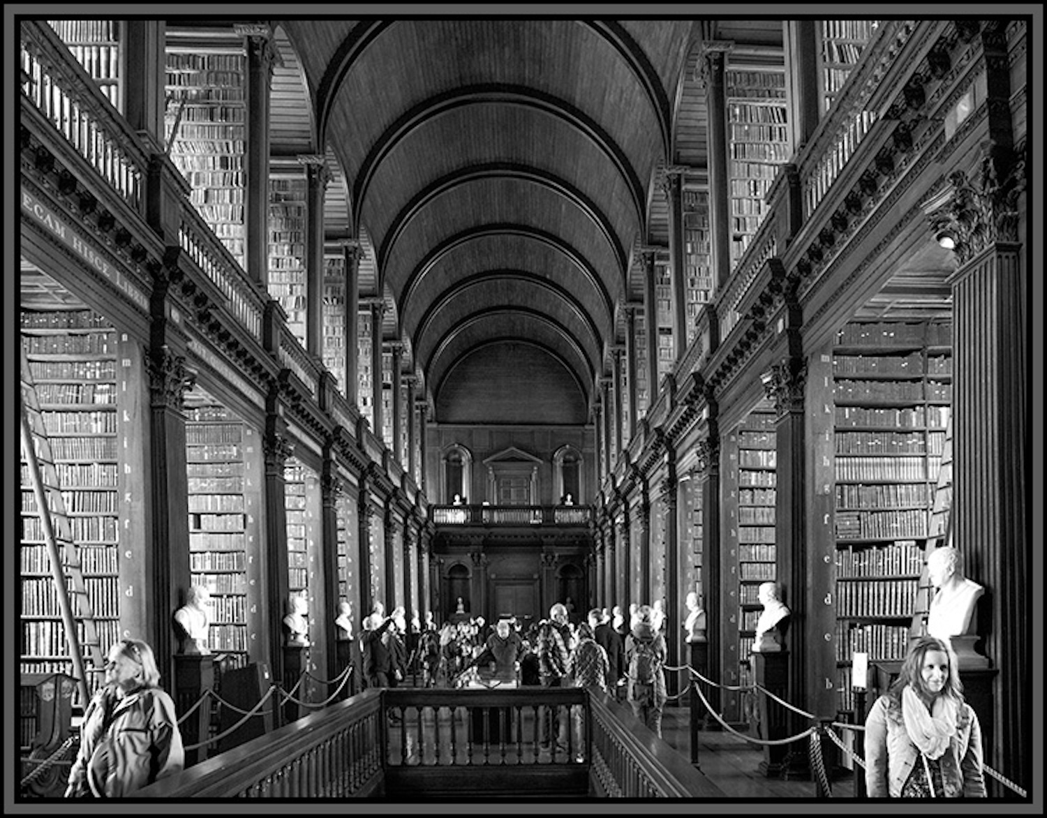
They bothered me as well, but I chose to leave them. However, on second reflection, I think you are right Kristi. Thank you. I will see what I can do, though I have had issues with PS on my Mac. Perhaps I can learn to do that in ON1. |
Feb 7th |
| 47 |
Feb 21 |
Reply |
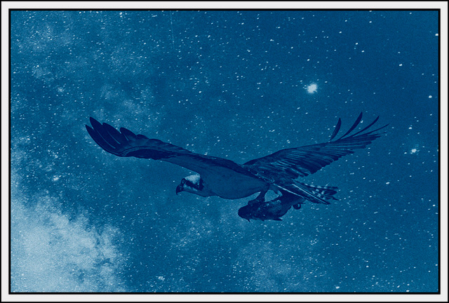
Thanks Jack. I appreciate your thoughts on the composition. To be honest what you mentioned is what actually attracted me to the concept behind the image. While you are right about the filter - I wanted to keep the appearance of what I would have seen in a B&W Negative from a film Camera. Still it bears some thought and perhaps modifying the presentation in the future. Thanks again.
|
Feb 6th |
6 comments - 5 replies for Group 47
|
6 comments - 5 replies Total
|