|
| Group |
Round |
C/R |
Comment |
Date |
Image |
| 47 |
Sep 20 |
Reply |
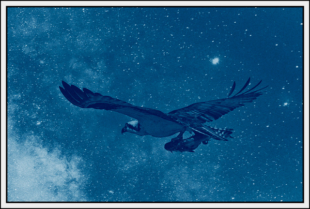
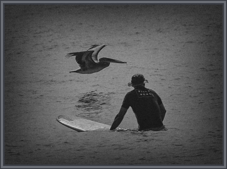
I thought about a tighter crop but was concerned about losing too much context. The vignette is not opaque so it still preserves the content, at least to my eye. |
Sep 30th |
| 47 |
Sep 20 |
Reply |
Jack, my apologies for taking so long to reply - this is the other version I mentioned. |
Sep 21st |
 |
| 47 |
Sep 20 |
Reply |
Thanks for the suggestion: I did some rework based upon some of the other comments as well.
|
Sep 21st |
 |
| 47 |
Sep 20 |
Reply |
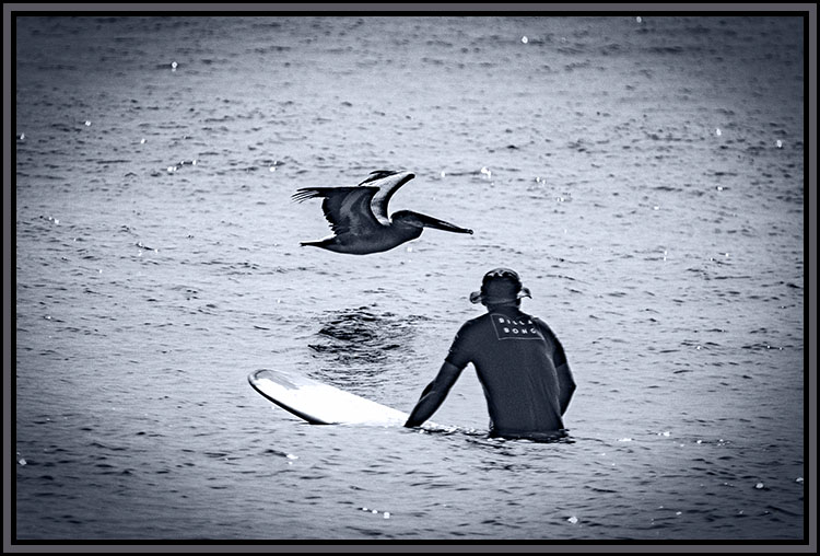
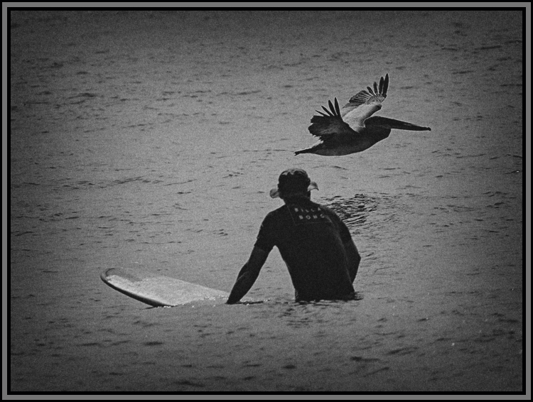
How would you have liked to have seen the positioning of the two? I did have another shot where the bird was placed differently, but heading away from the surfer. Was that what you had in mind? Curious - thank you. |
Sep 5th |
| 47 |
Sep 20 |
Comment |
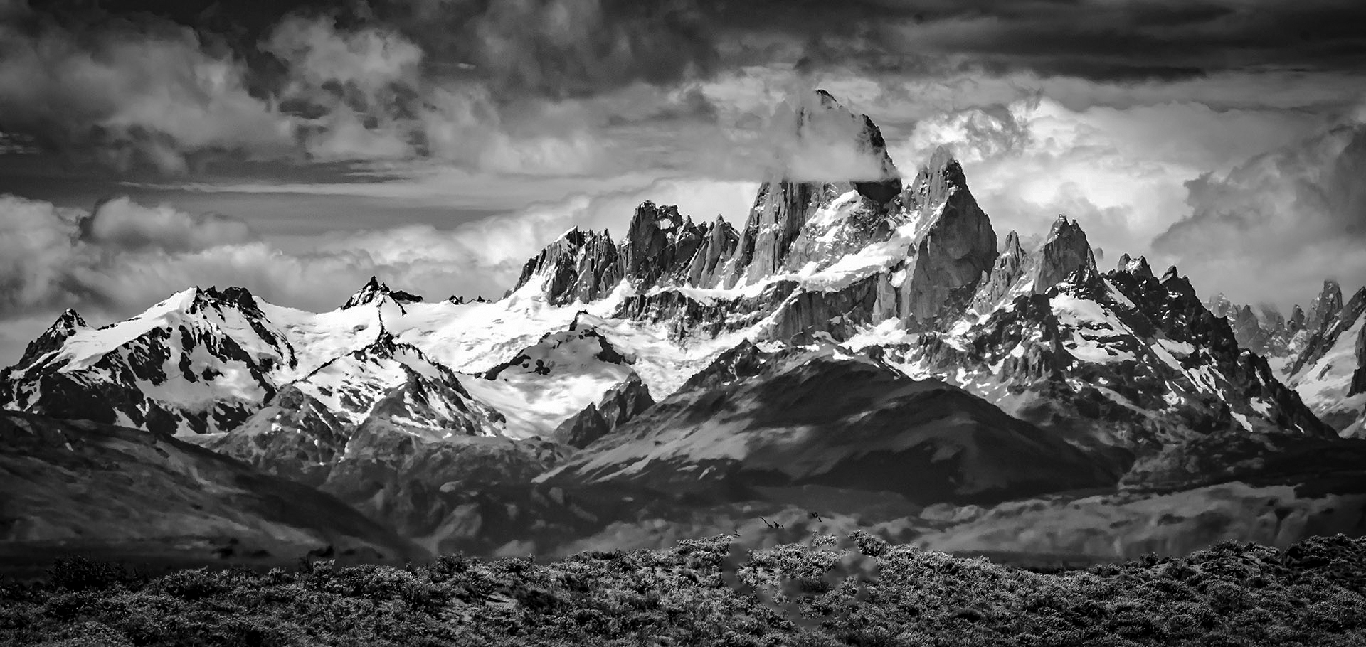
A really great mountain scene. As I see it, the bush really does not add to the image since my focus is on the mountains - the show and clouds. The contract of the peaks and texture of the mountains themselves. I do not think it really hurts but �� . Perhaps had the foreground object been a tent of heard of animals.
I did a little work on It removed the bush and lightened the foreground to let it speak for itself. Please let me know what you think.
A wonderful image of the mountains of Patagonia. Thank you for sharing it with us, I have never been but would love to go. |
Sep 4th |
 |
| 47 |
Sep 20 |
Comment |
I like this composition a lot. I have loved the sea since my time in the Navy having spent many days on the ocean aboard ship. I like the way the white in the waves gives me a sense of great lighting.
I think that it might have been a better for me (as I study it) presentation had you lightened the sailing ship a little more. To me , it is really (or I want it to be) the focal point of the image, but it is so dark that it does not fulfill that role for me. In fact the waves catch and hold my attention more than the ship does since they stand out so starkly.
I am not sure if you cropped the image, but if you did perhaps also giving a little more room between the ship and the right side of the image but I cannot be sure since the ship is so indistinct.
I really like your concept here and would love to see another rendition of this image. Thank you for sharing it with us Albert. |
Sep 4th |
| 47 |
Sep 20 |
Comment |
Don, I love this image - everything about the image, especially the sense of symmetry created by the reflection of the lake at the shoreline. The clouds wrapped around the peaks along with the over all reflection of the mountains in the lake, and the reflection itself. The border is also a really nice touch giving (to my eye) a sense of depth to the presentation of the image.
As I look at the image I get a great sense of wonder and peace - wishing I was there to witness the moment you captured in the image.
To my eye a really wonderful capture of a moment in time. Thank you for sharing it with us Don. |
Sep 4th |
| 47 |
Sep 20 |
Comment |
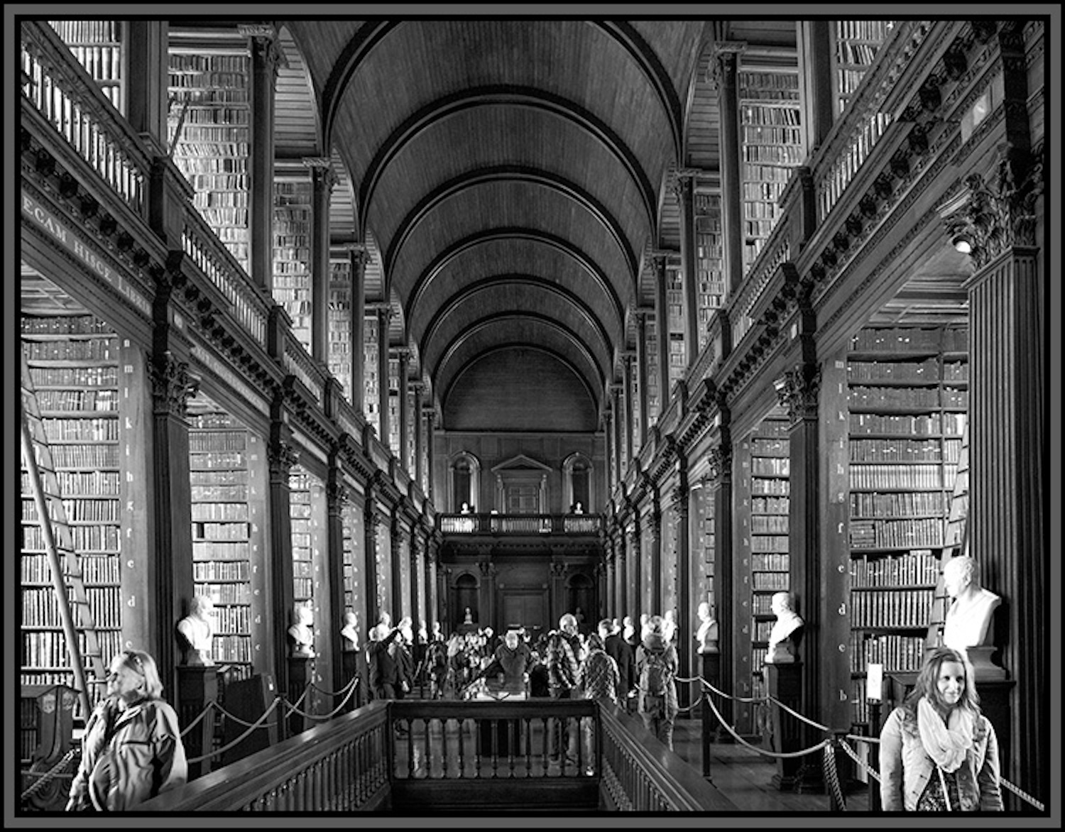
As with John's image, to my eye, the key to this image is the symmetry of the interior of the cathedral. I think you captured that wonderfully. The positioning of the columns gives me a real sense of the depth of the church.
In addition I like how your work with the lighting brings out the decorative work on the columns along with the font reflection. I very nice image and sadly one we could not often get in the pre-COVID times because fo the crowds and seating. So I think you were very perceptive and fortunate in your timing.
I will say that after studying both versions I like the color version - warmer appearance - a little more. Still, a nice monochrome conversion.
Thank you for sharing this with us Adrian |
Sep 4th |
| 47 |
Sep 20 |
Comment |
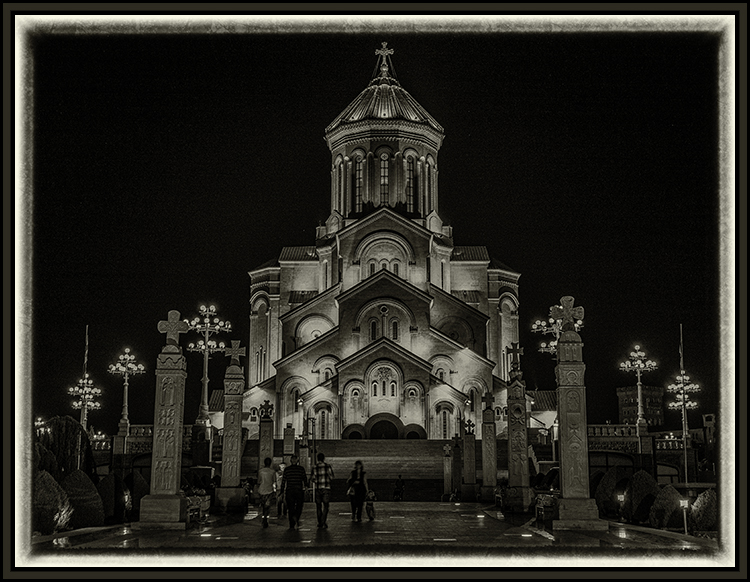
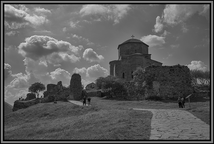
It seems that one Inviolable rule in photography (besides the rule of thirds) is do not center the subject in the photograph. I suppose there is a good basis for the rule. However, as I see this image, I see a good time when rules were "made to be broken". I really like the symmetry of this image. In addition the clouds help enhance the church providing a very nice background for the dome.
I like your use of contrast both for the sky and for the church itself bringing the character of the clouds and also the texture and decorations on the church.
I like this image a lot and I really appreciate your sharing it with us John, thank you. |
Sep 4th |
| 47 |
Sep 20 |
Comment |
I have had an abiding interest in PJ Photography. This is, to me, a good way of sharing a story about what is happening to others, or sometimes to us. I am glad that you are well and that you survived the fires.
You are correct, to my eye, about the smoke and monochrome accenting the texture of the smoke - something that does not appear as well in the color version. I had to really study the color version to find the red stripe - eventually did. I do not think the image has lost anything by not having it in the picture since the average viewer would likely miss it and probably would not know what is was if they did see it.
It is a sad slice of life in California which my family encountered some years back with the Santa Clarita fires. We did not feel them but the smoke was visible in Long Beach where we were living - that and the ash on our cars every day.
Thank you for sharing it with us Jack. |
Sep 4th |
6 comments - 4 replies for Group 47
|
6 comments - 4 replies Total
|