|
| Group |
Round |
C/R |
Comment |
Date |
Image |
| 47 |
Dec 19 |
Comment |
This is, to me, an interesting image, though not one I would have taken. The repeating patterns and the texture makes for an image you can study for some time and still find more.
I will not say more as all others have already covered what I might have said.
Thank you for sharing it with us Jen. |
Dec 24th |
| 47 |
Dec 19 |
Comment |
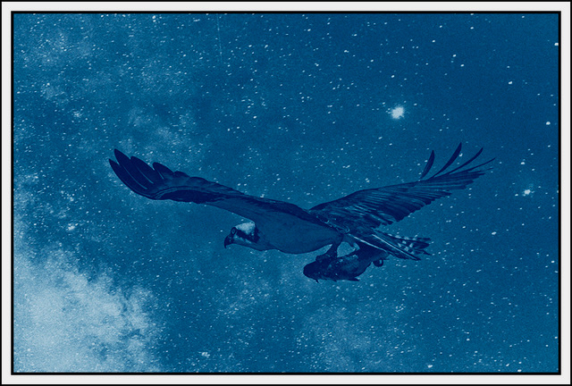
I like this image a lot. I have experimented a number of times with using a cyanotype tint for monochrome without success. From this image, I do not think I tried hard enough. The blue tint makes this image for my eye. I love the sky and the glow of the moon over the water. To my eye it is a wonderful nights-cape and the blue tint gives is a real sense of cold one might expect in the far northern climate. I cannot help but wonder what time of year this was taken.
A great image - thank you for sharing it with us Albert. |
Dec 24th |
| 47 |
Dec 19 |
Comment |
A really great image Don. What I like most about this image is the truck with the background of the trees in that hazy distance. To my eye this sets up the entire image. I am not sure how much processing you did to this image, but whatever you did worked extremely well for me.
I wish I could come up with a suggestion to make it better (well not really) and I cannot.
A great image and a wall hanger, thank you for sharing it with us Don. |
Dec 24th |
| 47 |
Dec 19 |
Comment |
I really like this image Adrian. This, to my eye, is a great image for a B&W treatment, good call. The hard appearance works well with the sense of cold in this winter landscape. Flipping it also worked well for me. It might have been nice for an animal to be in the image but I confess that is far more nitpicking than anything else.
Very nicely done Adrian - thank you for sharing it with us. |
Dec 24th |
| 47 |
Dec 19 |
Comment |
I find this a striking image. The issue I have with this is the extreme contrast in the image. It was already contrasty in the original. Increasing the contrast (as least that is how it looks to my eye) gives the image an almost surreal look to me - hard. Also the texture of his arms almost looks, to me, like he has measles or something.
All that is part of the image including the position of the officer's hands and his sun glasses gives the image a context of toughness.
With respect to your asking the officer to pose, I do not have a problem with posing if it fits the desired story intended by the shot.
Thank you for sharing with us John. |
Dec 24th |
| 47 |
Dec 19 |
Comment |
I like this image as far as the portraiture is concerned. I like the softer presentation in the complexion of their faces. Especially since we so often see a high contrast approach to so many portrait shots, particularly with respect to boys and men.
To my eye this is a nice window into another culture - one where school is so much more important than it has become in our own country these days - at least in many areas of the country.
I also like the clarity of their eyes and the softer tonality of the over all image that you chose. All in all, to my eye a very nice image.
Thank to for sharing it with us Jack. |
Dec 24th |
| 47 |
Dec 19 |
Comment |
LOL - actually there is an odd number - one was behind the tree on the right when I took the picture - just would not cooperate with me :-( |
Dec 10th |
7 comments - 0 replies for Group 47
|
7 comments - 0 replies Total
|