|
| Group |
Round |
C/R |
Comment |
Date |
Image |
| 4 |
Mar 21 |
Reply |
Good Luck !! |
Mar 30th |
| 4 |
Mar 21 |
Reply |
Vella, now you can see the spider webs on the branches. Added features. |
Mar 18th |
| 4 |
Mar 21 |
Reply |
Done |
Mar 11th |
 |
| 4 |
Mar 21 |
Reply |
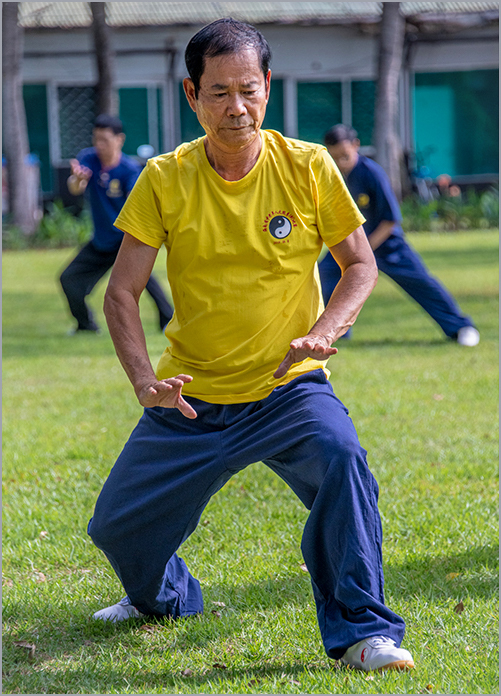
Guy, my eyes are adjusted to the sun and colors in the tropic.... |
Mar 9th |
| 4 |
Mar 21 |
Comment |
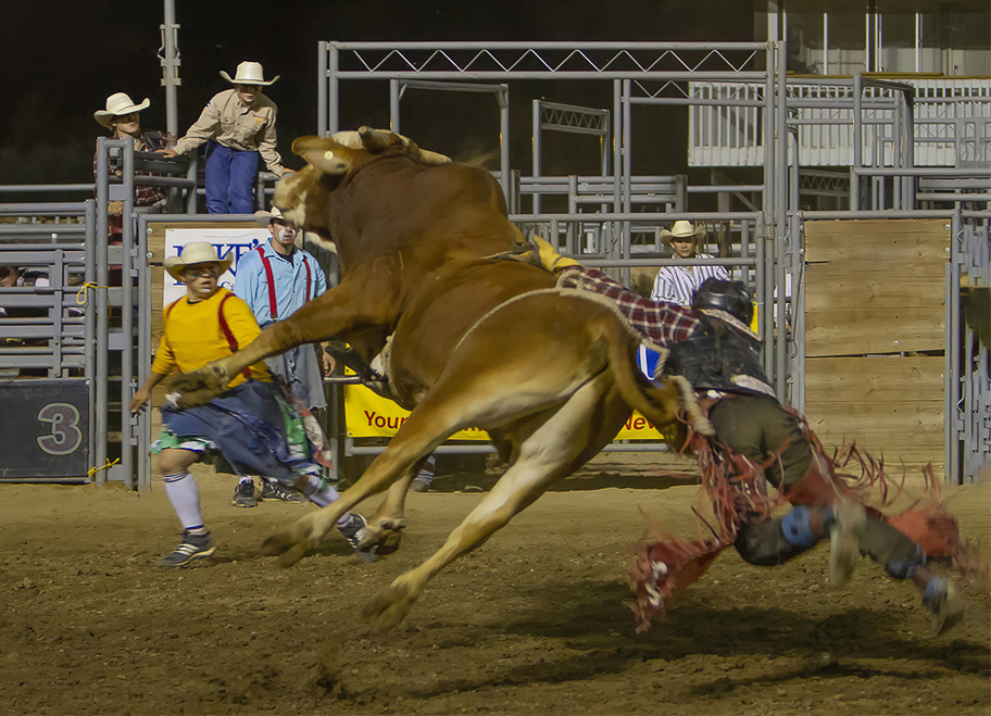
Erik, definitively an action shot showing movement in the falling rider, whom does not want to let go from the bull still holding on the rope. Rodeo photography is not easy. The light is terrible when is indors, and too harsh when it is outdors during the day, plus the myriad of advertisement banners and colors which are very distracting. I used Gary's image, cropped it since I do not think the cowboy at the left of the frame (my left) is adding to the image, completed the removal of the Murdoch's banner, as well as the Pike's banner on the left. Now our attention is really centered on the action and the bystanders. |
Mar 9th |
 |
| 4 |
Mar 21 |
Comment |
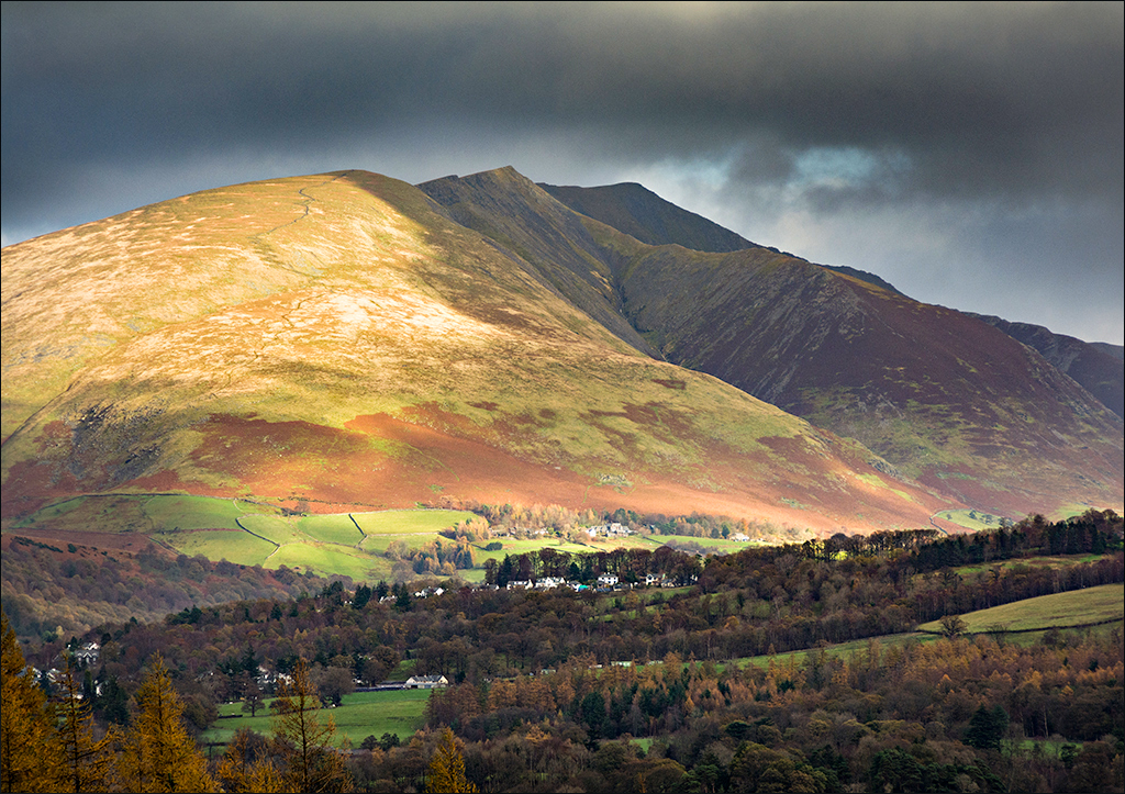
Guy, beautiful landscape but on my monitor the colors look washed out and does not do justice to the image. The clouds do have some impact. The bright late fall colors in the foreground enhance the picture. I just used ACR: the dehaze slider and some light in the shadows gave some contrast and made the colors more vivid. |
Mar 9th |
 |
| 4 |
Mar 21 |
Reply |
Question for Bill, why didn't you just cloned out the bright object in the foreground ? |
Mar 7th |
| 4 |
Mar 21 |
Reply |
Bill, as always you are right on !! |
Mar 7th |
| 4 |
Mar 21 |
Reply |
Bill, indeed it made the colors more vivid. |
Mar 7th |
| 4 |
Mar 21 |
Comment |
Bill, great HDR rendition showing all the details of the effects of time and the elements over the car's metal. Interesting to see the multiple colors of the parts, like if the truck was put together with parts of multiple units. The vegetation around it adds mystery to the image resembling a lost place. It is sharp, and the composition is showing enough of it to know. |
Mar 6th |
| 4 |
Mar 21 |
Comment |
Ian, it really took some planning to create this image as you describe in your note. The good thing is that you can always go back and try again. I like the way you placed your vantage point to catch the complete reflection of the Lighthouse top in the water. The shadows in the ground give some mystery to the photo. Your PP as Gary says brought out a lot of color and detail. We not always get what we bargain for... I went to Fairbanks Alaska on December 2018 for the northern lights. Stood outdoors at 40 below for three consecutive nights, and of course, they never showed up. I have seen pictures before and after our visit that make your jaw drop. |
Mar 4th |
| 4 |
Mar 21 |
Comment |
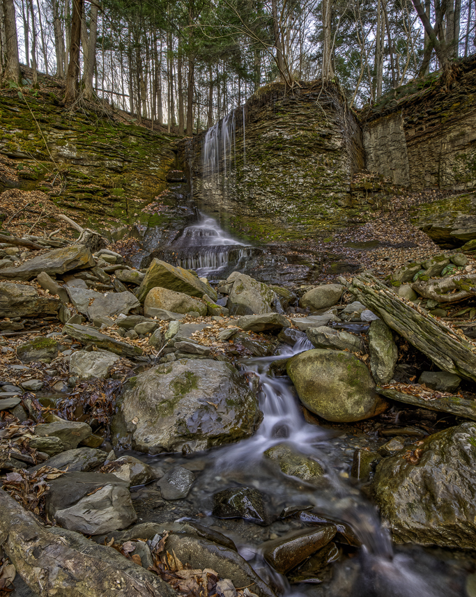
Gary, wonderful image of the waterfall, created using the right shutter speed to obtain the silky effect on the moving water and with no overexposure. The combination of the different frames rendered beautiful and vivid colors. Obviously it was taken from a very low vantage point, and literally you have to look up to appreciate the whole landscape. The first thing that we see ai a big tree root and a large rock which really takes prevalence, and then we can go and see the rest. My only suggestion is a small crop of this area to decrease the distraction. Well done. |
Mar 3rd |
 |
| 4 |
Mar 21 |
Comment |
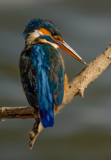
Vella, beautiful bird that looks like a variety of kingfishers given by the characteristics of the beak. The colors are very vivid and the plumage is very sharp. Interesting PP where you were able to separate the beak from the branch and bring out so much detail and colors. Now, I think the crop is too tight (you have plenty of real state in the original to give some more margin). Also, the branch was left like hanging in the air which creates some tension. I used your original image that I just added some light, flipped it and cropped. |
Mar 2nd |
 |
6 comments - 7 replies for Group 4
|
| 22 |
Mar 21 |
Comment |
Jerry, interesting end result. I am sure it took quite some time, which we have had lately. This will never happen on our backyard in Florida. Very creative indeed. |
Mar 2nd |
1 comment - 0 replies for Group 22
|
| 58 |
Mar 21 |
Reply |
"I am attaching a second image from a different vantage point to get your input and for illustration purposes." |
Mar 20th |
| 58 |
Mar 21 |
Comment |
Gloria it is probably one of the former British Commonwealth Islands given by the direction the cars are going and the architecture. The clock's structure takes more than 50 % of the real state. The gentleman sitting and having his "late lunch" (3:15 PM if the time is right) is overpowered by the green structure. The light is also harsh creating strong shadows. This is also a good photo travel image. |
Mar 9th |
| 58 |
Mar 21 |
Comment |
Bruce, you froze the moment for history. Indeed all but one are mesmerized by the beautiful baby. The exception was more interested in you. I tend to agree with Dan that perhaps more of the carriage should be visible. The crop around the rest of the frame is fine, eliminating as much as possible of the distracting background. |
Mar 9th |
| 58 |
Mar 21 |
Comment |
Hassan, very interesting juxtaposition of images and it takes more than one view to understand it, and at the same time makes you look hard for a main subject on the image. Of course the first thing you fix you gaze is the white building in the back which takes 1/3 of the real state, then you can see the rest of the items inside the sweets and chocolate shop. The three men walking into the image complement the composition. Nothing is sharp which creates some mystery into it. |
Mar 9th |
| 58 |
Mar 21 |
Comment |
Dan, good action image and you stoped the maneuver in a good spot showing the motion going on. Indeed it takes some strength to do this. The image is sharp. I sense a slight sepia tone conversion. Perhaps you should have used a shallower f/stop to try and blur the background and make it less distracting. With respect to the crop, yes it is too tight in the lower border of the frame, creating some tension |
Mar 9th |
4 comments - 1 reply for Group 58
|
| 69 |
Mar 21 |
Reply |
Brenda much better. Mervyn observation are also very valid. It is very interesting how much interest (no pun intended) this image and variations has created. |
Mar 26th |
| 69 |
Mar 21 |
Reply |
Brenda, This one is also very good. Here you are focusing more on the lily which is nicely framed by the giant leaves. |
Mar 26th |
| 69 |
Mar 21 |
Reply |
Brenda, the original is fine all together, but still has the excess foreground of the reflection. I personally do not care much for the painterly effect (dreamy look) in photography, otherwise I would be a painter.... This is the crop I suggest. |
Mar 9th |
 |
| 69 |
Mar 21 |
Comment |
Mervyn, you were able to restore the sharpness on the head and neck without creating a halo. Well done. The Green heron does not look very happy by loosing his/hers prey. This image denotes action. Nicely composed with a non distracting background. |
Mar 2nd |
| 69 |
Mar 21 |
Comment |
Brenda, the reflections in the water are too strong and distracting taking prevalence over the gigantic lily pads which are too far in the back. The painterly effect is also a distraction to my eyes. |
Mar 2nd |
2 comments - 3 replies for Group 69
|
| 72 |
Mar 21 |
Comment |
Mary, nice image with great reflection, and the fumes split the image in three areas besides the ski, each one with its own interest. The magenta like color in the foreground adds another shade and somehow blocks the blue from the ski. Interesting phenomenon. It is sharp |
Mar 20th |
| 72 |
Mar 21 |
Comment |
Here we have the square crop, and some dodging on the eye, but there is no information in there. Finished with a discrete vignette. |
Mar 10th |
 |
| 72 |
Mar 21 |
Comment |
Randy, great image of the osprey with the fish. Congratulations ! This image has an interesting vantage point (is it looking up ?) and the colors as the gradient in the light is very nice. Sharp. I visited the Antelope Canyon after the PSA meeting in Spokaene, Washington State, we stoped in Arizona and drove there. We booked a tour for photographers only and they told us that would be the case. The photographer's only lasted for 10 minutes and then an avalanche of people filled all the grooves in the Canyon. |
Mar 9th |
| 72 |
Mar 21 |
Reply |
Bruce, I think you can see more detail on Adrian's last month image. |
Mar 4th |
| 72 |
Mar 21 |
Comment |
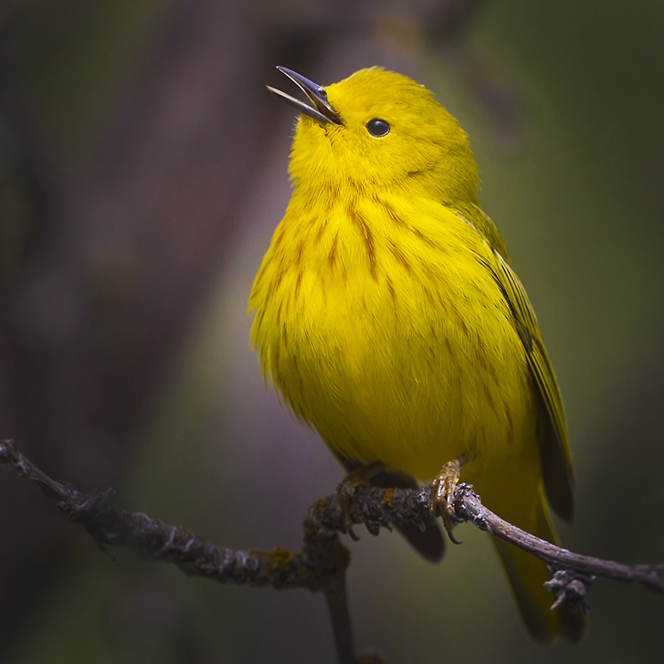
Bruce, very sharp and bright colors warbler. The bird is happy and chirping, given by his open beak. The background is muted and not distracting. I find the eye to dark and lacking the catch light. I just added some brightness to it. Also, perhaps there is some empty space in front of the bird, so I cropped it to a square format, and added a touch of a vignette. |
Mar 4th |
 |
| 72 |
Mar 21 |
Reply |
Adrian, big difference, much better. Maybe the crop is too tight at the lower edge. |
Mar 4th |
| 72 |
Mar 21 |
Comment |
Adrian, this image complements the previous one and gives us a broader view of the beauties of this landscape. I kind of like better the original image, where the reflections are not as intense, and therefore not distracting. In the PP image the colors are too bright and look kind of washed out. I like the orientation (no need to flip !!) and I would not crop it. The foreground in the left lower corner (my left) starts a nice leading line towards the more intricate rock formations. |
Mar 2nd |
| 72 |
Mar 21 |
Comment |
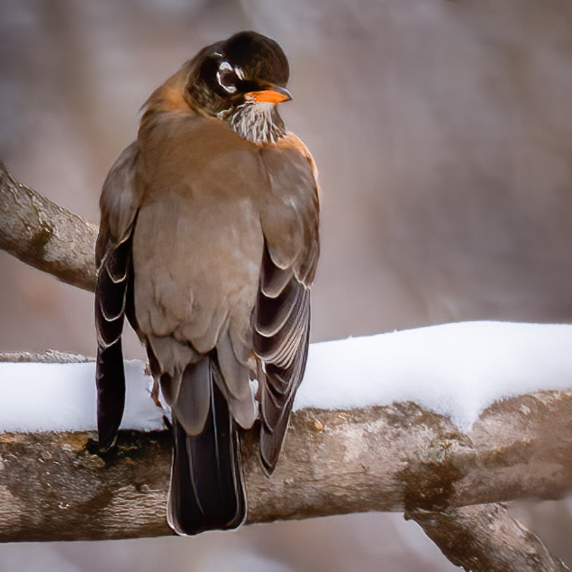
Marie, another perfect example of the large file digital cameras (45 Megapixels) allowing massive cropping and still retaining sharpness and detail. The composition is great and the colors are very vivid. The snow is not overexposed and the background is not distracting. Very nice winter nature image. |
Mar 2nd |
| 72 |
Mar 21 |
Comment |
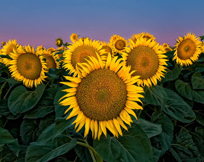
Walt, you created a wonderful image of the sunflowers in pristine condition. Sharp, strong colors, intact petals and perfect leaves. The lighting in the background complements the colors. I would just crop on each side to remove the amputated flowers. The B&W conversion does not do justice to the image.
This is what I had in mind |
Mar 2nd |
 |
7 comments - 2 replies for Group 72
|
| 89 |
Mar 21 |
Comment |
Gary, this image of the owlet is technically very good: sharp, colors, soft and non distracting background, position on the frame, but perhaps I would crop a little from either side and from the top. I wonder if you were able to capture a sequence of images (burst) since the essence of this birds is in their intense yellow eyes, so look and see if you have one with both eyes facing you. |
Mar 9th |
1 comment - 0 replies for Group 89
|
| 90 |
Mar 21 |
Comment |
Dan, beautiful and sharp flowers. Being this a macro photo that was planned I probably would have used a different vantage point, first to avoid the flowers in the back, and probably would have taken out that horizontal stick. The focus staking works wonders. |
Mar 9th |
| 90 |
Mar 21 |
Comment |
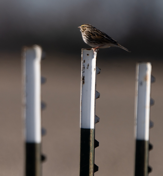
Dan, interesting idea, but there is a ton of empty and distracting space in this image, that you titled Sparrow Depth of Field, but the bird is insignificant in the whole context of the image. I also like the fact that you used the rule of odds, but that also happens with 3. I cropped the image as is, and now the Sparrow is a major player and you are still showing the narrow depth of field. |
Mar 9th |
 |
2 comments - 0 replies for Group 90
|
| 94 |
Mar 21 |
Comment |
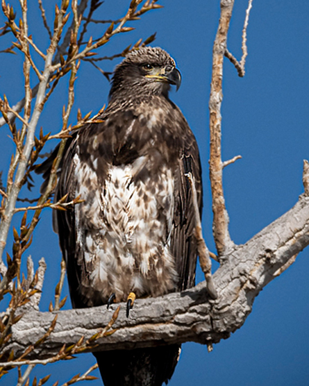
Christine, this happens to all of us. We see a bird that is not frequent in our backyard and we get all exited to get the shot but we tend to forget to think about composition. Any bird photo requires the whole bird and a tack sharp eye (this you have). Also you had another 180 mm of zooming power and you could have used a portrait orientation to get the "perfect shot" and would not need to crop. About this image I would crop it as this |
Mar 9th |
 |
1 comment - 0 replies for Group 94
|
24 comments - 13 replies Total
|