Activity for User 419 - Dr Isaac Vaisman - ivaisman@bellsouth.net
Avatar
Close this Tab when done
2528 Comments / 980 Replies Posted
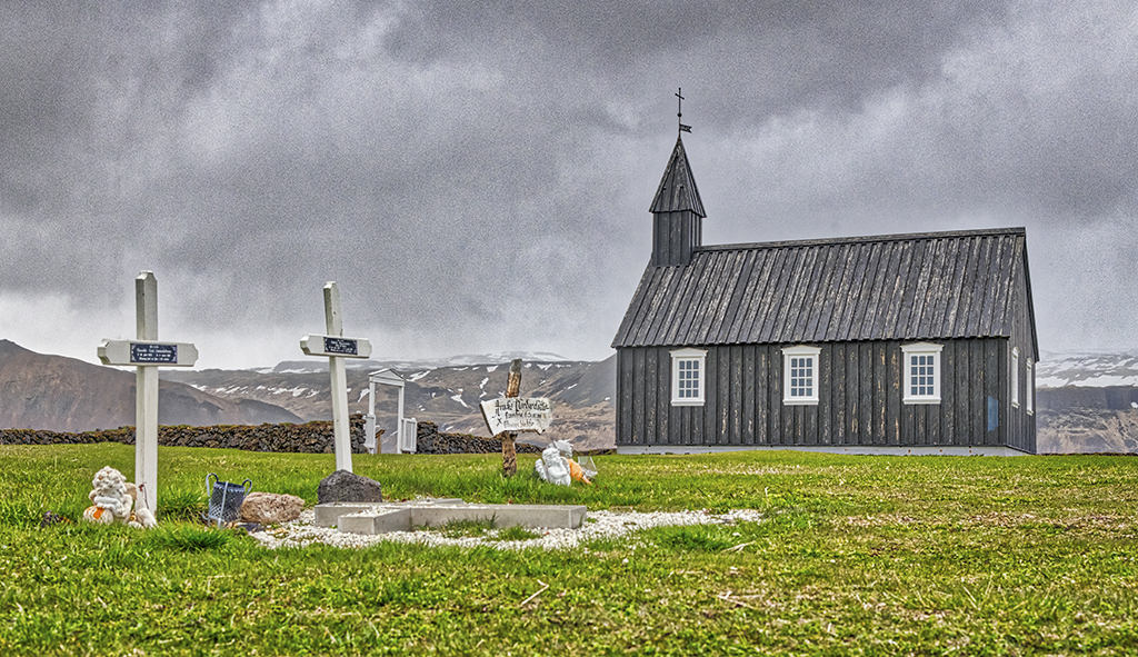
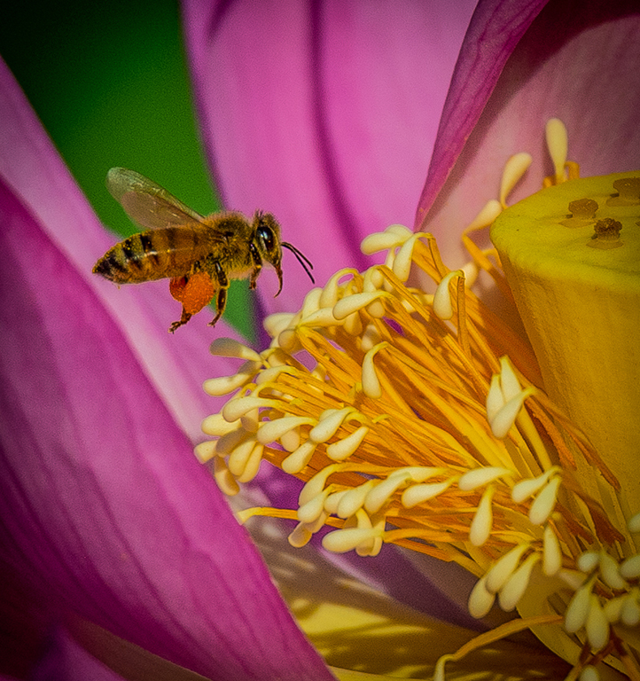
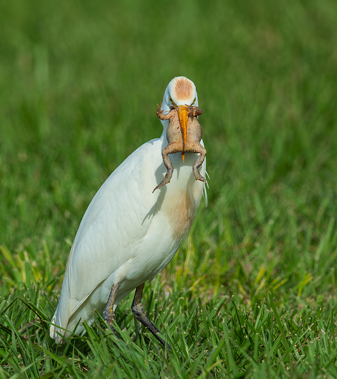
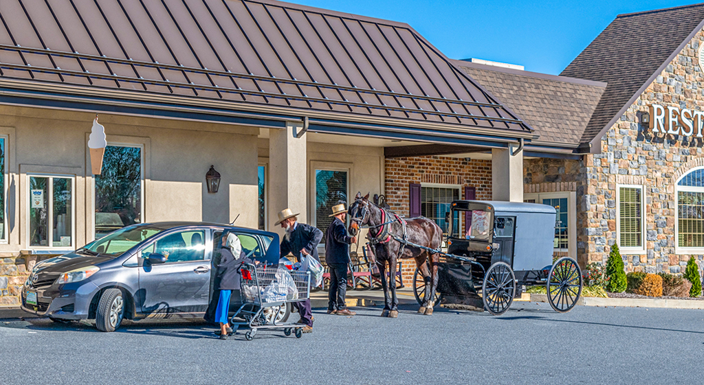
414 Images Posted
| = Current Round | = Previous Round |
| Group 04 | |||||||||||
|---|---|---|---|---|---|---|---|---|---|---|---|
 Apr 26 |
 Mar 26 |
 Feb 26 |
 Jan 26 |
 Dec 25 |
 Nov 25 |
 Oct 25 |
 Sep 25 |
 Aug 25 |
 Jul 25 |
 Jun 25 |
 May 25 |
 Apr 25 |
 Mar 25 |
 Feb 25 |
 Jan 25 |
 Dec 24 |
 Nov 24 |
 Oct 24 |
 Sep 24 |
 Aug 24 |
 Jul 24 |
 Jun 24 |
 May 24 |
 Apr 24 |
 Mar 24 |
 Feb 24 |
 Jan 24 |
 Dec 23 |
 Nov 23 |
 Oct 23 |
 Sep 23 |
 Aug 23 |
 Jul 23 |
 Jun 23 |
 May 23 |
 Apr 23 |
 Mar 23 |
 Feb 23 |
 Jan 23 |
 Dec 22 |
 Nov 22 |
 Oct 22 |
 Sep 22 |
 Aug 22 |
 Jul 22 |
 Jun 22 |
 May 22 |
 Apr 22 |
 Mar 22 |
 Feb 22 |
 Jan 22 |
 Dec 21 |
 Nov 21 |
 Oct 21 |
 Sep 21 |
 Aug 21 |
 Jul 21 |
 Jun 21 |
 May 21 |
 Apr 21 |
 Mar 21 |
 Feb 21 |
 Jan 21 |
 Dec 20 |
 Nov 20 |
 Oct 20 |
 Sep 20 |
 Aug 20 |
 Jul 20 |
 Jun 20 |
 May 20 |
 Apr 20 |
 Mar 20 |
 Feb 20 |
 Jan 20 |
 Dec 19 |
 Nov 19 |
 Oct 19 |
 Sep 19 |
 Aug 19 |
 Jul 19 |
 May 19 |
 Apr 19 |
 Mar 19 |
 Feb 19 |
 Jan 19 |
 Dec 18 |
 Nov 18 |
 Oct 18 |
 Sep 18 |
 Aug 18 |
 Jun 18 |
 May 18 |
 Apr 18 |
 Mar 18 |
 Feb 18 |
 Jan 18 |
 Dec 17 |
 Nov 17 |
 Oct 17 |
 Sep 17 |
 Aug 17 |
 Jul 17 |
 Jun 17 |
 May 17 |
 Apr 17 |
 Mar 17 |
 Feb 17 |
 Jan 17 |
||||||||||
| Group 15 | |||||||||||
 Apr 26 |
 Mar 26 |
 Feb 26 |
 Jan 26 |
 Dec 25 |
 Nov 25 |
 Oct 25 |
 Sep 25 |
 Aug 25 |
 Jul 25 |
 Jun 25 |
 May 25 |
 Apr 25 |
 Mar 25 |
 Feb 25 |
 Jan 25 |
 Dec 24 |
 Nov 24 |
 Oct 24 |
 Sep 24 |
 Aug 24 |
 Jul 24 |
 Jun 24 |
 May 24 |
 Apr 24 |
 Mar 24 |
 Feb 24 |
 Jan 24 |
 Dec 23 |
 Nov 23 |
 Oct 23 |
 Sep 23 |
 Aug 23 |
 Jul 23 |
||
| Group 58 | |||||||||||
 Apr 26 |
 Mar 26 |
 Feb 26 |
 Jan 26 |
 Dec 25 |
 Nov 25 |
 Oct 25 |
 Sep 25 |
 Aug 25 |
 Jul 25 |
 Jun 25 |
 May 25 |
 Apr 25 |
 Mar 25 |
 Feb 25 |
 Jan 25 |
 Dec 24 |
 Nov 24 |
 Oct 24 |
 Sep 24 |
 Aug 24 |
 Jul 24 |
 Jun 24 |
 May 24 |
 Apr 24 |
 Mar 24 |
 Feb 24 |
 Jan 24 |
 Dec 23 |
 Nov 23 |
 Oct 23 |
 Sep 23 |
 Aug 23 |
 Jul 23 |
 Jun 23 |
 May 23 |
 Apr 23 |
 Mar 23 |
 Feb 23 |
 Jan 23 |
 Dec 22 |
 Nov 22 |
 Oct 22 |
 Sep 22 |
 Aug 22 |
 Jul 22 |
 Jun 22 |
 May 22 |
 Apr 22 |
 Mar 22 |
 Feb 22 |
 Jan 22 |
 Dec 21 |
 Nov 21 |
 Oct 21 |
 Sep 21 |
 Aug 21 |
 Jul 21 |
 Jun 21 |
 May 21 |
 Apr 21 |
 Mar 21 |
 Feb 21 |
Jan 21 |
 Dec 20 |
 Nov 20 |
 Oct 20 |
 Sep 20 |
 Aug 20 |
 Jul 20 |
 Jun 20 |
 May 20 |
 Apr 20 |
 Mar 20 |
 Feb 20 |
 Jan 20 |
 Dec 19 |
 Nov 19 |
 Oct 19 |
 Sep 19 |
 Aug 19 |
 Jul 19 |
 Jun 19 |
 Apr 19 |
 May 19 |
 Mar 19 |
 Feb 19 |
 Jan 19 |
 Dec 18 |
 Nov 18 |
 Oct 18 |
 Sep 18 |
 Aug 18 |
 Jun 18 |
 Jul 18 |
 May 18 |
 Apr 18 |
 Mar 18 |
 Feb 18 |
 Jan 18 |
 Dec 17 |
 Nov 17 |
 Oct 17 |
 Sep 17 |
 Aug 17 |
 Jul 17 |
 Jun 17 |
 May 17 |
 Apr 17 |
 Mar 17 |
 Feb 17 |
 Jan 17 |
||||||||
| Group 59 | |||||||||||
 Apr 26 |
 Mar 26 |
 Feb 26 |
 Jan 26 |
 Nov 25 |
 Oct 25 |
 Sep 25 |
 Aug 25 |
 Jul 25 |
 Jun 25 |
 May 25 |
 Apr 25 |
 Mar 25 |
 Feb 25 |
 Jan 25 |
 Dec 24 |
 Nov 24 |
 Oct 24 |
 Sep 24 |
 Aug 24 |
 Jul 24 |
 Jun 24 |
 May 24 |
 Apr 24 |
 Mar 24 |
 Feb 24 |
 Jan 24 |
 Dec 23 |
 Nov 23 |
 Oct 23 |
 Sep 23 |
 Aug 23 |
 Jul 23 |
 Jun 23 |
 May 23 |
 Apr 23 |
 Mar 23 |
 Feb 23 |
 Jan 23 |
 Dec 22 |
 Nov 22 |
 Oct 22 |
 Sep 22 |
 Aug 22 |
 Jul 22 |
 Jun 22 |
 May 22 |
 Apr 22 |
 Mar 22 |
 Feb 22 |
 Jan 22 |
 Dec 21 |
 Nov 21 |
|||||||
| Group 72 | |||||||||||
 Apr 26 |
 Mar 26 |
 Feb 26 |
 Jan 26 |
 Dec 25 |
 Nov 25 |
 Oct 25 |
 Sep 25 |
 Aug 25 |
 Jul 25 |
 Jun 25 |
 May 25 |
 Apr 25 |
 Mar 25 |
 Feb 25 |
 Jan 25 |
 Dec 24 |
 Nov 24 |
 Oct 24 |
 Sep 24 |
 Aug 24 |
 Jul 24 |
 Jun 24 |
 May 24 |
 Apr 24 |
 Mar 24 |
 Feb 24 |
 Jan 24 |
 Dec 23 |
 Nov 23 |
 Oct 23 |
 Sep 23 |
 Aug 23 |
 Jul 23 |
 Jun 23 |
 May 23 |
 Apr 23 |
 Mar 23 |
 Feb 23 |
 Jan 23 |
 Dec 22 |
 Nov 22 |
 Oct 22 |
 Sep 22 |
 Aug 22 |
 Jul 22 |
 Jun 22 |
 May 22 |
 Apr 22 |
 Mar 22 |
 Feb 22 |
 Jan 22 |
 Dec 21 |
 Nov 21 |
 Oct 21 |
 Sep 21 |
 Aug 21 |
 Jul 21 |
 Jun 21 |
 May 21 |
 Apr 21 |
 Mar 21 |
 Feb 21 |
 Jan 21 |
 Dec 20 |
 Nov 20 |
 Oct 20 |
 Sep 20 |
 Aug 20 |
 Jul 20 |
 Jun 20 |
 May 20 |
 Apr 20 |
 Mar 20 |
 Feb 20 |
 Jan 20 |
 Dec 19 |
 Nov 19 |
 Oct 19 |
 Sep 19 |
 Aug 19 |
 Jul 19 |
 Jun 19 |
 May 19 |
 Apr 19 |
 Mar 19 |
 Feb 19 |
 Jan 19 |
 Dec 18 |
 Nov 18 |
 Oct 18 |
 Sep 18 |
 Aug 18 |
 Jul 18 |
 Jun 18 |
 May 18 |
 Apr 18 |
 Mar 18 |
 Feb 18 |
 Jan 18 |
 Dec 17 |
 Nov 17 |
 Oct 17 |
 Sep 17 |
 Aug 17 |
|||