|
| Group |
Round |
C/R |
Comment |
Date |
Image |
| 1 |
Aug 20 |
Comment |
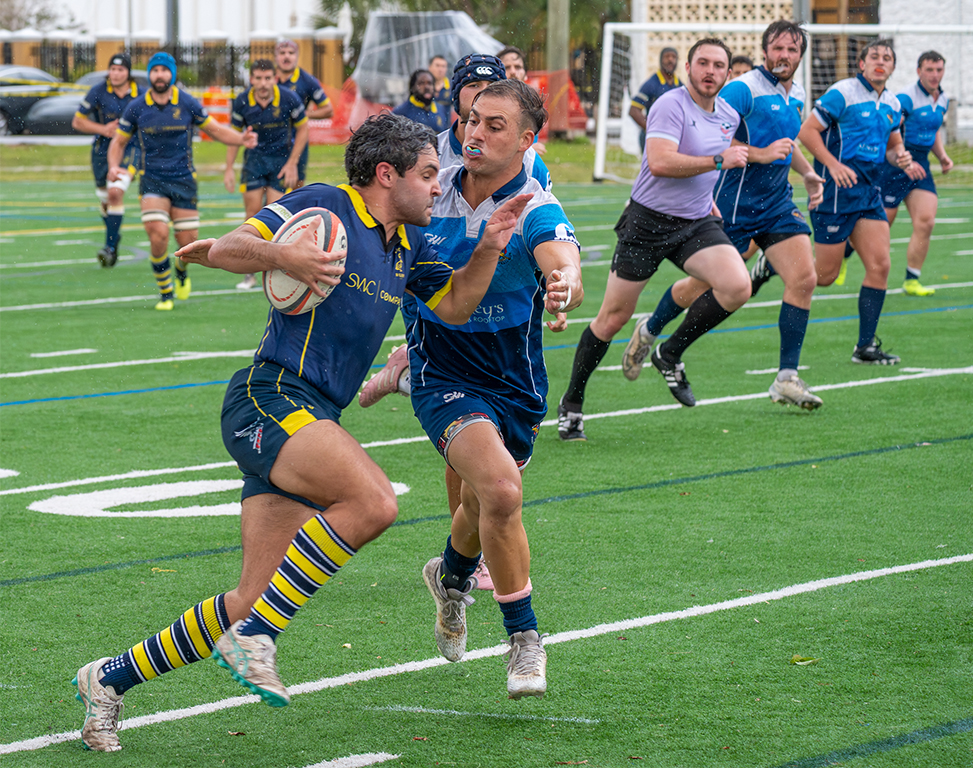
Neal, beautiful image, sharp, great color. I find very interesting the effect produced by the stroke inside the image. It makes the lower flower come out of the frame..... |
Aug 11th |
1 comment - 0 replies for Group 1
|
| 2 |
Aug 20 |
Comment |
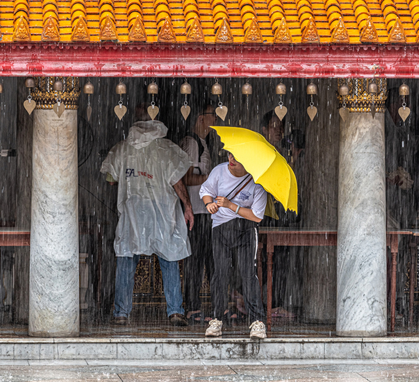
Hung, very nice image of the Golden Temple. Very tight crop makes you want to see more. In the lower 1/3 foreground there is a blue something that is distracting. Very interesting frame. Wonder if you could share how to do it. |
Aug 11th |
1 comment - 0 replies for Group 2
|
| 4 |
Aug 20 |
Reply |
I just learned a technique to create the "godlights": Briscoe light technique. |
Aug 24th |
| 4 |
Aug 20 |
Reply |
Ian, this is using Silver Efex 2 with the full dynamic filter option |
Aug 17th |
 |
| 4 |
Aug 20 |
Comment |
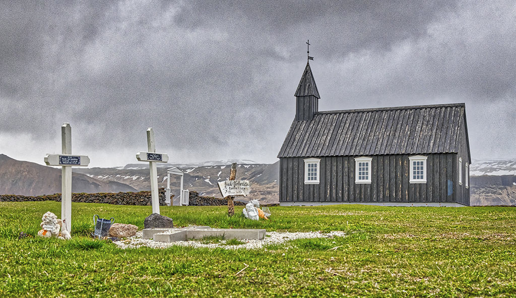
Bill, nice Church. It really could work as a multifaith building (Coexist) with the large star of David and the two crosses. Very sharp and nice handling of the colors. The sky seems a little HDR like to me. I guess that the godlights Joe mentions are the bright areas on the walls ? |
Aug 11th |
| 4 |
Aug 20 |
Reply |
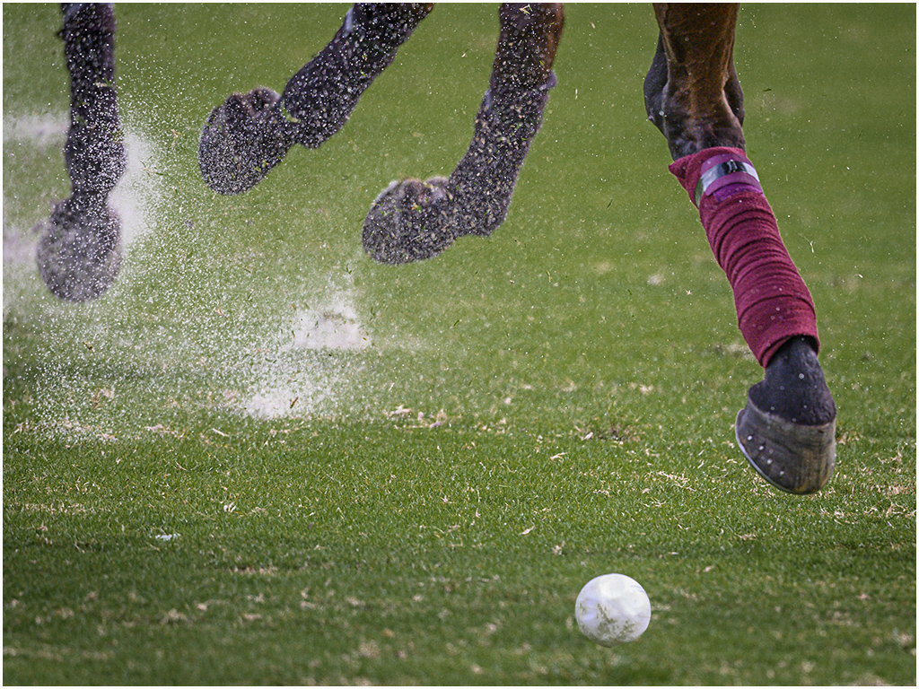
Vella, if I crop the image it would bring the tail of the horse too close to the edge creating tension. I fixed it using content aware fill |
Aug 6th |
 |
| 4 |
Aug 20 |
Comment |
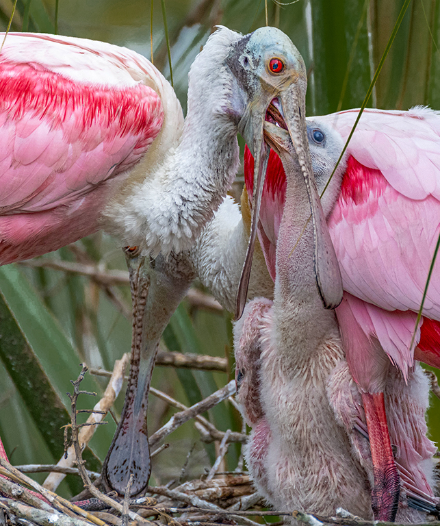
Ian, beautiful black swan. It is unfortunate that the background is also dark so the bird blends into it loosing detail and beauty. Using a selection of the dark area in the head and neck and adding light, reducing a blue hue, also adding some light to the eye, now makes the swan stand out better. The dark green background works as a "red (green) carpet" leading line towards the swan. The blue on the sides complement the image. |
Aug 5th |
 |
| 4 |
Aug 20 |
Comment |
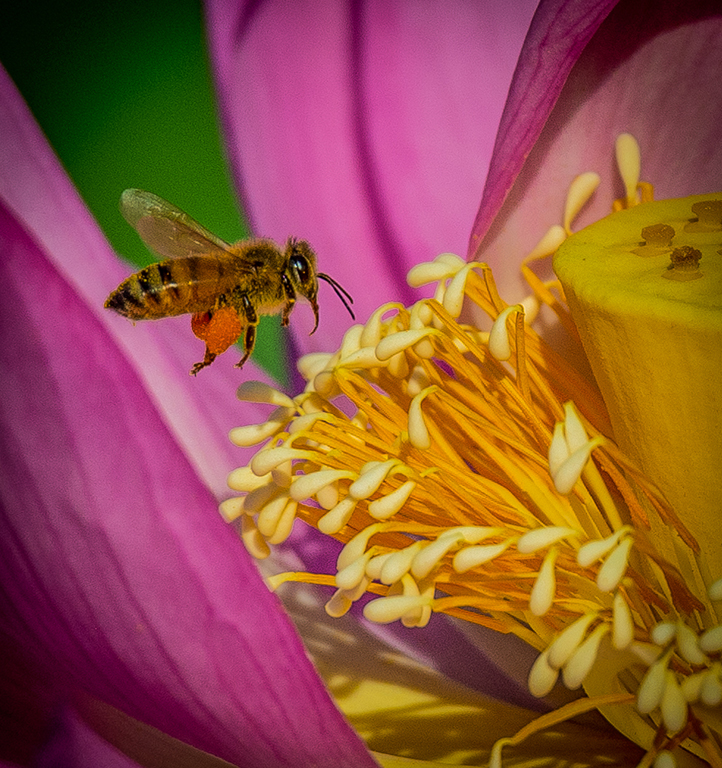
Found an interesting article that shows all the possibilities of flying critters "bee look alike"
https://www.canr.msu.edu/news/insects-that-look-like-bees |
Aug 5th |
| 4 |
Aug 20 |
Reply |
OK Guy, with the help of some "Reconstructive Surgery" the problem has been resolved.
|
Aug 2nd |
 |
| 4 |
Aug 20 |
Comment |
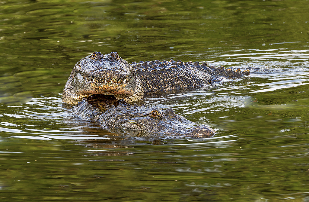
Vella, Good PP to obtain the residual sunset colors. The caiman must have come out the take a breath of air, and he became a prey for the big bees. Were the photographers also attacked by the bees ? It is sharp, and the landscape crop improved the composition. On second look I can see the tail of the fish that must have been thrown to the caiman..... |
Aug 2nd |
| 4 |
Aug 20 |
Comment |
Erik, as you; I was unable to see the comet Neowise after three attempts: clouds, very bright sky (light contamination). Anyway, this image is unusual for the effect produced by the lightning on the sea shore. It looks like it is on fire. The Milky Way complements and makes the image. I like your oblique vantage point. Your 25 seconds exposure was long enough to give you the full sky and the Milky Way, but not long enough to create strikes on the stars. On my monitor the image has a very strong magenta hue. Patience pays off. |
Aug 2nd |
| 4 |
Aug 20 |
Comment |
Joe, obviously it is a distorted reflection of the colorful chairs and tables of the restaurant on a metal sheet screwed to the side of a sort of shelves unit with restaurant items on the top (seeing on your original). Well cropped and adjusted. Your manipulation rendered tornasol (sheen) like colors. as always you keep a very open and creative eye. |
Aug 2nd |
| 4 |
Aug 20 |
Comment |
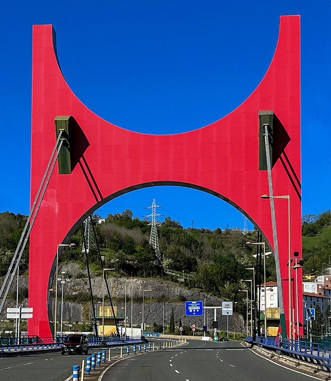
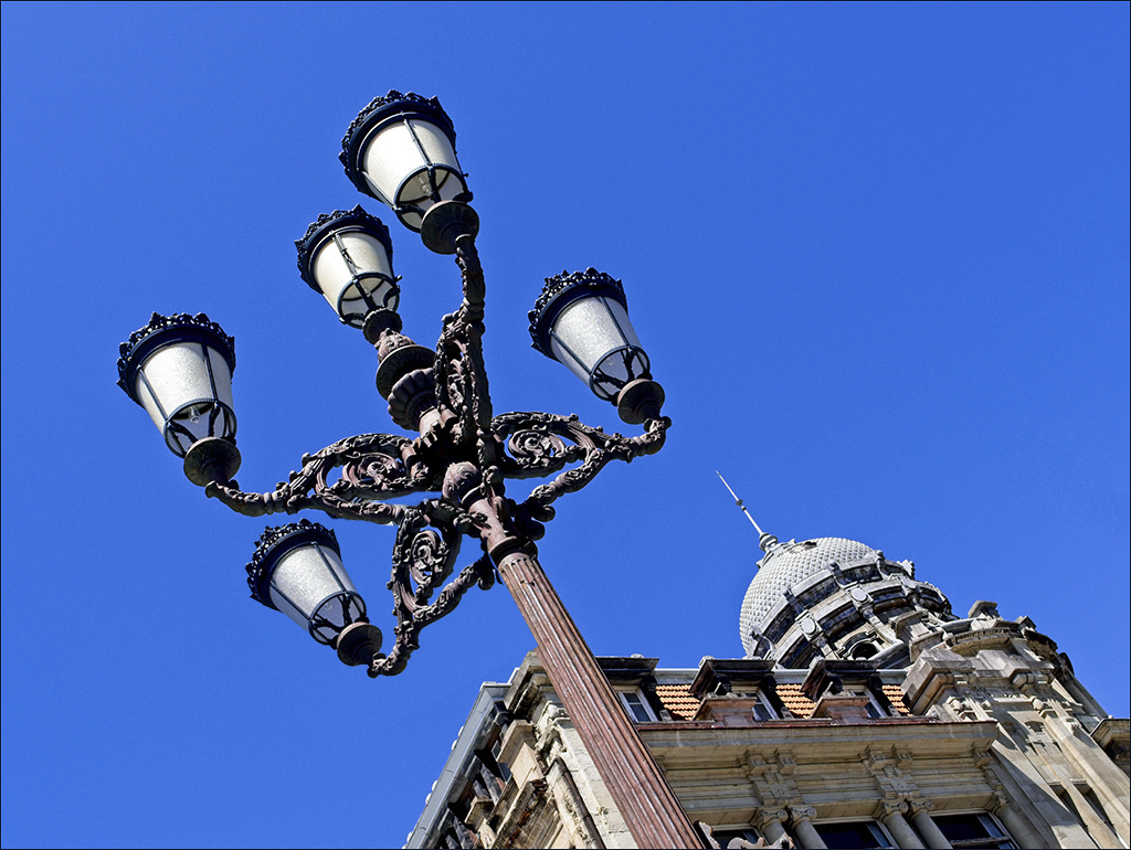
Guy, interesting vantage point. Image is sharp. Beautiful colors and non distracting and contrasting blue sky background to make the Bilbao Lamps stand out. The juxtaposed building adds interest to the image, and I see you kept the lines parallel, which prevented you from moving slightly to be able to obtain complete separation of the five lamps. Many times is a difficult dilemma to resolve on the spot. |
Aug 2nd |
7 comments - 4 replies for Group 4
|
| 13 |
Aug 20 |
Comment |
Paul, very artistic creation and original. I believe the "O" in hot is a garlic head ??which seems to be overexposed and my eyes go straight to it. Also the light coming from the left (my left) is creating bright spots on the hot peppers. Perhaps decreasing the brightness would help somehow and also intensify the colors. I think the strong colored background is competing against the peppers which are the focal point. I am a hot sauce lover. In fact I presented an image in January 2020 in my group 04 (http://psadigital.org/group04/image.php?iid=43312)
Well thought !! |
Aug 12th |
1 comment - 0 replies for Group 13
|
| 17 |
Aug 20 |
Comment |
Peter, I thinks this is a timely image and really pays tribute to Max. It seems that time has stopped in his office/hang out place. In addition to wrist watches he shows to be a fan of old cars. He looks very pensive and I am sure a lot is going through his mind. The image is sharp and the B&W handling is very good. |
Aug 2nd |
1 comment - 0 replies for Group 17
|
| 25 |
Aug 20 |
Comment |
Ruth, the whole image is very soft and lacks detail of this wonderful critters. |
Aug 11th |
1 comment - 0 replies for Group 25
|
| 48 |
Aug 20 |
Comment |
Margaret, we also have been to the Glenstone Museum in Potomac-MD which is private, a couple of times, and each one with different pieces of art. This year in February before COVID-19 we visited the new construction of several galleries. Your image is very colorful and sharp. I prefer the original since the clouds create like a veil. I would add a little light to the shadows to bring out more color and detail. |
Aug 11th |
1 comment - 0 replies for Group 48
|
| 58 |
Aug 20 |
Reply |
Desaturated |
Aug 14th |
 |
| 58 |
Aug 20 |
Reply |
Gloria, you mean like this... |
Aug 13th |
 |
| 58 |
Aug 20 |
Comment |
OK Bruce, here we go. Using some plastic surgery reconstruction (the Doctor in me...) I used your original image and the second one, taken within a few seconds from the other and I joined them together. It took some warping and levels adjustments as well as content aware fill, and cropped it to obtain the final image. The vantage points were slightly off one from the other, and your PP changed the characteristics of the colors, but I did the best I can. If you work from the original raw images before any PP the result will be much better. |
Aug 13th |
 |
| 58 |
Aug 20 |
Comment |
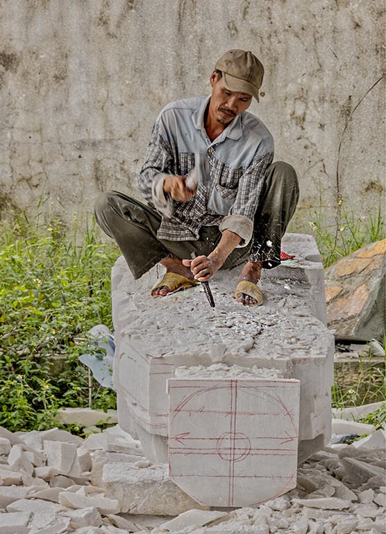
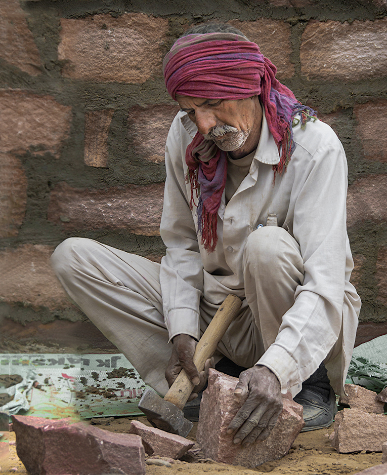
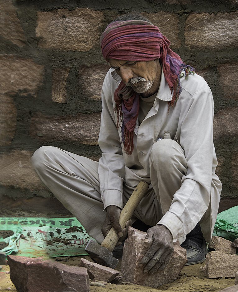
Bruce, good photojournalistic/street photo showing the worker deep in thought and doing his job. Incredible how they work the stones with bare hands and a hammer. The earth tones of his clothing and stone background is broken by the very bright green mat he is sitting on, but it is what it is. Good composition with his lower body and arms in a triangular shape. It is unfortunate that his right knee is just at the frame edge creating some tension. I just wonder if you have a little more real estate to his right before cropping it. The colors are well balanced and it is sharp. |
Aug 12th |
| 58 |
Aug 20 |
Comment |
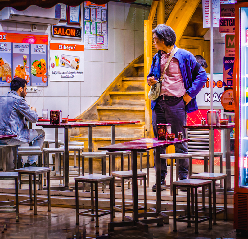
Hassan, interesting image. I had the same experience when we visited Istanbul a few years ago, We went to Ortakoy and ordered our food signaling with the finger to the waiter. Anyway, you image is full of color, in fact I would say too saturated especially the orange/yellow tones and has a HDR look . The refrigerator full of soft drinks is so illuminated and with multicolor containers taking almost 1/3 of the real estate, which in actuality are competing with the main subject which is the man trying to figure out what to order. The yellow staircase takes our view up and makes us wonder what is up there. The man at the opposite edge eating is right at the edge of the frame creating some tension. I did a few od adjustments including cropping a little on the top eliminating the numbers which are a little distracting, did a content aware fill on the lower corner, decreased a little bit the saturation of the yellow/orange on the man's skin, and cropped out the large refrigerator to a square shape leaving just a little edge. |
Aug 6th |
 |
| 58 |
Aug 20 |
Comment |
Gloria, I find your image very interesting. You captured the peak of the action with the axe frozen in midair and sharp. Obviously your lens was not wide enough from your vantage point to include the whole body of both the thrower and the attendant. It is always challenging to maneuver around the spectators to avoid obstruction, or to backup a little further to compensate your lack of wide angle. I am guessing that you used manual focus since it is tack sharp on the individuals, as well as the screen protecting the venue. |
Aug 3rd |
| 58 |
Aug 20 |
Comment |
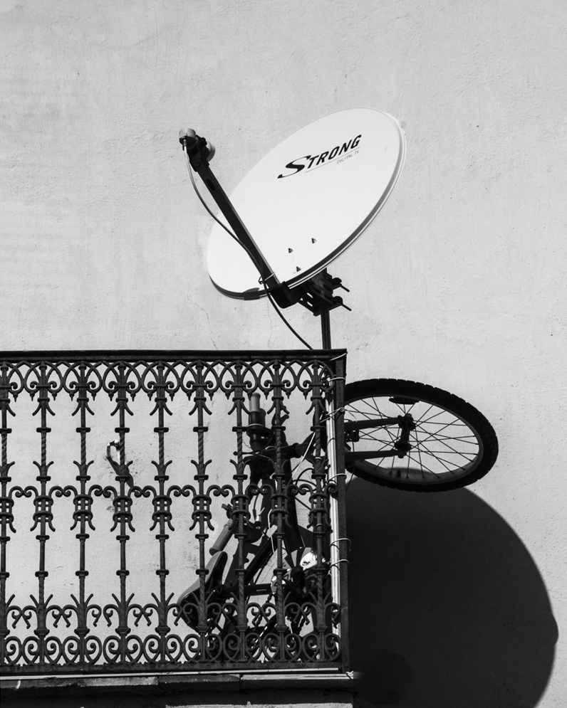
Daniel, interesting observation/creation. I like the juxtaposition of the satellite antenna disk shadow against the bike's wheel. It creates an abstract figure. It is sharp. I think that your crop has a lot of empty space that does not help the image, in fact; the dark column on the right of the image is distracting, as is the empty space above the antenna. I cropped the image as a portrait and 8x10 relation , made it straight, added some contrast and removed a few black spots in the background. I am sure that if you return at different times of the day you will get a variety of shapes. |
Aug 2nd |
 |
| 58 |
Aug 20 |
Comment |
Randy, indeed this image denotes chaos as you describe. the signs give the location. The B&W interpretation is well accomplished, but the chaos prevent me to stop at a focal point, since in every inch of the real estate something is going on. I would have labeled it Pandemonium. |
Aug 2nd |
6 comments - 2 replies for Group 58
|
| 67 |
Aug 20 |
Comment |
Larry, thank you for this image. First time I see this bird, and never heard of it before (27 years in South Florida and more than 15 photographing birds). |
Aug 2nd |
1 comment - 0 replies for Group 67
|
| 69 |
Aug 20 |
Comment |
Dean, another example of being at the right place at the right time. Very good composite. Very little light contamination that you were able to manage very well. |
Aug 11th |
1 comment - 0 replies for Group 69
|
| 72 |
Aug 20 |
Comment |
This what we have here is the essence of the digital dialogue discussion groups. We learn tips and tricks of the trade from each other. Thanks Bruce and Randy. |
Aug 24th |
| 72 |
Aug 20 |
Reply |
Randy, interesting technique. I just learned something new to play with. |
Aug 24th |
| 72 |
Aug 20 |
Comment |
Great comments and suggestions. Thanks to all of you. |
Aug 24th |
| 72 |
Aug 20 |
Reply |
Randy, now on second thought (in reality I missed it the first time) I would have left the water as you suggested. |
Aug 24th |
| 72 |
Aug 20 |
Reply |
Bruce, could you share a photo of your perches |
Aug 12th |
| 72 |
Aug 20 |
Comment |
Bruce, this image is outstanding: sharpness, composition (crop), muted background, owl's pose ready to take off, management of the whites. Oh well I can not find anything to suggest to improve it. |
Aug 11th |
| 72 |
Aug 20 |
Reply |
Walt, marked improvement in the detail removing the graininess. |
Aug 5th |
| 72 |
Aug 20 |
Comment |
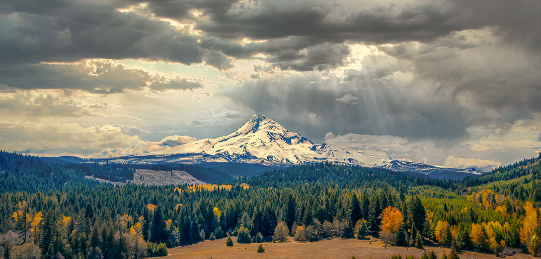
Walt, with the use of the Drones Photography, it has taken photography to a whole different ball game and perspective. The vantage points are limitless (except where they are forbidden...)In your description you make emphasis on the cloudy sky with the added gift of light rays coming through the clouds. I did a few adjustments to your image: Cropped to prioritize the sky, using an adjustment point in Viveza 2 from the Nick collection added color and structure as well as saturation to the area of the sky where the rays are. Added some light to the trees in the foreground since the colors are bright and pre-fall season, specially the area where the rays are illuminating. |
Aug 3rd |
 |
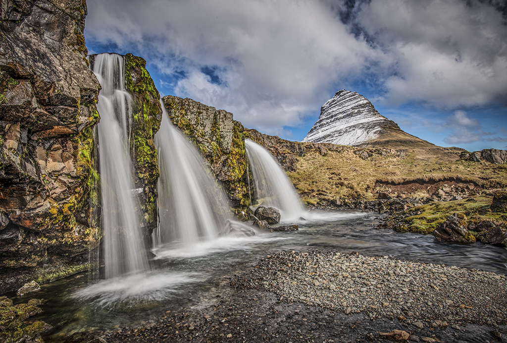
| 72 |
Aug 20 |
Comment |
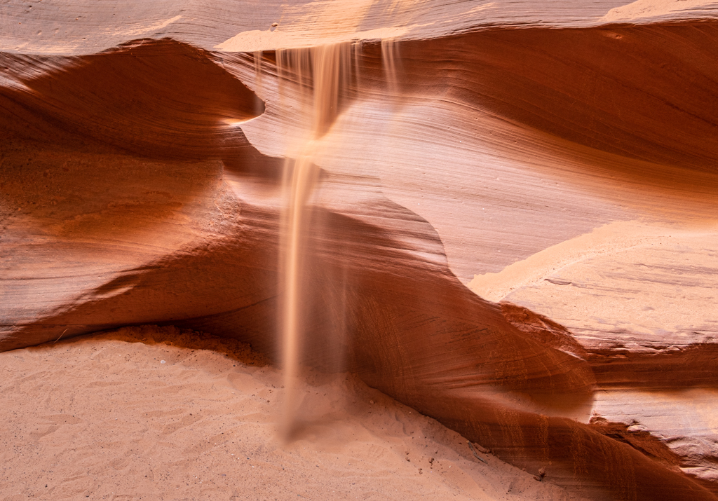
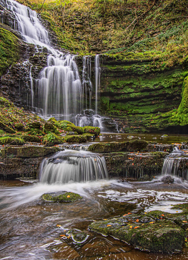
Adrian, what a lovely waterfall. Great composition taking a very low vantage point to be able to include all the steps of the fall and giving the impression (if not real) that the camera was at the water. The shutter speed was slow enough to obtain the desired silky look in the water any time a waterfall is photographed. The colors are well handled and your PP brought out the essence of them. I do see a slight yellowish hue in the water specially in the lower levels that I do not know if it is real. Anyways, for my taste; I reduced the brightness in the water and now we see more detail, and reduced the yellowish hue, and I flipped the image. |
Aug 3rd |
 |
| 72 |
Aug 20 |
Reply |
"little sections for the grape jelly (which they LOVE)" that explains the redish/purplish drooling..... |
Aug 3rd |
| 72 |
Aug 20 |
Comment |
Mary, once again you are treating us with your magnificent underwater images. Very colorful fish. Lots of other marine items in the frame. Your PP cleaned the distracting white sea fan. I just wonder if you could have used a smaller f/stop to obtain a better DOF, since the back of the fish is soft, but I do not know if it is my imagination since in the original the colors are brighter which shows more of the landscape, and the details more sharp. |
Aug 2nd |
| 72 |
Aug 20 |
Comment |
Marie, indeed the Baltimore Oriole is having a feast. He is still drooling the fruit juices (bluberries ??). You used a crop sensor camera (1.5 x factor) and the lens at 550 mm which in fact represents 825 mm. Were you hand holding ?? or on a tripod. Your shutter speed was only 1/200 second. It is always recommended to set your shutter speed to the inverse of the length of the lens max (600 x 1.5= 900) so it should have been at 1/1000 sec. I am surprised that the details on the feathers are still present, however a little soft. The Oriol is the National Bird of Venezuela (where I am originally from) and it is called Turpial. I would reduce the saturation a little bit. The background is perfect. |
Aug 2nd |
| 72 |
Aug 20 |
Comment |
Randy, great capture. Very nice composition, and three of the five bears are looking at you. You were able to separate the bush in the foreground from obstructing the cubs. You used a 45.7 Megapixels camera with a 500 mm lens, but you must have been very far from them since the crop is revealing a lot of granulation (which was expected in film photography). Please send me the original out of the camera without adjustments for reference. |
Aug 2nd |
| 72 |
Aug 20 |
Reply |
Yes Randy, and welcome again to our group. As you said, Topaz Sharpen AI works sometimes, but not always. Here, it did improve the quality of the image somewhat. |
Aug 1st |
8 comments - 6 replies for Group 72
|
| 92 |
Aug 20 |
Comment |
Geoff, you nailed it. Pick of action. Sharp. Good that her head is framed by the side of the tent in the back, this way there is no distraction and you can appreciate the expression on her face. The background is well managed, and the B&W interpretation is well done. Perhaps the crop is a little tight creating some tension. |
Aug 2nd |
1 comment - 0 replies for Group 92
|
30 comments - 12 replies Total
|