|
| Group |
Round |
C/R |
Comment |
Date |
Image |
| 3 |
Sep 19 |
Comment |
Marion(my wife's name as well), this is a very nice image, tack sharp from the front to the back with great composition created by the consecutive and decreasing size arches, augmented by the different shadows. The colors are also well balanced. Great image. |
Sep 5th |
1 comment - 0 replies for Group 3
|
| 4 |
Sep 19 |
Comment |
Guy, very intense blue hour. The bridge has a very interesting and elaborated architecture. The gargolytes line very nice the different curves. Obviously, it is a popular site for walking given by the many people on it. It is sharp, and the colors well managed with a 4000 ISO |
Sep 17th |
| 4 |
Sep 19 |
Comment |
If you want to see more of Thailand go to group 72 |
Sep 13th |
| 4 |
Sep 19 |
Reply |
Guy, and I just learned a new word |
Sep 10th |
| 4 |
Sep 19 |
Reply |
Thanks Thomas, I agree with you now, but I do not have the lower part in the original frame. I wish I did. Good reverse engineering ! |
Sep 9th |
| 4 |
Sep 19 |
Reply |
Thomas, I am not sure if I follow you ? Could you do it in the image and post it. |
Sep 9th |
| 4 |
Sep 19 |
Comment |
Ian, this man is doing a typical maneuver of Capoeira which is an Afro-Brazilian martial art that combines elements of dance, acrobatics, and music. Great capture at only 1/125 sec where the background is sharp as is most of the body of the performer except his legs which denotes the expected fast movement. Also interesting is how the members of the orchestra in the back are framed by the man's legs. Good composition under the circumstances. |
Sep 9th |
| 4 |
Sep 19 |
Reply |
Thomas, I prefer the third image without the disturbing red background, and the added bonus of a green candy. |
Sep 9th |
| 4 |
Sep 19 |
Comment |
Joe, I must add to Guy's observations that this lock was "adapted" to a new location: the keyhole in the lock is not followed by a perforation in the red frame, as it is not the missing bolt, finished by a skewed placement on the frame. 1/20 sec handheld is a lot to be asked for a human "bipod". I like the colors and the effect of time over the metal. |
Sep 9th |
| 4 |
Sep 19 |
Comment |
Thomas, god portrait of the Crowned crane. The bird is sharp, well placed in the frame. I personally do not like the painterly effect of the Topaz impression filter specially in the feathers. Another issue is the bright red area in the background which is competing very strongly against the head of the crane and it is very distracting as well. I would love to see the original to think what can be done differently. |
Sep 5th |
| 4 |
Sep 19 |
Comment |
Bill, great contrast from the classic to the modern architecture. I like the skewed angle you placed the buildings and the way they align. The blue glass has room to grow into the sky. Very sharp. There is an extra ingredient of the reflection on the side. Good eye. |
Sep 3rd |
| 4 |
Sep 19 |
Comment |
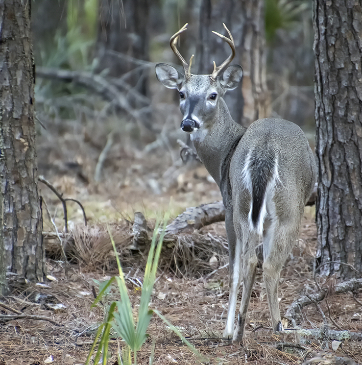
Erik, perfect timing. The young buck is almost camouflaged within the landscape. He is very sharp throughout and the cream is that he is looking at you and has a nice catch light. Additionally, he is framed twice: by the tree trunks as well as the three green bushes, two in the back which are out of focus and the one in the front. I cropped a little of the trunk tree on the right of the frame (my left) to remove the green bark which is slight distracting and a little from the bottom, still keeping the square format. |
Sep 3rd |
 |
7 comments - 4 replies for Group 4
|
| 5 |
Sep 19 |
Comment |
Barbara, I would also try to cover the fringe line on the cherries on the right side of the frame (my left) that was created after you changed the color of the plate to grey, and would try the dessaturate the blue hue on the cherries. |
Sep 3rd |
1 comment - 0 replies for Group 5
|
| 58 |
Sep 19 |
Comment |
Lauren, really interesting and busy image. It is a bit dark on my monitor. Indeed Pang Mei is the center of interest, but there are a lot of other things going on that compete somehow with her. First, I added some light to the shadows, I cropped it to eliminate some distracting items, and to take advantage of the leading lines in both sides, the blue table corner that leads you to Pang Mei enjoying her own concoctions, and the pipe on the ceiling . in the oposite side to guide you to the background and figure out what is going on there. The man carrying the bag of eggs also has a main role. It is unfortunate that the hand of the standing man converges with the walking man's hand, making it imposible to do a good cleaning plus the fact that the image submitted is of very low resolution. |
Sep 16th |
 |
| 58 |
Sep 19 |
Reply |
Gloria, good point !! |
Sep 13th |
 |
| 58 |
Sep 19 |
Comment |
Dan, nice and quiet image.Good PP treatment and finished with the bluish B&W tone. My only observation is that the placement of the hoot and chairs in the frame does not give room for a different cropping where the horizon line is not almost in the middle. I agree with Gloria's observation about moving your vantage point lower so the horizon would fall in one of the thirds. The inclusion of 1/2 sun is an added bonus. |
Sep 13th |
| 58 |
Sep 19 |
Comment |
Jim, I like the treatment you gave to the image to look vintage an faded and the contents of the frame. The kid is really in cloud 9 with all the paraphernalia he is wearing and the cherry is his smile. |
Sep 13th |
| 58 |
Sep 19 |
Comment |
Gloria, both images are good example of street photography portraits. I like the first option better where he has a more intense look, plus I like the background. The second image has the additional distraction of the McCafe cup, plus the angle looking up of the cigarette. |
Sep 13th |
| 58 |
Sep 19 |
Reply |
Stephen, your memory is priceless to keep details. The image is kind of awkward not showing shadows from the bushes. Very unreal. |
Sep 13th |
| 58 |
Sep 19 |
Comment |
As we can see, the options are many, and all have a certain character. |
Sep 13th |
| 58 |
Sep 19 |
Reply |
Gloria, I like this option better, makes sense. |
Sep 12th |
| 58 |
Sep 19 |
Comment |
Second option, which I prefer. |
Sep 3rd |
 |
| 58 |
Sep 19 |
Comment |
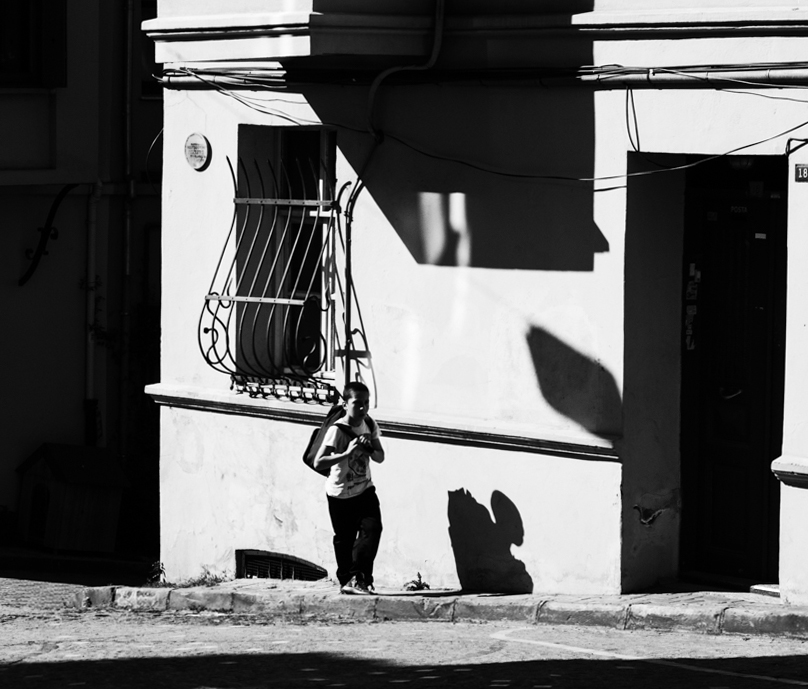
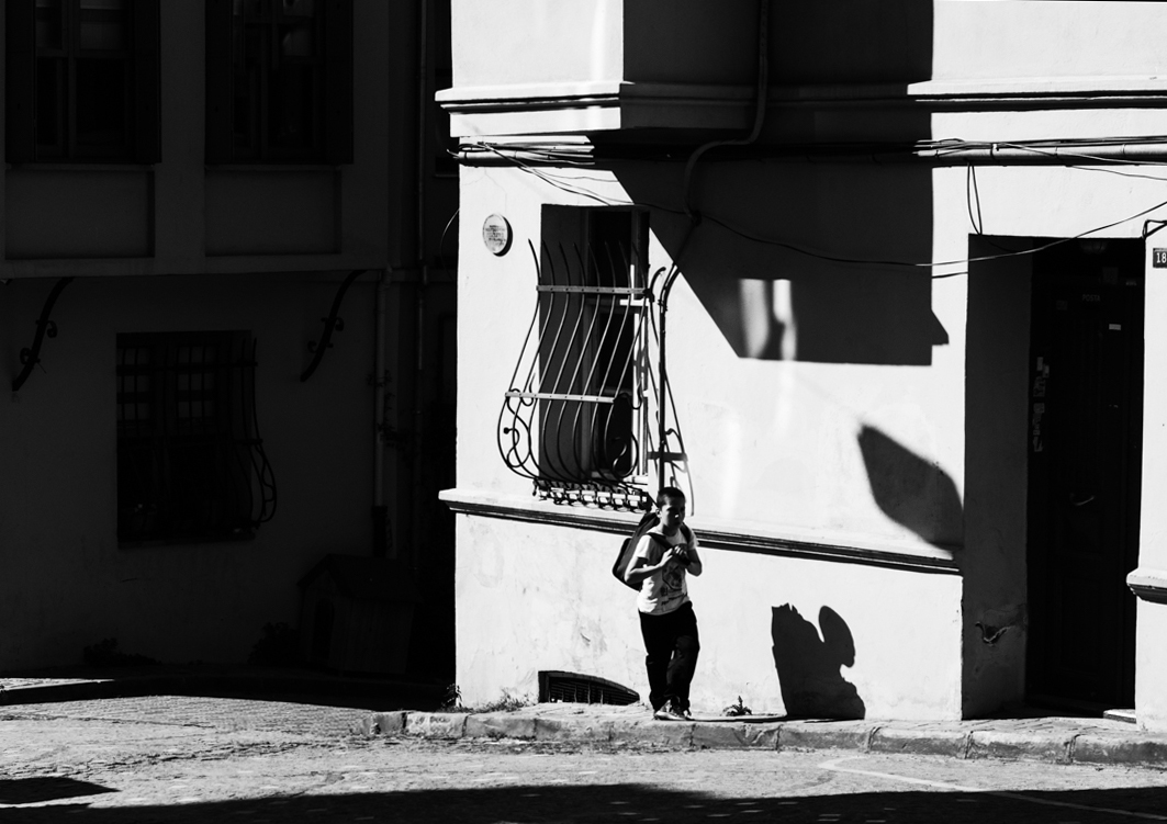
Hassan, this is a very high contrast and harsh light image, almost of graphic arts characteristics. The presence of the very bright areas compared to the dark areas keeps my eyes going all over the place until I find the young man with a back pack in the frame. He is back and side lit which creates a strong shadow on his face therefore no detail, I played with two different crops to progressively eliminate the distracting elements (very bright) and to bring my eyes directly to the student. I think I like the second option better, since gives more presence to the human component in this array of claro-oscuro elements. Also made the vertical lines straight. |
Sep 3rd |
 |
| 58 |
Sep 19 |
Comment |
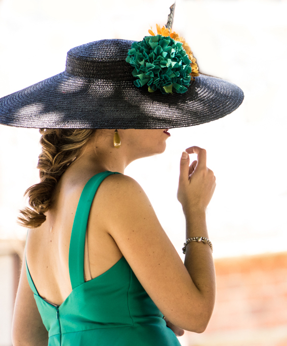
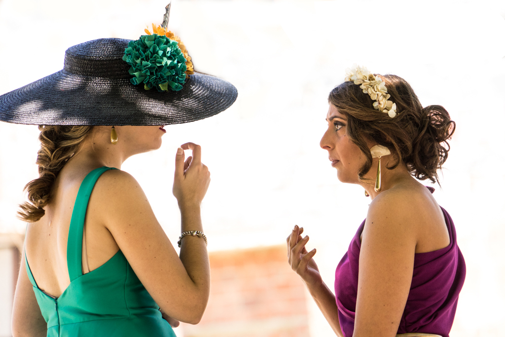
Daniel, good contrast of the subjects against the high key background from which they are separated. The two ladies are very sharp, and the one with the hat is trying to say something to the other who is showing her in a very subtle way, her middle finger (of course, not on purpose....) Using the select subject option in photoshop, which did a very good job selecting both ladies, I just had to fine tune it, then you reverse the selection and using the brush tool at a very low hardness of only 5 % I cleaned the upper half of the background removing all the distracting elements. I left the lower half to have some background present. |
Sep 3rd |
 |
8 comments - 3 replies for Group 58
|
| 72 |
Sep 19 |
Reply |
Thank you Walt, it looks a lot better indeed. |
Sep 27th |
| 72 |
Sep 19 |
Comment |
Abhijeet, indeed it is a very solitary tree. The landscape denotes a quiet and peaceful place. The colors are well managed in PP. It is sharp. My only observation is that the tree is too close to the edge of the frame creating some tension, but that was the result after straightening the horizon line, which have some distortion like interrupted traces (did you try to remove some imperfections ?). |
Sep 13th |
| 72 |
Sep 19 |
Comment |
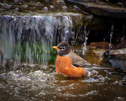
Marie, welcome to our group. This is a nice image of the Robin taking a bath. The image is sharp and shows a nice natural environment. I think your crop is too tight and took away almost the whole environment which in nature adds to the image. Also your crop left the bird with no room to move into it creating tension. I took your original image, adjusted to color, vibrance and texture and did a different crop, eliminating also the very blurred background, also added a light vignette. Now the bird has room to jump around, and shows his relation with the nice nature. |
Sep 3rd |
 |
| 72 |
Sep 19 |
Comment |
Adrian our group is Nature + which allows for land and sea scapes as well, in addition to animals and vegetables. I have not been in that area as yet. When we were in Yellowstone a few years ago, and wanted to go to the tetons, it was a very stormy day with lightning and hale, so we could not go. The colors brought out by your PP are just beautiful, and the light is just perfect. The reflections add interest to the image, and the presence of the two almost not visible photographers add scale to the magnificence of the place. I wish I was there. |
Sep 3rd |
| 72 |
Sep 19 |
Comment |
Walt, very nice landscape with the silky effect on the water accomplished by a long exposure using a "faked" ND filter. I like very much the composition and the way the little cascade flow follows a S path and disappears from the frame at the left lower corner (my right). It is sharp. I personally do not like the partial painterly effect produced by the Topaz Studio filter. I prefer the original as is which does not need any changes. |
Sep 3rd |
| 72 |
Sep 19 |
Comment |
Mary, nice colors and very nice sky with clouds, however; very little of the white sands dunes and no wind created waves on them which I think are the iconic images of the site. Anyway, it is sharp and your PP brought out the real colors. The presence of the dry bushes improves the image. |
Sep 3rd |
| 72 |
Sep 19 |
Comment |
Bruce, beautiful example of a male Snowy Egret in matting colors, plus his body gesture and the display of the fancy feathers, It is very sharp and the whites are not overexposed. The rest of your PP really brought out the magnificence of the bird. The dark and blurred background works very nice to show the details in the feathers. |
Sep 3rd |
6 comments - 1 reply for Group 72
|
23 comments - 8 replies Total
|