|
| Group |
Round |
C/R |
Comment |
Date |
Image |
| 4 |
Feb 19 |
Comment |
It must be the healing arts in me, which I did not notice before, the pimple on the left hand.... |
Feb 28th |
 |
| 4 |
Feb 19 |
Reply |
Thanks Bill, now there is more attention to the rider. It looks sharper too, but I see a bluish hue in my monitor. Do you ? |
Feb 28th |
| 4 |
Feb 19 |
Comment |
Guy, this is another architecture photography great shot. I agree with all the comments given and have nothing to add. Well exposed HDR with no overexposed lights. |
Feb 12th |
| 4 |
Feb 19 |
Comment |
Bill, really nice image which is a combination of real life and a painterly effect which softness the flower. It is sharp, nicely composed and the white frame within the image and the white stroke improves the card objective. |
Feb 12th |
| 4 |
Feb 19 |
Comment |
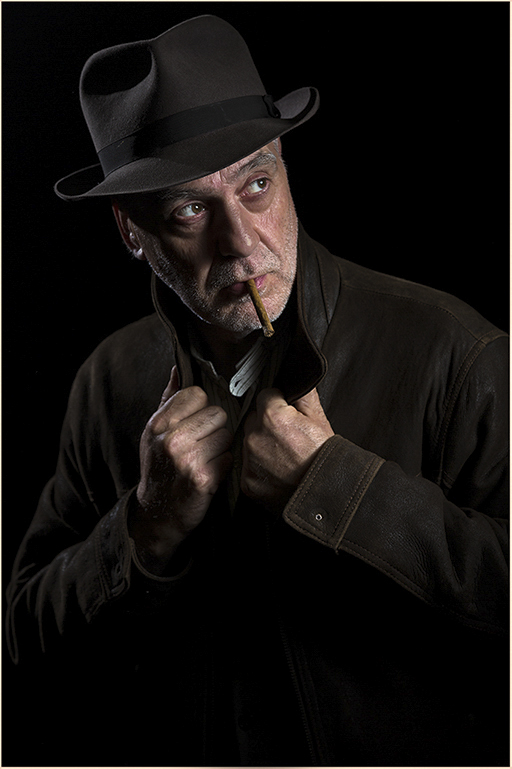
Ian, welcome back and I am glad that you are now settled. I went back to you December 2010 image in B&W which is the same model as this one and I realized that the visiting photographer Graham Curry is at the same time the model (multi tasking). Again this image, now presented in color, is very well illuminated, very sharp, the body language of the model is great and well placed in the frame, with the added feature of the cigar in his mouth showing that Graham dominates his trade very well. As stated in your description, I think that it will look more intense in B&W. |
Feb 7th |
| 4 |
Feb 19 |
Comment |
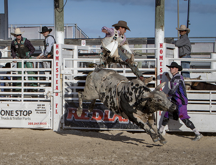
Erik, perfect action image with the bull's all four in the air, as is the raider. Very sharp, the colors are well balanced, most of the bystanders are looking towards the action which adds interest to the image. No clouds on the sky. I found the cut men at the edge as well as the other thee men in the frame somehow distracting and not adding any interest since they are minding their own business, so I cropped them out, ending up with an odd number.
|
Feb 7th |
 |
| 4 |
Feb 19 |
Comment |
David, the roses are well placed in the canvas and nicely framed and wrapped by the black velvet. Very sharp and the dark shadows gives good depth into the flowers with a certain degree of mystery. |
Feb 7th |
| 4 |
Feb 19 |
Reply |
Erik, great work. Now it is even better. The magic of photoshop of borrowing pixels from the other two images. |
Feb 7th |
| 4 |
Feb 19 |
Reply |
This is the "real" Palenque !! Interesting, the old man did not change anything in his body language between images. |
Feb 3rd |
| 4 |
Feb 19 |
Comment |
Now that I saw the real original, unfortunately the motorcycle prevents a different crop including the orange frame, so I prefer the square crop that you have identified as original, in spite of the central position of the man |
Feb 3rd |
| 4 |
Feb 19 |
Comment |
Joe, San Basilio de Palenque is a very poor town, and was the first conglomerate of free slaves in South America. When I met the fruit vendors with the colorful dresses in Cartagena (Palenqueras) I wondered if going there was going to be photographically productive, but the degree of misery is overwhelming, as proven by your image. Now; you post an original without the orange band ?? Where is your non cropped image ?? Overall, I like very much the relaxed body language of the man. There is no pavement on the streets, and I saw the pigs, dogs and cats wondering all over. If you include the whole door it can make a difference, since it will add balance, and take the man off the center of the frame. The colors are very vivid, and it is very sharp. |
Feb 3rd |
8 comments - 3 replies for Group 4
|
| 5 |
Feb 19 |
Comment |
Mike, the addition of the bird made the image from good to excellent. Very sharp and the trees take your eyes directly to the bird as leading lines. B&W interpretation adds to the impact. |
Feb 5th |
1 comment - 0 replies for Group 5
|
| 52 |
Feb 19 |
Reply |
Agree with the crop |
Feb 12th |
| 52 |
Feb 19 |
Comment |
Mike, this note is off topic, but your stated blog address takes you to shoes advertising |
Feb 12th |
1 comment - 1 reply for Group 52
|
| 58 |
Feb 19 |
Reply |
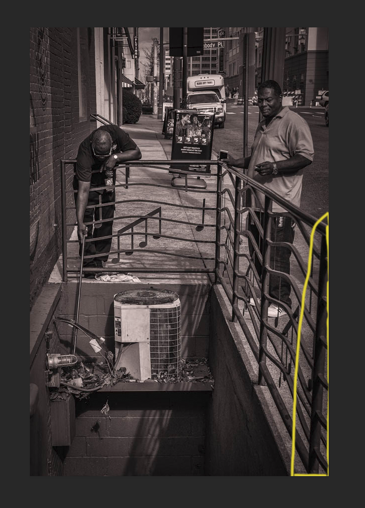
Using the Transform tool in Adobe Camera Raw in Photoshop and I gaged on the fence |
Feb 23rd |
 |
| 58 |
Feb 19 |
Comment |
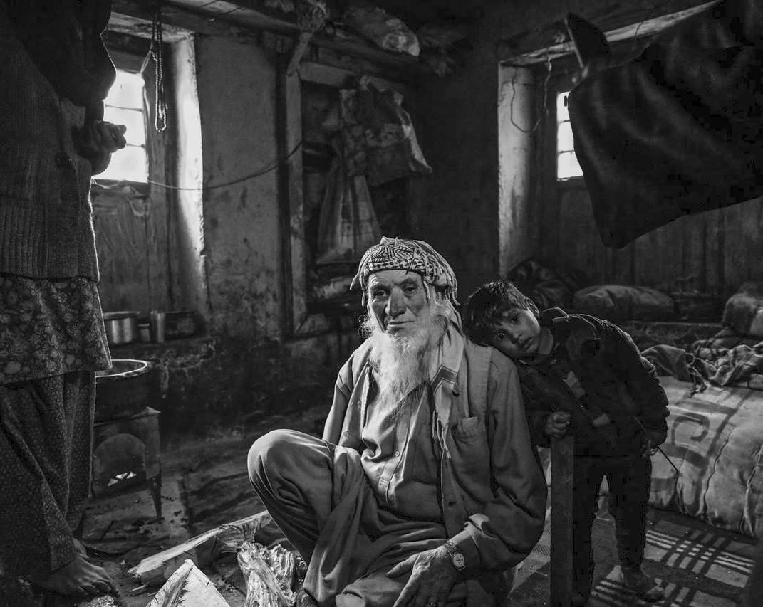
Lauren, nice image showing the bonding of the grandfather with his grandson in a natural environment for them. The old man is looking away from you, but the kid is looking at you. Very good B&W interpretation of the image, which is backlighted with natural light (ISO not stated). I find the very bright windows distracting and pulling my eyes away from the main subjects so I covered the back one partially by cloning the drape. It was 10:25 AM with bright light outside. I would have tried to avoid amputating the man's fingers. Added slight light to the shadows to see more detail, and cropped it. |
Feb 12th |
 |
| 58 |
Feb 19 |
Comment |
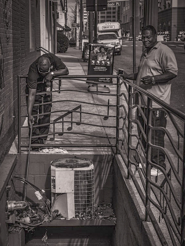
Dan, good B&W interpretation of the scene. It is sharp. it shows the working man and the observer. Interesting aspect of the image is that the fence is built as a pentagram with the musical notes. I made the image straight, added some light to the shadows to see more detail, and cropped some from the bottom |
Feb 11th |
 |
| 58 |
Feb 19 |
Comment |
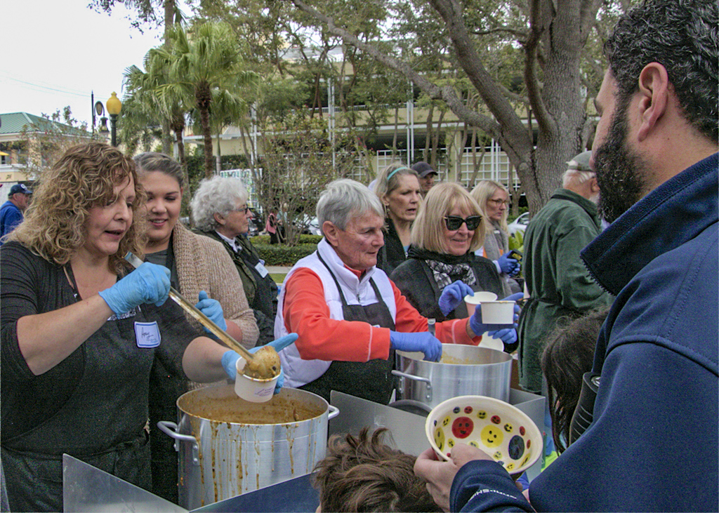
Jim, great capture of the charity soup event. Your vantage point was able to include both the volunteer's as well as the people being served, and also shows the have and have not (soup plate). It is sharp and well composed. I added some clarity, exposure and some light to the shadows. |
Feb 11th |
 |
| 58 |
Feb 19 |
Comment |
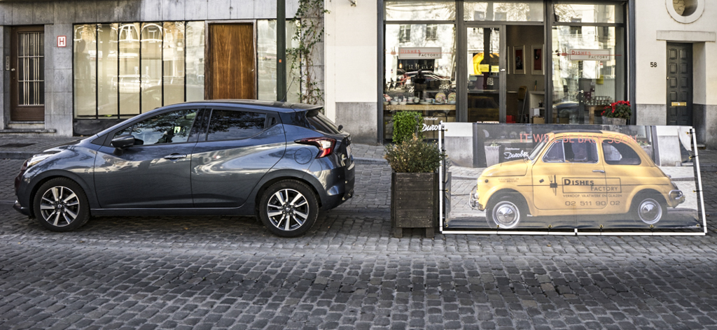
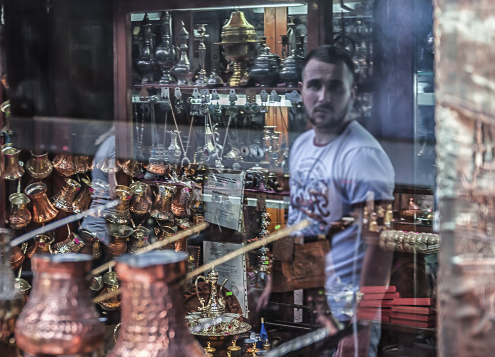
Daniel, great capture with the added extra of your conspicuous reflection in the storefront window in front of the yellow car image. For the store owners is a very clever way to secure a parking space in front of the store. The image is sharp. I made the vertical lines straight and added a little vibrance and clarity which improves the sharpness and contrast. |
Feb 11th |
 |
| 58 |
Feb 19 |
Comment |
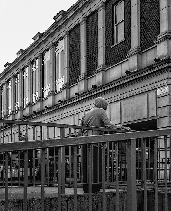
Gloria, very interesting image, sharp,and the B&W interpretation gives more character to it. The abundant presence of vertical lines in the buildings and fences takes away the main subject which is the hooded person, in spite of the fact that they work as leading lines. By cropping the image gives more emphasis to the main subject. |
Feb 11th |
 |
| 58 |
Feb 19 |
Comment |
Hassan, great image. It is sharp. Your vantage point avoided your reflection as well. The reflection is well placed in the frame. Agree with Lauren's adjustments and I just made it straight. |
Feb 11th |
 |
6 comments - 1 reply for Group 58
|
| 64 |
Feb 19 |
Reply |
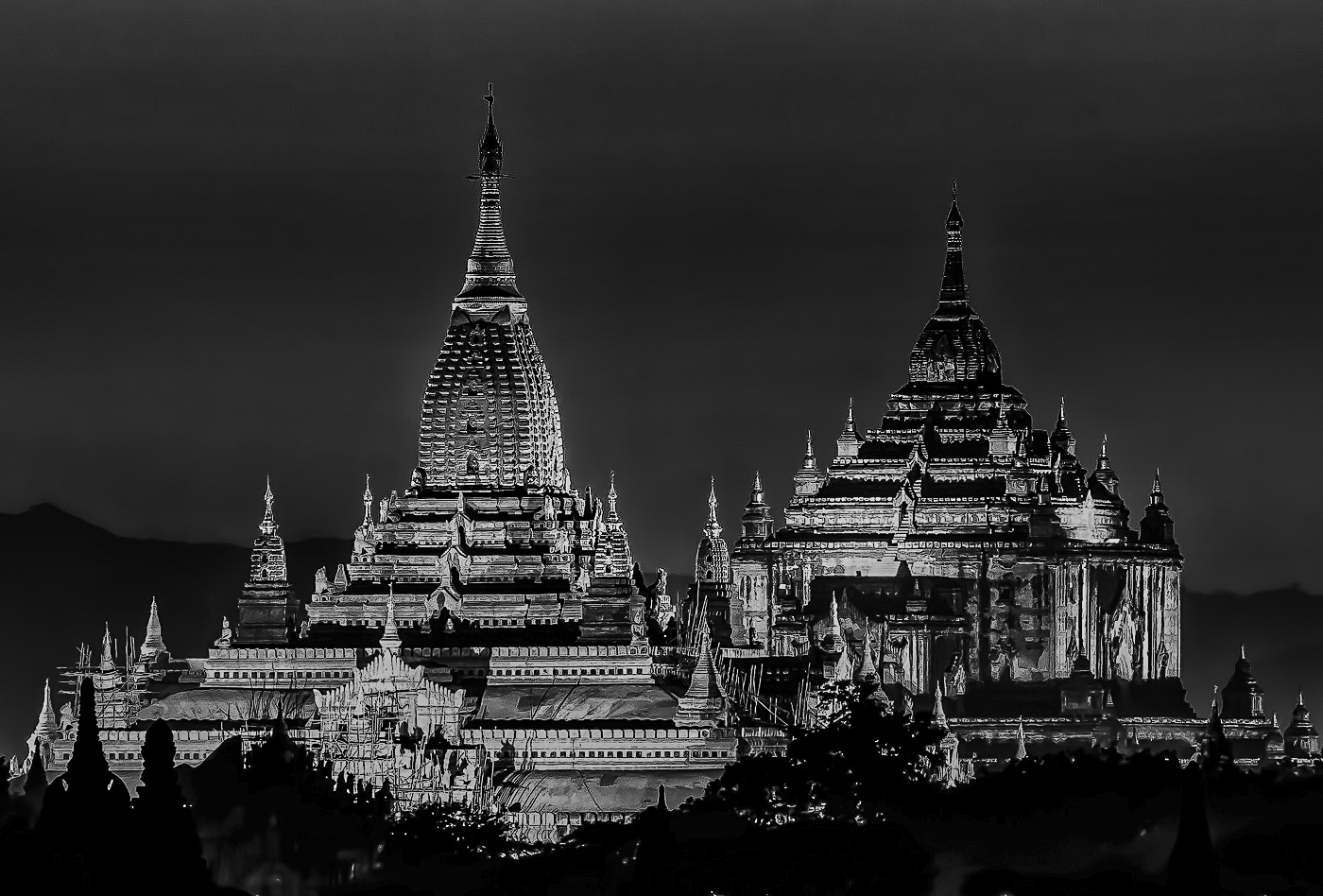
Stan, I also like the color version more. The mono version has a bluish hue (intended ?). I used one of the pre-sets in Silver Efex 2 and then in ACR reduced slightly the brightness, which helped in darkening the sky. |
Feb 19th |
 |
| 64 |
Feb 19 |
Comment |
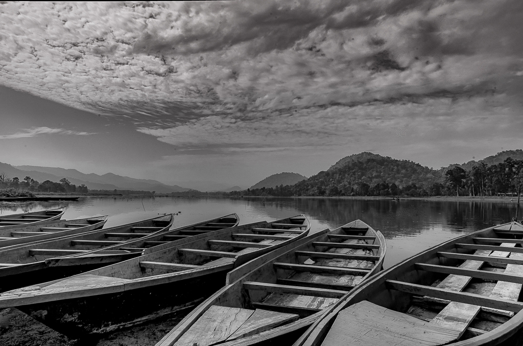
Abhijeet, with Viveza's 2 control points added some structure to the clouds...... |
Feb 19th |
 |
1 comment - 1 reply for Group 64
|
| 69 |
Feb 19 |
Comment |
Visit Group 77 and you will see the owl a fraction of a second before right after taking off. Both great images. |
Feb 5th |
1 comment - 0 replies for Group 69
|
| 72 |
Feb 19 |
Comment |
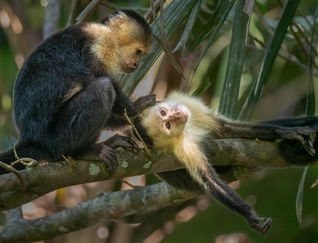
Adrian, I see a good interaction between the primates. They look relaxed. The image is sharp, and with the long lens + Teleconverter the far background is out of focus and not distracting. Your PP in Lightroom reduced the brightness of the light coming thru which is unavoidable.
Using a selection and content aware in CC2019 cloned out the two blue irregular areas, and with Viveza 2 controlled points reduced slightly the brightness and increased the clarity of the monkeys blond hair |
Feb 19th |
 |
| 72 |
Feb 19 |
Reply |
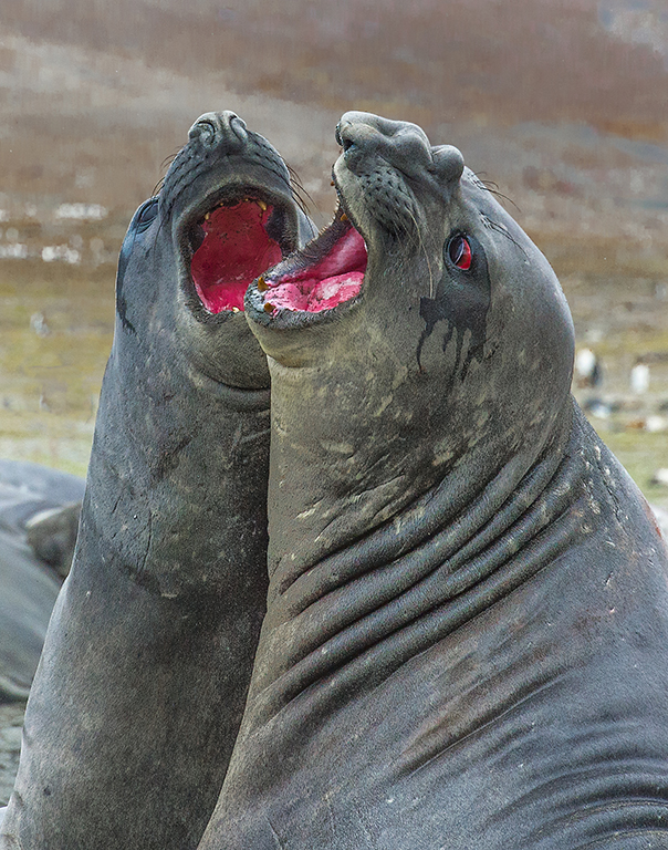
Kent, you captured the bulls in action and in natural behavior defining territory or defending members of their harem. The one in the front is older by the size of its nose. The scars in the neck is the price to pay for growing up older. I agree with Bruce's commentary about your vantage point to avoid the distracting background, since you were somewhat close to the subjects. Anyway, your PP brought out color and detail. You could also add a vignette to cover some of the distraction. I am attaching an image I created in Antarctica a few years ago.
|
Feb 12th |
 |
| 72 |
Feb 19 |
Comment |
Mary, indeed you have a vast experience and a great portfolio of underwater photography. this image was created very close to the subject ( I know that the sea horses are very small) since it fills the whole frame. It is in a typical behavior of holding on to something to prevent being taken by the deep currents. Your PP improved the color. It is sharp. |
Feb 12th |
| 72 |
Feb 19 |
Comment |
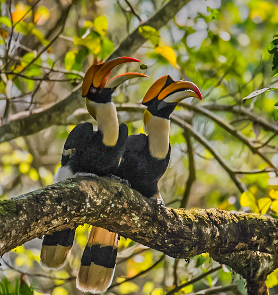
Abhijeet, great capture of the greater hornbill pair. On your Nikon D5300 600 mm is actually 900 mm in a crop sensor, and paired with the size of the birds in the frame of the original image, shows that they were very far from your vantage point. The 1/4000 sec froze the image, and in spite of the considerably amount of cropping, they are sharp. I like very much that one of the birds with the beak open is maneuvering something that looks like a fruit which adds impact to the image. Unfortunately, the tail of one of the birds, with apparent closed eyes. is touching the frame. Your PP brought out color, detail, but I think that your crop is too tight in the other borders. I used your original image and using a combination of camera raw and luminar, I cropped it differently to give more space to the birds. |
Feb 12th |
 |
| 72 |
Feb 19 |
Comment |
Bruce, this is a very sharp image of the pronghorn male, with the added action point that he is probably vocalizing his harem. Great management of the back and foreground eliminating distraction. The colors are natural and well balanced, I find the frame a little tight for the bock to move into. From your vantage point distance a landscape would have given you more room in the front and the back. Your PP brought out detail and color. |
Feb 12th |
| 72 |
Feb 19 |
Comment |
Walt, interesting image and effect (painterly). I would like to have something else in the image to give me sense of dimension. I do not know how close you were to create the image (28 mm). It is sharp and the B&W interpretation works well. I would have moved my vantage point up or down to avoid the horizon being in the middle of the frame. |
Feb 12th |
| 72 |
Feb 19 |
Comment |
Images have been reversed |
Feb 11th |
6 comments - 1 reply for Group 72
|
| 74 |
Feb 19 |
Reply |
Agree |
Feb 19th |
| 74 |
Feb 19 |
Comment |
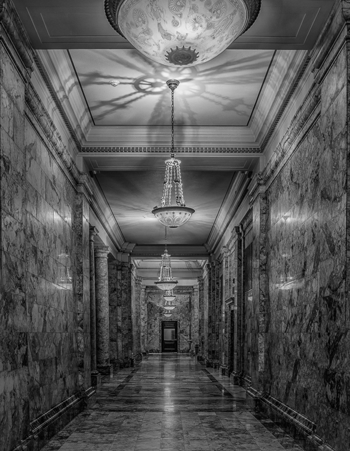
Pamela, interesting image and indeed full of leading lines. As stated by David it lacks impact. First I straightened the image, added contrast, reduced brightness and increased some light to the shadows, now there is more separation between the blacks and whites. Finally, I cropped the top of the image to reduce the predominance, and therefore distracting round lamp. |
Feb 19th |
 |
| 74 |
Feb 19 |
Reply |
David, very original image indeed. Some of the spots could be due to
sensor dirt as well. |
Feb 19th |
1 comment - 2 replies for Group 74
|
| 83 |
Feb 19 |
Reply |
Now that you mention it, I see what you mean.. |
Feb 25th |
| 83 |
Feb 19 |
Comment |
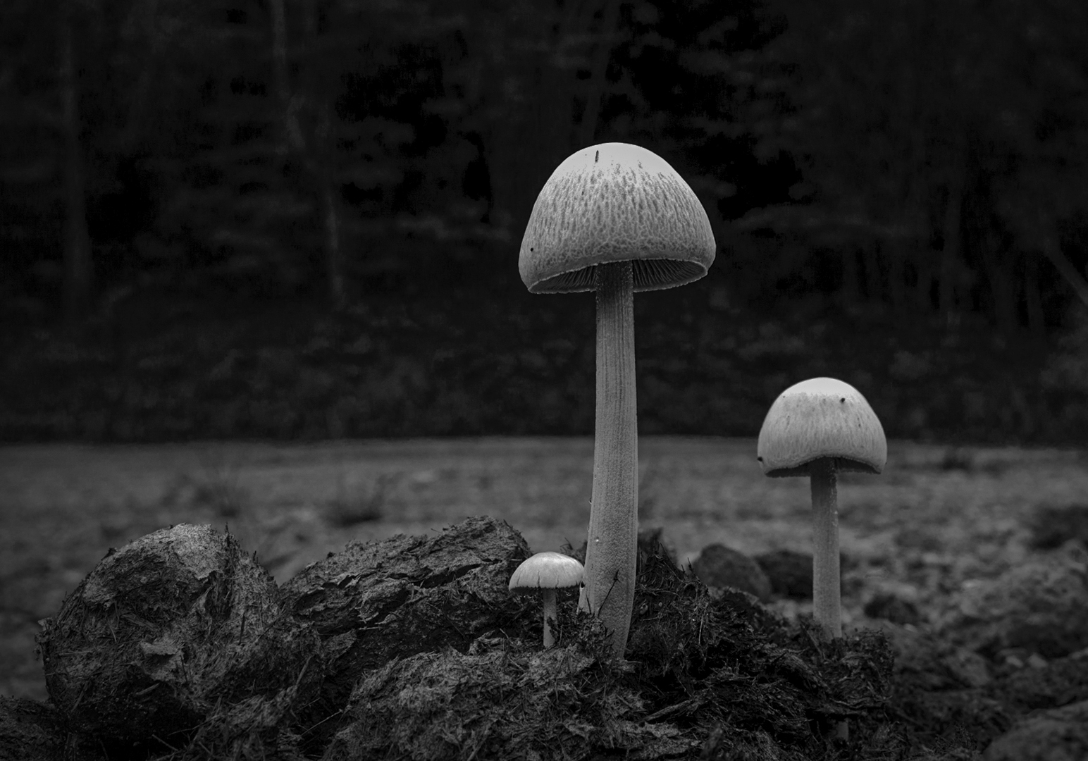
Hola Jose, y me encanta la tierra del Merengue... (I love the land of the Merengue Dance !). I like your image, specially your very low vantage point. You did not point out your metadata except the lens of 24mm, usually very sharp and with a great DOF which prevents you to blur more the background. I also like you B&W interpretation of the image. As stated by others, there is a lot of empty space. I cropped it differently than Tracy, but keeping the foreground which is interesting. Also lowered the brightness and added some clarity for more detail. |
Feb 17th |
 |
1 comment - 1 reply for Group 83
|
26 comments - 10 replies Total
|