|
| Group |
Round |
C/R |
Comment |
Date |
Image |
| 4 |
Oct 18 |
Reply |
Erik, sorry that I missed the FPSA detail. Congratulations indeed !!!! |
Oct 17th |
| 4 |
Oct 18 |
Reply |
Another way to kick the colors up a notch is using Luminar 2018 presets with a slider that allows you to apply any % to 100. |
Oct 12th |
| 4 |
Oct 18 |
Comment |
Thanks everybody for your nice and encouraging comments. |
Oct 12th |
| 4 |
Oct 18 |
Reply |
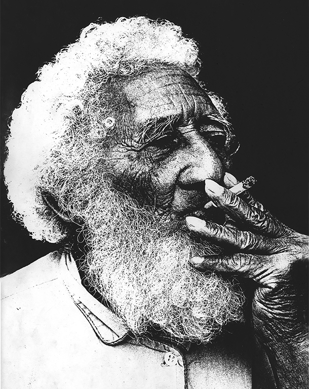
Bill and David, I know I am getting out of the subject, but reading Bill's note where he mentions the use of Kodalith with slides to obtain special effects, well, back in the wet Lab days, we used Kodalith as an internegative (first you made a B&W positive) then by contact method a new high contrast negative all developed in the Kodalith chemicals, then made a print with it. Was First price in Black and White at a couple of Camera Clubs in Venezuela |
Oct 9th |
 |
| 4 |
Oct 18 |
Comment |
Ian, I will go anywhere with that pilot.... The colors are so intense (blue plane and ski) and her jacket gets somewhat lost in the background. Nice pose. I agree with Joe that I would like to see the front of the plain, which would take her away from being smack in the middle. If including the front of the plain, would look better in landscape orientation. |
Oct 9th |
| 4 |
Oct 18 |
Comment |
Bill, I like how the blue truck takes prevalence in the image, without using a HDR process. The rest of the element in the frame creates a nice composition. Everything is in focus. The yellow wheels complement the colors. Nice clouds in the sky. |
Oct 9th |
| 4 |
Oct 18 |
Comment |
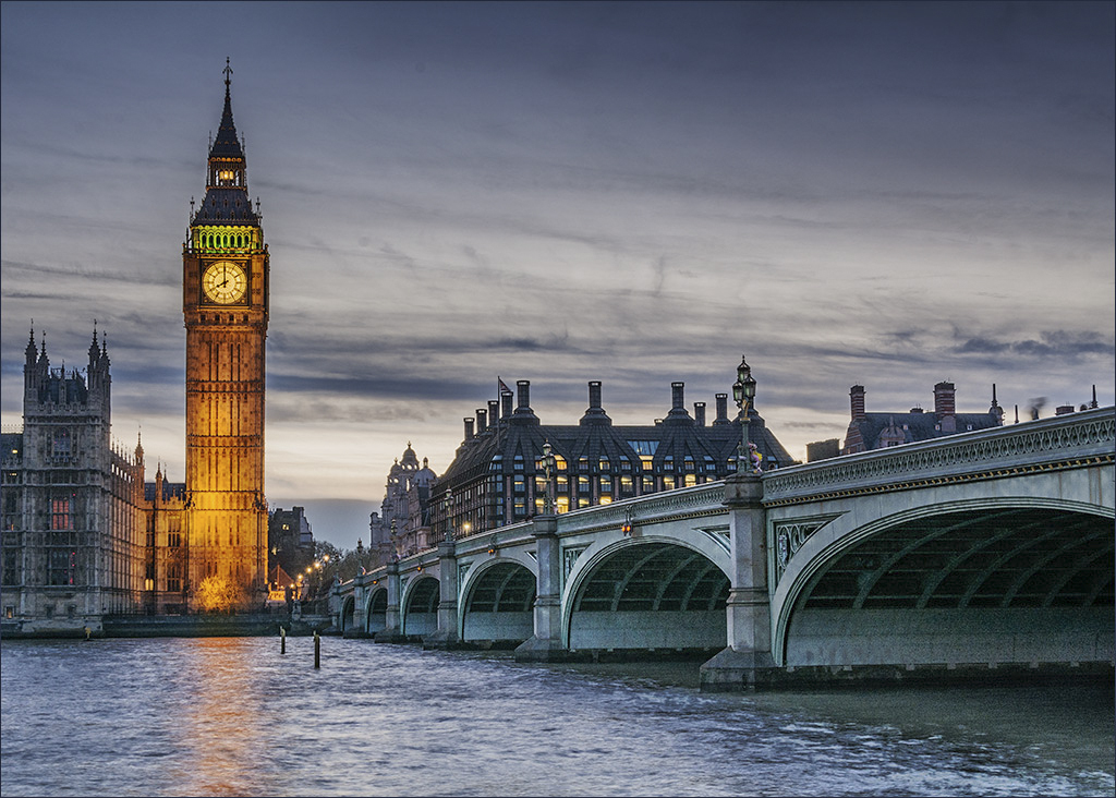
Guy, great iconic image of all the elements in the area, very sharp, nice colors, great composition. I just added some light to the shadows which gives more detail in the undersurface of the bridge, and the Parliament, and then with a selection of the parliament, added some more brightness. |
Oct 9th |
 |
| 4 |
Oct 18 |
Comment |
Joe, cool distortion of reality indeed. You look good !! Your selfie is a lot better in every aspect compared to the group picture. Your vantage point acquired the house as well. Your 200 mm crop really made the composition. |
Oct 5th |
| 4 |
Oct 18 |
Comment |
Erik, this image has a very HDR like effect, but you do not mention it. I wonder as how the ski ended up grey. The colors in the stilt house seem like a color negative effect. All together is very artistic. It is sharp. |
Oct 3rd |
| 4 |
Oct 18 |
Comment |
David, interesting process of PP, and if you did not mention the holes above the trees, I would take them as part of the process. Anyway; you made a snapshot into a dramatic seen HDR like. I believe you are keeping very busy with your 365 project. |
Oct 3rd |
7 comments - 3 replies for Group 4
|
| 5 |
Oct 18 |
Comment |
Nick, you are peeking on your twin's Playboy magazine and taking a glimpse of what is going on....
Very clever and elaborated set up, and good result of your scanning and PP.
|
Oct 3rd |
1 comment - 0 replies for Group 5
|
| 20 |
Oct 18 |
Comment |
Paul, very elaborated process to open square by square. My guess is that it was by selecting one or a straight line at the time ? |
Oct 10th |
| 20 |
Oct 18 |
Comment |
Very cool look indeed |
Oct 10th |
2 comments - 0 replies for Group 20
|
| 58 |
Oct 18 |
Reply |
Hassan, very well said !!!
"the negative side as the look careless about the place they are in. " |
Oct 26th |
| 58 |
Oct 18 |
Comment |
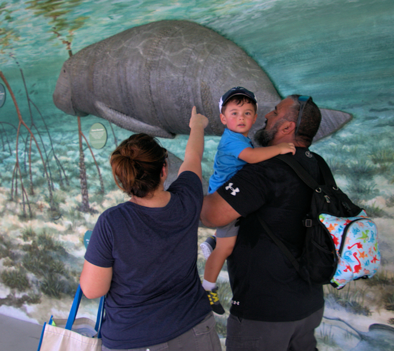
Jim, indeed the kid is more interested in you than the manatee. Interesting and nicely done mural. The "mother"is trying to get the kid's attention towards the mural with no success. The image is sharp. I cropped the image to place the kid off center, and added a slight vignette to guide the viewer towards the kid. |
Oct 23rd |
 |
| 58 |
Oct 18 |
Comment |
Deborah, the best camera is always the one you have in your hands when needed, as you have shown with this image created with an "older iPhone". To my eyes, there is some haze (mild fog) in the image probably related to the time of the day and the altitude of Cuenca-Ecuador (8.400 feet). Not much going on except this gentleman reading something and sitting at the end of the bench, which works as a leading line towards him. It is sharp. More people also sitting in the background. A little color given by the flowers on the tree to give more interest to the image. |
Oct 15th |
| 58 |
Oct 18 |
Reply |
f/ 5.3 |
Oct 14th |
| 58 |
Oct 18 |
Comment |
Hassan, another intriguing image of the market. The face of the man walking towards us is in the dark, and makes you want to see more, and you wonder what he looks like. Again there is a lot of light in the background with no detail, also making you wonder what is going on there. Lots of paraphernalia along the hallway. Your low vantage point also adds interest to the image. It is sharp. |
Oct 9th |
| 58 |
Oct 18 |
Comment |
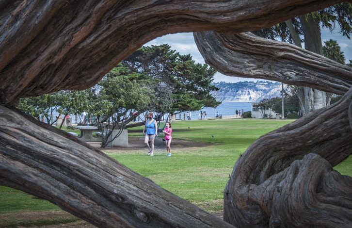
Dan, I like the way the wood frames the mother and the girl, but it takes almost complete prevalence in the image, more so, since the background is soft. I cropped some of the wood to give them more real estate. One way to improve the focus in the background is by focus staking, or just taking two shots very quick focusing in the foreground and then another focusing in the background. I know that they were walking, but you can move the focusing points very quick, and then merge them together. |
Oct 9th |
 |
| 58 |
Oct 18 |
Reply |
Indeed it is a more dramatic set up and now gives priority to the man and his dog, and lets you analyze the features with more detail not having any other distraction, but then, it is not street scenes bur studio photography. Both are valid alternatives but in different circumstances. |
Oct 6th |
| 58 |
Oct 18 |
Comment |
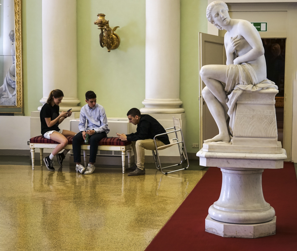
Daniel, this scene is becoming the rule rather than the exception. People go to any place even if they have to pay an entrance fee, and they get absorbed by the hand held device. Forget about interest in art, people do not communicate verbally with each other. More frequently that I would like to see, you observe a family of 6 sitting on a table in a restaurant, and all of them are looking down to their device.
I like this image were it shows the body language of the middle youngster somehow in the same direction as the statue, which is looking away of them in a manifestation of rejecting the youngster activity. I made the image straight, and had to add some canvas to fill in the defects created, using content aware in photoshop |
Oct 3rd |
 |
| 58 |
Oct 18 |
Comment |
Gloria, this is a nice follow up from your September image where Ernie is still sitting in the background. This one has the added element of the dog which increases the impact of the image. Nice B & W interpretation, it is sharp. The dog does not look very friendly though. |
Oct 3rd |
6 comments - 3 replies for Group 58
|
| 67 |
Oct 18 |
Comment |
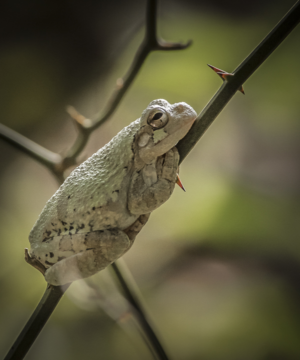
Michael, great capture. I have nothing to add to all the previous comments, but gave the image a different look by cropping it, lowering slightly the brightness and adding a vignette. |
Oct 4th |
 |
| 67 |
Oct 18 |
Comment |
Hi Larry, and welcome to the PID DD discussion groups and for taking the role of administrator. I do too in groups 58 and 72. As always, your images are outstanding, well thought and very well processed. This is not exception. I am looking forward to see more of your work, and also come to visit. |
Oct 3rd |
2 comments - 0 replies for Group 67
|
| 72 |
Oct 18 |
Reply |
Thanks Bruce, there is not a perfect way. Some like it tightly cropped, some like a wider view. |
Oct 23rd |
| 72 |
Oct 18 |
Comment |
Abhijeet, this is the first time I see this variety of Deer. You were able to catch his/her interest and look at you. It is sharp. The background is soft and non distracting. I just did a selection of the eyes and added some brightness to them. To me the original and the actual image look the same, and cropped square. Perhaps you did not send the actual original ? |
Oct 9th |
 |
| 72 |
Oct 18 |
Comment |
Bruce, this is perhaps the best owl image I have seen ever: interest, bird attitude, sharpness, color, composition, background. A real winner in my eyes. Nothing to change. |
Oct 9th |
| 72 |
Oct 18 |
Comment |
Kent, great PP of your image. The cropping really concentrated on the well fed quails, which are an odd number, and some of them interacting. If I am not mistaken we have a disproportion between males and females (only two ?). The image is sharp, and the path starting on the upper left, takes our eyes directly to the quails. Nice color adjustment as well. |
Oct 3rd |
| 72 |
Oct 18 |
Comment |
Walt, I like very much how you were able to PP the image to get so much detail on the sky and the Milky way, and also keeping the foreground. Great composition, and very sharp. |
Oct 3rd |
4 comments - 1 reply for Group 72
|
| 74 |
Oct 18 |
Comment |
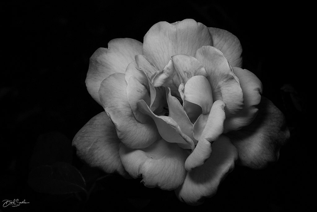
David, outstanding result. I just watched the video. Now I have some new ideas... I just added like 10 or so clarity to the image, it brings out more detail in the petals. |
Oct 13th |
 |
1 comment - 0 replies for Group 74
|
23 comments - 7 replies Total
|