|
| Group |
Round |
C/R |
Comment |
Date |
Image |
| 4 |
Mar 18 |
Comment |
Guys, thanks for all the flowers (Spanish expression when one gets positive comments !!!). |
Mar 12th |
| 4 |
Mar 18 |
Comment |
Guy, when you reduced the clarity really made the image soft, and with the undersaturated colors looks even softer and gives a sense of peace, more so, since the waters are really calmed. I am just curious of what is the thing I circled in red ? (it works as sense of landscape dimension). I agree with keeping the foreground. |
Mar 11th |
 |
| 4 |
Mar 18 |
Reply |
Joe, the image ended up being to grainy and looks over sharpened. |
Mar 11th |
| 4 |
Mar 18 |
Comment |
Ian, if that is the case, I love your smile and good dental care....
The image is scary. The way you PP the eyes to make them bloodshoted and to come out of the screen is very well done. The use of the multiple adjusting layers added a lot of detail and interest to the image. Nothing to change. |
Mar 11th |
| 4 |
Mar 18 |
Comment |
Bill, I can use my same description of the seen I did on Erik's image. The creek is in the right place, the exposure has given the silky look to the water, the colors are very bright and vivid, the reflections and the gold color in the water is magnificent, including the foliage fall colors. It is very sharp. What do you mean about a professional Scan ? |
Mar 5th |
| 4 |
Mar 18 |
Comment |
Joe, you did a great job straightening, cropping and adjusting the colors and clarity on this image. It indeed shows the effects of time and the elements on the building. The contrasting colors yellow and blue are very rich. The image is sharp. I believe that some of the Poles in the front are preventing the overhanging eave to collapse, and also add interest to the image. |
Mar 5th |
| 4 |
Mar 18 |
Reply |
Thanks !!! |
Mar 2nd |
| 4 |
Mar 18 |
Comment |
David, I see that you removed some of the "shmutz" (a.k.a. dirt spots) from the background and made it a little darker. My first impression was that the image needed to be straightened, but you make it very clear in your description that your intention was (is) to create tension which indeed exist. I want to put my hand to stop the sliding down ice cubes. I like the blue rendition (cold indeed). The ice cubes have some light reflection which implies tridimentionality, and are well placed in the frame. |
Mar 2nd |
| 4 |
Mar 18 |
Comment |
Erik, what a beautiful a pleasant image. The colors are very vibrant and the palette is proper for the fall colors. It is very sharp. The slow shutter speed gave you the right amount of silkiness in the water. I could not resist the temptation of flipping it to place the little waterfall on the right side of the frame. For people that have been there the flip is obvious, but for me, and those that have not been there is fine. Great composition anyway. |
Mar 1st |
 |
7 comments - 2 replies for Group 4
|
| 34 |
Mar 18 |
Comment |
Candy, your creativity does not stop to impress me. Thanks for the explanation. I just added a minute copy of where the little branches of the fern grow from so it looks it is branching out right from there and not from behind. |
Mar 8th |
 |
1 comment - 0 replies for Group 34
|
| 58 |
Mar 18 |
Reply |
Jim, yes it does |
Mar 29th |
| 58 |
Mar 18 |
Comment |
Jim, classic image of the "Make Love Not War - Hippies" time. Indeed an unforgettable chapter in history. I personally like very much Leonard Cohen (one before last in the list) Canadian song writer and performer who died last year. About the image, the colors are very vivid and intense, it is sharp, and the woman's head position looking down as if reading the poster behind her. She is well placed in the frame. |
Mar 7th |
| 58 |
Mar 18 |
Comment |
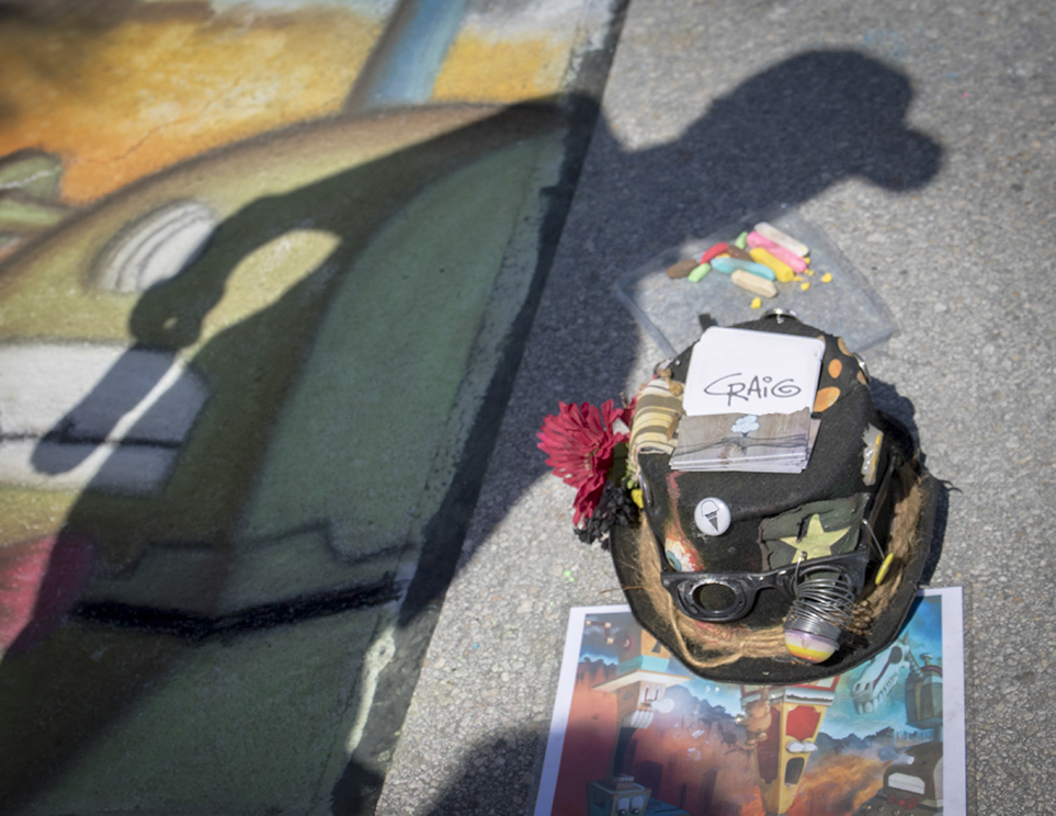
Gloria, your wait paid off. You were able to get Craig's (the artist) shadow framing his creation on the ground and the prototype (guideline). His backpack with all the tools as well as decorative elements and the pieces of color chalk complement the image and are sharp; however; the painting on the ground is slightly soft, not creating distraction. There is a clear strip at the bottom which is slightly distraction, so it was cropped, and the image was flipped to put the elements in the lower right, including his name. |
Mar 2nd |
 |
| 58 |
Mar 18 |
Comment |
Daniel, I like the geometric forms protruding from the wall and working as leading lines to take your eyes directly to the spider. The other geometric shapes (windows) help to frame the spider as well. The contrasting colors on the wall also make the image more interesting. At first I was tempted to crop the upper part of the image (red) but makes the image dull and not as interesting as it is. It is sharp. The fence bellow is somewhat distracting. First I cropped the lower third of the image but did not like the result, so I cloned it out, now keeping the balance of the image. I added a white stroke to separate the image from the black screen background. |
Mar 2nd |
 |
3 comments - 1 reply for Group 58
|
| 72 |
Mar 18 |
Comment |
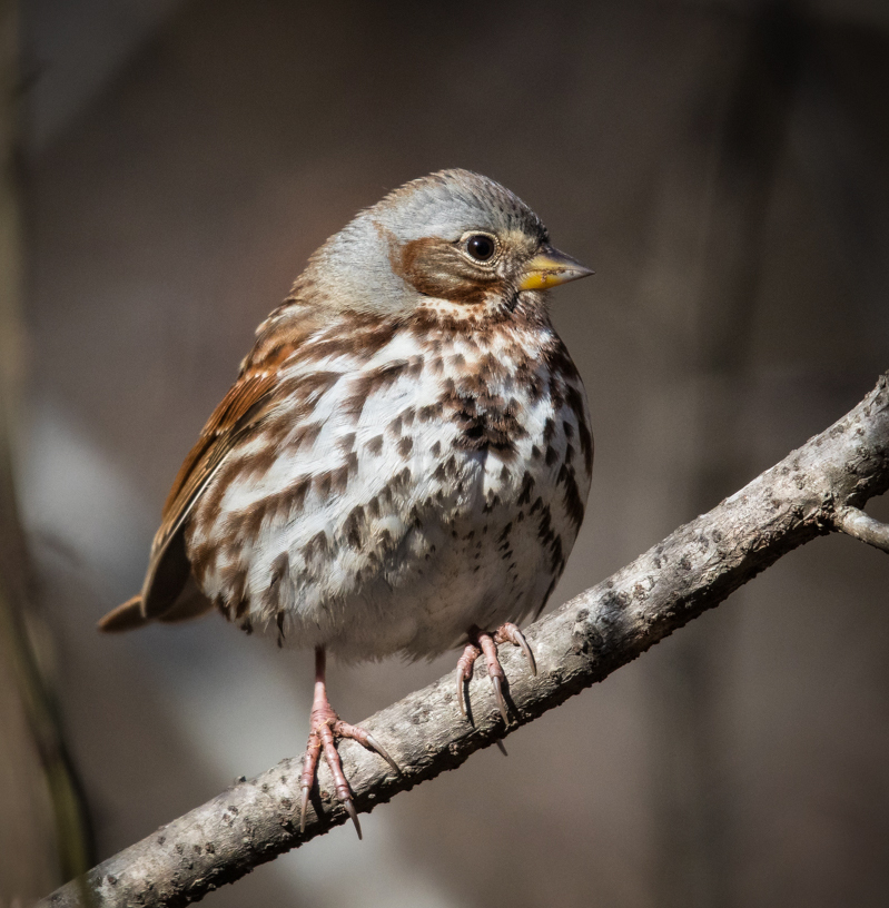
The second option is not for nature, but for "beauty" eliminating all the distracting element in the background and the branches. |
Mar 27th |
 |
| 72 |
Mar 18 |
Comment |
Vic, this is a really sharp image in spite of the 1200 mm. The bird is well illuminated, and has a catchlight. I think that Brice's crop is too tight and creates tension in the image. The colors are well balanced. I worked the image in two ways: Nature which does not allow changing anything with only cropping, but less and adding a vignette to hide somehow the distracting elements behind the bird at the edge. This way the bird has complete freedom of movement in any direction. |
Mar 27th |
 |
| 72 |
Mar 18 |
Comment |
Abhijeet, indeed the Rhino looks that he is coming to you with not the most friendly intentions. Obviously, your guides and driver know the behavior of this beasts, and you were able to escape harmless. You created a good image in spite of the frenzied moment. Your PP was able to bring out color and detail. |
Mar 7th |
| 72 |
Mar 18 |
Comment |
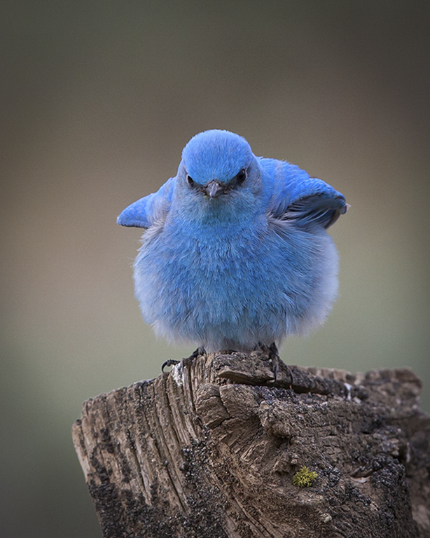
Bruce, great image of a very cute bird which I have never seen. You created the image at the right time when he/she was all fluffed. The resulting background must be the result of a long lens ( 600 or 800 mm ?). The image is very sharp and the bird is well placed in the frame. The cropped is appropriate. Nothing to change. The little green touch add interest to the image. Perhaps a vignette improves the attention to the bird. |
Mar 7th |
 |
| 72 |
Mar 18 |
Comment |
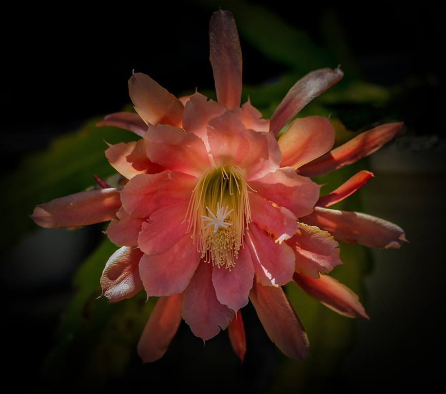
Nat, beautiful cactus flower. I personally like the original image in its "natural" environment. Your extraction, first distorted some of the flower petals, and when placed in a total black background looses realism and looks suspended in a black space. I took your original image and reduced some of the brightness. Unfortunately, some of the petals are overexposed and no pixels could be recuperated, then the blown areas. I added some contrast, clarity, and created a very strong vignette, which hides most of the bright areas, and still leaves some of the real environment (green) , without being distracting. |
Mar 5th |
 |
5 comments - 0 replies for Group 72
|
16 comments - 3 replies Total
|