|
| Group |
Round |
C/R |
Comment |
Date |
Image |
| 4 |
Oct 17 |
Reply |
Bill, I did, waiting for a response. Thanks for the suggestion |
Oct 19th |
| 4 |
Oct 17 |
Comment |
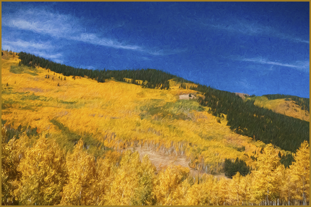
Bill, very colorful landscape. I personally do not like the painterly rendition a la Cezanne II. I would like to see the original image, more centered, since the foreground and the midground is very similar. Perhaps less is more. Would give more detail of the trees and the color transition from different shades of yellow to green. Nice slope in the sky/land transition. It looks better to me flipped. I like the gold stroke around it. |
Oct 9th |
 |
| 4 |
Oct 17 |
Comment |
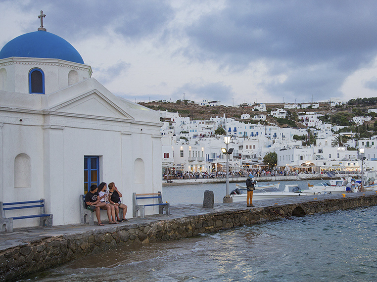
Erik, good PJ image of the island and its people. I think that the prevalence of the three ladies having a conversation is somehow lost in the immensity of the city/shore escape. I took the liberty to crop and flip it, this way, the ladies are more obvious. The colors are nice, and the white buildings with blue roofs are typical of the greek islands. |
Oct 8th |
 |
| 4 |
Oct 17 |
Comment |
Ian, well centered and symmetrical as well as framed with the ceiling panes. The colors are well balanced, it is very sharp and very well exposed. Nothing to change. |
Oct 6th |
| 4 |
Oct 17 |
Comment |
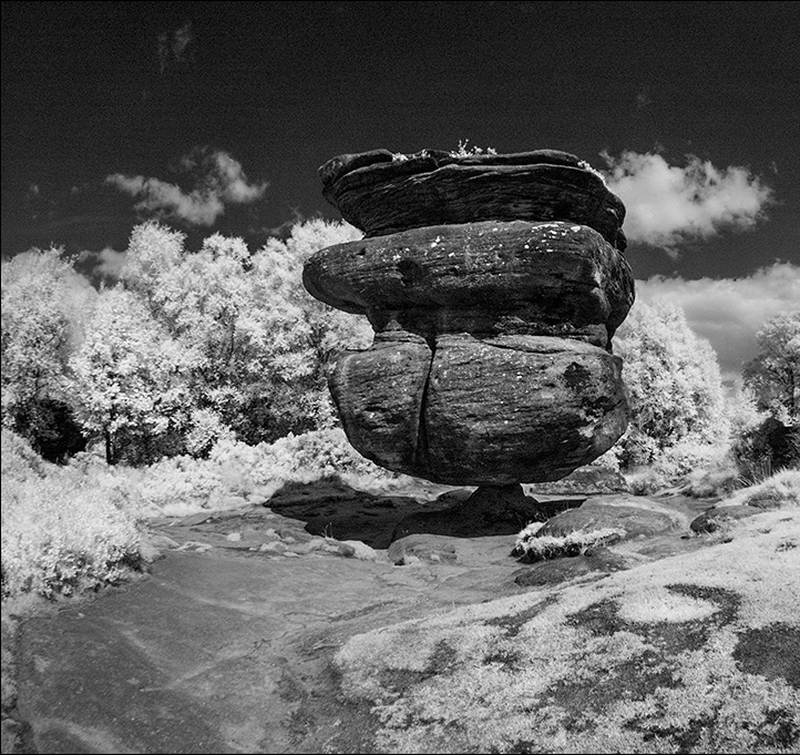
Guy, lovely IR rendition. I like the snowy effect that IR gives to the vegetation, and the dark sky to the blue color. There is a path that leads your eyes to the balancing large rock which is the center of attention.Good non distracting foreground. I like the image cropped to the main subject only. Some viewers will think that you need the balancing part in the image with the other rocks in the back. It is a matter of taste. |
Oct 6th |
 |
| 4 |
Oct 17 |
Comment |
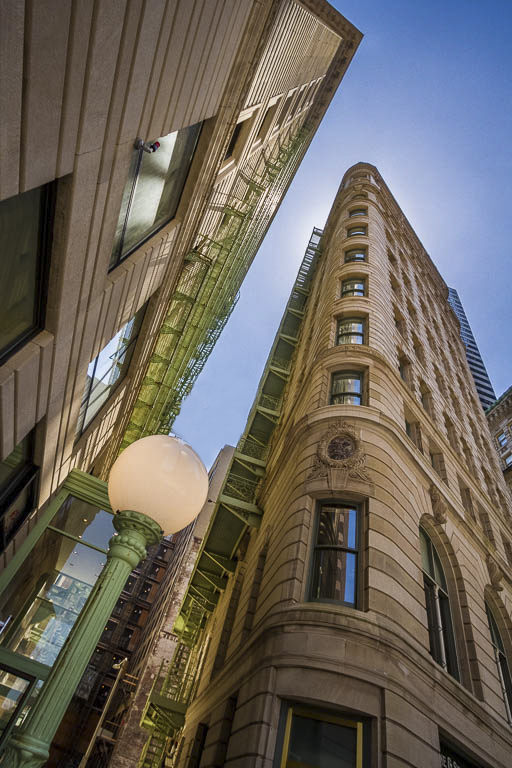
Bill, great vantage point with a very interesting perspective. Obviously, you walked your image around until you were able to frame the light pole between the buildings. Very sharp, great colors. I like very much the reflection of the building on the left of the frame on the windows just on the corner. The only thing that I would change is to remove the crane next to the light which is slightly distracting |
Oct 6th |
 |
| 4 |
Oct 17 |
Comment |
Joe, interesting image with a lot of detail showing the effects of long term weather exposure. The original image, even though the window is in the middle of the frame, has a nice composition and elements. Indeed, the cropped version is a lot more intimate. It is symmetric and very sharp. I can notice the changes done in PS. |
Oct 6th |
6 comments - 1 reply for Group 4
|
| 58 |
Oct 17 |
Reply |
Jim, I think they are same sex couple |
Oct 22nd |
| 58 |
Oct 17 |
Comment |
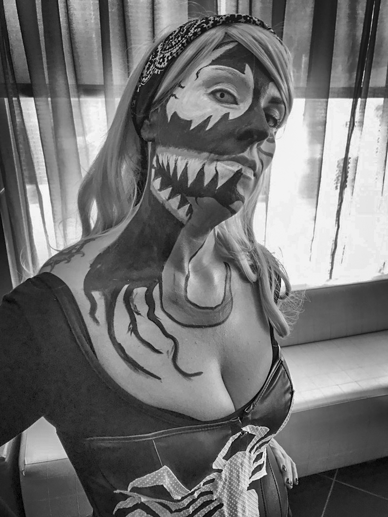
Jim, interesting image. I worked on both. Since it is backlith by the window, it looks better in B&W. I added a little light to the shadows, and decreased the highlights to mellow down the overexposure at the window. It is sharp, and I like her attitude. |
Oct 8th |
 |
| 58 |
Oct 17 |
Comment |
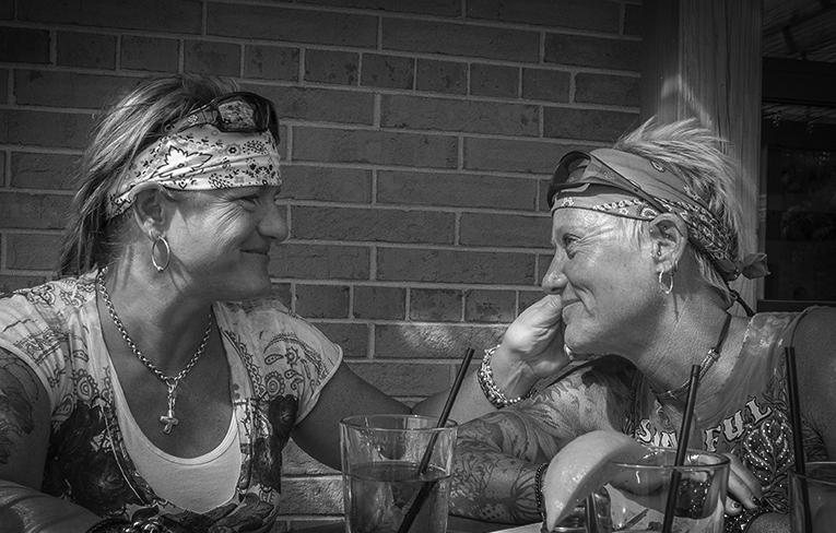
Dan, indeed you were able to capture the moment. The face expression of the woman on the left really denotes love and care, augmented by the fact that she is caressing her partner's face, and she is corresponded by her partner's face expression as well. I like your B & W rendition as it is. The image is well focused. Unfortunately, and due to the circumstances (happy hour-2 for 1....) there is a lot of clutter in the foreground and the hand was chopped. I cropped the image to eliminate as much distraction as possible from the foreground, still keeping the essence of the image which are their expressions and their bodies art and paraphernalia. Added a stronger vignette. |
Oct 7th |
 |
| 58 |
Oct 17 |
Comment |
Gloria, the glass wall/panels create a very good symmetrical frame to the combination of color lights and shadows inside the building, and creating an orange aura around the Obama's cardboard cutout, life size. The reflections on the glass adds interest to the image. |
Oct 6th |
| 58 |
Oct 17 |
Comment |
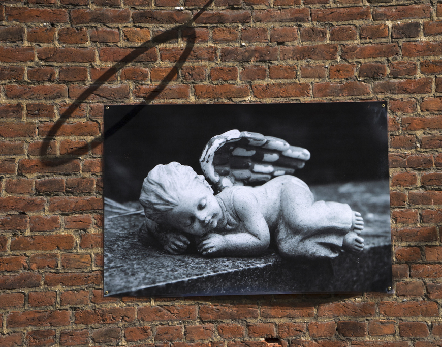
Daniel, this is a simple image of an angel's photo on a brick wall that frames very nicely and contrast with the photo. It is sharp. The combination of a Black and White image against the color background is interesting. You have a good eye to visualize the shadow of the ring resembling the nimbus or quora on the angel. I just cropped it slightly to place the picture off center. |
Oct 6th |
 |
4 comments - 1 reply for Group 58
|
| 69 |
Oct 17 |
Reply |
South Caroline |
Oct 13th |
| 69 |
Oct 17 |
Comment |
Hi Dean, and please forgive me for being out of this month image context, but please check my image in group 04, what a coincidence without planning..... |
Oct 12th |
1 comment - 1 reply for Group 69
|
| 72 |
Oct 17 |
Reply |
The only way to "freeze" the wings |
Oct 10th |
| 72 |
Oct 17 |
Reply |
Probably related to the tight crop |
Oct 10th |
| 72 |
Oct 17 |
Reply |
If you crop from the top, you will cut thru the Milky Way |
Oct 10th |
| 72 |
Oct 17 |
Comment |
Kent, I think this is a superb image of the Milky Way, and the stars reflect the immensity of the sky. Your PP really brought out color and detail. Agree with the cloning out of the distracting lights in the sky (airplanes ??) I am curious on the details of camera and lens. The settings are shown in the lightroom panes. |
Oct 9th |
| 72 |
Oct 17 |
Comment |
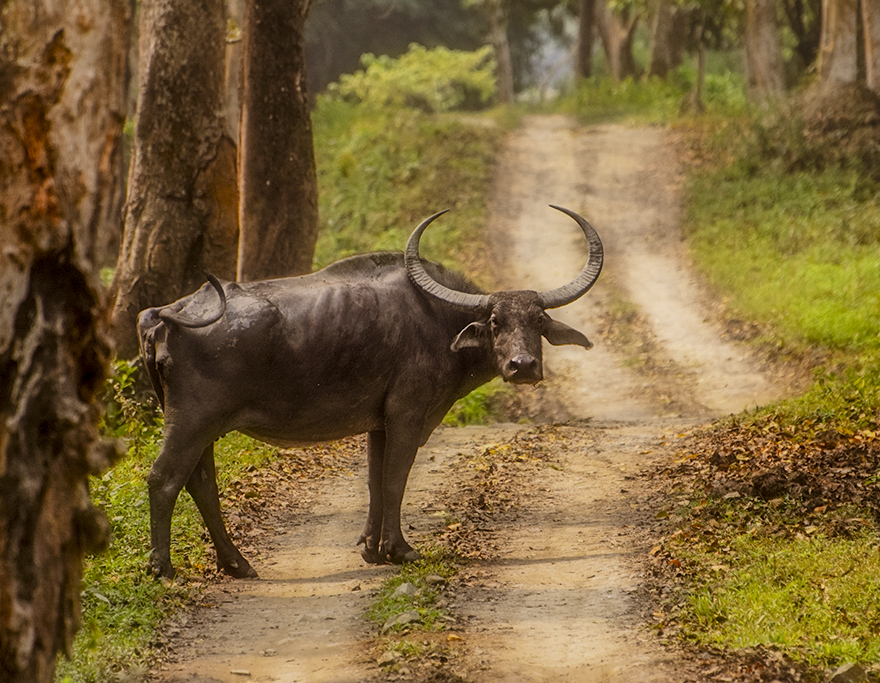
Abhijeet, Great image of the Asian Water Buffalo, and indeed "alert" looking at you. I like very much your PP final image with respect of colors and contrast, however, your crop is too tight creating tension at the edge. Comparing to the original I can see that you had no choice if you wanted to remove the tree which is out of focus. You could have changed your vantage point, to get the tree out of the frame, however, I understand that is not always possible. A good alternative that reduces the tension as well as the distraction of the out of focus tree is to flip the image. This way the trees are framing the buffalo. I used your original image and worked the colors as close to your rendition as possible. Also cropped slightly from the opposite side. |
Oct 6th |
 |
| 72 |
Oct 17 |
Comment |
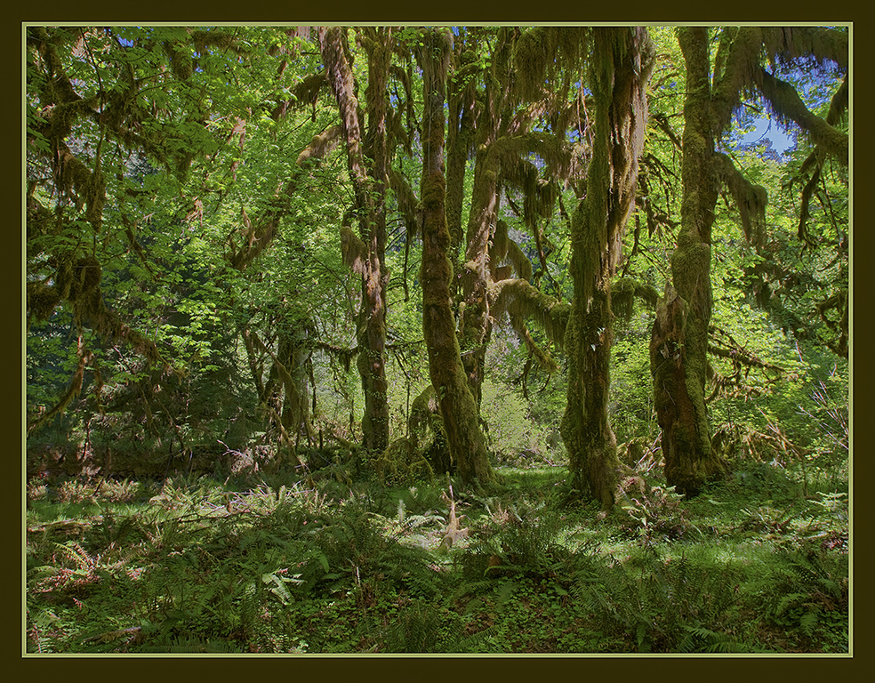
Mary, nice HDR rendition of the four exposures at the Hall of Mosses. The blending of all the images gave you nice detail in the highlights as well as the dark's (shadows) with little noise. I did increase slightly the light in the shadows to
see more detail. The green stroke around the picture, enhances the image. |
Oct 6th |
 |
| 72 |
Oct 17 |
Comment |
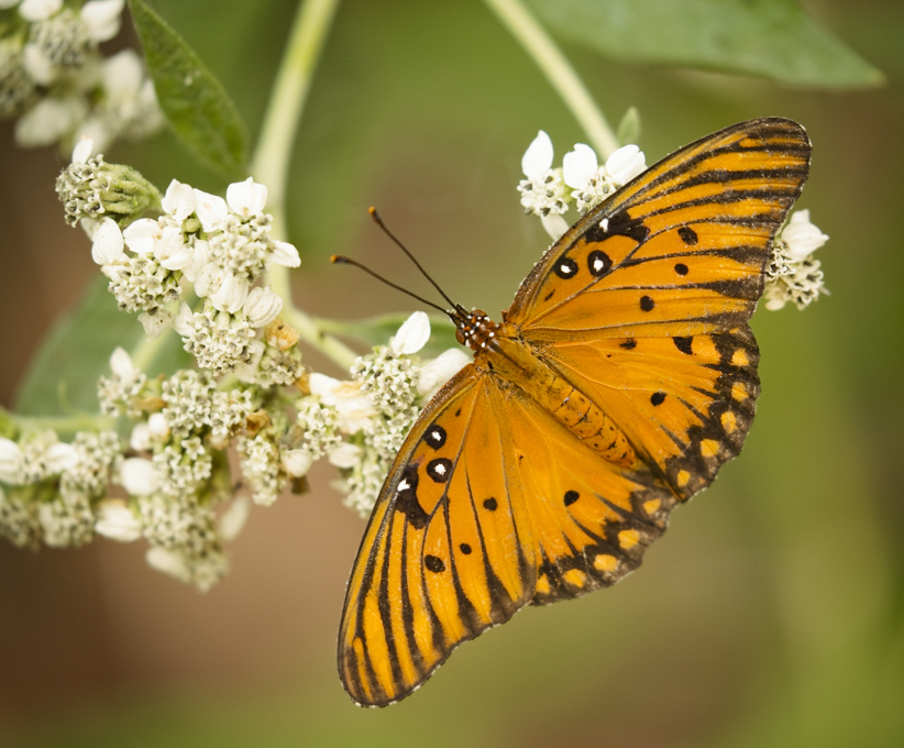
Vic, nice image of the butterfly. You were able to fix some of the blemishes on the right wing. The butterfly is well located in the frame; however, I think that there is some empty space so I cropped the image slightly. Added some vibrance and a subtle vignette. |
Oct 6th |
 |
4 comments - 3 replies for Group 72
|
15 comments - 6 replies Total
|