|
| Group |
Round |
C/R |
Comment |
Date |
Image |
| 4 |
Sep 17 |
Reply |
Bill, I will need to go back..... |
Sep 25th |
| 4 |
Sep 17 |
Reply |
We are fine, it was a bad scare, a lot of strong wind, broken trees and dirt. Erik is also OK
Thanks for asking |
Sep 12th |
| 4 |
Sep 17 |
Comment |
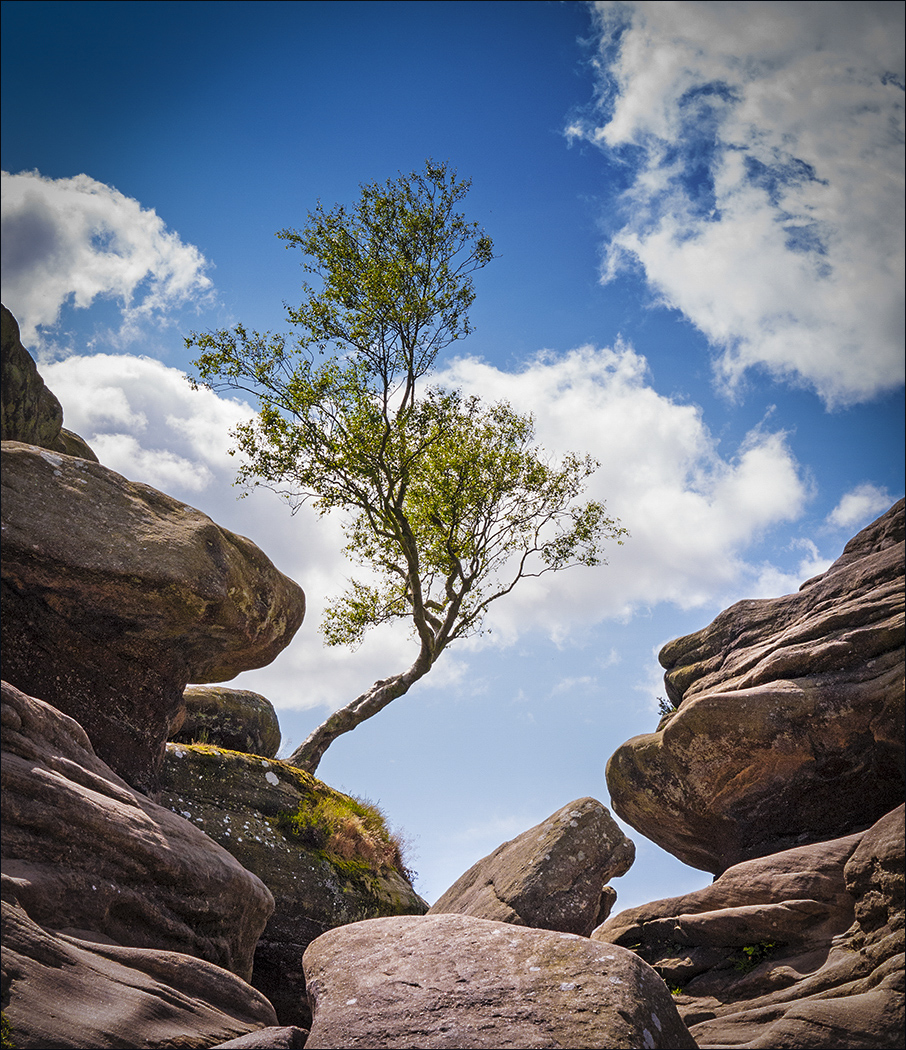
Guy, interesting and difficult shot per your description. Great composition, and indeed the spaces framed by the clouds mimic the space framed by the rocks, with the tree nicely placed without obstruction. I increased the saturation, specially the green, and added a slight vignette. |
Sep 6th |
 |
| 4 |
Sep 17 |
Comment |
Erik, what a beautiful nature shot, at the peak of the action. Great composition. I used ON1 effects and added some color to the birds and some luminance to the image, now more vivid, and added a slight vignette as well to make it more intimate. |
Sep 6th |
 |
| 4 |
Sep 17 |
Comment |
Ian, great action shot. I agree with Guy's comments and adjustments. I like your vantage point, the girls are coming straight to you. The background, slightly out of focus adds interest to the image. |
Sep 6th |
| 4 |
Sep 17 |
Comment |
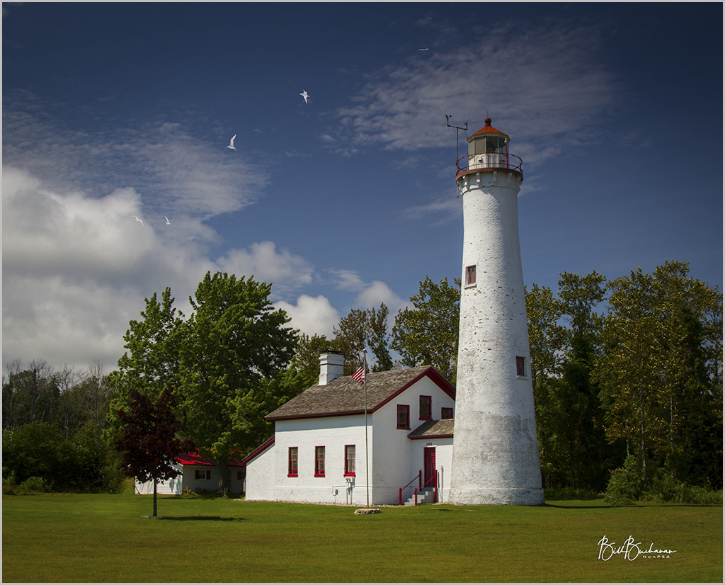
Bill, great image, nice color balance, sharp, nicely composed and PP to achieve the desired clean picture. I do not mind the added birds, however, I think you added too many and are somehow distracting taking my eyes away from the lighthouse. Perhaps something like 5 or so will add to it with less distraction. I also like the added white framing border. |
Sep 5th |
 |
| 4 |
Sep 17 |
Comment |
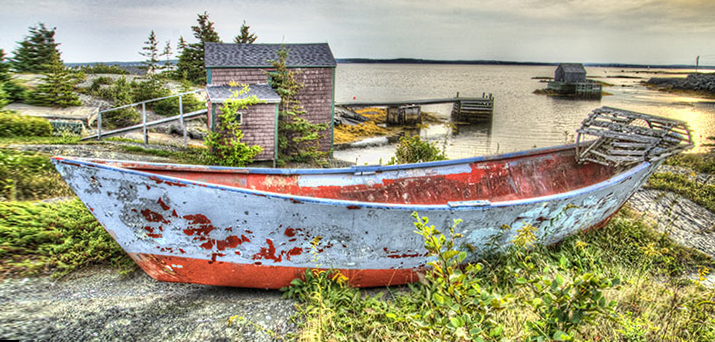
Joe, interesting landscape with good composition. I agree with Guy that the bright red building competes with the boat, so I desaturated it a little more than Guy. Also cropped the image at the bottom to make it more like a panorama and to eliminate some of the extra green in the foreground, and adding some canvas to the front of the boat.
It is sharp. Made the horizon line slightly straighter. |
Sep 5th |
 |
5 comments - 2 replies for Group 4
|
| 58 |
Sep 17 |
Reply |
Dan, it is a "she" |
Sep 23rd |
| 58 |
Sep 17 |
Comment |
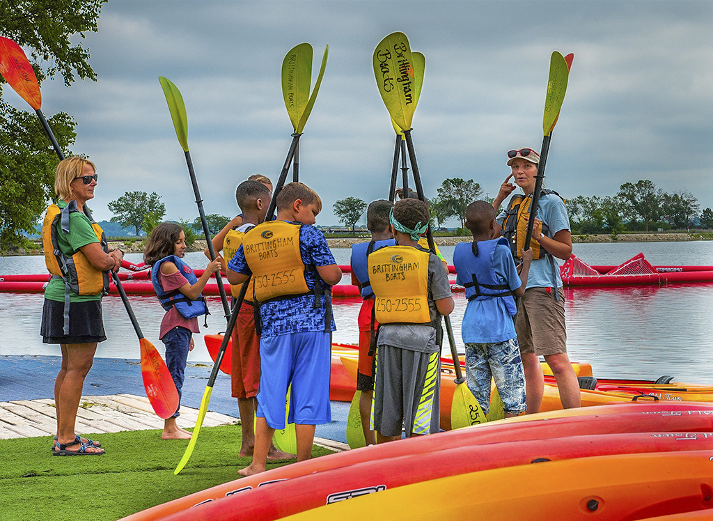
Dan, your image is full of bright colors. It is sharp, and nicely composed with the children framed by the two adults, one of which is looking at you. The children are paying attention to the explanation. I also like the way the kayaks frame the children in a V shape. I just added some light to the shadows to see more detail of the faces. Also cloned out a red structure behind the adult with the green shirt. |
Sep 10th |
 |
| 58 |
Sep 17 |
Comment |
Gloria. Toy store indeed. Interesting that it is located in one of the most christian sacred areas of Old Jerusalem, La Via Dolorosa (The painful road ). The image is very busy with all that amount of toys and colors. It is unfortunate that part of the man's face and arms are hidden behind the boxes. The image is sharp and the composition is good as well. I probably would have included the whole length of the man, and would have waited some time until he is completely visible, not necessarily looking at you. |
Sep 6th |
| 58 |
Sep 17 |
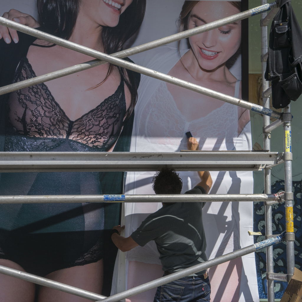
Comment |
Daniel, patience paid off. You captured the man at the right moment, and all of his body parts are nicely framed by the metal tubes, as well as the shadows created by them. I like the way the woman "looks" at him while his hands are in a "private" area, with acceptance..... Nothing to change, perhaps just a little more color saturation. |
Sep 6th |
 |
3 comments - 1 reply for Group 58
|
| 72 |
Sep 17 |
Reply |
Vic, some do: D750, D500 and the new D850 |
Sep 22nd |
| 72 |
Sep 17 |
Comment |
Kent, very good PP of the sunrise. The ring you mention is also present in the original image but much subtle. It is the sun. The colors are beautiful and intense. I think you left too much foreground in the lower third which is not helping the image. I cropped it to make the foreground 1/3 of the image, which still shows the dead tree you want to emphasize. and the ski remained the same, which is the center of attention. Made the horizon line straighter and added a little of dehaze which intensifies the orange colors and darkens slightly the trees more like a silhouette. Cropped a little from the left as well. |
Sep 11th |
 |
| 72 |
Sep 17 |
Reply |
Vic, it is a matter of taste |
Sep 11th |
| 72 |
Sep 17 |
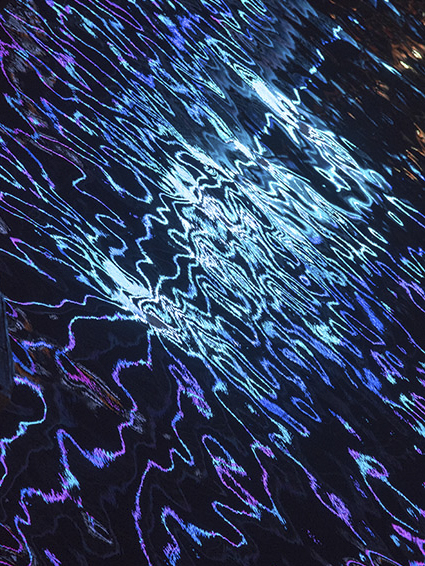
Comment |
Michael, very interesting and abstract image of the light reflections on the water. You do not specify shutter speed. I just wonder how it would look with a slight "long" exposure to make the lights look softer and more like a collage or color palette. Comparing both images I can see that you added some light to the shadows, but that also made a dark edge appear on the left of the image. I just cropped the image slightly to get rid of that and the black triangles. |
Sep 11th |
 |
| 72 |
Sep 17 |
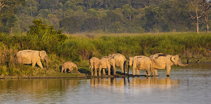
Comment |
Abhijeet, great image of the elephants herd, and good PP. Now, I think that you cropped too close to the left edge creating tension there, and not leaving enough space in the other end to go to. I personally prefer an environmental crop showing more of the natural area, in thirds, rather than the water. It is sharp. The size of the file is very small and may appear pixelated. |
Sep 6th |
 |
| 72 |
Sep 17 |
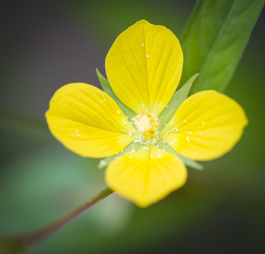
Comment |
Vic, this is an interesting flower. I have never seen it. Here you were faced with one of the most common difficulties in Macro photography which is DOF (Depth of field) which is less the closer you are to the subject which is the case of the lower petal which is out of focus. Even if you use a very small aperture (not stated) it is not enough to achieve focus from the tip of the petal, all the way to the center of the flower, which is also out of focus. In a situation like this sometimes you can get sharpness all across the image is by using focus stacking. Anyway, it is a nice image, but I prefer the square crop which makes the flower appear from the lower left corner, upward. Also added a slight vignette. |
Sep 6th |
 |
4 comments - 2 replies for Group 72
|
12 comments - 5 replies Total
|