|
| Group |
Round |
C/R |
Comment |
Date |
Image |
| 4 |
Aug 17 |
Reply |
On second thoughts, I agree with your crop |
Aug 12th |
| 4 |
Aug 17 |
Reply |
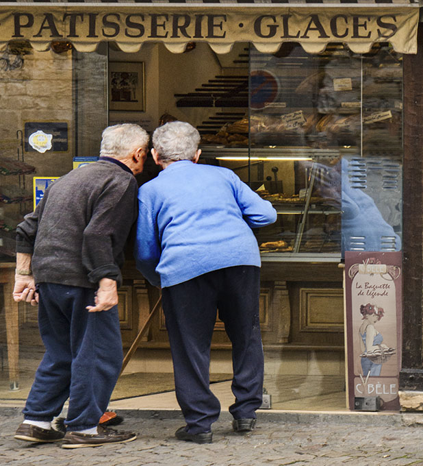
Bill, with your crop the two men end up in the center of the image, and the word "glaces" gets cut in half. We could tone down the large sign and clone out the blue one, keeping the reflections and detail. This way the composition is better. |
Aug 10th |
 |
| 4 |
Aug 17 |
Reply |
Yes Bill, the noise showed up when I did the adjustment brush additional light in the dark area of the wings |
Aug 9th |
| 4 |
Aug 17 |
Reply |
Sort off !!! |
Aug 8th |
| 4 |
Aug 17 |
Comment |
Bill, beautiful landscape image with great colors and composition. The sky deserves the 2/3rds real state that occupies.The main reflection is in the perfect place in the frame. Nothing to add. |
Aug 7th |
| 4 |
Aug 17 |
Reply |
Guy, your interpretation of the landscape, makes another image all together. |
Aug 7th |
| 4 |
Aug 17 |
Comment |
Bill, you proved again that being at the right place at the right time pays off. Beautiful and sharp panorama of another image of your collection of light houses. Indeed the silhouetted group of people next to the sun gives the impact to the image. Great colors, great composition. I would have flipped it, but that would have messed up your artistic signature. |
Aug 7th |
| 4 |
Aug 17 |
Comment |
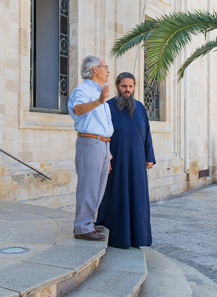
Erik, interesting image and the position of the priest head looking down shows that he is concentrated listening, and the interlocutor with the motion of his right arm, which is typical language/body movement of the mediterraneum tells the story. The palm tree is pointing to, and framing the priest. It is sharp. I just cropped a little from the top. I also like the way the stairs work as a base to the whole image. |
Aug 7th |
 |
| 4 |
Aug 17 |
Comment |
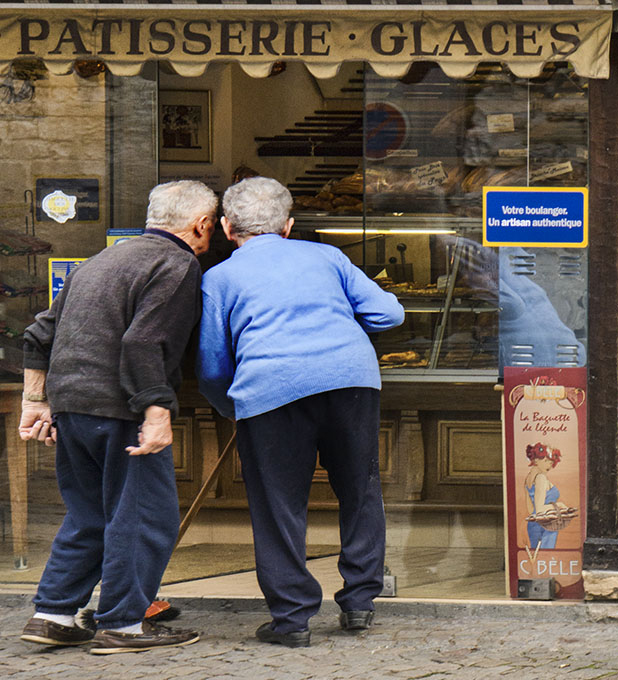
Joe, the two men are really looking intensely into the bakery. You can tell by their body language. The blue sign complements the story "Your pastry chef is an authentic artisan". The image is sharp. I find the yellow pillar to be distracting and pulling my eyes away from the main subject, so I cropped it.
|
Aug 7th |
 |
| 4 |
Aug 17 |
Comment |
Guy, you are the master of the staircases. Here we have another interesting image, a little skewed, very sharp, and dividing the image in smaller showcases, with different content which makes you travel all over to get all the details. It is sharp. |
Aug 7th |
| 4 |
Aug 17 |
Comment |
Ian, the image is sharp, nicely composed, a lot of detail and color, and the vignette frames very nicely the woman. The contrast of the red lips with the green background complements each other. Nicely done |
Aug 7th |
| 4 |
Aug 17 |
Reply |
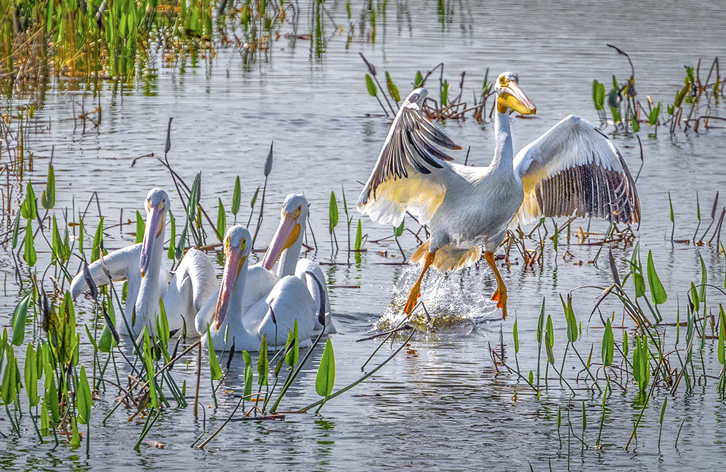
Guy, you are right, but the main reason is that the image is backlit. If you note, the greens and the other colors are already bright and saturated enough. The rest is white (birds) and grey/blue (water). However, I did follow your recommendations and added a levels adjustment, as well as additional light in the shadows. What I think happened was that the monitor I worked the image on was very bright (I had to recalibrate) and that is why the image i dull and dark. I fixed it. Thanks for pointing it out. |
Aug 7th |
 |
6 comments - 6 replies for Group 4
|
| 58 |
Aug 17 |
Reply |
Mofassirul, your observation would be possible only on a "staged" set up. This was done shooting from the hip..... I was able to move unnoticed to place them between the trees. |
Aug 27th |
| 58 |
Aug 17 |
Reply |
The idea from the discussion is to learn from each other. "A picture is worth more than a thousand words". The favor of an image with your suggestions is highly appreciated. |
Aug 23rd |
| 58 |
Aug 17 |
Reply |
The human element is very important, and really tells the story |
Aug 22nd |
| 58 |
Aug 17 |
Comment |
As you all can see, It is a matter of choice and very subjective. |
Aug 22nd |
| 58 |
Aug 17 |
Comment |
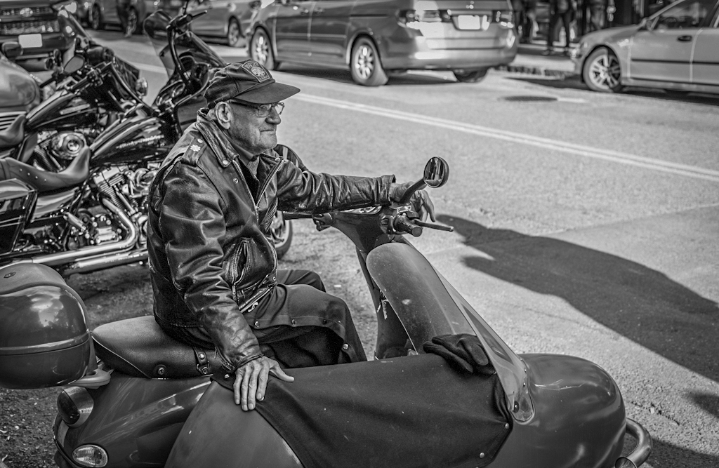
Ed, interesting image. Yes, he looks like somebody from "La Cosa Nostra". The man is well placed in the frame. To me it looks too contrasty with little detail. I added light to the shadows, and now you can see better the face. Added a vignette to take away some of the distraction in the bright background. |
Aug 10th |
 |
| 58 |
Aug 17 |
Comment |
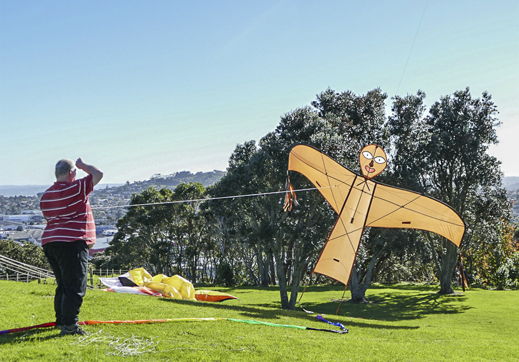
Liz, image with very difficult light conditions, being very contrasty and lack of details in the dark areas and with poor saturation of the colors, except for the kite with a face. It is sharp, and well composed. I cropped slightly from the right of the frame, added light to the shadows, decreased the brightness and added some vibrance to the colors. |
Aug 7th |
 |
| 58 |
Aug 17 |
Comment |
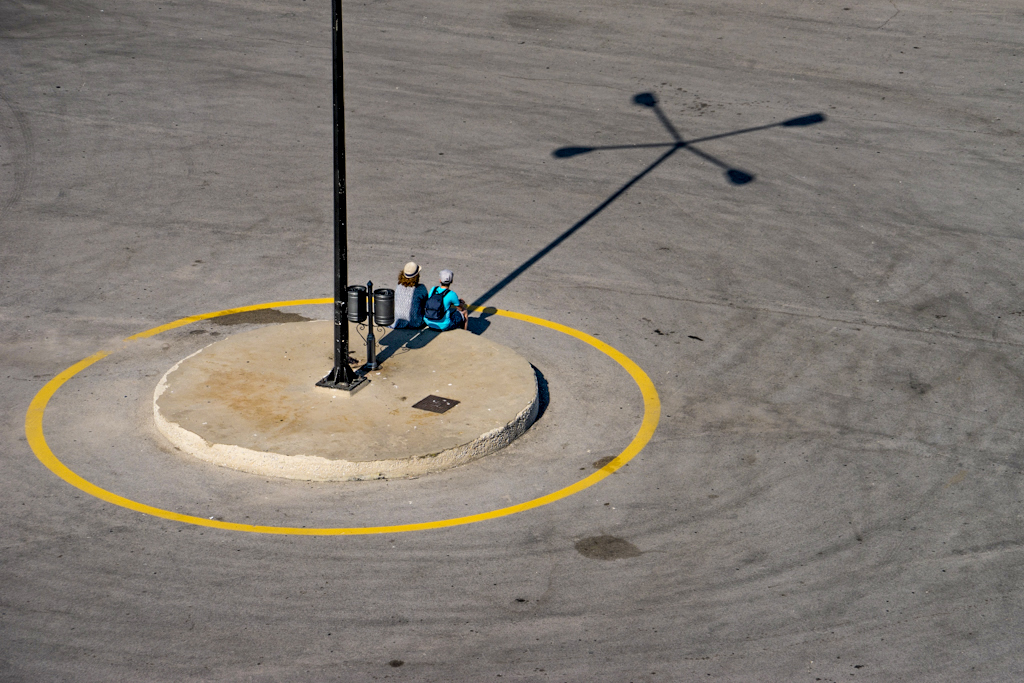
Daniel, simple, but at the same time a complex image, two individuals framed by the pole and the shadow of the pole in the ground, as well as additional geometric images with the bright yellow circle also framing the individuals. At first I thought there was too much empty space to the right, but after cropping t, it really changed the whole aspect ratio, so I desisted. I just added some light to the shadows to see more detail of the individuals, and added saturation to the yellow circle to make it more predominant. |
Aug 7th |
 |
| 58 |
Aug 17 |
Comment |
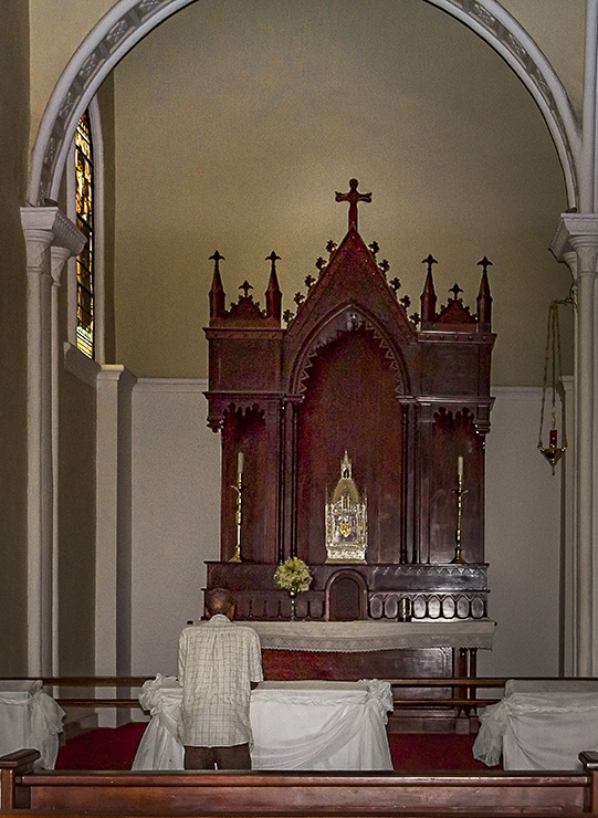
Gloria, this image denotes peace and tranquility as the title states. The man is well placed in the frame, and the altar is off center. Due to the little ambient light, the head of the man gets lost in the dark wood. The image is sharp. I added light to the shadows to separate the head from the background, and just cropped slightly from the bottom. |
Aug 7th |
 |
| 58 |
Aug 17 |
Reply |
And not always flash photography is allowed. |
Aug 7th |
| 58 |
Aug 17 |
Comment |
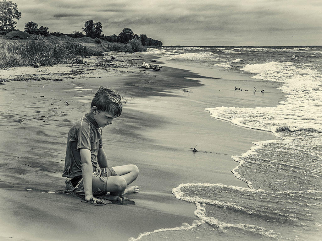
Dan indeed the kid is in deep thought due to the circumstances. I like the composition and where he is in the frame, however; I like it flipped better. The light sepia tone adds interest to the image. I also added slight light to the shadows to see his face better. |
Aug 7th |
 |
| 58 |
Aug 17 |
Comment |
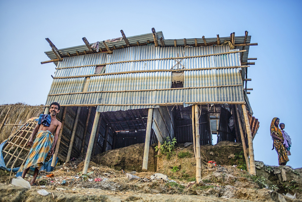
Mofassirul, it is amazing how people become "creative" on adverse conditions. It is really impressive how this construction stay up being so fragile. Obviously the man is proud of his accomplishments, and the woman holding the child is another manifestation that life goes on and tells the story. Your vantage point and your position at the time of creating the image gives this optical distortion. I added some light to the shadows and now you can see more detail under the the house. |
Aug 7th |
 |
| 58 |
Aug 17 |
Reply |
Dan, the EC was dialed on the camera from a previous shot. You can read it in the exif file, so I reported it. Probably I decreased slightly the exposure in post to overcome it. |
Aug 4th |
7 comments - 5 replies for Group 58
|
| 72 |
Aug 17 |
Reply |
Vic, thank you for the classification observation. I have a book about dragonflies and Damselflies and I just checked (I did not do it before) and you are right. The Blue dasher has clear eyes, not black like this one. |
Aug 27th |
| 72 |
Aug 17 |
Reply |
Kent, I used the regular cloning brush tool |
Aug 17th |
| 72 |
Aug 17 |
Comment |
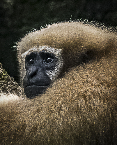
Other option, since you mention in your description that you wanted the focus on the face of the primate, then you can really crop it very tight like a portrait. Adding a vignette, your eyes are taken directly to the eyes of the monkey. |
Aug 12th |
 |
| 72 |
Aug 17 |
Comment |
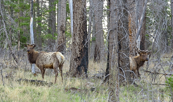
Kent, obviously the images are reversed (I told Sarah). You captured the Elk's in their natural environment, and you were able to have both of them look at you at the same time (bonus-interesting fact). I think your crop in too tight and creates tension in the image being both so close to the edge, and having plenty of space in the middle. I cropped your original image to what I think is more balanced, and also adjusted the vibrance and saturation of the colors, and gave a little light to the shadows to bring more detail out. I did close out a couple of wood sticks in the bottom edge. |
Aug 12th |
 |
| 72 |
Aug 17 |
Comment |
Hi Mary, great image of Santorini. Agree that should have included the whole tower, or just crop it completely. The observations by Sarah specially bringing up the colorful flowers adds to the image and reduces somehow the blue hue on the buildings. Vic's are also valid. Indeed it was a hazy day. |
Aug 10th |
| 72 |
Aug 17 |
Comment |
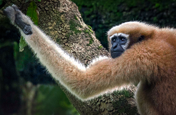
Abhijeet, great capture. By principle, we should not amputate any limb in our subjects, unless it is strictly necessary. Here, I PP your original image keeping the arm, which in fact works as a leading line towards the monkeys face. I did clone out all the bright areas which are distracting. I tried to reduce the brightness to the backlit fur with only minimal benefit. Now the face is in the 1/3. I added a vignette to bring our view to the monkey's face.
|
Aug 10th |
 |
| 72 |
Aug 17 |
Comment |
Sarah, your image (portrait) of the woodstork, specially your re-edit is magnificent. Indeed the bluish discoloration did not belong there. Yes, Wakodahatchee has been taken over by the woodstorks. The composition is great, and I like the fact that the head is slightly hidden in the plumage, a sign of modesty (far from reality in these birds). The detail in the feathers is great. You may add/increase the slight catchlight in the eye. |
Aug 10th |
| 72 |
Aug 17 |
Comment |
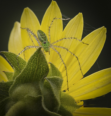
Vic, great capture indeed, and your PP brought out a lot of detail in the flower. The spider is tack sharp, your f/10 gave you enough DOF for all the details in the spider's legs. I agree with cropping some of the flower, but I think Sarah did it too tight specially on the top. I would have done it slightly more square. Cloned out a couple of orange lines in the lower right and added a vignette. |
Aug 10th |
 |
| 72 |
Aug 17 |
Comment |
Michael, Hi; I am new at this group. I must agree with the observations made by Vic and Sarah, and I do like Sarah's crop # 1. You also have to keep in mind that in the Macro world, depth of field is the most important factor in addition to shutter speed if you are hand holding. DOF at close distance is only a few millimeters, so you have to use on f/stop anywhere from 8 to 16 depending on the sweet spot of your lens. I will just mention something you can read about which is used in macro which is focus stacking. Color wise, your original has a better tonality. |
Aug 10th |
7 comments - 2 replies for Group 72
|
20 comments - 13 replies Total
|