|
| Group |
Round |
C/R |
Comment |
Date |
Image |
| 35 |
Sep 20 |
Comment |
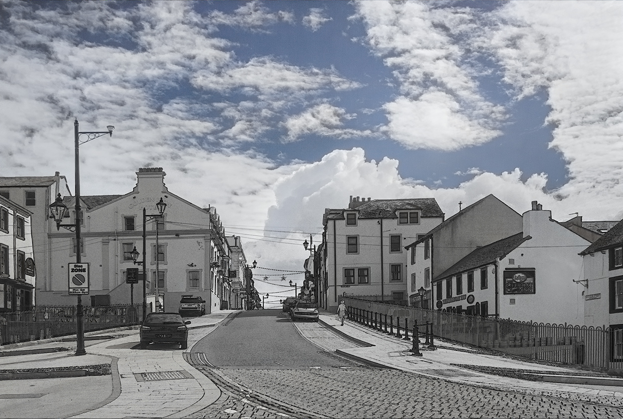
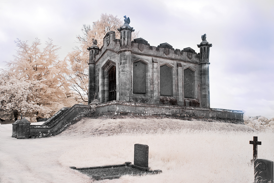
I do like the overall look Stuart, but like Debbie find it very strong colour wise. I feel it wouldn't take much to tone it down a touch to make it a more appealing image. Whether this be by adjusting your Hue & Sat. sliders or other method I feel it would be worth it. I can understand your frustration messing around with CLiR. I am still messing with it. There is no right or wrong, it's all experimentation until you get what you like. But I think you could adjust this now in PS. |
Sep 13th |
| 35 |
Sep 20 |
Comment |
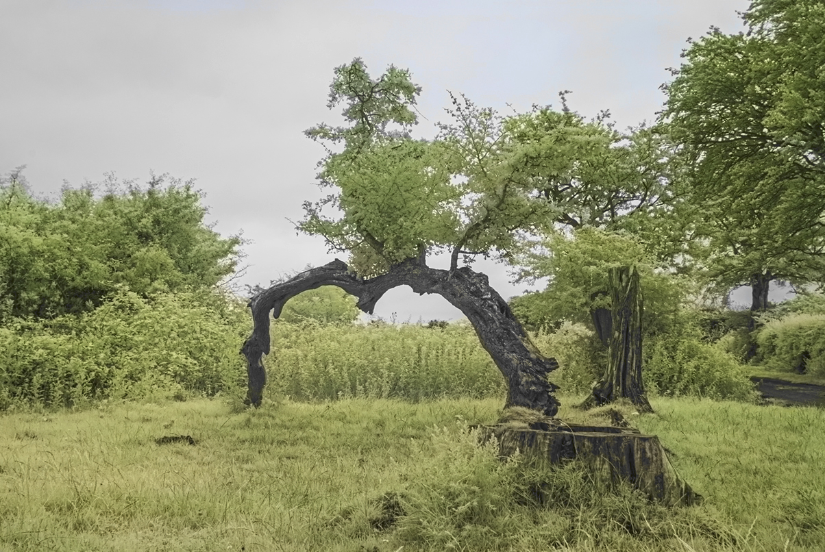
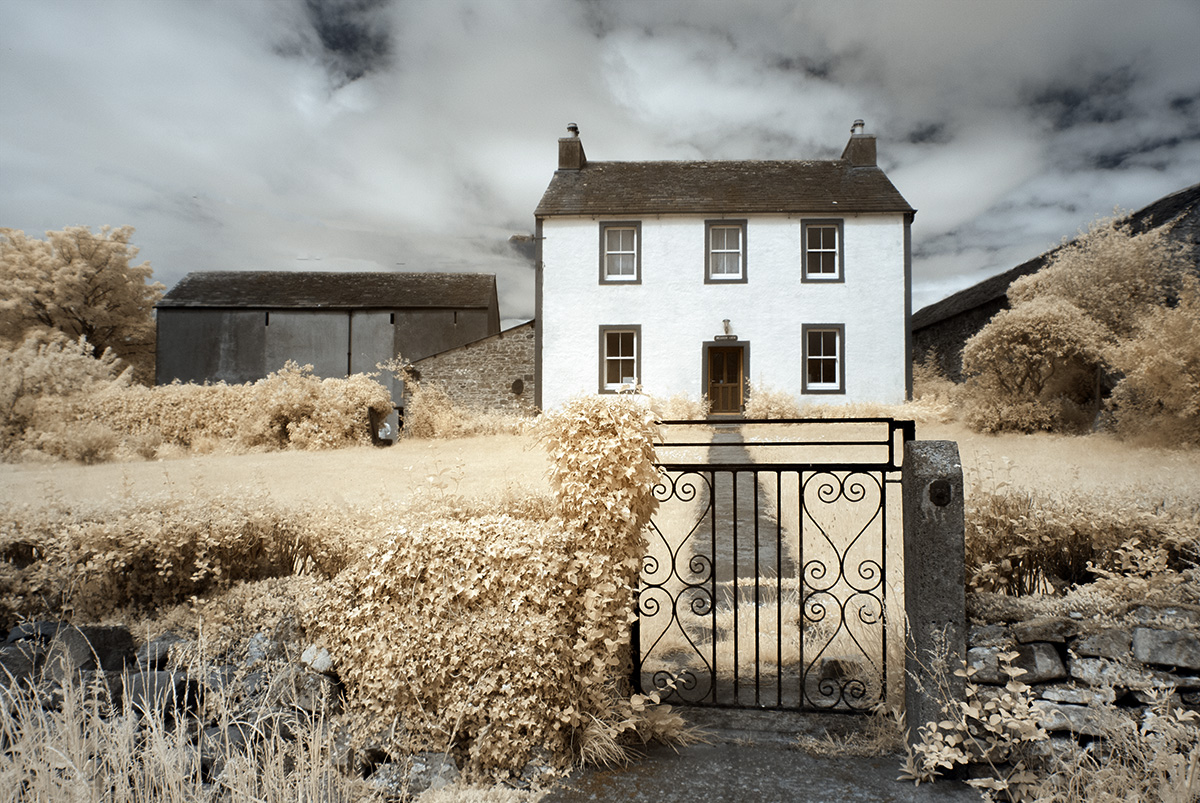
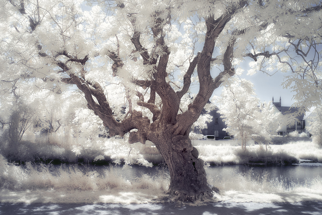
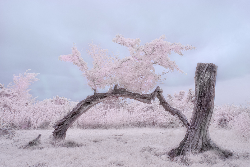
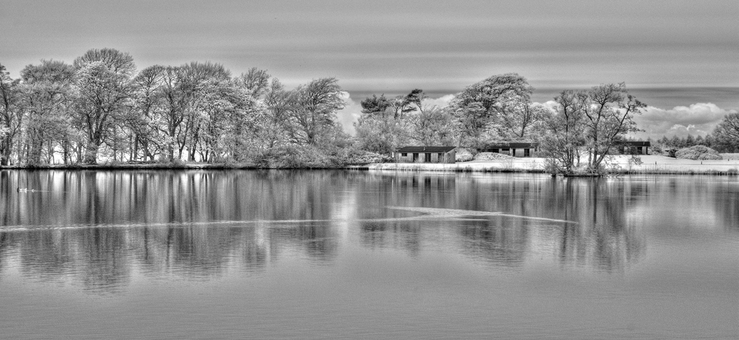
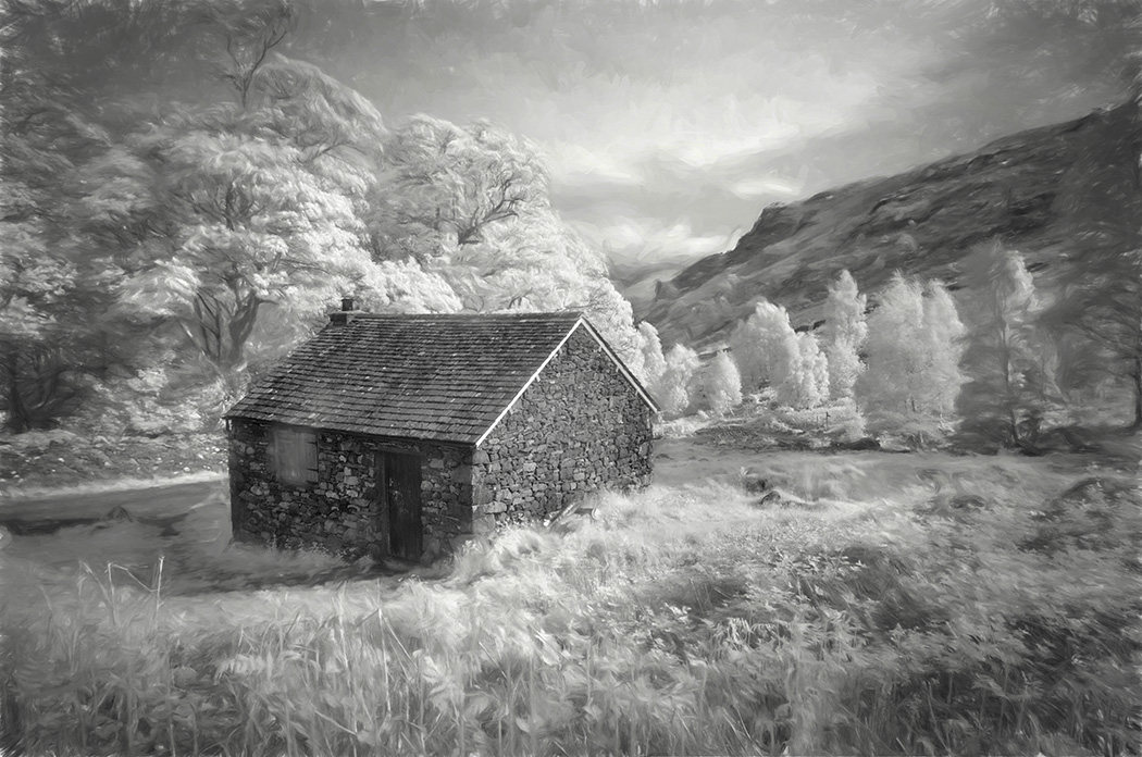
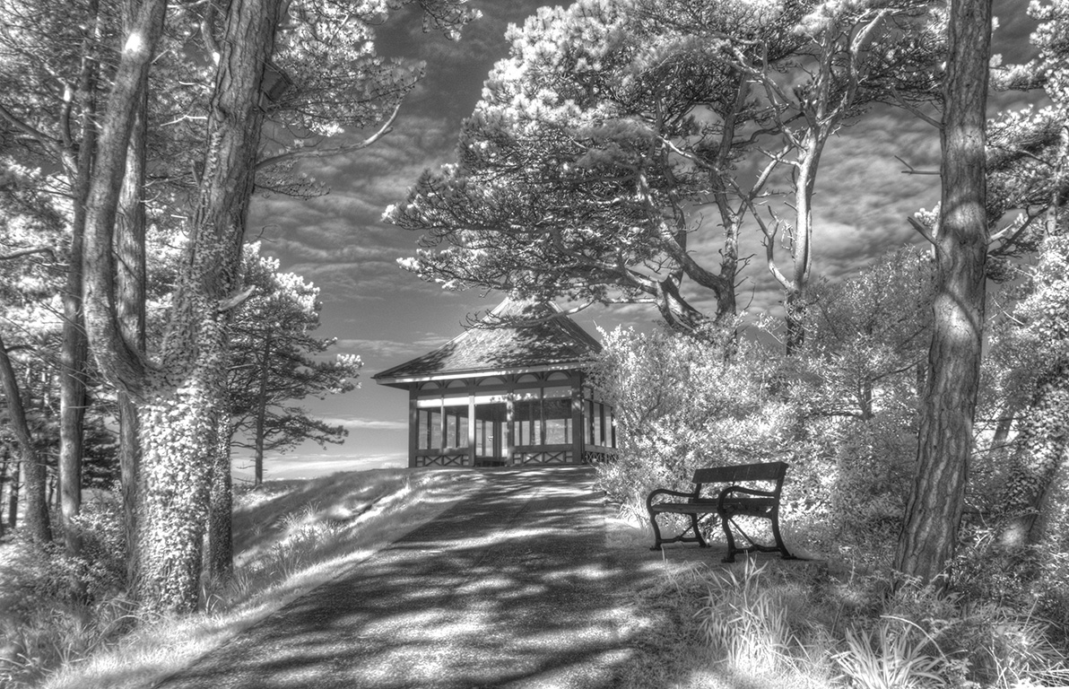
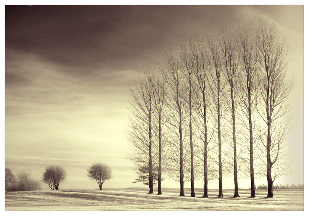
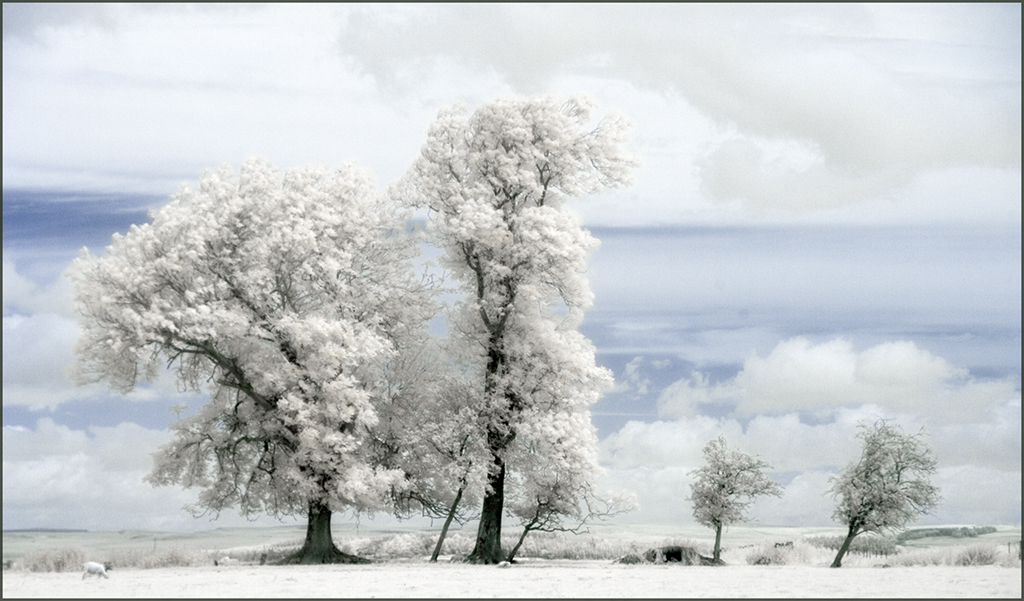
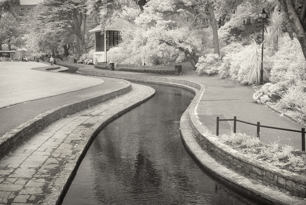
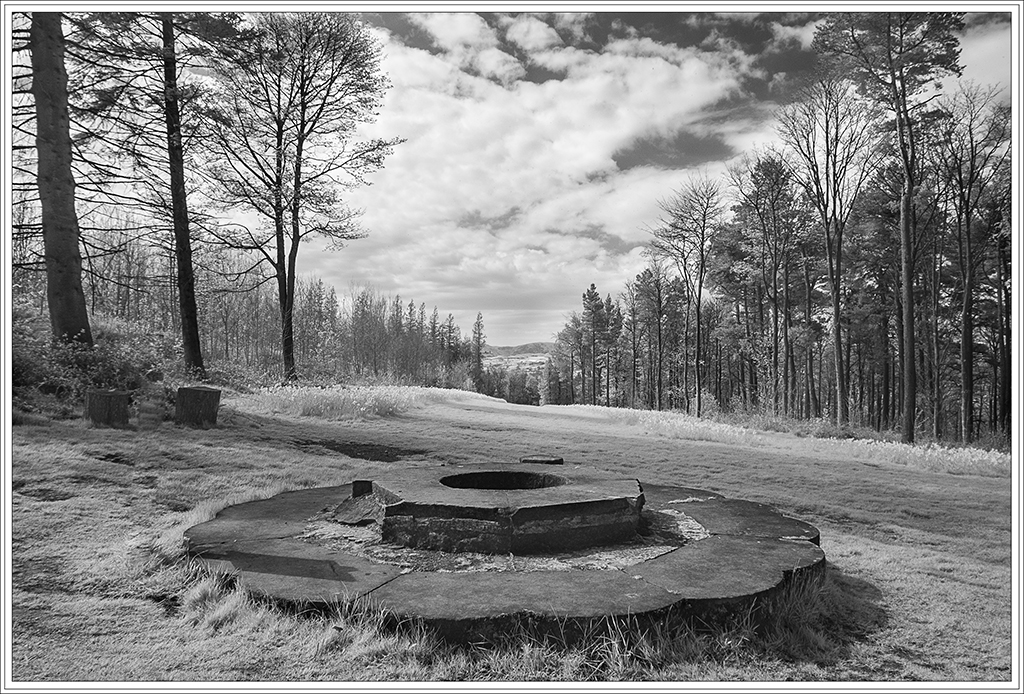
How delicate you have made this. It would have been very easy to give this a much harder effect as the trees look strong, mature and well developed. Particularly like the way the foliage has turned out and the shadow play on the grass. We have many trees in our area bent by the wind, so do not find these out of character. Nice soft arty image. Like it. |
Sep 13th |
| 35 |
Sep 20 |
Comment |
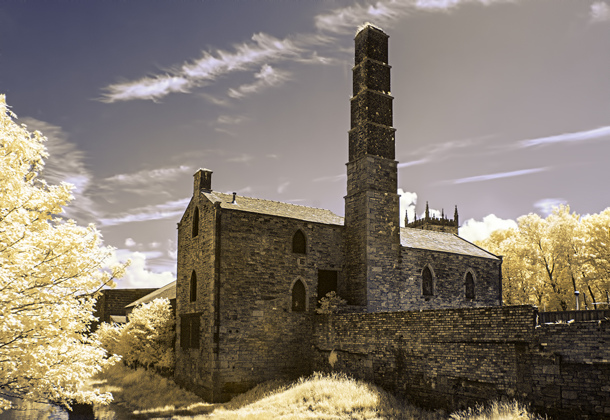
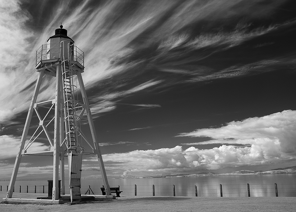
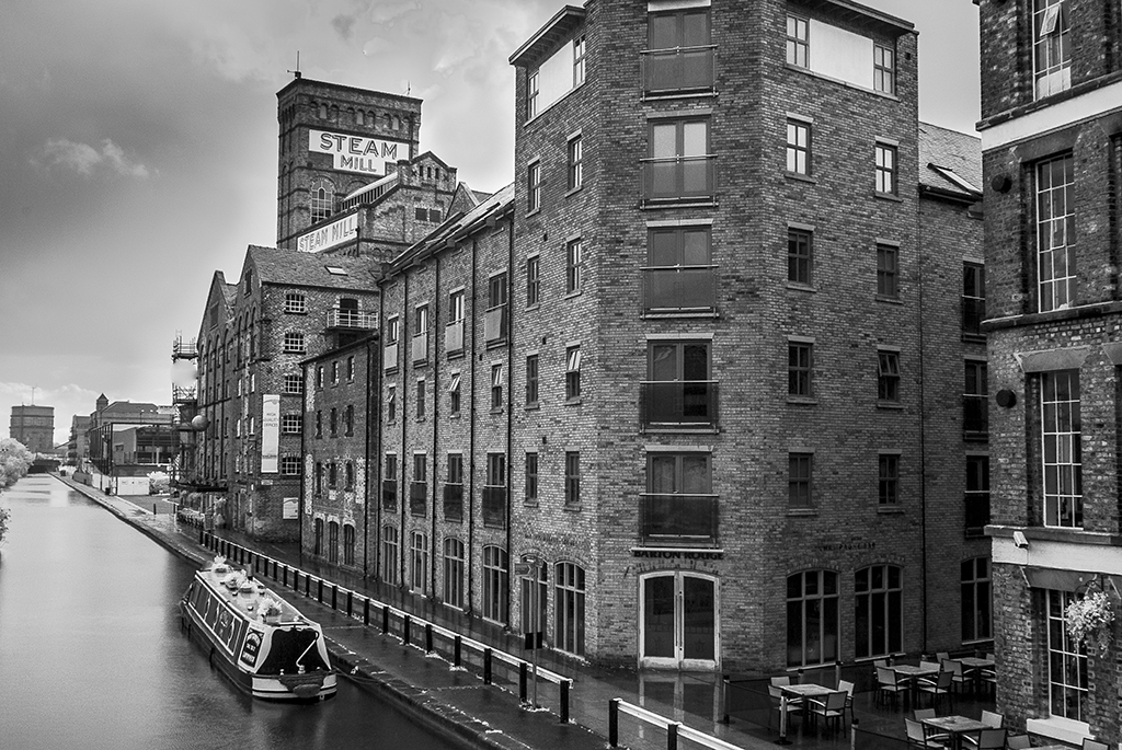
Nice job in processing this, with good tonal range showing rich blacks. Do like the repetitive patterns of the steel structure at the Right of the bridge and above, and the strong perspective lines leading into the distance. To make it even stronger I suggest cropping above the top horizontal steel bar as there is not a lot of interest above that. It is all below. |
Sep 13th |
| 35 |
Sep 20 |
Comment |
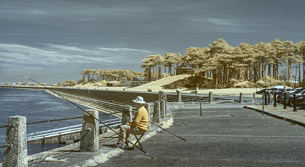
Good experiment Terry. I particularly like this. It does tend to lean to the left a bit but I find this gives it dynamism and impact and I do like the texture of the fence tops leading to the trees. As an experiment I cropped off the trees to see the effect without and actually like the bottom half, so two images in this for me. Strong appeal for me this one. |
Sep 13th |
| 35 |
Sep 20 |
Comment |
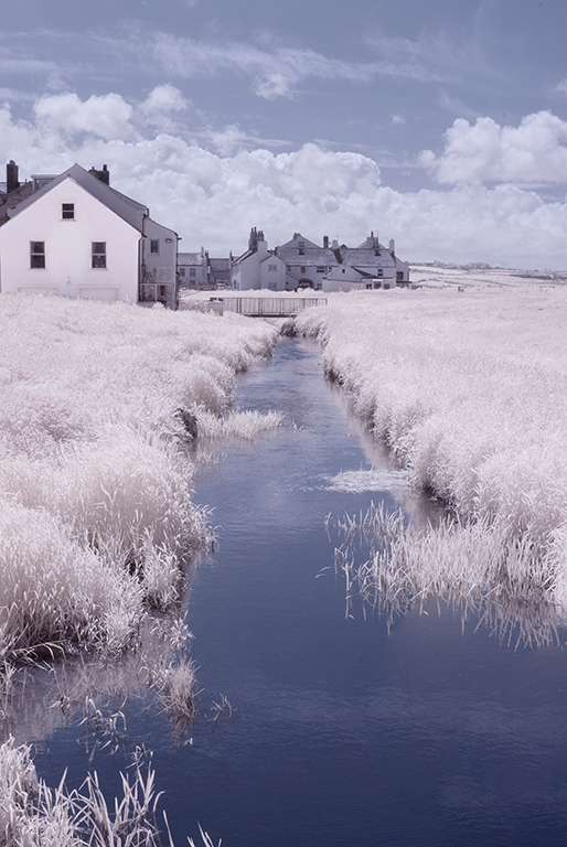
Super Drama here Julie all due to the fantastic sky. Good that you stopped for a drink!! I like that you have cropped the other tree out and relied on the fence and gate for a lead in and love how the fence seems to go on forever and fade away in the distance. I feel maybe the very White clouds directly above the tree and on the far right edge could do with just a little detail cloned into them as they are eye catching, which would be a simple job. Otherwise great pic. |
Sep 13th |
| 35 |
Sep 20 |
Comment |
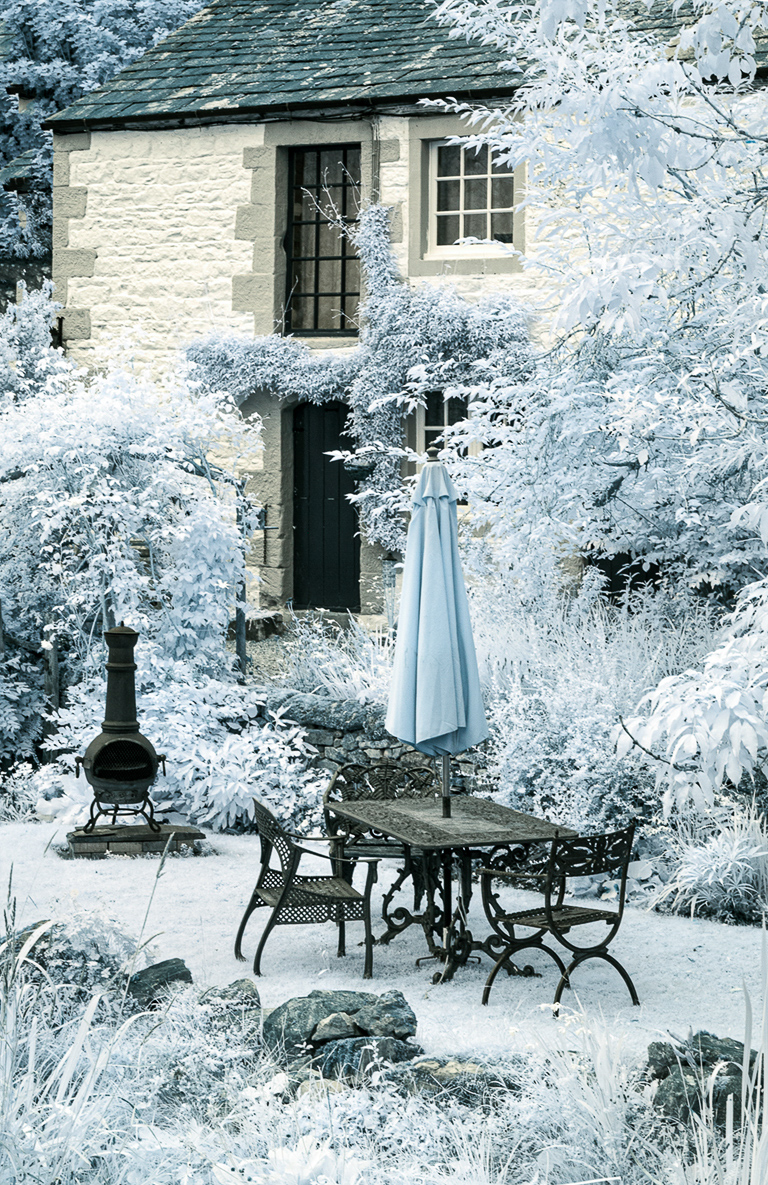
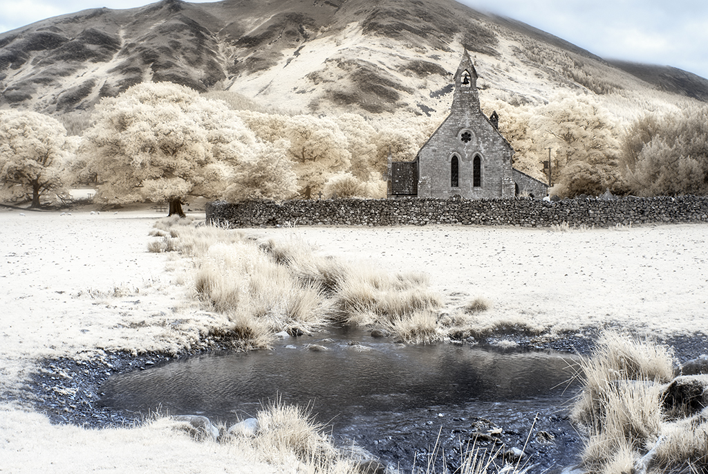
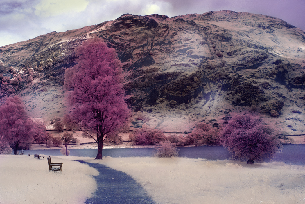
What a lovely effect Sharon. Dreamy , artistic, oft and subtle. I love this effect you have achieved and can relate to what you say about CLiR. It is all about experimenting and having satisfaction at the end of it. Your Morning Mist is probably the topping on the cake. I would think this would look absolutely great printed on Art Paper. As for competitions etc., I agree it all depends on who is judging and what style of images appeal to them but I certainly think it would be worth trying it out. |
Sep 13th |
| 35 |
Sep 20 |
Reply |
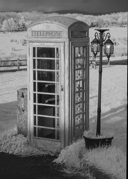
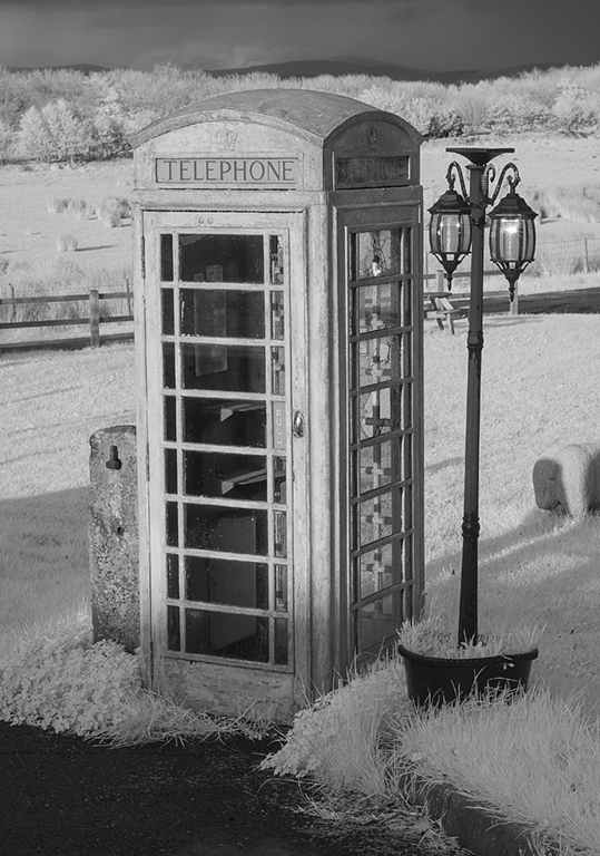
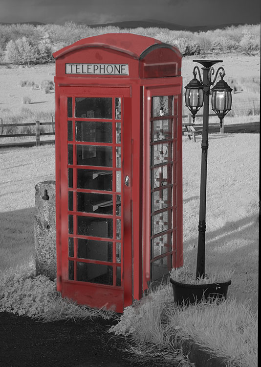
Following your advice I have attempted to paint the booth Red. Not perfect but it gave me an insight how to go about things. I had to select in most circumstances by using the polygonal selective tool as other attempts did not work easily, then filling from the colour picker the Reds, in some cases lighter or darker to give a bit of form. Again not too successful as there were lots of different areas to paint. The narrower panes inside the booth I used by clicking on the beginning of the pane and then at the end by pressing shift at same time and it zoomed along on its own. Very useful but only because they were short and narrow. I had to do every step on a new layer so I ended up with the layer stack very long. Thank you for your assistance. I will try and perfect the next one I do but will choose something with not so many parts.!! |
Sep 6th |
 |
| 35 |
Sep 20 |
Reply |
Thank you for your advice Terry. Certainly worth a try with your method. Watch this space!!! |
Sep 4th |
6 comments - 2 replies for Group 35
|
6 comments - 2 replies Total
|