|
| Group |
Round |
C/R |
Comment |
Date |
Image |
| 35 |
May 18 |
Comment |
Thank you for your advice Sharon. Photomatix Pro gives you choices for aligning the images which are: On tripod -hand held standard,- hand held minimal movement,- hand held large shift. I chose hand held standard and it seemed to do a good job. Will certainly try it again. |
May 16th |
| 35 |
May 18 |
Reply |
I can understand the difficulties trying to go wider. There is always some distraction that you do not want. I have no doubt that taking the other flare spots out would have helped but this might have proved difficult especially here. You would have to copy other parts of the branches over them probably. Also flare tends to soften the image where it travels, so maybe a bit more contrast in those areas would be needed. Worth a try though. Overall you have done a good job. |
May 12th |
| 35 |
May 18 |
Comment |
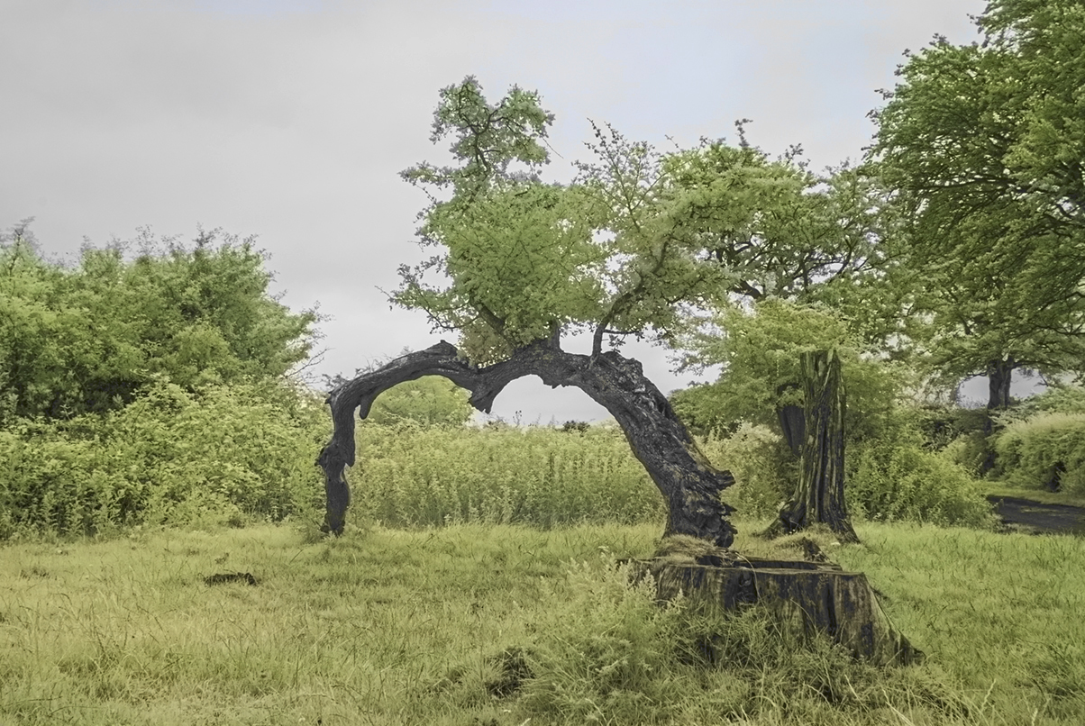
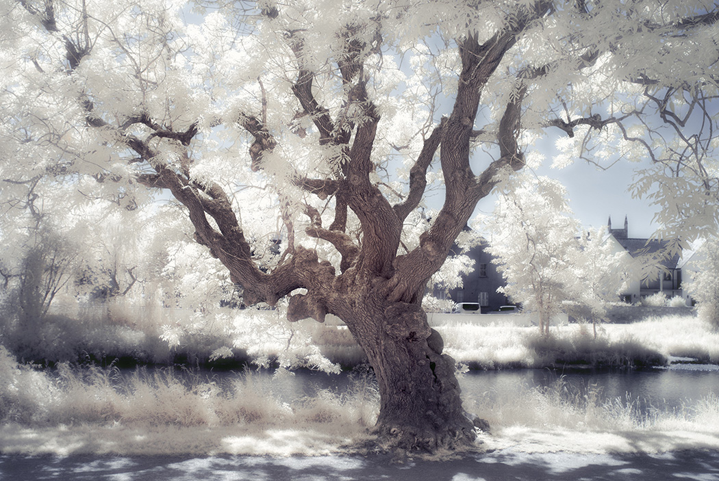
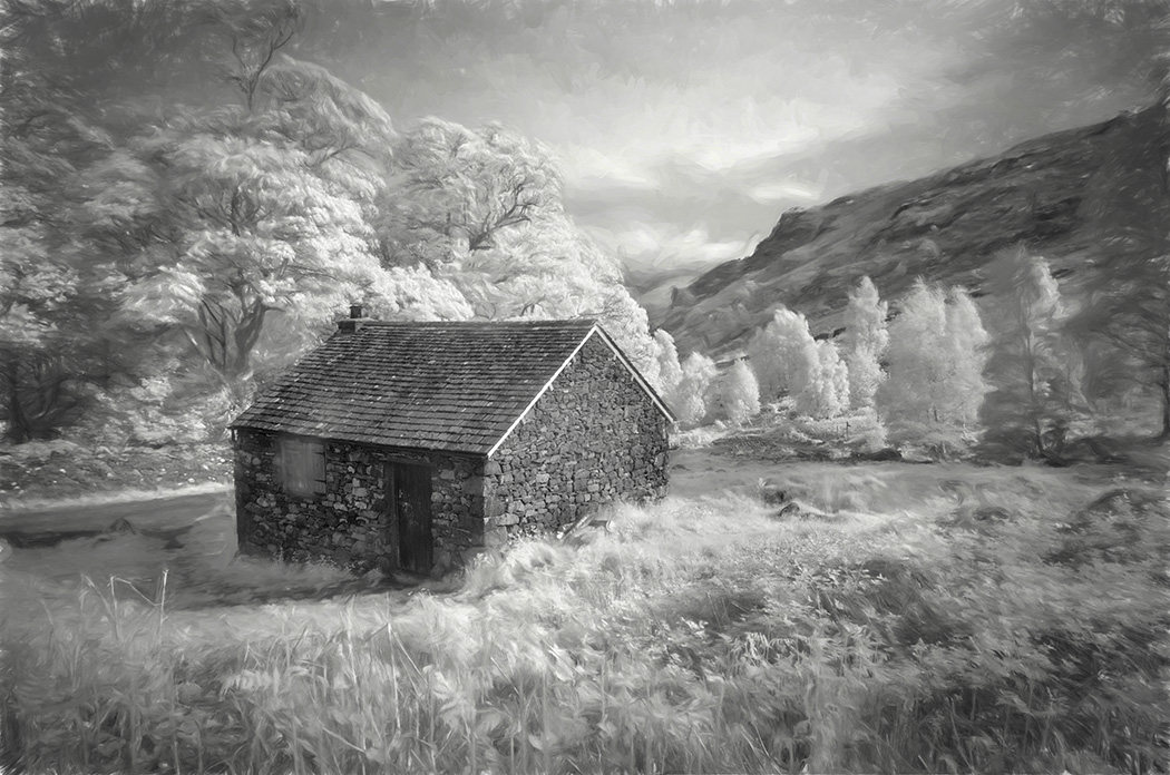
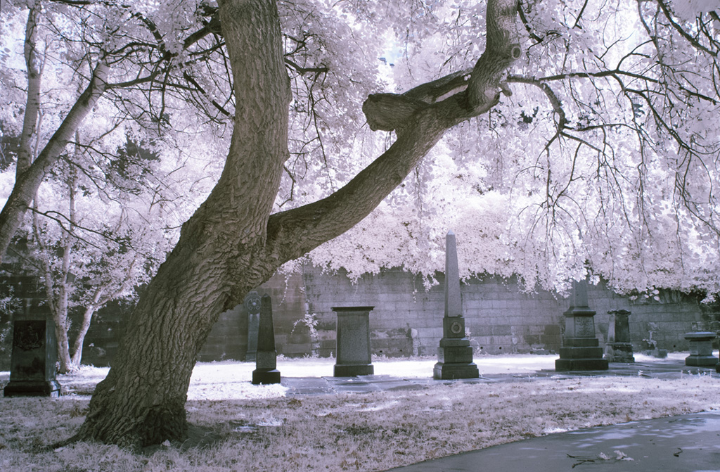
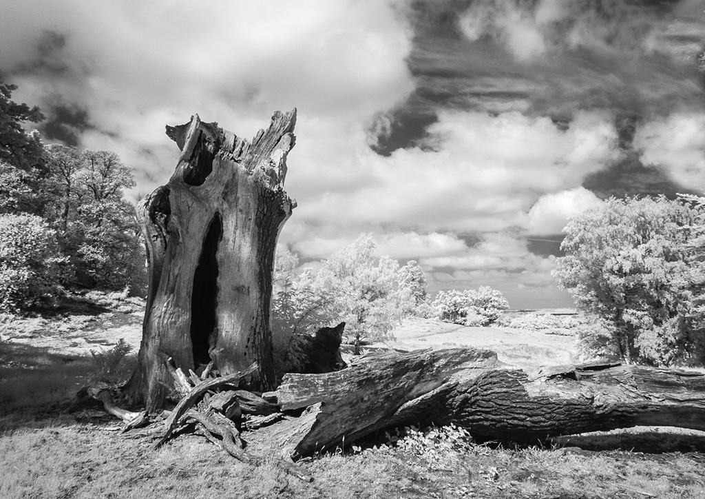
That is a lovely tree Debbie and I would like to have seen more of it as this is very tight in the frame. The shadows are an interesting feature. Shooting into the sun does cause problems and I did wonder what the bubble was until I looked up and saw more flare at the top. It has added a sense of mystery until you work it out. Well done. |
May 11th |
| 35 |
May 18 |
Comment |
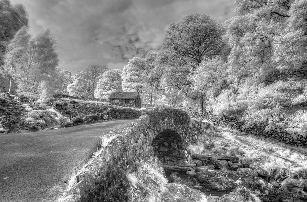
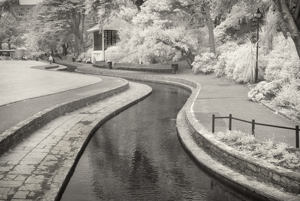
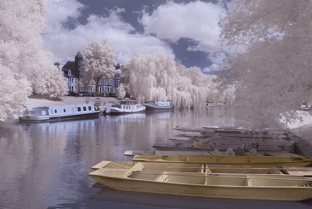
It does indeed look a lovely place to go Nelson. There is a lot to take in here. Beautiful trees, interesting bridge and water. But also you have chosen to tone in a strong Blue. For my preference it needs a more subtle tone of Blue as this comes over rather contrasty, and your original is easier on 'my' eye, with lovely soft reflections showing in the water and nice 'feathery' foliage. Each to his own though Nelson. We all have different tastes. |
May 11th |
| 35 |
May 18 |
Comment |
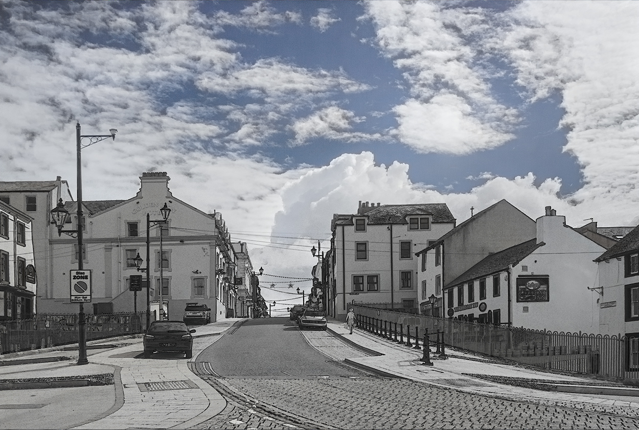
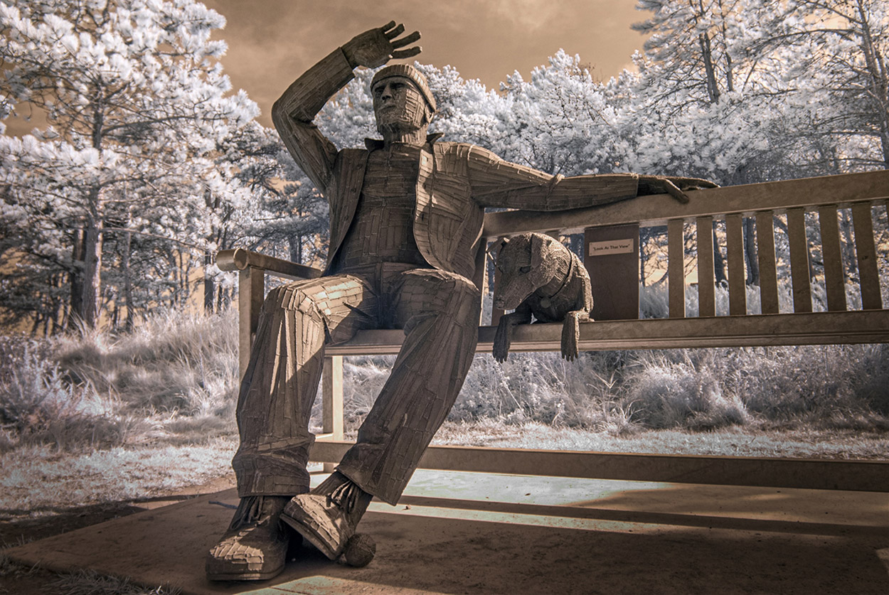
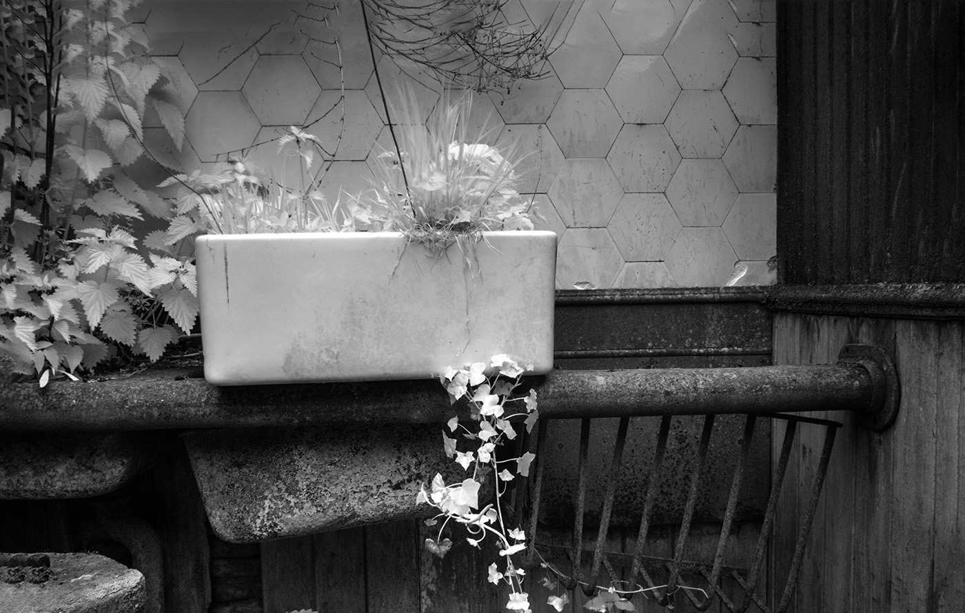
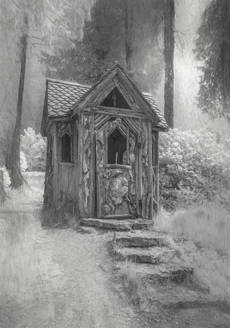
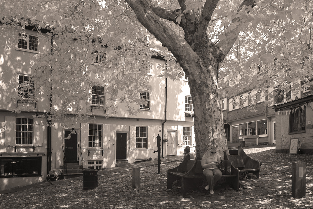
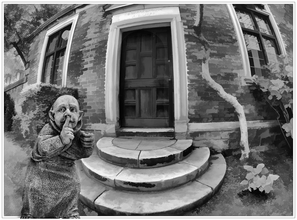
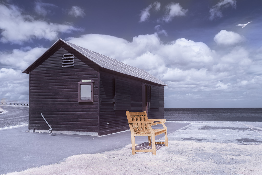
What a pleasant and quirky image. Can't fault it in any way.
The treatment you have given it, suits it perfectly and I can't think of anything better you could have done. Well done. Also love the simplicity of this image. |
May 11th |
| 35 |
May 18 |
Comment |
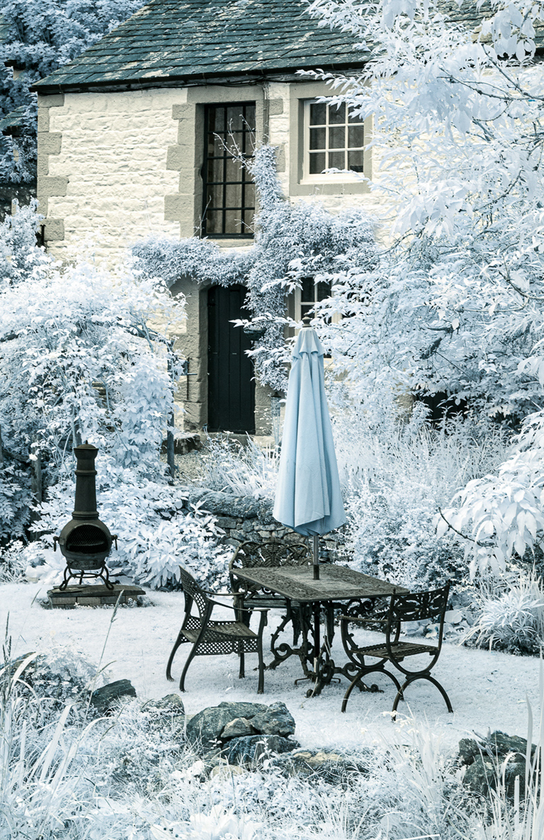
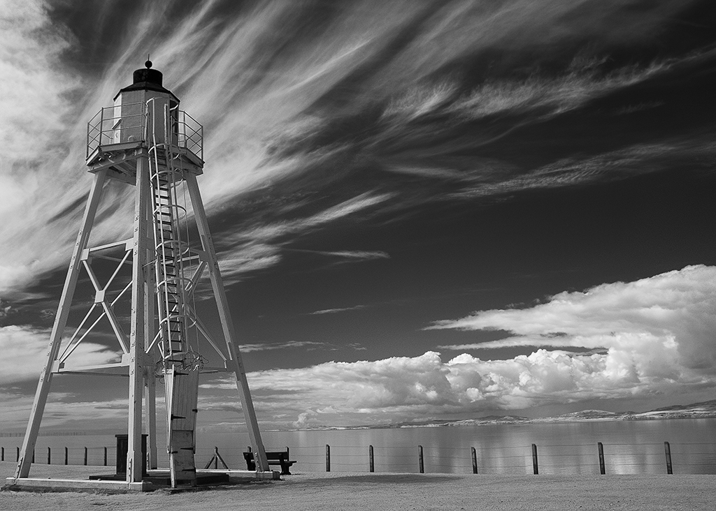
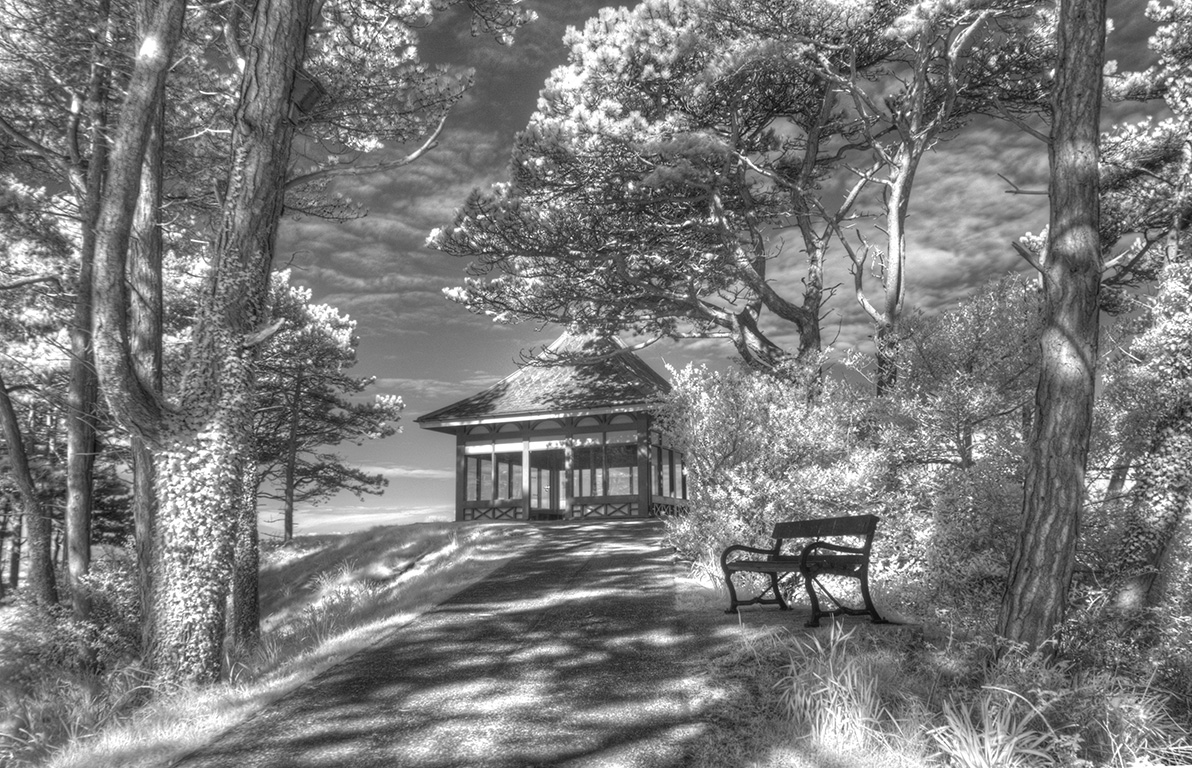
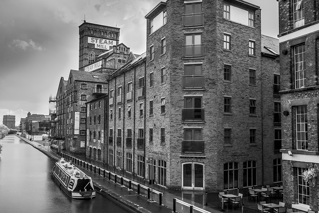
A great location Stuart. I'll bet this is popular with tourists and photographers. Overall you have made a good job of this considering it looks as though it may have been quite contrasty conditions and with that in mind I would crop off the sea at the right hand side which would also get rid of some of the specular highlights there.There is a feeling of recession and mistiness in the distance where the lighthouse is. The sky is interesting and if underexposed a bit to give some drama, I feel it would be a good backdrop to your lighthouse. I can imagine this would make good images in traditional B?W and colour so hope you made the most of your trip. Nice scene. |
May 11th |
| 35 |
May 18 |
Comment |
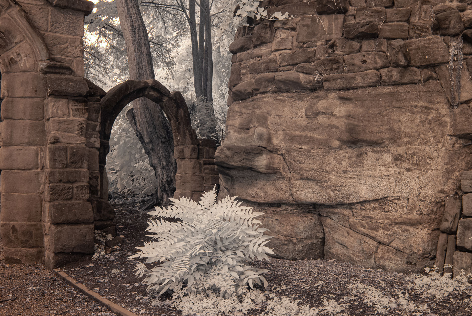
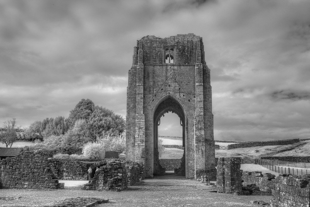
What a charming place, and the connection to 'Gone with the Wind' Wow!! This must be a very popular place with Visitors and tourists wanting to see it. Your treatment of sepia has served it well and indeed given it an 'old worldly' feel to it. However, I feel because of all the other 'stuff' around the building, the building doesn't stand out as your eye is roaming all over the place, and I felt a large slice of the right hand side should be cropped to concentrate on the building. It wasn't until I looked at your pencil sketch version that I felt the the whole image worked beautifully, as the sketching has minimised a lot of the surroundings. That is the one to concentrate on in my opinion. It is great!! |
May 11th |
6 comments - 1 reply for Group 35
|
6 comments - 1 reply Total
|