|
| Group |
Round |
C/R |
Comment |
Date |
Image |
| 35 |
Dec 17 |
Reply |
Hi Sharon. My process used to remove sharpening was to stamp the layers to add sharpening, then add mask and brush out on the mask the areas i.e. sky that you prefer to remain soft. Very easy. Good luck with Photomatix, it is very good and easy to use. |
Dec 18th |
| 35 |
Dec 17 |
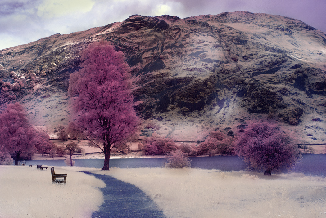
Comment |
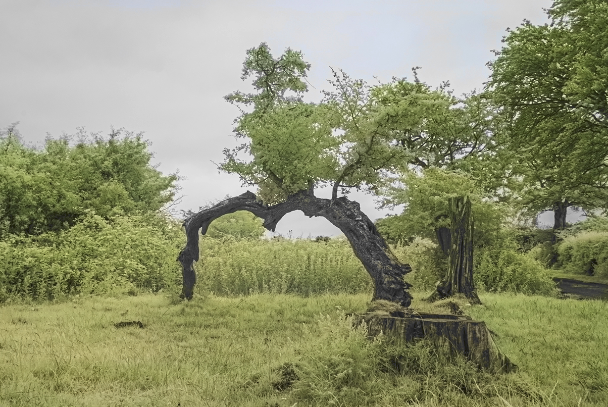
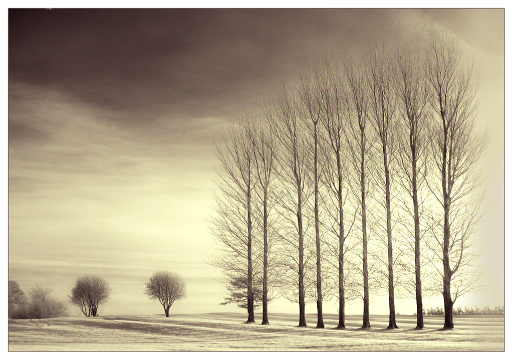
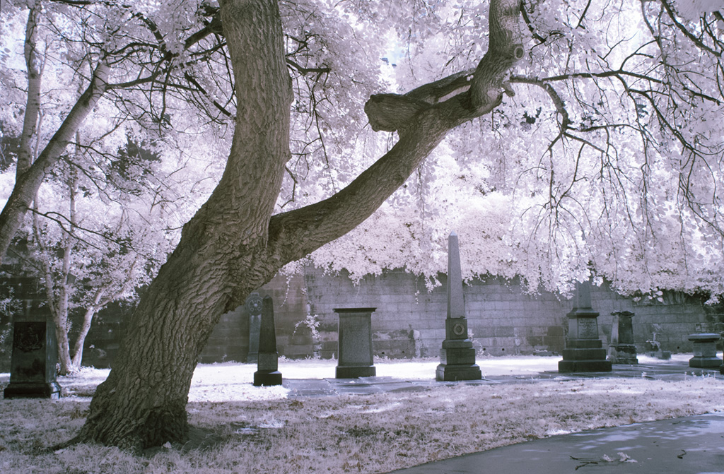
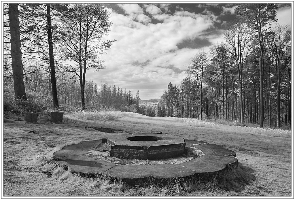
This to me is a pattern picture of nature. OMG. All these trees,- but that's what I think of America, everything on a large scale (although I've never been there). You have managed a good tonal range, and although there is contrast between the trees in sun and shadow there is a soft gentle feel and doesn't show any harshness which might have been there in the 'real'because of lighting conditions. I just might have been tempted to crop out more sky to emphasise the graphic design of the trees. I am intrigued tho by your original as I am not used to the colour it shows. I am so used to seeing originals in Red or Pinky tones. Is this due to your processing techniques. |
Dec 13th |
| 35 |
Dec 17 |
Comment |
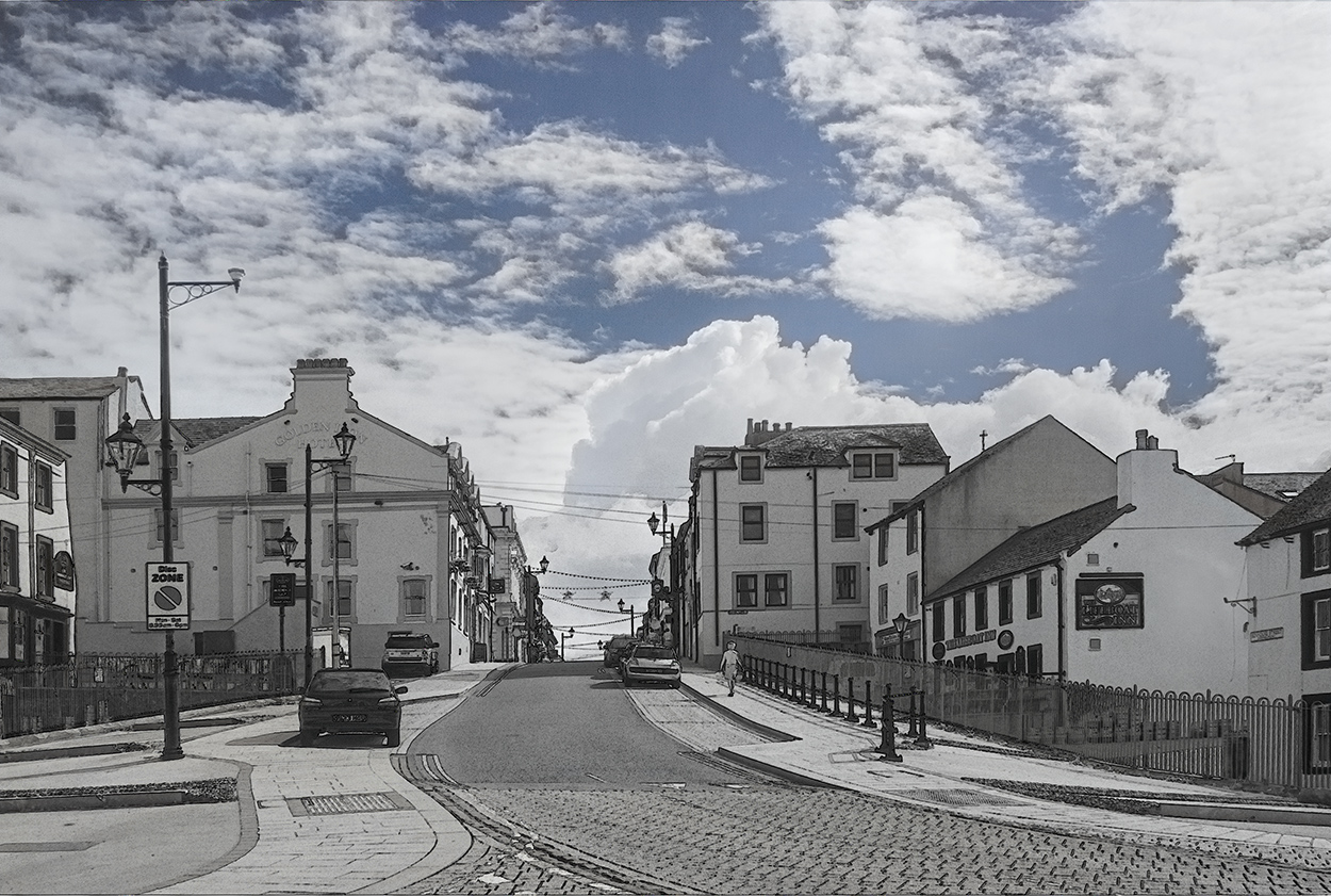
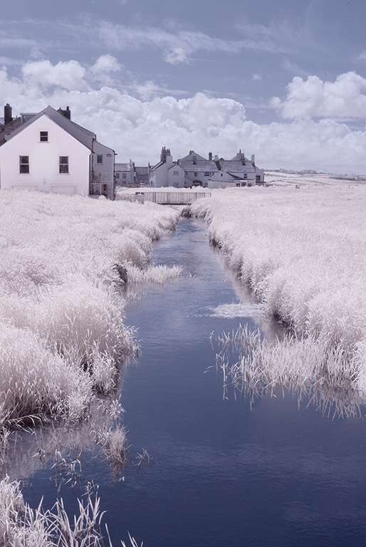
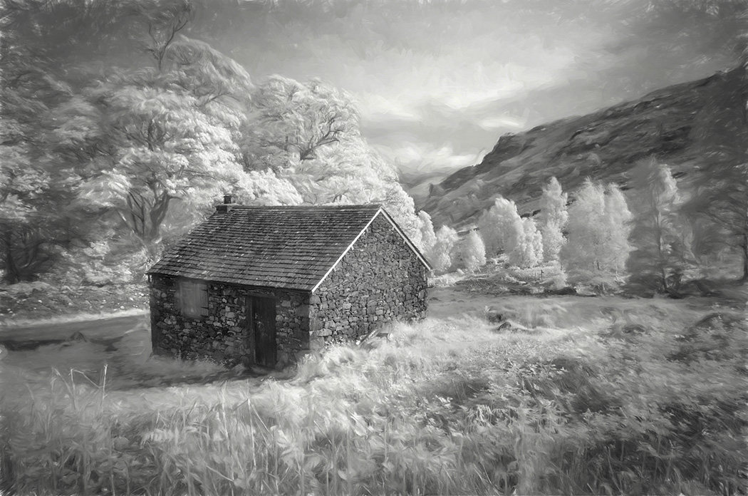
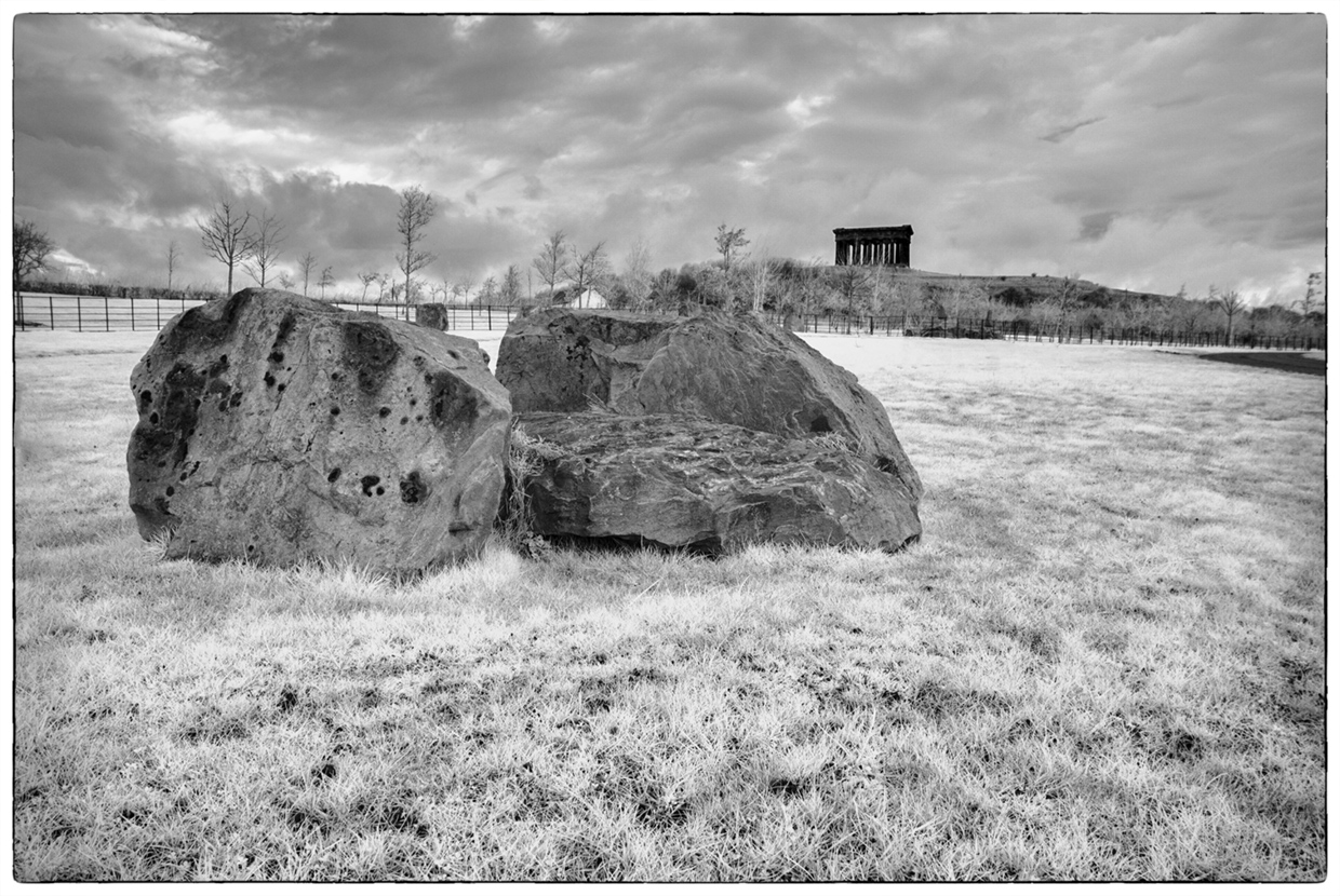
An image full of interest. This must have been a working farm at one time. Julie mentions vines. They are in regimented rows and I like how you have composed the shot by the lead-in of the left hand row and the others set back in degrees from the foreground. Only crit is I would prefer this with no sky whatsoever and crop as much as possible off it. There is no interest there and your eye tends to go towards it, as it is so Black. |
Dec 13th |
| 35 |
Dec 17 |
Comment |
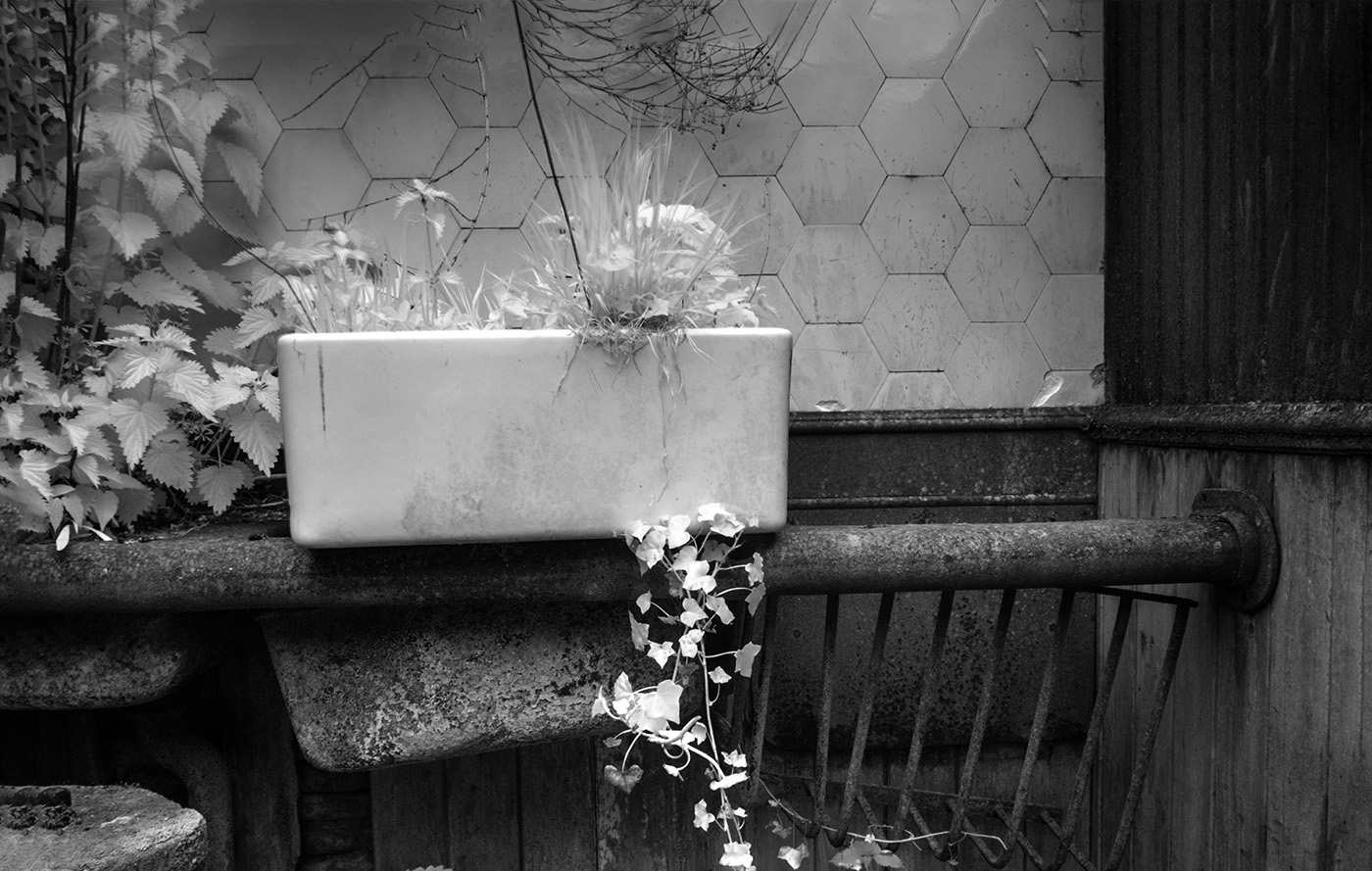
You have done a lovely job on this Sharon and I do like both versions. I do think the Mono version seems to stand out more as the background is more even than the colour version, which I wouldn't have minded if there wasn't a mono one to compare with. I particularly like the light coming through the petals (which to me is not blown out), and the beautiful texture of the petals. With no semblance of a stem the flower seems floating and I am trying to twist my head to see what it would be like as a horizontal. Nice work. |
Dec 13th |
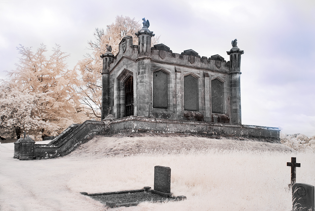
| 35 |
Dec 17 |
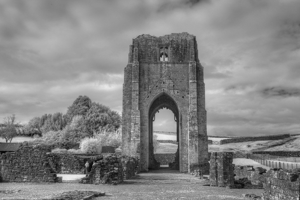
Comment |
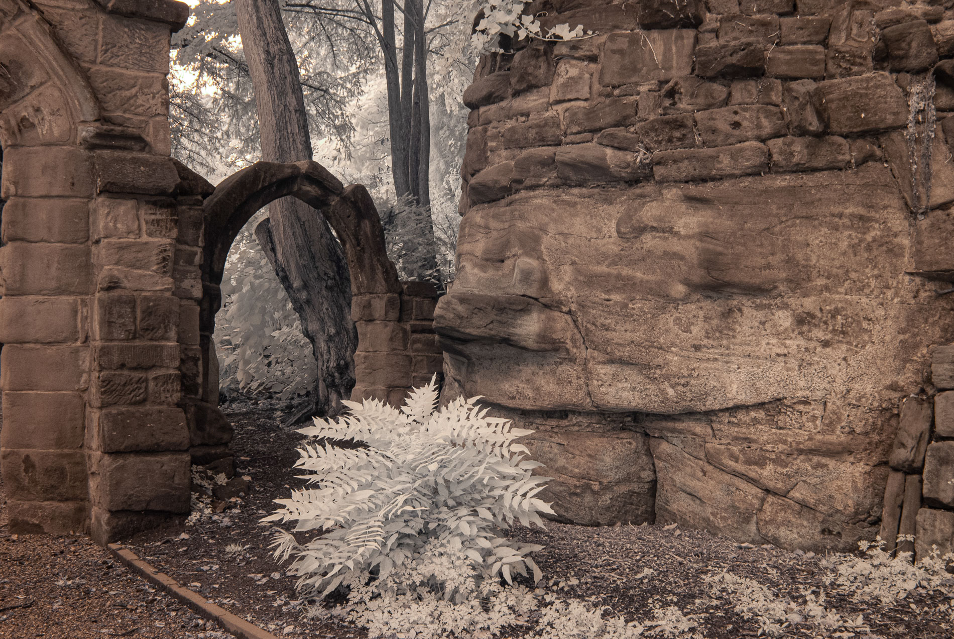
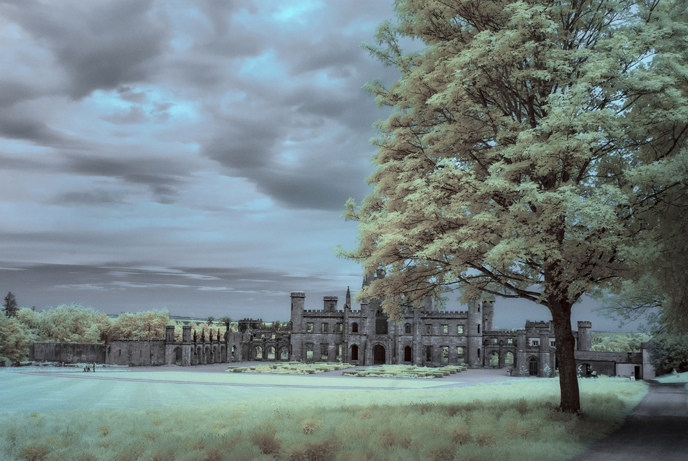
Eeh by gum Julie. You don't half get them!!
Another beautiful image which I cannot find a thing wrong with.
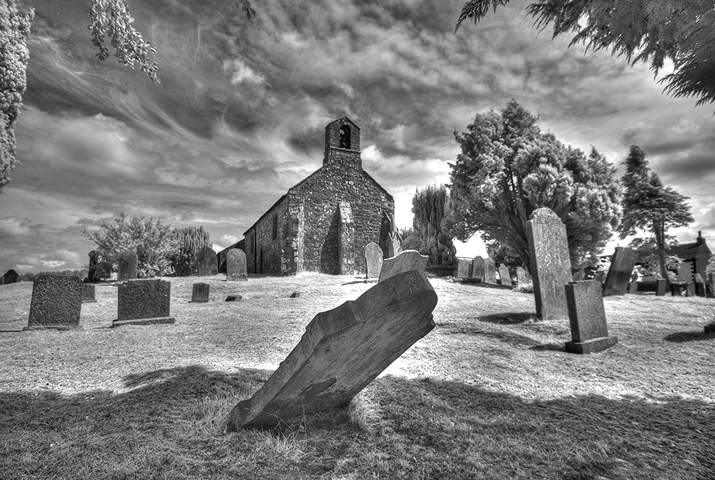
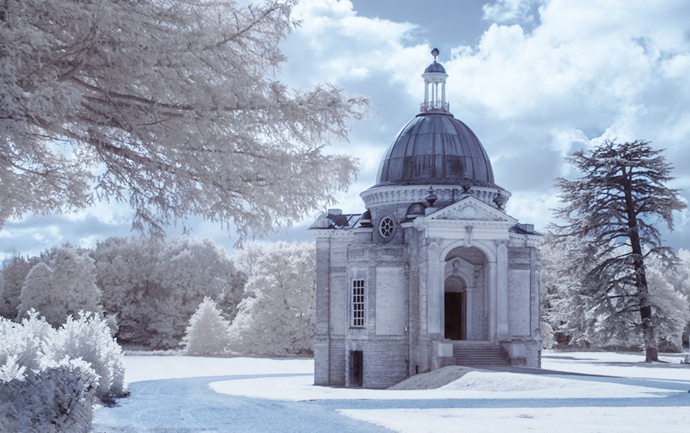
Nice tonal range, great composition and very pictorial with this commanding castle hiding behind the silvery tree which I feel is better than if there was no tree there. I'm glad you introduced The gatehouse and trees on the left which adds interest and acts as a nice lead in. Beautiful quality as I would expect from you |
Dec 13th |
4 comments - 1 reply for Group 35
|
4 comments - 1 reply Total
|